Paul Mullan
![]()
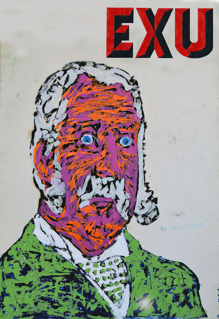
David Wojnarowicz, Untitled for ACT UP (detail), 1990
The Museum of Fine Arts Houston (MFAH) permanent collection is large but doesn’t get enough exposure. The planned expansion, designed by architect Steven Holl and dedicated to modern and contemporary art, may alleviate that problem. Construction begins in 2017.
Picturing Words: Text, Image, Message– one the MFAH’s small, occasional exhibitions of its collection – recently closed. Included was the print Untitled for ACT UP (1990) created by David Wojnarowicz to raise funds for the AIDS Coalition to Unleash Power in New York City, that era’s flagship AIDS activist organization.
More typical of the artworld during that period, Wojnarowicz’s work was deeply political and addressed issues like homophobia and AIDS, from which he would die in 1992. Two shows with which he was involved, Witnesses: Against Our Vanishing and Tongues of Flame, embroiled him in censorship conflicts with the Christian right. (Those forces used so-called “obscene” art – usually addressing sexuality, gender, or religion – as wedge issues to mobilize their base and to attack federal government funding for the National Endowment for the Arts.) Though distanced and not a formal member, Wojnarowicz was still somewhat sympathetic to ACT UP.
On one half of Wojnarowicz’s diptych is what looks like printouts of stock data: opening price, closing price, et al. The layout is similar to that of the Wall Street Journal and old, hardcopy newspapers The color scheme is green text on a black background, evocative of green-screen, monochrome monitors common then. Alphabetized ticker symbols run from GEB to GMP and from JR to KTF. A string of characters, “-K-K-K-“, introduces those companies whose names start with that letter. This is why the particular symbol range was chosen, per Fire in the Belly: The Life and Times of David Wojnarowicz![]() by Cynthia Carr.
by Cynthia Carr.
In the late 1980s, ACT UP targeted drug firms such as Burroughs Wellcome, which was charging astronomical costs for the sole, and problematic, anti-HIV treatment then available, AZT. Perhaps coincidentally the symbols GLX and JNJ – respectively, Glaxo Pharmaceuticals and Johnson and Johnson – also appear among the stocks. In perusing existing, online historical archives, though, I cannot find any references to ACT UP campaigns focused, prior to 1990, on those two corporations.
Nonetheless: Healthcare under capitalism profits at the expense of human lives, and AIDS was killing tens of thousands every year in the U.S. alone. This problem with the economic system as a whole is articulated by embedding Glaxo and Johnson and Johnson in the listings. For emphasis, those are superimposed over an outline of the United States, targeted by a bull’s-eye in red and white at the dead-center of the composition.
![]()
David Wojnarowicz, Untitled for ACT UP (detail), 1990
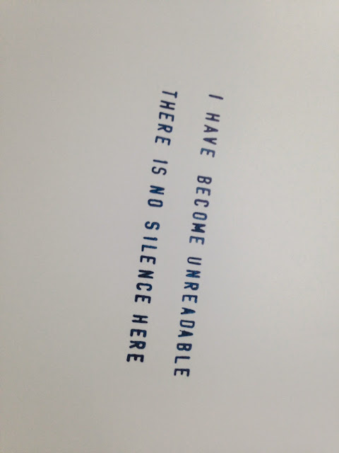
The diptych’s other half has (again) green text, with a different font and on a black and white background. The prose features the artist’s characteristic stream-of-consciousness:
Inflated oil prices spurred a boom in the 1970s in the Houston economy. Oil, however, peaked in 1981 at about $32 a barrel ($82 in 2015 dollars adjusted for inflation) and began to swoon, losing a quarter of its value by 1985. Prices collapsed a further 50% the following year, settling at approximately $12 ($26 2015 dollars) a barrel. This catastrophic downturn, from 1982-1987, saw the Houston area lose one out of every seven jobs, more than 220,000 total. (See the Greater Houston Partnership’s The Economy at a Glance: Houston, for March, 2012.) Huge swathes of houses were left abandoned or foreclosed. New office towers downtown – “see-through” buildings – were completely empty. The oil bust is legendary.
Troubled times for working people can give rise to political reaction.
In June, 1984, the Houston City Council passed two amendments called the Domestic Privacy in Employment Ordinance, which prohibited, in municipal jobs, employment discrimination based on sexual orientation. This was designed to protect lesbian, gay, bisexual, and transgender (LGBT) city employees from homophobic bias.
Christian fundamentalist churches and others quickly began collecting signatures to demand a ballot referendum, assuming that a popular vote would likely overturn those two amendments. Antigay sentiment was much worse then: per Gallup, almost half of the population believed that consensual same-sex relations should be illegal -- versus only 30% as of 2014.
(Much of my information here comes from two sources. First, local archivist and historian JD Doyle has an important website on the referendum, with scans of newspaper and journal articles not available elsewhere online. Second is Dale Carpenter’s “The 30-Year Fight for Equality in Houston,” an excerpt from his book Flagrant Conduct: The Story of Lawrence v. Texas![]() and published at Outsmart in October, 2014.)
and published at Outsmart in October, 2014.)
![]()
The KKK demonstrating against LGBT people, in downtown Houston in the run-up to the January, 1985 ballot referendum. The signs read: “Frag a fag” and “Houston is not a San Francisco yet: Vote No Jan. 19.”
Petition efforts were spearheaded by the Committee for Public Awareness (CPA), in which Council member John Goodner and Harris County Republican Party Chair Russ Mather were key figures. Louie Welch, a vocal bigot and Mayor from 1964-1973, and the Houston Chamber of Commerce, of which he was the President, also supported repeal. Veterans of Anita Bryant’s antigay initiatives in Florida advised. The Ku Klux Klan (KKK), which had shouted “death to homosexuals” during the Council debate, rounded out this front of establishment reaction.
The CPA campaign was virulently homophobic, a manifestation of “culture war” strategies that were to successfully expand right-wing influence around the country. Later “art wars” and attacks on Wojnarowicz, mentioned above, was part of all of this.
Pre-controversy, public opinion surveys had indicated that Houstonians opposed discrimination against LGBT people, by a nine-point margin. However, another survey in October, 1984 indicated that only 37% favored the anti-discrimination measures, with 50% against. On the day of the special election, January 19, 1985, the results were even worse: only 20% voted in favor of the amendments, with 80% against. This crushing defeat for the LGBT communities here would have wide-ranging political effects well into the 1990s.
The LGBT movement has, since the 1969 Stonewall riots, focused upon changing minds one-by-one. The idea that people should come out of the closet and tell their own, personal stories to family, friends, neighbors, co-workers, church members, etcetera is powerful and, ultimately, quite successful
However, mass opinion can be swayed, not only by individuals dialoging with one another at ground level, but also by the dynamics of institutional, formal, official politics. What happens at the top, among political leadership, matters as well. Tanking support for LGBT people, from June, 1984 to October, 1984 to January of the following year – pressured by a roaring, right-wing offensive – makes this clear.
Moreover, mass opinion is not sufficient to win popular votes. Even the strongly sympathetic have to be mobilized to actually walk into the voting booth – which is a greater commitment. The Christian right’s advantage in 1985 was the organizing prowess of churches, which, after all, concentrate lots of politically like-minded people in community every Sunday morning. That was one factor in the lopsided referendum results.
This victory emboldened CPA forces, which later in 1985 ran a “Straight Slate” of candidates against City Council incumbents who had supported the Domestic Privacy in Employment Ordinance. In a comeback attempt, Welch challenged Mayor Kathy Whitmire. In October, Welch was in a television studio, at the Houston ABC affiliate, preparing for a live interview. Someone asked him what his plans were for dealing with the AIDS crisis. Thinking that the microphones had not yet been turned on, Welch responded with: “shoot the queers.” The remark was inadvertently broadcast live, and an uproar ensued, with national exposure.
This is one source of Wojnarowicz’s text in Untitled. (Obviously, the artist confused the state’s governor with a Houston mayoral candidate.) Crisscrossing the diptych two halves are critical perspectives both on big medicine, suggested by the prose and stock-market numbers, and on the decade’s poisonous political atmosphere, suggested by Welch’s quote and the inescapable “-K-K-K-“.
In 2014, City Council passed the Houston Equal Rights Ordinance (HERO). This is far more comprehensive than the 1984 amendments and bans discrimination based on sex, race, color, ethnicity, national origin, age, familial status, marital status, military status, religion, disability, sexual orientation, genetic information, gender identity, and pregnancy. Given the 1985 defeat – and a later one in 2001 – the right is, again, attempting to require a ballot referendum on HERO. Currently, petitions are tied up in legal moves and being counted by a judge.
The downturn in oil prices since July, 2014 is, once again, sending the Houston economy into a tailspin, with exploration and services firms now routinely announcing layoffs ranging in the thousands; and real-estate developments, such as mixed-use, office towers, and mid-rise apartment complexes, being cancelled or put “on-hold.” As should be clear, that can have unpleasant, conservatizing political ramifications. Moreover and for the third time in as many decades, any referendum will put to the test the ability of the LGBT movement to, not only change minds in society as a whole, but to institutionalize those changes in the official, formal sphere of politics. Even in today’s relatively tolerant culture, the latter will not at all automatically follow the former.
Even quite distant from its origins, Wojnarowicz’s Untitled for ACT UP continues to speak to us.

David Wojnarowicz, Untitled for ACT UP (detail), 1990
The Museum of Fine Arts Houston (MFAH) permanent collection is large but doesn’t get enough exposure. The planned expansion, designed by architect Steven Holl and dedicated to modern and contemporary art, may alleviate that problem. Construction begins in 2017.
Picturing Words: Text, Image, Message– one the MFAH’s small, occasional exhibitions of its collection – recently closed. Included was the print Untitled for ACT UP (1990) created by David Wojnarowicz to raise funds for the AIDS Coalition to Unleash Power in New York City, that era’s flagship AIDS activist organization.
More typical of the artworld during that period, Wojnarowicz’s work was deeply political and addressed issues like homophobia and AIDS, from which he would die in 1992. Two shows with which he was involved, Witnesses: Against Our Vanishing and Tongues of Flame, embroiled him in censorship conflicts with the Christian right. (Those forces used so-called “obscene” art – usually addressing sexuality, gender, or religion – as wedge issues to mobilize their base and to attack federal government funding for the National Endowment for the Arts.) Though distanced and not a formal member, Wojnarowicz was still somewhat sympathetic to ACT UP.
On one half of Wojnarowicz’s diptych is what looks like printouts of stock data: opening price, closing price, et al. The layout is similar to that of the Wall Street Journal and old, hardcopy newspapers The color scheme is green text on a black background, evocative of green-screen, monochrome monitors common then. Alphabetized ticker symbols run from GEB to GMP and from JR to KTF. A string of characters, “-K-K-K-“, introduces those companies whose names start with that letter. This is why the particular symbol range was chosen, per Fire in the Belly: The Life and Times of David Wojnarowicz
 by Cynthia Carr.
 In the late 1980s, ACT UP targeted drug firms such as Burroughs Wellcome, which was charging astronomical costs for the sole, and problematic, anti-HIV treatment then available, AZT. Perhaps coincidentally the symbols GLX and JNJ – respectively, Glaxo Pharmaceuticals and Johnson and Johnson – also appear among the stocks. In perusing existing, online historical archives, though, I cannot find any references to ACT UP campaigns focused, prior to 1990, on those two corporations.
Nonetheless: Healthcare under capitalism profits at the expense of human lives, and AIDS was killing tens of thousands every year in the U.S. alone. This problem with the economic system as a whole is articulated by embedding Glaxo and Johnson and Johnson in the listings. For emphasis, those are superimposed over an outline of the United States, targeted by a bull’s-eye in red and white at the dead-center of the composition.

David Wojnarowicz, Untitled for ACT UP (detail), 1990
The diptych’s other half has (again) green text, with a different font and on a black and white background. The prose features the artist’s characteristic stream-of-consciousness:
"If I had a dollar to spend for healthcare I'd rather spend it on a baby or innocent person with some defect or illness not of their own responsibility; not some person with AIDS..." says the texas healthcare official and I can't even remember what he looks like because I reached in through the t.v. screen and ripped his face in half I was told I have ARC recently and this was after watching seven friends die in the last two years slow vicious unnecessary deaths because fags and dykes and drug addicts are expendable in this country "If you want to stop AIDS shoot the queers" says the ex-governor of texasThis passage’s final words have, for those familiar with our city’s history, unmistakable connotations.
Inflated oil prices spurred a boom in the 1970s in the Houston economy. Oil, however, peaked in 1981 at about $32 a barrel ($82 in 2015 dollars adjusted for inflation) and began to swoon, losing a quarter of its value by 1985. Prices collapsed a further 50% the following year, settling at approximately $12 ($26 2015 dollars) a barrel. This catastrophic downturn, from 1982-1987, saw the Houston area lose one out of every seven jobs, more than 220,000 total. (See the Greater Houston Partnership’s The Economy at a Glance: Houston, for March, 2012.) Huge swathes of houses were left abandoned or foreclosed. New office towers downtown – “see-through” buildings – were completely empty. The oil bust is legendary.
Troubled times for working people can give rise to political reaction.
In June, 1984, the Houston City Council passed two amendments called the Domestic Privacy in Employment Ordinance, which prohibited, in municipal jobs, employment discrimination based on sexual orientation. This was designed to protect lesbian, gay, bisexual, and transgender (LGBT) city employees from homophobic bias.
Christian fundamentalist churches and others quickly began collecting signatures to demand a ballot referendum, assuming that a popular vote would likely overturn those two amendments. Antigay sentiment was much worse then: per Gallup, almost half of the population believed that consensual same-sex relations should be illegal -- versus only 30% as of 2014.
(Much of my information here comes from two sources. First, local archivist and historian JD Doyle has an important website on the referendum, with scans of newspaper and journal articles not available elsewhere online. Second is Dale Carpenter’s “The 30-Year Fight for Equality in Houston,” an excerpt from his book Flagrant Conduct: The Story of Lawrence v. Texas
 and published at Outsmart in October, 2014.)
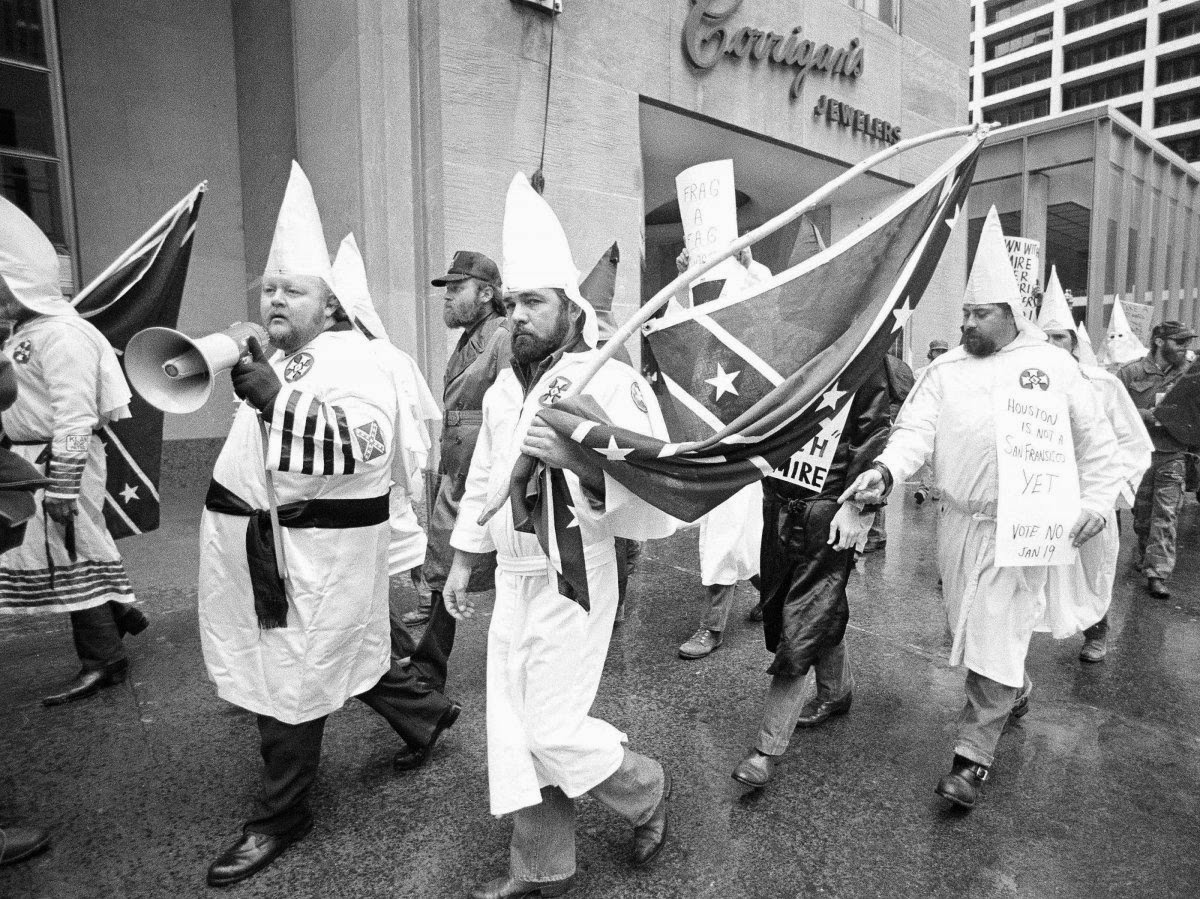
The KKK demonstrating against LGBT people, in downtown Houston in the run-up to the January, 1985 ballot referendum. The signs read: “Frag a fag” and “Houston is not a San Francisco yet: Vote No Jan. 19.”
Petition efforts were spearheaded by the Committee for Public Awareness (CPA), in which Council member John Goodner and Harris County Republican Party Chair Russ Mather were key figures. Louie Welch, a vocal bigot and Mayor from 1964-1973, and the Houston Chamber of Commerce, of which he was the President, also supported repeal. Veterans of Anita Bryant’s antigay initiatives in Florida advised. The Ku Klux Klan (KKK), which had shouted “death to homosexuals” during the Council debate, rounded out this front of establishment reaction.
The CPA campaign was virulently homophobic, a manifestation of “culture war” strategies that were to successfully expand right-wing influence around the country. Later “art wars” and attacks on Wojnarowicz, mentioned above, was part of all of this.
Pre-controversy, public opinion surveys had indicated that Houstonians opposed discrimination against LGBT people, by a nine-point margin. However, another survey in October, 1984 indicated that only 37% favored the anti-discrimination measures, with 50% against. On the day of the special election, January 19, 1985, the results were even worse: only 20% voted in favor of the amendments, with 80% against. This crushing defeat for the LGBT communities here would have wide-ranging political effects well into the 1990s.
The LGBT movement has, since the 1969 Stonewall riots, focused upon changing minds one-by-one. The idea that people should come out of the closet and tell their own, personal stories to family, friends, neighbors, co-workers, church members, etcetera is powerful and, ultimately, quite successful
However, mass opinion can be swayed, not only by individuals dialoging with one another at ground level, but also by the dynamics of institutional, formal, official politics. What happens at the top, among political leadership, matters as well. Tanking support for LGBT people, from June, 1984 to October, 1984 to January of the following year – pressured by a roaring, right-wing offensive – makes this clear.
Moreover, mass opinion is not sufficient to win popular votes. Even the strongly sympathetic have to be mobilized to actually walk into the voting booth – which is a greater commitment. The Christian right’s advantage in 1985 was the organizing prowess of churches, which, after all, concentrate lots of politically like-minded people in community every Sunday morning. That was one factor in the lopsided referendum results.
This victory emboldened CPA forces, which later in 1985 ran a “Straight Slate” of candidates against City Council incumbents who had supported the Domestic Privacy in Employment Ordinance. In a comeback attempt, Welch challenged Mayor Kathy Whitmire. In October, Welch was in a television studio, at the Houston ABC affiliate, preparing for a live interview. Someone asked him what his plans were for dealing with the AIDS crisis. Thinking that the microphones had not yet been turned on, Welch responded with: “shoot the queers.” The remark was inadvertently broadcast live, and an uproar ensued, with national exposure.
This is one source of Wojnarowicz’s text in Untitled. (Obviously, the artist confused the state’s governor with a Houston mayoral candidate.) Crisscrossing the diptych two halves are critical perspectives both on big medicine, suggested by the prose and stock-market numbers, and on the decade’s poisonous political atmosphere, suggested by Welch’s quote and the inescapable “-K-K-K-“.
In 2014, City Council passed the Houston Equal Rights Ordinance (HERO). This is far more comprehensive than the 1984 amendments and bans discrimination based on sex, race, color, ethnicity, national origin, age, familial status, marital status, military status, religion, disability, sexual orientation, genetic information, gender identity, and pregnancy. Given the 1985 defeat – and a later one in 2001 – the right is, again, attempting to require a ballot referendum on HERO. Currently, petitions are tied up in legal moves and being counted by a judge.
The downturn in oil prices since July, 2014 is, once again, sending the Houston economy into a tailspin, with exploration and services firms now routinely announcing layoffs ranging in the thousands; and real-estate developments, such as mixed-use, office towers, and mid-rise apartment complexes, being cancelled or put “on-hold.” As should be clear, that can have unpleasant, conservatizing political ramifications. Moreover and for the third time in as many decades, any referendum will put to the test the ability of the LGBT movement to, not only change minds in society as a whole, but to institutionalize those changes in the official, formal sphere of politics. Even in today’s relatively tolerant culture, the latter will not at all automatically follow the former.
Even quite distant from its origins, Wojnarowicz’s Untitled for ACT UP continues to speak to us.


 was published in 2008. It was a success for two reasons, I think. One, it treated the art world as its subject rather than particular artists or exhibits. Of course she wasn't the first to do this.
  (1982) by Howard Becker looked at the art world in a broader sense than Thornton did, and in pain-staking detail. Gary Alan Fine examined the world of outsider art in
  (2004). All three writers are sociologists, which makes their interest in art more than just an interest in aesthetics--they want to know about the range of activities and people involved in this space.
 is the answer. When I heard the title, I was worried that Thornton had abandoned her sociological background and was going to write just about a collection of individuals. But she has placed them to various degrees in a world of friends, colleagues, helpers and family--in short, she is not doing


 by William Hackman (2015, Other Press)
 by Michael Fallon (2014, Counterpoint)
 by Leslie Buchbinder (2015, Pentimenti Productions)
 , and it connected the artists (and many others). That's where I first read about the Ferus Gallery.
 by Hunter Drohojowska-Philp and the oral history compiled by Kristine McKenna,
  (as well as the documentary
  by Morgan Neville). With all this, it would seem that another book on the L.A. art scene in the 1960s would be irrelevant. But there are always new details to unearth, and points of view not yet discussed.


 by Bill Schelly (Fantagraphics Books, 2015).
 by Gerard Jones and
  by Sean Howe. I recommend both books highly.


 and it was written and drawn by Dylan Horrocks.


 by Craig Thompson


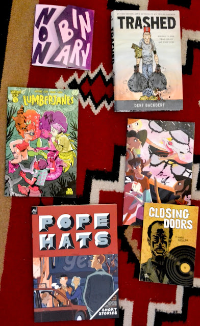
 by
by  by Shannon Watters, Kat Leyh, Carolyn Nowak, Noelle Stevenson, Brooke Allen, etc.
 by
by  by
by 
 by
by  by
by 
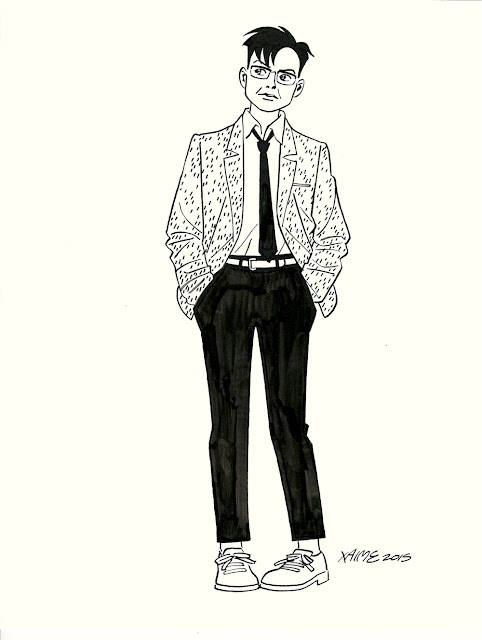
 by Don Thompson. I often feel that comics artists are missing out--not getting what they should get when they sell their original art. These low prices have allowed me to build up a really choice collection, if I may make such a claim. But I would gladly sacrifice this if it meant that Jaime Hernandez earned $25,000 whenever he sold a page of comics art.

 ,
,  ,
,  and
and  , which included great work by Mat Brinkman, Ben Jones, Gabrielle Bell, Gary Panter, Stéphane Blanquet, Shary Boyle, Chris Ware and many, many others. (
 is scheduled to come out next year.) In addition, he, his wife Raina and David Kramer run a bookstore/gallery in Los Angeles called
 . (He has one other book as well,
 .) The most recent two issues of Crickets have been serializing a story called Blood of the Virgin, from which the original art I bought came.


 back when it was


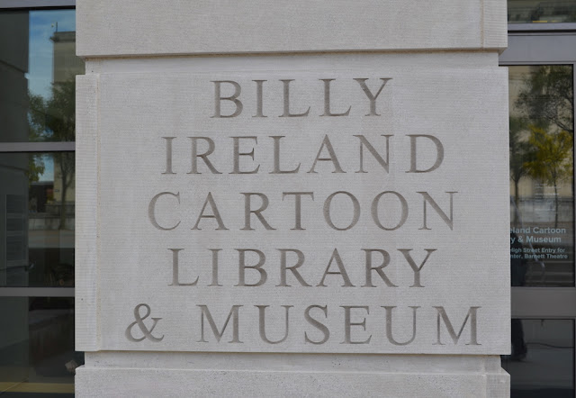
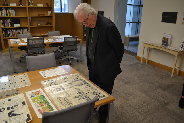
 . Within the cohort of readers of comic books, there appeared in the 50s and 60s some fans who looked at comics as scholars would--they treated their subject as art history and even a kind of philology as they tried to figure who had written and drawn many of otherwise anonymously produced comics, tried to understand the mechanics of comics, and tried to approach the work critically. They were operating outside academia at first, but eventually entered academia, first through communications departments and later through other departments. (Academically, comics is still an interdisciplinary field.) And around the same time, Lucy Caswell was figuring out what to do with Milton Caniff's papers.


 . Jenny Robb has written about him in