Robert BoydThe list below is a personal list of my favorite comics for the year. It's not really a "best of" list. For one thing, it excludes all the possibly great comics I didn't read this year. But more important, it reflects some of my own long-standing obsessions as a reader, which are hardly universal. (I go into more detail on this at the end of this list.) That said, here are the comics that impressed me most in 2015. They are in order by the name of the first-named artist or editor.
![]() Out on the Wire: The Storytelling Secrets of the New Masters of Radio
Out on the Wire: The Storytelling Secrets of the New Masters of Radio![]() by Jessica Abel (Broadway Books).
by Jessica Abel (Broadway Books).I have been following Abel's career since the 90s, when I first saw her self-published comics. She's done quite a lot since then, but I think this might actually be my favorite work by her so far. In it, she reveals how narrative radio shows do what they do. She talked to the creators of
This American Life,
The Moth Story Hour,
Radiolab,
Planet Money and several other radio shows operating in this more-or-less narrative genre.
Out on the Wire is structured a bit like a "how-to" with chapters on ideas, character and voice, story structure, sound and editing, but calling is a "how to" book would be selling it short. There are two other things Abel is doing in this book. First, it's an excellent piece of reporting. She spent significant time talking to and observing the creators of each of these shows, and while they each operate a little differently, she masterfully synthesizes their techniques and philosophies. The second thing she is doing above and beyond a "how to" is making a powerful case that this kind of radio show is art.
It's one of those hybrid arts. Think opera, film, and, yes, comics. These are all messy arts, not just because they combine elements that are often are war with one another (music and drama, writing and drawing, etc.) but because they often exist outside of a world where we think art is supposed to happen--the world of the radio dial, the multiplex, the comic book store, etc. One can listen to these radio shows and podcasts and think, that's not art; that's journalism. Or that's entertainment. But Abel pulls you slowly toward this realization that what we are listening to is a kind of art, and her case is strong.
Out on the Wire is a great book.
![]() Incidents in the Night Book 2 by David B and translated by Brian Evenson and Sarah Evenson (Uncivilized Books).
Incidents in the Night Book 2 by David B and translated by Brian Evenson and Sarah Evenson (Uncivilized Books).The second volume doesn't really require that you have read the first (although you should). I loved both. David B is an artist whose work I always admire. Along with some of his contemporaries, he brought a new sensibility to comics: a surreal edge, a bookishness. With his generation of French cartoonists, comics became less a visual thing (over-sized pages, lots of color) and more a literary form. (Not that David B's graphic sense is anything less than extraordinary.) His work confused me for a long time. I related it to Oulipo, the French literary movement founded by Raymond Queneau which included George Perec and Italo Calvino. And indeed Davis B is closely associated with many of the members of the comics branch of Oulipo,
Oubapo. But it wasn't until I read Patrick Modiano's
The Occupation Trilogy![]()
that I found a good literary analog to what David B seems to be doing in these two books.
There is kind of a pulp plot happening--secret societies of assassins, a cult to "the unknown god" Enn, and a cursed publication called "Incidents in the Night". David B himself is the narrator and protagonist of the first volume, but as his investigations get too close to the truth, he is murdered. Now dead, he continues to narrate volume 2. His brother Jean-Christoph seeks vengeance (this fictional brother is the same person as his real brother, who was the main character in David B's classic memoir
Epileptic). Soon a small group of characters are investigating an implacable secret society, the Fleet, with the aid of a group of booksellers, one in each arrondissement of Paris, who have occult links to one another. In that way it slightly recalls
From Hell![]()
by Alan Moore and Eddie Campbell, but its humor makes it feel more like the
Adele Blanc-Sec![]()
books of Jacques Tardi (as well as the aforementioned prose-writers). If like me you are a booklover and a lover of bookstores and someone who feels that cities have secret connected stories not easily discerned by casual observers, you will love
Incidents in the Night.
![]() Trashed
Trashed![]() by Derf Backderf (Harry N, Abrams).
by Derf Backderf (Harry N, Abrams).Derf Backderf spent most of his career doing a comic strip that appeared in alternative newsweeklies. I was surprised when he turned out to be an unusually talented long-form storyteller.
Trashed returns to an extent to what he did with his book
My Friend Dahmer, combining real life and research into one package.
Trashed is not as smooth at this mixture as
My Friend Dahmer![]()
because in the earlier book, he combined his own high school recollections of Dahmer with biographical details about Jeffrey Dahmer that his younger self could not have known. In
Trashed, he takes his own experience as a trash man, updates it to the present and fictionalizes it to a certain extent while interstitially including facts about trash and the way we deal with it as a country. It is a little odd at first, You'll be reading the story then suddenly you're learning statistics about what percentage of trash is packaging (29.8% percent, if you're wondering). But as I read it, I was reminded of
Moby Dick, of all books. Melville did the same thing; you'd be deep into the story when--
ert!--he changes direction completely and does a chapter on scrimshaw. Anyway, once you get used to this,
Trashed is a great story full of the kind of gritty working class weirdos that populated Beckderf's earlier graphic novel,
Punk Rock and Trailer Parks![]()
. His style is perfect, too--he has high command of his art (that's what doing a comic strip for 14 years can help you achieve) with just enough funk and dirt in his drawing to be especially appropriate for the subject matter. When a character falls into a stream of raw sewage, you feel it.
![]() Woman Rebel: The Margaret Sanger Story
Woman Rebel: The Margaret Sanger Story![]() by Peter Bagge (Drawn & Quarterly).
by Peter Bagge (Drawn & Quarterly).Peter Bagge is one of my all-time favorite cartoonists. I don't think he gets the respect he deserves because most of his work has been out-and-out funny (and funny cartoonists, like funny filmmakers, are sometimes not as respected as the more serious types). I seriously doubt he's ever going to give up being funny, but that doesn't mean that his work hasn't evolved or that he hasn't taken risks.
Women Rebel is a non-fiction graphic novel about the founder of Planned Parenthood, Margaret Sanger. This is in no way an obvious choice of subject matter for Bagge! Writing a biography, much less a biography of an early 20th century fighter for the rights of people to use birth control, is a surprising turn for him.
But maybe not completely. He has for the past few years been doing brief humorous stories about the Founding Fathers, so we know he has a history bug. And what worked with those stories--short, funny episodes from their lives--is continued in
Woman Rebel. Instead of trying to tell a continuous biography, Bagge splits it up into numerous short vignettes. On their own, they have a kind of dramatic unity (or the unity of a good joke), but taken together they manage to be a coherent, eye-opening biography of this remarkable figure.
![]() Step Aside, Pops: A Hark! A Vagrant Collection
Step Aside, Pops: A Hark! A Vagrant Collection![]() by Kate Beaton (Drawn & Quarterly).
by Kate Beaton (Drawn & Quarterly).Beaton has been running her webcomic,
Hark! A Vagrant! for several years now, and this is her second collection. The first collection was kind of a mish-mash. What worked fine online as kind of a laugh-a-day thing didn't work nearly was well in a book. In
Step Aside, Pops, she has denser, better-reproduced artwork and longer piece. Some of these pieces are already classic, like "Strong Female Characters", "Ada B. Wells" and "Nasty." Beaton has really gotten very very good, and this book is delightful.
![]() Eat More Comics: The Best of the Nib, edited by Matt Bors, Eleri Harris and Matt Lubchansky and featuring 45 contributors including Tom Tomorrow, Ruben Bolling, James Sturm, Jen Sorenson, Eleanor Davis, etc.
Eat More Comics: The Best of the Nib, edited by Matt Bors, Eleri Harris and Matt Lubchansky and featuring 45 contributors including Tom Tomorrow, Ruben Bolling, James Sturm, Jen Sorenson, Eleanor Davis, etc.For about a year and a half, political cartoonist Matt Bors edited a comics section, the
Nib, for
Medium. About half the contributions were more-or-less standard "alternative newsweekly"-style comics by some of the best artists working in that genre. But in addition to that, Bors ran a variety of longer-form comics that really stuck with me. Most of the work falls into the category of commentary or opinion, but there were many pieces that I would classify as journalism. Especially good were "A Lost Possibility: Women on Miscarriage" by Ryan Alexander-Tanner, Eleanor Davis's witty demolition of the idea of meritocracy in "Highgate County Fancy Chicken Show,""Bikram Addict" by Eroyn Franklyn and "Crossing the Line" by Josh Neufeld. But there are 300 pages of stories, most only a page or so, and the quality is generally really high. A really satisfying anthology.
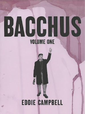
![]() Bacchus Omnibus Edition Volume 1 by Eddie Campbell (Top Shelf Productions).
Bacchus Omnibus Edition Volume 1 by Eddie Campbell (Top Shelf Productions).Eddie Campbell started writing and drawing Bacchus in 1987. As I recall, it was his attempt to create a "mainstream"-style comic, distinct from his humor work and his very personal autobiographical work starring his alter-ego Alec MacGarry. Bacchus in the comic is in fact the god of wine of Greek and Roman myth. I don't know why he is called Bacchus (his Roman name) instead of Dionysus, because he definitely identifies himself in the stories as Greek. He is quite old and looks it--apparently being a Greek god doesn't exactly make you immortal in Campbell's world. Early on his adventures come off as rather bent versions of a superhero adventure--Bacchus has an antagonist, Joe Theseus (the Theseus of Greek myth, in fact), and there is a lot of violence. It's not quite a regular superhero comic (Bacchus never even finds Theseus in the first storyline), but the elements are there at least.
Campbell apparently quickly realized that the real value in the character was in the myths and his embodiment of them. The stories he did around this idea are the best, particularly the cycle of stories called "Doing the Islands." Bacchus and Hermes travel around the Greek islands (being the only two surviving Olympians); Hermes is trying to round up a few souls who managed to escape from Hades--he still feels bound to fulfill his duties as a god, even though Zeus, Pluto and the others are long dead. Bacchus mainly engages in some sentimental storytelling. But accidentally stranded on a small, uninhabited island, he exercises his godhood and causes a truly Dionysian event to occur. This cycle of stories has some of Campbell's most beautiful art, as well. This volume collects over 500 pages of Campbell's
Bacchus stories.
![]() Poems to the Sea by Erin Curry (Grindstone Comics & Czap Books).Poems to the Sea
Poems to the Sea by Erin Curry (Grindstone Comics & Czap Books).Poems to the Sea is one of a series of minicomics published collectively as
Ley Lines. Each issue is by a different artist and deals with a different idea or person from the history of art. These have been a mixed bag so far (I'm a subscriber), but I loved
Poems to the Sea. The artists she references are
Cy Twombly and
Agnes Martin, artists who would seem to have no connection to comics at all--their work is, on the surface, completely devoid of narrative qualities. This comic consists of grids filled with a lot of nothingness--textures, small scribbles, etc. as if Twombly and Martin had collaborated. In the back, Curry quotes Rosalind Kraus: "The grid announces, among other things, modern art's will to silence, its hostility to literature, to narrative, to discourse." And certainly that is what one might feel looking at an Agnes Martin painting. But the irony is that for those of us immersed in the comics world, the grid suggests just the opposite--it suggests not only narrative, but infinite narratives.
For Curry, the same is true of Twombly, who often did series of drawings. Curry calls them comics (using the overly expansive definition pioneered by Scott McCloud). She considers this minicomic a sequel to
Twombly's series of 24 drawings called Poems to the Sea. Curry's
Poems to the Sea is not a comic
about Martin and Twomby, but a dialogue with them. And I thought it was quite beautiful.
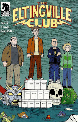
![]() The Eltingville Club #2 by Evan Dorkin (Dark Horse Comics).
The Eltingville Club #2 by Evan Dorkin (Dark Horse Comics).For about 20 years, cartoonist Evan Dorkin has been occasionally producing stories about the "Eltingville Comic Book, Science Fiction, Fantasy, Horror & Role-Playing Club." These have appeared here and there, usually in Dorkin's various one-man anthologies. They were very funny stories about four deeply unpleasant friends from the Eltingville neighborhood of Staten Island. Dorkin made vicious fun of geek/fan culture, and it rang true because he has been a dues-paying member of this culture his entire life. In
an interview, Dorkin described the club-members as "the people at the comic book store that everyone hates. They’re the angry fans, they’re the battling fans." And in
The Eltingville Club, he breaks up the club and has them reunite at San Diego Comicon ten years later.
In the intervening years, all of them have gotten jobs that come out of their teenage fan obsessions. I can relate--I grew up loving comics and then got hired by my favorite publisher, Fantagraphics, back in 1989. On one hand, that's great when it happens. On the other hand, I sometimes felt like I had a kind of unhealthy, parasitical relationship with comics. I think a lot of fans who turn pro must feel this way sometimes. (I'm glad I'm just a fan again.) And in the Eltingville Club, it's 10 times worse because they aren't just super-fans turned pro--they were horrible people when they were mere fans and now that they're pros, they still are! It's brutal and brutally funny. (A
book collection of all the Eltingville stories is scheduled for next year.)
![]() Treasury of Mini Comics Vol. 2
Treasury of Mini Comics Vol. 2![]() , edited by Michael Dowers, featuring work by Fiona Smyth, Steve Willis, Jeff Nicholson, Marc Bell, Molly Kiely, Lisa Hanawalt, Esther Pearl Watson and many others. (Fantagraphics Books).
, edited by Michael Dowers, featuring work by Fiona Smyth, Steve Willis, Jeff Nicholson, Marc Bell, Molly Kiely, Lisa Hanawalt, Esther Pearl Watson and many others. (Fantagraphics Books).This is the third (and reportedly last) volume of minicomics edited by Michael Dowers. The title is therefore a little confusing, but the first volume is called
Newave!: The Underground Mini Comix of the 1980s![]()
. All three volumes have the same format--a small trim size that reflects a popular minicomics size (4 1/4 x 5 1/2 inches) combined with a huge page count (over 800 pages). These books are bricks. This volume is primarily devoted to self-published micro-press comics from the 1990s to almost the present. I'm somewhat surprised at the low profile these books have--this series is a monumental publishing achievement. 2400 pages of the most ephemeral comics ever--comics that regularly had print runs in the 10s--including some of the earliest work of artists who would later go on to great success. The book starts with a series of modern day Tijuana Bibles (perhaps to remind the reader that regardless of its content, the minicomic is an outlaw form, a temporary autonomous zone outside the capitalist system of editors, publishers, distributors and shops). Some of the pieces are well known--Jeff Nicholson's demented classic "Small Press Tirade", for example--but I found a lot of stuff in here was new to me even though I was aware of most of the artists. I wrote a column about self-published comics called "Minimalism" from 1991 to 1996, and I was on top of the genre then. But it's a truly underground form, and it takes a great deal of effort to be aware of what people are doing with it. That's why these books are so valuable. I hope Fantagraphics changes its mind and keeps publishing this series forever.
![]() Extra Good Stuff
Extra Good Stuff![]() written by Dennis P. Eichhorn and illustrated by a variety of artists including Ivan Brunetti, David Collier, Pat Moriarty, Colin Upton, Noah Van Sciver and J.R. Williams (Last Gasp).
written by Dennis P. Eichhorn and illustrated by a variety of artists including Ivan Brunetti, David Collier, Pat Moriarty, Colin Upton, Noah Van Sciver and J.R. Williams (Last Gasp).Dennis Eichhorn was a writer who passed away this year. This was his last book and contained a variety of new stories as well as reprints of a few classics. Inspired by
Harvey Pekar, Eichhorn's stories were autobiographical and illustrated by various artists. But while Pekar's stories tended to be quiet character studies, Eichhorn lived a fairly action-packed life which included a stint in prison in Idaho for drug-dealing. And he played up the more exciting bits of even the most mundane aspects of his life. The result wasn't high comics art, but it sure was entertaining. And it helped that he found artists who had the same grungy, working-class vibe that typified his stories. One of the young artists who worked with him, Tom Van Deusen, illustrates a story about an incident when Eichhorn had a job as a medical courier. This is typical--bottom-rung employment, a job that was probably uneventful 99% of the time, but Eichhorn zeros in on one notable incident. And it's great! I've been rereading this to write this little review and the hardest story to reread was "What Next?", illustrated by one of Eichhorn's long-time artistic partners,
R.L. Crabb. Eichhorn is in the hospital for an unexplained procedure, when he sees on the TV playing in his room that Harvey Pekar has died. (Pekar died in 2010.) He imagines the angel of death in the room with him, and the man in the next bed dies. This book was published in September, and Dennis, who was an old friend, died in October.
![]() Mould Map #4, edited by Hugh Frost and Leon Sadler featuring art by Grace Wilson, Will Sweeney, Brecht Vandebroucke, Hanna K, MOSA, Gilbert & George, Stathis Tsemberlidis and many others. (Landfill Editions).
Mould Map #4, edited by Hugh Frost and Leon Sadler featuring art by Grace Wilson, Will Sweeney, Brecht Vandebroucke, Hanna K, MOSA, Gilbert & George, Stathis Tsemberlidis and many others. (Landfill Editions).This is called "The Eurozone Special," and many of the artists this issue come from EU countries, but the main thing about this issue of
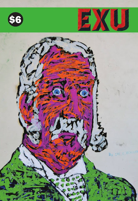
Mould Map is how political it is. This is a strange magazine. It is about half visual art and half comics (and this mixture reminds me of
Exu, although
Exu is weighted more towards the visual art side). It has a few articles and interviews as well, including a history of the great Italian comics magazine
Frigidaire that links its origins to the massive left-wing movements in 70s Italy. The comics have a vibe not unlike
Anarchy Comics![]()
, the Jay Kinney/Paul Mavrides comic of the 70s and 80s, as well as the work of English anarchist cartoonist Cliff Harper from roughly the same period. They've stated that
Adbusters was an influence, and that shows. It's kind of a voice that I haven't seen in comics in a long time.
For example, an untitled story by editor Leon Sadler is an ant ostensibly applying for a job with Bayer. In it, the applicant is asked three standard HR-style questions: "Describe a time when you have taken a leadership role, either of a task or a team of insects. What challenges did you face and what was your part in overcoming them?", "Describe a change that you have initiated at work. How did you develop your ideas and how did you encourage others to adopt those changes?" and "And now describe a situation when you exceeded customer expectations by displaying total commitment to providing solutions of the highest possible standards, and how you maintain the pathway to achieving and surpassing your goals.". My blood ran cold as I read them, remembering terrifying job interviews in my own past. The satire works because these are entirely real, straight out of HR 101. This kind of détournement is very Mavrides-esque. I also liked Brecht Vandenbroucke's piece a lot, which surprised me because
I hated his book, White Cube, which struck me as witless and cruel. But his satire of the anti-homeless spikes was funny and powerful.
The visual art tended to be dense with digital effects and less overtly political than many of the comics. I was especially pleased to see some Gilbert & George pieces where they made great use of digital graphics software--you can teach elder statesmen some new tricks, it seems.
Mould Map #4 could have been a continuation of #3, and that would have been great. But the political satirical content was an unexpected surprise that really worked great. I liked that it wasn't the scolding political style you see in so much political art these days, nor the earnest satire seen in
Eat More Comics (which I loved), but a restless postmodernist approach combining pastiche and détournement with an instinct for finding the jugular of its targets.
Mould Map #4 is way "artier" than
Eat More Comics, and between the two lies a fruitful range of approaches to doing political comics.
![]() Invisible Ink: My Mother's Love Affair With A Famous Cartoonist
Invisible Ink: My Mother's Love Affair With A Famous Cartoonist![]() by Bill Griffith
by Bill Griffith (Fantagraphics Books).
Bill Griffith is best known for his daily comic strip,
Zippy, a real oddity on the funny pages. And Griffith's career has been odd--he started as an underground cartoonist in the late 60s and it might be fair to say that he made his mark most as an editor--first for a title called
Young Lust and later for
Arcade. But as he was working on those titles, his character Zippy was gaining a following and was eventually chosen to be a daily strip for the
San Francisco Examiner in 1985 and was picked up by King Features a few months later. Griffith has been doing
Zippy every day ever since. And the strip is flexible enough that he was able to do a lengthy sequence to write about his troubled relationship with his dad within the confines of the strip..
But it's 2015 and everybody's doing graphic novels. So to tell this highly personal story about his mother's long-time affair with Lawrence Larier, a successful hack cartoonist from the 50s and 60s, Griffith took the plunge into long form comics. It's no surprise that this book is great because Griffith is a great cartoonist. He's a miniaturist (as are all great comic strip artists), but here he make excellent use of the larger pages and the ability to string a sequence out over many pages. But what is really interesting for me is to see Griffith take his satirist hat off. He's still the observant, analytical artist he has always been, but the subject matter is personal and emotional in a way that one doesn't expect from him. He's never going to wear his heart on his sleeve as a cartoonist, but nonetheless
Invisible Ink is very moving.
![]()
![]() Cricketsnos. 4and 5 by Sammy Harkham (self-published).
Cricketsnos. 4and 5 by Sammy Harkham (self-published).I've written about
Crickets a couple of
times before. I'm really glad that Harkham has gotten two issues out this year. We are now very deep into the story "Blood of the Virgin," the story of a young film director making a z-grade horror movie "Blood of the Virgin," for a Roger Corman-like movie studio while his marriage seems to be heading towards some rocky shoals. It is so pleasing to read this because Harkham creates an entirely believable world--or maybe worlds would be better. The b-movie world intersects with the world of Iraqi Jews in L.A., and it never seems like he's telegraphing period details to you. "Blood of the Virgin" is set in the early 70s, but unlike so many period
movies, there is nothing really obviously early 70s about what you're seeing. I mean it's there, but it's not telegraphed. Movies usually slap you in the face with their period soundtracks and crazy period clothes. But Harkham seems to realize that authenticity is not about period or cultural details, it's about making you forget that you are doing anything but read a story about some characters--a story you just can't stop reading. Eventually he'll finish "Blood of the Virgin" and it'll be printed up as a graphic novel which will probably be a more satisfying way to read it than the current multi-year cycle of comic books. But I love this comic so much that I just can't wait, so I'm sticking to reading it serially in
Crickets.
![]()
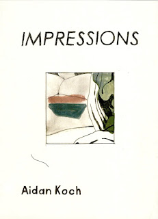
![]() Impressions and Glass Surfaces and Still Pools by Aidan Koch (Peradam and self-published respectively).
Impressions and Glass Surfaces and Still Pools by Aidan Koch (Peradam and self-published respectively).I hate to use the word "minimalist" to describe Aiden Kock's work because it seems like a cliché and not quite right anyway. But it certainly fits parts of
Impressions, a small graphic novel. There are pages where the panels are completely blank or where they have just a small bit of what a viewer might be seeing if she were standing in the room. The story is about an artist's model, and these partial representations are what the artist is painting. So we see a shape, a line, a splash of color and ultimately the nude body of the model. But this makes it sound a lot more programmatic than it is. The way it's depicted is described in the title--it is impressionistic, and it is only through the building up of subsequent images that we get an idea of what's happening and the mood of the scene. The model visits a sick relative (or perhaps one in a nursing home) where our impressions are, if anything, even more fragmentary. The main character has a conversation with a friend about the artist, and we viewers see only shapes of color representing facets of their skin or hair or clothes. And the model complains about the artist: "It's almost like he really doesn't see me. I'm just a shape."
Glass Surfaces and Still Pools is a formal experiment. As the title suggests, it is about reflection, and the concept is that the top half of each page reflects the bottom. But this isn't literal--only on a few pages is the top half a mirror-image of the bottom. There's no particular plot, just a minimal monologue by a naked young woman waking up. But it's a beautiful piece of work.
![]()
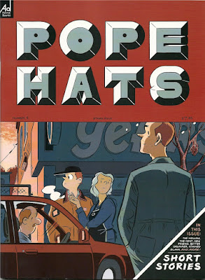
Pope Hats #4 by Ethan Rilly (Adhouse Books).This is one of those comics where I kick myself for letting three issues go by before discovering it. And by "discover," I mean it was hand-sold to me by the publisher, Chris Pitzer at
Comics Crossroads Columbus (aka CXC). This is one very good reason to go to comics festivals. I had previously been turned off by the stupid title. Anyway, I'm glad I finally picked it up. These little stories drawn in a clean style with tasteful colors turned out to be very affecting. I'm sure Rilly must hate being compared to Adrian Tomine and Dan Clowes, but he works in their mode. Characters are neurotic or alienated, stuck in situations where there is no clear way out, and nothing is resolved. I know this sounds like a damned frustrating read, but I found it powerful because it feels so familiar. It brings to the surface the anxieties that modern bourgeois people have, and it doesn't flinch from the insolubility of these problems. I realize this kind of story is not for everyone. A very reasonable criticism is that in a world full of horrors, where unarmed 12-year-old African-American boys can get gunned down by police for no reason, who cares about the problems of some white middle class fictional characters? Well, I do--these stories pierced me.
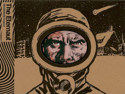
![]() The Eternaut
The Eternaut![]() by Héctor Germán Oesterheld and Francisco Solano López (Fantagraphics Books).
by Héctor Germán Oesterheld and Francisco Solano López (Fantagraphics Books).This book was originally serialized in Argentina between 1957 and 1959. There is much that could be said about the historical circumstances of its creation and about its creators. Much of this is covered in the introductions to the book itself. The thing to remember is that in 1957, there weren't really many serious, post-apocalyptic entertainments.
The Eternaut is an astonishingly grim story. We're kind of used to this now, with all the zombie stories out there, but it must have been a shocker for its readers. Although both Oesterheld and Solano López evolved quite a lot as artists after
The Eternaut, this is still a surprising and compelling piece of comics. A classic and a key piece of comics history.
![]() The Arab of the Future: A Childhood in the Middle East, 1978-1984: A Graphic Memoir
The Arab of the Future: A Childhood in the Middle East, 1978-1984: A Graphic Memoir![]() by Riad Sattouf (Metropolitan Books).
by Riad Sattouf (Metropolitan Books).This is a memoir by a popular French cartoonist that is unusually timely due to the author's Syrain background. But the Arab world Sattouf grew up in is quite different from the Arab world today. The memoir covers the period when he was two years old. His parents were a French woman and a Syrian man who met while graduate students in France. His father, Abdul-Razak, got a doctorate in political science and went to teach in Libya. At the time, Gaddafi was offering foreign academics a very good salary to teach in Libya, which he ruled through his very unusual ideology. For example, no houses we permitted to have external locks because private property had been eliminated. Of course, this meant if you left your house, you might return to discover that it was occupied by someone new! Life in Libya eventually becomes intolerable, so they moved to Syria. While Libya had a distinct ideology, Syria was a multi-ethnic country where certain ethnicities held power and wealth. Abdul-Razak's people were Sunnis living near Homs and were relatively poor. Here baby Sattouf experiences prejudice for the first time as mean boys call him "Jew" because of his blonde hair. This part of his life is about how he learns to navigate life with other kids his age and older without speaking very good Arabic.
But the most interesting character is the father, Adbul-Razak. He's a mass of contradictions--intelligent but curiously foolish; a believer of pan-Arabism but also a snob who looks down on Arabs based on their background, their religious affiliation or their status. He believes in war but is a coward. I don't know if he is still alive, but if he is, it must have been hard for him to read this book. Arab politics of the early 80s pervades this book, but it is really the story of a foolish father dragging his family from country to country without much of a plan. Riad's depiction of his own two and three-year-old understanding of the world is quite masterful, too, even as we readers understand so much more.
![]() Art Comic #2 by Matthew Thurber (Swimmers Group).
Art Comic #2 by Matthew Thurber (Swimmers Group).Thurber has a talent for analyzing (and satirizing) a thing by taking it to almost surreal extremes. That's what he did to the internet and cyberpunk in the great
INFOMANIACS![]()
, and it's what he is doing to the art world in
Art Comics. There are two parallel stories. One is about a group of students at Cooper Union in 1999. An art professor is undermining his students during a crit, and refusing to answer their practical questions about their post-college career. But it turns out that he is a minor member of a secret artistic cabal that suppresses promising art students to maintain the cabal's artistic dominance. This silly plot is over the top (the cabal member that visits the art professor can turn himself into a bat) but given the seemingly arbitrary nature of the art world, why not? This plotline is linked to another that began in the previous issue about a knight (armor, a horse, the whole thing) who is making his way south to Art Basel Miami on a mission of vengeance (it turns out that his parents were killed when an improperly secured Jeff Koons balloon dog sculpture fell on them).
Art Comic is a very funny comic. Issue three is out, but I haven't received my copy as of this writing. It'll probably show up several minutes after I hit the "publish" button.
![]() Killing and Dying
Killing and Dying![]() by Adrian Tomine (Drawn & Quarterly).
by Adrian Tomine (Drawn & Quarterly).Tomine is another artist I have been following since the beginning of his career, when he was still a teenager doing minicomics. (I wrote the minicomics column, "Minimalism," in the
Comics Journal for several years, which is where I encountered the earliest work of people like Abel, Tomine and James Kochalka.) He's an artist who has gotten progressively better and better, and it is exciting to say that
Killing and Dying is his best work (so far). The book consists of six short stories. Tomine experiments with styles and formats here. "Hortisculpture" is told in a series of 4-panel black-and-white comic strips with a full-page color "Sunday" strip after each group of six "dailies". "Go Owls" employs a very limited palette (kind of a series of duotones) with no black lines. "Intruders" has no panel borders and is drawn in a style much sketchier than Tomine's usual precision. But if you are familiar with Tomine's work, any of these stories will instantly be recognizable. What seems a little bit different about this book than his previous books is a visual distancing. We never get close to the characters. He accomplishes this in two ways. One, does relatively few closeup images on his characters. And even when he does, he minimizes their impact by making the panels quite small. I wonder if he is being influenced by Gabrielle Bell. The distancing effect in
Killing and Dying is similar to what one experiences in her comics.
The stories tend to be pretty mundane, but their emotional impact is all the more brutal for that. The title story, for example, is about a shy teenage girl with a stutter who wants to be a stand-up comedian. About halfway through the story, her mother dies of cancer. If Tomine were writing a Hollywood melodrama, that would be the point of the story--the death would be its climax. But Tomine focuses more on the extreme awkwardness of the girl's patently absurd ambition and the way her father is torn between supporting it and discouraging it. That is a theme running through the book--futile ambition. Characters make a wrong decision about what they should be doing with their lives at the beginning of the stories and we watch them crash and burn. It seems a little cruel except, I think, it's about us. We all make these wrong decisions that keep having consequences for us. At least, I know I have.
Not quite comics ![]() Drawn & Quarterly: Twenty-five Years of Contemporary Cartooning, Comics, and Graphic Novels
Drawn & Quarterly: Twenty-five Years of Contemporary Cartooning, Comics, and Graphic Novels![]() by various writers, artists, etc. (Drawn & Quarterly).
by various writers, artists, etc. (Drawn & Quarterly).Drawn & Quarterly is my favorite comics publisher. They decided to celebrate 25 years of their existence by publishing a massive book of remembrances, tributes, and comics. I shouldn't include it on the list because I contributed to it (I wrote a short piece about cartoonist Jason Lutes). But it's such an enjoyable compendium that I had to mention it.
If they had just taken the comics featured here and published them as a comics anthology, it'd be one of the best of the year. But there is so much more--lots of pictures, a detailed timeline and a huge selection of really excellent essays by people like Jonathan Lethem, Ivan Brunetti, Chris Ware, Lemony Snicket, Françoise Mouly, Joe McCulloch, Aaron Cometbus, Margaret Atwood, Tom Spurgeon, and many others. At 775 pages, there's plenty of room, and most of that room is taken up by the comics. Some are odds and ends that haven't been collected before, some are excerpts from longer works. Just the names of the cartoonists tell all--they are among the greatest ever. Here are 15 greats featured herein: Shigeru Mizuki, Gilbert Hernandez, Peter Bagge, Joe Matt, Kate Beaton, Lynda Barry, Julie Doucet, Mimi Pond, Marc Bell, Rutu Modan, Adrian Tomine, Chris Ware, Dylan Horrocks, Joe Sacco and Chester Brown. And again, that is just some of them.
I always fear that comics publishers publish these things right before some transformative change for the worse (bankruptcy or purchase by a publishing conglomerate run by MBAs). I hope that's not the case. I want Drawn & Quarterly to keep on publishing great comics for decades. But even if a meteor struck D&Q headquarters tomorrow, obliterating them from the Earth, they've already changed the history of comics very much for the better.
![]() Harvey Kurtzman: The Man Who Created Mad and Revolutionized Humor in America
Harvey Kurtzman: The Man Who Created Mad and Revolutionized Humor in America![]() by Bill Schefly (Fantagraphics Books).
by Bill Schefly (Fantagraphics Books).I
reviewed this book earlier this year. This mammoth biography seems to have everything, and for me it unlocked a lot of what happened to Kurtzman. Kurtzman was a very innovative cartoonist and writer who is revered by generation of artists who worked for him or were taught by him. His golden decade was the 1950s, when he did a series of ground-breaking comics for EC, created
Mad Magazine, and created two more humor magazines that while much less successful than
Mad, are considered classics by those who follow such things. Then in the 60s, everything starts to go downhill. There's a famous quote that Robert Crumb wrote in a sketchbook which was something like, Don't let what happened to Kurtzman happen to you. In other words, don't sell out your gift for a paycheck. Kurtzman's paycheck was from
Playboy Magazine, where he did a soft-core satire strip, "Little Annie Fanny".
This history is fairly well-known, and Schelly's book isn't a
revisionist take on it. But we learn a little bit more. Kurtzman had a family and needed to take care of them. One of them was his son Peter, who was autistic and required special care. In 1957, Kurtzman might have felt confident enough to risk everything starting a magazine, Humbug. But when you have lives depending on you, you can't take those risks anymore. I know lots of artists who would love nothing better than to work on their art 24/7, but they have spouses and children they love who need health insurance and a reliable roof over their heads. So they teach at a university and do their art when they can. I think Kurtzman's tragedy is a common one. We just see it more acutely with Kurtzman because he accomplished so much early on.![]() Welcome to Marwencol
Welcome to Marwencol![]() by Mark Hogancamp & Chris Shellen (Princton Architectural Press).
by Mark Hogancamp & Chris Shellen (Princton Architectural Press).Mark Hogancamp lived on Long Island and worked in a restaurant. His hobbies were drawing, dressing in women's shoes, and drinking. He had been drinking for a solid four hours when he was attacked by five men and had his head kicked in. He was in a coma for nine days and woke with vast areas of his memory gone, his alcoholism gone, and his ability to draw gone due to a tremor in his hands. The men who attacked him were caught and went to jail, but Hogancamp suffered serious PTSD. And money for therapy soon ran out. So he turned to art as therapy: he started building a small town in his back yard, made to1:6 scale. He bought G.I. Joe style dolls from specialist makers of military miniatures. Soon this little Belgian village was inhabited by World War II era military men and women of all armies. They come to seek peace after war. A truce endures in the village at all time. And their leader is an American soldier named Hogie. Hogie is Hogancamp, and he is a survivor of torture by the SS.
Hogancamp imagines scenarios and, indeed, a whole history of Marwencol. With a cheap 35MM camera, he has taken hundreds of remarkable photos. That's how Marwencol first became known--he entered a photo contest for military miniaturists (a whole subculture that I knew nothing about until reading this book) and won first place. In 2005, neighbor, David Naugle, saw Hogancamp walking a 1/6th scale Jeep like a dog on a leash down the road. Hogancamp did this to give the Jeep a proper look of wear and tear. He met Hogancamp and introduced him to Tod Lippy, the editor of
Esopus, a beautiful art magazine. This was Hogancamp's introduction to the art world. Since then, there have been gallery shows, a
documentary, and now this book. I've been
obsessed with Hogancamp's world for years and bought one of his photos for my collection.
Part of this art book is a series of photocomics. It seems natural--Hogancamp's models and figurines are beautifully made, and can be posed in any scenario. His photography is excellent. And he has made up stories about Marwencol since the beginning. Why not go the next step and create photo-narratives? So he did and they take up about half the book.
They aren't great because the writing isn't great. But they are pretty amazing to look at. And as I looked at them, I wondered why more comics artists don't do this kind of thing. Why always
drawing? There are so many ways to get images down on paper (or on the computer screen) now, but almost every comics artist draws her comics, whether on paper or on a tablet. I hope comics artists look at
Welcome to Marwencol and maybe get some ideas.
There have been several best-of lists published in the past couple of weeks (for example, in
The Guardian,
Salon,
Paste, the
Onion A.V. Club and
Slate). When I look at these lists, I notice not so much how many comics we disagree about (although I will note that the
Salon reviewer is coming from a whole different planet than I am), but rather how many comics there are on their lists that I haven't even read. It's impossible to keep up these days.
My comics buying habits strongly affect what showed up on this list. Every week
Joe McCulloch (at the
Comics Journal) and Tom Spurgeon (at the
Comics Reporter) make a list of notable comics shipping that week. I look at these lists, and if something interests me, I'll buy it via mail order. Occasionally I hear about something that sounds interesting, for instance on podcasts like
Comic Books Are Burning in Hell or
Inkstuds, and I'll pick that up (again by mail-order). I very rarely go to a comic book store--maybe twice in 2015. I do try to go to a comic festival at least once a year, and which one I go to strongly affects what I end up reading. I went to
CXC this year instead of
Comic Arts Brooklyn, and I can assure you that what was available at CXC influenced my list.
I'm not very interested in superheroes. I mostly got that out of my system when I was 13 or so. So none appear on my list. (That said, I have been enjoying all these cheesy superhero TV shows, like
The Flash and
Agents of S.H.I.E.L.D.) I haven't been keeping up with manga--it's a little overwhelming to try to follow. So no manga this year.
And along those lines, everything on my list is in English. The majority of comics published in 2015 were
not in English. Which is to say that there is literally a world of comics that were not considered for my list, even though I can assure you that some great comics were published in France, Italy, Japan, Mexico, Brazil, etc.
As readers of this blog know well, I am into contemporary art, so not only do a lot of the comics on this list come from comics' artier precincts, but several of them cross over into the art world in one way or another in terms of subject matter.
I know many of these cartoonists, and have known several for decades, so it's hard for me to be objective about them.
For all of these reasons, this is a "my favorites" list and not a "best of" list.


 by
by 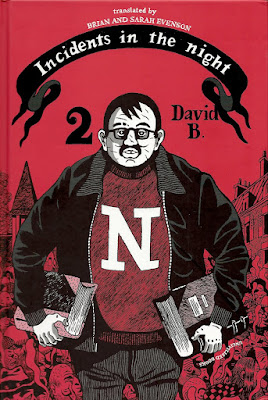
 that I found a good literary analog to what David B seems to be doing in these two books.
 by Alan Moore and Eddie Campbell, but its humor makes it feel more like the
  books of Jacques Tardi (as well as the aforementioned prose-writers). If like me you are a booklover and a lover of bookstores and someone who feels that cities have secret connected stories not easily discerned by casual observers, you will love Incidents in the Night.
 by
by  because in the earlier book, he combined his own high school recollections of Dahmer with biographical details about Jeffrey Dahmer that his younger self could not have known. In Trashed, he takes his own experience as a trash man, updates it to the present and fictionalizes it to a certain extent while interstitially including facts about trash and the way we deal with it as a country. It is a little odd at first, You'll be reading the story then suddenly you're learning statistics about what percentage of trash is packaging (29.8% percent, if you're wondering). But as I read it, I was reminded of Moby Dick, of all books. Melville did the same thing; you'd be deep into the story when--ert!--he changes direction completely and does a chapter on scrimshaw. Anyway, once you get used to this, Trashed is a great story full of the kind of gritty working class weirdos that populated Beckderf's earlier graphic novel,
  . His style is perfect, too--he has high command of his art (that's what doing a comic strip for 14 years can help you achieve) with just enough funk and dirt in his drawing to be especially appropriate for the subject matter. When a character falls into a stream of raw sewage, you feel it.
 by
by 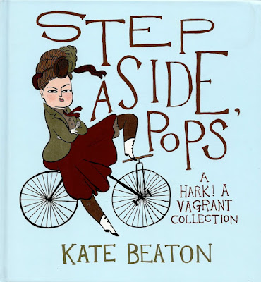
 by
by 


 , edited by Michael Dowers, featuring work by Fiona Smyth, Steve Willis, Jeff Nicholson, Marc Bell, Molly Kiely, Lisa Hanawalt, Esther Pearl Watson and many others. (Fantagraphics Books).
 . All three volumes have the same format--a small trim size that reflects a popular minicomics size (4 1/4 x 5 1/2 inches) combined with a huge page count (over 800 pages). These books are bricks. This volume is primarily devoted to self-published micro-press comics from the 1990s to almost the present. I'm somewhat surprised at the low profile these books have--this series is a monumental publishing achievement. 2400 pages of the most ephemeral comics ever--comics that regularly had print runs in the 10s--including some of the earliest work of artists who would later go on to great success. The book starts with a series of modern day Tijuana Bibles (perhaps to remind the reader that regardless of its content, the minicomic is an outlaw form, a temporary autonomous zone outside the capitalist system of editors, publishers, distributors and shops). Some of the pieces are well known--Jeff Nicholson's demented classic "Small Press Tirade", for example--but I found a lot of stuff in here was new to me even though I was aware of most of the artists. I wrote a column about self-published comics called "Minimalism" from 1991 to 1996, and I was on top of the genre then. But it's a truly underground form, and it takes a great deal of effort to be aware of what people are doing with it. That's why these books are so valuable. I hope Fantagraphics changes its mind and keeps publishing this series forever.
 written by
 , the Jay Kinney/Paul Mavrides comic of the 70s and 80s, as well as the work of English anarchist cartoonist Cliff Harper from roughly the same period. They've stated that Adbusters was an influence, and that shows. It's kind of a voice that I haven't seen in comics in a long time.
 by
by 


 by
by
 by
by 
 , and it's what he is doing to the art world in Art Comics. There are two parallel stories. One is about a group of students at Cooper Union in 1999. An art professor is undermining his students during a crit, and refusing to answer their practical questions about their post-college career. But it turns out that he is a minor member of a secret artistic cabal that suppresses promising art students to maintain the cabal's artistic dominance. This silly plot is over the top (the cabal member that visits the art professor can turn himself into a bat) but given the seemingly arbitrary nature of the art world, why not? This plotline is linked to another that began in the previous issue about a knight (armor, a horse, the whole thing) who is making his way south to Art Basel Miami on a mission of vengeance (it turns out that his parents were killed when an improperly secured Jeff Koons balloon dog sculpture fell on them). Art Comic is a very funny comic. Issue three is out, but I haven't received my copy as of this writing. It'll probably show up several minutes after I hit the "publish" button.
 by
by 
 by various writers, artists, etc. (Drawn & Quarterly).
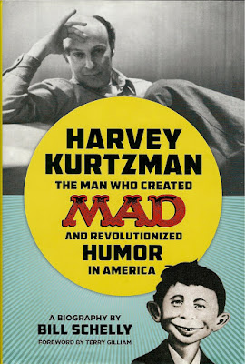
 by Bill Schefly (Fantagraphics Books).
 by Mark Hogancamp & Chris Shellen (Princton Architectural Press).


 edited by Paul Gorman with essays by David Hockney, John A. Walker, Chris Stephens, Lisa Tucker, Guy Brett, Paul Gorman, David E. Brauer and Jim Edwards, and Christopher Finch (Thames & Hudson).
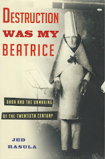
 by Jed Rasula (Basic Books).
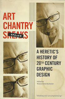
 by
by 

 by Dan Nadel (Matthew Marks Gallery).

 by Tony Fitzpatrick (Curbside Splendor).
 (Sieveking Verlag).
 by William Hackman (Other Books).
 by Hunter Drohojowska-Philp, but William Hackman offers a more expansive view. For one thing, he looks at the establishment and growth of various institutions that played a key part in this history, specifically LACMA and the Pasadena Art Museum (later the Norton Simon Museum). He gets into the story of the politics and personalities behind these museums. We tend to think of museums as solid institutions; they have always been here and always will. But Out of Sight shows just how difficult it is to will such a place into existence and how fragile their existences can be. (I've read an early draft of an upcoming book about Houston's art scene in the 1970s by
 by Michael Fallon, which was published in 2014. These three books form an unintentional trilogy of narrative art history tied to Los Angeles. I recommend them all.
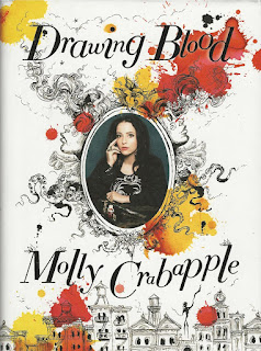
 by Molly Crabapple (Harper).
  by Barry Schwabsky which I read this year would have definitely been on my list except for the fact that it was published in 2014. I read several great photography monographs and collections this year, but they were all published years ago.
 she also asked "Why have their been no great artists from the aristocracy?" Obviously the relationship of the aristocracy to art is strong--the aristocracy were the primary patrons of art for a good portion of human history (and in some circles


 for the exhibit is excellent (if quite expensive). Copley was never one for grand art theories, and the essays here are blessedly free of theorizing. Toby Kamps writes a brief biographical essay, Jonathan Griffin writes about Copley as a patron of artists, Paul B. Franklin writes about his long relationship with Duchamp, and Gwen L. Allen (author of one of my favorite books on art,


 , about her arrest and trial that combines comics, photos and prose to describe her bizarre legal experiences. Her pen name means “good for nothing” in Japanese, and she was a typical struggling cartoonist before achieving notoriety as a “manko” (i.e., "pussy") artist. The book was translated by


 by
by 


 by
by 


 by Bob Fingerman (Image Comics, 158 pages.)
 (1994), a take-off on the Freaky Friday body-switching genre, except instead of a mom and teen-aged daughter switching, it was a 50+ year old black man switching with a bratty suburban white teen-aged girl. It was pretty funny, but the art was even more stiff than Skinheads (it was almost completely photo-referenced).
 ) dealt with life as a barely-scraping-by 20-something freelance artist in New York City. I would say that aspect of the story was for me the most interesting thing about Minimum Wage, but I loved the whole story. By this time, I had gotten to know Bob personally pretty well, and he included me and some of my co-workers in the background of one panel. Because it was a lightly disguised roman à clef, part of the pleasure in reading it for me was to try to figure out who all the people in the story were in "real life"--a lot of them were from the world of comics, so I knew a bunch of them.
 , has Rob briefly dating a 30-something hippie lady, a 50-something former TV actress and a woman who edits a gay porn magazine. (I assume these are fictional analogs to real people--I'm totally wondering about the identity of the former TV actress.) None of these assignations seem too disastrous, but they don't lead anywhere for Rob. Rob is 25 years old and a very eligible bachelor. He has a new well-paying comics gig drawing PRIX (sort of the analog in the Minimum Wage world of Teenage Mutant Ninja Turtles, whose comics Fingerman drew for about a year 1993. In Minimum Wage, instead of being turtles, they are horseshoe crabs.) He's kind of uptight about some things, but he is good boyfriend material. Of course, that could be self-congratulation on the part of Fingerman, of whom Rob is a quasi-autobiographical counterpart.


 by Gilbert Hernandez is a hardcore pornographic version of the first nine chapters of the Bible. I published


 by Susie Kalil and the


 , the long-running diary comic by