Robert Boyd
I read a few books about art this year. This list reflects pretty well my interests in art: understanding contemporary art, recent art history, biographies of individual artists (real and imagined), art that has a family relationship with comics, outsider/self-taught art, art from Houston and Texas and the social science of art. I don't recommend all of them, but quite a few were excellent.
![]()
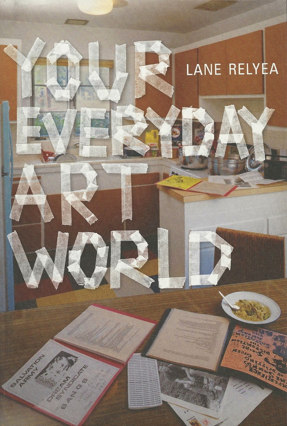
Your Everyday Art World![]() (2014) by Lane Relyea. A combination of a theory and a history of a particular tendency in contemporary art. Reviewed here.
(2014) by Lane Relyea. A combination of a theory and a history of a particular tendency in contemporary art. Reviewed here.
![]()
Topless Cellist: The Improbable Life of Charlotte Moorman![]() (2014) by Joan Rothfuss. A fantastic biography of Charlotte Moorman, who is best known as Nam June Paik's collaborator. But as this book demonstrates, she was so much more than that. Among other things, she was an incredible impresario--an equal to Sergei Diaghilev. Art history usually ignores the impresarios, the organizers and fixers who made sure that artists had a platform on which to stand. But that's a mistake--in addition to being a pioneering performance artist, Moorman was key in promoting the idea of performance art (before it even had a name) to audiences who had never in their lives imagined such art works.
(2014) by Joan Rothfuss. A fantastic biography of Charlotte Moorman, who is best known as Nam June Paik's collaborator. But as this book demonstrates, she was so much more than that. Among other things, she was an incredible impresario--an equal to Sergei Diaghilev. Art history usually ignores the impresarios, the organizers and fixers who made sure that artists had a platform on which to stand. But that's a mistake--in addition to being a pioneering performance artist, Moorman was key in promoting the idea of performance art (before it even had a name) to audiences who had never in their lives imagined such art works.
![]()
The Downtown Book: The New York Art Scene 1974-1984![]() (2006) edited by Marvin J. Taylor. This book was a gift from Earl Staley. Thanks, Earl! The book is quite scattered, and I kind of wish it had been written as a narrative history instead of broken up in essays describing different art forms. One weakness it has, in my opinion, is that it is overly wedded to the geographic of "downtown," wedding the physical place to the overall vibe too closely. Still, it covers a lot of art that remains a fascination for me, and it's one of the few books I know that writes equally about the music, dance, visual art, performance art and literary scenes in a particular place and time.
(2006) edited by Marvin J. Taylor. This book was a gift from Earl Staley. Thanks, Earl! The book is quite scattered, and I kind of wish it had been written as a narrative history instead of broken up in essays describing different art forms. One weakness it has, in my opinion, is that it is overly wedded to the geographic of "downtown," wedding the physical place to the overall vibe too closely. Still, it covers a lot of art that remains a fascination for me, and it's one of the few books I know that writes equally about the music, dance, visual art, performance art and literary scenes in a particular place and time.
![]()
Robert Gober: The Heart Is Not a Metaphor![]() with an essay by Hilton Als. I thought this was an ideal catalog for the MOMA exhibit (up through January 18, if you happen to be in New York City in the next three weeks). Als is not your usual art historian--he is the opposite of dry and academic, and his writing is blessedly free of jargon. But he does write about the fascination that theory had for men of his and Robert Gober's generation. He weaves in personal encounters with Gober's art with a deep knowledge of the work and a lived experience of the milieu that Gober arose from--especially the rise of AIDS and the concurrent politicization of gay men.
with an essay by Hilton Als. I thought this was an ideal catalog for the MOMA exhibit (up through January 18, if you happen to be in New York City in the next three weeks). Als is not your usual art historian--he is the opposite of dry and academic, and his writing is blessedly free of jargon. But he does write about the fascination that theory had for men of his and Robert Gober's generation. He weaves in personal encounters with Gober's art with a deep knowledge of the work and a lived experience of the milieu that Gober arose from--especially the rise of AIDS and the concurrent politicization of gay men.
But that's only part of the book--the back of the book is a combination timeline of Gober's career (and important events in world) and an oral history. What's fascinating is that you see a picture of a gifted artist starting from the bottom and gradually growing as an artist and in the esteem of the world. But what you also see is someone for whom everything broke right. Chance played a big part in his (temporal) success, although it should be said that Gober took that luck and ran with it.
![]()
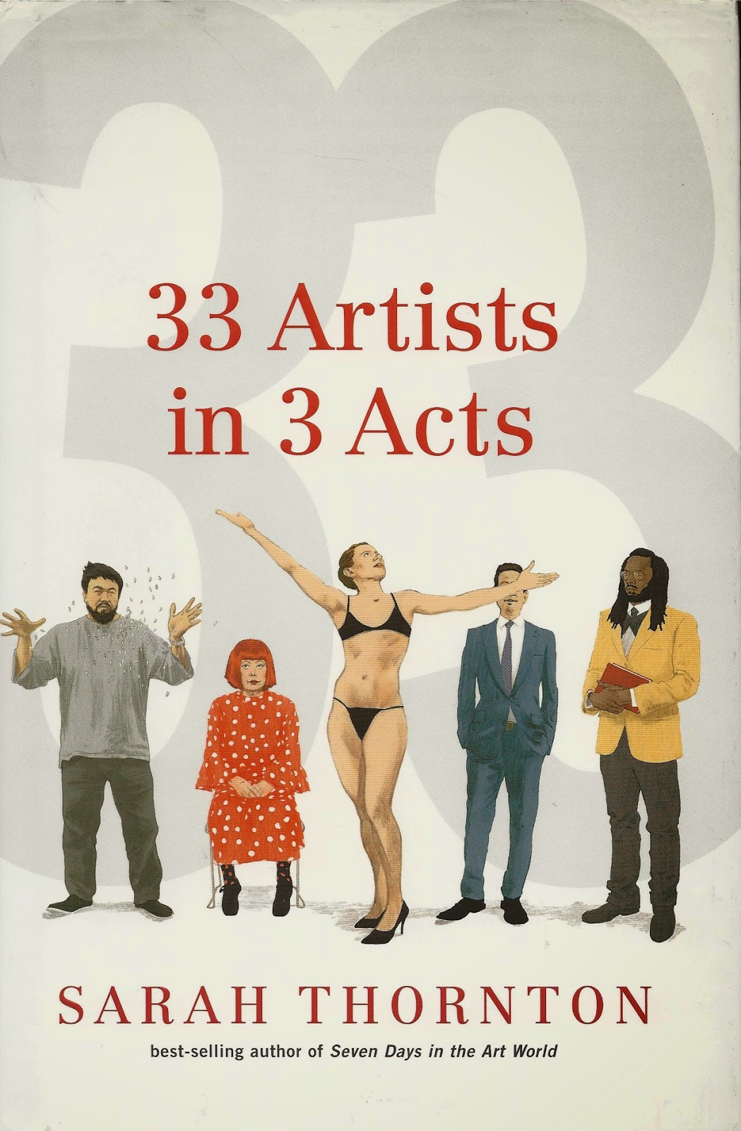
33 Artists in 3 Acts![]() by Sarah Thornton.The author of Seven Days in the Art World
by Sarah Thornton.The author of Seven Days in the Art World![]() returns with a new book where she visits a variety of artists on several occasions. Very readable. Reviewed here.
returns with a new book where she visits a variety of artists on several occasions. Very readable. Reviewed here.
![]()
The Miraculous![]() by Raphael Rubinstein. The shortest book on this list, but it has a kind of Borgesian efficiency--it punches well above its weight. I loved it and reviewed it here.
by Raphael Rubinstein. The shortest book on this list, but it has a kind of Borgesian efficiency--it punches well above its weight. I loved it and reviewed it here.
![]()
Midcentury Modern Art in Texas![]() by Katie Robinson Edwards. An important book of regional art history. Reviewed here.
by Katie Robinson Edwards. An important book of regional art history. Reviewed here.
![]()
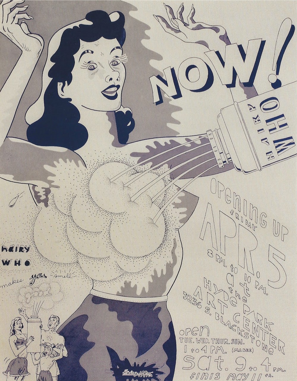
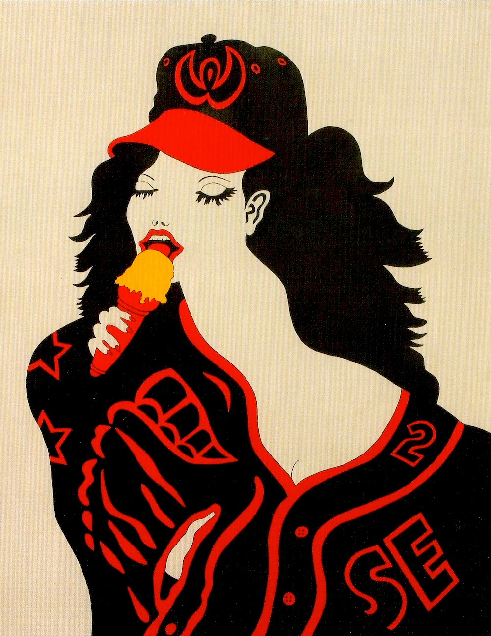
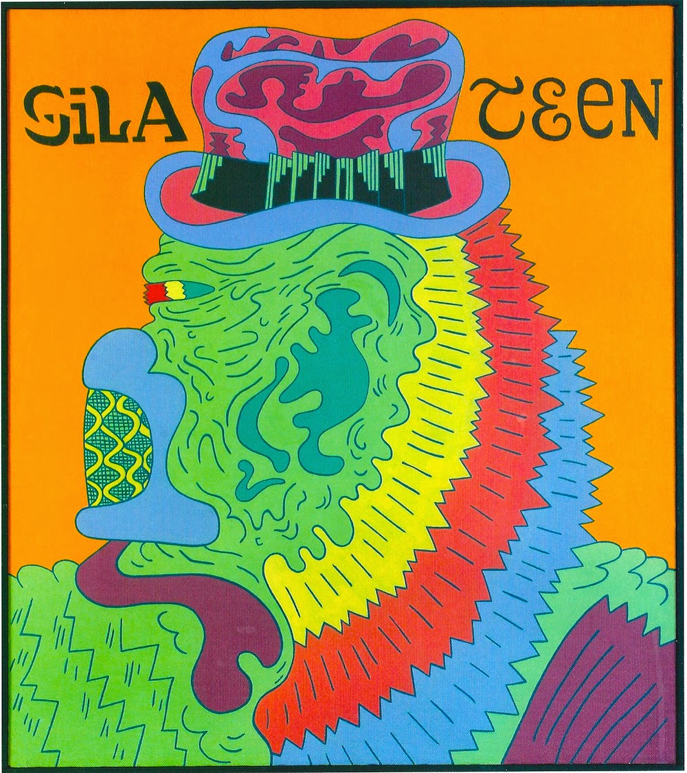
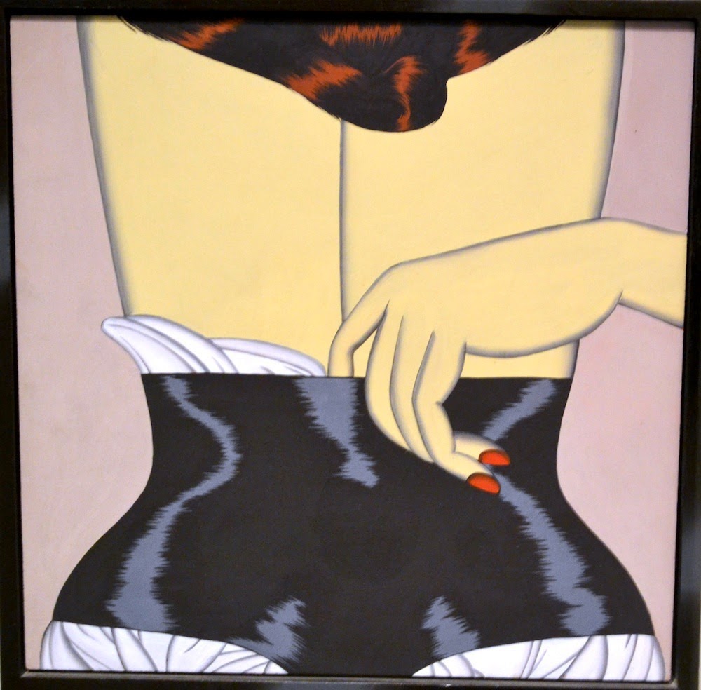
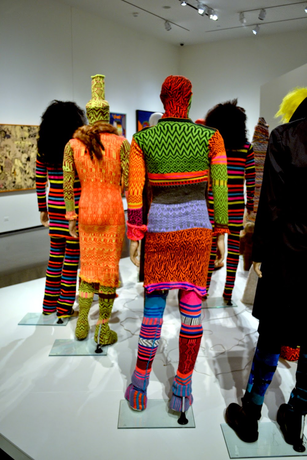
What Nerve!: Alternative Figures in American Art, 1960 to the Present![]() by Daniel Nadel. The catalog of this very diverse show features a bunch of very diverse essays as well as some absolutely wonderful photos. I saw the exhibit and wrote about it here.
by Daniel Nadel. The catalog of this very diverse show features a bunch of very diverse essays as well as some absolutely wonderful photos. I saw the exhibit and wrote about it here.
![]()
Everyday Genius: Self-Taught Art and the Culture of Authenticity![]() by Gary Alan Fine. A very useful sociological study of the world of self-taught art (sometimes called folk art, outsider art, visionary art, art brut, etc.). Like Howard S. Becker's Art Worlds
by Gary Alan Fine. A very useful sociological study of the world of self-taught art (sometimes called folk art, outsider art, visionary art, art brut, etc.). Like Howard S. Becker's Art Worlds![]() , Fine examines this world from every angle and constituency. He doesn't try to come up with a theory of self-taught art--instead, what he presents is data and what conclusions the data leads him to. It's an approach I appreciate highly, and one I think he does well. I wrote about the book in conjunction with my review of One of a Kind: Artwork from the Collection of Stephanie Smither at the Art League of Houston.
, Fine examines this world from every angle and constituency. He doesn't try to come up with a theory of self-taught art--instead, what he presents is data and what conclusions the data leads him to. It's an approach I appreciate highly, and one I think he does well. I wrote about the book in conjunction with my review of One of a Kind: Artwork from the Collection of Stephanie Smither at the Art League of Houston.
![]()
More Than a Constructive Hobby: the Paintings of Frank Freed![]() by William A. Camfield. The funky, funny paintings by self-taught artist Frank Freed were a part of Houston's art scene in the 50s and 60s. I picked up this book on sale at the MFAH mostly because the text was written by my old art history professor William Camfield. I found the book delightful and wrote about it here.
by William A. Camfield. The funky, funny paintings by self-taught artist Frank Freed were a part of Houston's art scene in the 50s and 60s. I picked up this book on sale at the MFAH mostly because the text was written by my old art history professor William Camfield. I found the book delightful and wrote about it here.
![]()
The Supermodel and the Brillo Box: Back Stories and Peculiar Economics from the World of Contemporary Art![]() by Don Thompson. This is kind of a sequel to his earlier book, The $12 Million Stuffed Shark
by Don Thompson. This is kind of a sequel to his earlier book, The $12 Million Stuffed Shark![]() . Thompson is an economist who has made a special study of the art market. While his earlier book was a unified work where Thompson presented the results of his research on what determines the monetary value of a work of art, this book is a collection of essays where he riffs on the changes in the art market since his first examination of it. He applies his research techniques to more contemporary blue-chip work, looking at collectors and art as an asset class, galleries, auction houses, art fairs, emerging markets and contemporary artists like Mauricio Cattelan and Jacob Kassay. It's a dirty business, but it's interesting to read an actual economist's take on it. The $12 Million Dollar Stuffed Shark is the more important book, but The Supermodel and the Brillo Box is interesting and informative.
. Thompson is an economist who has made a special study of the art market. While his earlier book was a unified work where Thompson presented the results of his research on what determines the monetary value of a work of art, this book is a collection of essays where he riffs on the changes in the art market since his first examination of it. He applies his research techniques to more contemporary blue-chip work, looking at collectors and art as an asset class, galleries, auction houses, art fairs, emerging markets and contemporary artists like Mauricio Cattelan and Jacob Kassay. It's a dirty business, but it's interesting to read an actual economist's take on it. The $12 Million Dollar Stuffed Shark is the more important book, but The Supermodel and the Brillo Box is interesting and informative.
![]()
The Essential New Art Examiner![]() (2011) edited by Terri Griffith, Kathryn Born and Janet Koplos. A great collection of articles and reviews from 1974 through 2001 that appeared in Chicago's New Art Examiner. There used o be a lot of regional art magazines--New Art Examiner, Artpaper, Art Lies, etc. Aside from the Brooklyn Rail, do any survive? Or are they relics of the age of paper?
(2011) edited by Terri Griffith, Kathryn Born and Janet Koplos. A great collection of articles and reviews from 1974 through 2001 that appeared in Chicago's New Art Examiner. There used o be a lot of regional art magazines--New Art Examiner, Artpaper, Art Lies, etc. Aside from the Brooklyn Rail, do any survive? Or are they relics of the age of paper?
![]()
Whitney Biennial 2014![]() by Stuart Comer,Anthony Elms and Michelle Grabner. This is the catalog for this spring's Whitney Biennial, which like all Whitney Biennials was a bit of a mess. Aren't they all? There were good bits, though. But it was a show that really required the viewer to see it over time, and I only had one day. The catalog doesn't make up for that, either. It's less fun than the exhibit, but I liked the Michelle Grabner section which featured short interviews with all the artists she selected.
by Stuart Comer,Anthony Elms and Michelle Grabner. This is the catalog for this spring's Whitney Biennial, which like all Whitney Biennials was a bit of a mess. Aren't they all? There were good bits, though. But it was a show that really required the viewer to see it over time, and I only had one day. The catalog doesn't make up for that, either. It's less fun than the exhibit, but I liked the Michelle Grabner section which featured short interviews with all the artists she selected.
![]()
White Cube![]() (2014) by Brecht Vandenbroucke. This book of interestingly-drawn cartoons dealt with the art world, but was, unfortunately, cruel and witless. Review here.
(2014) by Brecht Vandenbroucke. This book of interestingly-drawn cartoons dealt with the art world, but was, unfortunately, cruel and witless. Review here.
![]()
Role Models![]() (2010) by John Waters. It's a bit of a cheat to include this book here--only one chapter is about art. It's called "Roommates," and it's about his art collection. Isn't that a perfect word to describe your art collection? They are, in fact, the perfect roommates--while they never do the dishes, they likewise never leave any dirty dishes in the sink. Waters writes, "I love how mad Mike [Kelley]'s work can make some people. Isn't that the job of contemporary art? To infuriate? The real naysayers who can't see the reverse beauty of Mike's sculptures or paintings should be outraged because they secretly know that his art does hate them and they deserve it." (Ironically, my biggest "roommate" is a series of photographs... by John Waters.)
(2010) by John Waters. It's a bit of a cheat to include this book here--only one chapter is about art. It's called "Roommates," and it's about his art collection. Isn't that a perfect word to describe your art collection? They are, in fact, the perfect roommates--while they never do the dishes, they likewise never leave any dirty dishes in the sink. Waters writes, "I love how mad Mike [Kelley]'s work can make some people. Isn't that the job of contemporary art? To infuriate? The real naysayers who can't see the reverse beauty of Mike's sculptures or paintings should be outraged because they secretly know that his art does hate them and they deserve it." (Ironically, my biggest "roommate" is a series of photographs... by John Waters.)
![]()
Art: A Sex Book![]() (2003) by John Waters and Bruce Hainley. Now this is an authentic art book, and in true John Waters fashion, it's quite filthy. He and curator/critic Bruce Hainley assembled a bunch of art by many different artists that relate in some way to "sex"--sometimes in obvious ways (very, very obvious ways), and sometimes in pretty much invisible ways. They interview each other about the work pictured in the book. It comes off as a catalog for an exhibit that they'd like to have done. (The cover is by Mike Kelley, appropriately enough.) Hey, art world--let John Waters curate a big group show. He is obviously capable, and it would clearly be great!
(2003) by John Waters and Bruce Hainley. Now this is an authentic art book, and in true John Waters fashion, it's quite filthy. He and curator/critic Bruce Hainley assembled a bunch of art by many different artists that relate in some way to "sex"--sometimes in obvious ways (very, very obvious ways), and sometimes in pretty much invisible ways. They interview each other about the work pictured in the book. It comes off as a catalog for an exhibit that they'd like to have done. (The cover is by Mike Kelley, appropriately enough.) Hey, art world--let John Waters curate a big group show. He is obviously capable, and it would clearly be great!
![]()
Seeing Out Loud: The Voice Art Columns Fall 1998 - Winter 2003![]() (2003) by Jerry Saltz. It's easy to follow Jerry Saltz nowadays. His writing for New York Magazine appears online, free of charge, as do his many Facebook comments. He's everywhere. I've seen him walking around New York three times, and I don't go to New York all that often. But before he was a media figure, he was another ink-stained wretch at the Village Voice, incubator of many a great writing career. This book covers what was happening in New York in the late 90s. As always, the writing is very entertaining.
(2003) by Jerry Saltz. It's easy to follow Jerry Saltz nowadays. His writing for New York Magazine appears online, free of charge, as do his many Facebook comments. He's everywhere. I've seen him walking around New York three times, and I don't go to New York all that often. But before he was a media figure, he was another ink-stained wretch at the Village Voice, incubator of many a great writing career. This book covers what was happening in New York in the late 90s. As always, the writing is very entertaining.
![]()
The Inspector![]() (1973) andThe Labyrinth
(1973) andThe Labyrinth![]() (1960) by Saul Steinberg.I picked these up at my favorite used bookstore, Kaboom in Houston. Steinberg used to be an artist that every New Yorker-reading sophisticate was required to love, and quite rightly--his work is lovable. But what does it look like 40-50 years on? It feels a little dated because it refers to a world (and more particularly, an America) of Steinberg's time. But his drawing still feels adventurous, as if beamed in from the future. Because Steinberg got his start as a cartoonist, these books are sometimes seen by art comics aficionados as a species of art comics. And while there is occasionally a hint of narrative progression, what Steinberg mostly does is riff on ideas, creating more and more variations until he has exhausted one trope and moves onto the next. Beautiful work.
(1960) by Saul Steinberg.I picked these up at my favorite used bookstore, Kaboom in Houston. Steinberg used to be an artist that every New Yorker-reading sophisticate was required to love, and quite rightly--his work is lovable. But what does it look like 40-50 years on? It feels a little dated because it refers to a world (and more particularly, an America) of Steinberg's time. But his drawing still feels adventurous, as if beamed in from the future. Because Steinberg got his start as a cartoonist, these books are sometimes seen by art comics aficionados as a species of art comics. And while there is occasionally a hint of narrative progression, what Steinberg mostly does is riff on ideas, creating more and more variations until he has exhausted one trope and moves onto the next. Beautiful work.
![]()
Show Time: The 50 Most Influential Exhibitions of Contemporary Art![]() (2014) by Jens Hoffmann. This book marks a milestone in the increasing acceptance of curators as artists. Most of these exhibits were group shows that involved a gathering and selection by the curator. I don't know how I feel about that, but I can't deny that Hoffman (himself a well-known curator) has chosen some pretty consequential exhibits. As I read this, I wished for two things: first, that I had seen more of these when they happened (I only saw one), and second, that it had more photos. But to truly have "enough" photos, the book would have been 50 times as large. Each section tantalizes you with glimpses of a great exhibit you missed!
(2014) by Jens Hoffmann. This book marks a milestone in the increasing acceptance of curators as artists. Most of these exhibits were group shows that involved a gathering and selection by the curator. I don't know how I feel about that, but I can't deny that Hoffman (himself a well-known curator) has chosen some pretty consequential exhibits. As I read this, I wished for two things: first, that I had seen more of these when they happened (I only saw one), and second, that it had more photos. But to truly have "enough" photos, the book would have been 50 times as large. Each section tantalizes you with glimpses of a great exhibit you missed!
![]()
Painting the Town Orange: The Stories behind Houston's Visionary Art Environments![]() (2014) by Pete Gershon. The writer approaches this subject from the point of view of a historian and as a journalist. The book is accessible to the average non-specialist reader, but is packed with information. This is an important, necessary work of Houston art history. Not only did I review it here, but we ran several posts by Gershon that had been excised from the actual book for reasons of space. You can read these here, here, here and here.
(2014) by Pete Gershon. The writer approaches this subject from the point of view of a historian and as a journalist. The book is accessible to the average non-specialist reader, but is packed with information. This is an important, necessary work of Houston art history. Not only did I review it here, but we ran several posts by Gershon that had been excised from the actual book for reasons of space. You can read these here, here, here and here.
![]()
The Blighted Eye: Original Comic Art from the Glenn Bray Collection (2014) by Glenn Bray. Glenn Bray, like the Vogels, is not a rich collector. He inherited his family's hardware store in the San Fernando Valley. But he is an obsessive collector, often collecting the kind of art that no one has any interest in--at least until he collects it. The Blighted Eye is a book about his collection. It includes work by art world figures like George Grosz, Jim Shaw and Jeffrey Vallance, but most of his collection is of comics artists (especially underground comics, EC comics, punk comics, European adult comics, and bizarre comics from the odder tributaries of comics history) and "alternative" artists of every sort--Gary Panter, Robert Crumb, Carl Barks, Ernesto Cabral, Daniel Clowes, George Herriman, Daniel Johnston, Jaime Hernandez, Harvey Kurtzman, Chris Ware, Robert Williams, Jim Woodring and many more. As a small-time collector of inexpensive art myself, Bray is a role-model. The Blighted Eye is a beautiful book.
![]()
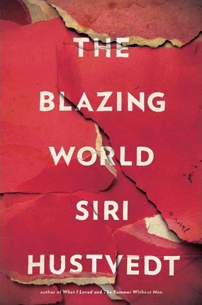
The Blazing World: A Novel![]() (2014) by Siri Hustvedt. A fascinating novel about a woman artist who uses male "fronts" as an experiment to see if her art will be more easily accepted if it's by men. An unusually rich and thought-provoking read, I reviewed it here.
(2014) by Siri Hustvedt. A fascinating novel about a woman artist who uses male "fronts" as an experiment to see if her art will be more easily accepted if it's by men. An unusually rich and thought-provoking read, I reviewed it here.
![]()
Pirates and Farmers: Essays on Taste![]() (2013) by Dave Hickey. I loved his books The Invisible Dragon and Air Guitar, but art critic Dave Hickey's newest book of essays, Pirates and Farmers, feels much less consequential. There are definitely some good bits in it, but mostly it feels a bit masturbatory. I'm a fan of gonzo criticism--of putting yourself in the work--but Hickey's act has gotten stale. This book, combined with his disastrous talk at Rice University early this year, it may be time to write the guy off. But he sure can write, which is a lot more than you can say for most art writers.
(2013) by Dave Hickey. I loved his books The Invisible Dragon and Air Guitar, but art critic Dave Hickey's newest book of essays, Pirates and Farmers, feels much less consequential. There are definitely some good bits in it, but mostly it feels a bit masturbatory. I'm a fan of gonzo criticism--of putting yourself in the work--but Hickey's act has gotten stale. This book, combined with his disastrous talk at Rice University early this year, it may be time to write the guy off. But he sure can write, which is a lot more than you can say for most art writers.
![]()
Words Will Break Cement: The Passion of Pussy Riot![]() (2014) by Masha Gessen. Gessen is a Russian-American journalist who gained sudden fame with her alarming, eloquent writings and statements about Putin and the growing hostility to LGBT people in Russia. I had been reading her for a long time, though--she was one of the first two write about what happened to the intelligentsia after the fall of communism (Dead Again: The Russian Intelligentsia After Communism
(2014) by Masha Gessen. Gessen is a Russian-American journalist who gained sudden fame with her alarming, eloquent writings and statements about Putin and the growing hostility to LGBT people in Russia. I had been reading her for a long time, though--she was one of the first two write about what happened to the intelligentsia after the fall of communism (Dead Again: The Russian Intelligentsia After Communism![]() in 1997), a subject I have a passing interest in. In this case, I think she wanted to get a book out on Pussy Riot before anyone else did. After they were arrested, she attended their Kafka-esque trials, and she visited them in prison as frequently as she could, getting their story under the watchful eyes of the turnkeys. And the story is amazing--not just their own personal histories and the history of the performance collective, but the story of getting this story from them. More than in any of the other books by Gessen I've read, Gessen is a character. She is not separate from the story she is telling. Perhaps that is appropriate given that the iron was still white hot as she wrote. Maybe in the future, there will be a dispassionate, scholarly history of Pussy Riot. This book isn't it.
in 1997), a subject I have a passing interest in. In this case, I think she wanted to get a book out on Pussy Riot before anyone else did. After they were arrested, she attended their Kafka-esque trials, and she visited them in prison as frequently as she could, getting their story under the watchful eyes of the turnkeys. And the story is amazing--not just their own personal histories and the history of the performance collective, but the story of getting this story from them. More than in any of the other books by Gessen I've read, Gessen is a character. She is not separate from the story she is telling. Perhaps that is appropriate given that the iron was still white hot as she wrote. Maybe in the future, there will be a dispassionate, scholarly history of Pussy Riot. This book isn't it.
I read a few books about art this year. This list reflects pretty well my interests in art: understanding contemporary art, recent art history, biographies of individual artists (real and imagined), art that has a family relationship with comics, outsider/self-taught art, art from Houston and Texas and the social science of art. I don't recommend all of them, but quite a few were excellent.
Your Everyday Art World
 (2014) by Lane Relyea. A combination of a theory and a history of a particular tendency in contemporary art. Reviewed here.
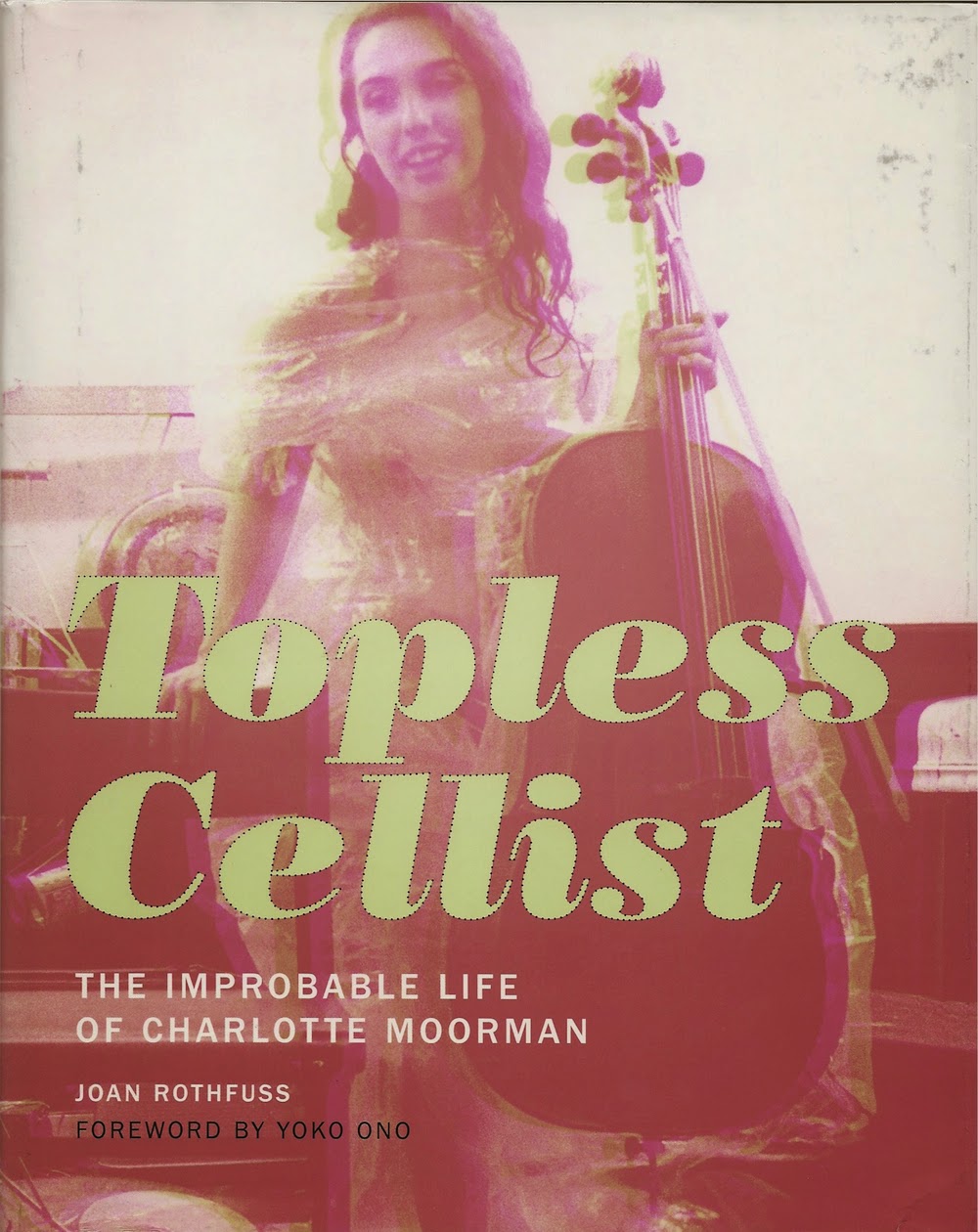
Topless Cellist: The Improbable Life of Charlotte Moorman
 (2014) by Joan Rothfuss. A fantastic biography of Charlotte Moorman, who is best known as Nam June Paik's collaborator. But as this book demonstrates, she was so much more than that. Among other things, she was an incredible impresario--an equal to Sergei Diaghilev. Art history usually ignores the impresarios, the organizers and fixers who made sure that artists had a platform on which to stand. But that's a mistake--in addition to being a pioneering performance artist, Moorman was key in promoting the idea of performance art (before it even had a name) to audiences who had never in their lives imagined such art works.
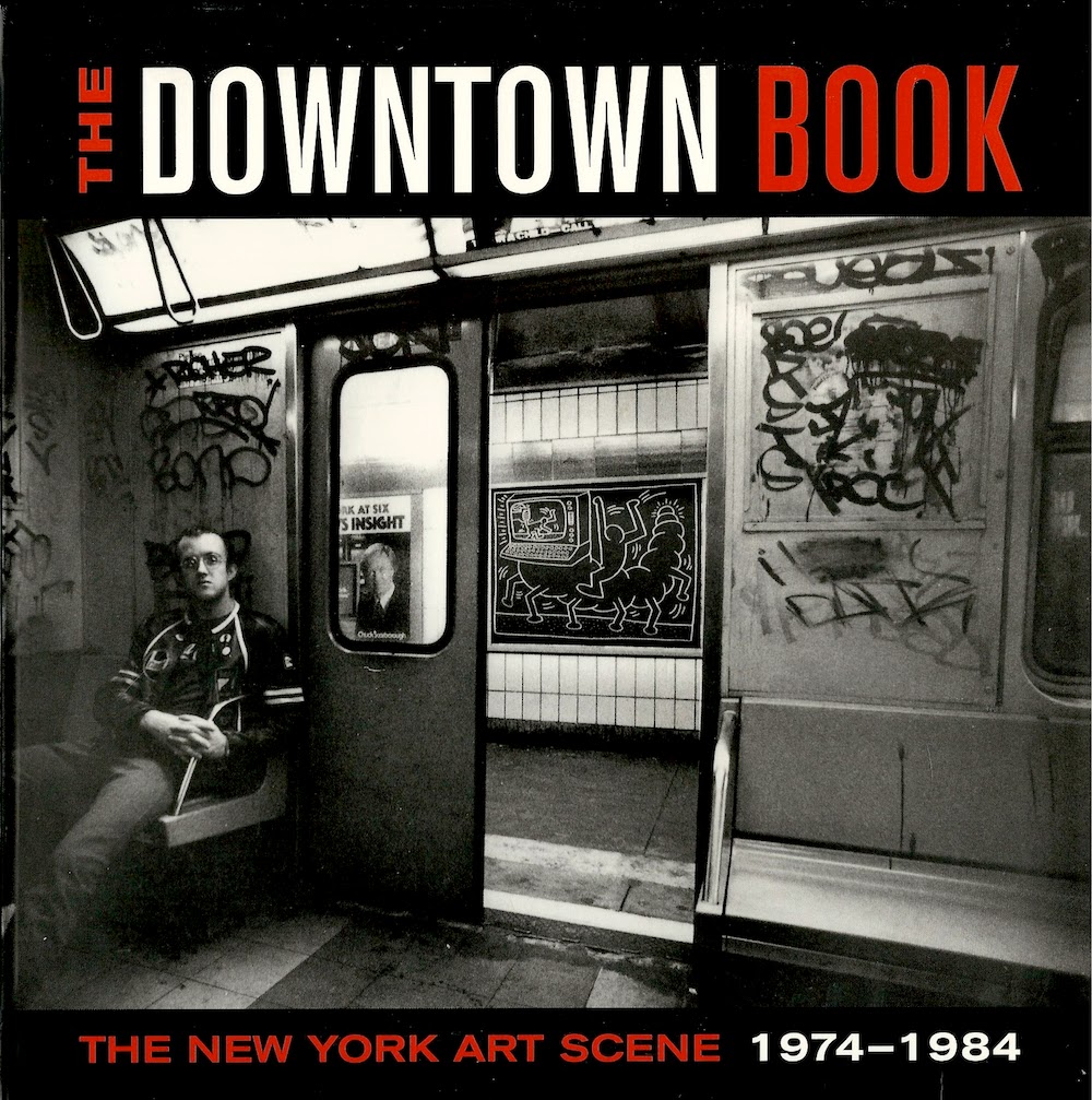
The Downtown Book: The New York Art Scene 1974-1984
 (2006) edited by Marvin J. Taylor. This book was a gift from Earl Staley. Thanks, Earl! The book is quite scattered, and I kind of wish it had been written as a narrative history instead of broken up in essays describing different art forms. One weakness it has, in my opinion, is that it is overly wedded to the geographic of "downtown," wedding the physical place to the overall vibe too closely. Still, it covers a lot of art that remains a fascination for me, and it's one of the few books I know that writes equally about the music, dance, visual art, performance art and literary scenes in a particular place and time.
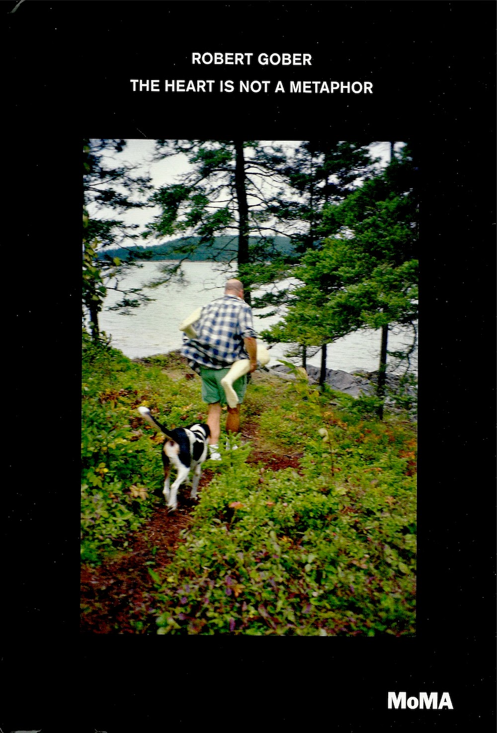
Robert Gober: The Heart Is Not a Metaphor
 with an essay by Hilton Als. I thought this was an ideal catalog for the MOMA exhibit (up through January 18, if you happen to be in New York City in the next three weeks). Als is not your usual art historian--he is the opposite of dry and academic, and his writing is blessedly free of jargon. But he does write about the fascination that theory had for men of his and Robert Gober's generation. He weaves in personal encounters with Gober's art with a deep knowledge of the work and a lived experience of the milieu that Gober arose from--especially the rise of AIDS and the concurrent politicization of gay men.
But that's only part of the book--the back of the book is a combination timeline of Gober's career (and important events in world) and an oral history. What's fascinating is that you see a picture of a gifted artist starting from the bottom and gradually growing as an artist and in the esteem of the world. But what you also see is someone for whom everything broke right. Chance played a big part in his (temporal) success, although it should be said that Gober took that luck and ran with it.
33 Artists in 3 Acts
 by Sarah Thornton.The author of Seven Days in the Art World
 returns with a new book where she visits a variety of artists on several occasions. Very readable. Reviewed here.
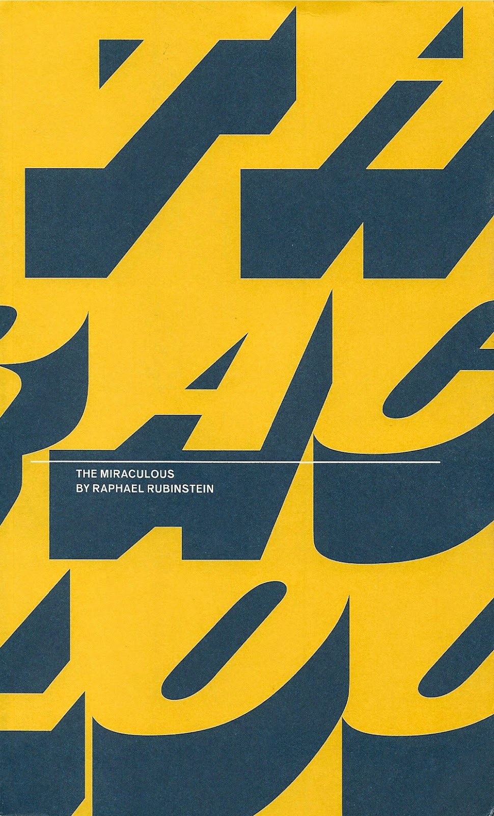
The Miraculous
 by Raphael Rubinstein. The shortest book on this list, but it has a kind of Borgesian efficiency--it punches well above its weight. I loved it and reviewed it here.
Midcentury Modern Art in Texas
 by Katie Robinson Edwards. An important book of regional art history. Reviewed here.
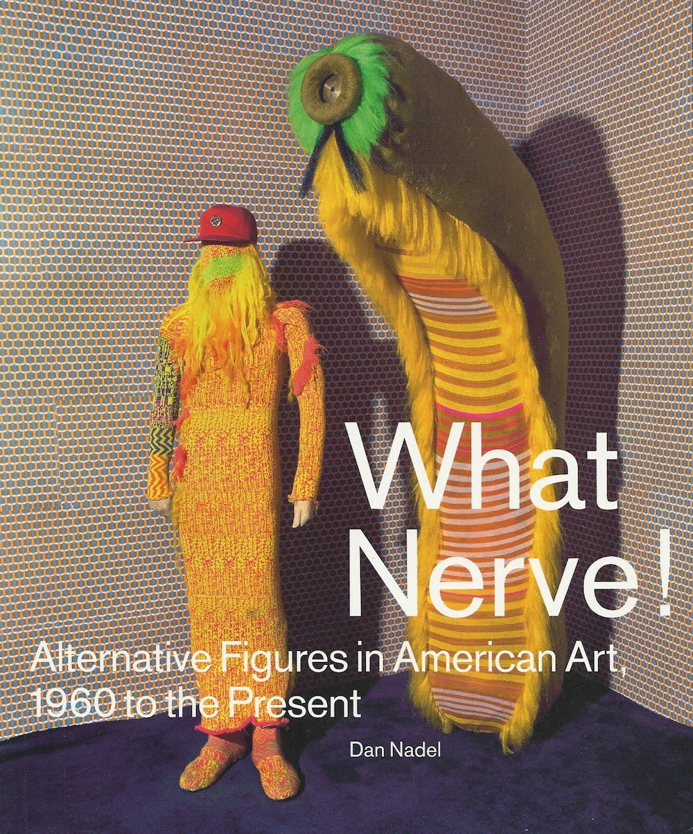
What Nerve!: Alternative Figures in American Art, 1960 to the Present
 by Daniel Nadel. The catalog of this very diverse show features a bunch of very diverse essays as well as some absolutely wonderful photos. I saw the exhibit and wrote about it here.
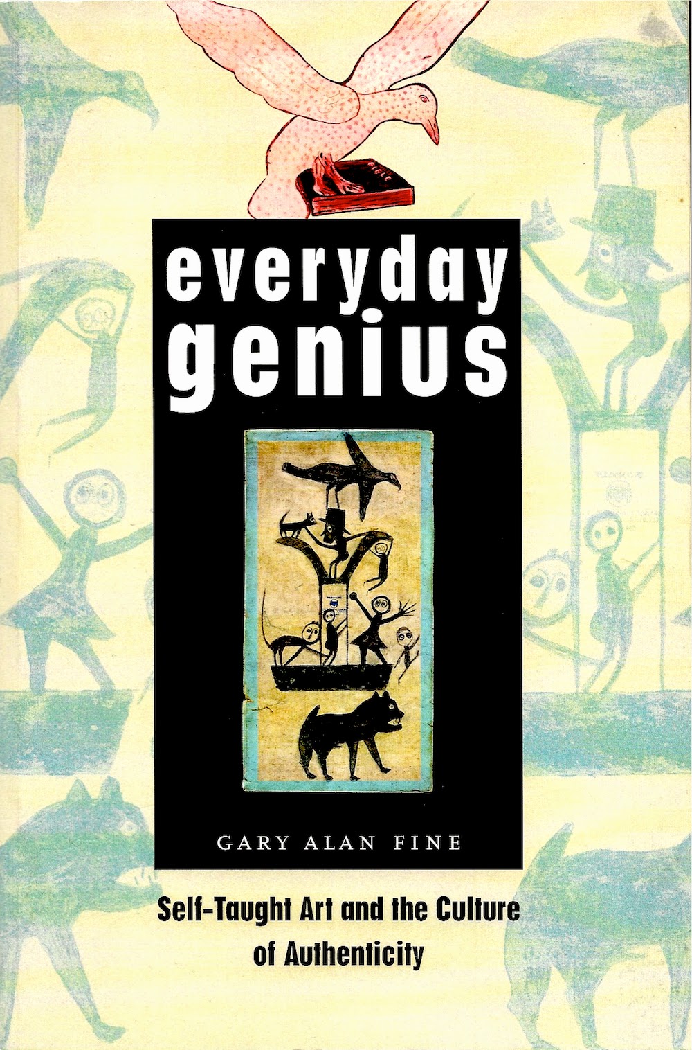
Everyday Genius: Self-Taught Art and the Culture of Authenticity
 by Gary Alan Fine. A very useful sociological study of the world of self-taught art (sometimes called folk art, outsider art, visionary art, art brut, etc.). Like Howard S. Becker's Art Worlds
 , Fine examines this world from every angle and constituency. He doesn't try to come up with a theory of self-taught art--instead, what he presents is data and what conclusions the data leads him to. It's an approach I appreciate highly, and one I think he does well. I wrote about the book in conjunction with my review of One of a Kind: Artwork from the Collection of Stephanie Smither at the Art League of Houston.
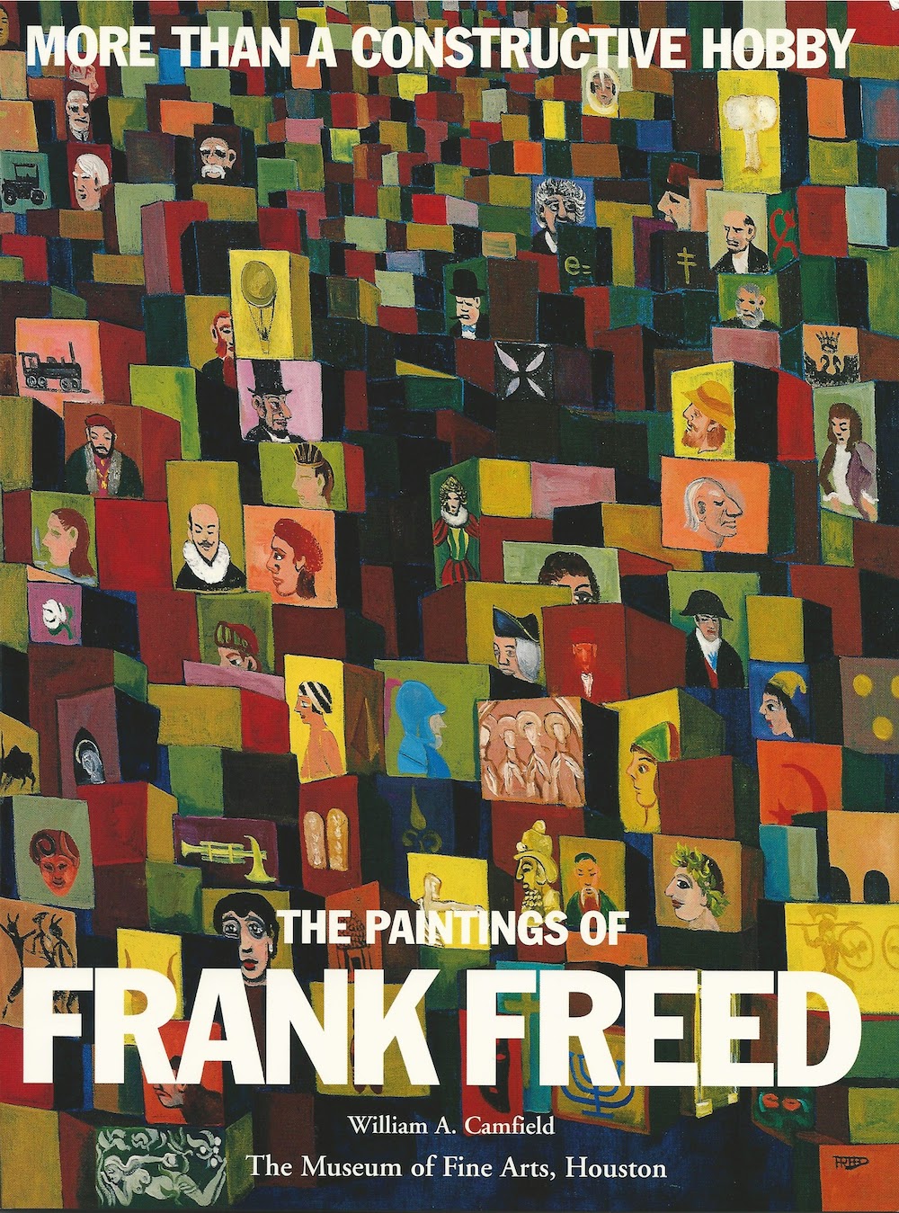
More Than a Constructive Hobby: the Paintings of Frank Freed
 by William A. Camfield. The funky, funny paintings by self-taught artist Frank Freed were a part of Houston's art scene in the 50s and 60s. I picked up this book on sale at the MFAH mostly because the text was written by my old art history professor William Camfield. I found the book delightful and wrote about it here.
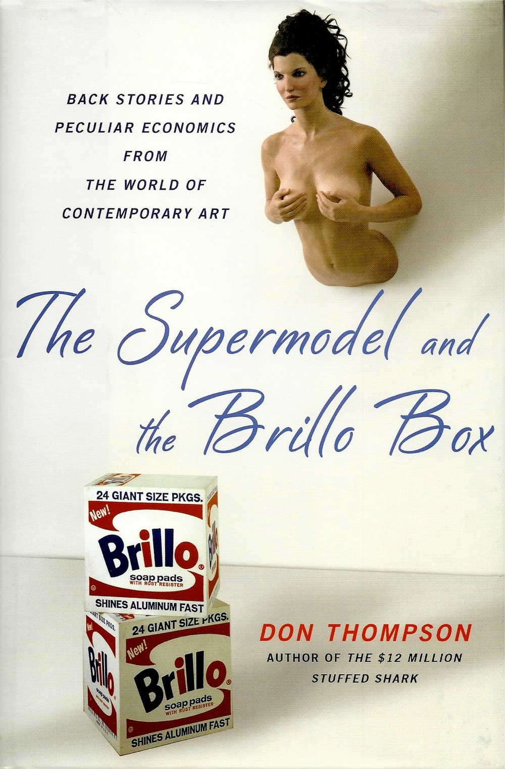
The Supermodel and the Brillo Box: Back Stories and Peculiar Economics from the World of Contemporary Art
 by Don Thompson. This is kind of a sequel to his earlier book, The $12 Million Stuffed Shark
 . Thompson is an economist who has made a special study of the art market. While his earlier book was a unified work where Thompson presented the results of his research on what determines the monetary value of a work of art, this book is a collection of essays where he riffs on the changes in the art market since his first examination of it. He applies his research techniques to more contemporary blue-chip work, looking at collectors and art as an asset class, galleries, auction houses, art fairs, emerging markets and contemporary artists like Mauricio Cattelan and Jacob Kassay. It's a dirty business, but it's interesting to read an actual economist's take on it. The $12 Million Dollar Stuffed Shark is the more important book, but The Supermodel and the Brillo Box is interesting and informative.
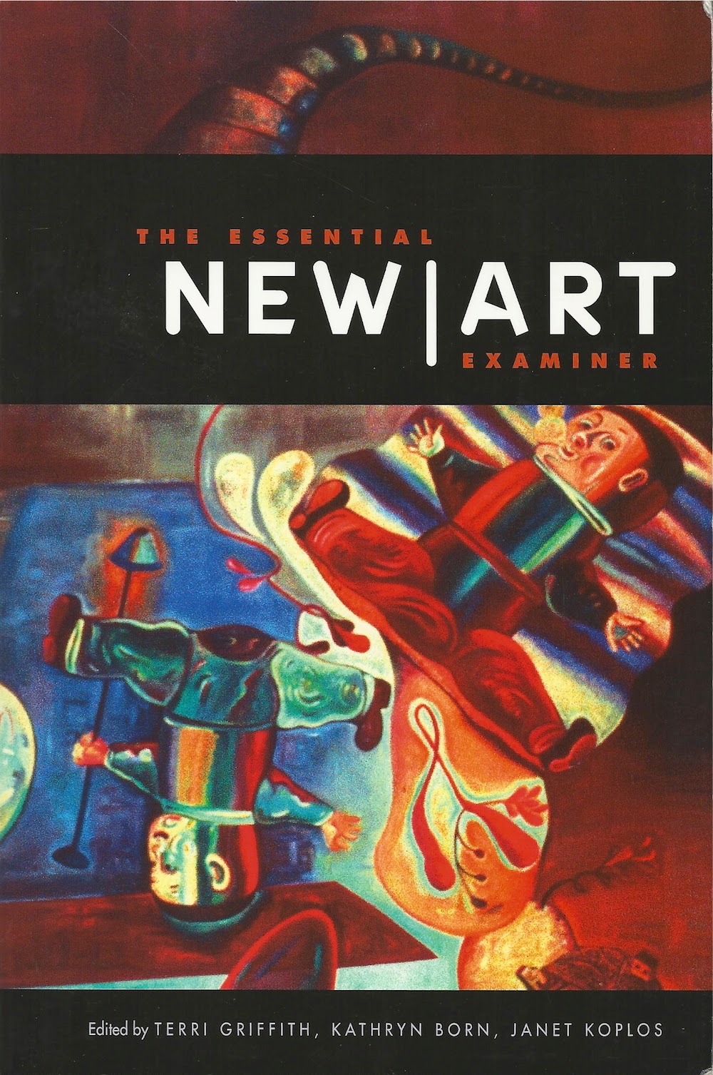
The Essential New Art Examiner
 (2011) edited by Terri Griffith, Kathryn Born and Janet Koplos. A great collection of articles and reviews from 1974 through 2001 that appeared in Chicago's New Art Examiner. There used o be a lot of regional art magazines--New Art Examiner, Artpaper, Art Lies, etc. Aside from the Brooklyn Rail, do any survive? Or are they relics of the age of paper?
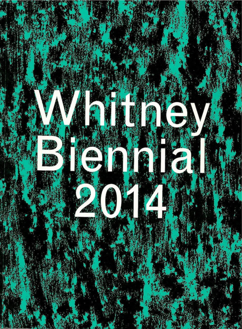
Whitney Biennial 2014
 by Stuart Comer,Anthony Elms and Michelle Grabner. This is the catalog for this spring's Whitney Biennial, which like all Whitney Biennials was a bit of a mess. Aren't they all? There were good bits, though. But it was a show that really required the viewer to see it over time, and I only had one day. The catalog doesn't make up for that, either. It's less fun than the exhibit, but I liked the Michelle Grabner section which featured short interviews with all the artists she selected.
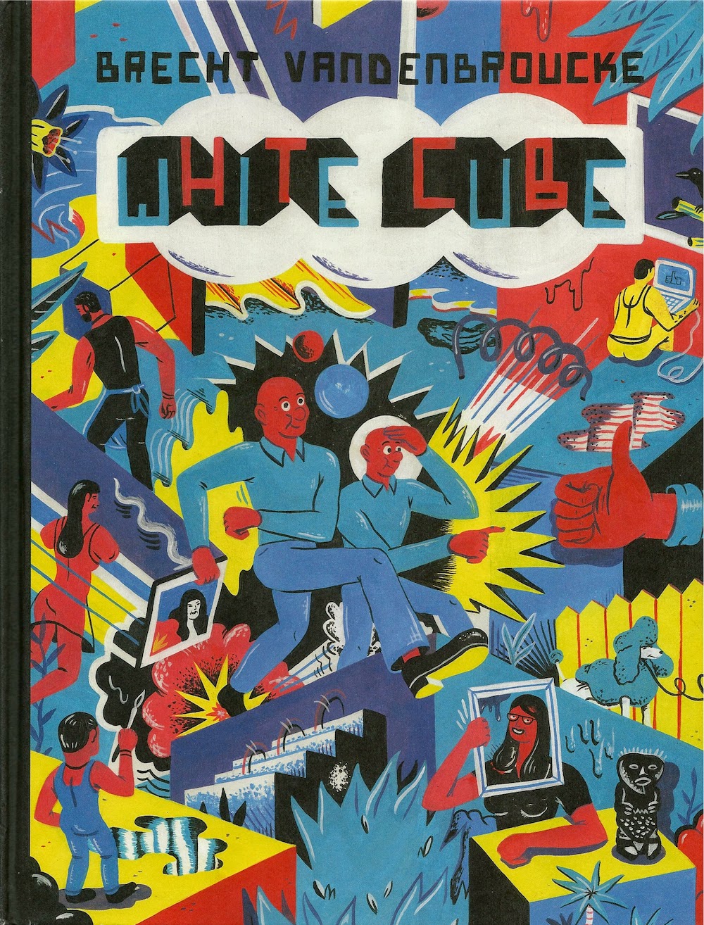
White Cube
 (2014) by Brecht Vandenbroucke. This book of interestingly-drawn cartoons dealt with the art world, but was, unfortunately, cruel and witless. Review here.
Role Models
 (2010) by John Waters. It's a bit of a cheat to include this book here--only one chapter is about art. It's called "Roommates," and it's about his art collection. Isn't that a perfect word to describe your art collection? They are, in fact, the perfect roommates--while they never do the dishes, they likewise never leave any dirty dishes in the sink. Waters writes, "I love how mad Mike [Kelley]'s work can make some people. Isn't that the job of contemporary art? To infuriate? The real naysayers who can't see the reverse beauty of Mike's sculptures or paintings should be outraged because they secretly know that his art does hate them and they deserve it." (Ironically, my biggest "roommate" is a series of photographs... by John Waters.)
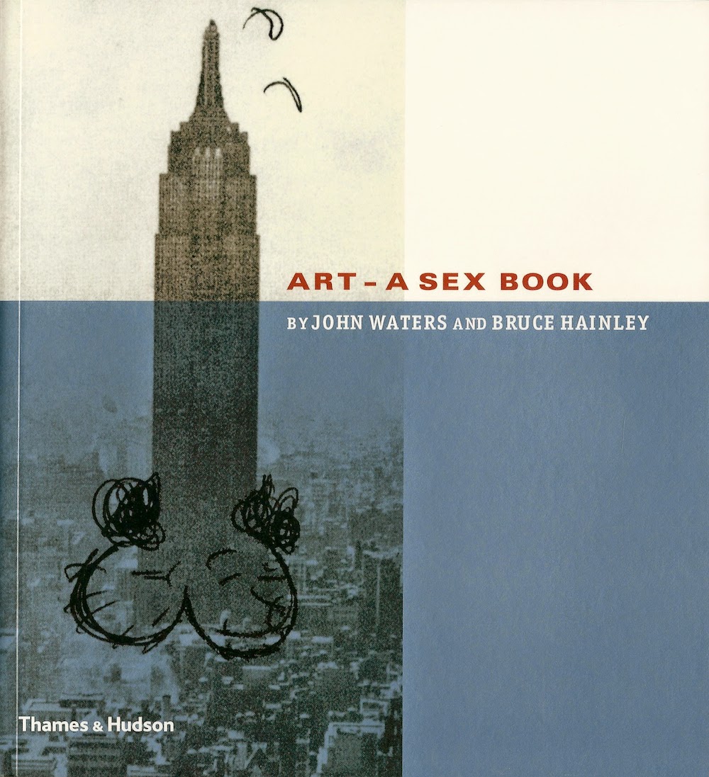
Art: A Sex Book
 (2003) by John Waters and Bruce Hainley. Now this is an authentic art book, and in true John Waters fashion, it's quite filthy. He and curator/critic Bruce Hainley assembled a bunch of art by many different artists that relate in some way to "sex"--sometimes in obvious ways (very, very obvious ways), and sometimes in pretty much invisible ways. They interview each other about the work pictured in the book. It comes off as a catalog for an exhibit that they'd like to have done. (The cover is by Mike Kelley, appropriately enough.) Hey, art world--let John Waters curate a big group show. He is obviously capable, and it would clearly be great!
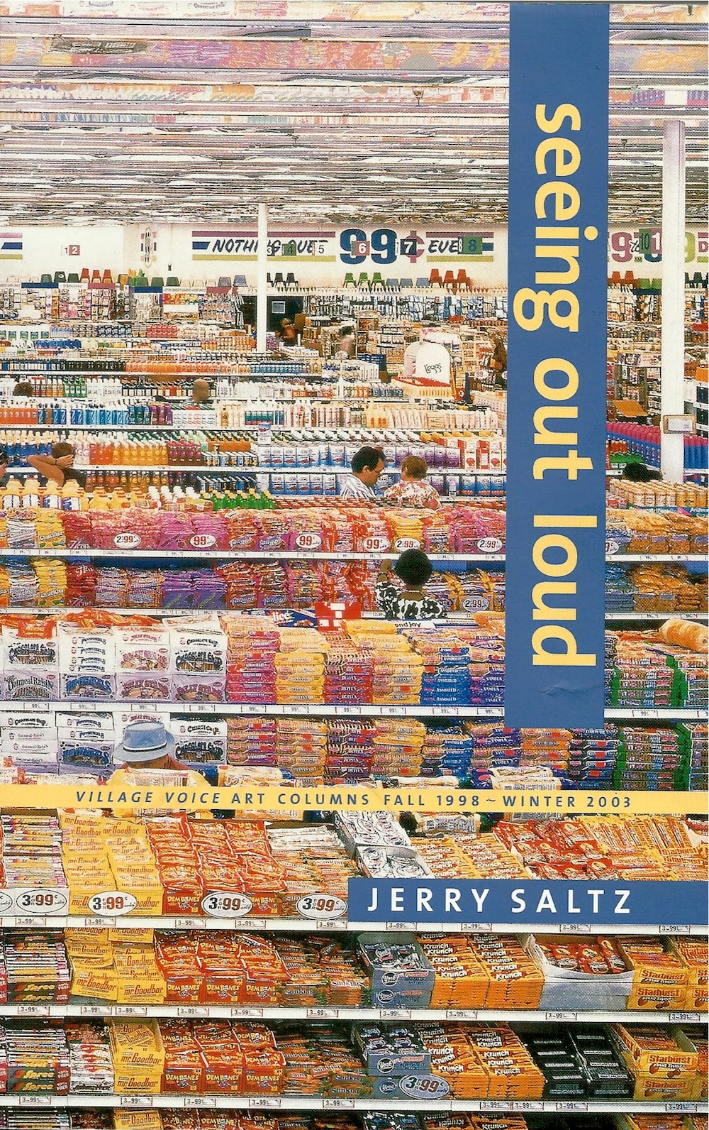
Seeing Out Loud: The Voice Art Columns Fall 1998 - Winter 2003
 (2003) by Jerry Saltz. It's easy to follow Jerry Saltz nowadays. His writing for New York Magazine appears online, free of charge, as do his many Facebook comments. He's everywhere. I've seen him walking around New York three times, and I don't go to New York all that often. But before he was a media figure, he was another ink-stained wretch at the Village Voice, incubator of many a great writing career. This book covers what was happening in New York in the late 90s. As always, the writing is very entertaining.
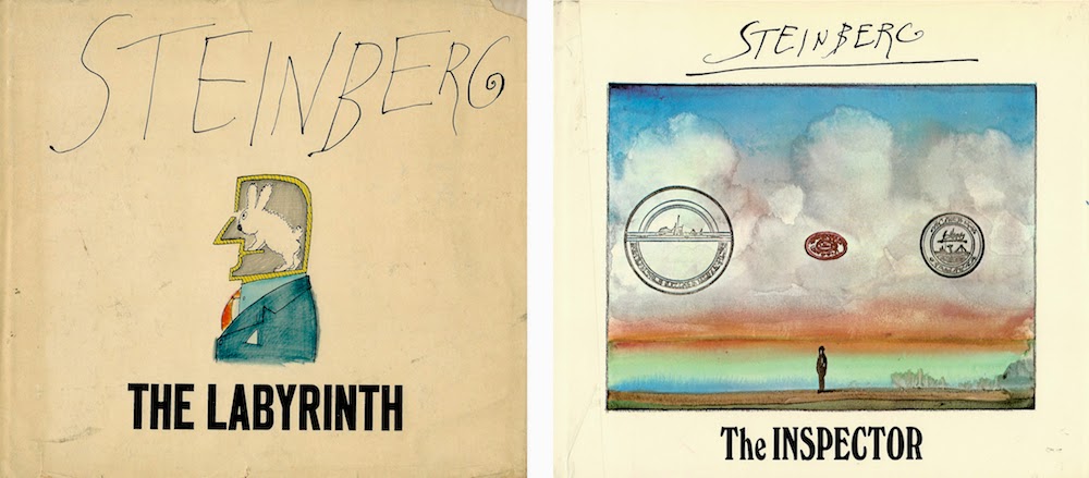
The Inspector
 (1973) andThe Labyrinth
 (1960) by Saul Steinberg.I picked these up at my favorite used bookstore, Kaboom in Houston. Steinberg used to be an artist that every New Yorker-reading sophisticate was required to love, and quite rightly--his work is lovable. But what does it look like 40-50 years on? It feels a little dated because it refers to a world (and more particularly, an America) of Steinberg's time. But his drawing still feels adventurous, as if beamed in from the future. Because Steinberg got his start as a cartoonist, these books are sometimes seen by art comics aficionados as a species of art comics. And while there is occasionally a hint of narrative progression, what Steinberg mostly does is riff on ideas, creating more and more variations until he has exhausted one trope and moves onto the next. Beautiful work.
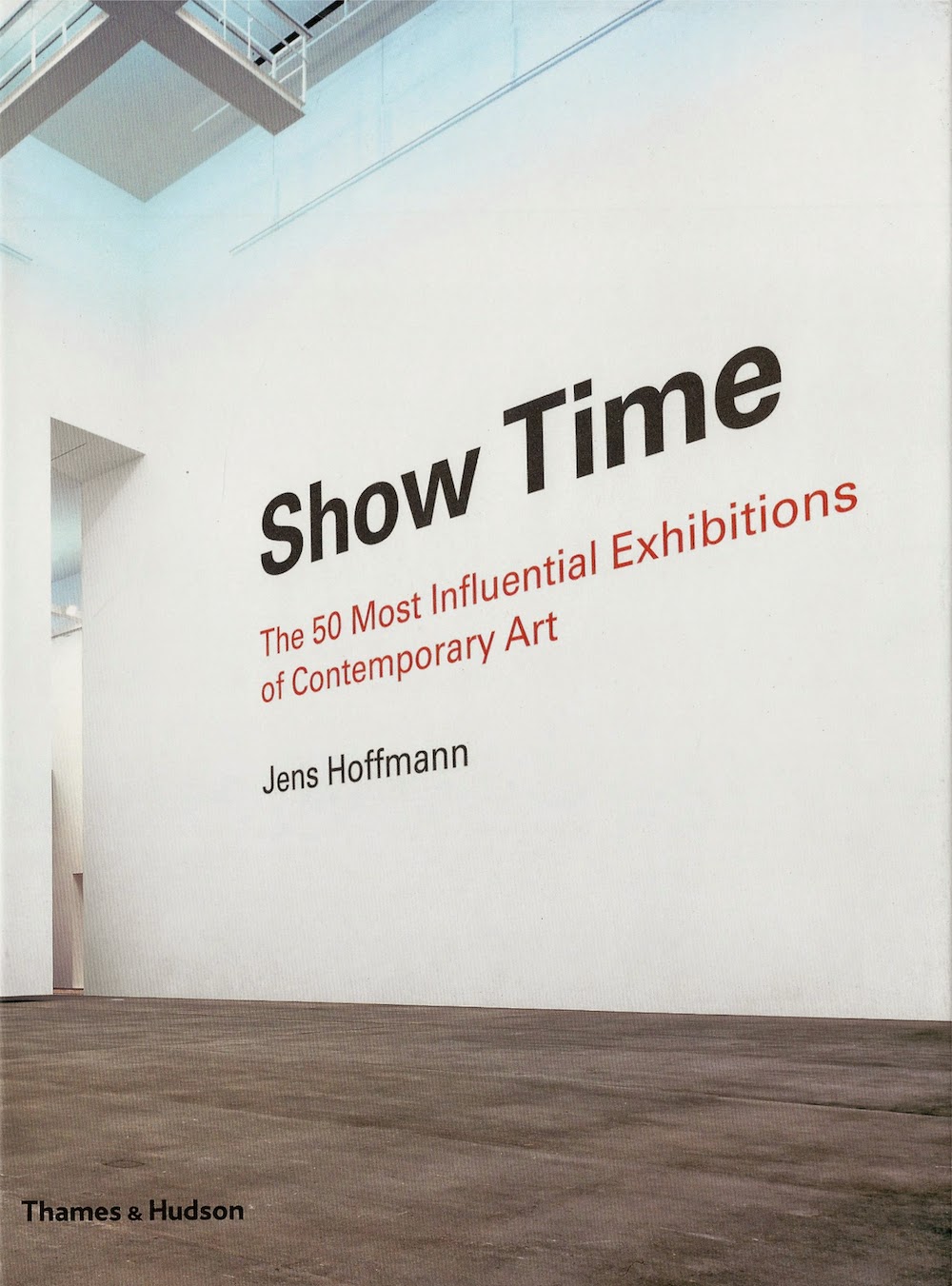
Show Time: The 50 Most Influential Exhibitions of Contemporary Art
 (2014) by Jens Hoffmann. This book marks a milestone in the increasing acceptance of curators as artists. Most of these exhibits were group shows that involved a gathering and selection by the curator. I don't know how I feel about that, but I can't deny that Hoffman (himself a well-known curator) has chosen some pretty consequential exhibits. As I read this, I wished for two things: first, that I had seen more of these when they happened (I only saw one), and second, that it had more photos. But to truly have "enough" photos, the book would have been 50 times as large. Each section tantalizes you with glimpses of a great exhibit you missed!
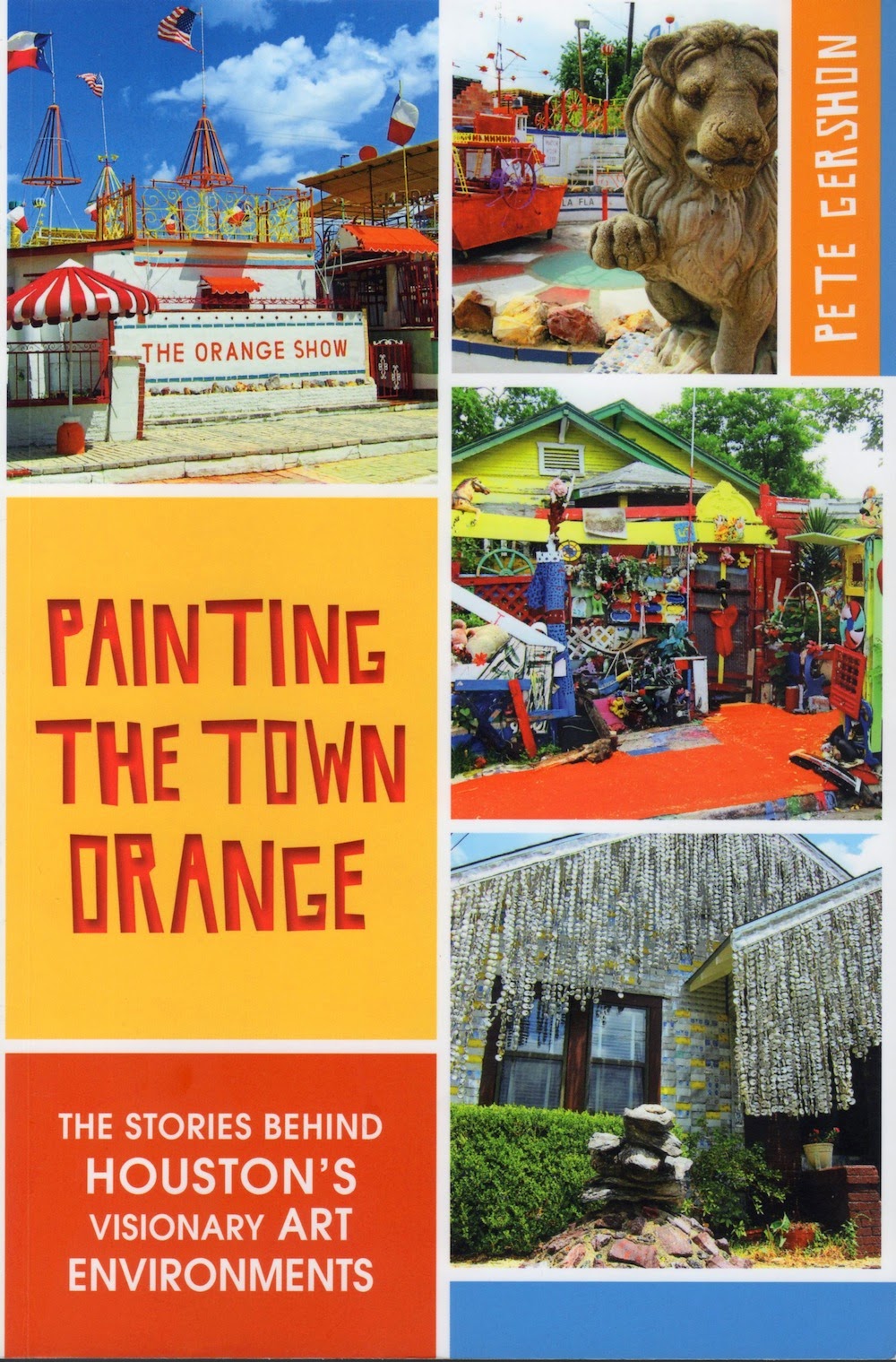
Painting the Town Orange: The Stories behind Houston's Visionary Art Environments
 (2014) by Pete Gershon. The writer approaches this subject from the point of view of a historian and as a journalist. The book is accessible to the average non-specialist reader, but is packed with information. This is an important, necessary work of Houston art history. Not only did I review it here, but we ran several posts by Gershon that had been excised from the actual book for reasons of space. You can read these here, here, here and here.
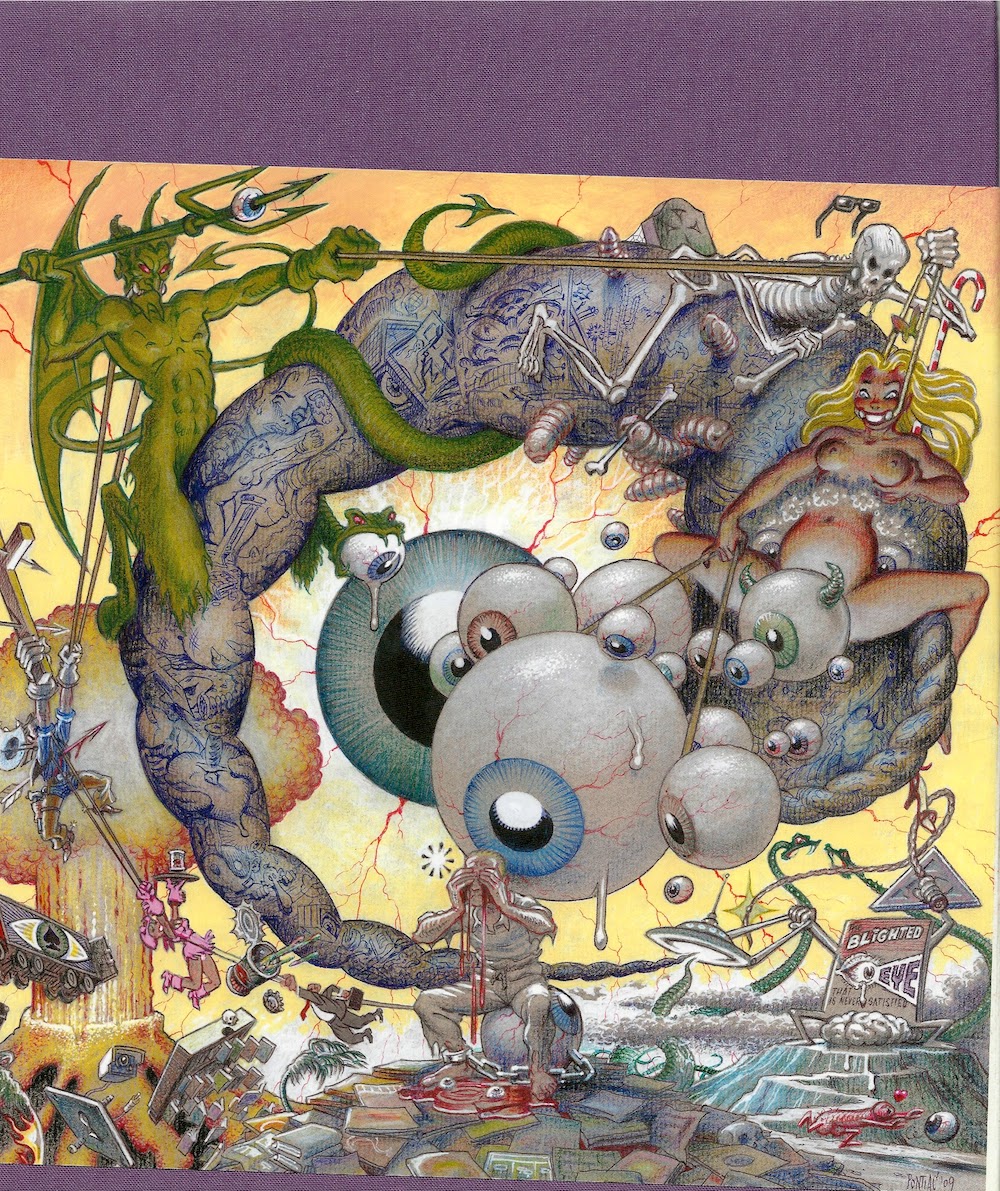
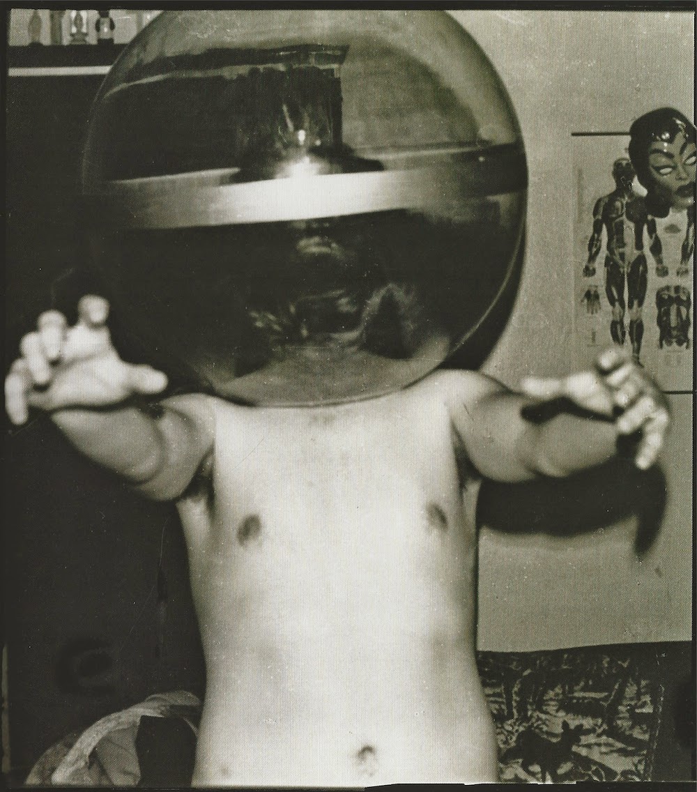
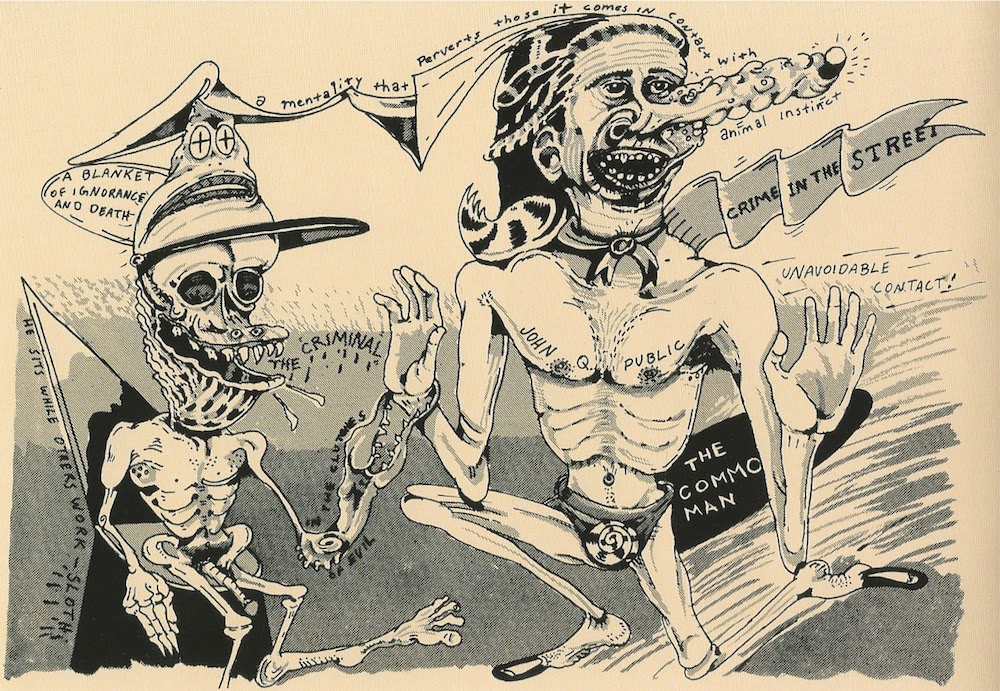
The Blighted Eye: Original Comic Art from the Glenn Bray Collection (2014) by Glenn Bray. Glenn Bray, like the Vogels, is not a rich collector. He inherited his family's hardware store in the San Fernando Valley. But he is an obsessive collector, often collecting the kind of art that no one has any interest in--at least until he collects it. The Blighted Eye is a book about his collection. It includes work by art world figures like George Grosz, Jim Shaw and Jeffrey Vallance, but most of his collection is of comics artists (especially underground comics, EC comics, punk comics, European adult comics, and bizarre comics from the odder tributaries of comics history) and "alternative" artists of every sort--Gary Panter, Robert Crumb, Carl Barks, Ernesto Cabral, Daniel Clowes, George Herriman, Daniel Johnston, Jaime Hernandez, Harvey Kurtzman, Chris Ware, Robert Williams, Jim Woodring and many more. As a small-time collector of inexpensive art myself, Bray is a role-model. The Blighted Eye is a beautiful book.
The Blazing World: A Novel
 (2014) by Siri Hustvedt. A fascinating novel about a woman artist who uses male "fronts" as an experiment to see if her art will be more easily accepted if it's by men. An unusually rich and thought-provoking read, I reviewed it here.
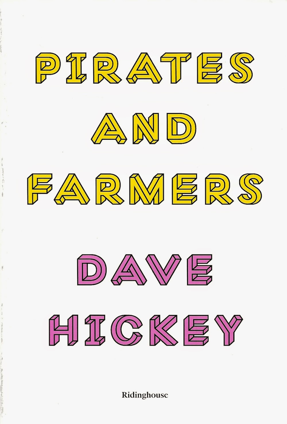
Pirates and Farmers: Essays on Taste
 (2013) by Dave Hickey. I loved his books The Invisible Dragon and Air Guitar, but art critic Dave Hickey's newest book of essays, Pirates and Farmers, feels much less consequential. There are definitely some good bits in it, but mostly it feels a bit masturbatory. I'm a fan of gonzo criticism--of putting yourself in the work--but Hickey's act has gotten stale. This book, combined with his disastrous talk at Rice University early this year, it may be time to write the guy off. But he sure can write, which is a lot more than you can say for most art writers.
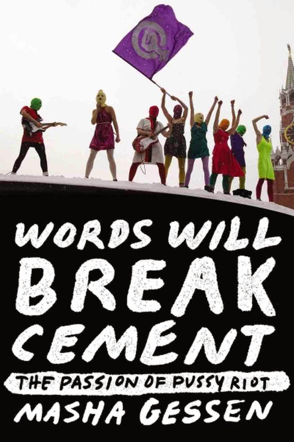
Words Will Break Cement: The Passion of Pussy Riot
 (2014) by Masha Gessen. Gessen is a Russian-American journalist who gained sudden fame with her alarming, eloquent writings and statements about Putin and the growing hostility to LGBT people in Russia. I had been reading her for a long time, though--she was one of the first two write about what happened to the intelligentsia after the fall of communism (Dead Again: The Russian Intelligentsia After Communism
 in 1997), a subject I have a passing interest in. In this case, I think she wanted to get a book out on Pussy Riot before anyone else did. After they were arrested, she attended their Kafka-esque trials, and she visited them in prison as frequently as she could, getting their story under the watchful eyes of the turnkeys. And the story is amazing--not just their own personal histories and the history of the performance collective, but the story of getting this story from them. More than in any of the other books by Gessen I've read, Gessen is a character. She is not separate from the story she is telling. Perhaps that is appropriate given that the iron was still white hot as she wrote. Maybe in the future, there will be a dispassionate, scholarly history of Pussy Riot. This book isn't it.


 comics.)


 came out.


.jpg)


 by Rackstraw Downes. Downes is a painter whose work I don't dislike, but in which I have only a little interest. I don't even know why I bought the book. Maybe it was the unusually modest but extremely handsome format--it's like a blank mass-market paperback untouched by an art director. And I totally judge books by their covers.
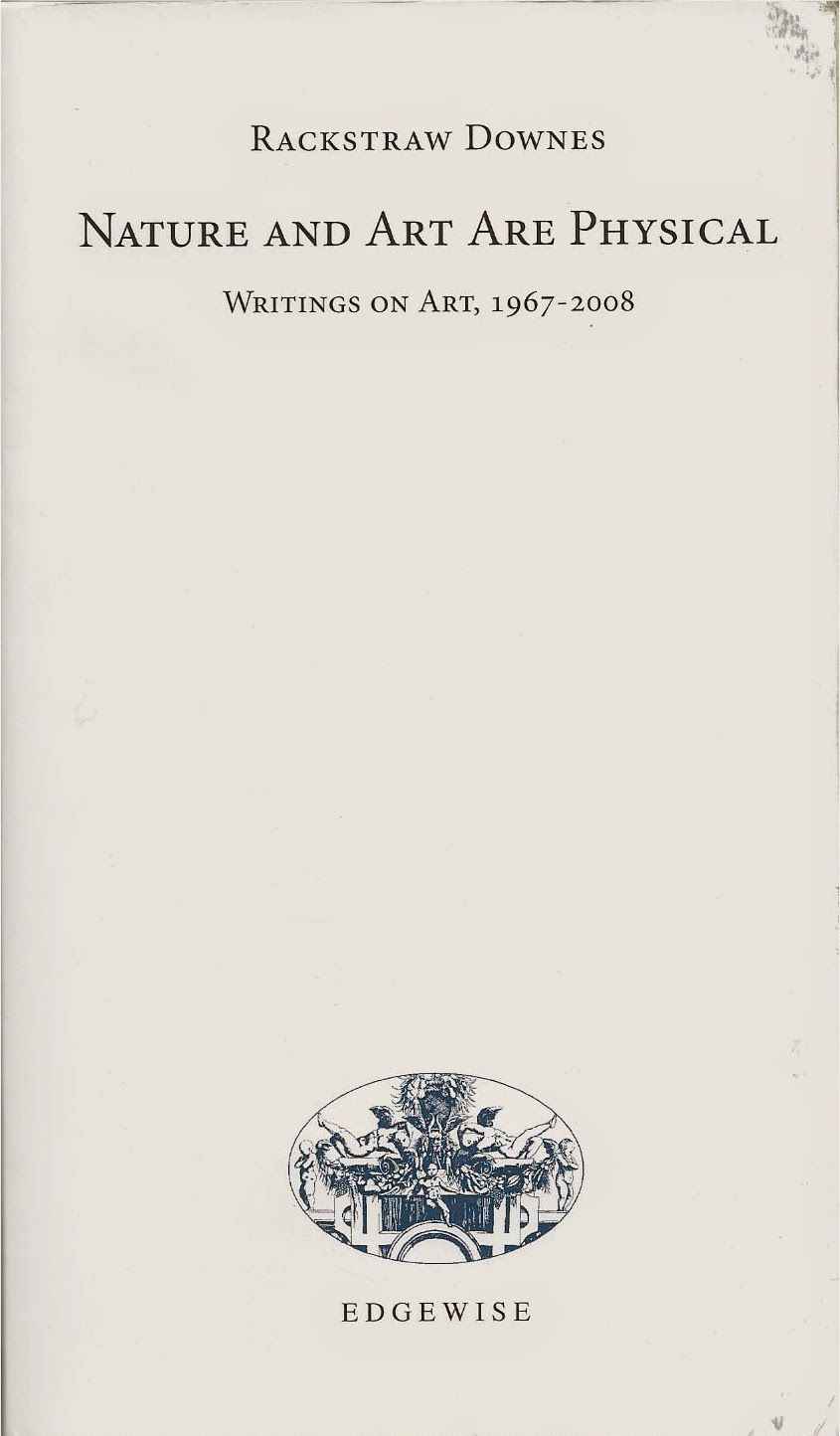
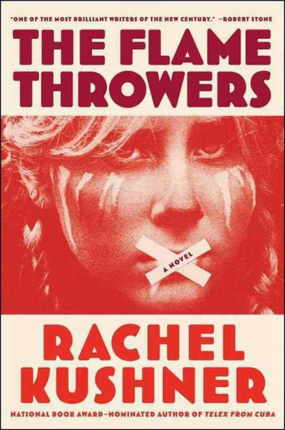
 by Rachel Kushner.
 by Patti Smith, and The Flamethrowers reminds you what a superb writer can do (as opposed to someone who is a really good writer for a rock star).
 . Carr had hired Coates for his first reporting job to at the Washington City Paper. Coates talks about Carr's mentorship and his philosophy of journalism--that a story could be about a big subject, but it needs narrative to drive it forward. Oh, I know and Coates knows that Carr didn't invent this. One can think of Willie Morris's Harpers, or many of the best writers for the New Yorker or Esquire. But Coates learned it from Carr and it obviously informs Coates' writing.


 But the bloom is off that rose, as we've seen in the recent recession. Creative people don't get paid much and are as likely to be exploited now as ever. And we'll never need as many creative people as we once needed factory workers. Those guys stamping out boxes for Nilla Wafers in Beacon and fabricating boilers at Pioneer Iron Works were contributing to an economy that brought more people up from poverty than any other ever did (at least, until China's recent economic opening).


 In Bedazzled, Peter Cook's Satan character was pranking people to provoke anger, one of the seven deadly sins. In Devil's Slice of Life, Barbatos gets paid for his work. I'd describe it as a cute-brut-style comic--Barbatos (and his victims and fellow devils) are drawn in a deliberately rough style, but it maintains a kind of manga-influenced cuteness. Devil's Slice of Life was printed in three colors on a risograph, which is a popular printing platform for small-press and self-published comics. Crotty is a member of a Dutch artists' studio called


 and
and  and
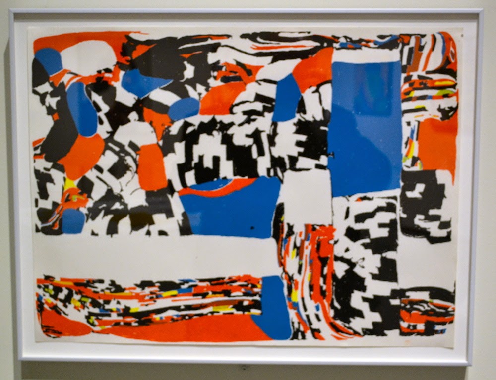
and  . What Nerve! brings together a lot of artists who have long been objects of fascination for Nadel as well as the idea of an alternate to the canon.


.jpeg)