Quantcast
Channel: The Great God Pan Is Dead
Viewing all 665 articles
Browse latest View live

People Should Get Paid for Their Work

$
0
0
Robert Boyd

People should get paid for their work. That's the basic premise behind Working Artists and the Greater Economy (W.A.G.E.). Their mission is a little less blunt:
Founded in 2008, Working Artists and the Greater Economy (W.A.G.E.) is a New York-based activist group whose advocacy is currently focused on regulating the payment of artist fees by nonprofit art institutions and establishing a sustainable model for best practices between artists and the institutions that contract their labor. 
The labor of artists for nonprofit art institutions is different from other kinds of labor. It's freelance instead of on-going. But it's not work-made-for-hire--the institution doesn't own the work unless a specific purchase agreement is made. Nonetheless, I think we can all agree that when an artist puts on an exhibit in some non-profit space, some work is done. If it's a show of paintings, most of the work is embedded in the paintings themselves, which the artist can subsequently sell. If it's a site-specific temporary installation, the artist has no hope of gaining future income from the work. Given this, it seems fair that these two artists be paid different fees. But the question is, how do you determine the fees?

In the world of commercial art, the Graphic Artists Guild publishes a book called Graphic Artist's Guild Handbook of Pricing and Ethical Guidelines. Commercial artists are in a similar situation as fine artists--they are freelance and they usually have many clients.This book gives them an idea of what they should charge for their work. Without this, they'd just have to guess what a fair price is and be more vulnerable.

Now the presence of the Graphic Artists Guild and the Handbook doesn't mean that artists don't get ripped off or exploited. But it helps artists understand when they are getting ripped off and provides tools for artists to avoid it.

How is W.A.G.E. approaching this issue? Mainly be going straight to the non-profits (501(c)3 tax exempt arts organizations) and providing a certification program. It involves changing their budgets (both annual and for specific exhibits/events) to reflect ethical pricing, as defined by W.A.G.E.'s fee calculator. So if a non-profit is W.A.G.E.-certified, an artist knows that there is a certain floor for her fee (and visitors know that the artists got paid fair fees). The fee calculator is based on the organization's total annual operating budget. I wish W.A.G.E. had defined this better. For example, would G&A expenses or depreciation count in your operating budget? I suspect it's different for non-profits than for commercial enterprises, but I'm not sure exactly how.

My problem with certification is that it only really provides a binary tool for artists--either the institution that may host your exhibit is certified or not. So it occurred to me that the expenses of any given 501(c)3 organization are public--they report them on their 990 tax forms, which anyone can access via Guidestar. If you look at the "Total Expenses" line of an organization's 990, the vast majority of that should be operational expenses. (If it's not, then I suspect that there's something wrong with the organization.) So I thought, let's use reported 990 expenses as a stand-in for total annual operating budget. Given this, what should artists be getting paid by various Houston area art non-profits? (In reality, the W.A.G.E. minimum fee will be slightly lower for some of the institutions once you take out the non-operational part of the expenses.)

W.A.G.E. Fee Calculator Applied to Annual Expenses of Houston-Area Art Non-Profits


* Assumed the written piece was 1100 words
** Assumed 3 hours of labor

There's a lot of information here. The left hand column are the institutions in question, in descending order by total expenses. The second column is the source of the total expenses number. The third column is the total expenses for each institution. The remaining columns are the minimum level fees for a variety of artistic activities recommended by W.A.G.E. using their fee calculator.

Some institutions are not shown because they are not 501(c)3s and therefore do not publish their 990s (the Station Museum and the Art Car Museum, for example). Some art institutions are part of larger institutions so I can't separate out their finances (the Rice Gallery, the Blaffer Museum, the Contemporary Art Gallery and the Fine Museum at HBU, the University Museum at TSU and the various galleries at HCC and Lone Star Community College campuses).

W.A.G.E. also has a maximum level of pay: "At the maximum rate, or 'Maximum W.A.G.E.' compensation at the Solo Exhibition rate is capped at the average salary of the institution's full-time employees." But since I don't have that information, I have left those figures off.

The first thing you notice is that for any institution with less than $500,000 in annual expenses, the fees are all the same. This is W.A.G.E.'s floor level. For operating expenses between $500,000 and $5 million, the fees are generally a percentage of the operating expenses. Above $5 million, the minimum is capped (as you can see for the HAA, the Menil and the MFAH). These fees do not include expenses such as travel, lodging and shipping. The institution is expected to cover such expenses above and beyond the basic fee, and W.A.G.E. provides guidelines for that.

I think this could be a useful took for artists. Even if an institution is not W.A.G.E. certified, it at least gives an artist an idea of what they should be asking for for their services.

Are their problems with W.A.G.E. and their approach? Yes. I had a long conversation the other day about this and several issues arose. To simplify, here are the questions that came up and here's how I (obviously not a spokesman for W.A.G.E.) would answer them.

1) Doesn't this commodify a relationship that is about much more than money?

Yes. This is always a cost in labor agreements. The question has to be what is lost versus what is gained.

2) Doesn't the floor price mean something different in different places? $1000 in New York City is different from $1000 in Houston, for example.

I think this is a serious issue. Was W.A.G.E. thinking primarily of their home base in New York when they came up with the floor pricing? If so, maybe there should be a scale based on relative cost-of-living for a given location. Obviously doing so would make the fee calculator much more complicated--and therefore less easy to use. But perhaps W.A.G.E. believes that this floor should be national in the same way that, say, the federal minimum wage is national.

3) Isn't W.A.G.E. too militant? Isn't their tone off-putting?

The history of labor rights won is not a history of asking politely. That said, for all of W.A.G.E.'s radical bluster, they don't suggest any consequences for 501(c)3s not getting certified. For example, are they suggesting that artists boycott especially egregious institutions? Picket them?

4) Doesn't this turn non-profit organizations into "the Man"?

Yes, in the sense that it formalizes the freelance relationship between artist and institution. But 501(c)3s are already formalized institutions in a legal sense. They aren't ad hoc spaces--they've gone through the trouble to become tax-exempt organizations with charitable purpose. We hold them to account, and asking that they pay decent fees is just one more example of this public accounting. The details of the fee calculator can be argued, but expecting everyone to come through in at least some minimal way doesn't seem unreasonable to me.

5) Doesn't the fee calculator, and particularly the "floor," penalize very small art organizations?

I think so. Box 13, with its annual budget of $85 thousand, is not in a position to pay every artist with a solo show $1000. This small artist-run institution exists mainly to provide inexpensive studio space (it was founded by artists who were evicted from the original CSAW). As far as I know, they have no paid staff. But they host some of the most interesting shows in Houston. Is it reasonable to expect the same pay rate from them as from Lawndale, which has more than five times Box 13's budget?

These issues will, I assume, be open for discussion at charge, a two-day practicum at the Art League. on November 8 and 9. Alas, I will be traveling that week, so I'll miss it. It will feature a variety of speakers and seminar leaders from both the local scene and from around the country, including Lise Soskolne from W.A.G.E. If you're planning to attend, think about spending some quality time with the 990s of Houston's various art non-profits. I know it sounds boring, but if you are thinking of exhibiting with any of them, you owe it to yourself to know something about their finances.

Have you had an exhibit with any of the institutions above? How much did they pay you? If you're willing to come forward, I think it would be very useful for other artists to know. Let us know in the comments section below.

On Choosing Not to Decipher

$
0
0
Robert Boyd

The name of the exhibit is I'll Imply, You Decipher, which could be the name of any number of contemporary art exhibits in the past 50-odd years. Much contemporary art can be described as abstruse, gnomic, hermetic, mystifying, inscrutable and impenetrable. For some viewers, this is off-putting. They may even feel insulted by it. They may feel that the work they're looking at (if not the entire enterprise of contemporary art) is fraudulent. Or they may feel that the work intentionally excludes them, they they aren't invited to the "club." That they aren't meant to "get it." They may feel that the work is a kind of puzzle to be deciphered. That it has a meaning that is hidden. The title of this show suggests that, doesn't it? But that's a game I don't play.

It's not interesting to me because "meaning" seems like the least valuable aspect of a work of art. The pay-off in drawing meaning out of an inscrutable artwork is almost always less than the cost of the effort put into the deciphering. If the meaning is right there on the surface, then I'll take it into account; otherwise, it's not worth the trouble. Because art has other qualities that--for me, at least--count a lot more. Artworks have presence. They may even have beauty. They have personal associations that are unrelated to whatever meaning the artist assigned to the work. All of which is far more important to me as a viewer than what an artist "meant."

But from the point of view of an artist like Kyle Earl McAvoy or Betsy Huete (who has written many posts for The Great God Pan Is Dead) there must be an awareness that their art may strike some viewers as difficult. Perhaps they realize that aspects of their art which presumably have personal meanings for each artist may not have that meaning at all for someone else.


Betsy Huete,  The Folly in Architecture, plastic bag, diatomaceous earth, thread, needles

For example, the use of diatomaceous earth in The Folly in Architecture by Betsy Huete. This white powdery substance is made of the fossilized shells of diatoms and has various industrial and agricultural uses. So if an artist uses a very specific "non-art" material like diatomaceous earth, she may be interested in some specific use of the material (as an absorbent substance for controlling spills of toxic liquids, for example), or in its nature as the fossilized remains of beautiful unicellular organisms, or because of its formal qualities (for example, its color or tactile qualities) or for some combination of unknowable reasons. Or she may be using it as a bricoleur, because it was handy. Maybe Huete just happens to have a lot of diatomaceous earth around.

But as a viewer, all I have if what is in front of my eyes filtered through my own experiences, thought processes, biases, desires, etc. And when I looked at  The Folly in Architecture, I mostly thought, "Bags of white stuff. huh."

Huete could have added a card with some information to help us interpret  The Folly in Architecture, much as has been done in the current show of art by Robert Hodge at the CAMH. I'm so glad she didn't. Such texts, while sometimes necessary, are graceless additions to a work of art. They never make the art better, just--at best--more comprehensible.


Betsy Huete, Harbor, 2013, dirt, table, concrete, meat, thread, needles, model trees/cacti, television, lamp

Huete's Harbor feels like a work of bricolage, except maybe for the model trees and cacti. It's an example of the time-worn genre of combining crap with crap. No aspect of it is elegant, not element of it seems new or particularly beautiful. The fact that it includes a steak that is undoubtedly starting to rot before our eyes just reminds you that Harbour may be many things, but pretty ain't one of them.


Betsy Huete, Harbor (detail), 2013, dirt, table, concrete, meat, thread, needles, model trees/cacti, television, lamp

What appeals to me--and perhaps only to me because it reminds me of a personal failing I have--is the tentative, unfinished quality. It's like she thought about making dinner but didn't get around to cooking the steak. She thought about doing a little gardening but only got as far as dumping some dirt out. Maybe making a model railroad would be a good project, but she only got as far as setting up the HO scale trees and cacti. Even relaxing in front of the tube was apparently interrupted, because now all we're picking up is snow. (The problem lies in this new antenna. If this damn set's broken, go to Allied TV Rental.)


Betsy Huete, Harbor (detail), 2013, dirt, table, concrete, meat, thread, needles, model trees/cacti, television, lamp

What does it all mean? The installation is begging you to ask that question. But I prefer to experience it as a strange presence, as if a bizarre interior decorator has installed a conversation nook in the back of galleryHOMELAND. The elements have no obvious relationship with one another beyond that we give them. And beauty? Well, why not--it's just "as beautiful as the chance encounter of a sewing machine and an umbrella on an operating table."


Kyle Earl McAvoy, 👍, socks, sandals, white briefs

By contrast, Kyle Earl McAvoy goes for more crowd-pleasing effects. Deciphering really isn't the issue with  👍 [sic, I guess]. Undies and a pair of muscular thighs are sure to get a thumbs up from about half the population. The individual elements of 👍, socks, sandals, undies and store-display half-dummy are all found objects (at least I assume the dummy is a found object), but they're all found objects that were designed to look good. Therefore it's not a surprise then that the combination of these objects looks good.


 Kyle Earl McAvoy, Solicit, 2014, mower engine, fumes

A lawn-mower engine, on the other hand, might be beautiful in the eyes of some, but it wasn't designed to look good. But McAvoy appeals to viewers in a different way here--with spectacle. The motor is bolted to the white pedestal, which is itself reinforced with angle brackets. Why? Because when you pull the rip cord and start the motor up, the whole thing bucks and jumps.


Kyle Earl McAvoy, Solicit, 2014, mower engine, fumes

It's a crowd-pleasing effect (as can be seen by the cheering Betsy Huete in the background above). There is an off-switch (which, if it is similar to other mower engines I've used, shorts the spark-plug to kill the engine) which the bucking of the pedestal eventually triggers. It's not quite a Jean Tinguely, but it does provide a few moments of pleasurable noise and movement (not to mention a lot of exhaust--on the opening night, galleryHOMELAND director Paul Middendorf had to open the gallery's bay door to keep the exhaust from overcoming the viewers).


Kyle Earl McAvoy, Solicit, 2014, mower engine, fumes

With Solicit, "deciphering" feels utterly beside the point. That's my advice for this exhibit (and really, for most art). It's an old idea and I'll defer to Susan Sontag (circa 1966). She said deciphering (or "interpretation," as she called it) was "the intellect's revenge on art." It's a wall between the viewer and experiencing the art. This viewer, at least.

I'll Imply, You Decipher runs through December 3 at galleryHOMELAND.

The Golden Age of Art Comics: Charles Burns and Dylan Horrocks

$
0
0
Robert Boyd
  • Three books by Charles Burns


Charles Burns, X'ed Out, 2010

2010 saw the publication of X'ed Out
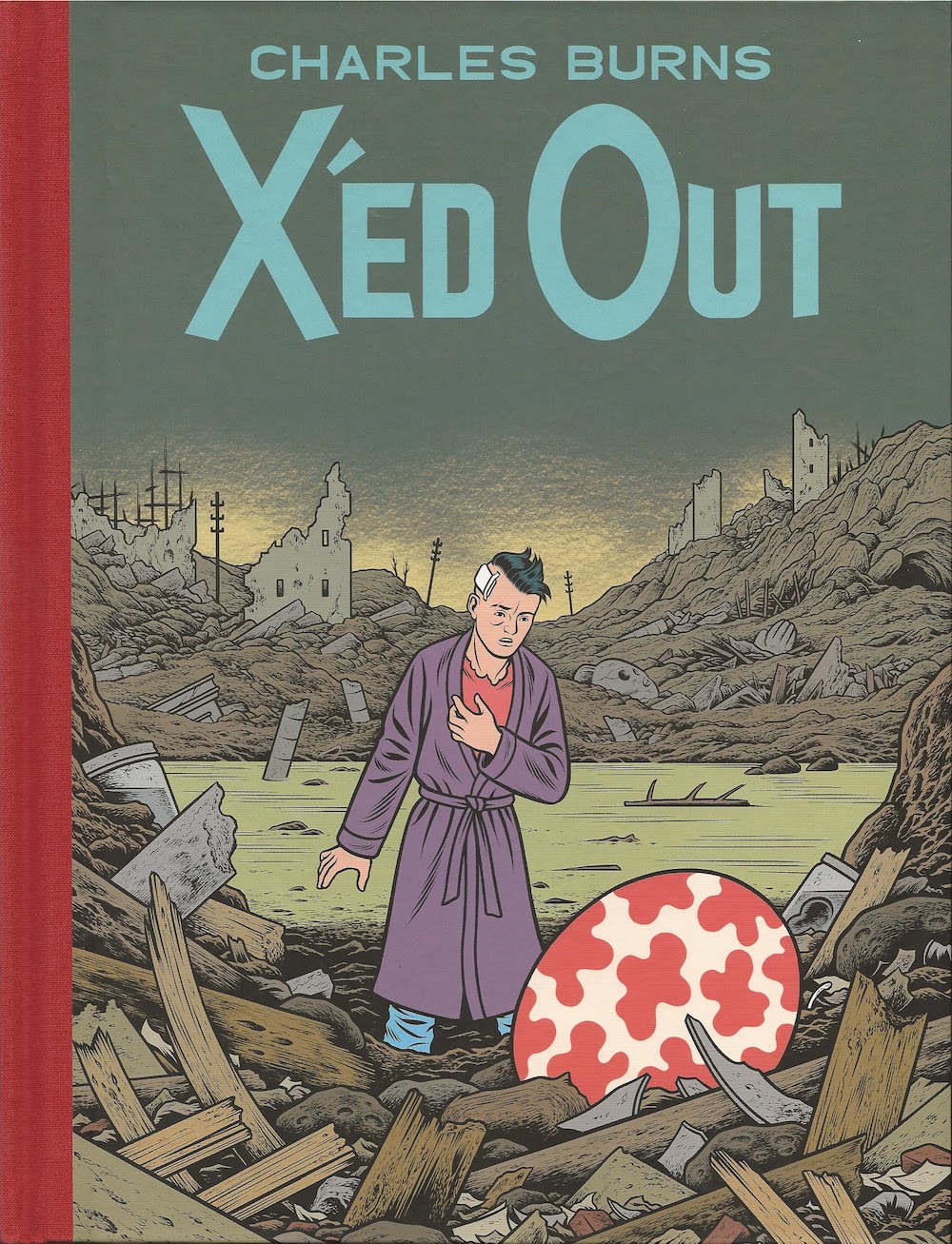
, the first major new work by Charles Burns since Black Hole. Right away, the cover was promising--it was a pastiche of sorts of Hergé's The Shooting Star
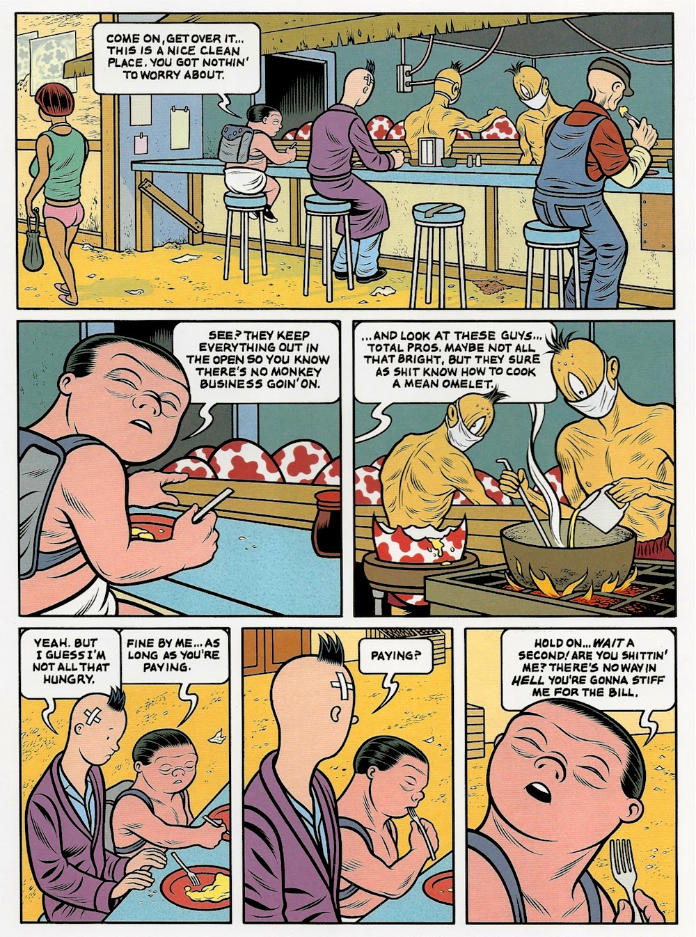
. Instead of setting it on a rocky shore, Burns set it in a grey, bombed out landscape. Burn's "Tintin" was a character drawn in a classic "realistic" comics style with a bandage on his head. But the pattern on the ovoid shape in the foreground was unmistakable--it was the same as the coloring of the mushroom in The Shooting Star.


Hergé, The Shooting Star, 1942

The book opened with a decidedly surreal scene, drawn in a style that was a cross between Burns' own style and Hergé's--that is to say, the styles of two obsessive perfectionists. The main character looks like an older Tintin, with a black quiff instead of blonde. But the book quickly leaves this surreal scene behind to depict a realistic story of a young art student named Doug. There are some flashbacks and flash forwards--we readers don't really know when "now" is, but we do know Doug was a student in the early days of the punk rock era, and part of his art is a performance that he does involving wearing a depersonalizing Tintin-like mask, reading Burroughs-like cut-up texts and playing collages of noise from a cassette deck hanging from his neck. (He calls his performance persona "Nitnit.") We see him doing this performance to a group of largely indifferent viewers as the opening act of a punk band. It's here he meets Sarah, who becomes his lover.


Charles Burns, X'D Out page 47, 2010

The link between the surreal fantasy world and Doug's world is obscure, but the main character in the surreal realm seems to be an analogue to Doug. The book was in color and published in a slightly oversize format, to deliberately mimic the format in Tintin. But unlike Tintin, the story wasn't neatly wrapped up in one volume. It was frustrating to reach the end because I knew it would be a long wait for the next volume.


Charles Burns, The Hive, 2012

Just as Black Hole was a book about adolescence, this series is about young adulthood. Burns seems aware in the same way that Jaime Hernandez was aware that people's bodies keep changing even after they become adults. In the second volume, The Hive, we see Doug's future self talking about the past. He goes from being a slim student to packing on a few pounds. But the time he is with Sarah is when he seems to be a physical peak. They are a beautiful couple and his later self is full of regret about what happened to them, which he knows but we don't.


Chales Burns, The Hive page 32, two bottom tiers, 2012

In the surreal world, the Doug analogue meets an equivalent to Sarah--she is a breeder in the Hive. The connections between the two stories seems to get stronger in The Hive, but they still seem mostly unconnected.


Charles Burns, Sugar Skull, 2014

Sugar Skull
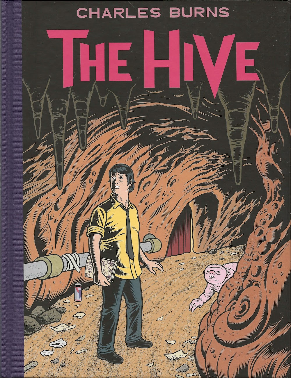
, which just came out, completes the story. All the flashbacks and disconnected episodes in Doug's life coalesce, and the parallel Burns-Hergé world makes sense as well. If there is any fault here, it's that everything is tied up a little too neat. But I found it satisfying. Doug turns out to be a pretty imperfect guy who stumbles badly as he transitions into adulthood and leaves behind some unrepairable wreckage. This is the kind of story an older person can tell convincingly. Burns was born in 1955. I wrote in an earlier post about how sad I feel about comics artists I've admired who, over time, drop out of the comics field. One reason I regret them leaving is that they will never tell stories from the point of view of full maturity. It is Burns' 59 years on this planet that give him the perspective to produce X'ed Out,The Hive and Sugar Skull. These books bring together the obsessions of his earliest work with an emotional maturity those works, as brilliant as they were, lacked.

I like seeing older cartoonists take this kind of material on, as Mimi Pond did in Over Easy. The health of comics as an art form depends on having several generations of serious comics artists working simultaneously.
  • The History of Dylan Horrocks

Dylan Horrocks, Incomplete Works, 2014

One of my favorite cartoonists is Dylan Horrocks. Born in 1966, he could be lumped in with a group of English, Australian, Canadian and New Zealand small press cartoonists whose work was quite sensitive, small scale and occasionally verged on twee. I'm thinking of artists like Eddie Campbell, Glenn Dakin, Ed Pinsent, etc., who were associated with the U.K. small press movement in the 80s and Escape Magazine as well as Fox Comics in Australia. Eddie Campbell and Dylan Horrocks are the two most successful of that group, but they all were interesting and they collectively offered an alternative to the dominant modes of alternative comics-making that came along in the 80s--the punk-inflected experimental work of the Raw artists (including Charles Burns), the sarcastic post-underground wise-ass work of Peter Bagge, Dan Clowes and many of the Weirdo artists, and the un-self-pitying autobiographical comics of Chester Brown and many Canadian cartoonists.

Horrocks is willing to mix autobiography into his work, which helps to ground his flights of fancy, but his great subject is comics itself. That's what comes through in story after story in Incomplete Works
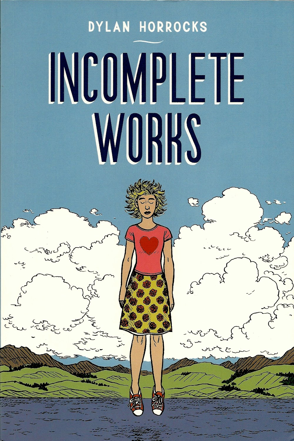
, a collection of stories from 1986 to 2012. I've read many of these stories before in the various ephemeral publications where they first ran, but it quite astonishing to see them in one place. It is interesting to see how constant his themes and subjects have remained over the course of almost 30 years of work.


Dylan Horrocks, "Little Death" page 2, 1986

His early work shows him searching for style, but his drawing seems very self-assured. The page above is from "Little Death," drawn when Horrocks was 20 years old. A story of sexual desire in dark public places, Horrocks notes that he met his partner, Terry Fleming, while working on it. It's almost proof of the old Jay Lynch theory--you get what you draw!

Like many artists from New Zealand, Horrocks moved to London for a while to try to make a go of it. And his feeling of alienation and home-sickness there inform a lot of work in the early parts of this anthology, including a masterpiece called "The Last Fox Story." In his endnotes, Horrocks writes that he drew it in ballpoint pen on memo paper. He was working in a bookstore in London and having serious doubts about his vocation as a cartoonist. The story was intended for the final issue of Fox, an long-running alternative comics magazine from Melbourne, Australia. The fact that Fox was coming to an end may have suggested to Horrocks that there wasn't a place for the kind of quiet, contemplative comics he drew.


Dylan Horrocks, "The Last Fox Story" page 18, 1990

He humorously portrays his dilemma in the story as a fear of comics, but what he's really talking about is that moment of crisis that hits young artists of all stripes--can he carry on? Is there a place for his work? Is he capable? Horrocks tells this story about comics using comics, but it seems quite universal. All artists face this, often at the same age as Horrocks did. As we know, many in his place say no--they decide to turn their life in a different direction. But as you read Incomplete Works, you know what Horrocks chose. He kept on going and started his own solo comic book, Pickle, in 1992. It was here he serialized one of the best graphic novels ever, Hicksville
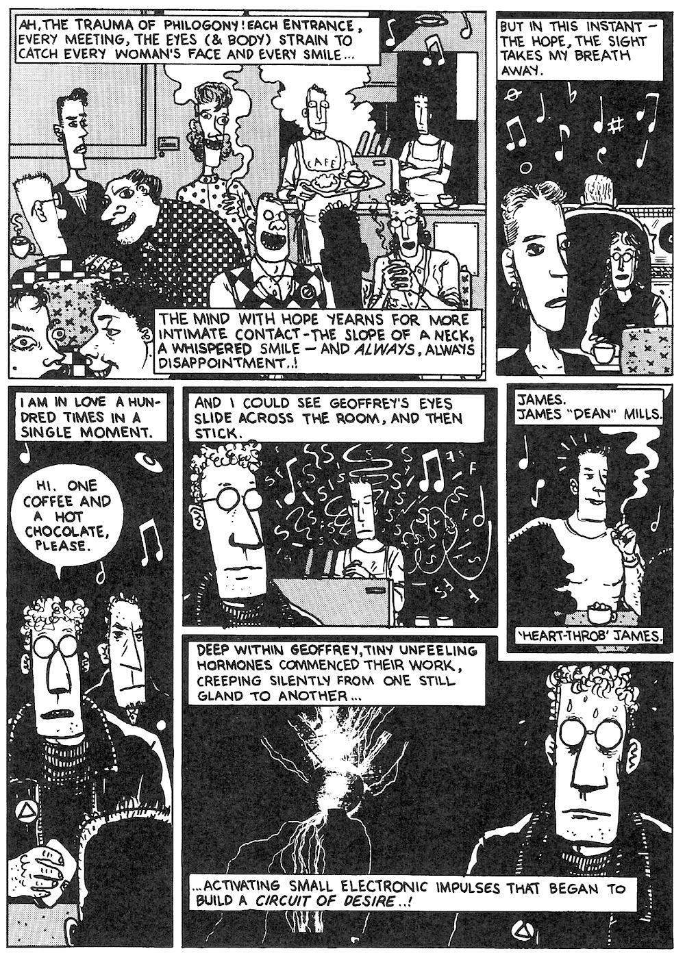
. (Full disclosure--I own two pages from this work.) And you can see his mastery of this art form blossom during the 90s in the stories here.


Dylan Horrocks, "A Cartoonist's Diary" page 12, 2012

It all comes full circle in the last story in the volume, "A Cartoonist's Diary," which was published online by the Comics Journal. His interests and concerns in 2012 as a 46-year-old man are not all that different than the 24-year-old who drew "The Last Fox Story," but now he is a teacher, an elder figure with an impressive body of work behind him. What I love about his art is that it is so humane and humble. He seems to see himself as part of a world-wide comics history. He reveres his predecessors, both famous (a little story about George Herriman) and obscure (a biographical strip about New Zealand underground cartoonist Barry Linton).

His next graphic novel, Sam Zabel And The Magic Pen, will be published later this year, and you can read most of it online right now at Horrock's website Hicksville Comics. The Magic Pen is great, as is Hicksville. But Incomplete Works is, I think, their equal. It's a moving, poetic collection of work.

"I’m Only 81": Notes on HJ Bott

$
0
0
Virginia Billeaud Anderson

Just after midnight on October 23, HJ Bott contacted me to say he would very much appreciate my comments on Scribble Morphings, his current exhibition at Anya Tish Gallery. I was not the proper person to write about his exhibition, I told Bott, because it doesn’t please me to write criticism. I did want to ask him a few interview questions, I said, in hopes of learning something about his art and life that’s different from the same old shit that’s been written in the past. Over the course of several visits we discussed the following:


HJ Bott, NARRATIVE: Generals, Decorated, 2014, Glazed Acrylics on Canvas, various generals’ stars, 34 x 34

Virginia Billeaud Anderson: In our correspondence, and even on your website, you occasionally allude to your mortality. It’s all about to “dissipate,” you told me recently. Because of age (b. 1933), do you make art feeling urgency about time running out?

HJ Bott: GAWD! You are so observant/perceptive. Yes, time has always been my albatross, wanting to be ever more prolific. Might mention I was a preemie that accounts for my pulmonary issues and the familial tremor that came on strong about 1990. Because of these physical restraints I have had to shift techniques to compensate, which every artist experiences. Both maternal and paternal genes are long lived; but in fact I am tired, and was forced to give up sculpture. Mortality is indeed interrupting artistic plans, and I know I'll never get to all the ideas I wish to execute concerning the Phenomena-of-a-Line using the DoV, the 24 Basic Scribbles and the new findings about pre-historic Egyptian cultures.

Also, I’ve had a few of the usual artist setbacks with work, studio and gallery losses, and some heavy depression cliffs, family sadness, and I lost my daughter to suicide, about the time my shakey ole tremors were mis-diagnosed as Parkinson’s.

Yet I’ve had a robust life, having been an Airborne Ranger who performed Counter-Intelligence shit in the mid-1950s, and other physically vigorous stuff like drag strip racing, I married three times, although this one has been 44 years, what luck. I joined the Army to piss off my parents for not allowing me to take my car from San Antonio to L.A. for my second year of school. Smart stuff, huh?

VBA: You know Harvey, one morning you turned my head. I sat near you at the weekly artists’ breakfast, and you were wearing your Stones’ lips and tongue T-shirt and the ponytail, and it brought up dreamy recollections of the early seventies when I was young and attractive and ignorant. Even with the wrinkles and talk about a knee replacement, you were hot. I’m not trying to flirt with you Harvey, I’m just saying you made my day.

HJB: Just as your steel-trap intellectual remarks have on occasion made mine, which I’ve written to tell you.


HJ Bott, Mobius Quatro, 2012, Glazed Acrylic on Canvas, 34 x 34

VBA: On the evening of your Scribble Morphings exhibition opening, Anya Tish told me she was tempted to install the triangular pieces as rectangles, until she read a note on the back of one that suggested a collector have the courage to hang them triangularly. Why are the pointed sides important to you?

HJB: One of my favorite antecedents, Max Bill, used the diamond format to maximize space and avoid the constraints of the rectangle and the square imposed by the usual stretcher frame format. It appeals to me to avoid cookie-cutter impositions and constraints to aspects of our existence, as expressed by Edward T. Hall in his book Hidden Dimension.Back to Max Bill, I see the format as a visual drift-off whereas rectangular/squares are constraining.

VBA: It’s interesting you brought up constraints. I recall Robert Boyd’s 2012 observation that it is precisely a self-imposed restraint, your “Displacement-of-Volume” process of mathematically devising linear patterns, which catapults your creativity. In your hands, the programmatic approach succeeds, because even if a viewer is unaware that such a painting as Mobius Quatro, which references the math-based Mobius Strip, derives from mathematical theories, he is knocked over by the beauty of an uncompromising artwork that seems to pulsate.


HJ Bott, Systems A-GO-GO, 2014, acrylic on canvas, 50 x 69 inches

HJB: I had an unusually high aptitude in math and geometry, and in the 1950’s I actually turned down a math scholarship to Rice because the art department sucked. My parents loved this. Math originates all. The painting Systems A-GO-GO was directly inspired by π (pi the mathematical constant 3.14159…). You see I’m working here with the relationship of the planet’s dimensions relative to the Great Pyramid, the perimeter of which is analogous to the equator’s circumference. Also the pyramid is nearly at the center of the Earth’s landmass and was probably exactly at the center when constructed, until tectonic plates caused landmass shifts. The significance of these measurements to my DoV System is paramount, relative to the left/right and top/bottom axis, as well as the inclination (almost 52º) of the pyramid. And scribble morphings, based on the basic markings that are universal to all cultures, overlay the DoV. Do you need me to explain more about the planet’s dimensions and all this other stuff I’ve been sputtering?

VBA: Give me an example of new findings about ancient Egyptian culture that you would like to incorporate into your art if you have the time.

HJB: The newest findings, as I understand them, are hieroglyphics showing cables along with copper electrodes that denote a power source for the pyramids, since there has never been evidence of the pyramids actually being tombs. This interests me enormously because my DoV and resulting art works have to do with OBJECT measurements, even though measurements themselves are but means to create an object. Does this make sense? There is so much more to explore, with time running out, and then I would make comparisons with the Mayan culture.

VBA: I can imagine your loyal collectors losing their composure over the complex narratives beneath the paintings.


HJ Bott, OH-GEE, 2014, glazed acrylics on canvas, 24 24 inches

HJB: Every work has a background story, as Bill Arning observed when he read my 2012 monograph Rhythm and Rhetoric. My best friend Earl Staley who is currently showing at Zoya Tommy Gallery works in a similar manner, Earl and I are both narrative oriented. Another narrative-driven work, the painting OH-GEE has the subtitle "Ordovician Graptolites" on the back to express invertebrate Plankton-like fossils from the Paleozoic Era about 500 million years ago. Don’t you find its yin/yang-shaped “commas” jazzy? We can trace such basic scribbles back to initial inhabitants of the Olduvai Gorge.

VBA: At the time of your 2012 Anya Tish gallery exhibition you connected your use of line, the most basic of design elements, to string theory by naming a painting after the string theory physicist Joe Polchinski. I actually retained the note you wrote to thank me for commenting that it was intuitively comfortable to imagine subatomic particles to be swishy like strings. Do the new works conjure particle physics?

HJB: OMG! That 2012 gallery show celebrated 40 years of DoV. Physics enters the new works through my reading of Edwin A. Abbott’s Flatland,the classic on perception which I give all my Perspective Drawing students, Cosmosby Carl Sagan, Michio Kaku’s Parallel Worlds: A Journey Through Creation, Higher Dimensions, and the Future of the Cosmos,as well as Brian Greene’s The Fabric of the Cosmos.
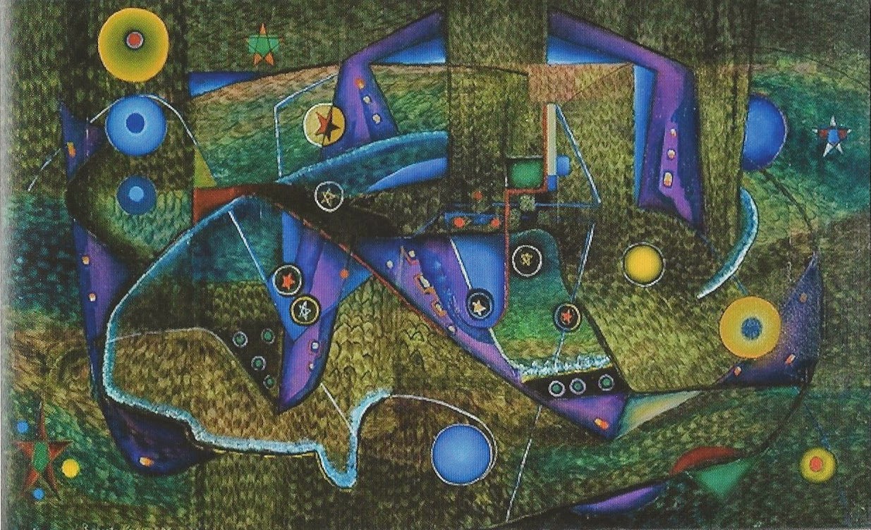
The painting Systems A-GO-GO is based on Mario Livio’s The Golden Ratio.Forgive me for listing books like a pretentious ass but a Houston Press writer used innuendo to snicker at my naming my painting after Joseph Polchinski, the big daddy of string theory. She obviously failed to grasp the extent to which this scientific material penetrates the DoV, Phenomena-of-a-Line, and Basic Scribbles components of my art.


HJ Bott, Polchinski’s Pertubations, 2012, Co-polymer vinyl on canvas, 36 x 36, (shown in the 2012 Anya Tish Gallery exhibition Rhythm and Rhetoric)

VBA: Looking at an ungodly long career, the innovations and inventions, gallery and museum exhibitions, awards and honors, do you consider yourself a success?

HJB: Virginia, the question of success is tough to answer because the word’s meaning varies as a noun (attainment,) adjective (prosperity,) and verb (which denotes continuing.) Even though my achievements have been extremely satisfying in the range and time of what has passed, the art world might not consider them particularly blue-chip. I created abundant products, objects, and concepts, and studied and researched a vast variety of materials and techniques, which has been exhilarating, especially after the cluster-fuck of shifting subjects and approaches that took place prior to my development of DoV. As a student of sculpture, painting, anthropology and social psychology, I achieved being an artist FIRST; and second, an independent, non-academic, broad ranging anthropologist. Throughout my art career there has been so many marginally profitable achievements that I look back on as triumphs, the series of ROBOTTs™, and deep-space-light installations, my European studies and exhibitions, development of the plastic TOBINITE™ for modeling, are only a few. And I married my soul mate, Margaret Deats (Dee Dee) Bott, who convinced me to become a full time artist at age 42 which gave me the luxury to research, read and experiment. I consider that success, even without prosperity.

Would I like to be in more public collections? Of course, but while some public collections are good for the resume and the ego, their audiences can be limited to registrars and curators. Do I want more exhibitions? If they are in museums and prominent galleries like Anya Tish, but then one must tolerate critics and dissatisfied viewers. But it’s worth it, I want to do more, there's still time, I'm only 81.


HJ Bott, Mesocarp Mischief, 2012, Co-polymer vinyl on canvas, 48 x 72, (shown in the 2012 Anya Tish Gallery exhibition Rhythm and Rhetoric)

Cute! at Rice Cubicle

$
0
0
Betsy Huete

Rice Gallery’s satellite video space, Rice Cubicle, is currently showing a suite of six short films in an exhibition calledCreature Worlds. Creature Worlds refers to the playful, whimsical characters that populate just about all of the films as well as how they interact with the environments the animators have created for them. Adorableness seems to be the common strain that threads them together, as bouncy music and pudgy, wide-eyed animals run, jump, tumble, morph, and fumble across the screen. But if all Rice Gallery wanted us to do was grip our foam-block seats with sadistic glee and giggle and clap maniacally, they could’ve just put on a lengthy rotation of YouTube cats, or waddling babies falling over. Instead, as they make clear with their gallery handout, these films by and large use cuteness as a segue to grander, more serious stories of life and death. Sometimes juxtaposing sweetness and humor with stern and perhaps sinister subject matter yields curiously jarring and effective results, and some of these films use this strategy even-handedly to take us beyond something just cute and fun to look at. And then there are other moments where the animators get caught up, seduced by the simplicity and satisfaction of their own creations.

Saigo No Shudan, KUNCHI (2013)

KUNCHI is a perfect example of the accompanying music making or breaking the work. Without it, the film would be just a bunch of white shapes bouncing around the screen. But with a chiming, incessant, almost shamanistic beat, the objects moving from right to left fall somewhere between a parade and ecstatic funeral procession. As the first wave passes by, ghosts sprout from a non-existent ground, hurling themselves at the passersby. They get stomped on as the second group rolls through, but one can only assume they will return as soon as the next batch of shapes move on.


KUNCHI from saigo no shudan on Vimeo.

FriendsWithYou, Cloudy (2012)

A sleek, well-crafted animated short, Cloudy starts off promising. A fluffy white cloud faces the viewer head on, singularly humming an upbeat tune while blinking, oval black holes for eyes stare us down. Transforming the natural creation of rain into a Fordist, mechanized enterprise is a compelling prospect. Depicting obese raindrops as happy-go-lucky laborers shoveling clouds and stabilizing pipes, to name a few tasks, before blissfully leaping to their deaths provides an avenue to construct meaning in a potentially subversive manner. Unfortunately, the overly childlike, xylophone laden score devolves the film within a couple of minutes into a tedious episode of Barney.


Tyler Nicolson, No Noodles (2012)

Out of all of the films, No Noodles is probably the cutest. The entire film—all two minutes of it—takes place at a dinner table, replete with a glass of water, silverware, and a large bowl of noodles. It doesn’t take long for things to get wacky, as various animals such as dinosaurs, lizards, whales, and fish leap, swim, jump through and on top of a very unlikely ecosystem. Rice Gallery’s handout states that the surprise lies in “seeing what pops out of the bowl next.” But even in this short of a time frame, the viewer quickly gets used to the idea of bizarre animals popping out of a bowl of noodles, whatever the reason or logic behind it may be. That part becomes gimmicky within thirty seconds or so. What is most compelling is instead the few times Nicolson has the animals interact directly with the bowl or silverware, as opposed to keeping them confined inside the bowl or under the noodles. By far, the most humanized aspect of the film is a rudimentary lizard: hopping onto the lip of the bowl, he is perched and hunched over, looking around curiously and confusedly. Curling and waving his tail, he seems like he wants to explore further, but instead opts to jump back into the bowl from whence he came.

No Noodles from Tyler Nicolson on Vimeo.


Jordan Bruner, The Leaf Woman & the Centaur (2011)

Quasi-scientific, quasi-biological: The Leaf Woman starts out with the Big Bang. From the Big Bang derives a mythical, god-like leaf creature (we assume is a woman) who plants seeds that breed all the animals in existence. Using paper cut-outs connected at the joints, Bruner builds characters with abrupt movements that feel jerky and generative. The score by Future Perfect accentuates a crescendo that is increasingly anxious and intense; as the Leaf Woman plants more seeds and breeds more life, everything—including the viewer—feels more and more chaotic. Animals dance, flip, copulate: mating humans get interrupted by a horse; the horse and woman breed a centaur. The centaur becomes enamored with the Leaf Woman. In an effort to capture her he kills her. The throbbing heart is completely over the top, but the plot is a surprisingly non-literal way to show how our rapid evolution is the very thing that will likely kill off our own species.


The Leaf Woman & the Centaur from Jordan Bruner on Vimeo.

Takuto Katayama, Dissimilated Vision (2012)

Dissimilated Vision is by far the most pared down, yet the most elegant of the six. The film does little more than follow a contour line as it morphs into various shapes, including eyes and fingers, just to name a couple. With a few notes of a piano, the line becomes a woman’s face—a face that becomes erased by her own windswept hair. But as the seconds roll on it becomes clear that Katayama is more intent on displaying entertaining optics than conveying meaning. The film becomes a heavy-handed barrage of eyes and mouths, and eyes in mouths, and more eyes, and more mouths.


異化した視覚 / Dissimilated Vision from KATAYAMA Takuto on Vimeo.

Asami Ike, USAWALTZ (2011)

It’s hard not to want to reach through the screen and hug all of Ike’s animals in USAWALTZ. Little rabbits bounce and kick atop a swimming dolphin. She gradually turns vertical, and spinning and ascending, touches her snout with a polar bear. The bear touches the paw of a lion, and so on, each twirling, eyes closed in utter serenity. Meanwhile, the hyperactive rabbits climb the bodies of the much larger animals as if they are steep, snowy mountaintops. There’s something relaxing, yet oddly disturbing about these ascending animals—as if they are privy to something we aren’t, as if their serenity is otherworldly.

USAWALTZ from Asami Ike on Vimeo.

Creature Worlds runs until November 23, 2014, at Rice Cubicle.

In the Jailhouse Now

$
0
0
Robert Boyd


Miao Jiaxin

I first became aware of Miao Jiaxin when he had a performance and exhibit in 2012 in Houston. Now I am about to become one of his willing victims. He has set up within his apartment in Brooklyn a cage which he rents out for $1 a night. But you have some serious rules to follow if you stay there. It is like any other Airbnb rental, except for one thing: from 9 am to noon, "you CANNOT access internet, NO electronic devices, books, radio, pens or craftwork. You CANNOT talk to anybody. You CANNOT do Yoga or any other exercises. You CANNOT sleep." Oh, and one other thing--you will be livestreamed as you sit there silently in the cage. This is where I will be tonight.


Miao Jiaxin, Jail's Seeking Prisoners, 2014, performance and video

When Miao created Jail's Seeking Prisoner, it was an actual Airbnb listing. It was like any other Airbnb listing--it had a price, it was an accommodation, and it had house rules. But the Airbnb people decided this was all too much for them and delisted it. Hyperallergic covered the whole sequence of events. If you want to stay for a couple of nights in Jail's Seeking Prisoners, you will now have to access it through its Facebook page.


Vincent Tiley following the Jail's Seeking Prisoners rules

And tomorrow morning, from 9 am to noon Eastern time, you will be able to see me sitting in Miao's cage. It will be a challenge. I have a restless mind and like to be doing something all the time. If I had practice in meditating, it would be simple enough. (I suspect it will be a fairly boring Livestream!) I surely won't be wearing an amazing outfit as Vincent Tiley and Jodie Lynkeechow did.


Jodie Lynkeechow in Jail's Seeking Prisoners

See you tomorrow, Sunday morning, live from Jail's Seeking Prisoners!


Pan Review of Books: The Miraculous

$
0
0
Robert Boyd


The problem with art criticism is that it's a limited genre. It's pretty hard to do something new in art criticism without leaving the genre behind. That's OK for most of us because we have no intention for our criticism to go beyond its primary function--to say something about some art--and it s secondary function--to keep a reader engaged for a brief time. Going beyond that risks turning a functional piece of writing into something else. Literature, maybe.

That's the risk art critic Raphael Rubinstein takes with his new short book The Miraculous.
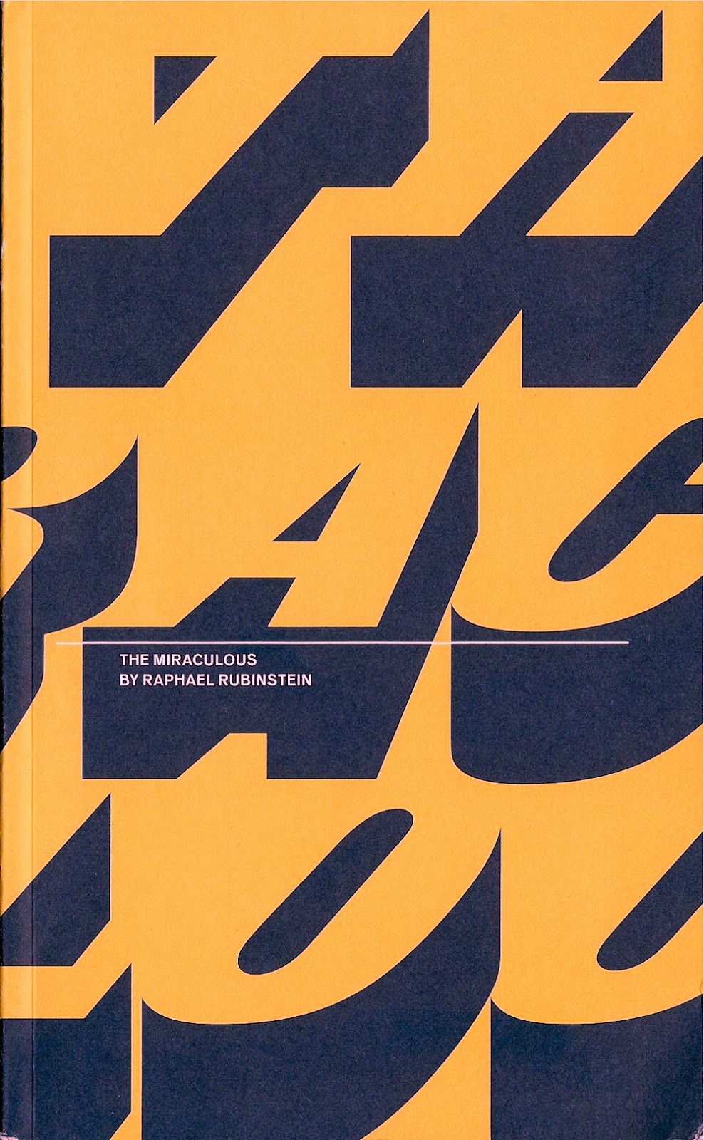
The Miraculous consists of 50 chapters, mostly pretty short, describing the way an artist has come up with a particular artwork--usually a conceptual artwork or a performance. Depending how familiar you are with the world of performance art and conceptual art, you will recognize some of these. And as I read, I noticed that chapter 22 described the bizarre time-passing activity of Percival Bartlebooth, the character from Georges Perec's novel, Life: A User's Manual.That made me smile, because when I read that novel so very long ago, I thought that the fictional Bartlebooth's absurd life-long project was basically an insane work of art. And it was enough that Perec described its execution--it didn't have to actually be done to be real. And that could apply to any number of the pieces or actions described in this book. The fact that they were actually executed is, well, miraculous.

The chapters vary in length, but are usually no more than two pages. Some are quite short, like chapter 37, which reads in its entirety,
In 1979, an artist decides to shake hands with every employee of the New York City Sanitation Department. It takes her eleven months and two days to shake the hands of all 8,500 workers.
You may recognize this as a piece of art done by Mierle Laderman Ukeles, who has been the artist-in-residence at Department of Sanitation since 1977. There is an index in the back that will help you identify the artists because the chapters never mention them by name. The descriptions are fairly deadpan, but because what they are describing is often so strange, they achieve a kind of poetry. By not naming the artist. Rubenstein forces the reader to think about the work described. No written work is completely neutral, but Rubenstein appears to be going for a journalistic "degree zero" style. No overt opinion is offered by the author, but sometimes his enthusiasm leaks through.

Two of the "fictional" works (works created within literary works) are by members of OuLiPo, a French literary group that was famous for writing prose and poems governed by various constraints. That's what Rubenstein seems to have done here--describe the work, it's creation and execution, but never name the artist, never analyze the work, never contextualize it within the world of art. The constraints he has placed on himself in writing this brief book results in a work that describes a universe of conceptual art in a way that no art historical text could achieve. And it does so with unexpected beauty.


Guy and Dolls

$
0
0
Robert Boyd

When I was a kid, I made models and built a town out of Legos. I've always been fascinated by models and dioramas. It's often an art that doesn't quite realize it's an art, as in the case of model railroaders or makers of dioramas or dollhouse builders (interestingly, Robert Gober got his start as a dollhouse builder). I've written about artists working in this realm before--Seth's Dominion and Seth Mittag's We're Still Here, for example. A few years ago, a documentary about Mark Hogancamp, Marwencol,came out. I wrote about it briefly in relation to the work of Charles Ledray, another artist who likes making little models.

Hogancamp was attacked outside a bar in 2000 by five men. The savage beating put him into a coma and even after he came out of it, he remained brain damaged.  Afterwards, as a homemade attempt at therapy (he couldn't afford the professional kind), he started to build a highly realistic World War II-era Belgian town in his back yard, populating it with customized action figures representing himself ("Hoagie"), his family and friends, and his attackers. The town is meant as kind of a respite from the war, where people can find healing and rest. This remarkable creation was "discovered" accidentally by an editor for Esopus magazine, who brought the town and Hogancamp's photos of it to a wider audience.

I was visiting New York and saw that an exhibit of new Hogancamp photos was going to be on display at Pioneer Works. The Women of Marwencol focuses on a side of Marwencol that is a key to its existence--the town is inhabited by women and who rescue and nurture men. On one hand, it's a male fantasy--a town full of sexy ladies who keep you happy and do your laundry and genuinely care about you. On the other hand, Hogancamp seems to be identifying the world of men as a dangerous, violent place and the world of women as a nurturing, healing place.

The new works are strange. There is still plenty of World War II imagery (including female Red Army soldiers), but he seems to have added fantastic elements (Deja Thoris, from Edgar Rice Burroughs' John Carter of Mars books, is referred to). It was lovely to see the prints--he sets them in nature that is wildly out of scale, but somehow feels convincing. He's not just a good model-maker, he's a good photographer as well.


Mark Hogancamp, Hogie With His Camera, 2014, Digital C-print, 13 x 18 inches


Mark Hogancamp, Anna, Hogie's wife, brings him a raincoat after a bloody skirmish, 2014, Digital C-print, 27 x 36 inches


Mark Hogancamp, Hogie's mother Edda relaxing on Mother's Day, 2014, Digital C-print, 13 x 18 inches

Hogancamp gives his alter-ego, Hogie, a family. I love that his mother Edda is an elegant, sexy older woman (older compared to most of the other women in Marwencol). The titles of the pieces, like Anna, Hogie's wife, brings him a raincoat after a bloody skirmish, show that there is a narrative happening. Whether that narrative can really be pieced together from the photos, even with the descriptive titles, I don't know. Of course, part of this narrative was explained in the 2010 documentary. But it seems to have continued developing since then. I hope one day there is a big beautiful book of these photos. If so, I recommend ordering them chronologically according to the narrative and using text to fill in the narrative gaps.


Mark Hogancamp, Untitled, 2008, Digital print, 13 x 17.5 inches

Some of the outfits and hair color show (as in the photo above) that Hogancamp, despite his keen eye for detail, isn't trying to go for any kind of historical accuracy.


Mark Hogancamp, Jacqueline looks at Deja Thoris, 2014, Digital C-print, 27 x 36 inches


Mark Hogancamp, Deja Vu, Belgian Goddess of Youth, whose look turns men to stone, 2014, Digital C-print, 27 x 36 inches

I cannot imagine a better title for any work of art in any medium than Deja Vu, Belgian Goddess of Youth, whose look turns men to stone. 


 Mark Hogancamp, Untitled, 2014, Digital print, 13 x 17.5 inches


Mark Hogancamp, Untitled, 2014, Digital print, 13 x 17.5 inches

There are several photos that come off as erotic, but Hogancamp never poses his dolls in overtly sexual poses. In many a kid's bedroom, Ken or G.I. Joe got it on with Barbie, and the whole premise of Marwencol has an erotic undertone. But perhaps it's Hogancamp's seemingly worshipful yet shy attitude towards women (the name, Marwencol, was created by taking part of his name and parts of the names of two women he had unrequited crushes on) won't let him go that far in his photography.

Mark Hogancamp, Untitled, 2006, Digital print, 13 x 17.5 inches

The images, as in the early one above, can be quite surreal. It's tempting to interpret them in light of Hogancamp's experience, but it's more pleasing to simply bask in the strangeness of the military woman, gripping a pistol in one hand and a teddy bear in the other, cropped so you don't see her face or feet. And the totality of these images is like that. They seem a little off no matter what--a bourgeois artist with an MFA wouldn't make these images which is part of what makes them so compelling. It is enough to know that they are therapeutic; further interpretation is not necessary. Hogancamp created this fantasy to deal with the world that hurt him so badly in the same way that Henry Darger created his fantasies to deal with his troubled world. Hard-nosed types who dismiss fantasy would do well to remember the good it does for damaged people like Mark Hogancamp.

The Women of Marwencol is on view at Pioneer Works until December 12.


Creatives in a Post-Industrial Society

$
0
0
Robert Boyd

I had been at the Asia Society in New York looking at Nam June Paik's robots. My next stop was a place I had never heard of, Pioneer Works Center of Art and Innovation, down in a neighborhood in Brooklyn called Red Hook. I was going to see a show of photos by Mark Hogancamp. I got on the number 4 train on the Upper East Side and took a long ride to downtown Brooklyn. From there, I got on the B61 bus. No subway went anywhere near Red Hook, as far as I could tell. But the bus put me within a few blocks of my destination. It was a long trip--I hoped it would be worth it. It didn't seem like an especially artsy neighborhood at first glance, and I almost walked right past the anonymous red brick building that houses Pioneer Works. The building is on the waterfront, and the area nearby is full of warehouses.


Pioneer Works seen from its courtyard

Pioneer Works seems to try to be everything all at once. Exhibition space? Of course. Residencies? You bet. Classes (ranging from traditional crafts to modern Maker-style classes)? Of course. Residencies for scientists? Why not! A magazine? Yep! A sculpture garden. Actually I'm not sure about the last one--but they had an outdoor space that had sculptures, so maybe so.


Pioneer Works' courtyard/sculpture garden

It's a new space (founded, as far as I can tell, in 2011). The founder and director is a sculptor named Dustin Yellin.Yellin's work reminds me a bit of some work by Paul Kittelson in that he presses two dimensions items between plates of glass to create a 3-dimensional object.

 
Dustin Yellin sculpture

The building was built in 1881. It was a factory for the Pioneer Iron Works, a fabrication company, until the middle of the 20th century. After that it was used for storage.


Pioneer Works interior

Pioneer Works list 19 names with functional positions on its contact page. I don't know if they are all full-time employees or employees at all. Maybe some of them are volunteers. But whatever the case, I suspect that this is a lot fewer people than Pioneer Iron Works employed in its heyday.


Several of Robyn Hasty's photos. She is a member of Pioneer Work's photography program

Art institutions reuse old industrial sites all the time, particularly in the Northeast where a lot of obsolete factory buildings are still standing. The most famous example is the Tate Modern, housed in what had been the Bankside Power Station. In the U.S., two well-known examples are Dia: Beacon, housed in a former Nabisco box printing factory and MassMOCA, which repurposed the former Sprague Electric Company factory.


Adeline De Monseignat, The Eclair Project: The Body, 2013, vintage fur, handblown glass, metal, pillow filler, fabric, nametag, ottoman. This was displayed in the 2nd floor gallery space at Pioneer works.

Not too long ago, the hope of cities was the "creative class," as convincingly theorized in Richard Florida's book, The Rise of the Creative Class. 
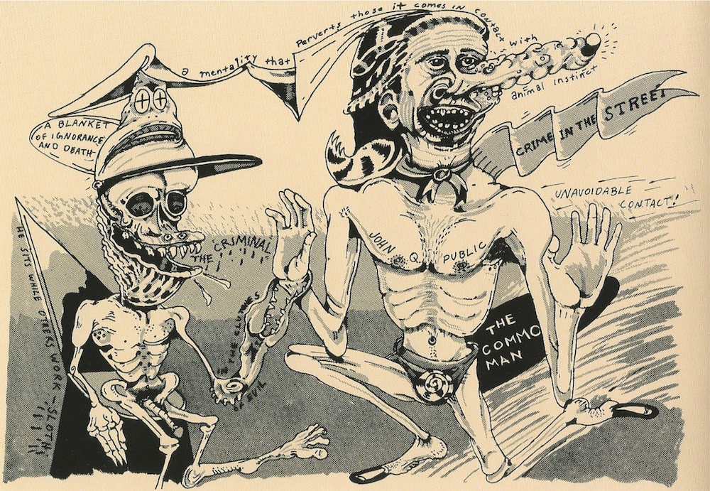
But the bloom is off that rose, as we've seen in the recent recession. Creative people don't get paid much and are as likely to be exploited now as ever. And we'll never need as many creative people as we once needed factory workers. Those guys stamping out boxes for Nilla Wafers in Beacon and fabricating boilers at Pioneer Iron Works were contributing to an economy that brought more people up from poverty than any other ever did (at least, until China's recent economic opening).

 
Michael Joo, Anemone, 2009, Bronze, patina and enamel paint, steel base, 73 x 50 x 34 inches (hat tip to Bernard Klevickas)

Don't get me wrong. I loved Pioneer Works. Their exhibits, their cool magazine Intercourse, their residencies all seem great. It certainly seems like a better use of the facility than the storage space it was just prior to its becoming an art space. But the conversion of defunct factory spaces into art spaces is a powerful metaphor for the conversion of U.S. cities from places where thousands of people made stuff to places where a few hundred creatives toil, typically for low wages.


Brett Swenson, Strewn, 2014, gypsum cement, found objects, 38" x 102". Displayed in the 2nd floor gallery at Pioneer Works.


Brett Swenson, Strewn (detail), 2014, gypsum cement, found objects, 38" x 102"

Some Minicomics. etc.

$
0
0
Robert Boyd

So I was in New York a couple of weeks ago at Comic Arts Brooklyn, a small festival devoted to art comics. I bought a lot of comics there, among them comics I'd class as minicomics. Minicomics used to be a pretty specific term--it referred to comics produced by folding a sheet of 8 1/2" x 11" paper twice until it was 4 1/4" x 5 1/2". You would trim and staple it and then you had a tiny 8-page pamphlet. So it was a very cheap format for someone to publish their own quickie 8-page comics on a xerox machine.

Of course, artists being artists, this was just the starting point. They played with formats, they added silkscreen covers on cardstock, they published each others' work (moving it from the realm of self-published to small press), they used different printing technologies such as print-on-demand, offset litho, risograph, etc. And, of course, they overlapped with the world of 'zines, so the content wasn't always strictly comics.

Given these caveats, here are a few modern minis.


 Sorry I can't come in on monday i'm really sick (2014) by Jane Mai. This mini was published by an established publisher of high-quality comics, Koyama Press. It seems to consist of diary excerpts from the girl on the cover, along with drawings of her sitting around in her panties depressed. Some of the thoughts are suicidal and self-deprecating. Some are funny, though: "i'll show you mine if you show me yours but also if you give me $1000 and also no". It's the bored thoughts of one person on a somewhat bad day. It works perfectly as a minicomic--you wouldn't want it extended much longer than it is, but for what it is, it feels truthful and revealing.


Devil's Slice of Life (2014) by Patrick Crotty. We follow a little devil, Barbatos, as he spends his day playing pranks on humans. This may remind you of many of the activities of the devil in the great Peter Cooke/Dudley Moore movie Bedazzled. In Bedazzled, Peter Cook's Satan character was pranking people to provoke anger, one of the seven deadly sins. In Devil's Slice of Life, Barbatos gets paid for his work. I'd describe it as a cute-brut-style comic--Barbatos (and his victims and fellow devils) are drawn in a deliberately rough style, but it maintains a kind of manga-influenced cuteness. Devil's Slice of Life was printed in three colors on a risograph, which is a popular printing platform for small-press and self-published comics. Crotty is a member of a Dutch artists' studio called Peow Studio. CAB is surprisingly international, which is wonderful.


Lil' Buddies Magazine, issue 1 by Edie Fake. This is a bit of a cheat, because it's not a comic and I didn't get it at CAB. This was by the cash register at Printed Matter, the venerable New York bookstore devoted to artists books, art books, art zines, self-published stuff, etc. Edie Fake is a Chicago cartoonist/performer, but Lil' [sic] Buddies is about found cartoon art--specifically quasi-vernacular anthropomorphized images used in advertising. The examples he and his correspondents have found are excellent.


from Lil' Buddies Magazine, issue 1

These two are not even close to the most insane anthropomorphic cartoon things in Lil' Buddies.


Greys by Olivier Schrauwen (2012). I've reviewed Belgian cartoonist Olivier Schrauwen's work before, so I expected to like this, which I did. The narrative here is much more foregrounded than in his other work that I've seen, but there is a degree of distancing and irony that flickers in and out, making you question what you are reading. Of course I see it as fiction (Schrauwen is relating an alien abduction experience), but the deadpan way of telling the story begs the question of whether Schrauwen is trying to create a convincing tale or if he is playing with the form of abduction stories for ironic purposes? And does it matter?


The spread above depicts the future of humanity as depicted by the aliens. Greys was published by Desert Island Comics, the great Brooklyn art comics store. Check it out the next time you're in Williamsburg.


Wastezoid by David Waterhouse. The loser stoner genre has always seemed very American to me, but the brilliant work of Simon Hanselmann proves that it's an international genre. David Waterhouse, from Brighton, England offers up an amusing English take. Especially fun is "Thorven, Invisible Black Metal Bestfriend," in which an unnamed wastezoid takes relationship advice from an imaginary friend spouting phrases like "Resuscitate my dying breeze into the dreams of tangled living corpses behind sigils made of flesh and trees!!" The drawing is rubbery and fun. It appears to be published by Rad Party.


Blindspot no. 3 by Joseph Remnant (2013). This is another comic published by a comic shop--in this case, Kilgore Books in Denver, Colorado. All the stories here are autobiographical (I think), and Joseph portrays himself as a dyspeptic, depressive individual. The comics are well done, and I can take this kind of story in small doses (33 pages is just about right). The stories are solipsistic--mostly Remnant and his thoughts and reactions to the world. Indeed, the one story where he interacts with friends, "Elevator", turns out to be a dream! But the drawing is beautiful, and Remnant constructs his stories well. I found myself enjoying them a lot despite the somewhat grim and depressing subject matter.


Mothership (2014)  and The In Between (2012, I think) by Esther Pearl Watson.Esther Pearl Watson is an artist who deserves a lot more consideration than a drive-by review of some minicomics. Watson is a painter,a cartoonist and an illustrator. But these two works don't slot easily into any of these categories not least because they are both heavily photographic. Mothership seems to conflate mothers (in general) with flying saucers (apparently, flying saucers have an important part in Watson's personal history, but not how you would think). She collages (I think) fuzzy photos of objects that could be UFOs over fairly generic landscapes, while describing the "soaring sisterhood" of the motherships.


The In Between mixes more straight-forward comics narrative with photos. The "in betweens" are places and situations--for her, it's art school (she went back to school to get a MFA at CalArts in 2010), and for her grandfather, it's  a "healthcare facility". I read this in between place as between his life and his death, but I may have been jumping to an overly bleak conclusion.


Combining paintings, comics and photos, this small color zine seems like a "mini-Gesamtkunstwerk," if such a thing could exist. Art school is on her mind--she compares her grandfather's constrained existence to minimal artwork and artwork dealing with nothingness, blankness and the void. But for herself, the opposite seems true. She is inspired by Robert Rauschenberg's "combines," which really were Gesamtkunstwerks.


You come to realize as you read it that a lot of the paintings and photos you have been seeing are parts of Watson's own combine.


Has she continued to make large scale installations? Or was that just an art school detour, a product of being in an in between place? Both Mothership and The In Between are examples of minicomics that are really on the edge of the category, which has never been well-defined anyway. Their existence makes me feel that the form has continued vitality. She sells them on a site called Funchicken.


Rewriting of Art History, Again

$
0
0
Robert Boyd


Many rock nerds (such as myself) can easily construct an alternate history of rock music, one that foregrounds hitless acts like the Velvet Underground, Love, Big Star and the Ramones, and erases many of the bands you are likely to hear on a classic rock station (AC/DC, Styx, Journey, Dire Straits, etc.). Partly that's because Big Star (for example) is utterly great and Journey (for example) is utterly dreadful. (And if you disagree, well, that's just your opinion, man!) But it's also because we rock nerds tend to excessively value discovering something for ourselves that wasn't easy to find--bands that were never played on the radio, for example. Classic rock, for us, was a metanarrative imposed by a power structure (as described in part by such books as Hit Men--see, we rock nerds are such nerds that were read books about rock music) that seemed arbitrary and unfair. There is a degree of ressentiment here--that can't be denied. But the idea that a metanarrative or a "grand narrative" is an inescapable (and oppressive) system is an idea that has been the source of many alternate histories and systems--including the rock nerds' alternative history of rock.

Dan Nadel's exhibit, What Nerve!: Alternative Figures in American Art, 1960 to the Present
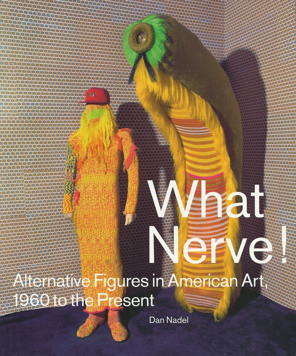
, collecting together art by H.C. Westermann, Jim Nutt, Peter Saul, Ken Price, Mike Kelley, Jim Shaw, Jim Drain, William Copley, Elizabeth Murray, Jack Kirby, Gary Panter and many more, is an equivalent to the rock nerds' challenge to the accepted history of rock. The grand narrative Nadel is challenging is the canonical history of art from the 60s through the 90s. You might think of this history as appropriation and assemblage paralleled by minimalism, post-minimalism transitioning to conceptualism, installation and performance, heavily undergirded by French theory as filtered through Artforum and October. Establishing a counterhistory to that seems like a worthwhile thing to do, right?

Except that in real life, it's really hard to come up with a cohesive history of art during that period. The idea that there actually is a metanarrative to be in opposition to seems suspect, especially in 2014. This is because the period covered in this exhibit was one in which in which Modernism went off the rails and a thousand flowers bloomed. Modernism was a real metanarrative that was slain (or at least crippled) by Post-Modernism, which is to say by the myriad challenges from many directions to its seeming hegemony. Art history was reclaimed and reframed as women, members of racial minorities, formerly colonized people, and LGBT people asked why art history and Modernism in particular seemed so white, so European/North American and so male? Specifically they were asking if the ideological underpinnings of Modernism, which hitherto had seemed so neutral and formal, masked hidden sexist and racist tendencies.

Compared to issues like those, the ones addressed by Nadel's exhibit seem far less consequential. And I hate the defensive title, What Nerve! The desire to showcase the work of overlooked or undervalued artists is a laudable one, but this title suggests that there was an elite NYC cabal looking down their noses at these provincial artists, saying "How dare they do this?" and holding them back. When an exhibit includes work by Mike Kelly, Elizabeth Murray, Ken Price and Peter Saul, this is a questionable premise.


Jim Falconer, Morbid Sunshine by a Miner Artist, 1966, oil on canvas, 78 x 78 1/4. Falconer was a member of the Hairy Who.

Nadel in his introduction writes, "With the recognition of modernism as the dominant art mode and the critical emphasis on theory, artists who were unable or unwilling to adopt to crisp rationales found themselves at loose ends." I think this can be reasonably said in regard to, say, the Hairy Who, a group of Chicago artists whose manic figurative work is a major part of the show, but is it true of Forcefield, the late 90s collective of RISD art students? They may have been rebellious, but not against Modernism, which was a corpse by the time they became active.


Forcefield (Jim Drain, Mat Brinkman, Ara Peterson and Leif Goldberg), various costumes and objects, 200-2002

Judith Tannenbaum, in her essay for the catalog "Outside the Looking Glass," writes more directly: "By bringing [the artists in What Nerve!] together, we hope to right this wrong, and to flesh out a history of representational art that has largely been submerged by the canon of Minimal and Conceptual art to which it runs parallel in the second half of the twentieth century." One can certainly say that these artists haven't been given their due (although with Mike Kelley and Elizabeth Murray, that is patently untrue), and that alone is a good reason to put them in an exhibit. And to say that they represent a certain tendency running through the past few decades is reasonable. But to posit an alternative art history that exists against the accepted narrative is an over-reach. For one thing, it ignores many figurative artists who were very successful, respected, etc., from the 60s forward. For example, Red Grooms, Alex Katz, Larry Rivers, Alice Neel, Richard Lindner, Mel Ramos, John Wesley, Tom Wesselmann, James Rosenquist, Wayne Theibaud, Phillip Guston, Neil Jenney, Malcolm Morley, Ida Applebroog, Jean-Michell Basquiat, Eric Fischl, Leon Golub, David Salle, Julian Schnabel, Robert Colescott, Jacob Lawrence, Kerry James Marshall, Raymond Pettibon and Kiki Smith. Tannenbaum at least makes a nod to them--and to the general pluralism of art starting in the 60s (undermining her own argument about the "canon"). (Ironically, when I saw What Nerve! at RISD, there was a small but choice exhibit called She: Picturing women at the turn of the 21st century up at Brown University's David Winton Bell Gallery, featuring figurative art by Glenn Brown, George Condo, John Currin, Yayoi Kusama, Chris Ofili, Jenny Saville, Lisa Yuskavage and others.)


Jack Kirby, Tribes Trilogy 3, 1976, ink and Dr. Martin's dyes on board, 15 x 20 inches

So if forming a counternarrative to canonical art history isn't a reasonable organizing principle for this show, what is? The work in it appears to have a family relationship, after all. The obvious connection is a kind of cartoon figuration. This is a little more specific than figuration generally. There are elements of caricature in much of the work. There is a good deal of humor. There are direct references to comic strips, comic books, magazine cartoons and animated cartoons. And many of the included artists--Mat Brinkman (of Forcefield), Gary Panter and of course, Jack Kirby--have significant bodies of comics art under their belts. Kirby, of course, is known primarily as a comics artist--Nadel includes in this show nearly all of his "wall art." I wish they had made this--cartoon figuration--the explicit theme of the show. It would have been a smaller statement than the counternarrative to art history idea, but one much more defensible and, to me, more interesting.

The other organizing principal could be "the obsessions of Dan Nadel." Nadel is an editor, publisher and curator. I first became aware of him in 2000 or so when I saw the first issue of his beautiful squarebound journal The Ganzfeld. The Ganzfeld dealt with comics in a new way. It looked at the intersection of comics and art. And within its pages were articles and features on many of the people in this exhibit--Peter Saul, the Hairy Who, Gary Panter, members of Forcefield and maybe some I'm missing. Nadel spun this magazine into a publishing concern, PictureBox (2000 to 2014), which published many art catalogs and comics featuring the artists in this show, including Return of the Repressed: Destroy All Monsters 1973-1977 and Gary Panter, a massive two volume retrospective in book form. As a curator, he has put together shows by Jack Kirby and Hairy Who member Karl Wirsum. And he edited two books of overlooked and underappreciated comics--a counternarrative to the accepted history of comics, if you will-- called Art in Time and Art Out of Time: Unknown Comics Visionaries, 1900-1969. What Nerve! brings together a lot of artists who have long been objects of fascination for Nadel as well as the idea of an alternate to the canon.

Whether you see this show as dealing with cartoon figuration or if you see it as a gathering of several of Nadel's artistic obsessions, the stated thesis in the catalog doesn't really hold water. Does the mean this is a bad exhibit? No, it just means that you should take its claims, and some of the claims made for it (for instance in the review "Here Is Your Nasty, Glorious, Freewheeling Alternative History Of American Art" by Priscilla Frank), with a grain of salt. Concentrate instead on the art itself. And to be fair, the big claims are only a small part of the scholarship in the catalog--mostly the essays deal with the specific artists and collectives and their work. They are, for the most part, informative, useful and entertaining.


Peter Saul, Dogpatch, 1961, crayon and collage on paper

It was pure pleasure to see early work by Peter Saul. Dogpatch is quite early, before his style tightened up. You can see some expressionist brushstrokes, which would mostly disappear from his painting later. It reminds me a bit of Richard Diebenkorn and Larry Rivers.

 
Peter Saul, Man in Electric Chair, 1966, styrofoam coated with plastic and enamel, 55 x 24 x 42 inches.

Saul's large sculpture, Man in Electric Chair is like a living underground comix image, but the textures and patterns in the paint feel ahead of their time. This is the kind of artwork I think of when I use the phrase "cartoon figuration." Whether Saul was consciously influenced by cartoons or comics, it's impossible to see Man in Electric Chair without thinking about them.


Kenneth Price, Red, 1961, ceramic, paint, wood, 14 7/8 x 17 x 16 3/16

Saul was lumped in with several other artists, including Kenneth Price, in a group called the Funk artists. Unlike the Hairy Who, Destroy All Monsters and Forcefield, these artists didn't call themselves Funk artists. It was the coinage of curator Peter Selz who showed a group of Bay Area artists in a show of the same name at the UC Berkeley museum in 1967. The catalog essay by Nicole Rudick relates the amusing history of the term, including the rejection of it by many of the artists to whom Selz applied it.

But is easy to see a visual relationship between the works. Even though Kenneth Price was never a figurative artist (which begs the question of why he's in the show except one never needs an excuse to include Kenneth Price in an art show), his curvy, colorful ceramics have a cartoony presence that relates them to other "funk" artists like Robert Hudson and Peter Saul.


Robert Arneson, Typewriter, 1965, earthenware with glaze, paint, 6 1/8 x 11 3/8 x 12 1/2 inches

One of the great things about seeing What Nerve! is that I got to see many works I had only seen in photos before, like Typewriter by Robert Arneson. At a time when his peers (including Ken Price) were making work that was sleek and minimal, Arneson was mining a deliberately grungy aesthetic. In a way, he is close stylistically to assemblagists like Wallace Berman, George Herms and Ed Kienholz despite his use of ceramics.

 
Jim Nutt, Now! Hairy Who Makes You Smell Good poster, 1968, offset lithograph, 21 1/4 x 16 5/8 inches

The Hairy Who were more self-directed and self-defined. Jim Nutt, Gladys Nilsson, Suellen Rocca, Jim Falconer and Art Green had been classmates at the School of the Art Institute of Chicago. They proposed a show to Don Baum, director of the Hyde Park Art Center, and he suggested that they add Karl Wirsum to the line up because Wirsum's work seemed similar to what they were doing. It turned out to be a perfect fit--the six artists worked closely together and forged a collective identity for a few years. Not that the work was collective--for the most part, they did solo work. But some aspects were collaborative--the comic-book-style catalogs they produced and the design of the shows.

 
Jim Nutt, Wow, 1968, acrylic on plexiglass, 30 x 25 inches

I have a special affection for the Hairy Who. When I was an undergrad in the early 80s taking an "art since the 1940s" art history class, the professor showed a single slide of Jim Nutt's work one day as representative of what was happening in Chicago. (I think he may have also showed Roger Brown and Ed Paschke.) It immediately grabbed me, and I wrote my paper for the class on the group, scrounging up information from old art magazines. In the early 80s when I wrote that paper they were still underrated, but since that time they have been rediscovered and reevaluated. Nutt always had success as a painter, but recently we've seen major gallery exhibits in New York for Karl Wirsum and Gladys Nilsson, as well as museum shows. Still it's nice to see some of the art from the original group of shows gathered together, as well as the ephemera (posters, comics) that accompanied the original Hairy Who exhibits.

 
Karl Wirsum, Baseball Girl, 1964, acrylic on canvas, 39 x 31 inches

When I wrote that paper back in the early 80s, I fell in love with the above image (reproduced quite small in the glossy pages of a mid-sixties art magazine) by Karl Wirsum. Unlike his later work, in which human figures become quite monstrous, Baseball Girl is an appealing and erotic image.


Karl Wirsum, Gilateen, 1968, oil on canvas, 24 1/2 x 21 1/2 inches

More typical of where Wirsum's art would go is Gilateen from 1968. The way Wirsum outlines flat areas of color may remind viewers of comic books, but the images themselves seem completely original. They have more the idea of a cartoon rather than a specific reference to a comics or cartoon image. And they anticipate what cartoonists from the 80s to the present would be doing. Wirsum was an artist who fell through the cracks for a while before being rediscovered, but it's easy to see why his work was dismissed (wrongly, I might add!). It seemed wacky and low brow and adolescent and just not serious. I think the lack of apparent seriousness was what kept many of these artists from getting their due. Maybe 60s and 70s-era critics like Michael Fried or Rosalind Krauss have exceptional senses of humor in private, but their public critical posture was dead serious. But as we've seen (and will continue to see), much of the art in What Nerve! was meant to be funny. And "funny" was hard for certain important critics to process.


Art Green, Double Exposure, 1969, oil on canvas, 36 x 24 inches.

In retrospect, much of the work of the Hairy Who appears dated. There is something inherently "60s" about Art Green's work, particularly paintings like Double Exposure. But the psychedelic colors and juxtapositions shouldn't prevent us from enjoying it today any more than they do with work by, say, James Rosenquist, whose work Green reminds me of.


Gladys Nilsson, Phantom Plus, 1966, watercolor on paper, 21 5/8 x 14 1/2.

Gladys Nilsson's soft forms remind me of any number of somewhat psychedelic 60s-era cartoons, ranging from Tom Wilson's Ziggy or the Heinz Edelmann-designed movie, Yellow Submarine. Her choice of watercolor is unusual for its time and lends her work a somewhat whimsical air. (Her more recent work, some of which is on view through December 6 at Garth Greenan Gallery in New York, has more sharp edges.)


H.C. Westermann, See America First plate 8, 1968, 18 lithographs, 21 3/4 x 30 inches each.

The Hairy Who were from Chicago, which had a long tradition of figuration while New York artists and critics championed abstraction. New York tastemakers seemed disdainful of the Second City's art scene; Chicago said "so what?" and went its own way. What appeals to me about this local history is that there is a continuity--older artists influenced and taught younger artists. I think this kind of lineage can be found in any sufficiently large and robust local scene. What Nerve! featured not only the Hairy Who, but three other artists with roots in the Chicago scene, including H.C. Westermann (above). Westermann is best known for his three-dimensional works, but See America First, a cheeky series of satirical lithographs, is quite nice. It shows Westermann, a blue-collar war veteran, approaching the somewhat more genteel territory of Saul Steinberg.


Christina Ramberg, Probed Cinch, 1971, acrylic on masonite in painted artist's frame, 13 x 13 inches.

Christina Ramberg was one artist in the show with whom I was almost completely unfamiliar. The name was familiar--it is often mentioned when people write of Chicago artists of the 60s and 70s (along with Philip Hanson and Roger Brown). Like Hanson and Brown, it has an appealing combination of precision and mystery. In the three paintings included in the show, we see these women's bodies in somewhat old-fashioned lingerie but no faces (facelessness was also a feature of most of Brown's paintings). The viewer is pushed right up close to these bodies.


Elizabeth Murray, Truth, Justice and the Comics #1, 1990, oil on canvas on wood, 50 x 53 x 4 inches.

Elizabeth Murray was born in Chicago and studied at the School of the Art Institute in the late fifties and early sixties. She seems to have picked up some of that town's attitude toward figuration and humor. She spent most of her career in New York, and that fact might account for her relative success compared to many of the Chicago artists. She got lumped in with the neo-expressionists in the late 70s and 80s, which was apt. But she avoided most of those painters' bombast and pretension. One thing she is well known for are her elaborate shaped canvases, such as Truth, Justice and the Comics #1 above. Her work always has a slightly grungy, hand-made physicality. Her work, like Phillip Guston's, embodied a kind of expressionist approach to cartoon figuration. It recalled in its way the old comics of the 20s and 30s like Barney Google and the Bungle Family--comics that, to paraphrase Robert Crumb, smelled of boiled cabbage. Her own tough Chicago childhood (which included periods of homelessness) might have fed into that, but her work never feels morose. In any case, she doesn't qualify as overlooked artist like Christina Ramberg might--I just saw an enormous Elizabeth Murray hanging over the ticket table on the ground floor of MOMA two weeks ago.


Cary Loren, Jim Shaw as a Spaceman, God's Oasis, 1975/2011, photograph, 24 x 20 inches.

Destroy All Monsters was a band/commune in Ann Arbor in the mid-70s. It consisted of four members, Cary Loren, Niagara, Jim Shaw and Mike Kelley.  Kelley and Shaw left to study and CalArts and became very well-known contemporary artists. Indeed, Kelley is considered one of the key artists of his age.

The four of them did a lot of art while they lived together but perhaps more important is that they embodied their art in the way they lived. Their house, God's Oasis, was mostly a reflection of Jim Shaw's scuzzy collection of the lowest-brow pop culture possible.


Mike Kelley (foreground) and Jim Shaw in Shaw's bedroom at God's Oasis.

I was amused to come across the photo of Kelley in Shaw's bedroom standing by Shaw's comic spinner rack. You can see a copy of Katy Keene, a comic that featured paper dolls for its titular model protagonist, in the bottom left. The one time I met Mike Kelley was during the 90s at San Diego Comic-Con. He had just come from the auction, clutching his prize and grinning with pleasure. I asked him what he got, and he pulled out an original Bill Woggon Katy Keene paper doll page. In other words, the things that obsessed them as undergraduate weirdos continued to be an important part of their work as mature artists. For Kelley, it was abjection, as seen in his quasi-sexual installations and performances using well-used stuffed animals. It was also almost worshipful depictions of Kandor, the bottled city from Krypton in old Superman comics. For Shaw, it was his endless explorations of adolescence and cults. It all started here.


Mike Kelley, Political Cartoon (In the Clutches of Evil), 1976/2011, pigment print on paper, 32 x 45 3/4 inches

But that doesn't mean that the work done by these four artists in God's Oasis was all that good. Kelley's underground comix-influenced Political Cartoon, for example, looks like the work of an ambitious, snarky college student, but doesn't compare in power with Kelley's mature work.


Niagara, The Key, 1974, watercolor on paper, 17 x 14 inches.

The same is true of Niagara's drawings and watercolors, which was among the least interesting art in the show. The life they lead at God's Oasis and in the "band" Destroy All Monsters (which at the time existed to deliberately annoy its listener/victims by making godawful noise) was the real art--art as life. What we have left in this exhibit are relics of that life, but they are far less interesting than the personal accounts in the catalog by Cary Loren and Niagara. (After Kelley and Shaw headed west, Destroy All Monsters became more of a "real" rock band.)


Forcefield, Slice Print, 2001, silkscreen print

Forcefield was similar to Destroy All Monsters in that it was a collective, a band, and a group of people whose life was as much a work of art as was their music, graphic art and costumes. But compared to Destroy All Monsters, the relics of Forcefield's existence are much more interesting. Forcefield consisted of four members, Jim Drain, Ara Peterson, Mat Brinkman and Lief Goldberg. Drain, Brinkman and Goldberg lived with several other artists in Providence, Rhode Island, in a warehouse structure they called Fort Thunder. Fort Thunder was packed with stuff--even the high ceiling was hung with random garbage. The walls were all made of slapped-together plywood, and every inch was covered with drawings, graffiti, stickers and glued-objects. The artists who lived there had bands (in addition to Forcefield there was Lightning Bolt), put on shows for other bands, made costumes, had a silk-screen studio (Fort Thunder silkscreens are highly prized), produced comics, etc.

Nadel could have chosen any aspect of Fort Thunder to include in this show, but chose Forcefield, which was perhaps the most focused part of the sprawling activities associated with Fort Thunder. But what is ironic is that he includes this band/performance group in a show devoted to figurative art. Outside of their Forcefield work, Leif Goldberg and Mat Brinkman have done tons of figurative work in drawings, comics and animation. Drain and Peterson's non Forcefield work has been mostly abstract and installation-based. The only aspect of Forcefield that could be considered figurative (and this stretches the term) are the knit costumes they made.

 
Forcefield (Jim Drain, Mat Brinkman, Ara Peterson and Leif Goldberg), various costumes and objects, 200-2002

But even if calling them "figurative" stretches the definition of the word, so what? They're amazing. Initially the costumes were pieced together out of old afghans found in local thrift stores, but when Jim Drain joined, he started knitting them from scratch. (Knitting has remained a part of Drain's artistic practice.) The patterns and the way they cover the wearer's face give them an alien, slightly threatening appearance, but the fact that they're knit makes them simultaneously seem cozy and inviting. 


Jack Kirby, Dream Machine, 1970-1975, ink and watercolor on board, 18 x 52 inches.

In 2003, the Contemporary Arts Museum in Houston mounted a show called Splat Boom Pow! The Influence of Cartoons in Contemporary Art. It was notable in that among 34 artists included in the show (which included Elizabeth Murray and Peter Saul), only one had actually produced comics. Thankfully, What Nerve! avoids this. Perhaps Nadel's most radical curatorial move is to include several works by Jack Kirby. Kirby wasn't a fine artist who dabbled with comics on the side. He was a lifelong comics practitioner who did a small number of stand-alone painted artworks. Nadel collects almost all of them. They each reflect Kirby's unique techno-psychedelia that characterizes some of his finest comic book work.


Jack Kirby, Dream Machine detail, 1970-1975, ink and watercolor on board, 18 x 52 inches.
 
This is the key to the exhibit in my view--the idea of cartoon figuration and its possibilities. Unlike much Pop Art which was holding a kind of mirror to pop culture (and comics and cartoons were a part of that), these artists were attempting to work within that vocabulary--and were willing to show that that vocabulary permits a wide variety of expression. Jack Kirby, working for hire in what was widely considered one of the cheapest, most low-brow forms of pop culture, came up with a highly personal form of expression.

It's not about "influence" (as in Splat Bang Pow!) or appropriation--it's ultimately about expression. That's what connects all the artists in What Nerve!, whether they practiced any sort of cartoon figuration or not. And despite the somewhat overblown claims made for the art here, the work here adds up to something greater than the sum of its parts. It's an interesting, unexpected show.

What Nerve! runs at the RISD through January 4, 2015.


Gary Panter, Austin Corbin from the series The Near Extinction and Salvation of the American Buffalo, 1981, acrylic on paper, 22 x 30 inches.


Jim Drain, untitled (bench), 2010, powder coated stainless steel and aluminum. These weren't part of the exhibit--they were right outside the gallery. 


William Copley, The Seven Year Itch, 1973, acrylic on linen, 58 x 45 inches.

In Review: Urban Theater: New York Art in the 1980s, at the Modern, Fort Worth

$
0
0
Paul Mullan


Barbara Kruger, Untitled (I shop therefore I am), 1987, Photographic silkscreen on vinyl 111 5/8 x 113 1/4 x 2 1/2 inches

The artists included in Urban Theater: New York Art in the 1980s were major figures during the decade itself. Moreover, with a few exceptions, selections are arranged in the galleries according to then-predominant critical categories. For example, works by Cindy Sherman, Richard Prince, and Robert Longo are in one room, exemplifying the “Pictures Generation” strategy of appropriating popular culture images. In this sense, the exhibition, at the Modern Art Museum of Fort Worth and organized by the Modern’s Chief Curator Michael Auping, eschews revisionism.


Robert Longo, Untitled, 1981, Charcoal and graphite on paper, 96 x 60 inches

Relegated to the rear gallery are the most explicit politics. Numerous posters by the Guerrilla Girls critique the under-representation of women in the institutional artworld. Extra-artworld politics are exemplified by vitrine displays of material artifacts from ACT UP, the AIDS Coalition to Unleash Power. Mass movements around AIDS and feminism, and around queer communities and government censorship as well, were only one emphasis of the era’s art. Nonetheless, that art as a whole, and the sometimes vitriolic arguments around it, is better understood by way of the larger, political context.

Among the decade’s theoretical disputes, Benjamin Buchloh, Craig Owens, Douglas Crimp, and others challenged either painting’s contemporary tendencies – e.g. neo-expressionism – or the medium tout court. An ideology critique of art’s role in burgeoning political reaction, especially in western Europe, was fundamental in those debates; however hazily, the question of art’s positive valence for future progressive political upsurges was, as well. (That some of those claims no longer apply, given shifting historical conditions, is obvious.) Oil-on-canvas was regarded skeptically.


Julian Schnabel, The Jute Grower, 1980, Oil, plates, and Bondo on wood, 90 x 120 inches

In Julian Schnabel’s huge “plate” painting The Jute Grower (1980), crockery projects boldly from the picture plane, and the board’s diagonal sides, into the exhibition space. Some pieces are almost whole; some semi-circular, remaining identifiably part of a shattered dinner plate, saucer, teacup, or bowl; and some random shards. Most visual characteristics other than shape, such as decorative patterns, are obliterated by naturalistic midnight-blue slathered on each piece. The boards are only partially filled with dinnerware; there are “empty” areas of craggy white, metaphorizing earth or vegetation. The surface barely holds the roughly modeled image of a man and (presumably) jute stalks, readable from only a medium distance or further back. This painting is more object-like – and less the flat picture screen so crucial for artists elsewhere in the show.

Surfaces through which images have to “fight” are even more variegated in other Schnabels. Dinnerware can saturate an entire board, intensifying the abex, all-over effect. Ornamented crockery – unbroken and unpainted – can demand to be read as such. Palettes can be diverse and multichromatic. Even real tree branches or antlers can be included. The broader works’ heterogeneous materiality is attenuated in The Jute Grower.

This base materiality is surely related to earlier, lauded 1970s post-minimalism, with which neo-expressionism supposedly ruptured. Nonetheless, longstanding critical neglect of Schnabel’s painting is only now being overcome.


David Salle, Clean Glasses, 1985, Acrylic and oil on two canvas panels, 105 x 100 inches

In a work, David Salle frequently juxtaposed highly divergent styles: photographic reproductions; industrially produced, decorative fabrics and other found objects; hard-edged geometric abstraction; and imagistic representations. Clean Glasses (1985) attenuates that divergence, with its consistently imagistic idiom and thin, sketchy application of paint.

Classic dichotomies in painting are visually articulated. The top panel’s recessive, artificial reds versus the bottom panel’s more-dominant earthtones refer to modernist contention around surface and depth. The former’s cool, photographic source versus the latter’s expressionistic handling gestures toward further modernist debates around artistic creativity’s source.

These formal dichotomies are, problematically, recoded in terms of a traditional masculine / feminine duality. This arises from pornographic conventions such as the headless woman, rendered in soft-focus, red grisaille (Salle had worked for Stag magazine). Shadows cast between the woman’s legs, spread and centered before the viewer, indicate a sexualization of spatial concepts of “depth”, as figuratively a woman’s body to be penetrated. “Depth” is further gendered as a domestic interior – paradigmatically feminized in patriarchal society – vis-à-vis the residential building’s exterior and laundry hanging from the balcony. The impression of “domesticity” is strictly derived from these latter sign-relations, as the cloud of red in the top panel does not actually resolve into a room or rear wall.

The active subject to which all of this is counterposed is implied by the wall’s agitated brushstrokes, moving in all directions, and the perfunctory modeling, particularly of the left window and exposed bricks at right. In arguments around abstract expressionism, such subjects had been paradigmatically masculinized.

Hal Foster wrote of a concurrent work: Salle’s “Brother Animal (1983) is … a formulaic display of dead, dispersed images with charge enough only to damp out any connection or criticality”; “[t]his is fragmentation at its most entropic, most cool” (Recodings 1985, 134). This was a not-uncommon response to the artist’s “postmodern” stylistic diversity – and its rupture with a self-critical, self-referential trajectory a la Clement Greenberg. Conversely, feminist Mira Schor blasted Salle, dismissing notions that such heterogeneity evacuated meaning itself. That meaning was identified as precisely the works’ noxious, anti-woman approach and its inextricable entanglement with his critical perspective on painting’s history.

Graffiti artists in the show include Coleen Fitzgibbon and Robin Winters, both part of the important 1980 Times Square Show, as well as Jean-Michael Basquiat, Kenny Scharf, and Keith Haring. The latter was an effective communicator and wanted mass audiences for his images. Haring’s ubiquitous work appeared in mass media outlets like MTV and was sold at his Pop Shop retail stores. This populist vibe and commercial stench led to – once again – critical neglect in the US.


Keith Haring, Untitled, 1982, Sumi ink on paper, 107 x 160 inches

Haring created widely distributed designs for political movements: against the white-supremacist apartheid regime in South Africa; around the AIDS crisis; and against nuclear weapons. Outside those hopeful movement contexts, his large-scale drawings in Urban Theater have ominous undertones. Untitled (1982) depicts a seven-headed hydra before which multiple figures are fleeing. A central figure holds another aloft; as indicated by short lines emanating from the prostate body, and similar to Haring’s famed Radiant Baby, the latter is “glowing”. (Is this a sacrifice, or a rescue?) The hydra heads spew fire or smoke – suggested by wispy lines analogous to vertical, abex-styled ink-drips elsewhere on the paper, and unlike the artist’s usual thicker, homogeneous line. The creature’s outline is full of Xs or crosses, signaling its surface and hinting at the Christian fundamentalist base of the Republican Reagan administration – which, not coincidentally, supported the apartheid regime, aggressively deployed nuclear missiles throughout western Europe, and turned AIDS into a global crisis through its criminal neglect.


Peter Halley, Glowing and Burnt-Out Cells with Conduit, 1982, Acrylic, Day-Glo acrylic, and Roll-a-Tex on canvas, 64 x 96 inches

Well-known essays by critically valorized Peter Halley stressed how geometric abstraction – specifically the grid – reflected the rigid, repeatable, serial order of modern life: from suburban developments to office cubicle to shopping malls. That is materialized in his Glowing and Burnt-Out Cells with Conduit (1982), with its square, red and black “cells” of roughly textured Roll-a-Tex, similar to standardized treatments for walls and ceilings in cookie-cutter housing. This, again, departed from postwar, western modernist perspectives in which medium specificity, opticality, or geometry’s “transcendental” nature was key. Such perspectives rejected using geometry as linguistic signs, whether critical or not of everyday life and its alienations. Abstraction-as-sign is, of course, integral to appropriation-based postmodernism elsewhere at the Modern.


Philip Taaffe, Brest, 1985, Linoprint collage on paper mounted on canvas, 78 1/4 x 78 1/2 inches

The artworld umbrella of “simulationism” encompassed Halley, Philip Taaffe, and Ross Bleckner. The latter’s Sanctuary (1989) addressed the then-raging AIDS crisis, which was killing tens of thousands every year in the US, with no end in sight. As if the imagined walls and ceiling had been perforated, a darkened interior is punctuated with hundreds of shimmering “lights” – that are, indeed, negative space on the canvas, exposed areas of golden-bronze underpainting. As with Halley, conventions of geometric abstraction and the grid are connoted. The “lights” are positioned in rows at regular intervals; rows are almost horizontal, as in minimalism, towards the bottom; and higher, rows’ upwards curvature increases with mathematical uniformity. Contours of what appears to be a domed vault, its top centered, are traced; the brightness increases, by way of strengthening hues in the underpainting, towards the dome’s center. As with Halley, all of this points outwards to the social, each equivalent light signifying a loss from mass death.


Ross Bleckner, Sanctuary, 1989, Oil on canvas, 84 x 60 inches

The painterly medium of Sanctuary was “conservative”; its status as a unique object, proper for galleries or museums; and its tone reflective rather than militant. This was quite unlike the politicized practice of other artists who engaged with AIDS activism and, out of urgency and necessity, prioritized photography, prints, and similar mass-reproducible media. New anti-retroviral therapies for HIV began dramatically reducing mortality rates in the late 1990s, and Bleckner’s poetic work of mourning seems more apropos today.


Barbara Kruger, Untitled (Your body is a battleground), 1989

Distant from painting, Barbara Kruger’s vibrant polemics were routinely adopted by progressive publishers and journals; public awareness campaigns around issues like domestic violence against women; and political events. Untitled (Your body is a battleground) was used on posters for the 1989 March for Women’s Lives, focused on abortion rights, in Washington, DC.

However, Kruger is solely represented in Fort Worth by Untitled (I shop therefore I am) (1987). Proportions suggest near-square aspect ratios of analog, tube televisions, although the sheer size suggests an advertising board. The hand presents a business card shape on which the text is printed, reinforcing that it’s all about commerce. This riff on Descartes is a (now) banal ideology critique of the construction of identity through consumerism and commodification, a critique imagining passive, mass audiences apt to wander a shopping mall. Kruger’s genuinely political graphics closely target audiences more conscious and engaged, on the ground, precisely by identities and their material foundations.

In limited selections from Cindy Sherman’s Untitled Film Series featured at the Modern, she performs women’s roles associated with Hollywood movies of the 1950s and early 1960s – such as the femme fatale and damsel-in-distress. Denotative elements include period design, such as hats, hairstyles, and early-modern skyscrapers.


Cindy Sherman, Untitled Film Still #55, 1980, Gelatin silver print, 30 x 40 inches

Readings of Sherman over the years have proposed that the series takes a critical perspective on performativity: of femininity; of other gender positions, such as masculinity (a widely unacknowledged presence within some of these works); or of gender itself. This occurs via the multiple roles’ random, non-narrative appearance throughout the series; and via the photographs’ ostentatious theatricality – as in the artists’ brightly lit face, set against a dark backdrop, in Untitled Film Still #55 (1980). As well, the black-and-white photographs evoke an era before color cinema; and the calculated treatment of Untitled Film Still #5 (1977) creates an effect of grainy, low-resolution film stock. The material medium’s latter two properties can formally connote the 1950s and thus – when Sherman made these works – the roles’ sense of historical artifact and changeability.


Cindy Sherman, Untitled Film Still #5, 1977, Gelatin silver print, 30 x 40 inches

Feminist movements, a product of the 1960s’ upheavals, were in the 1980s still expanding their influence in broader culture, gaining political and legal victories, and maintaining optimism about the future. Reactionary politics around women and gender could be understood as substantively in the past, the 1950s. That is no longer the case, of course, with a roaring right-wing offensive underway against abortion rights, contraception, and women’s gains generally.

Gender is thus posited as de-essentialized, a social construct. These readings were influenced by disputes within radical feminism, in which “woman” was allegedly determined by natural, biological characteristics: for example, the ability to birth children. The current, relative weakness of the women’s, and other social, movements – and the relentless commodification and consumerism addressed in Kruger’s Untitled (I shop therefore I am) – means these readings and Sherman’s canonical series now lack that critical energy. The multiplicity of social roles no longer signal “performativity” or “gender” as such, but rather the individual, empirical positions themselves – more straightforwardly assimilable to the shopping mall.

The decade’s art, particularly painting, could be exuberant. This is a minimal aspect of the exhibition, though, Scharf’s work aside. The weight, across different media, is unmistakably on the linguistic and conceptual, enabling visitors to better grasp the burning questions of that time.

“Urban Theater: New York Art in the 1980s” is on view at the Modern Art Museum of Fort Worth until January 4, 2015.

The Pan Review of Books: 33 Artists in 3 Acts

$
0
0
Robert Boyd


Sarah Thornton's Seven Days in the Art World 
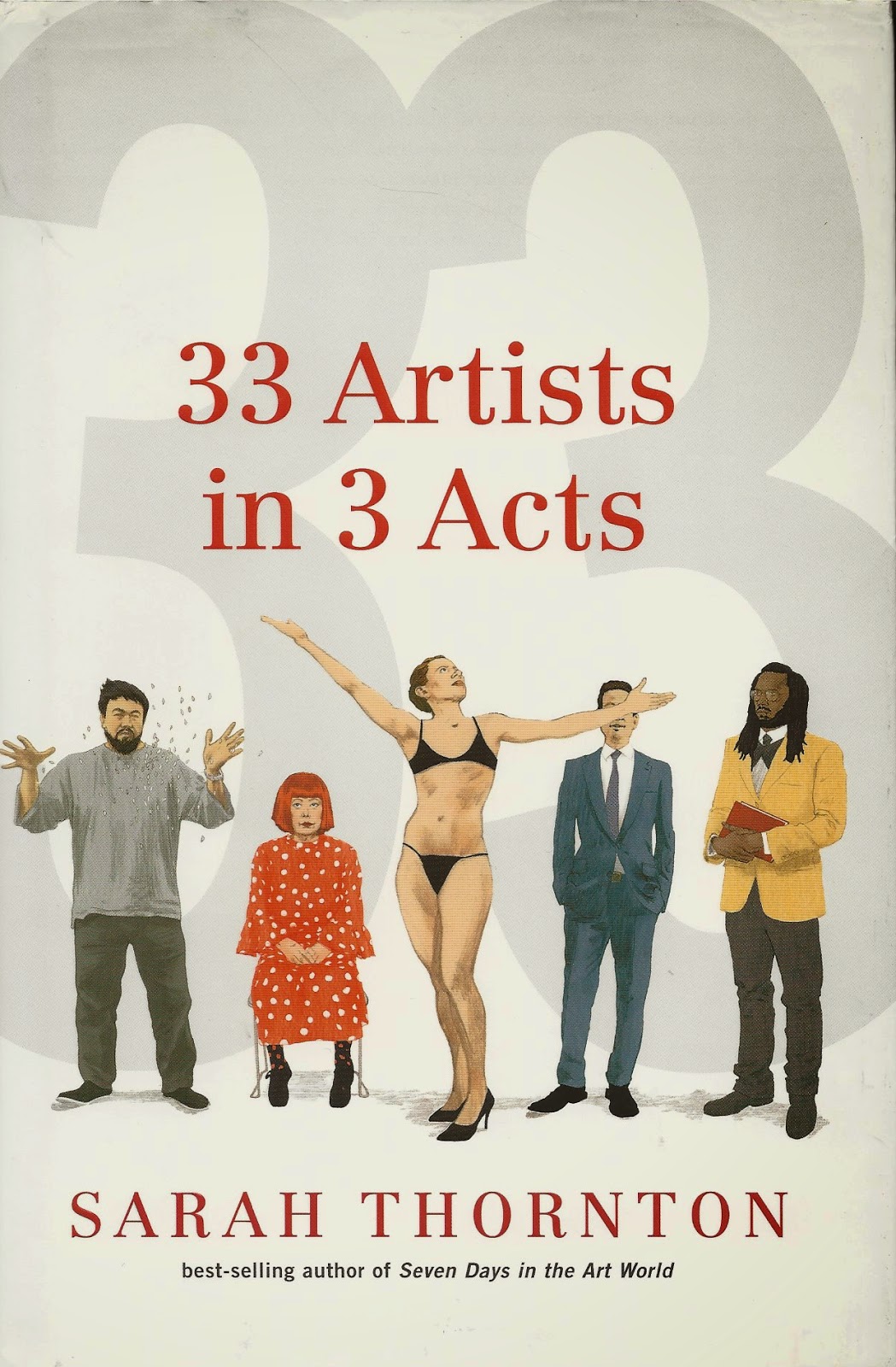
was published in 2008. It was a success for two reasons, I think. One, it treated the art world as its subject rather than particular artists or exhibits. Of course she wasn't the first to do this. Art Worlds (1982) by Howard Becker looked at the art world in a broader sense than Thornton did, and in pain-staking detail. Gary Alan Fine examined the world of outsider art in Everyday Genius: Self-Taught Art and the Culture of Authenticity (2004). All three writers are sociologists, which makes their interest in art more than just an interest in aesthetics--they want to know about the range of activities and people involved in this space.

But Thornton wasn't writing an academic text. What she also brought to it was a sharp-witted, first-person journalistic writing style. She is a good writer. I admit that's a highly subjective judgment, but what I mean is that I would probably find her writing entertaining even if she were writing about something I have no particular interest in. How many art writers can you say that about?

After writing Seven Days in the Art World, Thornton became the art correspondent for The Economist. This gave her a platform to write about the art world without having to become an art critic. This being The Economist, a lot of her writing was about the art market. Not having any particular need to suck up to that world, her articles could be quite cutting and revealing. (I think writers like Thornton and Felix Salmon who write about the art market occasionally for general interest publications are for more interesting than professional art market observers like Marion Maneker because they are disinterested--and better writers.)

But writing about the art purchases of ultra-rich can leave one feeling pretty dirty, and Thornton swore it off in a grand and glorious way in her article, "Top 10 reasons NOT towrite about the art market." This was published in 2012 in Francesco Bonami's Tar Magazine. Among her reasons not to write about the art market were that "Oligarchs and dictators are not cool" and "It implies that money is the most important thing about art." She also told readers that there were many scandalous stories she could tell about the art market that couldn't make it past the Economist's lawyers. However bad the art market seems based on her reporting, she implied, the reality is far worse.

That was a good way to end one stage in Thornton's multi-year exploration of the world of art, but the question was, what next? 33 Artists in 3 Acts is the answer. When I heard the title, I was worried that Thornton had abandoned her sociological background and was going to write just about a collection of individuals. But she has placed them to various degrees in a world of friends, colleagues, helpers and family--in short, she is not doing Art 21-style profiles.

The book is divided into three sections: Politics, Kinship and Craft. The last is a bit cheeky--although many of the artists display high degrees of craft in their work (such as Isaac Julien, Grayson Perry and Christian Marclay), the craft she is most interested in is the crafting of an identity as an artist. This is why she wants to interview artists in their studios, because she sees them as places where the artist practices this identity.

Sometimes she is heavy-handed, as when she juxtaposes a chapter on Jeff Koons and a chapter on Ai Weiwei--both similar artists in some ways, but Koons is described as something of a phony in a sharp suit compared to the politically active Ai. The way Thornton splits up the chapters in interesting, too. There are several chapters each for Koons and Ai, reflecting different encounters Thornton had with each artist. This means we see time passing. This doesn't mean much for Koons--his life is on an even keel. But for Ai Weiwei, Thornton interviews both before and after his arrest and detention by the Chinese government. Thornton's admiration of him (and her disdain of Koons) is evident. She writes, "Many Western artists squander their freedom of speech through convoluted forms of self-censorship. It is hard to resist Ai's elation that he is not one of them."

Act II, Kinship, contains two large interlocking sections about Maurizio Cattelan and his friends, curators Francesco Bonami (who published Thornton's essay about quitting the art market beat) and Massimiliano Gioni, and about the family of Laurie Simmons and Carroll Dunham (and their two daughters Grace Dunham and Lena Dunham). Her interviews with the Dunhams are especially interesting because they start when Lena Dunham is filming Tiny Furniture (which stars herself and Laurie Simmons as her mother, but which Carroll Dunham chose not to be in). This film would establish Lena Dunham's reputation and would lead to her being given a TV show in HBO, Girls, which would shoot her into stardom. Some critics have suggested that Lena Dunham's success is due to some kind of nepotism, which is absurd. No one watches a TV show because of who the star's parents were, and more important, who outside of the art world has ever heard of Carroll Dunham and Laurie Simmons? Still, the chapters on the various family members do show how much Lena Dunham's upbringing and family background shaped her career path. Not least, it showed her an artistic path she didn't want to take--the elite world of contemporary art where only a privileged few will ever see your art.

One chapter deals with two artists, Jennifer Dalton and William Powhida. I think Thornton included them perhaps to counteract the way the rest of the book deals with so many of the glitterati of the art world--Dalton and Powhida's work together has been specifically critical of the art world. Much of the book deals with artists who operate at the higher levels of the art world which is where the money is. So when she writes about Cattelan, she has him on the phone with mega-collector Dakis Joannou, while writing about Powhida, she refers to his famous critique of the vanity show of work from Jannou's collection at the New Museum.

But the artist Thornton seems to admire the most is Andrea Fraser. The performance and video artist is profiled over several chapters in Act III, which deals with "craft." Fraser is depicted as being simultaneously canny and reckless in crafting her own identity as an artist. The first chapter on Fraser is description of a performance. Fraser is provocative and takes on many personas in the course of the performance, which makes her see a little hard to get a handle on. Her work is based on psychology and psychotherapy, and she looks at other artists' public performance as artists through that lens. But Thornton also mentions how Fraser is a high school drop-out with no university degrees who prior to being hired as an art professor at UCLA lived precariously on little income and carried debt. Part of the work of being an artist may be crafting one's identity as an artist, but being an artist also means living in the real world.

Fraser's most infamous work deals with this--Untitled (2003) is a video of Fraser having sex with an art collector who has paid $20,000 for the experience. The collector also got one copy of the video, which was produced in an edition of five. It feels like a piece of stunt art in some ways, but it's blunt analogy: being an artist in the high end art world is not unlike prostitution. Along these lines,  Fraser also wrote an essay for the 2012 Whitney Biennial called "L'1%, C'est moi," a brutal condemnation of the art market and the extreme inequality that has feeds it. It's worth quoting:
Rather than turning to collectors to subsidize the acquisition of art works at grotesquely inflated prices, European museums should turn away from the art market and the art and artists valorized in it. If this means that public museums contract and collectors create their own privately controlled institutions, so be it. Let these private institutions be the treasure vaults and theme-park spectacles and economic freak shows that many already are. Let curators and critics and art historians as well as artists withdraw their cultural capital from this market. 
I think Fraser's willingness to issue such a full-throated denunciation is part of what Thornton admires. Thornton issued her very public "I quit!," but she still is interested in the world of blue chip art, and that world includes collectors and the market. There is an ambivalence in 33 Artists in 3 Acts. Thornton is not quite willing to go as far as Powhida, Dalton and Fraser in her rejection of the ethical and moral pit of the high-end art market, but she gives them ample space to say how they feel. Meanwhile, she writes about many of today's bluest of the blue chip artists like Koons and Damien Hirst and others, sometimes with disapproval but not always.

I'm not condemning her for her ambivalence, because as ethically screwed up as the big-money art world is, it is fascinating! That's a good deal of the pleasure in reading this book. Thornton is an interested interlocutor, who wants to like the artists and their activities but who approaches most of them with at least a little skepticism. I would say that in this book, the sociologist part of Thornton recedes somewhat in favor of the journalist part, but the sociologist is still there. I've said it before--we need more people with backgrounds in the social sciences writing about art, and if they can write as compellingly as Sarah Thornton, all the better.

Domesticity with Chuck and George

$
0
0
Robert Boyd

MANUAL. Elmgreen and Dragset. Allora & Calzadilla. McDermott & McGough. Pruitt-Early. Gilbert and George. And Chuck and George. The latter is the collective name of team of Brian K. Jones and Brian K. Scott, two artists who met in art school in the early 90s and have been an artistic team and a couple ever since (or they were still a couple as of January 2013, when the Dallas Observer named them official "Masterminds'). They named their collective selves in honor of the most famous two-man team in art, Gilbert and George. One interesting thing about artistic partners is that they may or may not also be couples. The Art Guys are a team but not a couple. Hillerbrand+Magsamen are a team and a couple. Some artistic couples are not teams, like Laurie Simpson and Carroll Dunham or Robert Gober and Donald Moffet. Some artistic couples break up and cease to be teams, like Pruitt-Early. Some couples who are teams break up as couples but continue their artistic partnership, like Elmgreen and Dragset. And some make the domesticity implicit in coupledom a subject of their work, as with Hillerbrand+Magsamen.

If you go to Chuck and George's website, there is a section called"La Casa de la Chuck and George," which features 50 photos of their actual Oak Cliff (Dallas) home, a house crammed with their own artwork and other things they have collected. It's clean but cluttered, a funky home that would be laughed at by an interior decorator but that the right person (me, for example) would find cozy and inviting. It's beautiful. It is, quite honestly, the kind of ambiance I personally aspire to create in my own modestly funky home.


Chuck & George, Table Scrappin' installation

They have recreated something of a mini-version of their home inside Box 13 with Table Scrappin'. Rather than just hanging their artwork up on the walls of Box 13, which would have been a perfectly acceptable installation strategy, they built a room within a room--three wall-papered walls with art hanging on them, a simulated hardwood floor, a table and a TV. Home sweet home.


The table is set with jolly horror-movie sweets--skulls and eyeballs--and the TV plays animation (Jones' artistic practice includes animation). Two enormous papier-mâché self-portraits decorate the back wall.


Two tiny self-portraits are on the right hand wall, next to an inviting peephole. You look in, hoping maybe to see something naughty, and instead you see a tiny version of the same room you are in. A room within a room within a room.


It's all about Chuck and George. The entire room is a gigantic self-portrait of sorts, and it is filled with smaller self-portraits. And if the room is a self-portrait, then the tiny room is another self portrait.


Of course, they aren't exactly realistic self-portraits. They depict themselves in varied ways--as angels, demons, skeletons, monkees and occasionally as people. They are fundamentally cartoonists when they draw themselves. Colored line-drawings are their main means of expression.


Chuck and George, Table Scrappin' vol, 1, title page, hand colored letter press print


Chuck and George, Table Scrappin' vol, 1, page 1, hand colored letter press print

They are skilled printmakers. When I met Brian K. Scott (aka "George"), he showed me some amazingly detailed (and slightly filthy) linoleum blocks he was carving to make prints out of. Table Scrappin' vol. 1 is a series of hand-colored letterpress prints featuring the pair sitting at a table, continually transforming.


Chuck and George, Table Scrappin' vol, 1, page 2, hand colored letter press print

The sequence of images will make one think of a comic strip, and the single point of view and old-fashioned printing may more specifically make you think of comic strips from the 19th century. That's fine as far as it goes, but what I think is happening here is a little different. It feels like a dialogue between the two artists. Are they taking turns drawing each page or drawing each figure? I wouldn't be surprised if something like that was going on.


 Chuck and George, Table Scrappin' vol, 1, page 3, hand colored letter press print

Of course, if that is the case, they disguise it well--the style is remarkably consistent from one page to the next. The style of the linework is so consistent that I would suggest that one artist is finishing all the pages. But maybe I'm underestimating the pair's ability to subsume their individual styles into one composite style.


Chuck and George, Table Scrappin' vol, 1, page 4, hand colored letter press print

After all, as their webpage makes clear, Scott and Jones are each stellar draftsmen.  And the collective work of Chuck and George really does come across as a combination of the two artists' individual styles.


Chuck and George, Table Scrappin' vol, 1, page 5, hand colored letter press print

The work is violent and sexual, but also has the feeling of very old children's books. In this regard, their work reminds me strongly of cartoonist Tony Millionaire, another artist whose acid-etched pen-and-ink style recalls 19th century illustrators like John Tenniel and A.B. Frost. Millionaire's delightfully perverse comic strip Maakies is similar in tone to Table Scrappin' vol. 1 (and also features monkees!), but interestingly, Millionaire has taken his "perverse children's book" style and drawn actual children's books. Maybe that would be a next step for Chuck and George. I suspect they'd be great at it.


Chuck and George, Table Scrappin' vol, 1, page 6, hand colored letter press print

Another irony in Table Scrappin' vol. 1, and in the entire show, is that no matter how sexual, violent or just plain bizarre the work gets, there is always a sense of the domestic. I said the work seemed like a dialogue, but perhaps I should have said it's like a game--the kind of game played on the parlor table--a board game or cards or dominoes.


Chuck and George, Table Scrappin' vol, 1, page 7, hand colored letter press print


Chuck and George, Table Scrappin' vol, 1, page 8, hand colored letter press print

And just when you think the game is over, and Chuck and George have returned to being Brian and Brian, masks put aside and dominoes laid out...


Chuck and George, Table Scrappin' vol, 1, page 9, hand colored letter press print

...It starts all over again! Table Scrappin' is a game with no end. It's not a diversion--it's a way of life for couples. I suspect there will be some very competitive dominoes games between Chuck and George for decades to come. At least, I hope so.

Table Scrappin' runs through December 13 at Box 13.

To Think That I Saw It on Cherryhurst Street

$
0
0
Robert Boyd

When I got an invitation to see an exhibit at Cherryhurst House, I had never heard of it. I assumed it was a new gallery or exhibition space, but the invite was vague. And that bugged me because I didn't want to get sucked into someone's lame amateur hour pop-up gallery or whatever. That's the problem with going to something you've never heard of before. In my experience, there is about a 50% chance that it will be totally boring, a 40% chance that it will be embarrassingly horrible in some way. and a 10% chance of being interesting. Of course, I treasure those 10% experiences, but every time I respond to one of these out-of-the-blue invites, I worry about the other 90%. But my worries were unfounded--the exhibit of Cherryhurst House's two resident artists, Daniela Edburg and Barbara Levine was excellent.


Daniela Edburg installation

The house is really two houses, connected by a porch. One house is used for exhibition space and is connected to Dallas McNamara's living space. The other house is the live-work space for resident artists. McNamara is the owner of Cherryhurst House. McNamara is a photographer who bought the houses in 2008, saving it from McMansionization. The extensive renovations are tasteful and respect the original 1913 dwelling (it's no "humper house"!). The idea is that resident artists can collaborate, and that the exhibition space would be a constantly shifting record of this collaboration and furthermore, the location of a "salon."

As I write this, Art Basel Miami Beach and its many satellite art fairs are in full swing. It's an orgy of selling super-expensive merchandise to high net-worth individuals. So it occurs to me that someone who has some extra money to spare who instead of buying some art objects chooses to setsup a residency in her home is admirable, right? Not buying into the conspicuous consumption of Veblen objects, or the reification of commodities, or however you want to put it. Right on, comrade! But I happen to be reading Lane Relyea's Your Everyday Art World, where he quotes Miwon Kwon's essay "Exchange Rate: On Obligation and Reciprocity in Some Art of the 1960s and After":  "[T]he presumption that dematerialization = anticommodity still persists in structuring the contemporary art discourse," despite the fact that "services, information and 'experience' are now quantifiable units of measure to gauge economic productivity, growth and profit. Ideas and actions do not debilitate or escape the market system because they are dematerialized; they drive it because so." So we could say that Dallas McNamara is just another collector, collecting the experience of having artists reside in her home and the dialogic or relational artwork that a salon can be said to resemble. Not that there's anything wrong with this. I'm a collector, too, but not one adventurous enough, for example, to "collect" a performance. So if McNamara is a "collector," she is a pretty audacious one.

Daniela Edburg, Moss collected from Þingvallavegur, Iceland, 2013, archival ink print, 40 x 24 cm

Daniela Edburg is a Mexican artist (born in Houston), but much of her art in this exhibit has origins in trips taken to nature reserves in Canada and Iceland. She writes, "In the natural reserves of Canada and Iceland it is forbidden to take anything, including leaves, rocks, moss, branches or even deer droppings. This prohibition led me to make my own samples and, in this way, possess precious and forbidden objects." My "make," she mean to crochet her samples out of various natural fibers. So in Moss collected from Þingvallavegur, Iceland, the bit of moss she is holding against the landscape has, in fact, been crocheted by Edburg. And not only that, it was crocheted on the spot, while she was there in that landscape. I asked her if that meant she was always hiking around carrying crochet gear and yarn, and she told me yes.


Daniela Edburg, Steam collected from Haukadalur Iceland, 2013, archival ink print, 40 x 24 cm

And some of the things she "collects" couldn't really be collected even if she wanted to--like steam or a cloud. But by making simulacra out of yarn, she gets to exit the parks not only with "forbidden" objects, but impossible objects.

Daniela Edburg, The Sample Project, 2012-2014, crocheted natural fibers, wire wood, archival in prints in a wooden piece of furniture

And like any good collector, she has a lovely display case for her finds. You can see the object and a photo of the location in each cubbyhole.

Daniela Edburg, The Sample Project detail, 2012-2014, crocheted natural fibers, wire wood, archival in prints in a wooden piece of furniture

Daniela Edburg, The Sample Project detail, 2012-2014, crocheted natural fibers, wire wood, archival in prints in a wooden piece of furniture

But having gone to these places and crocheted these objects was just the start for Edburg. She plays with scale, making a giant "sample" of deer droppings. It looked like a comfortable object to plop down onto and relax, but I observed no one trying it out in that fashion.


Daniela Edburg, Inner Garden, 2014, crocheted wool inhabitable sculpture

In the same gallery, there was a series of photos Edburg calls Civilized Portraits. Each feature a photograph of a chimera with an animal head and human body. I couldn't tell if people were wearing animal head masks or if the two parts were joined in Photoshop. They had the dignity one would want in a formal portrait. Each figure is dressed modestly and placed against a dark background. And next to each portrait is a box of (crocheted) shit.


Daniela Edburg, Civilized Portraits: (left to right, all 2014) Civilized Blackbuck--Civilized blackbuck droppings, archival ink print and crocheted quivuit objects in a box, 92 x 58 cm; Civilized Goat--Civilized droppings, archival ink print and crocheted cotton objects in a box,110 x 73 cm; Civilized Deer--Civilized deer droppings, archival ink print and crocheted alpaca objects in a box,101 x 70 cm

I guess there are a lot of possible interpretations of this--the obvious one is that it reminds us that we are animals and that our shit is as much a part of us as our civilization is. But the presentation, complete with the elegant and beautiful handmade crocheted turds, is completely civilized. That is a vibe one gets from all of Edburg's work in this show--not nature, not wilderness, but civilization. More particularly, a sense of bourgeois comfort.


Daniela Edburg, Civilized Moss, 2014, archival ink print, 110 x 76 cm

Even her self-portrait, Civilized Moss, radiates this feeling. It is not formal like the other Civilized portraits, but its setting in the kitchen, and the cup in the subject's hand, speak to bourgeois domesticity.


Daniela Edburg, The Comfort Zone (Chandelier), 2013-14, iron, glass vials and crocheted yarn in oil

Edburg pushes it with The Comfort Zone. This piece is a chandelier made of specimen bottles, each one containing an off-white larva of a tineola bisselliella or a common clothes moth. Of course, they aren't actual larvae--each one is a crocheted object, suspended in clear oil. But still, it's quite creepy, like something you'd see in a horror movie.


Daniela Edburg, The Comfort Zone (Chandelier) (detail), 2013-14, iron, glass vials and crocheted yarn in oil

So on one hand, it might push you a little bit out of your comfort zone because of the creepiness factor. But on the other hand, a big beautiful chandelier is emblematic of haute bourgeois comfort. It entertainingly plays with both extremes. And what a striking, beautiful object! My bourgeois self covets it.


Barbara Levine, Out of this world, 2014, 17 archival pigment prints, 80 x 148 inches

Barbara Levine's work involves found photography.She is half of Project B with Paige Ramey, which makes prints of anonymous vintage photographs available to collectors. Part of what she showed at Cherryhurst House was curatorial; photos selected and arranged by Levine that she did not take. For instance, the grouping Out of the World, 17 photos bunched tightly together on one wall of the gallery. Many of the photos were of sideshow performers, which is one of the subjects that Project B specializes in.


Barbara Levine, Koo Koo the Bird Girl from Out of this world, 2013, 20 x 24 inches

Some readers might recognize Elizabeth Green ("Koo Koo the Bird Girl") from the movie Freaks. Out of this world is a dramatic collection of photos. When I saw this, I was reminded of a passage from John Berger's Ways of Seeing. He wrote:
Adults and children sometimes have boards in their bedrooms or living-rooms on which they pin pieces of paper: letters, snapshots, reproduction or paintings, newspaper cuttings, original drawings, postcards. On each board all the images belong to the same language and all are more or less equal within it, because they have been chosen in a highly personal way to match and express the room's inhabitant.
So if you were highly interested in sideshow freaks (and I have known several people with such interests), you might put up a bunch of photos of them, along with any other photos or images you like. But what I can't imagine you doing is hiring Barbara Levine to come up with the grouping for you. I don't say this because I think she did a bad job--I like Out of this world, partly because I am fascinated by the world of sideshow performers, but also because these deployed these disparate images in a clever way. But if I wanted to decorate my house with images of sideshow performers, it would be out of a passion for the subject. It would necessarily be, as John Berger writes, highly personal. It would never be something that I would outsource to someone else.


Barbara Levine, Cactus between us, 2014, 5 archival pigment prints, 32 1/4 x 80 inches

But in Cactus between us, Levine does something different. Instead of curating a group of images, she mixes and matches images inside the rectangle of the photographs. Vintage images of a woman and of a couple are collaged with cactuses. (The top and bottom images seem unaltered from their original source, but I can't be certain of that.) So perhaps these are prickly people, given to pointed remarks. It doesn't bode well for the implied romance. I liked the fact that the arrangement of the photos both mimicked the form of a human figure and a tall saguaro cactus.


Barbara Levine, Blonde on Blue, 2014, archival pigment print, 8 x 10 inches

Not all of Levine's work involves multiple images and archival sources. As far as I can tell, Blonde on Blue is a photograph taken by Levine. It doesn't seem to be part of Project B. It was displayed in the same room as The Comfort Zone, which struck me as appropriate. Both pieces combine discomfort and beauty. For me, there is something disquieting about this image. It seems to suggest violence or deception. But the colors are beautiful. Of course, a combination of discomfort or disquiet with beauty is a characteristic of surrealist artists. This kind of juxtaposition certainly reminds me of Man Ray. While Cactus between us is witty but comprehensible, Blonde on Blue is more mysterious. Its meaning never settles with me, and for that reason, I like it more.

The show was a good pairing of artists. It spoke both to positive bourgeois values (tastefully displayed beautiful objects in a lovely house) with disquieting aspects--shit, sideshow freaks, chimeras, etc. It was a good introduction to Cherryhurst House.


The Pan Review of Books: Midcentury Modern Art in Texas

$
0
0
Robert Boyd


I remember reading Robert Hughes on how when he was a young man in Australia, he and his friends would have passionate discussions about the latest developments in modern art based on two inch tall black and white photos in Art News. It wasn't quite as bad in Texas--one could take a trip to New York from Texas more easily than you could from Australia, after all, but let's face it: Texas was far, culturally and physically, from the cultural capitals of the world where modernism was forged. Of course, you can't keep a thing like modernism secret. Word leaks out to the provinces and artists get inspired to try their hands at it. Midcentury Modern Art in Texas by Katie Robinson Edwards tells the story of how modern art came to Texas.

She tells the story in two ways. First, she describes "scenes"--groups of artists in one location who knew each other and had similar interests and influences. While art in Texas could be seen as a continuity, especially as artists get teaching jobs and teach subsequent generations, and that wouldn't be a wrong way to view it. But the thing was, until about the 1960s or so, it was hard for modernist art to sustain itself in Texas. So these scenes popped up, flourished for a while, and died away. Beyond looking at scenes, she looks at individual artists, particularly those who transcended any scene or who were otherwise so singular, they couldn't be slotted in one place or another.


Forrest Bess, untitled (No. 5), 1949, oil on canvas, 10 x 12 7/8 inches

Forrest Bess (1911-1977) seems like the obvious example of the lone artist, not part of any scene. After all, he painted his best-known work while living in a shack at the mouth of Chinquapin Bayou accessible only by boat and miles from the nearest paved road. But he spent some time in Houston and knew other young modernists there. Ola McNeill Davidson (1884-1976) started a gallery in 1938 called Our Little Gallery, where she taught young artists, including Forrest Bess, Robert Preusser, Frank Delejska, Gene Charlton and Carden Bailey--some of the earliest modernist painters in Houston.

But the astonishing thing is that Davidson wasn't Houston's first modernist painter--that distinction belongs to a woman born in 1859 (!) named Emma Richardson Cherry. Based on the reproductions of her work I've seen, she wasn't a very good painter, but she wasn't completely dire. But she is important because she was always eager to know what was new in the world of art and to bring it to wherever she happened to be living. She moved to Houston in 1896, but frequently visited Europe. She saw the Salon d'Automne exhibit twice, but the book doesn't specify which years. However, she did see very early works of cubism there, which gives one an idea of the time frame. Cherry became a member of the Société Anonyme, Inc., the organization formed by Katherine Dreier, Marcel Duchamp and Man Ray for the purpose of propagating modern art in America. It was a perfect organization for Cherry as that had been her mission for years. And Davidson was a protégé of Cherry.


Robert O. Preusser, untitled (Stars and Circles), 1937-38, oil on Masonite, 20 x 30 inches

Of Davidson's students, Forrest Bess is the one most likely to be remembered in the art history textbooks. But perhaps the most successful in life was Robert O. Preusser (1919-1992). He saw an early exhibit of abstract art at the MFAH in 1938 and it was a life-changing experience. He studied at the MFAH's school (now the Glassell School) and continued his education in Chicago and Los Angeles, before returning to teach at the MFAH school. But Preusser's story reflects what happened with many Texas artists over the years. In 1954, he took a teaching job at MIT, where he remained for over 30 years. There simply were more opportunities for Texas artists outside of Texas than in Texas. So artists like Gene Charlton, Carden Bailey, Bill Bomar, Myron Stout, whose untitled (number 3, 1954) is on the cover of Midcentury Modern Art in Texas, and other artists felt they had to leave Texas. With this book, Edwards demonstrates that Texas was not a lifeless desert of art in the first half of the 20th century. But it was still pretty dry.


Alexandre Hogue, Erosion No. 2--Mother Earth Laid Bare, 1936, oil on canvas, 44 x 56 inches

While Houston was an outpost of modernism, Dallas belonged mostly to the American Scene painters, who were doing mostly realist work. The two leaders of the Dallas scene were Alexandre Hogue and Jerry Bywaters, both uneven painters capable of greatness. Bywaters went on to become director of the Dallas Museum of Fine Arts, and Dallas never became a center for modernism in Texas in the way Houston and, surprisingly enough, Fort Worth were. Still, if your city's two greatest 20th century artists are Bywaters and Hogue, you aren't doing too bad.


Bror Utter, untitled, July 1952, oil on canvas, 30 x 18 inches

Fort Worth is the site of two separate artistic scenes or groupings. A group of artists that came to be called the Fort Worth Circle rejected the regionalism of Bywaters and Hogue for modernism and abstraction. They were painters and printmakers; the core group included Bill Bomar (1919-1990) and Bror Utter (1913-1993). But after a bright moment in the 50s, the Fort Worth Circle was disbanded in 1958 and its artists dispersed. Some of the artists were gay, and I suspect that that motivated some of them to move to slightly friendlier climes than Texas. The next scene grew up around sculptor Charles Williams' (1918-1966) studio. Edwards writes:
If late-1940s Fort Worth modernism was marked by sophisticated, occasionally cross-dressing soirées at Flora and Dickson Reeder's house, the mid-1950s and 1960s revolved around the martini-drinking macho "salon" at the sculptor Charles Williams's home and studio.
I wish she had written more about this--what were the social scenes like? Where did artists meet and hang out? A lot of this kind of information is mentioned in passing, and Edwards understandably wants to spend more space talking about the art. But I get the feeling that these gathering places were critical in sustaining these scenes in various cities. In any case, this newer Forth Worth scene attracted younger artists like Roy Fridge, Jack Boynton and Jim Love (the last two more commonly associated with Houston).


Toni LaSelle, Study for Puritan, 1947, oil on canvas, 12 x 14 inches

Edwards discusses other scenes that popped up in places like Austin and Denton, where Toni LaSelle (1902-2002) taught. These scenes were fed by the fact that there were universities there that needed art teachers as post-high school education in Texas expanded. Higher education was (and still is) an important was for artists to make a living as well as a site for them to congregate and trade ideas.

The last chapter on Houston was especially meaningful because some of the artists discussed are people I know who are still alive and productive, including Richard Stout (b. 1934), Henri Gadbois (b. 1930), Leila McConnel (b. 1927) and the woman who taught me to paint, Stella Sullivan (b. 1924). But I was disappointed in the section on John Biggers (1924-2001) and the TSU scene. It's hard to slot Biggers' work in because it is figurative in a time of abstraction, but his work is informed by modernism, as is Carroll Simms. And given the amount of attention given to the Dallas Regionalists, Biggers and the TSU scene seems shortchanged. I would have liked to see more of his art and read more about his career. This all seems ironic since Edwards complains elsewhere in the book that early Texas modernism was almost exclusively produced by white artists.Biggers is a major exception to this depressing rule.

The book closes with a long section of artists biographies and selected exhibitions, making it a useful reference book in addition to being an important history.

I have a feeling a book like this could be written about any region of the country. Modernism was obviously centered in major metropolitan centers like New York and Paris, but it captured the imaginations of a few pioneering spirits like Emma Richardson Cherry, who took it back to wherever they came from. I think it's unfortunate that we don't generally value these regional art histories, particularly when regional scenes occasionally toss up uncategorizable geniuses like Forrest Bess who are hard to slot into canonical art history. But I also feel it's important for art students from a particular location to get some idea of the art history beneath their feet. We need to reclaim "provincial" as a badge of honor--particularly as we now live in a connected, networked world where the art world no longer has a center.

Real Estate Art: 1535 Milford St.

$
0
0
Robert Boyd

One again HAR provides us a glimpse at someone's art collection in their real estate photos. The house at 1535 Milford, designed by Natalye Appel, is for sale.Swamplot reported on it, which tipped me off to the art collection within.


The picture by the staircase is Fanny by Chuck Close--but not the original, which is huge. Did Close produce smaller-scale prints of it?


There is another small-sized Chuck Close image in the house, his portrait Phil (of Philip Glass). The original was painted in 1969, but he has returned to it several times since. Those are the only two pieces I recognize.


But we may assume the owners have a thing for portraits, because this room has a striking large-scale frontal portrait.


The bedrooms also have some pieces of art, but nothing I recognize.


And these five phones on the wall below surely aren't functional. I assume they are a piece of artwork or at least meant to be decorative.


One Swamplot commenter said, "They need to dial-down the phony décor." Which raises the question, is this actually someone's art collection? Or is this a bunch of stuff hung up by the realtor to make the property look attractive? I don't know. I leave that to you readers. Does anyone know who owns this house? Is this their artwork? Can you identify any of the pieces shown?

Darryl Lauster's Vessels of History

$
0
0
Robert Boyd


Darryl Lauster, The Inaccessibility of Various Things, 2014, cast paper, steel, period Victor Victrola, Tommy Dorsey music and electronic components, 47 x 31 x 19 inches

A plane circles an antique Victrola as a big band plays. One might remember at that moment that something like 50% of British air crews died in World War II. Dead airmen is one theme in Ought Not No One by Darryl Lauster, on view through December 20 at Devin Borden Gallery. He writes letters to pilots who died in Vietnam.


Darryl Lauster, The Newburgh Papers (letter to Sgt. Carter), 2013m ink on handmade paper, 22 x 15 each

Six are displayed, including this one to Sergeant Carter. "Thank you for giving your life in service to our country." Why is he doing this? The end of the letter, which is chatty and refers to his grandfather's own military service, explains: "A favorite poet of mine talks about writing letters to the dead. I guess I write you as a way of asking questions about myself. If only you could share the knowledge you have gained with me, I'd have more answers."

Writing these letters and displaying them publicly feels somewhat calculated. It seems that they should be private. The Darryl Lauster who wrote them comes of as a character invented by the real Darryl Lauster. Except he writes about crying as he writes them. There is a tension here between sincerity and artifice. The work won't let me decide how I feel about it.


Darryl Lauster, Self-Portrait as a Loadmaster, 2014, digital media on archival paper, 78 1/2 x 36 inches

Lauster poses in a flight suit that belonged to his grandfather, who served in World War II and Vietnam. On his website, Lauster writes, "This self-portrait is an attempt on my part to bear witness to his service, knowing that, in the same way I cannot quite fit into his uniform, I cannot quite live up to his legacy." What stuck in my head after seeing this image the first time was Lauster's resplendent mullet. I had seen a similarly leonine nape drape recently.


Eugene Porter from The Walking Dead

At the risk of spoilers, Eugene Porter (played by actor Jack McDermitt) is a character from The Walking Dead television series who pretends to be a scientist with a cure to the zombie plague in order to get protection from fellow survivors. He needs this protection because he is such a wimp that he is to afraid to fight the zombies himself. It's coincidental (I assume) that Lauster and Porter so resemble one another. In addition to their two magnificent Tennessee top hats, they are both faking it--putting on the costume of a person they know they can't live up to. The difference is that Lauster never pretends otherwise.


Darryl Lauster, Spar and Compliant Tower, 2013, steel, aluminum, brass, plastic and hand blown custom glass bottle with cork, reconfigurable hickory base, 50 x 21 1/2 x 8 1/4 inches each

I saw a work related to Spar and Compliant in a group show at Devin Borden in 2012. Lauster's sculptures of off-shore oil-producing platforms are simplified forms--they don't depict these structures in detail. He is recalling the classic ship in a bottle model with these two pieces. For model makers, the ship in a bottle is a kind of bravura stunt, a "how'd he do it?" But with these wide-necked custom-made bottles that Lauster uses, there is no such mystery.


Darryl Lauster, Compliant Tower, 2013, steel, aluminum, brass, plastic and hand blown custom glass bottle with cork, reconfigurable hickory base, 50 x 21 1/2 x 8 1/4 inches

One can think of relatively recent artworks that are similar, like Mike Kelley's Kandors (Kandor is a city from Superman's home planet of Krypton that has been reduced and placed in a bottle by Braniac) or the delicate sculptures made of human bone under bell jars by Charles LeDray. But by placing his bottles in a horizontal position, Lauster is not recalling a bell jar (which suggests a scientific display) but the ship-in-a-bottle model, which is more sentimental and decorative.


Darryl Lauster, Compliant Tower, (detail), 2013, steel, aluminum, brass, plastic and hand blown custom glass bottle with cork, reconfigurable hickory base, 50 x 21 1/2 x 8 1/4 inches


Darryl Lauster, Spar, 2013, steel, aluminum, brass, plastic and hand blown custom glass bottle with cork, reconfigurable hickory base, 50 x 21 1/2 x 8 1/4 inches

When I see these, I wonder who they are for. Are they destined to decorate the offices of executives from Transocean or Nabors? After all, they are works of art but they are also merchandise for sale. But it's tricky--if you visit the offices of companies that do offshore work of any kind, you often will see elaborate scale models of the ships or platforms they operate. They are a kind of corporate marketing, something to show the clients. Are they art? Would a client be able to distinguish between one of those models and Lauster's versions? If Spar and one of these corporate lobby models were in the same room, is one art and the other not art?


Darryl Lauster, Spar (detail), 2013, steel, aluminum, brass, plastic and hand blown custom glass bottle with cork, reconfigurable hickory base, 50 x 21 1/2 x 8 1/4 inches

I don't pretend to have an easy answer for that. And it's something I think about all the time. (I have some weird obsessions, I know.) 


Darryl Lauster, In Case of Fire, 2013, neon, wood/iron, 16 x 23 x 15 inches

Lauster writes about this piece, too: "In Case of Fireis a reflection on our nation’s various legacies, and the ways in which changes often come about only through great trial and hardship.  More significantly, we are be reminded of how easily those changes can be eradicated if we do not remain vigilant." I like that Lauster writes in clear English, but it seems he is being a little vague on purpose. The legacy that's in danger here is the legacy of FDR--Social Security, vast government built and operated infrastructure, government work programs for the unemployed, etc. The neon is bright but fragile, and there is a giant hammer right next to it. He did this piece in 2013, several years after George W. Bush's attempt to privatize Social Security went down in flames. But this most recent election renews that danger. While the works discussed above were marked by sadness or even nostalgia, In Case of Fire marks a turn towards an angry political stance.


Darryl Lauster, Draft, 2014, ink on hemp, fig and mulberry papers, 18 x 139 inches

That stance is amplified in the next two works, which seem freakishly appropriate to our current political moment. Draft and Vessel are bitter works. Draft in particular seems particularly angry. Lauster writes, "This collaged text-based work, titled Draft, is a disjunctive narrative of four protagonists that is excerpted from a novel in progress.  It is meant to conjure individual struggles with bigotry, identity, isolation and psychological disorders.  The character’s voices are bitter, resolute and very familiar." 


Darryl Lauster, Draft (detail), 2014, ink on hemp, fig and mulberry papers, 18 x 139 inches

The displacement and genocide of native populations of America are mentioned. These are forceful voices.


Darryl Lauster, Draft (detail), 2014, ink on hemp, fig and mulberry papers, 18 x 139 inches

The characters are faced with the choice of violence and self-annihilation through inebriation. This was powerful when I read it last week, but now as the news juxtaposes the art world's orgy ofconsumerism in Miami on one hand and the riots in the streets over the no-billing of police officers who killed Eric Garner and Michael Brown, the choice seems all the more stark and relevant.


Darryl Lauster, Vessel, 2014, Antebellum Proslavery text, paper, plaster, steel and reconfigurable wood base, 54 x 41 x 9 inches

Vessel deals with more historical horror and crime. It's another model, a boat made of papier-mâché. There are no sales, but it appears to be the hull of a sailing ship. There are also no decks. It's a crudely made hull on a metal stand.


Darryl Lauster, Vessel (detail), 2014, Antebellum Proslavery text, paper, plaster, steel and reconfigurable wood base, 54 x 41 x 9 inches

And the paper from which Vessel is constructed is from an Antebellum pro-slavery text. It's vile and sickening, and it tells you what kind of ship you are looking at, and the wretched cargo of human beings it carried. The work in this show reels you in--the Tommy Dorsey music, the jocose photo of Lauster in the tight flight suit with his outrageous hockey hair, the cute little oil platforms in bottles--and then submerges you in war, slavery and death. Maybe this tactic is what it takes to convince us, passengers on a Ship of Fools, to face uncomfortable truths.


My Favorite Comics of 2014

$
0
0
Robert Boyd

I feel a little guilty posting this list now because in the next 19 days I am sure to read some more comics that should have been in the top 10 or at least in the honorable mention list. There are still some from Comic Arts Brooklyn that I picked up and haven't yet read, for example. But that said, I've read a whole bunch of comics this year and have some opinions about them and 'tis the season, you know?

Notice that I didn't say "The Best" comics of 2014. I haven't read all the comics the came out this year, so what do I know? For one thing, I've only read comics published in English. So what of the thousands of comics published this year in French, Japanese and other languages? But even if you specify English-language comics only, I've read only a small percentage of the total published. So if you know of a really great comic that's not on my favorites list, it may simply be that I haven't gotten around to reading it yet. Or it may be that we just disagree.

Because above all, this list reflects my own idiosyncratic tastes. For example, I've come to really dislike most "mainstream" comic books over the past couple of decades. I find them hard to get into. At a moment when superheroes have finally gained universal popularity, I've grown permanently tired of them. I still have a nostalgic love for the ones I read as a kid (although I find it hard to read them now), and I recognize that there are works within that genre that are exemplary, but I'm not personally interested in searching them out. Once or twice a year I'll make an effort, and I'm always disappointed. So there won't be any costumed heroes on this list.

But more than this, what often happens is that one of my favorite cartoonists produces a new book, and it's excellent as usual, and therefore it ends up on the list. I'd like to think I chose Jaime Hernandez and Dylan Horrocks books because they are inarguably the best, but my relationship with their work goes back so far and is so deep, I can't be sure I'm really being objective. Sam Alden is the only cartoonist on the list whose work I'd never read before this year (although I can't say I was super-familiar with Mimi Pond's work or Christophe Blain's--and Blain's writing partner, Abel Lanza, was a revelation).

With all these caveats and disqualifications, here are my favorite comics from 2014.


1) Can't We Talk about Something More Pleasant?: A Memoir 
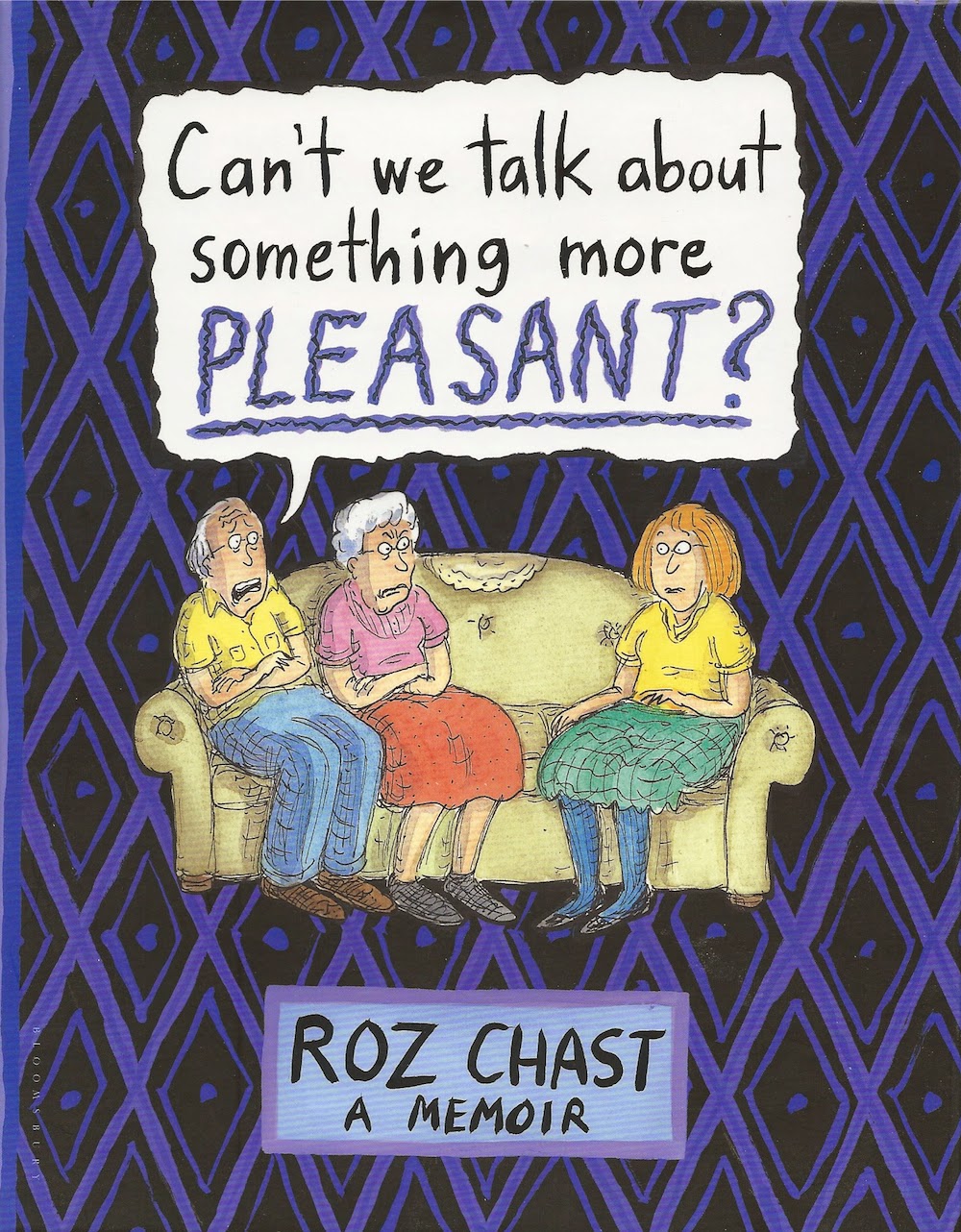
by Roz Chast (Bloomsbury USA). Long my favorite New Yorker cartoonist, this lengthy work on a serious subject is miraculously both moving and hilarious. She can't stop being Roz Chast even while talking about the slow decline and death of both of her parents. And it had personal resonance with me because it deals with issues that I and my siblings are having to deal with with our own elderly parent.

Chast's parents were significantly older than her. She first became aware of problems when they were 90--she visits their apartment in Brooklyn and notices it is covered with grime--something her mother had never previously tolerated. She tells these stories in episodes often presented as full page comics--very similar to her strips in the New Yorker. These episodes are linked by hand-written illustrated text pieces which keeps the thread together. Her odd parents at first seem quite vital for two people in their 90s, but a fall puts Chast's mother in the hospital and makes Chast realize how senile her father has become. It becomes obvious that these are two people who should not be living alone in an apartment. But it took a year after her mother's fall for them to seriously consider moving into an assisted living situation.

Chast has always been a cartoonist whose drawing was crude (but funny). But this book demonstrates that she has great chops and deploys them only when they will have maximum effect. Her full page drawing of her father when her mother returned home from the hospital is classic--a funny, loving portrait. She also includes photos of the crap she cleaned out of their apartments when they finally moved out.

She deals with the irritations, the guilt, the sadness and all the other emotions of seeing a parent decline and die. The book is moving, very funny, and instructive, and I appreciate it as a representative of a new genre in comics (for example Special Exits by Joyce Farmer and The Song of Roland by Michel Rabagliati). It heartens me to think that comics are now mature enough to deal with this subject. Roz Chast's Can't We Talk About Something More Pleasant? is an unexpected masterwork.


2) Sam Zabel And The Magic Pen by Dylan Horrocks (Fantagraphics Books). I saw this unfold more of less in real time as Dylan Horrocks drew it--he posted the first page online on February 23, 2009. Now it's finished and you can read the entire story in book form. Horrocks tells us a fantasy story about the joys, dangers and responsibilities of fantasy stories. It's quite post-modern in that regard and may remind you a little of Italo Calvino or Vladimir Nabokov, but Horrocks always wants you to remember that you are reading a comic book about comic books. It's funny and sexy and there's self-doubt and sadness in it, too. It's this richness that's kept me interested as it unfolded glacially before my eyes over the course of five years. The wait was worth it.

The basic premise is that there exists a magic pen that if you draw a picture (or better yet, a comics story) with it, you can then blow on the picture and be transported into the world you've drawn. Not only that, any reproductions of that image or comic will have the same property. That's how Sam Zabel, a cartoonist writing a terrible mainstream superhero comic for which he feels zero passion, is transported into another world--specifically, a rather silly and sexist but somewhat delightful version of Mars from a kid's comic published by a New Zealand cartoonist in the 1950s. He meets a young woman, Miki, who carries a backpack full of comics and drawings created with the magic pen, which allows for a variety of explorations.

In some ways, Sam Zabel and the Magic Pen is playful and light-hearted, but the book is always asking this question: what is the responsibility of the fantasist? "Responsibility" and "fantasy" are not two words that go together very often, except when various scolds tell us that fantasy itself is irresponsible. But this book really wants us to consider them as partners in a way--it tells us that our fantasies are where we go wild and break out of our mental and emotional binds (there is even a chapter called "Anhedonia"), but that we must always remember that fantasies have consequences. It's a beautiful, thought-provoking comic.


3) Here 
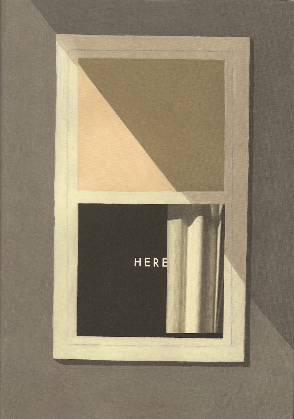
by Richard McGuire (Pantheon Books). This is the most formally daring of all the comics I've listed. Each page is a double spread, facing into the corner of a nondescript room, with a window on the left and a fireplace on the right. In the upper left-hand corner of each page is a year, like 2014 or 1956 or 1775 or even 3,000,500,000 BCE. And what you see in the spread is what you would be seeing at some point in that year. So we see the house being built in 1907, and we see the large house across the street being built in 1764. We see the forest before then inhabited by Native Americans who come into contact with Dutch settlers, and we see prehistoric landscapes. And we see a future, which at first seem fairly hightech. One image from 2213 shows a tour guide using a device that allows the tourists to see what we're seeing in Here--the house that stood on that spot throughout the years. But we also see a very distant future that seems devoid of humanity. We even have a guest appearance by Benjamin Franklin, who visits the colonial house which is, apparently, where his son lives. And all these different views are shown in non-chronological order.

Within each double-page spread are inset panels. They are from different times as well, and we see small episodes and events unfold, mostly from the 20th century, but quite a few from the 18th century and several from before. These floating panels are distinguished from the larger spreads and from each other by color. McGuire's color scheme helps us keep the different elements distinct.

This is an expansion of a six page story Richard McGuire published in RAW in 1989. That story is legendary--an acknowledged classic. But by expanding it as he has done here, McGuire has created something quite different (although no less formally audacious). I heard him speak earlier this year, and he was at pains to say this wasn't about his family or his childhood home, except that it really was. The family shown in the late 50s and 60s is his family. He really did grow up in an old house across the street from William Franklin's house in Perth Amboy, New Jersey. But while the personal stories here are important, the book is unmoored from them. There is no linearity here unless one carefully follows the dates in the corners of the pages and panels. And, in fact, the book invites you to do this. Reading it through once is like looking at a kaleidoscope, but as you read, you mentally file away episodes you want to return to, like the fight between two men in straw boaters in 1910 or or the romantic Native American couple in 1609. I've just "read" this book, but I suspect I won't really be "finished" with it for quite a while.


4) The Love Bunglersby Jaime Hernandez (Fantagraphics Books). This collects several related stories from Love & Rockets. Jaime Hernandez has been drawing stories about Maggie Chascarillo since the early 80s, and he's allowed her to age over that time. But one thing he's done a little bit recently is to deepen her personal history--characters we never knew existed are slotted into her childhood or young adulthood and make appearances in her adult life. In this volume, he introduces Calvin, Maggi'es brother. His childhood story is told in the searing "Browntown", surely the most disturbing story in Hernandez ever wrote. The damage done to Calvin as a boy affects him (and Maggie and her lover Ray) as middle age adults. As Faulkner wrote, "The past is never dead. It's not even past." In addition to "Browntown," there is "Return For Me," set shortly after the period in "Browntown," and told from the point of view of Maggie's friend, Letty Chavez. It's a startling story, because it's told in past tense as if Letty is telling it to us up until the instant that Letty is killed in a car accident. Her story ends mid-sentence.

But the main thrust of the story is how Maggie and Ray, whose relationship has come and gone over the years, finally end up an old couple together. Getting there is a quite a twisty journey, and Hernandez tells it rather obliquely. For someone who has written a generational epic, Hernandez has evolved into a minimalist. I wonder what he's going to do next, because this book feel very much like an ending to Maggie's story. It's a beautiful ending, too, especially for those of us who have been following this story since the beginning.


5) Over Easy by Mimi Pond (Drawn & Quarterly). This is another one that took years to come out--I heard about it from Pond herself in 2009. She posted a few pages on line, and then nothing until this year. This is a brick of a graphic memoir, unusual in that it discusses the ins and outs of work, a subject criminally ignored by most cartoonists. Jobs, employment, co-workers, the boss, the grind--Over Easy has it all, and it's all funny and affecting. My review is here.


6) The Hospital Suite 
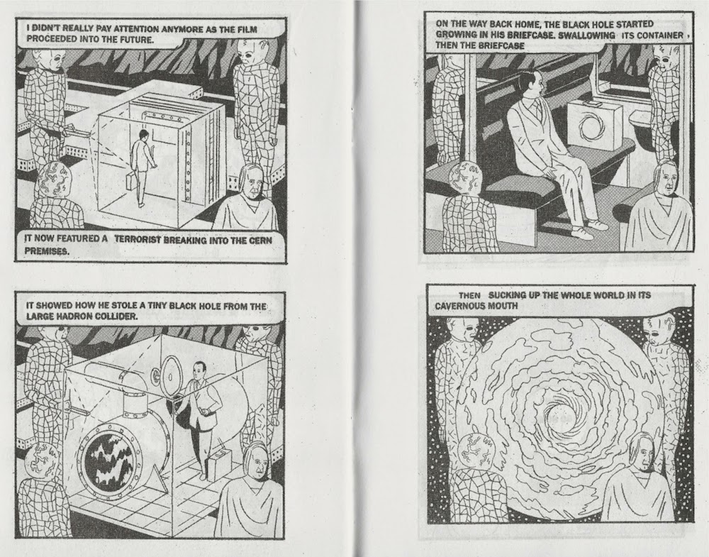
by John Porcellino (Drawn & Quarterly). Starting in 1997, John Porcellino started feeling sick. This book is a memoir of illness, both mental and physical. First it's stomach pain, which he is reluctant to treat because of the cost. He only goes when his wife threatens to leave him if he doesn't. He is diagnosed with Crohn's disease, but treatment doesn't seem to help. Porcellino depicts the emotional aspects of sickness very movingly. His pacing is perfect. In one panel, he is on his knees searching. The caption reads, "My wedding ring had slipped off my now-bony finger...." This is followed by a "silent" panel, and then one that reads, "and I cried and cried." In this case, it turns out they had misdiagnosed him, and they were able to fix that, but his problems were just beginning.

His illnesses eventually contribute to the end of his first marriage. He wishes he could "be a normal person" and ponders suicide. His struggles with allergies may remind readers of the movie Safe. And most of all, Porcellino's depiction of OCD is the best depiction of that insidious disease I've seen. "One half of your brain is making you do this nutty stuff... The other half is telling you how ridiculous you are for doing it..." From the beginning of the book, Porcellino depicts himself as a spiritual seeker, particularly interested in Buddhism. But the disease turns even that against him as he comes to believe that God is punishing him for some reason. At one point he borrows a copy of the old Japanese monster movie Destroy All Monsters from the library. But his OCD-afflicted animal brain concludes that if he watches, monsters could come and destroy his town. His rational mind knows this is insane, but still he can't bring himself to watch it.

Porcellino's drawing is minimal and functional, and that has always served his poetic, haiku-like stories. But the stories here are not poetic. They are about about how disease destroys the poetry in his life. Porcellino went through hell, and he is humiliated by the experiences. Sickness is not just pain (although there is plenty here); it is one indignity after another. Porcellino's magic is that he succeeds in making the reader empathize, even when his character can't seem to forgive himself.


7) Sugar Skull by Charles Burns (Pantheon). The concluding book of a trilogy, it wraps up the mysterious beginning and middle with a gut-punch of an ending. Burns is an artist who was closely associated with the legendary RAW and is best known for his graphic novel Black Hole. I reviewed Sugar Skull here.


8)  Weapons of Mass Diplomacy 
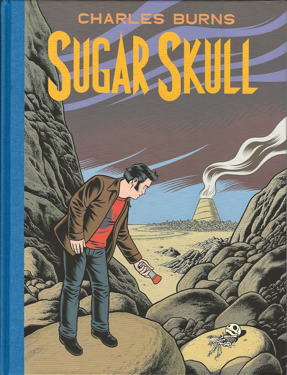
by Abel Lanzac and Christophe Blain (SelfMadeHero).Weapons of Mass Diplomacy was reviewed here in August. It's surprising that a roman à clef about French diplomacy could simultaneously be so funny and so moving.


9) Incomplete Works by Dylan Horrocks (Victoria University Press). Yes, Horrocks gets two entries in the top 10. I wrote about Incomplete Works earlier. The funny thing is that I knew Sam Zabel and the Magic Pen was coming this year--it had been announced and was being discussed, and of course readers of the online serialization could see that it was heading towards a climax. But Incomplete Works was a total surprise to me when Horrocks announced it on his own website. They are both deserving of their places on this list--one an overview of his art from its earliest days, the other a fully mature masterpiece.


10) It Never Happened Again: Two Stories by Sam Alden (Uncivilized Books). I reviewed this book earlier this year. It's been a great year for this artist, about whom I know very little except that he is in his mid-20s and seems to be quite peripatetic. In fact, before this year I had never heard of him. But he's someone whose work I'll be keeping an eye on from now on.

Honorable Mention 
  • Best of Enemies: A History of US and Middle East Relations, Part Two: 1953-1984 by Jean-Pierre Filiu and David B. (SelfMadeHero). Not quite as good as the first volume, but still good. These books feature rather didactic texts, but the text is enlivened by the fertile visual imagination of David B, one of the greatest cartoonists alive.
  • Buddy Buys A Dump by Peter Bagge (Fantagraphics). Reviewed here. 
  • My Neighbour's Bikini by Jimmy Beaulieu (Conundrum Press). It starts off as a "meet cute" romantic comedy, but My Neighbor's Bikini is actually quite sexy. It has a down-to-earth eroticism that is emphasized by Beaulieu's beautiful pencil drawing.
  • Truth is Fragmentary: Travelogues & Diaries by Gabrielle Bell (Uncivilized Books). Review here.
  • Mutiny Bay by Antoine Cossé (Breakdown Press). A find from Comic Arts Brooklyn, this book takes an incident of mutiny from the voyage of Magellan and fleshes it out in a detailed, almost hallucinatory way.
  • How To Be Happy by Eleanor Davis (Fantagraphics Books). Beautifully drawn, these stories range from dramatic to humorous, but all told from the point of view of the modern person who is into yoga, worried about wheat allergies, etc. I'm not even sure what to call this vast subculture--but I like the way Davis circles around and through it, dealing with its absurdities and beauties.
  • Angie Bongiolatti by Mike Dawson (Secret Acres). An intriguing story that combines left wing street politics with frustrated romance in an unexpected way. Discussion of Dawson and this book lead to one of the most popular posts this year.
  • Minimum Wage Volume 1: Focus on the Strange by Bob Fingerman (Image Comics). The first version of Minimum Wage (collected asBeg the Question) found Fingerman loosening up from his earlier art style and getting into a funny roman à clef. (I was even drawn into the background of one scene!) But this new Minimum Wage series is so much better--his drawing amazingly continues to improve with age and the dialogue feels less written and more lived.
  • Megahex by Simon Hanselmann (Fantagraphics Books). By all accounts, Simon Hanselmann is a workaholic. Funny then that his primary subject is the lives of a household of lazy stoners. The work captures the repetitiveness of the stoner life perfectly, and is hilarious.
  • World War 3 Illustrated: 1979–-2014 edited by Peter Kuper and Seth Tobocman, featuring work by Kuper, Tobocman, Eric Drooker, Sabrina Jones, Sue Coe, Chuck Sperry and many more (PM Press). I really beautifully produced "best of" collection of the venerable left-wing political comic that has been published continuously since 1980.
  • Facility Integrity andThe Libertarian by Nick Maandag (Pigeon Press). Nasty, funny comic books that each take a slightly ridiculous premise and carries it to an absurd end--in one, a corporation prohibits its employees from shitting on company time, and in the other a libertarian falls in love with a "vegan-socialist feminist." Hilarity ensues.
  • Showa 1939-1944: A History of Japan (Showa: A History of Japan) by Shigeru Mizuki (Drawn & Quarterly). Mizuki's history is eccentric and depends heavily on photo references, but the parallel stories of his own life as a young soldier in the Imperial Japanese Army are amazing.
  • Forming II by Jesse Moynihan (Nobrow Press). This volume was not quite as engaging as volume 1 because the story (by necessity) slowed down a bit. Volume 1 spent a lot of time putting the chess pieces in place. Forming II is showing us how the game is playing out.
  • Rough House 2 with work by Nicolas Mahler, Kayla E, James Roo, Mack White, Brendan Kiefer, Doug Pollard, Gillian Rhodes, Russell Etchen and many others (Raw Paw). The second squarebound issue of this Austin-based anthology shows both increased ambition and growth by individual artists. Really enjoyable, and I hope it continues.
  • Beautiful Darkness by Fabian Vehlman and Kerascoët (Drawn & Quarterly). A very strange story set amongst the fairies and insects of a forest, in a surprisingly violent fantasy world. Beautifully drawn but disturbing.
  • Jim by Jim Woodring (Fantagraphics Books). Collecting all the comics and 'zines that were published under the moniker "Jim" (and a few odds and ends from elsewhere), this is some of Woodring's finest, most oneiric work.
  • RAV 1st Collectionby Mickey Zacchilli (Youth in Declne). Scratchy, urgent graphics combined with an absurd, funny, pulpy story.

Loners Need Not Apply: Your Everyday Art World

$
0
0
Robert Boyd


I literally just finished reading Your Everyday Art World by Lane Relyea, which I found to be a frustrating experience. In it, he posits the idea of the network as the engine of new art. And he seems taken with the idea, often comparing this new art favorably against older kinds of un-networked art that don't meet his approval. But as you read the book, you realize how selective he is. Indeed, if there is a perfect example of critical selection bias, this is it. Anyone forming a theory of art engages in this--it's pretty much unavoidable, and let's face it: art history is not science. But what was weird (and in the end, kind of satisfying) is that Relyea is constantly undercutting his own argument by showing how these newish tendencies are not unadulterated good things. His enthusiasm shows through, but he is constantly arguing the other side as well.

Anyway, as I read it, I kept folding down corners on pages that contained things that interested me. And because I'm a fundamentally lazy writer, I've decided that instead of writing a review that addresses the entirety of Relyea's tome, I'd just look at the pages that I bent the corners of.

Page 11. Right at the start, Relyea seems to realize that this new networked art world reflects some of the most pernicious aspects of the modern world as a whole:
Artists and designers are the role models for the highly motivated, underpaid, short-trm and subcontracted creative types who neoliberals imagine will staff their fantasy of a fully freelance economy--what ex-Al Gore speechwriter Daniel Pink has titled "Free Agent Nation" and the Tony Blair government pithily christened "The Talent Economy." As Andrea Fraser sums up, artists "have become poster children for the joys of insecurity, flexibility, deferred economic rewards, social alienation, cultural uprooting and geographic displacement."
Hear that all you adjuncts out there? This kind of networked art world that Relyea seems to be championing is the same one that engenders groups like W.A.G.E., who fight for artists working on "projects" (essentially freelance art jobs) to get decent pay for that work.

On the same page, he quotes Miwon Kwon:
"... the presumption that dematerialization = anticommodity still persists in structuring the contemporary art discourse," this despite the fact that "services, information and 'experience' are now quantifiable units of measure to gauge economic productivity, growth and profit. Ideas and actions do not debilitate or escape the market system because they are dematerialized; they drive it precisely because so."
And yet, Relyea occasionally evinces a knee-jerk antipathy to "objects" in favor of experiences. Kwon is a regular touchpoint for Relyea in the text, and after a while, I started to wish I was reading a book on this subject by Kwon instead of Relyea.

Page 13. But like I said, Relyea seems to realize that his ideal of "networks, databases, platforms and projects" is ambiguous. "To take one glaring example, the accumulation of prestige, contacts, and information by those who are 'international' and jet around constantly is routinely won off the backs of those left behind, the assistants, adjuncts, and other lower-ranking and less well-known professionals..." I always laugh when an artist's bio says she lives in "New York/Mumbai" or "Berlin/St. Louis/Mexico City." Saying this about yourself is like driving around in a Porsche--it signals to the world your (relative) wealth. Internationalism is not inherently progressive, but in the art world it is often treated that way.

Page 39. An interesting aside on the gradual demise of the Frankfurt School's idea of an all-powerful culture industry whose purpose was, to quote Thomas McEvilley, to "psyche-out the working class." It was replaced by the idea of media that resisted dominant culture (the Birmingham School) like the material produced by activist groups and subcultures--'zines, hip-hop, flyers, etc. Relyea gets personal, here, talking about editing Artpaper in the 1980s and advocating DIY culture. But he accuses his younger self of naivete, pointing out how easily this stuff has been co-opted and neutralized. Don't be too hard on yourself, Lane--all of us who lived through those times thought that was stuff was cool. My review in 1991 of the catalog for High and Low: Modern Art and Popular Culture ended by saying that the D.I.Y. work that arose from subcultural sources was far more interesting and authentic  than what the curators of High and Low called the "big box" (the museum) and the "little box" (TV).

Page 67. A network implies communication which implies sociability. While he called out the problematic nature of the jet-setting artist, he returns to it. Discussing Douglas Gordon (one of the touchstones of Your Everyday Art World), he writes, "And that's why Gordon writes the formula as he does: art relates to place relates to international practice and dialogue. Or talk plus travel, using [Christine] Borland's more concise math. A few years later, Miwon Kwon would nod in agreement from across the Atlantic, writing in October that 'if the artist is successful, he or she travels constantly as a freelancer.'"

Reading this, my first thought was, what about shy artists? Hold onto that thought. Later on the same page, Relyea writes, "As [Luc] Boltanski and [Eve] Chiapello describe the change, against an older assumption that 'people are creative when they are separated from others,' today 'creativity is a function of the number and quality of links.'" So for all of you who are awkward in social situations, who lack the gift of gab, who don't have magnetic personalities--fuck you!

First of all, this binary distinction which threads its way throughout the book (solitary versus networked) seems too extreme. Obviously there are gradations, and over time, one might exist in both extremes at different times. Plus, while there is the romantic myth of the "solitary genius," most people are aware that creativity has often arisen from social scenes--groups of artists and writers in particular places at particular times, trading ideas and pushing each other along. All that's changed recently is cheap airfare and the internet.

But it also seems to imply that a solitary person can't be creative. But would Henry Darger have created better art if he hadn't been so isolated? (His life might have been better.) My problem is that Relyea seems to assign an ideological rightness to the networked artist, that this inherently tosses up better art, "better" being defined more-or-less as "more aligned with contemporary culture."

Page 102. In this chapter, Relyea has been discussing scenes that grew out of specific locations that support his thesis. Glasgow starts it, then he moves to Los Angeles, writing initially about MOCA's group exhibit Helter Skelter in 1992. That was an important exhibit, but he writes as if prior to the 90s, L.A. was an impossible environment for artists. To which I say, Ed Ruscha, Robert Irwin, Edward Keinholz, etc.

But the point of this chapter is not so much an argument about L.A. as a description of a scene that developed there in the 90s, especially the rise of apartment galleries such as Bliss, founded in 1987 by Gayle Barkley, Jorge Pardo and Ken Riddle. (Interestingly, we Houstonians recently had the opportunity to see Jorge Pardo's work in a local apartment gallery, Front.) The rise of DIY spaces in Los Angeles was a major movement that was noted even by Roberta Smith in the New York Times. Words like "flexible,""modest,""grass-roots,""spontaneous" and "organic" were used to describe this movement. But Relyea notes that this movement didn't exist outside the art world (and I would say that about all the art he writes about in this book). Despite the fact that these DIY spaces were off the beaten path, located in residential neighborhoods, etc., an exhibit there was still an exhibit. "It didn't affect the rent, but it did get listed on one's CV."

Furthermore, these spaces "mostly addressed themselves to niche or insider groups." It was very hard to see these shows. In fact, if you didn't see one on opening night, you probably never did. This is true of the equivalent spaces that operate in Houston today: Front, Cardoza Fine Art and Scott Charmin Gallery. It takes a certain commitment to see work there, and unlike a big, bad top-down institution like the MFAH, the average attendee seeing a show at one of these galleries is part of a pretty small art clique. (That doesn't mean that I don't love them, though.)

page 111. Here Relyea tells the story of LACE, Los Angeles Contemporary Exhibitions. LACE is a non-profit art space similar in size and mission to Diverse Works in Houston. But move the clock back to 1990, when LACE was "one of the nation's biggest alternative art spaces outside of New York City, housed in a two-story abandoned warehouse in downtown L.A." The space had been purchased with help from the city's Community Redevelopment Agency. It was a beautiful space, and I loved going there when I lived in L.A. The nearby warehouses were usually filled with flowers, so the streets around LACE had an unexpectedly lovely smell. I had the privilege of co-curating a show there of art by contemporary alternative comics artists. We originated the show, Misfit Lit, in Seattle in 1991 and then installed it at LACE early in 1992--which was perfect timing because it meant I could see Helter Skelter.

For Relyea, LACE was the opposite of DIY. "Its operation was anything but 'spontaneous' and 'organic'." As a non-profit, it depended on moneys from the city, state and federal governments, as well as tax-deductible donations. It was therefore publicly accountable. Every jury had to be unbiased and impersonal, "fair, democratic, and neutral." It had a bureaucratic existence like any similarly-sized 501(c)(3) nonprofit organization. This resulted in decisions that were seldom "forcefully coherent" but instead were "muddled by compromise." (To which I say, that's democracy for you. You know who was "forcefully coherent"? Hitler.)

In 1990, LACE's finances collapsed, its director was fired, and half its staff laid off. Relyea contrasts this to the growth in prominence of the L.A. scene fed by the new D.I.Y. spaces. But he's not doing so to condemn LACE (although he does that), but rather to point out that as budgets for the arts declined and the popularity of supporting art with tax dollars waned in the 80s during the Thatcher/Reagan years, D.I.Y. conceptually took the place of bureaucratic institutions like LACE. The idea here is that while D.I.Y. seemed acceptable, even progressive, it was actually just another symptom of a growing neoliberal environment. Those D.I.Y. gallerists were just more entrepreneurs, like the guys who started Apple or H.P. in their garages--heroes of the new economy.

It's a good story, but deceptively told. Relyea never says why LACE ran into financial trouble. Was it actually because of disappearing government funds? Furthermore, he fails to mention that LACE survived this--I know since Misfit Lit was exhibited there after the financial meltdown. LACE is still a going concern.

Page 119."Trust" was an exhibit at Tramway Gallery in Glasgow in 1995. The idea for the show was hatched in bar (i.e., through talk in a social situation). The idea of trust was built into the way the show came together. According to one of the curators, Charles Esche, the work was selected according to a rule: "...one of us had to had to have met the artist, and to have had some sort of reasonable personal encounter with them; that trust should be there on a personal level." The show featured a bunch of artists who are now international art stars (including Felix Gonzalez-Torres, Carsten Höller, Rirkrit Tiravanija, Andrea Zittel and Cady Noland); I'm not sure what their reputations were then."'Trust' was an exhibition about not only talk and travel but also about artists who talk and travel." In other words, it was a result of the network.

But not surprisingly, "Trust" was a bomb locally. The art was incomprehensible to the public. There is a network here, but it's a closed network. Relyea quotes a review by Clare Henry: "[The show's] presentation ignores the punters in favor of an inner circle." This, I would suggest, is the problem with much of the work described in Your Everyday Art World. But as I've mentioned, Relyea doesn't shrink from these facts:
As for the wider audience, they weren't buying it. From their position, as noninitiates and constituencies beyond the art world, defined precisely for being on the far side of the boundary between inside and outside, what they saw was separation. But this time it wasn't just the typical alienation from the museum's or gallery's patrician condescension or from art's broken promise of wresting freedom from necessity--this time they were further offended by confronting what appeared to be a closed network, a clique. Like a picture behind glass, the sociality of "Trust" existed apart.
That last metaphor, "a picture behind glass," is a good description of what a shy, awkward person feels at a party or a crowded bar. There's stuff happening, conversations, conviviality, and it seems like you're just looking at it without being able to access it. That guy doesn't get to be part of Relyea's everyday art world. He's made to feel like an uncool rube when in the presence of the artistic elite. The only one who'll talk to him is Laurel Nakadate, and that's because she wants to put him in a video that ridicules him.

Page 160. Relyea posits that art school has grown more important in recent years because it provides access to the network. And of course, it does provide that access. But he writes, "If the value of school once owed to it's solitude, its encouragement of the  undistracted pursuit of studies, today it's the opposite..." The art school that offered "solitude" and "undistracted pursuit" is a total straw man. When did that ever exist? Schools, including art schools, have always been about crowding people together and creating connections--at the very least between students and teachers. But even more so, I think prospective art students have always wanted connection and sought it by going to art schools. I recall an interview with Spanish artist Javier Mariscal in the magazine Escape from the early 1980s. The interviewer made a cliched condemnation of art schools, and Mariscal disagreed. He said (quoting from memory, so I might get it wrong), "When you're in high school and you want to be an artist, you feel like a martian. But when you go to art school, suddenly you're surrounded by martians." In other words, you go to be part of a group--a network--that you can't be a part of where you were before. You want to be on the other side of that "glass wall."

Page 184. I'll close with Relyea on critics, a class of people he says have been made obsolete in the new networked art world:
Critics [...] have no equivalent of academia or the museum world, they lack institutional grounding and organization, there is no well-organized system of training that erects high educational barriers and weeds out the unqualified. They don't have the transcontinental academic archipelago of professionally linked colleagues and symposia, through which to travel, mingle, connect. Compared to professional historians, critics are unincorporated, amateurish, and undisciplined, a motley crew lacking the filtering, disciplining, and coordinating of a highly codified system."
Fuck yeah!


Viewing all 665 articles
Browse latest View live