Quantcast
Channel: The Great God Pan Is Dead
Viewing all 665 articles
Browse latest View live

Art Everywhere

$
0
0
Robert Boyd

Art is everywhere. Even outside my bathroom window.


These billboards are barely visible through the tree branches outside my window. There's an image on the left-hand side of the right billboard. Here is what that image looks like without a bunch of leaves in front of it.


Erwin E. Smith, Frank Smith, Watering His Horse, Cross-B Ranch, Crosby County, Texas, c. 1909

It's part of a billboard art show called Art Everywhere. The project consists of 58 artworks put up around the country on a large number of billboards. There is a map showing where all the billboards are, but it's inaccurate--it doesn't show "my" billboard, which is on Fannin just south of Drew in Houston. Assuming the rest of the map is correct, you will be able to see several of the billboards around Houston in diverse locations (as well as all over the USA).

The earliest work in Art Everywhere is Watson and the Shark by John Singleton Copley, and the most recent is a Cindy Sherman photograph. Several artists have more than one piece--Winslow Homer, Mary Cassatt, John Singer Sargent and Georgia O'Keefe. There is a preference for representational work in the pieces chosen, but there are a few abstract paintings in the mix.

I vaguely knew this was happening, but it wasn't until I saw the billboard out my window that I realized it was happening now. You will be able to see these billboards through the month of August. Going on a long road-trip? Spotting the Art Everywhere billboards might help pass the time!

What I Didn't Do This Summer

$
0
0
Robert Boyd

What I haven't been doing this summer is writing. I have an excuse--I moved into a new place, which has been a very time-consuming process. But I've also procrastinated. There have been things I fully intended to write about--the amazing Trenton Doyle Hancock show at CAMH, the ginormous Big Show at Lawndale, the great new artists residency in Navasota and much more--that I just never got around to finishing. Usually I feel consumed with guilt if I'm not producing. But this summer, only a little guilt. And that's a little troubling for the future of the blog. After all, I don't get paid to do this--so without guilt, what's my motivation?

But slightly guilty introspection is not the purpose of this post. Just because I've dropped the ball this summer doesn't mean you need to deprive yourself of quality online art commentary. Obviously Glasstire is still going strong, and recently has been pissing people off a lot, which I like. People getting pissed off means people actually care and engage. Houston's art scene can sometimes feel like a warm soup of complacent consensus (with a lot of "off the record" backbiting, natch). But several Glasstire pieces recently have inspired a lot of contentious comments (which can often be pretty deadly, but I think Glasstire monitors its comment sections to weed out the obvious trolls). For example, check out "How Tight Is Texas for Artists" by Christina Rees, which asks "Why would anyone who is truly creative stay in this city or this state if they could live elsewhere?" Bill Davenport hit one out of the park with his two-fer  "Painting on my Planet" and "The Top Ten Painters In Houston", in which Davenport responds to a somewhat puzzling top 10 painters list in the Houston Press. Davenport proposes that that list is from another planet ("Planet A") while he prefers work from "Planet B." Part of me thinks Planet B should have been called "Planet MFA," but his list was not only pretty good, but it inspired a deluge of reader-generated lists.


But everyone who reads The Great God Pan Is Dead already reads Glasstire, right? What else should you be paying attention to? A new project by Houston artist Brian Piana is Spill Some Stuff. Spill Some Stuff is a podcast, which is a form of internet communication I have to admit that I don't like all that much. My problem is that you listen to them thinking you can be doing something else at the same time, but I can't really simultaneously do anything else and pay attention to the podcast. It's too hard for me to divide my attention. But that's me--obviously there are a lot of multi-taskers out there who can work on some project while still actively listening to a podcast. The success of Bad at Sports proves this.

Spill Some Stuff is very new and has had only two podcasts so far--but they are both pretty meaty. The podcasts last about an hour. Piana has promised that Spill Some Stuff won't be exclusively art-focused, but his first two interview subjects, Emily Link and Elaine Bradford, are both well-known members of the Houston art scene.


Emily Link, Steinmann, 2011

The first episode was an interview with Emily Link, and they discuss Link's art as well as her work with Lawndale Art Center, focusing particularly on The Big Show, which was about to open when this interview was conducted. Piana is a little nervous, and he has a tendency to hog the discussion. The word "awesome" pops up too frequently in this interview. But these quibbles aside, it's an impressive debut. Piana, it turns out, has a fantastic radio voice and is a natural radio interviewer. There's never "dead air"--if he talks a little more than his subject, it's in the service of moving things along. It never feels awkward and he's never at a loss for words.


Elaine Bradford, I See You, 2014, ceramic figures and crocheted embroidery threads (from the Big Show at Lawndale)

And his second interview with Elaine Bradford is even better. They discuss her career and recent work, as well as her work with Box 13 Artspace. And practice makes perfect--Piana's interviewing is even better in this second installment than in the first. This is good stuff. I look forward to hearing more.

Another bit of online art commentary I've been consuming is Art vs. Reality, a series of videos written and starring Peter Drew. Peter Drew is a young Australian artist and critic whose previous claim to fame was to be almost kicked out of the Glasgow School of Art in 2013 for doing illegal street art.

His six-part video series, Art vs. Reality, features him taking on the persona of an extremely pompous art critic doing the kind of "explains it all to you" TV show that reminds one a bit of Robert Hughes. It has a satirical edge, but it aims to address real issues--art galleries (using "galleries" in the English sense of any place designed specifically to show art, including museums), art schools, conceptual art, street art, artists as "geniuses" and art critics. Each episode is followed by a mini-episode in which he responds to viewer mail. (In the first episode, he asks for feedback on the role of galleries today--but warns viewers, "By all means, challenge my opinions, but I warn you: my education cost more than a Blue Period Picasso, I've dined with the world's greatest curators and ruined careers of over a thousand artists. To destroy your argument will be my pleasure... And your privilege. So in other words--let's have a healthy debate!"

This series reminds me a bit of the great series Art Thoughtz by Hennessy Youngman, the alter ego of artist Jason Munson. Youngman and Drew both address their viewers as "internet" ("Wassup internet!"). They both address serious issues of art lightly. Their styles are totally different, but their willingness to use humor to engage the art world marks them as related projects. Given the dour seriousness of much of the art world, they're refreshing.

Here is the first episode of Art vs. Reality:


Comics Strips vs Comic Books

$
0
0
Robert Boyd

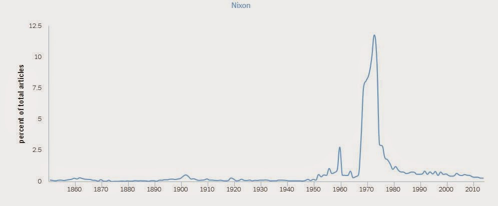
Recently, the New York Timesmade available a web tool, Chronicle, that would allow one to take a word or phrase and graph its appearance in the Times over time. So one could take, for example, a proper name like "Nixon" and see how often it appears.


As we can see, the name "Nixon" appears occasionally in the Times for a century but starts picking up in the early 50s, following the rise, fall, second rise and second fall of Richard M. Nixon. It's a fun tool to play with. It allows you to graph the word as a percentage of all articles in the Times or as an absolute number of articles, and also allows you to see a glimpse of the articles that are mentioned. It's not perfect--a lot of the information used is scanned from microfilm which seems to create some challenges for character-reading software.

I'm interested in comics as an art form, and for most of the last century, the most common type of comics were comic strips. Today, comic strips seem almost like a vestigial form, and many comics enthusiasts don't think about them too much. I think this is a shame--for decades, the primary way that millions of Americans (and people around the world) encountered the art of comics was in comic strips. They were a diverse form aimed both at adult readers and children (unlike comic books in America, which until the late 60s were produced almost exclusively for children and adolescents). The subject matter of comic strips was for many decades more diverse than in comic books, as were the visual techniques employed by artists. The format, however, was rigid and minimal--a few panels arranged horizontally. But within that simple format, multitudes existed.

The New York Times, ironically, has never carried comic strips. But it does report on all things, including popular culture. So the phases "comic strip" and "comic book" have appeared in articles over the years. I thought I'd use Chronicle to see how often this happened. I also added the much more recent phrase "graphic novel."


"Comic strip" is mentioned in the Times starting in 1921. "Comic book" appears much earlier, but not with the meaning we now associate with the phrase (the earlier uses are in reference to books that are funny). It isn't until the 1940s that the modern usage of  the phrase "comic book" appears. "Comic book" surpasses "comic strip" briefly in the 50s, primarily because of a moral panic associating reading comic books with juvenile delinquency. But one thing the graph suggests to me is that until 1992, comic strips had more cultural currency than comic books. But after that date, their relative status switched dramatically. Starting in 1994, "graphic novel" has been a continuous presence in the Times, surpassing "comic strip" in 2008 but still far short of "comic book."

Of course, this is just the New York Times. The Times is an important indicator of upper-middle class cultural concerns, but it's not exactly a census or poll of the entire population. Now Google has had a similar tool for several years call an Ngram. It uses 5.2 million books as its source material. So I used the same phrases and created an Ngram to see how it would compare to Chronicle.


Very similar! Comic strips start getting mentioned frequently in books just before 1920. Comic books appear in the mid 30s, really taking off in 1943. We see again in the 50s comic books getting mentioned more frequently than comic strips--it's a little later than in the New York Times, which might be attributable to the fact that it takes longer to write and publish a book than to write and publish articles in a newspaper. In 1992, comic books surpass comic strips in the Ngram, just as they do in Chronicle. "Graphic novel" starts to take off a little earlier in the Ngram (mid-80s) than in the Times, but it never quite achieves the heights in the Ngram chart as it does in Chronicle.

These two graphs seem like a good indicator of cultural currency for comic books and strips, but not of artistic appreciation. Indeed, there is no way we can tell from the graphs alone whether the mentions of these forms are positive, negative or neutral. Oscar Wilde said, "The only thing worse than being talked about is not being talked about," which may sometimes be true, but some attention truly is harmful. The vast negative press given to comic books in the 1950s was a disaster for the form. Nonetheless, one thing both these graphs show is that comics generally, whether comic strips, comic books or graphic novels--have grown steadily in their cultural currency for almost a century.

Four Recently Read Comics by Sam Alden, Gabrielle Bell and Peter Bagge

$
0
0
Robert Boyd


It Never Happened Again: Two Stories (Uncivilized Books, 2014) and Haunter (Study Group Comics, 2014) by Sam Alden. That these two books are by the same cartoonist is somewhat astonishing to me. Sam Alden is a 25-year-old cartoonist with exceptional drawing skills. He tailors his drawing to the story at hand--the two stories in It Never Happened Again are drawn in pencil and Alden leaves out a good deal of extraneous detail, particularly in "Hawaii 1997," where he uses minimal means to effectively convey both a sun-drenched beach and the same beach in the moonlight.

(Aside: historically, comics were drawn with pen and ink for technological reasons--it was easier to reproduce solid black marks and black outlines helped to "trap" color for hand-cut color separations. The use of ink was so necessary and ubiquitous that industrially produced comics had artisans whose job description was "inker"--they covered up the cartoonist's gray pencil drawings with crisp, easy-to-reproduce ink lines. Modern reproduction technology has rendered this practice obsolete, but aesthetic inertia keeps it going.)


Sam Alden, It Never Happened Again, "Hawaii 1997" pp 38-39, 2014

"Hawaii 1997" is set on a Hawaiian vacation and seems possibly autobiographical. The main character "Sam" is a little boy, fascinated by an older girl in a bikini (to the amusement of his parents), who sneaks out onto the beach at night and encounters a little girl. That's about it, but it is unexpectedly moving. James Joyce wrote that the moment of an epiphany in a story was when "the soul of the commonest object … seems to us radiant, and may be manifested through any chance, word or gesture." Alden finds this in "Hawaii 1997." The only false note is the little girl's closing line--it's very apt but feels too sophisticated and worldly for a little girl to say.


Sam Alden, It Never Happened Again, "Anime" pp 132-133, 2014

The second story, "Anime," follows a young woman, Janet, whose love of anime becomes a self-destructive obsession. The story shows an obsession with something trivial can become a substitute for living one's life--something that many of us who have ever been fans know about--but also how such an obsession can give one a sense of accomplishment and intangible joy. This story impressed me all the more because unlike "Hawaii 1997," it wasn't obviously autobiographical. Without knowing anything about Alden's life it's impossible for me to say how much Janet is based on himself. But creating a convincing character of the opposite sex indicates to me that an artist or writer is stretching.


Sam Alden, Haunter, pp. 13-14

After the realistic stories in It Never Happened Again, the strange fantasy story (more of an episode than a full-fledged story) in Haunter is unexpected. Not just the subject matter, but also the delicate pen-and-onk drawing combined with the intensely colored watercolors give it a completely different look from It Never Happened Again. What the two books have in common is that the art feels wonderfully hand-made. Alden in no way tries to disguise his hand. The only straight lines in Haunter are the carefully made panel borders. Significantly, they aren't drawn--they appear to have been made by taping off the panels.

The protagonist in this wordless story is apparently a subsistence hunter, dressed in rags and carrying a bow. Pursuing her prey, a javelina-like animal, she stumbles across what appears to be a ruined and abandoned temple. Curiosity killed the cat--the hunter leaves off her hunt to check it out. She finds in it a large idol holding a chest, in which she finds some relics--a cell phone, a pistol, an alarm clock. She seems to not recognize them--her time must be long after the collapse of our industrial civilization. It's a good device, having a character in a seemingly primitive society stumble across an unexpected relic of our time. Gene Wolf used it memorably in The Shadow of the Torturer, and everyone remembers the climax of the Planet of the Apes, when Charlton Heston finds the partially buried remains of the Statue of Liberty.


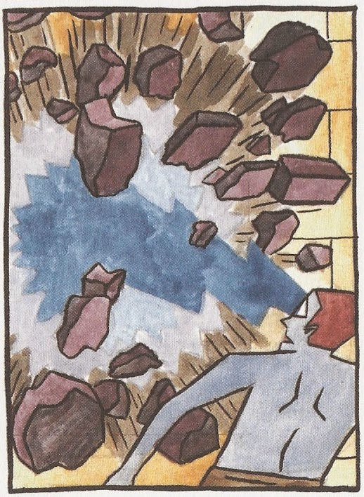
Sam Alden, Haunter, page 45

Alden might have been thinking of that movie when he drew Haunter. His hunter wakes a demon guardian of the temple. The demon, with her blue-green skin and spiky crown, looks like a malevolent version of the Statue of Liberty, who far from welcoming tired poor wretched refuse would prefer to kill them. The entire comic is a chase and a dual between the hunter and the demon. The hunter lives in a future fantasy world, the outlines of which are barely hinted at. That kind of information is not important to the story at hand, but if Alden were to create more stories set in this world, I'd be interested in reading them. As it is, the gorgeous artwork and propulsive action in Haunter make it a pleasure to read.

Man, I'm getting old. There are cartoonists like Sam Alden and Michael DeForge (age 27) doing astonishing work who are half my age. It's hard for a geezer like me to keep track of this new generation, but worth the effort.


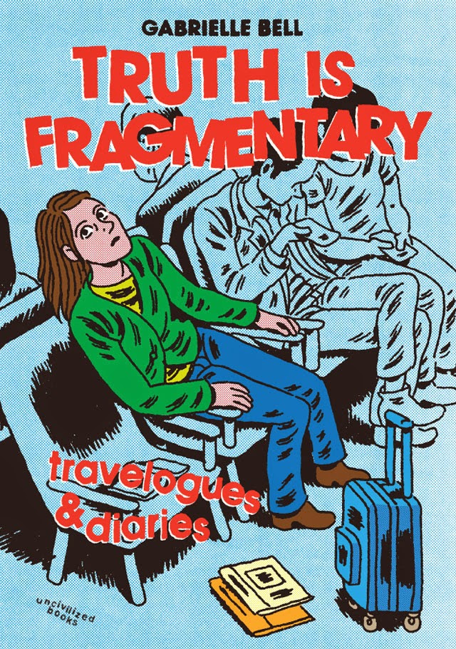
Truth is Fragmentary: Travelogues & Diaries (Uncivilized Books, 2014) by Gabrielle Bell. Every now and then, Gabrielle Bell will be short of cash and will go on her blog and sell some original art. Last year, I bought three pages--a short self-contained story about getting lost in the woods with her boyfriend. These three pages are in her latest book, Truth is Fragmentary. I mention them because if I own original artwork by Bell, how can I be objective reviewing her work? That's for you, the reader, to decide.


Gabrielle Bell, Truth is Fragmentary p. 145

That said, Truth Is Fragmentary is not Bell's best book. It does give the reader a peek into the life of an established creator of art comics (which may be similar to the situation of a lot of contemporary artists), and that's valuable. It's a life of poverty punctuated with occasional all-expenses-paid trips to wonderful places (for comics festivals). Bell plays up her loneliness and isolation, but it doesn't completely work--she seems to have lots of friends as well as the aforementioned boyfriend. She portrays herself as continuously on the verge of a breakdown, but it's hard to know how much of that is real. She has shown a willingness to fictionalize her own life in the past and does so here, as with her presumably fictional narrator of her trip to Colombia. I mention this not to say that Bell is an untrustworthy source but rather to describe what she is doing, which is a semi-fictional memoir. Sometimes this approach works (as in 2010's "Manifestation," which can be found in an untitled version in her 2012 book The Voyeurs), but it seems only intermittently successful here.

Her accounts of her trips to comics festivals can get a bit tedious--the travails of travel, hanging out with festival friends (fellow artists), etc. This might have been why she invented the false narrator for her Colombian voyage. But occasionally you get pages like this:


Gabrielle Bell, Truth is Fragmentary p. 67

This is a prime example of comics about comics, which is a genre that verges on the masturbatory. But I found this episode quite moving. Dominique Goblet's concerns as an artist are similar to Bell's, and Bell is entranced by Goblet's articulation of them.  That sudden feeling of revelation can be quite powerful. Bell instantly becomes a needy fan.

Bell is an important artist, but Truth is Fragmentary finds her in a bit of a holding pattern. There are some great moments here, but it doesn't cohere in an interesting way. It is best enjoyed as a collection of fragments (truthful or not).


Buddy Buys A Dump (Fantagraphics, 2014) by Peter Bagge. Peter Bagge's character, Buddy Bradley, was introduced in a short-lived comics anthology, Comical Funnies, in 1982. Buddy and his family were revived in 1985 in Bagge's solo anthology, Neat Stuff. Buddy was a misfit high school student in these comics. From 1989 to 1998, Buddy starred in Hate, which featured his adventures as an aimless young man first in Seattle and later in New Jersey. These brilliant comics happened to hit at the same time grunge did, unexpectedly turning Bagge into an important chronicler of those times. He has always maintained that Buddy is a version of himself, but ten years younger. After Hate ended, Bagge kept Buddy alive with infrequent stories in the Hate Annual. Between 1998 and now, Bagge has published 11 of these stories (apparently the Hate Annual hasn't exactly managed to come out annually). For the most part, Bagge has left Buddy Bradley behind, concentrating on various graphic novels and pieces of comics journalism. (Again I must disclose that I own some original art by Peter Bagge.)


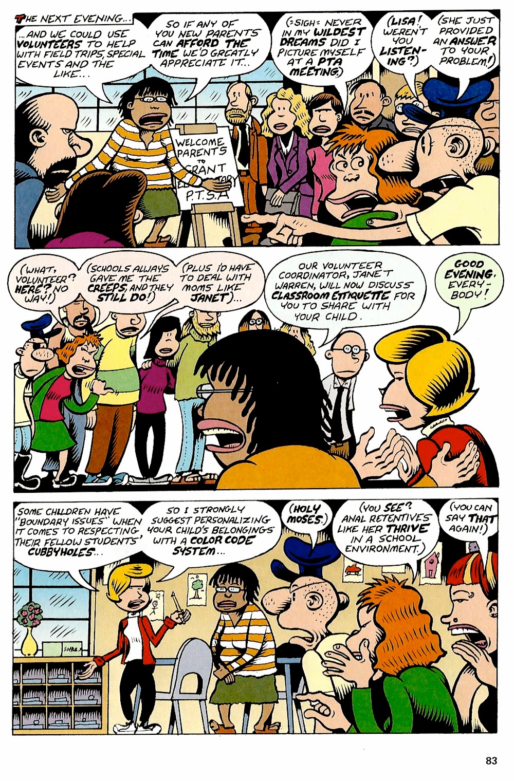
Peter Bagge, from "Lisa Leavenworth-Bradley Discovers Her Creative Outlet" (Buddy Buys a Dump p. 83), 2009

The stories in Buddy Buys a Dump compress Buddy Bradley's life drastically. Marriage, new jobs, home ownership, a child, even dealing with elderly parents: these issues get touched on in these often hilarious stories. But because he's only giving Buddy a few pages for each year of his life, Bagge can't delve very deeply into them. We reader have been permitted to dip into Buddy's life intermittently, as if reading a once-a-year catch-up letter from a distant relative. That's too bad--one of the things that made Neat Stuff and Hate so enjoyable was the level of detailed involvement we readers had with the cast. Buddy Buys a Dump has something of a drive-by character in comparison. This isn't to say it's bad--the stories are funny and entertaining, and what more could you want? But it isn't classic Bagge.

Real Estate Art: 2526 Bellmeade

$
0
0
Robert Boyd

The house at the corner of Bellmeade and Westheimer is for sale. If you have ever wanted to live in River Oaks and can afford a $4.2 million dollar mortgage, this house is for you. This modern house is full of art, which is visible in the realtors photos. It seems mostly pretty subtle, with lots of work on paper. I only recognize one of the artists. How about you?


This James Surls sculpture is quite beautiful. This spinning wheel is a formhe has usedmany times. If you are in River Oaks and want to see a James Surls, they just installed a new one on Kirby a few weeks ago.


on the left: four monoprints by Terrell James

As for the other art in the house, I just can't tell. (Update: The four monoprints on the left above are by Terrell James. Certainly quite different from the work she recently showed at Barry Whistler Gallery in Dallas!)) But I like the look of these pieces in the dining room.


Update: According to a commenter, one of these pieces is a Robert Wilson.


Update: A commenter says the image over the couch on the left here is a photo by Casey Williams, the recently deceased Houston photographer.


The people who live here are collectors. Their tastes are low key--this isn't visually aggressive art for the most part. My feeling is that anyone who would buy a Surls for their home has reasonably sophisticated tastes. But I can't identify any of the other work, so I will toss it out to you, the readers.

Joseph Cohen's Use-Value

$
0
0
Robert Boyd

When one looks at Joseph Cohen's elegant paintings which occasionally are made with gold or diamond dust suspended in the paint, the last thing one thinks of is "use value." It's a Marxist term about which Marx wrote, "The utility of a thing makes it a use-value. But this utility is not a thing of air. Being limited by the physical properties of the commodity, it has no existence apart from that commodity. A commodity, such as iron, corn, or a diamond, is therefore, so far as it is a material thing, a use-value, something useful." Cohen was using the term to distinguish his own work from that of artists who produce "zombie abstractions." Zombie abstractions were called out earlier this summer in an article by Jerry Saltz. He wrote
This work is decorator-friendly, especially in a contemporary apartment or house. It feels “cerebral” and looks hip in ways that flatter collectors even as it offers no insight into anything at all. It’s all done in haggard shades of pale, deployed in uninventive arrangements that ape digital media, or something homespun or dilapidated. Replete with self-conscious comments on art, recycling, sustainability, appropriation, processes of abstraction, or nature, all this painting employs a similar vocabulary of smudges, stains, spray paint, flecks, spills, splotches, almost-monochromatic fields, silk-screening, or stenciling. Edge-to-edge, geometric, or biomorphic composition is de rigueur, as are irregular grids, lattice and moiré patterns, ovular shapes, and stripes, with maybe some collage. 
It certainly sounds familiar.


Joseph Cohen, Zombie Painting #1

I saw the painting above on the wall of his studio. It was, Cohen said, a deliberate attempt to create a work of zombie formalism. He said it took him several minutes to create this art-fair ready masterpiece. This is the kind of work that he describes as having no use-value. We could quibble about this--after all, if it is useful for decorating one's living room, that surely counts, no? But for Cohen, the use value of art has to do something with the need by people for art-qua-art as distinct from decoration.

I met with Cohen at the house which he built himself and shares with his girlfriend, Lindsay Davis. An architect friend helped him design it, and the electrical work and plumbing were done by professionals. But beyond that it was him and some hired hands. He built it on a small triangular lot and turned this complication into an advantage. It's a beautiful dwelling.


The living quarters are on the first two floors and the studio on the third. I was glad to be able to see where he lived as well as his studio. It meant getting a peek at the art on his walls. It's my experience that artists have the best art collections.


Joseph Cohen's living room

For instance, that's a Robert Goodnough to the left of the television in the photo above.


A David Reed in the kitchen

And he had several pieces by David Reed. Interestingly enough, both Reed and Goodnough are known for their art writing as well as their visual art. Our conversation made me wonder why Cohen doesn't write about art. He had a lot of thoughtful things to say about contemporary art and artists. For example, he spoke about how he had been looking at Wade Guyton, and how the idea of using something printed as a basis or substrate for a painting might work for himself. That such a practice have a purpose is important to Cohen. That was part of his beef with the zombie painters. Their techniques weren't aesthetically required; they were just the easiest way to get the work done.


Joseph Cohen, Proposition 369

For many painters, this might not be an issue. They're creating an image and how one gets there is not that important. But boy howdy, not with Cohen. He is deeply concerned with what he calls the "aboutness" of the work. Everything has a reason. The way he talks about it, he seems very concerned with process. But that would be the wrong conclusion. "Aboutness" is, as I understood it, the thing itself. All the steps and materials to get to the thing itself are important because of the thing itself.

Cohen is articulate when talking about art, whether his own or other people's. This isn't all that common. Many of the best artists I know seem reluctant to speak about their work or other people's. They are often self-deprecating or aloof, which I read as strategies of avoidance. I don't hold that against them, but I appreciate artists who can express something about their art. Cohen, who studied English lit and philosophy in college, seems to feel comfortable discussing these issues. It made for a mentally invigorating studio visit.


Cohen's studio

Of course, the main reason I was there wasn't to have a conversation. It was to look at work. Cohen's work is well-known in Houston. The earliest work of his that I saw was made with some of the cheapest materials possible--surplus house paint and cheap wood paneling. The thing that drew my attention to these works were the carefully "sculpted" drips. I described them at the time as being like stalactites, but in the studio this time, they appeared to me as like rows of sharp teeth. Of course, paint is semi-liquid and drips are a natural part of the process--an inherent quality of painting. But Cohen isn't allowing accidental drips into his work--he turns the drip into a very deliberate, controlled effect.


Joseph Cohen, Proposition 401


Joseph Cohen, Proposition 401 (detail)

Because dripping is a long-time practice of Cohen, he has developed a repertoire of drips, many of which were on display in his studio.


Joseph Cohen, Axiom 2


Joseph Cohen, Oak proposition

As random as the drips can seem, they are in fact purposeful, as is everything else in Cohen's work. The switch from house paint to varnish mixed with pigment and various substances (crushed diamond, gold, iron oxide, etc.), the inwardly sloping backsides of the paintings, painted so that the wall glows faintly with the reflection of the color--these are carefully considered strategies to create the final objects.


Murray Goldfarb relaxing in the studio

The result are objects of great beauty. I still have a hard time applying the term "use value" to them. I guess I'm too cynical about things like this. If I'm lucky, I don't think about economics at all when I look at a ravishing painting, but if I do, it's Veblen that comes to mind, not Marx.

But it appeals to me that Cohen thinks in those terms. I said artists are often reluctant to speak about their own work, preferring for it to speak for itself. Or so they say. But I think they are reluctant because someone like me will end up fixating on a phrase or word--"use value,""aboutness"--and lose sight of the work before our eyes. But Cohen's words about his art didn't affect my appreciation of the work except to give it a deeper context.


Joseph Cohen and his playful dog Murray Goldfarb

Real Estate Art--Bert Long Edition

$
0
0
Robert Boyd

Swamplot alerted us to the fact that Bert Long, Jr.'s house is for sale. Long, one of Houston's most important artists for the past few decades, died in February of last year. The house is in the Fifth Ward on Buck St., a few blocks south of I-10 and east of Waco St. The block on which it sits has some nice looking houses as well as a few that appear to be in serious disrepair. I guess that's one way to define a transitional neighborhood.


Bert Long, Jr.'s house

The Fifth Ward is the kind of neighborhood that West Side anglos are afraid of. But like I said, it's in transition. The Fifth Ward may have been called the the "Bloody Nickel" for decades, but in 2013, there were no murders in the Fifth Ward. This might not seem like something to really brag about, but it's more than the Heights or Montrose can say!

The neighborhood is very gradually gentrifying. And Long's house is a part of this. Before 1999, it was a dilapidated duplex, a double-barrel shotgun house.


Long's house before being remodeled


Long's house before being remodeled

But young Houston architect Brett Zamore decided to rehab it. This became his masters thesis project at Rice University. Now it's identified as "House 00" on his website.  You can see how this project was the seed of so much of what he has done subsequently, such as the Shot Trot house and the Zamore Homes kit houses. To me, what makes a city is not its grand architectural statements--skyscrapers, museums, etc.--but people's dwellings. So even though he doesn't have any big public commissions here in Houston, Zamore is my favorite local architect.

Here's what House 00 looked like after Zamore got done with it.


The door you see is original but repurposed. I love that Zamore carefully preserved the signs of wear on the door. The wall there is original shiplap which has been coated in varnish.

But these photos (taken from Zamore's website) show it in 2000, I think, before anyone was living in it. Fourteen years or so of Bert Long have changed the place. Here are some photos from HAR.


In 14 years, a lot of plants can sprout. Now the house is well-shaded, which probably helps on the electric bills.


And of course, like all artists' homes I've ever seen, Long's house is packed with art. Some I can identify as his, but there appears to be art by others there as well. (As usual, I'd like to ask readers for help identifying pieces shown in these photos.)


The wooden object to the right of the American flag is, of course, a small sculpture by James Surls.

The house is fairly small--960 square feet. It's hard to imagine that it was once a duplex, but shotgun houses were built for poor people and tend to be tiny.

At some point a studio building/garage was added to the property.


This studio/garage is quite large--it's actually as big as the house! Part of it is for the car, but the left-over part has central air and could be used as an apartment.

The asking price is $200,000, which seems pretty high for this subdivision. (There are houses within a few blocks going for $70K and $60K.) But there are two buildings on this lot, and this is obviously a special house. You wouldn't just be buying a piece of cookie-cutter shelter--you would be buying art history. Brett Zamore's first house! Bert Long, Jr.'s home! I realize that these won't mean much to the average Houston house hunter, but they mean a lot to me.

The house has one more interesting art connection--the realtor is Star Massing--wife of Art Guy Jack Massing. I hope she sells it to someone who can appreciate its unique history.

Houston Art/Houston Museums

$
0
0
Robert Boyd

Randy Tibbits wrote an article guaranteed to get some artists' blood boiling. "MFAH and the Menil Are Depriving Us of Local Art" appeared in the April 23 issue of the Houston Press. The subtitle was equally blunt: "Houston museums should display some Houston art." Now this is a bit ironic since a few days after this article appeared, the Contemporary Art Museum opened a huge one-person exhibit of drawings by Houston art star Trenton Doyle Hancock. But Tibbit's point is still well taken. Even though the MFAH has a lot of Houston art in its collection, it only shows this art occasionally. In my experience, you'll find it in themed group shows. For example, last year's Calaveras Mexicanas: The Art and Influence of José Guadalupe Posada included work by Earl Staley and Trenton Doyle Hancockand  Playing with Process: Explorations in Experimental Printmaking had work by Mel Chin. And of course every year they put on a show by the Core artists, who are artists who come and live in Houston for two years (and many over the years have stayed past their residencies and become important parts of the local scene--Sharon Engelstein, for example).

Tibbit's article has a lot of problems. He weirdly dismisses photography: "I'm not counting photography, or the decorative arts in Bayou Bend's Texas room — those are fab, but different beasts from the big 'A' art at the MFAH main campus." But he is correct that neither the Menil nor the MFAH has any particular desire to show us the art history of Houston: "We rightly (though perhaps a little too often) give ourselves lots of credit for a vibrant contemporary art scene. There's art everywhere. The city is full of galleries and studios. It's no challenge to see art that's being made in Houston. But art that was made in Houston? Seeing that is almost impossible."

The article includes a slideshow of some of Houston's earliest modernist art. This doesn't help Tibbit's case because the work shown is not that great--mostly of historical interest. After being energized by his righteously angry article, I was deflated by the lame art in the slide show (fortunately a couple of slides towards the end--a Richard Stout and a John Biggers--pep things up a bit). Tibbits has made a reputation for his interest in very early Houston art, including some excellent original research (see “Our Little Gallery” Of Abstract Art In Houston, 1938, for example) and curatorial work (Emma Richardson Cherry: Houston's First Modern Artist at the Houston Public Library in 2013), so the slide show reflects his interests as an art historian.

Devon Britt-Darby wrote a response to Tibbit's article in Art + Culture Texas. He also criticizes the work in the slideshow and asks reasonably what work from the permanent collection on display should be taken down to show this "tepid, tentative, conservative" work. (For example, Amy Nude by Leila McConnell below.)


Leila McConnell, Amy Nude, 1948

Britt-Darby accuses Tibbits of shilling for CASETA, the Center for the Advancement and Study of Texas Art, an organization for which Tibbits is a board member. I don't think this is entirely fair (he doesn't mention CASETA in the article), and anyway, he presumably is a member of CASETA because he's interested in this kind of artwork.

But the argument that a museum shouldn't lower its standards to show "local" work, which Britt-Darby makes ("The relevant period for the Menil spans roughly from the 1940s to the 1970s. What would Tibbits remove from the Menil’s walls to make room for David Adickes and Henri Gadbois?"), is a very serious one, one that has been used not just here but all over the world for decades. And it's one I'd like to argue against, because I think the premise is wrong.

Museums have a lot of missions, and perhaps the most important one is to display good art--the best art, if possible. But the definition of "good art" varies over time and is ideologically fraught to boot. Western culture has spent the past 40-odd years coming to terms with the realization that its definitions of "good art" excluded art by women and by non-white artists; that aesthetic theories masked white supremacist ideologies. As Thomas McEvilley pungently noted, "Abstract art came to seem the ultimate self-delusion of Euro-Modernism, no longer to be viewed with a reverent gaze but with a knowing smirk. Malevich's Black Square became the flag on the masthead of the slave ship, flapping sinisterly in the breeze of history" (Thomas McEvilley, The Exile's Return: Toward a Redefinition of Painting for the Post-Modern Era, p. 6, 1993). So when someone makes an argument that we are excluding a certain class of art for reasons of "quality," I am suspicious.


reclining female torso, style of the Goulandris master, Greece, Cycladic Islands, early Cycladic II, late Spedos variety, 2500-2500 B.C., white marble

Furthermore, museums have a historical mission as well. Some of the art shown is shown not because it is by some measure "the best", but because it helps us understand a moment in time--a particular bit of art history or human history in general. When I look at the Greek antiquities at the Menil, I don't see ahistorical aesthetic objects--I see remnants of a vanished civilization (several civilizations, actually) and the hands of artists and artisans who made practical and ritual objects that still manage to move us thousands of years later.

The MFAH and the Menil are Houston museums, whatever else they are. And Houston has its own history, and that history includes a history of art. In order to explicate that history, these museums (and the MFAH in particular) would probably have to take down work on view now and replace it with work that was aesthetically inferior. I don't know how this would work. Britt-Darby seems to think such a move would "come at the expense of other American artists’ representation, not the Indonesian gold galleries or the European galleries, etc.", but since we're talking about a purely hypothetical situation, I won't speculate.

But the upshot would be that if the MFAH did something like Tibbits suggests, it would be doing something to address Houston as Houston. It would no longer just be an art museum that happens to be in Houston, it would be an art museum dealing with Houston and its art history. Perhaps this would be an intolerable expansion of the MFAH's mission. Perhaps it is naive and indeed provincial to think that because an art museum has "Houston" in its name, it should have any interest in the art history of Houston.

But some institution should care. This history threatens to be swallowed up, tossed down into a memory hole, forgotten as its participants die. We let Houston history vanish every day, and that includes its art history. And the MFAH (and to a lesser extent the Menil) must shoulder some of the blame for that.

Chris Sperandio's response to the article was to suggest that the Menil and the MFAH "open up project spaces in your institutions." I agree but only on one condition--that these spaces show not only contemporary local art but also put on shows of older local art. I think we need both, and in some ways, the need for the latter is more urgent than the need for the former.

(By the way, some work has been done to remember Houston's local art history. I recommend this lecture by Richard Stout.)


Carrie Schneider's Détournement

$
0
0
Robert Boyd

Tonight Right Here, Right Now opens at the CAMH, featuring Houston artists Debra Barrera, Nathaniel Donnett and Carrie Marie Schneider. I have heard through the grapevine that there is some dissatisfaction with how much the CAMH is paying the artists. Schneider has always been a big supporter of the idea that institutions should pay artists more. Now the following article appeared on Glasstire, under her byline. I think it was Schneider trolling the CAMH, using her old log-in credentials to insert this piece of détournement onto Glasstire's site. By doing it on opening night, there is no way the CAMH can pull her from the show. The article claims to be an interview with the "director of the CAMH," but it never mentions CAMH director Bill Arning by name. I am swiping this article without permission from anybody. If Schneider wants me to pull it down, I will. If she wants to get paid, there is a crisp $100 bill with her name on it.

(Update: As I was posting this, the article has been pulled from Glasstire.)

Right Here, Right Now: Houston, Hearing from CAMH’s Director


Today the Contemporary Arts Museum Houston opens with a show entitled “Right Here, Right Now: Houston” featuring the work of local artists. In anticipation of this exhibition, and concurrent with the institution’s 65th anniversary season, I sat down with the Director of the CAMH to learn more.
 CAMH ceiling grid
Why did the CAMH choose to show local Houston artists?
I feel it should be one of our responsibilities to recognize the [local] artists who present new ideas and a fresh approach. It is one of our responsibilities. Museums and art centers are so preoccupied with exhibitions that they tend to forget the artists. We do not intend to make the museum a sacred temple. We mean to research new ideas. For too long now, we in the museums have considered the artist merely as a commodity to be used, but the artist today is someone who uses [their] imagination to produce something more than just an object to be collected. I think the real savers of the environment will be the young creative people who understand the problems of an urban society and can change that society for the better. I think artists should work directly with city planners. People say that’s being done now, but it’s just tokenism. I’ve talked about paying artists to come to the museum and innovate and people tell me it’s a silly idea, that we’re doing the artists a favor. Well, I say you can’t get a scientist to work for you without paying him. Why should we treat our artists any differently?

How could the CAMH afford such a proposal?
We’re going to dispose with a lot of the unnecessary crap that most museums get stuck with.  This museum cannot be either an Acropolis or a country club and it won’t be. It’s going be a place to move things- and it’s…flexible enough so that it can function inside and out as an artistic medium in which artists can create imaginative works. The outside walls have a reflective skin, so that the whole building can be turned into a light sculpture. We hope to make everyone aware of sensations they may have forgotten or have never experienced. We have to get over the idea that all art must be viewed under glass and at a distance.

I look forward to seeing that.
This place won’t just be concerned with exhibitions, either. [We'll have] an after-school program with a thousand kids enrolled.  And I don’t mean making things to take home to Mama. The idea is to take a kid and make him aware of his environment, that’s all. [We'll get] seven-year-olds making fountains. We’re trying to develop awareness, not art, and we’ll do it with rock music or whatever else it takes.

That’s a big education initiative, but is it really the CAMH’s place?
I believe in a total education program. I want to develop a living center for the community. We need people from the public schools in here with us. The education department has been a dirty word in museums, but public school teachers are vitally important. I’ve got to take time to meet with teachers and find out what their kids want and need, and not just send them a lot of stuff they don’t need. I want to get this museum involved with college students, too. Let them install shows and get them working directly with artists. It is not Culture on a Corner. We plan to bring visiting artists and to take a role in the development of the whole city, by bringing statements, via exhibitions, about urban development. One day art forms will be flowing out TO people rather than being collected IN what we now think of as museums. Art can’t be divorced from people. Art is society and society is art. Art today moves out of museums and into the whole city.

That is all impressively ambitious, but really, how could you afford it?
I’m concerned with here. I came here because I believed Houston was capable of vigorous art activity. I know it is now. The money is here, the resources haven’t been tapped. Houston is potentially able to support contemporary art as few other places can. And who’s in a better position to act as liaison between the artists and the corporations than the museum?

And how will the board be convinced to go along with it?
I’m one of the few museum directors in the country whose trustees don’t interfere with museum programs and I couldn’t have that freedom in Los Angeles or New York or anywhere else. I gave a lecture at the Chamber of Commerce not long ago, and told them a lot of things that would have horrified conservatives in other cities, and when it was all over a lot of those businessmen told me, “I like what you said.”

What’s the impetus behind these policies?
Artists today aren’t interested in selling works to collectors– at least, not the artists I want to work with. This will enable an artist to come in here and use the museum, not just show in it. We’ve got to put the human thing back into our museums, and the only people who can do it are artists.

Right Here, Right Now: Houston opens at the Contemporary Arts Museum Houston August 22 at 6:30 pm and is on view until November 30, 2014.

also by Carrie Marie Schneider

Biting the Hand that Feeds You as Institutional Critique

$
0
0
Robert Boyd

When I posted the previous post, I wasn't entirely sure what it was. Now that I have seen Right Here, Right Now: Houston at the Contemporary Arts Museum Houston, featuring work by Nathaniel Donnett, Debra Barrera and Carrie Marie Schneider and spoken to Schneider about the mock interview, I have a clearer idea.


Carrie Schneider and Alex Tu, The Human Tour

Part of Schneider's section was sort of a greatest hits show. Leftover bits from previous works, like the Human Tour (above), Care House and Hear Our Houston, gave viewers an idea of the range of Schneider's work as well as her concerns as an artist. She is the kind of artist who places herself completely outside the realm of galleries and objects for sale. Her pieces are performances and installations, and are usually collaborative. There is a sense of social practice and of relational aesthetics at work. Much of her work involves getting under the skin of a place. The Houston metropolitan area could be said to be both her most important subject and the canvas on which she makes her artworks.

But the majority in this show was about the CAMH itself. And the interview she published the day Right Here, Right Now opened was an unofficial part of the show.


Carrie Schnieder, Balloon, 2014, custom-made ventilation equipment, hardware, and heat-sealed emergency blankets (Advisor: Gary Felix, Engineers: Lisa Augustyniak, Pietro Valsecchi)

Probably the first thing viewers notice is this giant inflated object, Balloon, which mirrors the CAMH's quadrilateral shape. The architecture of the CAMH was a starting point for much of the work Schneider assembled. She was specifically responding to a show at the CAMH from 1982 called Dreams and Schemes: Visions and Revisions for the Contemporary Arts Museum. The CAMH building was designed by Gunnar Birkerts and built in 1971. It was a bold modernist statement, all angles and sliver skin. The metal clad exterior reflected a lot of regional industrial architecture. Factories and warehouses in Houston often look like this--though usually not so sleek! The 1982 show allowed a bunch of architects, including many that were at the time building some of the hippest PoMo buildings in town (Arquitectonica and Taft Architects), to reimagine the space, whether by altering or adding to Birkerts' original design or replacing it all together.  Schneider, who was given free rein to go through the CAMH's archives, exhibits a lot of documents from this exhibit, and had some of her artistic colleagues help her to create their own versions of the CAMH.


Carrie Schneider, Pool, 2014, Foam core, cardboard, blue insulation foam, paper, theatrical gel, aluminum foil, straw, cocktail umbrella, bamboo skewers, moss, worry dolls, glue, and tempera paint, 23 ¾ x 9 ¾ x 5 inches


Carrie Schneider, Bank, 2014, Gatorboard, foam core, linoleum, carpet and cork flooring samples, aluminum, wood, coffee stirrers, plastic figurines, ribbon, gold chain, paper, artist’s tape, and ballpoint pen, 27 x 10 ¾ x 5 inches


Carrie Schneider, |||||||||||, 2014, Styrofoam Whataburger cups, foam core, and hot glue, 35 x 15 ½ x 4 ½ inches


Carrie Schneider, Stephen Kraig and Gabriel Martinez, Sand Tray, 2014, Wood, paint, sand, and figurines (supplied by Texas Art Asylum), 7' x 3.5' x 9.5"


Carrie Schnieder and Gabriel Martinez, untitled, 2014, metallic in silkscreened on metallic posterboard, nails, and paint, edition of 300 (being assembled by museum-goers)


Carrie Schnieder and Gabriel Martinez, untitled, 2014, metallic in silkscreened on metallic posterboard, nails, and paint, edition of 300 (displayed on blue V-shaped wall)

This work is playful and fun. The alternate CAMHs are utopian and aimed at play. Regina Agu created her own CAMH for the show with artist-curated shows and longer hours, for example. This collection of alter-CAMHs created by Schneider, by Schneider and various collaborators and by her artistic colleagues, becomes almost a show within the show, as if the act of curation on Schneider's part is an artistic act. This is a trend--similar shows-within-shows have appeared at the last two Whitney Biennials, for example.

Also seen at the most recent Whitney Biennial is the act of combing through an archive and displaying it as artwork--Mark Fisher/Public Collectors exhibited a mini-archive of materials related to the life of Malachi Ritscher, a devoted collector of recordings of live experimental music and dedicated political activist; and Joseph Grigely displayed selections from the papers of Gregory Battock, an art writer/curator active in the 1960s and 70s. Grigely explicitly called this work "archives as art", describing the vitrines as "an irregular modular sculpture" (Whitney Biennial 2104 catalog).


Carrie Schneider, Barthelme Board Minutes, photocopies, adhesive tape, staples, pushpins, and highlighter pen, 94 x 156 inches 

Schneider does her own archive raiding for this show. There is a section of board meeting notes from the early 60s (when it was still the Contemporary Arts Association) when Donald Barthelme was the temporary chairman. She covers a large wall with blown up photocopies of the meeting notes, some of which are highlighted in yellow. These is a lot of discussion of the philosophy of the CAA as well as practical matters. Barthelme became temporary director shortly after the CAA fired Jermayne MacAgy and ended its relationship with the Menils, who were seen as overly domineering. His job was how to get the CAA back on its feet after losing such a powerful, skilled director and two very deep-pocketed board members. Many of the segments highlighted by Schneider deal with such issues of the CAA being artistically relevant as well as operationally and financially healthy.

Much of the discussion centered around Barthelme's exhibit New American Artifacts: The Ugly Show (1960). Hiding Man: A Biography of Donald Barthelme describes the show as work that "Don collected from pawnshops, antique stores, and the banks of Buffalo Bayou [...] 'cultural objects of ambivalent status.'" The board questioned whether objects like brass knuckles belonged in a museum.

The photocopies are hard to read. Some are fuzzy and the ones on the highest level are too far from viewers (this viewer at least) to be legible. But despite this, the gist can be understood. It's a nice piece of local art history and it makes sense that Schneider would include these documents. But the thing here is that this isn't just a trip down memory lane--Schneider is using the CAMH's past to comment on its present. While the CAMH has put on some adventurous exhibits in the past few years, nothing has been as challenging as New American Artifacts: The Ugly Show. Everything the CAMH has shown since at least 2009 has been work that fits comfortably into what the art world would accept as art. Nothing really falls outside the art world consensus space or is even liminal. For example, the homme moyen sensuel might have found the Joan Jonas/Gina Pane or Glenn Fogel exhibits incomprehensible, but not a denizen of the art world.


Carrie Schnieder, Archival materials related to key moments in CAMH's history (1960-1973); Gunnar Birkert's building design (1967-72); Sebastian "Lefty" Adler's tenure aas Director of CAMH (1966-1972), copies of newspaper and magazine articles, photocopies, and offset print catalogues

Another wall contains framed magazine and newspaper clippings. These are interviews with Sebastian "Lefty"Adler, director of the CAMH from 1966 to 1973, and they tell a story of a very different CAMH. I read these clippings again as a rebuke from the CAMH of the past to the CAMH of today. Because Adler was the director of the museum and was making statements that seem quite radical, this installation by Schneider seems specifically to be calling out current CAMH director Bill Arning.

Schneider constructed a synthetic interview by stringing together various quotes from Adler. She presented as an interview with "CAMH's director," presumably so people would initially read it as an interview with Bill Arning. Schneider told me that the reason she created this fake Glasstire post was that people are more likely to read a blog post than to read a clipping framed and placed on a wall. You can go read the interview in full, but here are a few key quotes:
Museums and art centers are so preoccupied with exhibitions that they tend to forget the artists. We do not intend to make the museum a sacred temple. We mean to research new ideas. For too long now, we in the museums have considered the artist merely as a commodity to be used, but the artist today is someone who uses [their] imagination to produce something more than just an object to be collected.
This museum cannot be either an Acropolis or a country club and it won’t be.  
The education department has been a dirty word in museums, but public school teachers are vitally important. I’ve got to take time to meet with teachers and find out what their kids want and need, and not just send them a lot of stuff they don’t need. I want to get this museum involved with college students, too. Let them install shows and get them working directly with artists. It is not Culture on a Corner. We plan to bring visiting artists and to take a role in the development of the whole city, by bringing statements, via exhibitions, about urban development. One day art forms will be flowing out TO people rather than being collected IN what we now think of as museums. Art can’t be divorced from people. Art is society and society is art. Art today moves out of museums and into the whole city.
Artists today aren’t interested in selling works to collectors– at least, not the artists I want to work with. This will enable an artist to come in here and use the museum, not just show in it. We’ve got to put the human thing back into our museums, and the only people who can do it are artists.
These are all things Adler said in the early 70s. (That said, it has to be remembered that what Adler showed lots of art by artists who were more than happy to sell their work to collectors.)

By creating a guerrilla fake interview with the "CAMH's director," Schneider was engaging in deconstructive criticism of the institution and its director. Museums and the art world are often the target of criticism--down in Galveston the day after Right Here, Right Now: Houston opened at the CAMH, William Powhida and Jade Townsend presented an ambitious installation, New New Berlin and Nevada Art Fair at the Galveston Artist Residency. It was critical of many aspects of the art world, including Bill Arning, to whom was assigned the role of mayor of New New Berlin. (Not a good weekend for Arning, no?)

I find Powhida's sarcastic dissections of the art world extremely amusing, and I like Mark Flood's savage take-downs as well. But these are blunt hammer blows compared to the surgical precision of Schneider's work. She expertly slipped a stiletto into the CAMH's ribcage without the CAMH even noticing, and even more astonishing is that she borrowed the stiletto from the CAMH itself. Schneider was the proverbial treacherous house guest. The only artist I can think of who has done something comparable is Hans Haacke. (I introduced Hyperallergic editor Hrag Vartanian to Carrie Schneider at the New New Berlin opening, and he congratulated her on her "Haacke hack." Damn, I wish I had said that.)

How did Arning respond? Very diplomatically. On Glasstire, he wrote"I wish I had said them but they are all from the legendary directors of CAMH’s first years in this building. The collapsing of time and the timelessness of these issues is pretty fascinating. Good piece." On a Facebook post, he commented "I would be happy if these were my quotes but if you follow the link they are from legendary earlier CAMH directors from the first years in this building. Its a cool piece in every way." What else could he say?

Schneider told me that she had written fake Glasstire post a month and a half before the show opened. She patiently sat on it until the day of the opening. She had access to Glasstire because she had been a contributor in that past. (Needless to say, Schneider's posting privileges have since been revoked.) She couldn't post to the front page of the well-known Texas online art magazine, but her post was visible if you knew the URL. She sent the URL out to several people and let the propagating qualities of social media do the rest for her.

Schneider is critical of the CAMH that is, and she has a vision of what the CAMH could be--a relative of Barthelme's vision and Adler's vision. The question is, will anything change? I am dubious--time institutionalizes institutions. Sclerosis sets in. The CAMH serves a purpose as it is. To me, it seems up to others to create new institutions or frameworks to operate in the ways Adler described. What the CAMH no longer does (if they ever did), Project Row Houses does. (And what PRH doesn't do, Alabama Song might.) It seems unlikely that the CAMH will ever be a radical institution again at this stage in its existence. Not impossible, but unlikely. Nonetheless, it was truly a pleasure to witness Schneider's masterful ninja attack on the very institution housing her exhibit.

A Visit to Bert Long's House

$
0
0
Robert Boyd

I ran a post on Bert Long's old house, now for sale, a few days ago. All the pictures in that post either came from the listing for the house on HAR or from architect Brett Zamore's website. When realtor Star Massing announced that she was hosting an open house, I decided to go by and check it out myself. I was especially eager to see the art on the walls--art by Bert Long and art by his friends.

Some of the art I could identify, but not all of it. If you know anything about any of the "anonymous" pieces, let me know in the comments!


Bert Long

I'm pretty sure these eyeglasses were by Long himself. He was obsessed with the image of eyes.


Bert Long

Another Bert Long eye. You can see several of them in the back courtyard of the Houston Museum of African American Culture.


Here's a great photo of Long from his days as a chef. This photo was propped up in his studio.


James Surls (object on the left)

James Surls and Bert Long were by all reports close friends. Long had two Surls pieces in this small house, the sculpture above and a lovely pencil drawing over his bed.


James Surls


James Bettison


John Alexander


Solomon Kane

This Solomon Kane is hanging in the bathroom. (I'm always afraid to hang art in the bathroom--I worry that the steam from the shower will damage it.) It has the insane piece below hanging across from it.


Is this by Bert Long?

Another mousetrap-based piece is on the same table as the James Surls sculpture.


Another Bert Long? Or is it by someone else?


Bert Long


Michelle O'Michael (I think)

I think this sleek blue sculpture is by Michelle O'Michael. But I have no idea about the object to its right.


Bert Long

Long has two large sculptures in his yard. I wonder what will become of them? I can imagine there are more than a few lawns in Houston that would benefit mightily by having a Bert Long on them.


Bert Long

According to Massing, Long's widow, Joan Batson, is moving up North to live close to relatives. I assume she'll take all this art with her. In any case, it won't be here. The house will be a blank slate for its new owners. I hope they treat it with respect for its history and fill it with art they love.

Top Six Art Listicles That I Could Find (in 5 Minutes on Google)

Who's Who in Jesse Moynihan's Forming (NSFW)

$
0
0
Robert Boyd


Forming II by Jesse Moynihan

I wrote about Jesse Moynihan's highly amusing götterdämmerung Forminga couple of years ago. The second volume, Forming II, has just been published (and you can also read it online at Moynihan's website). I thought about writing a review of the second volume, but such a review would have been too similar to the first. Suffice it to say, Forming II excellent.

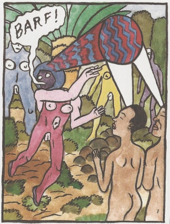
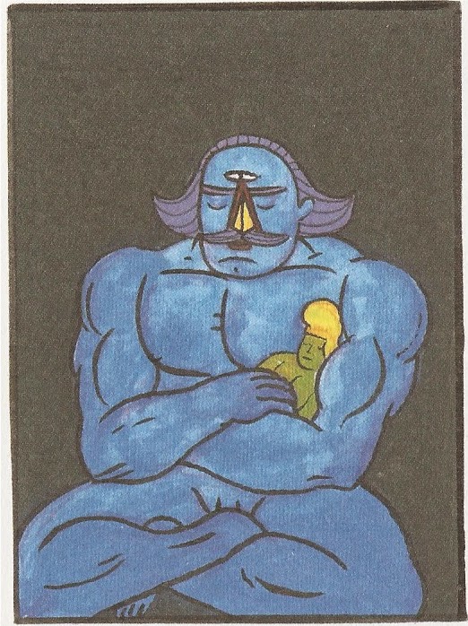
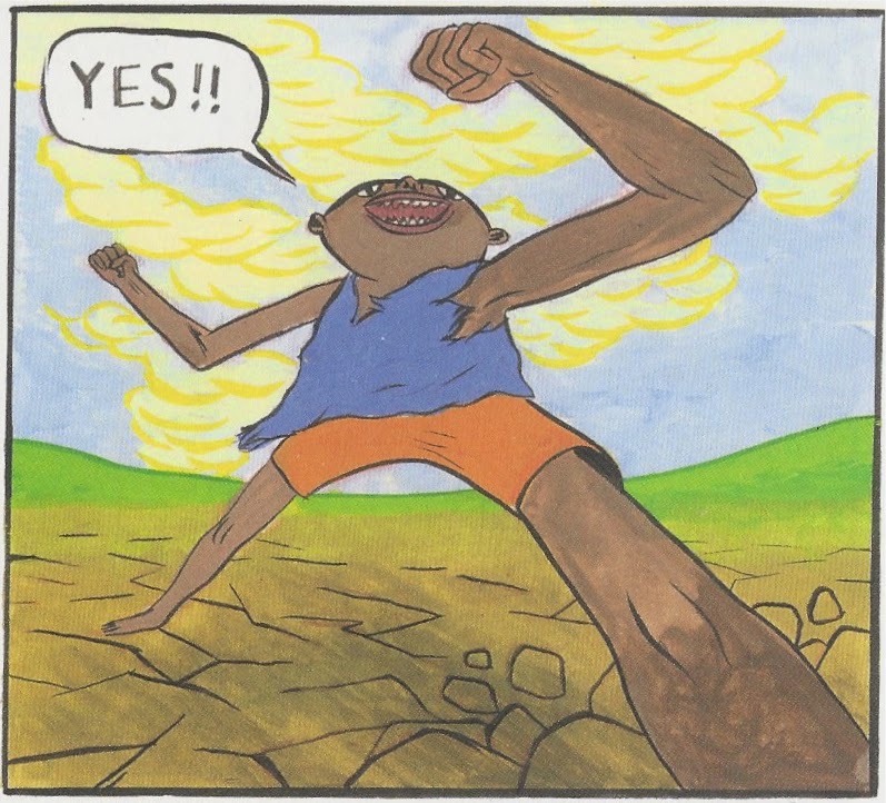
But it occurred to me as I read Forming II that it's hard to keep everyone straight. There are so many characters in these books, and they come from such a wide variety of mytho-religious traditions. So I decided I'd make a list of all the characters, who they are in mythology and who they are in Moynihan's hilarious mash-up of mythologies.

I realize that this post will be utterly obscure to 98% of this blog's readers. And I admit it's a totally fanboyish post to write. All I can say is, check out his comic--you can read it on your computer for free--and decide if you're interested. Or just skip this post!

I thought about organizing it alphabetically, but I decided instead to do it in order of the characters' appearance in the story (more or less). That way, you can read it along with the books or online strip. But keep in mind--my descriptions of the characters will frequently contain spoilers.

There are several characters that have no name (yet) and no mythological counterpart--the Yeti-like creature that defeats Atys, the snake-man who aids Lucifer, the personification of death that visits Nommo on Dogon, etc. But I wanted to concentrate on the identifiably myth-based characters.

Two characters who are mentioned but don't exactly appear in Forming are Ahura Mazda (father of Mithras) and Ain Soph. Ahura Mazda is a Zoroastrian deity, and Ain Soph in Kabbalistic lore is God prior to his self-manifestation.


Mithras

Mithras. In the book, he is a powerful, high-tech being from planet Dogon who has come to Earth in 10,000 BC to develop a mining colony. He is the son of Ahura Mazda and his assistant on Dogon is Nommo. He weds Gaia and fathers several children, who rebel against him.

Mithras was a Roman deity. It was assumed for a long time that he was associated with the Zoroastrian angel, Mithra, but apparently this link is now considered dubious. There is not much known about the Roman Mithras (although much is known about his cult). The Persian (Zoroastrian) Mithra was subordinate to Ahura Mazda, and was associated with cattle, the morning sun and justice.


Nommo

Nommo. Nommo is Mithras' put-upon assistant back on Dogon. He is contacted in his dreams by Lucifer, who is seeking outsiders to help him escape from his hellish prison at the center of the Earth. Lucifer later transforms Iapetus into Nommo.

In Dogon mythology, Nommo is not necessarily a person but a type of person--amphibious, hermaphroditic creatures. (The Dogon are a tribal group in Mali.) The Nommo are also associated with "ancient astronaut" claims, which sort of fits here.


Themis (left) and Gaia (right)

Gaia. She is a work-boss in Mithras' colony who becomes Mithras wife. We later learn that she was instructed to do so by Ghob, the gnome king. She has several children with Mithras--Brontes, Steropes, Arges, Cronus and Rhea--as well as two, Themis and Iapetus, with her lover on the side, Noah.

In Greek mythology, Gaia is the primordial goddess who represents the Earth. She is the mother of a whole host of mythological beings, including the Cyclopes, the Titans, some of the Muses and many more.


Cronus and Themis

Cronus. Cronus is one of the sons of Gaia and Mithras. Ghob instructs him to rebel against Mithras.

Cronus in Greek mythology is one of the Titans, a son of Gaia and Uranus. He becomes leader of the Titans and kills Uranus, only to be killed in turn by his son Zeus.


Left to right, Brontes, Steropes and Arges

Brontes. A son of Gaia and Mithras, he is a Cyclops.

In Greek mythology, Brontes is one of the three Cyclopes born of Gaia and Uranus. Brontes is also known as the thunderer, and all three brothers are expert craftsmen, forging Zeus's thunderbolts, Poseidon's trident, Artemis's bow and arrows, etc.
 
Steropes

Steropes. Another Cyclops son of Gaia and Mithras.

In mythology, Steropes is known as "lightning."


Arges

Arges. Another Cyclops son of Gaia and Mithras. He is contacted by Lucifer in a scheme to overthrow Mithras.He ends up in the pit of Tartarus, guarding a gem that Lucifer needs to escape his prison.

In mythology, Arges is "bright."


Serapis meets the native humans

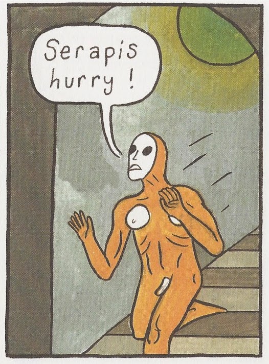
Serapis the Androgyne.  He and his posse of Nephalim guards land on Earth sometime after Mithras. They are law enforcement figures whose job is to shut down Mithras' illegal mining colony--but Serapis wants instead to get in on the action.

Serapis is a Graeco-Egyption god, supposedly devised by Ptolemy I to bring the Greek conquerors and Egyptian subjects closer together. He is, in a sense, a Greek version of the Egyptian god of the afterlife, Osiris.


Serapis and the Nephalim Guard

Nephalim Guard. They are clones of Serapis, acting as his henchmen.

The Nephalim appear the Torah as offspring of the "sons of god" and the "daughters of men."


Thenis and Mithras

Themis. Themis is a daughter of Gaia and Mithras. She wears a blindfold and can communicate telepathically. She contacts Cain by telepathy when she becomes worried about the degenerating state of her mother.

Themis was a Titan, representing Justice and divine law.


Iapetus and Lucifer

Iapetus. A son of Noah and Gaia, he is prematurely aged during the overthrow of Mithras. He keeps running things more or less as Mithras had, under the influence of Lucifer. His face is ripped off by Ghob, but he gets a new face--Nommo's face--courtesy of Lucifer.

Iapetus was a Titan, and a god of mortality. He is one of the sons of Uranus and Gaia--but he is sometimes linked to Japheth, one of the sons of Noah.


Lucifer

Lucifer. At the dawn of time, Lucifer wills himself into being, declaring himself independent of Ain Soph. He is trapped at the center of the Earth and contacts Arges, Nommo and the unnamed snake-man to try to free him.

Lucifer is, of course, the angel in the Christian faith who rebelled against God and was cast down.


Michael holding Mithras

Michael. Michael is an agent of Ain Soph who battles Lucifer. During the battle, they inadvertently cause the universe to come into being. As punishment for this, Michael casts Lucifer into the center of the Earth, where he plots his escape.

The Archangel Michael is mentioned in Jewish, Christian and Islamic scripture.


Adam

Adam. One of the humans encountered by Serapis when he and his Nephalim Guard land on Earth. Like all humans before the aliens came, he could communicate telepathically with other humans and animals. He was vegetarian, but Serapis corrupts him into eating meat. He seems to fair pretty poorly under Serapis'"civilizing" influence.

Adam is the first human in the Jewish, Christian and Islamic faiths.


Serapis, Adam and Sheshai

Sheshai. Another of the Nephalim.

In the Bible, he is one of the sons of Anak.


Rhea

Rhea. A giantess, she is the daughter of Mithras and Gaia. She loves her brother Cronus and has a baby, Zeus, with him. After Ghob rips Iapetus's face off, she engages with Ghob in an epic battle.

In Greek mythology, Rhea was a Titan, married to Cronus and the mother of Zeus. She hides Zeus from Cronus so that he can grow up and defeat his father, freeing his siblings, the Olympian gods, whom Cronus had swallowed.

 
Noah

Noah. Noah is one of the people of Atlantis not enslaved by Mithras. He is Gaia's lover and father of Iapetus and Themis.

In Jewish, Christian and Islamic traditions, Noah is the last of the pre-Flood patriarchs. He saves humanity and all animals by building an ark. His sons are Ham, Shem and Japheth.


Ghob

Ghob. The gnome king, he forces Gaia to marry Mithras, knowing that such a union would produce children capable of overthrowing Mithras. He later attacks Iapetus and rips his face off and subsequently engages in an epic battle with Rhea and Zeus.

Ghob doesn't appear to come from any ancient mythology as far as I can determine, but in modern "magical" practices, he is associated with the element of Earth and is the king of gnomes.


Serapis and Eve

Eve. Another of the humans Serapis encounters. He teaches her English then rapes her, impregnating her with Cain.

Eve is the second human in the Jewish, Christian and Islamic faiths.


Serapis and Talmai

Talmai.  One of the Nephalim.

In the Bible, Talmai is a son of Anak and a member of the Nephalim.


Arba

Arba. Another of the Nephalim.

In the Torah, Arba is the father of Anak.


Anak and Atys

Anak. One of the Nephalim.

Anak is a figure from the Torah, an offspring of the Nephalim.


Atys

Atys. He comes from the same place as Serapis and Mithras. Repeatedly bested by Serapis, he finally seems to have the upper hand only to be defeated by what appears to be a Yeti, who turns him into a large stone.

Attis was a Phrygian god of self-mutilation (he castrated himself ) and vegetation.  At one time, he was associated with Atys, the son of Croesus as mentioned in the Histories of Herodotus. That identification was apparently spurious, though.


Emperor Mainyu

Emperor Mainyu. He sent Atys to assassinate Serapis for going rogue.

Angra Mainyu was the evil opposite of Ahura Mazda in Zoroastrianism, a sort of Satanic figure.


Janus

Janus. On a whim, Janus manipulates time and space to help Atys.

Janus was a distinctly Roman god (having no Greek counterpart). Two-faced, he was the god of beginnings and transitions.


Cain

Cain. Child of Serapis and Eve. Through communication with Themis, he becomes aware of the gem that Lucifer lost. His battle with Nommo and the army of Titans causes the destruction of Atlantis and the seeming death of many characters. (But with Gods, death is not always the end.)

In the Bible, Cain is also the son of Adam and Eve, and kills his brother Abel--the first murder.


Zeus

Zeus. Zues is the blue skinned offspring of Rhea and Cronus.

In Greek mythology, Zeus is also the offspring of Cronus and Rhea, but he kills Cronus, who had hitherto eaten all his brothers and sisters upon birth. These siblings become the other gods of Olympus and Zeus is their king. His overthrow of Cronus leads to the battle between the gods and Titans.

Left to right: Adam, Abel and Seth

Abel. A son of Adam and Eve. Half-brother of Cain.

Abel, is, of course, the first murder victim in the Bible. (But not the last!)

Seth. A son of Adam and Eve. Half brother of Cain.

In Jewish and Islamic traditions, Seth is the third son of Adam and Eve, born after the murder of Abel.


Metatron and Noah

Metatron.  "Mediator between higher and lower gates," he seems to be a messenger on behalf of Ain Soph, appearing to Michael and to Noah at various times.

Metatron is an archangel in Jewish and Christian folklore, although he does not appear in canonical scripture.

Pan is Five Year Old

$
0
0
Robert Boyd


I just realized that Pan had an anniversary this month. The Great God Pan Is Dead is officially five years old. Now if you look over in the right hand column, you will see posts going as far back as December, 2006. But that is a little deceptive.

I started a personal blog (initially called Boyd's Blog, later renamedWha' Happen?) back in May 2006. I occasionally wrote about art on it, increasing in frequency as I made more of an effort to see more local art events and exhibits. Finally, in August 2009, I decided to spin off an art blog separate from my personal blog. My first post official post was posted on August 21, 2009. But I imported a bunch of art posts from Wha'Happen? into this blog, which is why it seems to start much earlier.

The first five posts after that introductory post were:
Interestingly, some of these are subjects I would return to again and again: two more posts about the Vogels,  several posts mentioning Jim Pirtle (including this one), ditto for Surls, Elaine Bradford and Emily Sloan.

As for Wha'Happen?, it gradually diminished as The Great God Pan Is Dead expanded.

To celebrate our fifth birthday, I'm going to re-post my five favorite posts, perhaps with a little introductory commentary, over this Labor Day weekend.

I want to thank everyone who has read The Great God Pan Is Dead for the past five years, and I especially want to thank the writers who contributed over the years: Dean Liscum, Virginia Billeaud Anderson, Betsy Huete, Brian Piana, Paul Mullan, Pete Gershon and Carrie Marie Schneider. Thank you all so much!

Zombie Formalist Shootout in Galveston

$
0
0
Robert Boyd


William Powhida and Jade Townsend, Map of the town of New New Berlin

This map greeted visitors to New New Berlin and the Nevada Art Fair, an installation by William Powhida and Jade Townsend, at the Galveston Artists Residency last weekend. Bill Arning is identified as mayor. Given that this entire installation is a satire of Houston and of the art world, it's not exactly a compliment. But why Arning and not, say, Gary Tinterow? Because back in 2012, the following quote appeared in Art in America:
“Moving to Houston four years ago I had no idea I would find an art scene so vibrant, international and spirited,” CAMH director Bill Arning told A.i.A. over the weekend. “I keep telling artist friends that it's the new Berlin: cheap rents; great galleries, museums, and collectors; and a regular flow of visits from the best artists working today.” [Paul Laster, Art in America, October 21, 2012]
Or maybe they were thinking of this quote:
First off I tell artists it's the new Berlin: cheap rent, a global audience, scores of supportive venues. It's an amazing life for art makers.  ["Interview; Bill Arning Director Of The CAMH HOUSTON the `New Berlin`", Maria Chavez, Zip Magazine, August 28, 2013]
First Arning is stabbed in the back by an artist he's exhibiting, now this: Arning portrayed as the huckster selling Houston to the art world, not so different in the spirit from the ad the Allen Brothers placed in newspapers across America in 1836.


The installation makes snotty fun of Houston, but isn't very deep. I'll outsource most of my opinions to Bill Davenport's great review in Glasstire, which can be summed up with one phrase: "simplistic carpetbagging."


entryway to New New Berlin


New New Berlin had privatized security, of course.


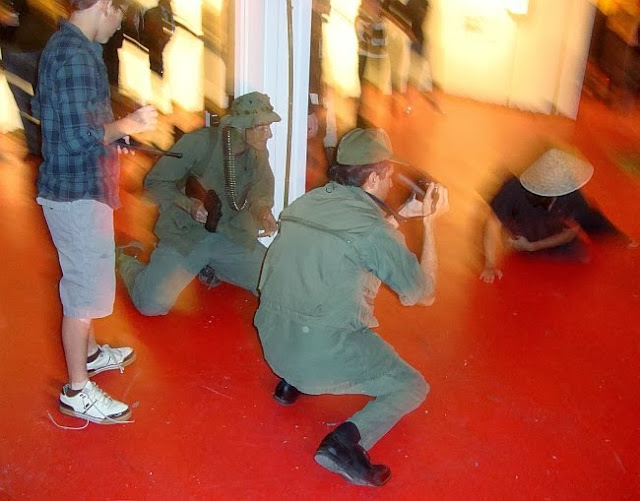
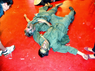
A saloon/whorehouse (where the warm whiskey was free if you were wearing a cowboy hat). The bartender was artist Brian Piana.


And David McClain played the reactionary newspaperman, who from time to time came out to read what seemed like a completely unhinged rant. It turned out to be from "The Alamo," Michael Bise's passionate but confusing editorial that ran in July in Glasstire.


And naturally there was a money-grubbing church complete with a Dan Flavin-style cross. The preacher was Emily Sloan, who has a lot of relevant experience given her "Southern Naptist Convention"and "Carrie Nation" performances.


William Powhida & Jade Townsend, ABMB Hooverville, 2010, Graphite on paper. 40 x 60 inches 

It was the "Flavin" cross that caught my eye. As satirists of Houston, Townsend and Powhida aren't brilliant. But as satirists of the art world, they're quite clever. Their collaborative drawing ABMB Hooverville imagined the glitterati of the art world living in a shanty town on the beach, for example. Much of Powhida's solo work spells out (quite literally) his disgust with the crass Veblen-esque corruption that typifies so much of the upper level, blue chip art world. 

Typical of his work is to make a list--"Why You Should Buy Art", "Some Cynical Advice to Artists", "What Can the Art World Teach You", etc.--and then carefully draw it. I don't mean calligraphy (although that is a part of it). What Powhida does is to make a list or piece of text or diagram on a piece of paper and then carefully draw the piece of paper as an object.


William Powhida, What Has the Art World Taught Me

New New Berlin and the Nevada Art Fair are full of lists and signs.


The newspaper's editorial policy is a satire of corporate media.


The military/police/prison industrial complex gets the works, too.


And here is a map of the Nevada Art Fair.

And you can see Powhida's hand in them. The content is sarcastic and the writing is recognizable. But while the newspaper editorial policies and White Horse Security Services seem obvious and heavy handed, the more art related stuff seems funnier and stronger. Like the fact that you in the floor plan for Nevada (itself a take-off of the NADA art fair), the booth for Non-Profits is completely closed off.


The one building in New New Berlin that really works on this level is the Livery Stable. It reflects a common trajectory of post-industrial structures. First a structure may be a factory or a warehouse--a working building. Then after a while, that function no longer exists (in America, at least). The building becomes derelict until someone has the bright idea of handing it over to artists for studios. The artists move into this shitty but indestructible structure and turn it into a lively space for art. The once derelict neighborhood the building occupied gets a few bars and restaurants and becomes "hip." The owner of what was a white-elephant can now sell out to a developer who will put condos in the old warehouse after giving the artists the boot. It's an old story, and what I like about Townsend and Powhida is that they relate it to the old West (a livery stable being the nastiest building in town, and one devoted to work) and include the whole cycle in a series of overlapping signs--the "Artists Studios" banner that overlaps the "Livery Stable" sign, the "Luxury Condos" sign that is pasted on top of the "For Sale Sign".


Nevada Art Fair shooting gallery

The best part of the installation was the shooting gallery. Several "artworks" were hung on the far wall of the GAR gallery, and visitors had the opportunity to fire paintball guns at them. They were in "booths" for various galleries, such as David Zwirnered and the Joanna Picture Club (to give it a little local flavor).


Participants could fire paint guns at the pictures, which over the evening became encrusted with paintball residue. Shooters were in theory limited to five shots each, but many of these nice, liberal artsy types went hog wild as soon they got a gun in their hands, firing dozens of shots while Jade Townsend yelled "Only five shots per person!" in irritation.


 Jade Townsend firing in the shooting gallery


David McClain takes a shot

Hyperallergic editor Hrag Vartanian was there, and he commented that the paintings almost looked like contemporary abstractions one could see at a real art fair. That made me think of"zombie formalism," the term that Jerry Saltz recently applied to so much contemporary abstract painting. So what do you think, readers? Could any of these paintings go toe-to-toe with Lucien Smith, Dan Colen, Parker Ito or Jacob Kassay?


So New New Berlin and the Nevada Art Fair weren't entirely successful as works of participatory art, but shooting paintballs at canvases was a whole lot of fun. All art fairs should include a paintball firing range.


The Best of Pan: Newsflash: Thomas Kinkade and his Art are Ridiculous!

$
0
0
[This post was originally published on January 11, 2011. I'm proud of it because it spells out a theory of parody and explains why this massive installation failed as parody. At the time, Diverse Works was doing a lot of ambitious installations that just didn't really work--see this review of Tara Conley and Tria Wood's My Life As a Doll by Dean Liscum for another example. Since this post was first published, Diverse Works has undergone a complete change in management and Thomas Kinkade has died.]

Robert Boyd

Photobucket

Boy, that Thomas Kinkade sure does suck. He must suck, or Patricia Hernandez wouldn't go through so much trouble to create an elaborate parody of his oeuvre at Diverse Works. To be sure, Kinkade's saccharine confections are flabby and sentimental. His business empire is built on marketing kitsch to rubes. This has been obvious to everyone with a smidgen of education and taste in America. (In other words, the dreaded cultural elite that misters Beck and Hannity and O'Reilly do yeoman's work warning us against.) And, perhaps most satisfying to starving artists everywhere, Kinkade's empire is collapsing--his company, which went public in 1994 with an IPO of $110 million, entered bankruptcy in June of 2010. The self-proclaimed Christian evangelical was arrested for DUI last year and has lost several lawsuits brought against him from franchisees who say they were defrauded by the self-proclaimed "Painter of Light."

Photobucket
The transparent obviousness of Kinkade's awfulness, his corporatizing of art, his dreadful bad-taste-mongering, would seem to make parody or his work, well, a bit pointless. Why bother? And yet not only did Patricia Hernandez parody his work, she built a whole mall to do so. It is hard to imagine a more monumental waste of effort. I don't necessarily oppose kicking someone when they're down (indeed, when they are down, they're in the perfect position to be kicked), but I don't see much point.

Photobucket
Patricia Hernandez, Parody of Light showroom, installation, 2010

How does parody work? I grew up reading MAD magazine. About one third of MAD was free-form humor. Another third was satirical. And the remaining was parody. When I was reading it, the most popular parodies were their movie parodies, drawn by Mort Drucker. They seem pretty obvious in retrospect, but they had a great deal of power. Why? Because they were making fun of things that we 12-year-old readers were simultaneously consuming. We'd see a movie like Butch Cassidy and the Sundance Kid and read the MAD parody, "Botch Casually and the Somedunce Kid." And the parody would point out the cliches in the movie, and how illogical parts of it were, etc. It was undermining the very entertainment we were consuming--almost in real time. That's what good parody does. It speaks to the people who accept the thing being parodied as normal--and it tells them how not normal (how contrived, how ridiculous, how manufactured) it is.

Photobucket
Patricia Hernandez, Parody of Light branded toilet paper, installation, 2010

Parody is important. It's one of the ways we see behind the curtain. When we get used to the conventions of some form of art, parody comes along and reminds us that these conventions are there. This helps us because sometimes, those conventions can acquire status as eternal verities. These conventions can, over time, seem to have moral force. Parody is the court jester, the little boy pointing out that the emperor has no clothes. It's a key aspect of postmodernism, and is one way to achieve defamiliarization of the "normal."

But parody implies an audience. The reason that the National Lampoon Sunday Newspaper Parody and National Lampoon 1964 High School Yearbook Parody worked so brilliantly (besides the brilliance of the creators of those works, Doug Kenney, P.J. O'Rourke and John Hughes) is because everyone read the newspaper (in the late 70s) and everyone had a high school year book. They were examples of default culture for everyone who read the parodies. Their fundamental normalness and the invisibility of the conventions and assumptions that went into them made them ripe for parody--but only if the people reading the parodies were already intimately familiar with the things being parodied.

You can see where I'm going here. Hernandez isn't aiming her parody at people who otherwise are surrounded by Kinkade's kitsch. On the contrary, by placing the parody in Diverse Works, she is hitting a sophisticated, art-savvy audience that already knows that Kinkade is a charlatan and that his art is kitsch. Her work can't defamiliarize Kinkade's art because we already can see the strings Kinkade is using to manipulate his viewers. The revelatory aspect of parody is entirely absent.

Photobucket
Patricia Hernandez, A Perfect Day, oil painting, 2010

What are we left with, then? Nothing pretty. Hernandez writes "The face of the clown [whom she has inserted into the paintings] remains unseen because it has no single identity. It's a stand-in for Kinkade, his audience, how the public often perceives artists, or in a couple of images, for me." [Emphasis added.] So in the end, this whole endeavor becomes another opportunity for sophisticated, educated people to make fun of the bad taste of poor people. It's a little like that website, People of Walmart. It's funny, but I feel uncomfortable laughing at the tastelessness and cluelessness of the working class. And that's what I feel like Hernandez is doing. Making fun of the rubes.

Photobucket
Patricia Hernandez, Leap Through a Void, oil painting, 2010

On February 26, Diverse Works will be selling the various "Parody of Light" branded objects to benefit something called Studio One Art Resources, which is a nonprofit formed by Hernandez to help Houston's alternative art spaces establish archives--a very worthy and needed project.

The Best of Pan: The Battle of 11th Street in Which Shit Got Real

$
0
0
 [This post is from March, 2012. Around that time, Pan was starting to get more interested in performance. This was mostly due to Dean Liscum, who has written many amusing accounts of the Houston performance scene over the past few years. Since this time, Otis Ike and Ivete Lucas have had several more exhibits locally. The woman who attacked the performance was a local artist. She later explained that her anger was fueled by being hassled by the reenactors. She didn't like guns being pointed at her. She has since moved to a different part of the country, but out of respect for her I'm going to continue to keep her identity a secret!]

Robert Boyd

GGallery had an opening last night that dealt with the imitation and reality. The show, One Big Mistunderstanding, by Otis Ike and Ivete Lucas, was all about the subculture of Vietnam War reenactments. Like its better-known counterpart of Civil War reenactments, the Vietnam reenactors stage battles and skirmishes as realistically as they can, short of actually killing people. A chance encounter with a reenactor at a flea market led Ike and Lucas into the subculture. Ike and Lucas have documented subcultures before, so this would seem to fit in with their previous practices. The installation was very well made, which I have to credit to new GGallery codirectors, Diane Barber and Bradford Moody. (Indeed, the gallery in general looks a lot better and less cluttered now.)


One Big Misunderstanding installation view


One Big Misunderstanding installation view


Otis Ike, 1966 Moynihan's Men, photograph

The majority of the show consists of photos like this, some in color and some in black and white. The wall text suggests that the black-and-white photos are supposed to be more ambiguous--are you looking at a reenactment or the real thing? 

Lucas and Ike's documentation of the scene wasn't limited to photographs. They documented the online presence of the reenactors, including their obsession with Star Wars.


(This painting of Chewbacca riding a squirrel and fighting Nazis is by an artist named Tyler Edlin who, as far as I know, has nothing to do with the Vietnam reenactor community, beyond having a few of them as fans.)


One side of the gallery was occupied by this bamboo hut, where performers dressed as Viet Cong entered, exited, and busied themselves looking like they belonged there. In the hut, a video played which combined footage shot of the reenactments, footage from the Vietnam war, and what appeared to be a first-person Vietnam combat video game. They were clearly playing with what was real and what was a representation. This tension underlay the whole enterprise.


For instance, this guy manning the table with two machine guns on it. Was he a vet? Were the guns real or replicas?

There were numerous performers, in essence playing the part of reenactors who themselves play the part of actual soldiers. (The performers may have included actual reenactors, but I don't think all of them were reenactors.)


urban guerrilla


Viet Cong in stripper boots

At 7 pm a performance was to begin. The Viet Cong were gathered around their hut while the American soldiers crept up, snaking through the crowd of viewers.


Now all through the show, there was one viewer who had been loudly proclaiming her disapproval of this whole thing. This show and Vietnam reenactments in general were "bullshit." I don't want to put words in her mouth, but she seemed to be saying that there was something wrong if not obscene with playacting this horrible war. She was steamed. But no one expected her to attack the performance.


She is the blue-grey blur in the pile of bodies in this photo. She literally hurled herself into the middle of the battle reenactment with fists swinging. She's a small woman, but she managed to bring down these performers into a pile. The viewers were confused. I was confused. Was she deliberately joining in with the performance as a spontaneous provocative act? Or was she, in fact, physically attacking the performance.

It was the latter. This group of performers pretending to fight in Vietnam were quite unexpectedly attacked for real. The ambiguity between reality and representation could hardly be better demonstrated than by what happened.


But the performers were troopers. After their attacker had been dragged away, they stayed in character (playing corpses).


Then surreally, a guy dressed in 60s pop-star drag came out and sang "These Boots Were Made For Walking."


This seemed calculated to remind the viewer of one of the most surreal scenes in Apocalypse Now, the Playboy Bunny performance at the jungle base. By this time, the attacker had been hustled out the door, and was looking worse for the wear--swollen lips, two chipped teeth, and blood in her mouth. Her attack had been fueled by plenty of alcohol, and she was still mad as shit. But her friends managed to move her away from GGallery and ultimately to her home.

When Le Sacre du printemps premiered at Théâtre des Champs-Élysées in 1913, the audience rioted. But this kind of reaction to a performance is rare. Even the most "transgressive" performances are viewed by polite, respectful audiences. I'm embarrassed to admit it, but it was thrilling to see this melée. It was refreshing to see someone who felt so passionately that she physically tried to interrupt it. Afterwards, I recalled Mario Savio's words: "There's a time when the operation of the machine becomes so odious—makes  you so sick at heart—that you can't take part. You can't even passively  take part. And you've got to put your bodies upon the gears and upon  the wheels, upon the levers, upon all the apparatus, and you've got to  make it stop." But my pleasure at witnessing it was not so high-minded. I was pleased to see a polite little performance turn into something that seemed so real.

This unplanned bit of craziness and violence reiterated one of the themes of the exhibit better the show itself ever could. That tension between reality and representation was brutally brought home by this unplanned act. This small woman tackling several grown men was--unlike every other thing in the show--real. But as you watched it, you didn't know. You kept asking yourself, is this part of the act? Is this really happening? Like David after the dentist, this was a performance where you had to ask yourself, "Is this real life?" And as it recedes in time and becomes a part of memory, I am still asking myself that question.

Update: Over at Glasstire, one of the performers, Manik Nakra, has a first person account of the attack/intervention.  Also, I'm told by Otis Ike that the Nancy Sinatra performer is Paul Soileau, aka Christeene.

The Best of Pan: Green Blob saves Cello Fury from Naked Tutus (NSFW)

$
0
0
[Dean Liscum had been blogging for Pan for a while when he wrote this post. He had even started blogging about performance.  But his humorous appraisal of this anarchic show seemed to prefigure his later writing on performance art in Houston. He was an eager participant, willing to allow himself to be moved by what he was seeing and experiencing, but also willing to have a laugh. Dean's performance posts have been some of the most popular in the history of the blog--possibly because of all the nudity in them, but I hope all those people searching for naked performance artists took the time to read Dean's great writing.]

Dean Liscum

In the dead center of summer in Houston, Tuesday's are dead. Monday's are even more livelier because it's industry night and you can buy drinks for you favorite bartender and s/he can remind you what a lousy tipper you are and how lame your game looks to the rest of the bar.

In the art world, they're even deader. So, when one of the members of Continuum forwarded a FB invite to Southmorehouse's event Naked Tu-Tu Tuesday #27. I glanced over the invite (excerpted below), reviewed my desolate social calendar, and clicked Join.
This is a ballet themed NT so bring your naked self and your Tutus to Notsuoh on Tuesday July 31st for an evening of ballet, music, and audience participatory performance art featuring Cello Fury from Pittsburg, PA (that does not mean "Prince Albert", folks) and Continuum, a local Houston performance art troupe (who will also lead a movement workshop).
To get such a sweet spot we have already volunteered to do an exhibitionist improv and definitely goofy dance routine while they play. Just kidding - maybe...
The phrase that caught my attention (and inspired my attendance) was "audience participatory performance art featuring Cello Fury." What the hell, I thought. I like Cello Fury's music, and even though I've never participated in a performance art piece before, I figured that I could undulate to the rhythm in a way that would make my white boy ancestors proud or at least play the equivalent of a performance art landscape prop.

I also discounted the theme spelled out in the title due to three facts:
  1. The invitation included the following disclaimer: "...There will be lots of people wearing clothes. Please, no pressure on them. The idea of NT is to make everyone comfortable with whatever their choice of attire."
  2. Although we're not technically in the Bible Belt, we are below it. Even though the dirty south may be on the down low, we don't admit those kind of things or show them in public.
  3. And finally, I took the line "PA (that does not mean 'Prince Albert'...), as an implicit guarantee that come what may, I wouldn't have my frenulum staple-gunned to my thigh. (At a place like Notsuoh, it's a good guarantee to have.)
Tuesday arrived and so did I. The show was on the second floor of Notsouh. I opened the door and raced up the stairs into a re-enactment of Marina Abramović and Ulay's Imponderabilia by two Continuum members. The performance art piece involved a naked (except for a stocking cap) male and a naked female on opposite sides of an entrance. Anyone who wanted to pass through the threshold had to walk between the two naked figures. Because of their presence, the entrant had to turn sideways and face (and come in contact with) either the naked male or the naked female.


Members of Continuum re-enacting "Imponderabilia"

This performance greeted everyone who showed up to the audience participation training. I was perplexed by the choice before. I was also fully aware of the political-social-sexual implications that I was forced to ponder. So rather than make a decision, I made multiple decisions and passed between the performers sometimes facing the male, sometimes facing the female until, like a over indulgent child at a free carnival ride, I was asked to let someone else take a turn.


I was mostly worried about stepping on their toes with my boots.


I could have ridden that ride all night but someone threatened to get out the staple gun.

On the second floor, it was a pretty sparse crowd. Maybe 20 people, half of them naked Southmorehouse regulars wearing more smiles than tutus.

The remnants of the first performance was being cleaned up. It featured Christine Cook fully experiencing her cake and ending in what any foodie (or your id) would enviously label a "foodgasm."


Have your cake and wear it too (photo copied from southmorehouse FaceBook page)


photo by Hilary Scullane

Next on the agenda, Continuum members, Sway Youngston and Jonatan Lopez re-enacted another Abramovic\Ulay performance piece, Light/Dark. This work started with the two artists sitting cross-legged across from each other staring into each other's eyes.


boy sees girl Abramovic-style

They then took turns slapping each other, tit-for-tat or rather whap! for wham! as the blows resonated in the space.


slap and ...


(tongue) tickle

The exchange evolved or devolved into a wrestling embrace. Both performers remained seated, but managed to lock arms and hold-grapple-pull-twist each other climaxing in an embrace-kiss. For the denouement, they then re-established the separation and the slapping until the piece simply ended.


Continuum members varying interpretations of the naked tutu

After pondering that painful performance (a metaphor for relationships? romantic love? the life of an artist? Continuum dues?), the audience drank beer, took photos, and lamented the fact that Texas has 367 miles of coastline and one clothing optional beach, which is Hippie Hollow in Austin. (At this gathering, I observed that naked people talk about being naked and nakedness issues as opposed to the geopolitics such as the war in Syria or the economic crisis in Spain.)


Rosario and Rosalinda plead with artistically inept

Around 9 p.m. instructions for BalletSutra began. I was excited. After all, this piece inspired me to show. Not because it was entirely new (Lopez had previously performed YogaSutra), but because it aspired to make the inartistic (namely the inartistic me), artistic. I figured if they could turn me into a performance artist, who knows what other transformative powers their art might possess.


The piece began with an introduction of our teachers, Rosario and Rosalinda, who apparently hailed from some undisclosed latin american country or a Jorge Luis Borge short story. Rosario explained that we would perform this sutra in front of the band Cello Fury as they played one of their sets. Rosalinda explained that the philosophy of BalletSutra involves a "dominate" and a "submissive," which seemed a more accurate description than just having a lead and a whatever that other person is.


The R's then walked the participants through the 5 movements of BalletSutra. There was twirling, flapping, kneeling, and something like a pirouette. It felt like a cross between tango, two-step, and ballet, but mainly it was slow and deliberate and the intentionality gave it gravitas. We performed the 5 movements until it appeared that either we had mastered it or that if nothing else we were more likely to injury ourselves on an out-of-control spin than a member of Cello Fury.


Beware: BalletSutra in progress

Our instructors congratulated and dismissed us. Then we waited for the band and their fans to arrive. Neither of whom knew that a group of naked tutu-ists, newly schooled in the art of BalletSutra and eager to show off our mad skills, was awaiting them.

They arrived and their presence inspired some to frolic frenetically on stage and ...


all around it. The roadies looked a little flustered. Cello Fury's fans did some jaw dropping, but the stayed and everyone settled in. The opening act started playing and everyone relaxed...or at least relaxed as much as they could if you were at a family gathering and uncle Leo refused to put his pants on.


Then Cello Fury took the stage and began to play. BalletSutra did not commence. Turns out that Notsuoh's upstairs stage is not quite as big as the members of Continuum thought. So out of safety concerns and\or in deference to Cello Fury (who wasn't warned of\invited to\ approved of, or collaborate in the whole BalletSutra thang), Continuum called off the performance leaving several of its supporters dressed in tutus, primed for dominance and/or submission, and without an expressive or creative outlet for their 5 new dance moves.


So Cello Fury jammed on (in a similar fashion to the video but this is not the performance), encouraging audience members to dance, and some did. But, no one BalletSutra'd as they boogied.


Meanwhile, 4 members of Continuum regrouped in a space next to the crowd and performed the "Green Blob." This performance consisted of a constantly moving, changing amorphous mass of green humanity.


Faces, feet, hands, and haunches protruded and then receded from the giant green organism as it slithered, shivered, and undulated across the floor. I was mesmerized as my mind tried to identify the creative anatomies that were limned in green. How could a thumb-nose-hip be in that configuration? And before I could puzzle out the pose another emerged.


The piece lasted for several minutes until the exhausted members emerged to applause. The consensus among those who'd seen it performed at the Texas Contemporary Art Fair and Bar Boheme during Continuum's turn at Cultured Cocktails was that this performance was a 'great' Green Blob.


Continuum members and their supporters. What you looking at Willis?

I left the evening tutu'd, artistically un-transformed, but better for the experience.


The Best of Pan: Dallas Is a Jewel

$
0
0
[In 2012, I took a big road trip across Texas, visiting museums and srt spaces in San Antonio, Marfa, Dallas, Fort Worth and Austin. The upshot was a series of posts, including this three-part post on Dallas (here are part 2 and part 3). The post comes off as quite critical of Dallas, but the fact is that I loved Dallas and its art, and have been back severaltimes and encountered more of the vibrant alternative scene there.]

Robert Boyd

Did you ever see Dallas from a DC 9 at night
Well Dallas is a jewel oh Dallas is a beautiful sight
But Dallas is a jungle but Dallas gives a beautiful light
Did you ever see Dallas from a DC 9 at night

Dallas is a woman who will walk on you when you're down
But when you are up she's the kind you want to take around
And Dallas ain't a woman who will help you get your feet on the ground
Dallas is a woman who will walk on you when you're down

(bridge)
I came into Dallas with the bright lights on my mind
I came into Dallas with a dollar and a dime

Well Dallas is a rich man with a death wish in his eyes
A steel and concrete soul in a warm heart and love disguise
A rich man who tends to believe in his own lies
Yeah Dallas is a rich man with a death wish in his eyes

I arrived in Dallas not by DC-9 but after a non-stop drive from Odessa. My hotel, The Belmont, was on top of a hill overlooking some warehouses, a dollar store, and, off in the distance, downtown Dallas. The Belmont is an old moderne-style hotel built in the 40s and rehabbed fairly recently into hipness. And the neighborhood it's in, Oak Cliff, has undergone a similar transformation. When I arrived in Dallas, I went to a superb restaurant in Oak Cliff called Gloria's with my friend, Todd Ramsell. Todd gave me a tour of the Bishop Street Arts District, a part of Oak Cliff. From what I can tell, Oak Cliff's story is similar to that of the Heights in Houston. A charming neighborhood that became a slum, which made it cheap enough for some artists to movie in, which gave it some hip cache, which caused it to gentrify. The Belmont Hotel is an example of this and is a beautiful reuse of already existing architecture. Driving around, Oak Cliff felt a little like South Congress in Austin. Hip but commercial.

Ramsell told me that some Oak Cliff residents are so loyal to their hood that they try to get the city on their drivers licenses to be shown as "Oak Cliff" instead of "Dallas." (Oak Cliff tried and failed to secede from Dallas in 1990.) But trying to put Oak Cliff on your driver's license is not just an expression of Oak Cliff pride--it's an expression of being ashamed to be from Dallas. As hard as it is to believe about a city that swaggers and wears its self-importance on its sleeve, there are people who cringe at being from Dallas. And for good reason--people from other places really dislike Dallas. Ramsell related to me that occasionally when he tells someone he's from Dallas--especially someone from Austin--their first response will be to say with false solicitousness, "Oh, I'm sorry." I mentioned this to my sister who lives in Austin, and she sent me the phone photo below, which proves Ramsell right.

 
How Austin views Dallas

So what is Dallas? A self-confident art colossus with huge museums (and malls and football stadiums) housing fantastic art collections? Or a place of meek, embarrassed artists who might prefer to be from somewhere else, even if that somewhere else is only Oak Cliff? I think it's both. Dallas has a bit of an inferiority complex, and this manifests itself simultaneously in grandiosity and "cultural cringe." (And look, lest anyone think I am picking on Dallas, I think this is a common complex for provincial art towns, including Houston. I have an artist friend here who is constantly comparing Houston's art scene unfavorably to San Francisco's, for example.)

I was in Dallas for a few days. This was my first extended trip to the city since I was in college. Recognizing that there is something dubious about a critic parachuting in for a few days and then pronouncing judgment, I offer the following disclaimer: this post represents my first impression of the Dallas art scene, but hopefully not my last.

One thing that struck me as weird about Dallas was the way that everything is a "district." The city (or someone) seemed desperate to brand any given part of Dallas as this or that "district". There is the Arts District downtown, the Design District west of downtown, and in Oak Cliff, the Bishop Arts District. (Never could find the Hobo District, though.) In terms of visual arts, the Bishop Arts District seems largely aspirational. According to this gallery map created by Douglas D. Martin, there are only four galleries in this district, compared to a bunch over in the Design District and a large number scattered in other neighborhoods like Deep Ellum. (BAP offers plenty of places to shop, though.)

I started off in Deep Ellum. I wanted to see Kirk Hopper's gallery in particular because I had corresponded  with him briefly about Forest Bess (he runs the big Forrest Bess website, an invaluable resource). He wasn't at the gallery, but I was pretty impressed by the space itself. It was late sumer and late summer is a time for more eccentric art shows. Kirk Hopper was showing Amerwarpornica, a two-person show featuring the work of Kara Maria and Eurydice (yes, she has a one-word name, just like Cher or Sting). Both of them incorporated pin-up/porn images in their work. Eurydice's was notable because it was embroidered.


Eurydice, George (Washington) Gets Hot, 2010, hand-stitched with silk thread on hand-dyed silk, 52: x 43"

The centerpiece of the exhibit was a massive embroidery by Eurydice called Bathers. Here, she provides her take on a classical erotic subject. The bathers are, as far as I can tell, taken from pornographic sources and "collaged" together. They don't quite seem to be occupying the same space as one another, even though they are layered and recede n the distance. This strange "collage" effect may remind viewers of another artist who copied mass-produced female images to create vast populated landscapes--Henry Darger. Even the color of the underlying canvas recalls the somewhat yellowed paper of Darger's original art.


Eurydice, Bathers, 2012, hand stitched embroidery on unprimed canvas and vintage silks, 8' x 28'

I'm interested in the work, but when I walk into a gallery like this, I often wonder who the theoretical buyer is? (Assuming there is one, of course.) Who would hang a 28-foot wide tapestry of porn girls in their home? I'm almost more interested in the potential owner of this work than the work itself. Given the time of year, Hopper may have been assuming that no one would spend $60,000 for Bathers, but that it might draw attention to his gallery. And that seems like a pretty reasonable late-summer strategy.

Barry Whistler Gallery is right around the corner from Kirk Hopper Fine Art, but it was closed when I went by. But I did find something that was to characterize my Dallas trip.


I saw this sign for Health Care Art Consulting and felt instant cognitive dissonance. How do these words go together? But apparently, this is a company that supplies hospitals and other health care facilities with art. And thinking about it, I am not surprised such a business exists. But think about the art you see in hospitals and doctors offices. It is so unmemorable, so staggeringly banal, that it barely exists. And yet here is a business devoted to providing it. I'm sure this service is available in Houston and elsewhere. But until I came to Dallas, I never saw someone advertising this service. And in Dallas, it turns out, such advertisements are common.

 
Art for every occasion

In fact, Dallas has a whole part of town devoted to this kind of thing. It's called the Design District, and it's where you go to buy furniture, decor and art. As you can see in the gallery window above, you can buy art for your corporate offices, your medical clinics, your hotels, and for your home--one-stop shopping! This whole district was confusing to me. There's nothing like it in Houston. No doubt we have retailers of business furniture and interior designers who work to fill hotels and corporate offices with eye-pleasing decor. We just don't have a neighborhood devoted to it.

The Design District has its own sign

I spoke to Danette Dufilho at the Conduit Gallery (a very good gallery in the heart of the Design District), and she told me that at one time, this had been a strictly B2B area. Interior designers, acting on behalf of corporate and individual clients, would buy the furniture and decor they needed here. Apparently, vendors here realized there was money to be made by opening up to the public.

 
Corporate decoration or art? You decide!

The problem I see is that there's no clear demarcation between the galleries that sell corporate decorations by the square yard and the galleries that sell art qua art. Indeed, having such a district where these distinctions are blurred helps remind one that all art in art galleries, no matter how cutting edge it is, is merchandise.

Still, as I noted, there are galleries in the Design District selling interesting work which would be unlikely to be bought by an interior decorator for a corporate office. Conduit Gallery is one of those, and when I visited them, their front gallery was full of beautiful, dangerous-looking objects by Gabriel Dawe (who had a very cool installation last year at Peel).

 
Gabriel Dawe, Pain Series no. 23, 2012, deconstructed shirts and pins, 22" x 11" x 9"

 
Gabriel Dawe, Pain Series no. 28, 2012, shirt collars, sequins and pins, 11" x 8" x 6"

These sculptures, made of pins and fabric, make one think of iron maidens and other medeival torture devices. Or dangerous S&M devices, or things used by the bad guys in a horror movie. Pain Series No. 28 made me also think of primitive carnivorous creatures with maws filled with razor-sharp teeth, waiting for you to swim too close. In short, there is no way someone would put one of these elegant, deadly things in a hospital or corporate office. And in this way, Coduit Gallery separates itself from some of its peers in the Design District.


piece by Rex Ray, oil, acrylic and mixed media on linen

On the other hand, they were also showing colorful, pretty work by Rex Ray in the back, so perhaps they hedge their bets.

Other work I saw in the Design District that struck me as more than mere corporate decoration were the paintings of Benjamin Terry and painting/photos of Bonny Leibowitz at Cohn Drennan Contemporary.

 
Bonny Leibowitz, Streaming Consciousness, 2011, photography, encaustic, monotype on kozo and and pigment on cradled board, 30" x 30"

The two artists seem strikingly dissimilar, and I wonder why they were paired for this show, Blurr. But I liked Leibowitz's quasi abstract pieces, and while it took me a few minutes to get past my feelings of "ugh--paintings of hipsters," I warmed to Benjamin Terry's paintings as well.

 
Benjamin Terry, Over and Over Again, 2012, mixed media on panel, 75" x 74.5"

And over at Holly Johnson Gallery, there was a very likable show of Al Held-like abstractions by Tommy Fitzpatrick.


Tommy Fitzpatrick, Close-up (left) and Structural Components (right), 2012, acrylic on canvas, 13" x 17" each

 
Tommy Fitzpatrick, Techtonic, 2012, acrylic on canvas, 48" x 40"

 
Tommy Fitzpatrick, Unbuild, 2012, acrylic on canvas, 30" x 45"

So while there is something bizarre about having these high-quality galleries crowded in among the generic corporate art galleries, it's no surprise that there are plenty of good galleries in Dallas. (And let's face it--corporate decoration art galleries exist in Houston--they just don't advertise themselves so nakedly. Dallas's corporate galleries should be given points for their honesty.)

But what about more alternative offerings? I saw none and I attribute this primarily to my unfamiliarity with the scene and briefness of my visit. I plan to search that stuff out the next time I'm in Dallas, and I invite any Dallasites to school me about what I missed. But one problem I can see for the grass roots is that the best art school in the area is in Denton. The University of North Texas, like many colleges with large, high quality art departments, spins off a lot of artistic energy. It's like the University of Houston in that regard. The big difference is that UH is inside the Loop--it's near where artists live and work and exhibit. UNT is 40 miles from Dallas and about the same from Fort Worth. Does this inhibit the artistic interaction between Denton and Dallas? It must.

Christina Rees recently wrote an article for Glasstire that dared young Dallas artists to use their very marginality as a license to go crazy without worrying about what anyone thinks. She wrote:
[...]There is no real economy for your art being made here in DFW. Almost none. Not enough to make a living. And there isn’t a mainstream press, like there is in NYC and London, to cover your career if you made a commercial leap anyway. And that’s okay. Because this kind of vacuum is when it’s time to fuck things up. This is a magic hour, a once-in-a-lifetime chance when you have nothing to lose, and the place that you’re in—your neighborhood, your city, your region—if you get busy, can get really interesting.
I’m picking on you lot because you aren’t painters (another breed entirely), and you aren’t makers of pretty things and decorative objects. Your brains are wired the right way to fuck shit up. And I’m not writing about Houston or Brooklyn or Silver Lake either. I’m writing about here. ["Dear Young DFW Whippersnapper Artists," Christina Rees, Glasstire, July 27, 2012]
This got a huge number of responses, many defensive or dismissive (or both at the same time). The article and the responses suggested that there was something wrong with the local scene as far as young and/or cutting edge artists go. The comments were very interesting. I especially liked one by Douglas Martin, who provided a capsule view of the art scene (nice to have for an outsider like me):
What is made obvious in this passionate tirade is that our art scene is currently segmented: You’ve got your old artists that did not go to art school that are either bitter or not, depending on their interpretation of their own status in the scene they are still passionate about being included in (yes, I sometimes take the time to Google the names of commenters I don’t recognize). You’ve got your old artists that went to art school here and maybe got their MFA’s. Of these, some of them stuck around to teach and some left Dallas and maybe returned disenfranchised by the uninviting art scenes of NYC, LA, Chicago, etc. You’ve got the new generation of art students (the whippersnappers) who are blessed with a seemingly unequaled set of passionate and educated teachers who either cut their teeth locally or brought their MFA’s or PhD’s here. There’re the (gutter)punks that think they can make art, the street artists, and the life-time art students who befriend these whippersnappers. Professionally, there’re the gallerists that somehow survived the passage of time selling their abstract glass and brass sculptures and 2-inch thick oil paintings and the gallerists who encourage challenging, often local contemporary artists. And then there’re the staff of the local art institutions, the independent curators, and the journalists and art critics–all of which most people don’t know. What remains are the collectors, the casual buyers, and the simple fans of art (and/or free wine). Maybe I missed some subgroup, but that seems to be the scene. [comment by Douglas D. Martin, "Dear Young DFW Whippersnapper Artists," Christina Rees, Glasstire, July 27, 2012]
And he followed this Dallas taxonomy with a diagnosis of the problem that Rees was addressing.
With maybe the exception of visits during the Art Fair, upper level staff and trustees of the art institutions and collectors rarely make it to see any emerging art shows. And, as I mentioned in my comments on The State of the Arts and on the “research results” of Creative Time, neither do the competing gallerists. This disconnect from the scene is important to note. Older teachers and writers may hang with whippersnappers and wax philosophically over drinks at Amsterdam or Meridian, but because of their institutional ties, they are afraid, as Jenn Gooch mentioned above, to criticize in print, and often they miss shows.  [comment by Douglas D. Martin, "Dear Young DFW Whippersnapper Artists," Christina Rees, Glasstire, July 27, 2012]
Rees's article, in light of Martin's comment, seems almost nihilistic. It's as if she's saying, "Since no one cares anyway, do whatever you want." Is it any better in Houston? I think a lot of big time collectors are very hesitant to buy from local artists (unless they have the sufficient cultural capital, as bestowed by museum shows, blue chip gallery representation, and out-of-town critical recognition) or even to slum in the scene. But some young Houston collectors I know are willing to engage with the work of younger or more difficult artists. It's far from perfect, but if what Rees and Martin are saying is true, it's a lot better in Houston than in Dallas for young whippersnappers.

Indeed, it's not artists one thinks of at all when one thinks of Dallas and art. (And this despite having an interesting art history that goes back at least to the 30s, including two of my favorite Texas artists, Alexandre Hogue and Jerry Bywaters.) One thinks of big institutions and big collectors. I can't remember where I read it, but the statement "In Dallas, the man who owns the art is more highly regarded than the artist" is something that has always stuck with me.

That's the next part of my Dallas trip--viewing the mega-collections.

The Best of Pan: No Seriously, What’s the Matter With Rice?

$
0
0
[This is the last of our "best of Pan" posts. Tough choice. Betsy Huete has written a bunch of good posts, and I almost chose her great review of the Wols retrospective at the Menil.Two other posts considered were Virginia Billeaud Anderson's visits with Perry House and Nathanial Donnett--they brought a personal connection with the artists that is generally lacking in reviews. But there can only be five, and I chose this post from March 2014 because as a Rice graduate, Rice's ambivalent relationship with art education has long troubled me.--Robert Boyd]

Betsy Huete

 
The building formerly known as Art Barn ready to be disassembled

Rice University’s recent decision to raze the Art Barn has caused quite the stir. (Well, possible razing—the Brown Foundation at present is discussing the possibility of moving the building to the Fourth Ward—because deconstructing, moving, finding land, and rebuilding is apparently a much more financially viable option than simply maintaining it onsite.) Although it has done little for the arts beyond sitting next to the Media Center for decades, proponents claim that it has symbolic and rich art historical and architectural value for not only Rice but Houston at large. While these claims may absolutely be true and the Art Barn’s demolishing very sad, as arts writer Devon Britt-Darby, Matchbox co-curator Jessica Fuquay, and Glasstire commenter Lisa Hardaway among others have made abundantly clear, this is just one incident, one symptom of the systemic failure of Rice University to take its arts program seriously.

And it’s easy for us to point finger, isn’t it? Yes, where the powers that be choose to direct—or not direct—their funding is certainly one culprit, and we’ll get to that in a bit. But the truth is Rice’s blatant lack of respect disguised as nonchalance towards the visual arts has far reaching tendrils that are deeply entrenched within the arts department as well as the greater student culture.

 
Edward and Nancy Kienholz, The Art Show, 1984 at the Art Barn (from Finders/Keepers catalog, 1997)

I’d like to start by saying that I didn’t even know what the Art Barn was until I got to grad school, nor was I aware of its dense, luxurious history and connection to the Menils. I thought it was just the corrugated metal building for Continuing Studies that happened to look an awful lot like the Media Center. Now sure, we can chalk that up to my own ignorance and lack of curiosity, but it begs the question: why is the school across town discussing, educating, and celebrating Rice’s art historical significance when Rice isn’t? Why did it take nearly a decade out of school to understand how amazing it was to be able to take a class with Thomas McEvilley? And why were there only three people in it? Why did Rice Gallery, one of the most exciting spaces in Houston, turn their backs on its students and deny them a senior show?

To be clear, Visual and Dramatic Arts department (VADA) has a lot of great things going on. When I was there, the faculty was excellent, and as people like George Smith, Bas Poulos, and Darra Keeton have retired, it seems they have found excellent replacements in Chris Sperandio and Natasha Bowdoin, and I’m sure they will find someone great to fill the sculpture faculty position. Rice’s decision to team up with the MFAH and have a constant influx of Core Fellows as adjuncts was stellar, and I can say first hand how formative that was for my undergraduate experience. But there have also been missteps within the department, like alienating probably the best lecturer I’ve ever had—David Brauer—because students complained that he graded too harshly. What the hell? Has anyone heard of Rice students filing a petition against their chemistry professor because, gee, he’s just too tough?

And this brings me to the student culture. Rice’s student body consists of the most creative, innovative, quirky, nerdy, funny, open-minded people I have ever met. This is why I found their indignant attitude towards the arts as a discipline, towards its power as an instigator of critical thought so confounding. I remember the sideways glances, the thinly veiled looks of contempt upon telling anyone at school I was an art major. I mean, how impractical is that? What kind of job would I get? And I think a lot of that doubt and even shame pervaded students within the department. It is common for students at Rice to double, even triple major, but it says something when every student in the department is a double major. In fact, I distinctly remember being the only student in my class who only majored in art. Why is that? There’s no way to be totally sure, but it certainly speaks for a lack of confidence in art’s purpose as a discipline and rigor within the department.

To be completely fair, I’m pretty old; I graduated nearly a decade ago (Martel ’05). It’s quite possible many things have changed since my time there. I hope they have, and there are obvious indicators to suggest times are indeed changing within the department. The development of grass-roots student run and alternative spaces like Matchbox and the Emergency Room have become exciting mainstays not only for the campus but for the Houston arts community in general. The Cargo Space is an innovative mobile residency, one of the very few mobile artist residencies in the country, at least that I’m aware of. Unfortunately, these endeavors were done in spite of Rice’s support, not because of it.

And that brings me back to the powers that be: what propels Rice’s blasé attitude towards the visual arts? Just ask Rice’s PR rep, B.J. Almond, and he’ll retort, citing the university’s public art program and its plans for the Moody Center of the Arts. The argument against plop art is too easy: as pretty as it is, it doesn’t tangibly affect the students and their education. The Moody Center of the Arts is a little more difficult; it’s harder to criticize an institution that doesn’t even exist yet. As exciting as it seems though, the evidence suggests that the Moody Center is more interested in garnering public attention and collecting donations than fostering an excellent visual arts program. The vice provost for interdisciplinary initiatives, Caroline Leveander, was quoted in Rice News as saying that “there’s a trend in elite higher education to build art centers on campus and raise awareness of the arts” and that “the new center should help recruit highly talented faculty and students in the visual and performing arts.” Call me crazy, but I think a good way to recruit exceptional talent would probably be to establish an MFA program for them to be able to attend. OR A BFA PROGRAM FOR THAT MATTER.

While the “Harvard of the South” continuously turns up its nose at its own artists, it is interesting to note that actual Ivy League schools like Columbia and Yale not only support their art students and faculty, they are among the best in the country. It seems that those universities are dedicated to the utmost excellence in all disciplines, not just the ones that the people running the show deem most important. So I think the real question isn’t why Rice doesn’t support the visual arts, but rather why isn’t Rice embarrassed that it doesn’t support the visual arts?

I hate to say it, but perhaps the demolishing of the Art Barn is a good thing. It seems to be shining a light on issues subsumed within yet simmering at Rice University for a very long time. Maybe this is what VADA needed: maybe this will somehow inhibit people from settling for the university’s PR placations and instead ask it to nurture its students and faculty that are trying so hard to make their program better.

Viewing all 665 articles
Browse latest View live