Quantcast
Channel: The Great God Pan Is Dead
Viewing all 665 articles
Browse latest View live

Pearland High School vs HSPVA for the Championship

$
0
0
Robert Boyd

The Bayou City Art Festival  displays installations by Houston area high school students every year in Memorial Park. They call this the emerging artist program. I don't know how many entries they get, but I've noticed for the past few years that the High School for the Performing and Visual Arts always has a lot of work in the show. But they have a rival--the unexpectedly strong Pearland High School. (Other schools have pieces from time to time, but these two seem to really dominate.) HSPVA is a given--of course they should dominate this contest of champions. But why Pearland? Of all the high schools in the Houston area, why would this one in particular have such a strong showing?

I think the answer may be an art teacher there named Sam Jowers. Jowers has a BFA from the University of Houston and seems to be an enthusiastic supporter of her student's art. (For example, she has posted her student's artwork on Artsonia, an online children's art museum, for the past four years.)

High schools all over Houston compete in the arena of sports. Here they are competing in the arena of art. Who shall emerge victorious?


Jose Aaron Rosenblatt, Poetic Edda

Pearland's Jose Aaron Rosenblatt put Pearland on the board with his mythological Poetic Edda.


Jose Aaron Rosenblatt, Poetic Edda

He appears to be going full Scandinavian with this sculpture, which may in fact be a portrait of the dragon Fáfnir.


Zoie Brown, One of These is Not Like the Other

HSPVA's Zoie Brown makes a strong comeback for her team with a totally different strategy. One of These is Not Like the Other is a stack of very similar looking white cylinders that appeared to made out of plaster (but I'm not sure what it was actually made of). This abstract, rather minimal piece is a stunning riposte to Rosenblatt's opening gambit, making Poetic Edda seem a tad overblown in comparison.


Brittany Santos, Riding Through Walls


Brittany Santos, Riding Through Walls

In a stunning countermove, Pearland's Brittany Santos gives a conceptual piece, Riding Through Walls, which reminds me of a kinder, gentle and more metaphysical Ed Kienholz.


Helen Little, Busy Busy Busy

Helen Little from HSPVA created a groundhugging nautical diorama with Busy Busy Busy. But Pearland's Rachel Beck had a similar idea in her piece Weight of the World.


Rachel Beck, Weight of the World

But the winning play was by Mason Marth of Pearland High School, with his striking sculpture Peace of War.
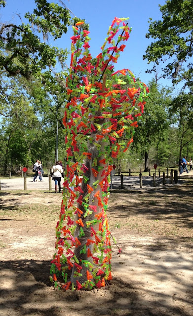

Mason Marth, Peace Over War

This well-designed hand was constructed out of chicken wire and transparent plastic water guns. The irony is a little easy but quite timely, and the plastic guns looked fantastic with the sunlight shining through them.


Mason Marth, Peace Over War (detail)

With Peace Over War, I declare Pearland High School to be this year's champs.

Of course I'm just kidding about the competition aspect here. This isn't just another football game. It's a fairly remarkable collection of large-scale artworks by high school students. Just by size alone, they seem way more ambitious than anything I ever attempted in high school. But the dominance of Pearland High School and HSPVA should be taken as a challenge to every other high school in the Houston area--show us what you got! I know there are creative, talented and ambitious would-be artists all over Houston. I want to see their installations next year!


Share

Pan Recommends for the week of March 28 to April 3

$
0
0
Robert Boyd

I've been in a hotel room in Arkansas for the whole week, so here are a few things I am looking forward to very strongly when I get back to sweet home Houston.

THURSDAY


God's Architects by Zachary Godshall at 14 Pews, 7 pm. A documentary about visionary architects and the mystical visions from God that inspired their work. Sounds fascinating!

FRIDAY


Christopher Cascio, Harvest Time, 2012

35th UH School of Art Master of Fine Arts Thesis Exhibition at the Blaffer Gallery, 6 pm. A show I look forward to every year, this year's class includes Megan Badger, Christopher Cascio, Erica Ciesielski Chaikin, Fiona Cochran, Carrie Cook, Stacey Farrell, El Franco Lee II, Elicia Garcia, Jessica Ninci, Stephen Paré, Jasleen Sarai, and Katelin Washmon. Many of these artists have been making their mark locally for a while, but now they will have something they didn't have before: a diploma (to paraphrase the Wizard of Oz).


Jessica Ninci, Waiting for to Go, 2012


Hillaree Hamblin painting from Daytime Television

Daytime Television featuring art by UH and Rice art students Trey Ferguson, Hillaree Hamblin, Stephanie Hamblin, Miguel Martinez, and Ana Villagomez, curated by Debra Barrera at galleryHOMELAND, 6 pm. The UH Thesis show isn't the only student show opening Friday night--young artists traditional rivals Rice and UH are teaming up at galleryHOMELAND to show their stuff.

SATURDAY

Project Row Houses Roung 38 featuring installations and work by M’kina Tapscott and Kenya Evans, Darin Forehand, Derek Cracco, Jürgen Tarrasch, Sean Shim-Boyle, Rahul Mitra, and Thomas Sayers Ellis, 2:30 pm (artists' talks) and 4 pm (opening). Another big Project Row Houses Saturday afternoon, featuring some work in cultural exchange with Space One Eleven in Birmingham, Alabama.

MONDAY


Paul Horn's Cheeseburger Cheeseburger II at the McDonald's @ I-45 and N Main, 7 to 10 pm. A pop up show at Houston's swankiest eatery, brought to you by Paul Horn and his merry band

Share

Judy Haberl's Ghostly Garden

$
0
0
Robert Boyd

The Houston Center for Photography has a very interesting show up right now called Unusual Garden. One photographer has a room all to herself. Judy Haberl's photograph Antidote, takes up one complete wall. It's 21 feet wide. Then on another wall are circles of woven fabric arranged in a seemingly random pattern.

Judy Haberl, Antidote from the series Photoluminescent, photoluminescent print, 21 x 8'


Judy Haberl, Antidote(Doillies) from the series Photoluminescent, photoluminescence on woven fabric

The room they are in is curtained off from the rest of the HCP by heavy, opaque curtains. And every few minutes, the lights turn themselves off. Then you see something like this.


Judy Haberl, Antidote from the series Photoluminescent, photoluminescent print, 21 x 8'

I apologize for the shaky image--it would have been better if I had used a tripod. This glowing image of a topiary garden in a darkened room verged on the uncanny. The five-year-old me might have been unnerved by the topiary--the sudden darkness and mysterious green glow would have been terrifying. I've been obsessed with things that glow ever since I was a kid seeing the phosphorescent minerals at the Museum of Natural Science. The effect in artwork is often used towards trivial ends, but Antidote seems just right--it speaks to the deep spookiness of glowing images.


Judy Haberl, Antidote(Doillies) from the series Photoluminescent, photoluminescence on woven fabric

And Doillies is, if anything, even more powerful. (Again, forgive the focus--imagine them in sharp forcus. Or better yet, get down to the HCP and see them in person. The show is up through April 21.) As woven circles in a lit room, they made little impression on me. As glowing objects floating in front of my face in a pitch dark room, I felt myself regressing like William Hurt in Altered States. I was a primitive animal, perhaps a rotifer, swimming in a warm Cambrian ocean among a colony of photoluminescent diatoms. It is a shock when the lights come back on, yanking one back into reality.

There is something a little gimmicky about producing glow-in-the-dark art. Certainly it doesn't seem like a medium conducive to producing strong feelings in the viewer. As Bob Dylan put it, "...flesh-colored Christs that glow in the dark / It’s easy to see without looking too far / That not much is really sacred." But somehow Haberl has pulled it off. I was unexpectedly stirred by these glow-in-the-dark pieces.

Share

Translucence: A Talk with Lucinda Cobley

$
0
0
Virginia Billeaud Anderson

Lucinda Cobley is intellectually engaged with her process of painting and printing on transparent materials such as etched glass and clear plastic. The artist possesses impressive knowledge of her materials and at times sounds like a scientist when discussing light refraction or the chemical properties of marble dust. Her practice is to apply oils or acrylics mixed with minerals and pigments such as alabaster, malachite or marble dust, onto stacked sheets of Mylar, frosted plexi, or glass, so that textured paint, reflected light and shadows resolve into meditative translucence.

Cobley recently opened her Sequence exhibition at Wade Wilson Art (up through April 27), and when I previewed it I was disarmed by seeing all of her favorite materials in a single exhibition. There was complexity and cohesion in the presentation that moved me. To anchor my understanding of her chosen process, as well as her evolution in the last five years, I asked a few questions.


Lucinda Cobley, Intervals No. 5, 2012, Ink on plastic, 50 x 40 inches

Virginia Billeaud Anderson: Let’s begin with printing. You are exhibiting mono prints in Sequence, and simultaneously in Santa Fe. Last year you exhibited prints in Wade Wilson’s Impressions show, and in the Spring Street exhibition, and at the Museum of Printing History in October. Tell me about your printing.

Lucinda Cobley: I had not done any print making for many years. It evolved out of working with transfer drawings using carbon paper. I realized I was making a simple print, so that led to mono printing using a brayer, a rubber roller, and a sheet of glass. At first I tried to keep things simple and clean but after a while I began to “let go” and that process became exciting once I began to print from various surfaces such as strips of wood and rubber. About a year ago I joined Burning Bones Press, a print-making co-operative so I could have access to a printing press and evolve. I got excited about re-reading Paul Virilio’s The Aesthetics of Disappearance. Virilio’s book got my brain working!

VBA: That’s impossible reading. I’ll never forget the day I saw those large sheets of plastic drying in the sun. Blue-toned ink created translucent horizontal forms that were also grid-like. Passages ranged from visually abrupt to faint and timid. Many reminded me of waves.

LC: The horizontality of the Intervals series was akin to landscape - water and sky began to materialize out of forms created from the brayer's lap marks which appeared like changing atmospheric effects and time elapsing, as the ink petered out across the surface. Intervals (transition), one of the new pieces from this year, is a hybrid work. I started by using a brayer and transferring marks by mono printing methods, but then went into it with a brush and worked it into a painting. But I used printmaking ink, which is different from drawing ink such as India ink. It's more viscous.


Lucinda Cobley, Intervals (transition), 2013, Ink on plastic, 44 x 36 inches

VBA: You are known for your layered glass works, and of course glass design was a specialty in your art education in England. (It might surprise you to know I’m aware of two other Houston-based artists who completed postgraduate work at Central Saint Martin’s, both teachers.) Talk about your glass work.

LC: The (Dis)appearance triptych in “Sequence” is glass, it’s made with acrylic and pigments on etched glass. It contains 3 glass panels that I “etched” into, with the sandblasting process. The panels are etched on the reverse side.

VBA: That triptych’s coloring is subdued compared to the more boldly colored glassworks in the 2010 Revision series. I recall a striking magenta with weird blurring. Color seemed to float.

LC: For Revision, I painted on both sides of the glass, so it’s fair to say paint was vigorously applied. Also I sandblasted both sides of the glass, meaning I used compressed air to shoot sand to give the glass a granular texture. Due to layering, etching and textured paint, those works have the perception of depth, the reflection and translucency I desire.


Lucinda Cobley, from the Revisions Series, 2010, 2011, Oil and pigment on glass

VBA: You incorporate plexi into works, and some of the new plexi pieces have mirrors.

LC: My Reverb series is made of plexi and mirror plexi. Each piece has three stacked layers - two plexi layers and one plexi mirror, all painted with acrylic and pigment.


Lucinda Cobley, Reverb ii from the Reverb Series, 2013, Acrylic and pigment on plexi with mirror plexi, 44 x 36 inches

VBA: Because we’ve discussed it in the past, I’m aware of your strong interest in pigments. You studied their properties formally, and seriously studied the history of their use from the Neolithic through the ancient Egyptians and Romans, and subsequent eras. And you have lectured on and taught classes on mixing pigments.

LC: Yes, by adding pigments one can alter paint’s texture, and alter color visually. Particles embedded within the paint change it granularly so surface quality can be a crystalline finish perhaps or a matte finish. Marble dust is one of my favorites.

VBA: Also graphite.

LC:Sequence includes works from my Transposition: Graphite series. In them acrylic is mixed with graphite on drafting film. I enjoy combining graphite powder with matte fluid acrylic medium. It seems to contrast and also be comparable to painting with white pigments such as marble dust. Both have had long historical use as pigments.

VBA: OK, after you mix acrylic paint with a medium, and a pigment, what tools or implements do you use for application?

LC: I use a variety of tools - a brush, squeegee, spatula, palette knife.


Lucinda Cobley, From the Transposition: Graphite Series, 2013, Acrylic and pigment on plastic, 26 x 19 inches

VBA: Plastic makes up a significant part of your portfolio, and it turns out one of your plastic pieces, Revision: White 1, entered the permanent collection of the MFAH. Curator Rebecca Dunham put Revision: White 1 in the museum’s 2011 Synthetic Support: Plastic is the New Paperexhibition, which included works by Jasper Johns who innovated the technique of drawing with ink on translucent polyester film. You told me at the time of the acquisition that Revision: White 1 had layered sheets of plastic painted with acrylic mixed with selenite crystal, and that the ancient Babylonians called the mineral selenite “moon dust.” A shaft of moonlight in your bedroom inspired that painting.

LC: MFAH hung me next to a Man Ray!


Lucinda Cobley, Colour Transposition Series 5, 2013, Acrylic and pigments on plastic, 12 x 12 inches

VBA: Lucinda, you once used the word “rhythm” in an artist statement, and in my opinion it’s a proper word for the new small-scale plastic pieces. Most have disarranged columnar forms and diagonals, with estranging colors.

LC: The 12 x 12 works are from my Colour Transposition series, in which each piece is made with 2 layers of polyester drafting film, which is actually Mylar. Paint application varied from thick to thin veils of color, I used both runny liquid paint and more viscose paint, and some paints are mixed with a variety of pigments. I attempted to pair the sheets that seemed to work together. An “eclipsing” takes place as the upper painting creates a dynamic with the lower, obscuring almost completely or contrasting in a way that is visually compelling. After pairing, I tried to unify the whole by reworking the surfaces, adding and erasing paint.

The choice of forms - the vertical blocks and diagonals are simple shapes that are vehicles for experimenting with color and texture. The forms are derivative of tree trunks or branches but in misshapen fragmented states, as if seen through a veil.

VBA: For all that is deliberate, your process is sprinkled with randomness.

LC: It pleases me you get that. Colour Transposition allowed surprises - heavier gestural marks and unexpected hues. I can do something radically different each time. I enjoy working in a way that offers the possibility of chance arrangements, it keeps the process fresh.


Lucinda Cobley, Colour Transposition Series 2, 2013, Acrylic and pigments on plastic, 12 x 12 inches

Share

6 More Comics

$
0
0
Robert Boyd

I meant to review a lot more comics during the time that Comics was on view at the Emergency Room, but I haven't been as diligent as I hoped. That exhibit is still on view through April 11. I hope you will find the time to go check it out. It includes original comics artwork from a variety of artists, including Otto Soglow and Walt Kelly, whose work I review below.


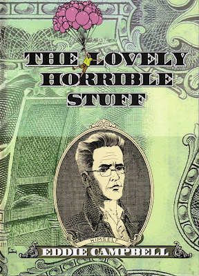
The Lovely Horrible Stuffby Eddie Campbell (Top Shelf, 2012). A minor work in Campbell's oeuvre. The first half deals with his own interactions with money, including incorporating himself so that he can write and draw a Batman comic (and he sees this as every bit as absurd as it sounds) and loaning his father and law $70,000. Neither of these things ends well, which reinforces Campbell's basic sense that one should keep things simple, not borrow (or lend) money, and otherwise be a good, miserly Scot. Frequent quotations from headlines about the financial meltdown and recession of 2007-09 reinforce these views

The second part of the book involves an unintended trip to the island of Yap, where giant limestone discs were famously used as "money." Campbell explores the mythology and history surrounding this custom, and also discusses the economists who have used the example of Yap to discuss financial matters such as the concept of fiat money. But he finds himself more interested in the discs as artistic objects, carved by generations of anonymous Isamu Noguchis. At the end of the book, he suggests money problems have caused a serious rift between himself and his wife, suggesting that his frugal, conservative approach to money is no cure-all.

For this book, he floats text above each panel. There is a lot of text, and as a consequence, the panels are quite small. It feels like the art is almost an afterthought. The book is in color, and Campbell makes full use of the digital toolbox, but in ways that feel unique to him. The work often involves photographs combined with drawn images and "painted" with slabs of Photoshop color. Sometimes this doesn't work, but overall, it's quite interesting. Because of their detail, photos have an effect of stopping the eye and interrupting the visual flow of a comics narrative. But Campbell's technique of digitally painting the photographic elements simplifies them in much the same way a well-crafted drawn cartoon panel is simplified. This keeps the eye moving and the narrative puttering along.

(It is interesting but probably irrelevant to note that Eddie Campbell was a student of painter Derek Boshier.)


Best of Enemies: A History of US and Middle East Relations, Part One: 1783-1953 by Jean-Pierre Filiu and David B (Self-Made Hero, 2012). Except for the first chapter, in which a Gilgamesh myth is retold using paraphrases from George Bush and Donald Rumsfeld, the content of this book is fairly straightforward. It is a brief retelling of U.S./Middle east relations, starting with our early wars with the Barbary pirate states, our inability to prevent France and Britain from carving up the Ottoman empire after World War I, our establishment of friendly relations with the Saudis during World War II (as a guarantee of oil supplies for the war effort), and finally our involvement in the Iranian coup that set the Shah up as dictator. The book stops in 1953.

There are many details of this history that I didn't know which this book, brief though it is, lays out. I am somewhat troubled by its lack of a bibliography--the authors expect the reader to simply take them at their word that these are true accounts. As I read the section on Iran, it occurred to me that while this history is little known to most Americans, every Iranian probably knows it by heart. So while we may view them simply as religious fanatics, they hold a long grudge.

The reason I think so highly of this book is because of the astonishing cartooning of David B. David B employs literary devices that a poet might use: metaphor, metonymy, etc. And he uses devices that don't really have a name because there is no literary equivalent. He employs the structure of comics so creatively that I just can't think of another artist like him. It is especially striking that he uses this vast expressive toolbox in this essentially informational book. It is not an obvious approach, and yet it works beautifully, leaving the reader with a book ten times more fascinating than it would have been with more straightforward comics illustration. David B. turns what would have been just a polemic into a work of art.

 
The Furry Trap by Josh Simmons (Fantagraphics Books, 2012). The genre of horror, it seems to me, is at a disadvantage in comics. In prose, horror can use the imagination of the reader to fill in the horrific details--an imagination that each of us has, as we can see from our nightmares. Good prose horror depends on this partnership with the reader to work. In movies, the filmmaker controls time, which means that suspense and dread can be built up to extremely high levels before being released. The simplest version of this (but very effective) is the shot of the long-anticipated bogeyman popping out at the victim/protagonists.

Comics can't really do either of these things. So how does a horror cartoonist like Josh Simmons compensate? Partly by an unflinching willingness to show extremely horrible things quite explicitly (in ways that would never fly in a movie intended for general distribution). The Furry Trap is drawn in an accessibly light-hearted style (cartoonish), but Simmons nonetheless depicts terrible things--extreme scenes of sexualized violence. (This is not a book for the kids.) But curiously, the most unsettling story is "Demonwood." It feels like the prelude to the usual Simmons story--the horror is unstoppable and it's coming, but it isn't here yet. And that is truly frightening.

 
Dotter of Her Father's Eyes by Mary M. Talbot and Bryan Talbot (Dark Horse Comics, 2012). Mary Talbot is an English feminist scholar, the daughter of a well-known Joyce scholar, James S. Atherton, and the wife of graphic novelist Bryan Talbot. Dotter of Her Father's Eyes parallels her own childhood and upbringing with that of Lucia Joyce, the tragic daughter of James Joyce. And curiously, she chooses to tell it graphic novel form, drawing on her husband's considerable talents and, it must be added, encouraging him to move in a very different direction than his previous work. The book is divided into three interwoven parts--Mary Talbot's past, drawn in brown with a sepia-tone base (with occasional flashes of color), Lucia Joyce's parts, drawn with blue and back duotone, and the scene set in the present, which is drawn with simple black outlines and flat but vibrant Tintin-ish colors. Both of the "past" sections tend towards a sketchiness that I've never seen before in Bryan Talbot's work (it is still very precise; it only feels sketchy compared to his other work).

The problem with the book is that the two stories--Mary's and Lucia's--fail to really parallel one another. Lucia's life is one of thwarted ambition and madness. Mary's is one of abuse and neglect by her father. But Mary's ambitions, it seems to me, were never thwarted at all. If anything, her father seems annoyed that she is aiming so low, and is pleased when she gets her PhD. The most interesting parts dealt with the fact that she grew up in a working class neighborhood because her father wasn't making a lot of money as a Joyce scholar. So she had an intellectual cultural upbringing that was of little use to her on the playground. (Girls make fun of her at school for not knowing who the Beatles are.) There are parts of this book that are interesting and amusing, but the whole is less than the sum of the parts.


Pogo: The Complete Daily & Sunday Comic Strips, Vol. 1 by Walt Kelly (Fantagraphics, 2011). Pogo got its start as a comic book--this origin is possibly unique in the history of comic strips. That was in 1942. Pogo was revived as a daily strip for the New York Star, a short-lived liberal newspaper, and when it folded in 1949, Pogo got picked up by a syndicate and began its glorious newspaper run. This volume reprints all the New York Star strips and all the syndicated strips through the end of 1950. Kelly's drawing style is quite mature--it's not going to evolve much from here on out. He had worked for Disney and had very slick, deft brushwork. But the strip, constrained by space that an animated movie never has to face, is visually dense, a thicket of brushed lines. His language is dense as well--in an era that is about to see the coming of such minimal strips as Peanuts, Beetle Bailey, Hi & Lois, King Aroo, etc., Pogo stands out. These are not strips that, as Wally Wood said of Nancy, take more time not to read than to decide not to read.

In the first two years we get some of the familiar tropes and most of the regular characters. There is a world series game, a gift from Porkypine to Pogo on Christmas, and so on. There are hints of the political aspect of the strip that will come to characterize it, but most of that is in the future. For these first two years, it's mostly about slapstick and wordplay.


Cartoon Monarch: Otto Soglow and the Little King by Otto Soglow, edited by Dean Mullaney (IDW, 2012). The Little King got its start in The New Yorker and made a transition to the comic strips, where it ran from the 1930s to the 1970s. Soglow was a minimalist--frequently the strips had no words at all, and even when they did, he kept them to a minimum. The drawing consisted of simple forms and elegant, thin lines. The strips dealt with a small number of themes over and over, using them as a way to create formal variations on simple ideas. It's in these variations that the strip shines. This thick, well-edited volume shows Soglow returning to the same jokes over and over again (mixed up hats and crowns, soldiers on parade, advertising signs, etc.). Some of the funniest strips are about the King's reaction to modern art. Cartoonists loved to make fun of modernist art (which I've always found ironic--the greatest cartoonists distorted and abstracted the human figure every bit as much as any modernist painter). But Soglow ends up portraying his king as a post-modernist avant la lettre. There are more than one strip where on seeing an art exhibition, the little king adds his own art--which will invariably be an advertisement or a sign with words.

There are several series of comic strip reprints that are attempting to collect the entire work of a given cartoonist on a certain comic strip--Pogo (above), Milton Caniff's Terry and the Pirates, E.C. Segar's Popeye, Frank King's Gasoline Alley, etc. But this approach is not appropriate for every classic comic strip. In the case of TheLittle King, it would be tedious to read 40 years worth of these strips. This well-chosen collection of Soglow's best is a better way to honor this master of minimalism. Cartoon Monarch also includes an excellent biographical essay on Soglow.

Share

Comics at the Emergency Room

$
0
0
Robert Boyd

I mentioned in my last post that Comics: Works from the Collection of Robert Boyd is still on view at the Emergency Room gallery at Rice. I hope readers will indulge me as I publish a few installation shots.


The Emergency Room has a very cool neon sign. It's called "The Emergency Room" because it is all about showing solo work and installations by emerging artists in the Houston area.


So what are a bunch of old comics pages doing there? Some of these artists could indeed be thought of as "emerging," but about half of them are dead. All the pieces come from my personal collection, so Chris Sperandio suggested the way to think of it was as art from an emerging collector.


That's flattering, I guess, but feels a little weird. All I did was to acquire this work. It's not that big a deal. Instead, I think that we keep the idea of "emerging" when we think about comics as an emerging art form. That's an arguable notion for an art that has been around since the early 19th century, but it is emerging into the consciousness of the art world. There are a few artists who have gallery representation and whose work is showed by museums. But within the art world, there is little institutional support for comics. As far as I know, the MFAH (and its many counterparts around the nation) are not buying up pages of comics art.


So what, one might ask? Comics is way outside the mission of a museum like the MFAH. Sure, but consider that the MFAH collects furniture and jewelry and decorative objects and films many other items that are not capital "A" Art. (The retired longtime director of the Metropolitan Museum of Art--and former director of the MFAH--Philippe de Montebello said that the Met shows "every category of art in every medium from every part of the world during every epoch of recorded time.") The same is true with other museums all over the country. So from where I sit, this is still a blind spot for art institutions in the United States. (And sorry if I'm picking on you, MFAH. You know I love you.)


Anyway, it has been a personal mission of mine to bring the art world and the comics world closer together in whatever small way I can. That began with Misfit Lit at the Center on Contemporary Art in Seattle in 1992 (whence it traveled to LACE and several other venues). It continued with Walpurgis Afternoon (a two-person show featuring work by Marc Bell and Jim Woodring) in 2011 at Lawndale.


art by Peter Bagge

So with this show, I am again storming the castle wall of the art world armed with a peashooter. But eventually an army of critics, artists and curators each with her own peashooter will shoot enough peas to crack that wall. And maybe then we'll cease having shows like Splat Boom Pow! The Influenceof Comics in Contemporary Art (2003) at the CAMH, shows that honor comics by featuring one actual comics artist out of the 40 artists whose work was included.


clockwise from the top left: Jim Woodring, David Collier, Skip Wiliamson, Alison Bechdel, Alison Bechdel, Skip Williamson, Dylan Horrocks, David Lasky

But mostly it was a chance to show off a little bit of my collection and have some bragging rights. It's up through April 11. I'd be honored if readers of this blog would come see it.


clockwise from the top left: Gilbert Hernandez, Harry Tuthill, Harold Gray, Jaime Hernandez

The gallery is on what most people would call the second floor of Sewell Hall (but because they start counting floors from a sub-basement, it's officially on the fourth floor). The hours are Thursday, 5-7:00 p.m., Saturday, 11-3:00 p.m. and by appointment.

art by Walt Kelly

Share

In the Studio with Alissa Blumenthal

$
0
0
Robert Boyd


After I discussed some of her paintings from the Core program show, I got an invite from Tatiana Istomina to visit her study where she produces paintings by "Alissa Blumenthal." I had never visited a Core studio, so I was quite eager. Long and thin, it seemed functional and less grungy than some studios I've seen. I guess the glass bricks are handy if you like to work with natural light. We settled in to talk as I tried to take it all in. I'm not a polite interlocutor when I'm surrounded by art--my eyes keep wandering. And this is especially true in an environment full of work like this that I find fascinating.


I didn't turn on the recorder on my phone--I wanted the conversation to be natural and unforced. (I also hate transcribing.) So this is all from my own imperfect memory. I wanted to discuss Alissa Blumenthal with Istomina. Blumenthal is the fictional painter to whom Istomina credits her work. Blumenthal is a painter who was born in Russia in 1899, studied with Malevich, immigrated to the U.S. in 1925, and lived a long, uneventful life in New York until her death in 1995, achieving very modest recognition for her art only occasionally, and dying completely unknown as an artist.


My main question was why create this alter-ego? Why not just do the paintings and claim them as your own? A curator who visited Istomina recently inadvertently answered that question. Looking around Istomina's studied, she declared "Painting is dead." "Blumenthal" shifts the time frame back to a period when painting was most certainly not dead--far from it.


But Istomina told me an interesting thing. She said that when she did the first Blumenthal paintings, she hadn't created Blumenthal yet. Blumenthal the fictional character was only a month old. What this suggests is that Istomina just wanted to do some abstract paintings--indeed, maybe felt compelled to do them--with no theoretical apparatus justifying their existence. She says that while she was doing them, she was so deep into them that such thoughts were banished. Jackson Pollack wrote,"When I am in my painting, I'm not aware of what I'm doing." The problem is, what happens when you are no longer "in the painting"? Istomina would move from the trance-like state of total engagement to self-doubt--is this just a piece of merchandise for sale? Does it have any other meaning? Blumenthal was a way to deal with those questions once she finished the work.


Of course, once you start down that road, Blumenthal takes of life of her own as Istomina adds new details to her biography. The paintings came first, but another approach would have been to make up a fictional painter, give her a biography, then paint paintings that seem to fit who she was. The paintings would then be, in a sense, illustrations for the biography of that painter. That is not what Istomina wants to do, but I wonder if it will be possible to avoid it. She created Blumenthal so she wouldn't have to think about the issues of what it means to be a painter in 2013. But now, can she paint without thinking about being a painter in 1940? 1924? Etc.?


I think so far, she has been able to resist becoming an illustrator of Blumenthal's life. For one thing, these paintings don't resemble paintings from Blumenthal's era. Someone for whom the creation of the fictional painter is the main thing wouldn't necessarily come up with such ahistoric paintings. Blumenthal is not just a painter of the 20s or the 40s, she is a highly eccentric painter from that period, doing work quite unlike her peers. That suggests a reason why her work was neglected--it didn't fit in with the narrative that was forming about modern art at that time. Another reasons for its neglect would be her sex. (One of the most exciting developments in recent decades has been the rediscovery of many women painters whose work was somewhat overlooked in their time--for instance, Seductive Subversion: Women Pop Artists 1958-1968 at the Brooklyn Museum in 2010. I was pleasantly surpirsed to see a large piece by Chryssa hung at the Menil this weekend.)


We discussed many other things that afternoon--Yves Klien, Thomas McEvilley, curve-fitting, etc. I tried to find a link between her training as a geophysicist (she has a PhD in the discipline from Yale) and her art, but she mostly shot this down. It was while she was getting her PhD that she became interested in art--by taking art classes at Yale. I am still astonished that someone would spend so much time and effort reaching the pinnacle of a notoriously difficult area of study (geophysics is geology with huge extra dollops of math) only to change courses so drastically. It's a powerful statement about how important art must be to Istomina.


On April 5, an exhibit, Alissa Blumenthal: A small retrospective, opens at Art Palace. I anticipate that it will be excellent.

Share

Dean Liscum Gets His Hands Dirty


The Formalists at Project Row Houses

$
0
0
Robert Boyd


Jürgen Tarrasch, Vines and Leaves, 2013, painted installation

We don't think of Project Row Houses as a site for formalism. We don't imagine that artists are going into these small reclaimed houses and using them to investigate the plastic visual qualities inherent in the medium. We aren't accustomed to thinking about installations in those terms at all (although certainly minimalists did so in their own fashion), but more importantly, we aren't used to thinking about Project Row Houses that way. The project as a whole is explicitly about community engagement, and many of the projects are political or polemical, or have social practice dimensions (for example, John Plueker's Antena Books: Pop-Up Bookstore and Literary Experimentation Lab or Darin Forehand's Printproject).


Jürgen Tarrasch, Vines and Leaves, 2013, painted installation

Nonetheless, when an artist is given a row house for an installation, it has certain formal qualities as an architectural space, and all the artists use this to a certain extent. In Vines and Leaves by Jürgen Tarrasch and Salt House at Sean Shim-Boyle, formal effects dominate. The houses are small boxes--a single room with windows on all walls and doors at either end and a column--the brick chimney--in the center. But they aren't all the same. The house used for Vines and Leaves has a flat ceiling while the one used for Salt House has a vaulted ceiling with dark brown wooden cross-beams. I'm not sure if these are permanent or if the artists specified them for their respective works. In either case, the type of ceiling is important for the work each artist did.

Tarrasch has painted the entire interior of his project various bright, intense glossy shades of green. On a sunny afternoon, with light pouring in, you end up with green reflected light bouncing around inside the boxy shape.


Jürgen Tarrasch, Vines and Leaves, 2013, painted installation

The pattern of light coming in through the window and crawling across the speckled green walls is part of the piece, a use of the inherent qualities of the structure for a dazzling visual effect. The yellow and green "speckles" are short staccato brush-strokes which could be seen as leaves being caught by sunlight. Up close, they look a little like Howard Hodgkin's brush-strokes. And like Hodgkin, Tarrasch is depicting something real (leaves and vines) through almost total abstraction.


Jürgen Tarrasch, Vines and Leaves, 2013, painted installation

The low ceiling is important for a couple of reasons. One is that as light enters the windows and doors, Tarrasch has made sure that it doesn't have to go far to be reflected. You are inclosed by a confining green, both in terms of local color and reflected color. Green photons are bouncing around all over Vines and Leaves, pouring onto your retina. The work is fundamentally retinal. Tarrasch is using the interior of the row house in a way no different from the way a painter uses a canvas, as a surface or support for the painterly visual effect he hopes to achieve. And it works.


Jürgen Tarrasch, Vines and Leaves, 2013, painted installation

This is not to say that there are not other meanings and possible interpretations embedded in the work. It would be impossible to imagine otherwise. I've never believed Frank Stella's dictum "What you see is what you see." On the contrary, I feel that what Borges wrote in the introduction to Doctor Brodie's Report applies as well to visual art as to literature: "There is not a simple page, a simple word, on earth--for all pages, all words, predicate the universe, whose most notorious attribute is its complexity." But for this post, it is the formal visual qualities that concern us.


Sean Shim-Boyle, Salt House, 2013, installation

Rather than taking the row house as a surface for paint, Sean Shim-Boyle uses the inherent qualities of the house as formal elements. Salt House's row house has a vaulted ceiling with cross-beams. The ceiling and walls are white, the floor grey, and the crossbeams a stained wood-color. The brick chimney in the center of the house is left uncovered, and because of the vaulted ceiling, it seems especially tall. The windows and doors let light pour in.


Sean Shim-Boyle, Salt House, 2013, installation

Shim-Boyle has done two seemingly simple additions. The most prominent is that he has added a second chimney, slanted at a shallow angle extending from a rear corner to near the front of the house. This second chimney is astonishingly realistic--it looks and feels like brick and mortar. The second element is a long thin hole in the floor into which are set bright fluorescent lights, creating, as it were, a new "window" for allowing light into the house.


Sean Shim-Boyle, Salt House, 2013, installation

What made me think of formalism when I saw this house was the diagonal of both the second chimney and the hole in the floor. When I see an element perpendicular to the ground next to a leaning element, I think of sculpture, specifically the geometric metal sculpture of artists like Mark di Suvero. We have here a sculptural form, one which uses the material of the setting and the elements of the setting. Even the angles of the light and chimney can be said to be reflecting the angles of the vaulted ceiling. And the play of light and dark (chimneys and beams against the white painted walls) gives the viewer the feeling of being within a geometric abstract painting.


Sean Shim-Boyle, Salt House, 2013, installation

Both Salt House and Vines and Leaves depend on visual fascination and--dare I say it?--beauty. Most artists who do installations in a PRH row house rely on the structures' humble grunginess and mutability as a ground for the work, and they are perfect for that. But Shim-Boyle and Tarrasch are operating under the assumption that these places are beautiful and that their installations should reflect that. In this regard, they go back to one of the original inspirations for Project Row Houses. When PRH founder Rick Lowe first saw these row houses on a bus tour sponsored by SHAPE, where they were held up as dangerous places, blighted houses that needed to be torn down and replaced. But they made Lowe think of certain paintings by John Biggers of this kind of house, and they inspired him to think of preserving them instead of tearing them down. (See What We Made: Conversations on Art and Social Cooperation by Tom Finkelpearl for Lowe's first-hand account of this.) Biggers's paintings find a kind of geometric beauty in the houses--a beauty that Tarrasch and Shim-Boyle have rediscovered.


John Biggers, Shotguns, 1987

Share

Obscure Art Movies: Catchfire (aka Backtrack)

$
0
0
Robert Boyd

I'm always on the lookout for feature films that include artists and the art world in some way, like Age of Consent and Boogie Woogie. Catchfire (1990) is one of these. You can see it on Netflix under the title Backtrack. On the face of it, it sounds potentially great. Directed by Dennis Hopper, it stars him, Jodie Foster, Joe Pesci, Vincent Price, John Turturro, Dean Stockwell, Fred Ward and Tony Siroco (who played Paulie on The Sopranos). It also features appearances by Charlie Sheen, Catherine Keener and Bob Dylan. Interesting, right? Wrong. Catchfire is terrible--so bad that Hopper took his name off as director--it's officially an "Alan Smithee" movie.

The basic plot is that Foster (as artist Annie Benton) witnesses a mob-related murder. The mob knows who she is so she turns to the police (Fred Ward in particular) for help. But she sees Dean Stockwell, the mob lawyer who was present at the murder, in the station and flees. So now the police and the mob are after her. The mob sends a hitman named Milo (Hopper's character) to find her. She eludes them all for a while, but eventually Hopper, who has become obsessed with her, finds her. But instead of killing her, he abducts her. In a Patty Hearst-like moment of Stockholm syndrome, Foster falls for Milo. They continue to be chased until a final confrontation with the mob.

The problem with this movie is that there is no suspense, no excitement. The characters are illogical and their motives obscure. There are occasional surreal moments that all fall flat. Foster is essentially playing Jenny Holzer (whose art was used in the movie, presumably to Holzer's regret), but she hardly seems like an intellectual artist type. She really doesn't have a personality at all. So unless you are obsessed with seeing art in movies (like me), give this one a pass.


Jody Foster in her studio


Dennis Hopper in Foster's Gallery


Dean Stockwell with a piece that Hopper bought. It reads "Killing is Unavoidable." Subtle, right?


Charlie Sheen as Foster's boyfriend in their apartment. His function in the movie is to be murdered.


A strange cameo by Bob Dylan as a chainsaw-wielding relief sculptor. I couldn't recognize his pieces--anyone out there know who did them? Update: They're by Charles Arnoldi. You can seem more of them here. Tip of the hat to eagle-eye Earl Staley for recognizing them.


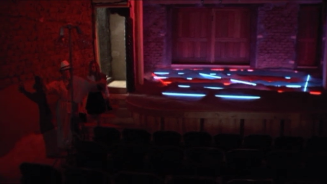
Foster hides out for a while in an old movie theater in New Mexico, where this Laddie John Dill neon installation is.


Share

Houston Artists on the TV

$
0
0
Robert Boyd

Here are a couple of videos that came our way in the past few days. In the first, Michael Bise talks about his art and his heart--and how the latter's problems influenced what he does with the former. If you are heading up to Dallas anytime before May 12, he has a solo show up at the MAC.


The second is a Kickstarter video by Monica Vidal, who is trying to finance a third "hive." We wrote about the first hive, the Tumor Hive, back in 2009 when this blog was still a baby. And her watercolors were exhibited at the Pan Art Fair, courtesy of Front Gallery.


Share

The Great God Pan Sells Out

$
0
0
Robert Boyd


What is this thing? If you want to know, check out "Chain Chain Chain" on Glasstire. Today I'm starting a little experiment of letting Glasstire publish some of my posts first. They get exclusive use of the content for two weeks, after which time I will publish it here, mostly for archival purposes.

Of course, if you are reading this blog, you should also be already reading Glasstire. Personally, I'd go insane if I didn't have access to Glasstire's super-complete calendar, and I enjoy all the rest of it, too. Especially the Cody Ledvina videos. Because they're funny.


Share

Pan Recommends for the week of April 4 to April 10

$
0
0
Dean Liscum and Robert Boyd

There is a hell of a lot of interesting, diverse art events and exhibits happening in town--way more than what we have listed here.  Check Glasstire for a much more complete listing. It's exciting but also a bit depressing that it is getting hard to actually see everything in Houston. Here are a few things to see this weekend.

THURSDAY


This isn't the sculpture Jonathan Clark is unveiling Thursday night--but it's similar!

Jonathan Clark at Skyline Art Services, 5 pm. Clark's sculpture is just exhilarating like a high school stage band with a groove. Plus, music, food, drinks and art featuring the Kashmere Stage Band!

FRIDAY


an adult Frida look-alike contest Friday and a kids Frida look-alike contest Saturday afternoon.


We have no idea who these people are!

Liz Magic Laser: Tell Me What You Want To Hear at Diverseworks, 7-9 pm. Art that explores interview techniques? We may try these out on some unsuspecting artists.


Alissa Blumenthal courtesy of Tatiana Istomina

Alissa Blumenthal: A small retrospective at Art Palace, 6–8 p.m. The fictional artist gets a non-fictional gallery exhibit.


Matt Messinger, Dancers, 2013

Matt Messinger: New Paintings at Devin Borden Gallery, 6–8 p.m. The low-key Houston artist gets a well-deserved gallery show.

SATURDAY


"The Challenging Phenomenon of Jermayne MacAgy," lecture by Chelby King at William Reaves Fine Art, 2 pm. The first professional director of the CAA (which later became the CAMH), MacAgy is a key figure in Houston's art history. William Reaves Fine Art is currently showing a group show of Houston Modernist painters from the 50s and 60s (the MacAgy years).


Eric Fischl, Tumbling Woman

Eric Fischl: Cast & Drawn at McClain Gallery, 2-4 p.m. The figure in bronze, glass and watercolor,. Just so you can say, "Yeah, I saw that."


Earl Staley: The Speed of Life at New Gallery/Thom Andriola at 6–8 p.m.Professor Art returns with a show of new work. 


Illustrate the End: The Art of Vincent Finkat El Rincón Social, 8 pm – 12 am. Because the folks at El Rincon always keep it interesting.


Share

Blogging ARTlies -- December 1994/January 1995

$
0
0
Robert Boyd


Issue four of ARTliesbuilt off the "degree zero" feel of issue three. The design was still mostly functional, but easier on the eyes than the previous issue. They continued to report from outside Houston (Los Angeles, Austin), and they added a couple of artist's projects to the mix--the cover and inside cover were a political piece by Carol Saborowski (about whom I can find no information online), and the center was an insert by a person of group called "Anti-Trust." Neither impressed me too much, but I like that they were included.

Peter Doroshenko returned this issue with two interviews. In the first, he interviewed French curator Jérôme Sans, followed by him and Sans co-interviewing Paul McCarthy. Doroshenko asked Sans what he thinks about Houston, and Sans talked about how the Houston art community is isolated. Given this bait, you'd think that Doroshenko would change the subject, but he doubled down on Houston! I can totally relate--as a city, we seem very self-absorbed. (I'm guilty of it.) It is in critique of this that such institutions as Skydive and Cargo Space came into being.

Also of note was a review of a three-person show at Lawndale called Buttered Side Up, featuring work by Bill Davenport, Giles Lyon and David Aylsworth. The reviewer, Mark Allen, more-or-less liked the show but criticized Lawndale for hosting it! He saw Lawndale as an alternative space and didn't think this show was alternative enough. After all, all of these artists had shown at commercial galleries.

His description of Davenport's work was quite amusing. "Davenport knows that nothing is more boring than having to look at well-made art, so he's saving us the trouble. Some of the work in the show suffers from trying too hard, but few would voice that objection about Bill." Great stuff, and meant in a complimentary way.

The present, I find as I read old issues of ARTlies, is always echoing the past. Davenport wrote a review recently for Glasstire where he praised an artist's work in similar terms, using phrases like "frightening, frippy nihilism" and "aggressively unimpressive." Unfortunately, the artist didn't get it and was quite angry!

Share

On Video: Les Blank and Gabriel Dawe

$
0
0
Robert Boyd

Les Blank, RIP


Documentarian Les Blankdied last Sunday.  Best known for Burden of Dreams, his documentary on Werner Herzog, he made numerous documentaries over the course of his career, including The Blues Accordin' to Lightnin' Hopkins (trailer above).

Gabriel Dawe in fast motion


Gabriel Dawe Plexus no.22 Zadok Gallery
from ZadokGallery on Vimeo.

Gabriel Dawe's giant colored thread pieces look extraordinarily labor-intensive but as you can see from this video, if you have enough Adderall, it doesn't take all that long to construct one!


Share

PAF is Coming

Liz Magic Laser's "Tell Me What You Want to Hear"

$
0
0
Carrie Schneider
photos courtesy of Diverseworks


photos: Patrick Bresnan left to right: Shannon Buggs, Nick Anderson, Linda Lorelle, Lizette Garcia


Liz Magic Laser's Diverseworks commission Tell Me What You Want to Hear began by enlisting professional empathy conjurers to cull, perform, and refine their methods of influencing public opinion. Directed to play heightened versions of themselves, participants were asked to narrate a moment of performance when they were entirely authentic, spectacularly engaging, and not at all manipulative.

The Media Training 

To this elusive end, media training was conducted at Houston Media Source in February. The storytellers were interviewed on camera and live feed went to a conference room for screening by panelists Nick Anderson, Pulitzer Prize-winning editorial cartoonist; Shannon Buggs, journalist and Director of Communications for the University of Houston's College of Liberal Arts and Social Sciences; Felipe Campos, artist, producer, and educator; Maurice Duhon, realtor, former political candidate, musician, and reality TV personality; Lizette Garcia, Broadcast Journalism major at the University of Houston; Linda Lorelle, Emmy Award-winning journalist and former KPRC-TV news anchor; Sue Lovell, former Houston City Council member; and Mustafa Tameez, founder and managing director of Outreach Strategies, one of Texas' leading public affairs firms. Once interviewed, each participant was seated in front of their muted footage to receive criticism according to the amalgamated tricks of the charismatic communication trades.


Panel reviews of participant's on camera interviews took place during media training workshops at Houston Media Source in February. left to right: Mustafa Tameez, Nick Anderson, Shannon Buggs, Liz Magic Laser


In addition to attention span considerations: keep it direct, on task, brief, energetic, and assertive, the main point is that the audience cannot digest you unless you are not refined. The key to success is refusing to exhibit natural responses of the human body to its environment-- scratching, sipping, shifting eyes or shifting in your seat-- that could make you appear unattractively like a person in front of the persona capturing camera.

The disavowal of maintenance is not new, but it was eerie to hear the body's need for rest and support flatly deemed unacceptable. And although disturbed by these rules, I nonetheless later found myself irked at Lorrelle for wearing a pair of distractingly bobbly earrings on camera-- she should hold her head still!

The Screening and Recording Before a Live Audience

In keeping with Laser's compelling investigations of potentially democratic forms gone awry (majority rule in focus testing, voting in political polling, and authority leveling in the interview) Tell Me What You Want to Hear used the multi-vocal judicial panel and the audience-input inclusive talk show.


Shannon Bugg's hosts a talk show style screening before a live audience at Diverseworks. The audience watched and responded to a projected live broadcast of the participants performing across town at UH's School of Communications news studio

For last Wednesday night's screening before a live audience at Diverseworks, Shannon Buggs played a talk show host whose emphatic "We are all so comfortable here with one another!" manner (of a focus group leader or a fish camp counselor) waned over the course of the show. Her scripted questions "Do you respond to this? Would you like to have media training? Is performing a skill that every person should have? Is there a difference between trying to influence and manipulating?" were asked politely and elicited polite responses from a hesitant audience, able to see themselves on camera and adjusting accordingly.

The Studio Performance

The participant's performances at an offsite studio, UH's Valenti School of Communications news studio, were also projected in front of the audience at Diverseworks. Relentlessly on-camera, the preened personalities looked like animatronics after the lights ignite but before the electricity flows. Each was activated to deliver highly refined, empathy-inspiring sound bites, intercut with footage from their pre-media training interview and previous TV appearances. To my ear, their stories had the bizarre quality of Toastmaster speeches, so smoothed over by abstract principles that they lose their spark and credibility. The art crowd audience seemed to agree, asserting that mistakes and vulnerability make it seem more real.

Participants perform at UH's School of Communications for a live broadcast to a studio audience at Diverseworks


Which Criteria are We Following

Back at the media training in February, in an on-the-spot moment, the award winning, show stopping Linda Lorrelle shared her experience reporting on a competing anchor and eventual friend's struggle with cancer. The room was emotionally saturated and we were all cancer-awareness champions, when, in an emotion-barring voice, Laser offered incriminating and inconsistent feedback. At times she echoed grooming tips on posture, gesture, and inflection, and at times she seemed to be working against it to deliberately pale the evocative.1

The same week of this media training, Laser's own delivery during her artist talk at Rice University was long and drawn out. As her voice slid into a grating and disaffected monotone, it seemed curious that someone so steeped in methods of effective communication would fail to deploy any of them. Maybe it's a deliberate modulation to avoid spectacle or celebrity, but it is also recognizable as the designated artist affect.2

Alongside a requisite cynicism, the wry reveal has risen to prominence as the most recognizable artistic gesture of our times. This was exactly the case in Laser's Armory Show contribution, crowd sourced from art consumers in focus groups. As in Push Poll, Laser looked at the feedback loop, how behavior is generated based on response, and on and on and on. In this case, Laser's approach of asking the consumer what they want to consume produced something novel, but pre-digested.3


photo of Laser's Armory Show swag from Kareem Estefan's post
 
The Armory Show all too easily swallowed Laser 's critical stab at its "lend your artist identity to the fair" demands, so instead of causing a rift in the system, Laser's process generated swag that brands its bearers as self-aware and its profit driven fair as avant-garde.

Sometimes, overestimating the institution's intention to take advantage, the artist gives support a preemptive thrashing that the harshest neoliberal would applaud. Sometimes, underestimating the institution's ability to take advantage, the artist as a whistle blower merely creates on-demand disruptions too reliant on support to effectively address issues or implicate the host.

Considering this minefield, kudos to Laser and to Diverseworks. She let down some of her well justified guard to conduct a less predetermined examination of authenticity in performance, and they continued to support dynamic work in its unruly but rich experimental stage.4

Degrees of Consumability

Earlier this March, Laser answered an interview invitation with an insightful investigation of the interview as a form. She mentioned resentment at having to stand outside her work and reveal its truth, and having to perform her authentic self.

This is understandable, especially with lifestyle questions asking, "What bar do you like? What books do you read? What art do you buy?" that seem designed for fans to consume like her in addition to consuming her. Like others in the spotlight, artists can't afford to drop a rich thought just once or slow down the personal divulging- getting off the conveyor belt means becoming obsolete.

If Laser has figured out that resistance's next turn will, in fact, be a very purposeful invisibility, she has a given us a head start on how to tactically disappear behind performed affectations.

At a time when the public is not only media literate but increasingly fluent, from entertainment (reality TV) to political spectacle (Mission Accomplished) Laser is hung up on why performances are still effective even when we know how they are constructed.5


The Art Show

Tell Me What You Want to Hear is represented for subsequent audiences as three channels of synced video: from the control room of Laser and the production team, from the studio of the participants as they performed (intercut with previous media training and TV appearance footage), and from Diverseworks of Buggs and the live audience.


Liz Magic Laser, Tell Me What You Want to Hear 3 channel videos projected at Diverseworks. left to right: of the control room at the news studio, of the studio  feed, of the audience at Diverseworks. Diverseworks audio design installed headphones around the seating area playing audio from the control room, 
speakers at this front wall playing audio from the studio, and speakers behind the seating area playing audio from the live audience.


As you enter the space, perpendicular to the posted script, shiny and smiley photographs of each participant greet you. In these photographs as well as in the video, the participants appear stacked into frames with their previous appearances, pinpointing degrees of refinement throughout the media training process, and forcing a collapse between personality and performance.

 
photos: Patrick Bresnan of Lizette Garcia

 
photos: Patrick Bresnan of Maurice Duhon


photos: Patrick Bresnan of Linda Lorelle

The Participants

In projects such as In Camera, The Digital Face, and I Feel Your Pain, Laser used actors to play media professionals and politicians. In Tell Me What You Want to Hear, she seems in pursuit of a less removed representation. She used people, who have actually performed these roles, to perform heightened versions of themselves. This is where things may have gotten interestingly off-kilter for Laser. Not only could she not control the non-actors, but she had to contend with their expertise.

Although Laser "see[s] camera and camera operators as playing constitutive roles in the scenarios [she] create[s],"6 the project's lack of clear intention was a point of frustration for some participants. "This is what we do," asserted one of the media production students who did the camera, sound, and editing for work Tell Me What You Want to Hear. Although appreciative of the unique, hands on experience, they wanted to be respected for and directed in their craft. 

At times, I wondered if Tell Me What You Want to Hear was another absorption of a non-art field into the art world to be observed, examined, and teased - not necessarily with anything being teased out. Critical distance has such cache that artists who operate at a remove can be valued more than artists who work near enough to perceive the essential.

Without acknowledging why Lorrelle, Buggs, and Offerman are compelled to get their message across with as much impact as possible, and thus without understanding their motivation, Tell Me What You Want to Hear could fail to go beyond faulting them for their method.


UH School of Communications Media Production students did the camera, sound, and editing work for Tell Me What You Want to Hear

When Does Media Become Mass

But, what at first seemed like antagonism directed at the wrong people (not having access to the president's coaches or the news media giants and picking on local professionals who volunteered for her project instead) turned out to be a question of "When does media become mass?"

This inquiry hung in the air most starkly during young, aspiring broadcast journalist Lizette Garcia's moments on camera. She earnestly described how she wants to influence people's opinions and amplify the Latino perspective, but she couldn't help mechanically repeating the questions and agreeing that she must straighten her hair to be camera ready.

When the artist's deconstructive unraveling lacks a simultaneous additive process to create new meaning, the gotcha! impulse makes for art that is not only paranoid, but also predictable. Where Tell Me What You Want to Hear does manage to raise questions without falling flat is in Laser's own use of the feedback loop and the participants' contributions- pivotal elements of a show that, in the end, echoes its own multilayered process.

In the case of Lorrelle, the virtuosity of her performance disarmed the examination of it. Those tense moments between Lorrelle and Laser also created some of the weirdest disconnects between the art worker's propensity for deconstruction and the media worker's aim to perfectly refine.

Something generative came from the clashing between the current art world formula: irony + opacity = sophisticated art and the media standard: easily consumable entertainment = successful journalism.

Surplus Value

The fact that artists can take extant but untapped parts of life; garbage collecting, luchadors, shrimping, focus groups, and reconfigure them in an art context to generate cultural value7 is one example of what experts artists can be at manufacturing meaning--or in Marxist terminology-- surplus value. The charismatic talking head that makes the news seem real is not all that different from the brand that makes a product twice as expensive is not all that different from the extra white space around a print that takes itself more seriously and so fetches a higher price.

The moral of the story, that we can all deploy these tactics for good or for ill, was offered by Offerman, echoed by the audience, and affirmed in Buggs' "this process has made me think" wrap-up. With this, the participants signed off to an outtro of spacey theme music, applause, warm handshakes, and congenial conversation- suspiciously framed but not necessarily suspect.

As Maurice Duhon said when asked what he saw in artists' investigations of his roles as a political candidate (City Council Meeting) and as a reality TV star (Tell Me What You Want to Hear), "More than anything, it all relies on what the audience is willing to receive."


Shannon Jackson described the assumption that "Rather than exploring love or any affect at risk of corruption and blind sentimentalization, the job of poets and artists should be to reject such accommodations to the world, to resists full intelligibility, and to guard against any warm incorporation by society. Art should challenge social sense and social sentiment at every turn, refusing to be a vehicle for softening political agendas, refusing to make social injustice palatable through the pleasure of aestheticized emotion" Jackson, Shannon. "Why Not More Love." More Love: Ackland Art Museum. Ackland: Ackland Art Museum, 2012. copy at www.is.gd/4O9KqV 


"In a bid to be 'fit' for philosophical, as well as political discourse, artist have learned to cultivate detachment, distrust, and doubt..." the normalized status of disenchantment within the new spirit of contemporary capitalism... disenchantment itself has become a normalized aesthetic strategy fully integrated into a contemporary art market...So too the cultivation of disenchantment and various 'ugly' feelings within the critical humanities risks becoming an 'operational requirement.'" Jackson, 207.

See also Komar and Melamid's Most Wanted Paintings.

Far too many arts institutions have become media masters in their own right, shooting the photos and writing the copy that portrays any event as a raving success regardless of how substantial or interesting it actually was. Documentation that makes the stuff look good after the fact is, after all, what is required by the funders, so it is sometimes what takes precedence. Glimpsing all that went into it, I can vouch that how Tell Me What You Want to Hear is represented by Diverseworks is just the tip of the iceberg.

"I'm dissatisfied with the relationship we, the public, have to mass media. This is precisely the relationship I would like to see dismantled and re-assembled...The avant-garde distrusted catharsis because it rendered viewers passive and unable to think critically...The same performance methods used to conjure audience empathy are being applied in tandem with market research to engineer public opinion. In my work I am trying to reckon with the fact that our awareness does not break the spell performance can have on us." "Liz Magic Laser, Commissioned artist, The Armory Show Focus Group, 2013" by Katy Diamond Hamer, Flash Art Online, March 5, 2013.

6ibid.

Though perhaps only in an abstract, isolated sense, insofar as I'm not sure how much good social practice has done for social work, etc.

Share

Pan Recommends for the week of April 11 to April 17

$
0
0
Dean Liscum and Robert Boyd

A relatively slow week for art exhibits opening, but pretty heavy on lectures and talks. The Great God Pan Is Dead is taking its show on the road this weekend, but for those of you here in Houston--there are plenty of opportunities to expand your mind!

THURSDAY


Soo Sunny Park, Fractal Immersion, 2007  

Soo Sunny Park: Unwoven Light at the Rice University Art Gallery, 5 pm (runs through August 30). Inspiration with a chainlink fence and plexiglass.


Vasif Kortun

Lecture by Vasif Kortun (director of research and programs at SALT) at the Glassell School of Art, 7–8 pm.Innovation all the way from Istanbul.

FRIDAY

 
Senalka McDonald, As a Real One, 2012, digital chromogenic print

2013 Core Exhibition artist talk with Senalka McDonald and Madsen Minax at the Glassell School of Art, 12–1 pm. What's for lunch? Talk and more talk.

 
still from The Golden Line by Ritwik Ghatak

TITLES2 - Festival of Experimental Films from India featuring a Ritwik Ghatak retrospective: 12,13,14,15 April 2013 at the Rice Media Center, 7 pm. Part of the Bengali realist film movement (along with Satyajit Ray), four of his films will be shown at the Rice Cinema.

SATURDAY


Karyn Olivier, Inbound

For Now, Let’s Call It Art: The Fifth Annual Booker-Lowe Lecture with Karyn Olivier at the Glassell School of Art, 4–5 pm. Talk, talk, talk all weekend long, featuring the artist of Inbound.

 
Karen Hiller's on the left and Clay McClure is on the right

Unforgotten: Karen Hillier | Clay McClure at BLUEorange Contemporary, 6 pm (through May 12). Is BLUEOrange a new gallery? I think it must be! If so, it looks like they are starting off with a pretty interesting show.

Share

Up-side Down People: A Talk with Kelly Alison

$
0
0
Virginia Billeaud Anderson

In an artist statement that appeared in the exhibition catalog MFAH published in 1985 forFresh Paint, The Houston School,Kelly Alison announced she had decided to allow spontaneity to direct her approach to neo-expressionism. She had discontinued, she said, “looking around for something that had meaning and then painting it,” and would instead allow her paintings to “live apart from ordinary perception and have their own meaning.”

In 2008 I wrote a newspaper article about her Theory of M exhibition at G Gallery and gained insight into the manner in which Alison incorporates randomness into her process of drawing and painting on layered collage elements. She begins a painting such as Blood Money for instance by researching how many times the U.S. government propped up a genocidal dictator since her birth. As images come forward, a Cambodian dragon, Nicaraguan horned-devil, missiles, and gun-pointing Uncle Sam’s, they are executed on a ground of newspapers, magazines, sketchbook drawings, and hand-written notes from Philosophy and History classes, while she is in an altered state she describes as “in the moment.”

Alison’s practice is to mindlessly fill sketch books and notebooks with drawings and stream of consciousness writing while engaging in ordinary activities such as talking on the phone. If she applies collage pieces densely it is because she believes this material corresponds to the background noise of television and computer media bombardment. “When I’m doodling an unexpected form such as a burka might surface,” she said, “and I don’t pay any attention to the way I apply the collage layers, don’t think about or over-analyze. It’s guided by the subconscious and put there randomly. There’s subconscious stuff happening.”


Kelly Alison, Blood Money, 2007, Mixed media on canvas, 92” x 76”

When I previewed Pick Your Poison, an exhibition of thirty of Alison’s newest works at d. m. allison art through April 27, I noticed a few deviations from the past. Some paintings have little or no epigraphic components. And coloring is different. Alison used pastels and lollypop tones for the works’ circular patterns and other abstract forms because those colors are ridiculous near images that represent astringent or tragic subject matter. Her process still involves randomness, and her narratives are still ambiguous. Hoping to understand the artist’s newest works, as well as her development in the past few years, I asked her a few questions.

Virginia Billeaud Anderson: Years ago Art in America made the brilliant observation that your “vocabulary of figurative symbols” included “up-side down people.” Almost thirty years later your newest works are filled with up-side down people, figures are falling up-side down and drowning up-side down, with their shoe bottoms visible. What’s all that?

Kelly Alison: The falling and drowning men are part of an ongoing obsession with the words “Falling, Burning, Drowning Man.” I showed the falling man last year in my Twist of Fate exhibition and I’m now showing the drowning man at Dan’s. Once I painted a drowning man I just kept doing some form of it over and over. I suppose it’s because of pessimism about the chaos in a system that’s ruled by the status quo, day after day after day, I just can't get away from it. I feel helplessness on my own part. I have no idea when I'll paint anything about a Burning man, but it will probably relate to activists and political protesters who self-immolate. To come back to your point about the figure’s legs, they represent man as anonymous, as lacking a soul. The shoe bottoms are inspired by the work of Philip Guston and also that upturned foot in Max Beckman's The Night. Man’s predicament is further allegorized in the flowers.

VBA: When asked the meaning of one of your human comedies you frequently say you are unsure of the arts’ meaning, yet to discuss pessimism hints at meaning.

KA: I’m unsure of meaning. I suppose this work generally relates to mortality. Death is finding its way into my artwork, artist have died, Bert Long and Daniel Kayne, and my mother’s sister, colleagues at work. It’s happened so much lately I suppose I’m more aware of how short life is.

VBA: Kelly, you actually painted a burning man. I recall a painting made before 2007 that was full of writing, along with dismembered body parts, fractured architecture, and a hand grenade. It had an entire paragraph about Kennedy backing Diem to prevent the Communist takeover of South Vietnam, and the 1963 burning suicides of Buddhist monks. The center of its composition was dominated by a large red abstract form, which I’m certain was your burning man.

KA: Those notes were from a history class.


Kelly Alison, Drowning Man, 2013, Mixed media on canvas, 45 x 32

VBA:Drowning Man has the motif of a sinking boat. Please comment on that.

KA: The sinking boat forces the viewer to ask the question "what happened here?" Again it is a statement of doom, these painting are all about doom, whether real or fantastical. The figures have lost their humanity.

VBA: Although the new works have less text, there’s still some interesting scribbling. Drowning Man for example has the words “Secret Police,” “165 Dead, 6 Children” and “December 1948, My brother woke me up by saying they had come.”

KA: The text in Drowning Man and the other paintings is random. I purposely keep it that way to allow synchronicity as I proceed. It helps for the work to talk back to me with its own ideas. I create text from doodling a couple of hours every day while watching TV or talking on the phone, or during meetings. The words “Secret Police” deepen the mystery of "what happened here?” Also there are random words from a show I was watching about a bank robbery. Another painting contains an image of an automatic weapon called the Glock, because I’ve been following the gun debates. My art still has drones, many are the tiny spider photography drones, because I’m fascinated by the technology.

VBA: I see Kelly Alison in Game of Drones. She’s that small hair bow-wearing figure that holds an umbrella, and it’s not the first time you’ve put her in a painting. Another time she was a bent over stick figure at the bottom of the composition, with the entire narrative balanced on her back.

KA: She is an additional vehicle for my story telling, a narrative tool, as well as a self portrait.


Kelly Alison, Game of Drones, 2013, Mixed media on canvas, 45 x 32

VBA: You did the same thing in 2011 in House of Cards which was exhibited in Art Car Museum’s Fourteen exhibition. Its self portrait was in the form of a crawling baby and it had a machine that spit out dollar bills and drones on its back. In that painting Baby Kelly was somewhat of a focal point.

KA:House of Cards related to the financial mess. The cards coming out of the magic-hat represented mortgage backed securities, houses were under water, a bird that turned the lever of power stood on tarot cards, and the ten of diamonds and jack of clubs symbolized fraud and greed. And yes, the machine spewing out dollars was the Fed printing money and the military using drones, with the whole thing balanced on the baby’s back. You probably noticed I painted a second crawling baby at the top of the composition, which was a salute to Keith Haring’s Radiant Babies.


Kelly Alison, House of Cards, 2011, Mixed media on canvas, 7’ x 10’

VBA: I get all worked up when you reference other artists. The “anthropomorphic flowers” that populate the new works are derived from Yayoi Kusama’s large polka-dot decorated flower sculptures, and her novel "Violet Obsession," in which a young girl talks to flowers as agents of the universe.

KA: The image of the man’s tied-up hands in last year’s Twist of Fate show similarly cited Richard Serra’s 1968 film “Hands Tied.” Serra made a flickering black and white video of a man’s hands, bound at the wrist with twine, struggling to untie the central knot. As soon as the hands break free the struggle begins all over again. The paintings voiced the absurdity of life and death, our perpetual battle to stay afloat.

VBA: What’s with the UFO’s?

KA: UFO’s are one of this series’ allegorical apocalypses, along with asteroids, floods, drone strikes, voodoo, drought and nuclear attack. All of these, alien abductions included, are allusions to mans’ folly, and helplessness and inability to escape it. Your question made me think more about it. I included UFO’s because they are pop icons, just like the other catastrophes in Pick Your Poison are very iconic in a pop sort of way, as seen on CNN etc.


Kelly Alison, Carried Away, 2013, Mixed media on canvas, 45 x 32

VBA: UFO’s are now on beer. The flowers are strange. In an artist statement you called them “victims” of the various apocalypses, but at the same time indicated they are divinatory.

KA: Both, I’m interested in plant consciousness and plant shamanistic power. Many ancient cultures believed that plants, like animals, are consciously aware of human beings and seek to heal us with their energy. Jagadish Chandra Bose experimented with plants’ nervous systems and believes they feel pain and have awareness of affection.

VBA: I failed to catch this in the past, this is the first time I see the influence of Surls. The guy’s sculptures can be so botanical, and weirdly anthropomorphic and totemic. I’m also seeing similarity between some of your disembodied eyes and the eye clusters Surls rendered in graphite in 2010 for Drawings on the Wall: She Speaks with the Blue Angel at Barbara Davis. I wrote a newspaper article about those drawings, which I found mystical and erotic. At the time he acknowledged their metaphysical import.

KA: He was influential. Once I created a motif and then realized it was his woodcut.

VBA: You mentioned being inspired by an Asian art exhibition at MFAH. Could your shift in colors relate to that?

KA: All those candied colors, and I went to China and that opened me up.

VBA: I saw a triptych and several other pieces you made just before a trip to Peru. The forms which replicated the Nazca lines and some patterns in nature were mesmerizing.

KA: I was anticipating getting closer to some kind of inner knowledge, and even the possibility of the extraterrestrial. Collage placement and brush work in those works were intensely random, I tried to be almost worshipal, letting my skin pour into it. I was in a state of mind, in a way you could say it was like a prayer. I felt something calling me.

VBA: OK, tell that fun story about the big-city curator’s trip to “the country.” It was 1984, before you had a studio, and you were painting in your husband’s barn in Brazoria County.

KA: And the barn didn’t have any doors. Barbara Rose was organizing Fresh Paint and came there to see my art, and my husband’s cows came in the barn and stood near us like they were looking at the art.

Share

Painting the town Blue: Dimopoulos and Dean (and a few others)

$
0
0
Dean Liscum

On Saturday (3/23/13), I quietly parked my car on a side street off Waugh, inconspicuously crossed Allen Parkway, slipped down the grassy banks to a phalanx of crepe myrtles and matter-of-factly painted them blue. I wasn't alone. There were others.


Mayor Parker and some of our accomplices

It wasn't an act of vandalism but rather one of public art. The Houston Arts Alliance, in partnership with Galveston Arts Center and Galveston Island Tree Conservancy, invited Konstantin Dimopoulos to bring his temporary art installation, Blue Trees, to Texas. This ain't Dimopoulos first tree "blueing". He's recreated this art work in California, Florida, Washington and now Texas. In 2011, Blue Trees was a featured installation at the Vancouver Biennial.

Dimopoulos' aesthetic act is simple: make the familiar unfamiliar. He decided to do that by painting trees blue, to paraphrase him, make them "magical." By painting the trees ultra-marine blue--it's not Yves Klein Blue; I made the mistake of assuming it was--he hoped to stimulate his audience, which is basically everyone: art patron and passers by alike, to see trees anew. He wanted the public to reflect on the essential role trees play in our daily existence and to take note of the rapid rate at which primordial forests around the world are disappearing.


Piper Faust and Tommy Gregory, HAA's Civic Art + Design Coordinators making it happen

After the loss of millions of trees caused by the drought in 2011 and by Hurricane Ike, HAA, the Galveston Arts Center, and the Galveston Island Tree Conservancy invited Dimopoulos to recreate Blue Trees in both cities to remind its citizens of the devastation and emphasize their importance.

The project occurred over three days from Thursday, March 21st to Saturday, March 23rd. Each day, volunteers worked from 8:30 a.m. to 4:30 p.m.


Dean as public art volunteer (a.k.a. Dean the art tool)
photographed by Hilary Sculane

Of course, I showed up at noon on the last day. By that time, the space had been prepped and most of the plant-safe pigment had been applied to the lower portion of the trees.


Hilary Sculane touching up earlier effort

After I spent about 30 minutes taking pictures and asking annoying questions, I, the artist, HAA staff members Tommy Gregory and Piper Faust, and a few hardcore volunteers from Houston and Australia (a.k.a. the artist's wife) painted the upper portion of the trees.


Konstantin helping clean up 

We finished around 2 p.m. Then, it started to drizzle. As we cleaned up, Dimopoulos looked slightly concerned. The "paint" wasn't really paint, he explained. It was simply pigment suspended in water. The binding agent is what's toxic to trees. Once the water evaporates and the pigment adheres to the bark, the color will slowly fade until its complete gone. Depending upon the amount of rain and other weather conditions, this process takes between 6 and 9 months.


Complete 


Viewed from Waugh street 

I found the work to be spare and stunning, but then I'm often overly impressed by my own effort.

I recommend judging for yourself.

To see more photos, visit the Houston Arts Alliance website dedicated to Blue Trees to Texas. Or do yourself a favor and see it in person at Allen Parkway and Memorial Drive at Waugh Drive.

You can't miss them. They're the only magical blue trees in the vicinity.


Share
Viewing all 665 articles
Browse latest View live