Quantcast
Channel: The Great God Pan Is Dead
Viewing all 665 articles
Browse latest View live

Invisible Curator: Tony Feher and the Art Guys

$
0
0
Robert Boyd

When I was an editor for The Comics Journal, I did a little feature called "Swipe File." At the time, we thought of it as a way of publicizing that common misdemeanor of comics, swipong an image or pose from some other source. It was our way of saying, "Gotcha!" In retrospect, I have a lot of sympathy for the swipers--they were usually guys on a deadline, churning out pages of comics at an industrial pace that they had no ownership rights or emotional connection to. They just needed to pay the rent, feed their kids, etc. If in a pinch they copied a pose from some earlier comic, I can understand. But back when I was assembling "Swipe File" every issue, I was a bit more moralistic about the ethics of hacking it out.

Anyway, one thing I quickly realized was that all swipes weren't simple stealing. Often artists would pay tribute to an earlier master by recreating a famous panel or pose within the context of their own story. Sometimes artists would appropriate an image for ironic reasons--for example, take a heroic pose and recreate it in an anti-heroic context. And sometimes, two artists would somehow have the same idea, the same visual solution to a problem, without necessarily being aware of the others' work at all. This isn't really a "swipe" (the word implies a causal relationship between two works). What's interesting about this is that two artists make have ended up creating similar work for very different reasons. Each artist might have working through a distinct set of concerns, and the work my address these concerns while still being similar to another work.

With that, consider Tony Feher's installation at Diverse Works. It consists of dozens of small clear plastic bottles, partially filled with water. They are hanging from the high ceiling of the Diverse Works space at various heights. And then over the windows, Feher has hung a curtain of white plastic bags, but it's the bottles I'm concerned with here.


Tony Feher, Free Fall, 2013, installation with plastic bottles, water, string and plastic bags

Tony Feher, Free Fall, 2013, installation with plastic bottles, water, string and plastic bags

When I saw Free Fall, it triggered a memory. I pulled down my copy of the Art Guys catalog, Think Twice, from 1995. What I was remembering was a photo of a piece called Plastic Ellipse.


The Art Guys, Plastic Ellipse, 1991, plastic refuse and monofilament

So I think this is obviously not a "swipe." The works are different enough to preclude that. Besides, Free Fall easily fits within Feher's oeuvre--we can see that in his 20-year survey currently on view at the Blaffer Gallery. But they are also similar in an important way--they consists of plastic bottles hung from the ceiling. It's an intriguing coincidence.


Share

"I Am" Is a Vain Thought: Thomas McEvilley 1939-2013

$
0
0
Robert Boyd

Art critic Thomas McEvilley died Saturday, March 2. It's hard for me to put into words how much he meant to me as a teacher and a thinker. I first encountered him as an undergraduate at Rice. I took his class on film history, which consisted of him showing a series of films and talking about each one briefly. He had olympian disdain for any films that smacked of commercial intent--we saw virtually nothing that came out of the Hollywood studio system, for example. He justified this be explaining that he was teaching "the art history of film history." This statement has stuck with me ever since because it implied that there were many histories or any given artform. So I've become interested in, for example, the economic history of art and the social history of art--subjects that may overlap with art history but are not identical. Likewise, I've always thought that thinking about comics should be done from the point of view of art history--that an art history of comics is more interesting (to me, at least), than other histories.

(It literally just occurred to me as I write that that the upcoming small exhibit of original comics art from my personal collection, Comics, mirrors McEvilley's film history class. In the class, he showed a number of silent films that could reasonably be called popular entertainment but within which the art of filmmaking was being invented. But instead of then segueing into the studio film, he skipped ahead to Italian Neorealism then to Nouvelle Vague and so on. In Comics, I devote about half of the exhibit to comic strips (mostly pre-1960s), and then skip over "mainstream" comics straight to the alternative and art comics of the 1980s to the present. I think it was McEvilley who provided this model--to create a different art history of comics from the one that is usually told. And given this, it only seems right to dedicate the exhibit to his memory.)

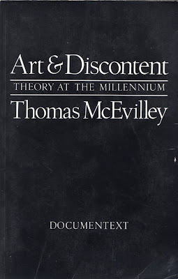
His other class was "Art and the Mind." In contrast to the film history class, this one was information rich. The content of this class mirrored to a certain extent the content of his later books. I took the class in the mid-80s. Art & Discontent and Art & Otherness were published in 1991 and 1992. The books themselves consisted of articles and essays he wrote, often for Artforum but also in various museum catalogs. Despite their scattered origins, they hold together quite well as books. And anyone who took "Art and the Mind" will find what he says in these books quite familiar.


Art and Discontent (1991) deals primarily with the way that art acquired a religious regard after the Enlightenment took down religion itself. McEvilley contends that art was given a phony aura of divinity by certain philosophers (he references Kant in particular) and talks about Modernism's ascent towards an idea of the sublime, which for McEviley is a mistake because it takes art out out of the realm of the real, a theme he will return to over and over. (The title of this post comes from an essay in this book.)


Art and Otherness: Crisis in Cultural Identity (1992) features his famous review of the Museum of Modern Art's "Primitivism" in the Twentieth Century, "Doctor, Lawyer, Indian Chief." This review eviscerated that show--a monument of scholarship that nonetheless turned the non-western cultures that produced works that inspired the Modernists into artistic spear carriers (in more than one way) in the drama of Modernism. This is the review that Jerry Saltz claims jump-started multiculturalism. That may be claiming too much, but curators William Ruben and Kirk Varnedoe unwisely responded to Artforum, which gave McEvilley another go. It was a knockout blow. (So thorough was his victory that he outsourced his evisceration of Varnedoe's MOMA sequel, High and Low: Modern Art and Popular Culture, to two other critics from his perch as editor of Contemporania.) This book expands on the ideas present in that review.


The Exile's Return: Toward a Redefinition of Painting for the Postmodern Era (1993) follows right on the heels of the previous two books and perhaps because of that has the most straightforward concept. Painting, for centuries the primary Western art form, ceased to be so around 1965 due to a crisis of legitimacy. But in 1980, it came back--chastened in many ways--as a newly revitalized form. Given this thesis, McEvilley is able to reprint a variety of excellent reviews and catalog essays about painters, including Agnes Martin, Robert Ryman, and surprisingly in a way, certain Neo-Expressionists like Georg Baselitz and Julian Schnabel.


For some reason, there is a big time gap before McEvilley's next art book, Sculpture in the Age of Doubt(1999).And perhaps for that reason, it is a much denser book which essentially walks the reader through a history of Western thought (with big dollops of Buddhist thought added)before talking about sculpture. His main subject is a Greek philosophy called Pyrrhonism which was based on radical doubt. McEvilley saw sculpture as more easily embodying this kind of doubt (which he saw as necessary for ending the Kantian/Hegelian project of Modernism) than painting. Indeed, he suggests that painting, by wishing to become "objects" instead of illusions, wants to be sculpture. So you go 68 pages into Sculpture in the Age of Doubt before he talks about any specific sculptures. Interestingly, while he discusses the work of well-known international artists like Marcel Broodthears, Jannis Kounellis, Anish Kapoor, etc., he touches on artists with a local connection (that is, Texas/Houston) like Michael Tracy and Mel Chin. Even though his ties to Houston got less and less over time (he was hired as a young PhD in 1969 by the Menils to teach at Rice--by the time I took his classes in the 80s, he was commuting from New York City), he still knew many in the artistic community and supported their work. As late as 2004, he wrote an essay for a show of work by Houston painter Richard Stout.


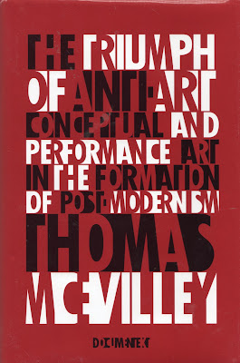
Now it may seem strange that a critic so devoted to overthrowing the hitherto timeless verities of the Modernist project would write books about such traditional artforms as painting and sculpture. Sculpture had come to be so broadly defines that it could be almost anything, but what about art that was dematerialized, that existed as a process or a ritual, rather than a thing? That was the subject of the next one on the series, The Triumph of Anti-Art: Conceptual and Performance Art in the Formation of Post-Modernism, published in 2005 after another seemingly long wait. (At least, it felt long to me.) Again Pyrrhon is a philosophical touchstone, especially for his direct influence on Duchamp, who McEvilley sees as the father of "anti-art." Opposed to Pyrrhon is Kant. For McEvilley, Kant's big problem is that he separated art off from other human endeavors in his Critique of Judgment. The aesthetic is separated off from the cognitive (Critique of Pure Reason) and the ethical (Critique of Practical Reason). (I will take McEvilley's word for it because after reading Foundations of the Metaphysics of Morals in college, I decided I had read enough Kant.) McEvilley seeks to reclaim the cognitive and ethical for art, and places conceptual art within the cognitive sphere and performance art within the ethical sphere (to simplify his much more subtle arguments). The rest of the book is a discussion of specific artists and works.

Now at this point, you might be asking yourself, what about theory and shit? McEvilley wrote a lot about philosophy, but it was all really old philosophy. He rarely mentions Derrida, Baudrillard, Deleuze, Foucault, Kristeva or any of those mostly French big brains whose work underpins so much art criticism and theory of the last thirty years. I mean, McEvilley is a monster of erudition--he seems to have read everything. So why not refer to the really current theory in his work?

I think it's because he thought it was old hat. He knew so much about Greek and Indian philosophy (he read them in Greek and Sanskrit, about which more later) that when he saw contemporary Post-Structuralist philosophy, he saw echoes of other thought expressed thousands of years ago. For the reader, this meant that McEvilley's work was blessedly free of super-difficult post-structuralist jargon. That is not to say that it was easy reading, but it didn't have that unnecessary extra layer of cant--the kind of writing that has come to be known as "international art English." McEvilley's prose was, in contrast, pretty straight-forward.


McEvilley returned in 2010 with Art, Love, Friendship: Marina Abramovic and Ulay Together & Apart, a book that  seemed design to cash in on the sudden unexpected popularity of Marina Abramovic, but in some ways is his most personal book because it deals with his friendship with Ulay and Abramovic and their relationship with each other, through art. The centerpiece is a long account of Abramovic and Ulay's Great Wall performance, where they walked the length of the Great Wall of China starting at opposite ends until they met at the middle. McEvilley accompanied them for part of the way. This was their last piece together--the meeting would, ironically, be a farewell. And there is a sense in McEvilley's account of that familiar awkward feeling of being a friend of a couple that is breaking up.


Marina Abramovic, Thomas McEvilly and Ulay from Art, Love, Friendship

These books are collectively a great work of art criticism and theory that for me form a basis or jumping off point for thinking about art. There are aspects or tendencies of McEvilley's thought I disagree with, but usually when I think about contemporary art, I'm bouncing it off him in my mind. It's like I'm having a discussion with him (and I can hear his unique voice--you can, too in this excellent video from 2000). But the crazy thing is that these books were kind of a side project for him. His main project--his life's work, really--was a comparative study of Greek and Indian philosophy called The Shape of Ancient Thought. (I've never read it and probably never will, but the video I linked to outlines it very well.)

Jerry Saltz writes wittily about auditing McEvilley's classes at the School of Visual Arts, poet Charles Bernstein wrote an excellent obituary, and Rainey Knudson writes about taking "Art and the Mind" at Rice in a post that stirred up many memories for me. I suspect there will be other tributes in the days to come. But the best tribute to McEvilley would be to read his books. It's been 20-odd years since I read Art & Discontent--I think it's about time to read it again.

Share

5 Comics

$
0
0
Robert Boyd

In the lead up to Comics: Works from the Collection of Robert Boyd (March 14 to April 11 in the EMERGEncy Room at Rice University), I want to spend a little time thinking about and writing about comics. I'm always reading new comics and at any given time have a stack of not-yet-read comics (sharing space with not-yet-read novels and not-yet-read art books). Despite my looming tower of unread books, I have actually managed to finish a few, including some which were excellent.

Now most of these comics were published last year. You see, I tend to take a long time to get around to reading my comics, and once I do, I take a long time to review them. Nonetheless, I hope these reviews will be useful.


The Song of Roland by Michel Rabagliati (Conundrum Press, 2012). This is the fifth volume of autobiographical comics by Michel Rabagliati. Rabagliati came to comics through his illustration career (apparently he was hired to create a logo for Drawn & Quarterly, the art comics publisher, in 1990 when it was just beginning, and this gig sparked an renewed interest in comics on his behalf). Perhaps because he doesn't come to comics via underground/alternative comics, his conception of autobiography is quite distinct from the unflinching self-examination that characterizes the work of, say, Chester Brown. In fact, even though he is usually the main character, he has plenty of time for everyone else in who he comes in contact with in his stories. And in The Song of Roland, he turns the camera mostly away from himself and on his father-in-law, Roland, as he slowly dies of pancreatic cancer. It's a moving story, all the more powerful for being so familiar for persons of a certain age (Rabagliati is three years older than I am).

His drawing stye is stylized and fairly slick, and his storytelling is mostly pretty conventional. It reads easily, eschewing experimentation and formal trickery. Each of the books centers around one important passage in his life--losing his virginity, moving away from home, the death of a parent, but they are pleasingly discursive. Even in The Song of Roland, which deals with such a serious topic, Rabagliati throws in some slapstick about adjusting to the internet (necessary for his illustration career) and moving into his first house with his wife and daughter. And that works, because these important passages (such as a death of a close family member) always happen while you're living your life. Rabagliati is a very warm-hearted cartoonist.


Roughhouse edited by William Kauber and featuring William Cardini, Aaron Whitiker,Brendan Keifer, Gillian Rhodes, Katie Rose Pipkin, Colin Zelinski, Tyler Sudor, Alex Webb, Sophie Roach, Douglas Pollard, Connor Shea, Blake Bohls, Baylor Estes and Matt Rebholz (Raw Paw, 2013). This squarebound anthology is the newest item in this review; I picked it up on March 2 at Staple! in Austin, and they told me they had just picked it up from the bindery that morning. The book was printed by "risograph," a digital printing technique that apparently combines elements of xerography and mimeographs. It allows them to do two and occasionally three-color printing, but the quality is fairly crude. But in Roughhouse, that works. These are impolite comics, not quite housebroken. They come out of the tradition of Weirdo, the great 80s anthology edited by Robert Crumb, Peter Bagge and Aline Kominsky-Crumb. The quality of the stories varies wildly, and many of them eschew such bourgeois values as "endings" and "having a point." But a lot of them are really good, and on balance I liked Roughhouse a lot.

Standout stories included "The Disappearing Food Truck" by Aaron Whitaker, which takes the old EC horror story structure and wittily recontextualizes it for present-day Austin; "The Thing That Was Trying to Hide" by Brendan Kiefer, in which the train of the story keeps getting interrupted in a manner that recalls If on a Winter's Night a Traveler; Sophie Roach's almost completely abstract untitled comic story; and Douglas Pollard's bizarre "Output," a story that perfectly recaptures the Weirdo vibe.

Now where you get this comic, I don't know. If you're in Austin, you can try Austin Books and Comics--they seem pretty good about carrying this kind of thing. Otherwise, email Raw Paw at rawpawzine@gmail.com and hope for the best. UPDATE: I'm told that Roughhouse will have its official launch at Farewell Books in Austin on March 6 at 6 pm. If you're in Austin, swing by and check it out!


New York Drawings by Adrian Tomine (Drawn & Quarterly, 2012). It's a bit of a cheat to include New York Drawings in this list. It's mostly an art book with a total of seven pages of comics in it. But Tomine is best known for his comics--he's been a star of the alternative comics scene for decades. (I reviewed his minicomic Optic Nerve for The Comics Journal in 1991 or 1992, when Tomine was still a teenager). Most of the art in here is work he did for The New Yorker--quite a few covers, but primarily illustrations for the listings and for reviews. Naturally he draws some very familiar faces--movie stars, musicians, etc. These are the least interesting of the work here. Best are his illustrations that try to capture a bit of life in New York City. He prettifies things quite a lot--his New York doesn't seem to be very dirty and is filled with attractive people. This may not be the most honest depiction of New York, but it's one that we can fantasize about.

A friend of mine once called Tomine the Sal Buscema of alternative comics, and coming from a comics nerd, that is not a compliment. His drawing style is blandly realistic and deadpan. But I've always been drawn to it, and here he adds an additional element beyond what we see in his comics--color. He uses a flat, Tintin-like coloring style, and his choice of colors is subtle and beautiful. The drawings here are lovely, but they make me long for a full-color comic from Tomine. That would be magnificent.


The Infinite Wait and Other Stories by Julia Wertz (Koyama Press, 2012). This is my first Julie Wertz book, even though she has done others. The drawing is a bit awkward. It's functional but not much more. But her comics are really very funny, which makes up for less-than-dazzling artwork. Wertz has a sarcastic, funny quip for every situation she finds herself in. There used to be a feature in MAD Magazine when I was a kid called "Snappy Answers to Stupid Questions." The Infinite Wait reads like "Snappy Answers to Stupid Questions" with a plot. As I read it, I kept thinking that comics was just going to be a stop along her career--she'd end up writing for television or movies eventually. Obviously words are where her talents lie. But she apparently anticipated this--her first story, "Industry," includes a section when Wertz is unable to write a script even though she has interest from a major film studio. At the end of the story, which catalogs her work history from childhood to the present, her character says the least sarcastic thing in the whole book, "I mean, when I found comics, I knew instantly that it was what I wanted to do. It just felt right. And now that I'm actually a cartoonist and it's working, I want to ride it out as long as I can."

Even though Wertz is a comic writer (comic in the sense of "funny"), she's not shy about revealing painful things--her alcoholism (and how it resulted in her losing three jobs in a row), her lupus, etc. In this way she is part and parcel with the tradition of confessional autobiographical comics started by Justin Green with Binky Brown Meets the Holy Virgin Mary (1972) and continued in the work of Chester Brown and Joe Matt in the 1980s and 90s.


Are You My Mother?: A Comic Drama by Alison Bechdel (Houghton Mifflin Harcourt, 2012). Alison Bechdel's work sneaks up on me. The subject matter often seems designed to make me lose interest, and yet I get sucked in. Her comic strip, Dykes to Watch Out For, was about the lives of a group of friends, politically active left-wing lesbians. When I first looked at it, it felt overwhelmingly politically correct. But as I read, it became clear that she was depicting individuals within a subculture, and their complex negotiation of that particular subculture was shown with good deal of humor and irony. And I ended up loving these characters! (Except Mo, who remained irritating to the end.)

The same is true with Are You My Mother?, a memoir about Bechdel's fraught relationship with her mother. She deals with this relationship through psychoanalysis (which strikes me as boring), she draws (and interprets) lots of her dreams (and there is nothing less interesting than other people's dreams), with lengthy digressions into the life and work of English psychoanalyst Donald Winnicott (wha--?) and the novels of Virginia Woolf. It sounds like a recipe for disaster! But by the end of it, I felt like I was right there on the couch with Bechdel, was utterly fascinated by Winnicott, and was ready to reread Woolf (whose books I like anyway, so that's not so bad). This book won me over completely.

I think a lot of people in the alternative comics world have a problem with Bechdel--too wordy, too political, they don't like her drawing. She has a level of erudition that many comics fans might be threatened by or feel is pretentious. I think some of this attitude toward her work happens because she came to comics out of a completely different soil than that of the usual alternative comics fan or reader. She didn't grow up reading underground comics or Love & Rockets and isn't steeped in that particular history. But I think that if these skeptical readers view it this way, even unconsciously, they will be denying themselves the pleasure of reading a brilliant cartoonist.

Share

Staple!

$
0
0
Robert Boyd

I went to Staple! last weekend. Staple! if a comic book convention in Austin devoted mainly to small press/independent comics. It's not as narrowly focused on art comics as The Brooklyn Comics and Graphics Festival, which is too bad for me because I prefer art comics. (I realize to a non-alternative comics aficionado, this may seem like a trifling if not nonsensical distinction.) But I saw some good art comics there that I liked, including Roughhouse, which I just reviewed.


This was the table where I picked up Roughhouse. If I imagine in my head what a group of young art comics creators would look like, it's exactly like this picture! The guy on the right is Brendan Kiefer, but I don't know the rest. (Attention Austin: if you recognize yourself in any of these photos, let me know!)


I also saw my old friend Chris Staros, who is co-chief of long-time alternative comics publishing house Top Shelf (where I picked up some books by Alan Moore, Kevin O'Neill and Eddie Campbell).


Above is the Top Shelf Booth, manned by Staros and writer/retailer Wayne Beamer.


One of the Guests of Honor was James O'Barr (sitting on the left), whose best-known comic, The Crow, was bleak and gothy. In contrast, he seemed quite personable and friendly, willing to chat with and sketch for devoted Crow fans at length.

As for the rest of these photos--I have no idea who these folks are. I bought stuff at some of their booths, so I may be reviewing some of it later. Or maybe not. Anyway, Staple! is not quite like a big mainstream comic con. No Klingons or super-heroes wandering the floor. But like mainstream comics conventions, Staple! was full of people willing to let their freak flags fly.


Share

Pan Recommends for the week of March 7 to March 13

$
0
0
Robert Boyd

Here are just a few of the art events this weekend happening in Houston and Galveston.

THURSDAY

 
Bas Poulos, Arcadia Vista 'A' (Large Version), 2012, 48x60 inches, acrylic on canvas

Bas Poulos: The Arcadia Vista Landscapes at Meredith Long Gallery, 5 pm. I saw these in Poulos' studio when he was still working on them, and am looking forward to seeing the completed series. Based on certain Greek landscapes, former Rice University painting professor Poulos simplifies and abstracts them in these intensely colored paintings.


Tetramorph: The Mavis C. Pitman Award Exhibition at the Rice Media Center, 6–8 pm, featuring work by Trey Ferguson, Lisa Bileska, Jessie Anderson, and Alexandria Fernandez. I know nothing about this except that these are Rice student artists, and I was one of those once. I bet they are less clueless than was. (Thursday is the night for Rice artists, it seems.)

FRIDAY


Kodachronology featuring work by Shannon Duncan, Donna Fernandez, and Tere Garcia at the Caroline Collective, 7-10 PM [show runs through April 19th]. Even though Kodachrome film was officially discontinued in 2009, these photographers still had some of the color film that "give[s] us those nice bright colors" and "the greens of summer," according to Paul Simon. They developed the film in black and white chemicals, and this show is the result of that experiment.

SATURDAY


Akin Forray Ledvina: Art Show at Domy Houston with work by Chris Akin, Sebastian Forray and Cody Ledvina at 7 pm. I'm informed that this art exhibit will feature free beer.


Chris Akin, Sebastian Foray and Cody Ledvina (not to scale)


piece by Teruko Nimura

The Bridge Club; Christa Mares, Marianne McGrath, Teruko Nimura; and Jared Wesley Singer at Box 13, 5 pm. The Bridge Club performs (5 to 8 pm) and other artists have work on display in conjunction with the NCECA conference later this month. The Bridge Club's hypnotic performances are always worth checking out.

Share

Pan Video Parade

$
0
0
Robert Boyd

I found the video below, "Inside the Library of Thomas McEvilley" by Michael Kasino on Vimeo. It wasn't embeddable but it was downloadable. So I hope Mr. Kasino won't be angered that I have copied it and embedded it here. (You can see more videos by Kasino here.)

Unsurprisingly, McEvilley's apartment was overflowing with books. But I see he also does something I do--he hangs art in front of his books. The thing is, if you are an art lover and a book lover, you end up with a dilemma. Books and art both tend to take a lot of wall space. And unless you're quite wealthy, you probably have a somewhat limited quantity of wall space. So the solution for some of us is to put art in front of books.

McEvilley tells us that he has never bought a piece of art or asked an artist for a piece, but that he often gets pieces as gifts. He has a lot of pieces by James Lee Byars and William Anastasi, two artists he was personally very close to. He also has a giant stuffed tiger that he found on the street in a puddle and brought back to his apartment.

Here is an excellent quote from the video: "Antiquity, especially the bronze age... It possesses me. I wake at night thinking about it."


James Kalm walks through the big Jay DeFeo retrospective at the Whitney Museum (there's about of minute of a random brass band playing at the beginning of the video).


Share

Mark Flood Teaches George W. Bush to Paint

$
0
0


Oh, wait. It's Bonnie Flood. (She must be Mark's sister.)

Share

Black Ghost: On Not Forgetting Bert L. Long, Jr.

$
0
0
Robert Boyd

Black ghost is a picture, and the black ghost is a shadow too
Whoa black ghost is a picture, and the black ghost is a shadow too
You just can see him, but you can't hear him talkin'
Ain't nothin' else that a black ghost can do


On February 28, Bert Long's final exhibit of new (and old) work, Bert L. Long, Jr.: An Odyssey, opened at Houston Baptist University's Contemporary Gallery. Long died February 1st of pancreatic cancer. It's been a hard few weeks for art in Houston. Thomas McEvilley, William Stern, Anthony Palasota, the sobering news about Wendy Wagner. I got in a conversation online about a tribute written to Long by Gary Reece. Reece had written:
I remember asking him after the interview to lend me the catalogues of his shows so that I could get a better feel for the progression of the work. He was silent.

Bert: There are no catalogues.

GR: What do you mean there are no catalogues? Look man if you don’t want me to have them, just…

Bert: No it’s not that. There are none. See that’s one of the perceptions about Bert Long. There are many. The perception that he is rolling in the dough, that he is at the top of his game, that there is documentation out there concerning him. But there is none.

Have heard museum directors and curators talk about his importance, his place in all of this and when one looks around for the Articles of Validity and Worth, the catalogues, one finds nothing. Nada. 9 solo museum shows and nothing. So how should one chart the exclusion of this important variable in the story of this important artist? This question should be not asked in lieu of the funding necessary to produce a publication. Has more to do with the commitment of an institution to the artists they present; a very telling litmus test. The capacity of an institution to put together a coterie of curators, writers, graphic artists, select a publishing house, is well, what they do. And before you fix your mouths to say anything, brochures and gallery notes, though thoughtful, no, they do not count. Sent for you yesterday and here you come today. ["Thimble," Gary Reece, Not That This, February 27, 2013]
On Facebook, Devin Britt-Darby expressed surprise at this fact ("What, indeed, is up with nine Bert Long Jr. solo museum shows and no catalog?"), and sparked a conversation between him, me and Nathaniel Donnett. I could only think of one minor gallery publication for Long off the top of my head. I was pleased when I went to HBU that they had printed a catalog for Odyssey.  They were giving them away for free. As catalogs go, it's a bit eccentric--but so is Long's art.

The truth is, Long needs a full scale monograph. He needs something with beautiful photos, insightful essays, rigorous scholarship, and striking design. Something that would be a monument to the artist and would hold his memory. Something that would help to keep him from becoming a ghost, a dimly remembered figure in some remote provincial outpost in the history of art.

 HBU's Contemporary Gallery filled with Bert Long's admirers

Don't get me wrong. People aren't likely to forget Long soon. You could tell by the big crowds at HBU (which, let's face it, is not exactly in a central, easy-to-get-to location) and at a memorial to him later that evening downtown. The viewers at HBU seemed to be making earnest attempts at engaging the art--I overheard discussions between people trying to suss out what the work meant to them. It was everything an artist could want from a crowd of viewers--conversation and engagement with the work.


The work demanded engagement. A few pieces, like Purgatory, were pretty self-evident in their meanings. At least it seemed so to me. The blinking "OPEN" was like a seedy business trying to lure customers in.


Bert L. Long, Jr., Flow, 2000, acrylic on wood with fiberglass eye and gourd, 47 x 30 x 36 inches

Flow used a similar eye (perhaps from the same mold) to those included in Field of Vision, Long's installation over on Elgin. The stair-step structure with the eye at the top made me think of a piece of an ancient temple, looted by archeologists and relocated to a Western museum. The weeping could be tears for the desecration. Or it could be a fountain where the play of water represented sorrow. In in the water, we see images of eyes flowing over the steps. So that could be read as growing blindness and the regret that comes with it. The thing is, a piece like this allows a viewer to tell herself all manner of stories. It demands stories be told. These works aren't the kinds of work that you can walk by with a shrug, or that you can look at and say "Hmmm, intriguing" or "How lovely."


Bert L. Long, Jr., Road Kill, 1990, acrylic on canvas with frame of acrylic, metllic gold and silver paint, tire, reflectors and mirrors on white pine, 72 x 96 x 4 inches

For instance, a painting of a black bird with a ghostly snake in its beak can't just be seen as what it depicts. The very act of describing it makes you complicit in telling its story, which feels like an ancient myth or fable. And the "road" symbols--torn tire, reflector lights, mirrors--add a layer of complexity.


Bert L. Long, Jr., Pre-Rome, 1990-92, etching on paper in hydrostone frame with paintbrush, glass eye and plaster hand

One thing that characterizes Long's work is his use of highly stylized, sculptural frames. The frame is part of the work--and in the case of Pre-Rome, I'd even characterize it as the most important part of the work.


Bert L. Long, Jr., Quest, 1983, acrylic on trunk with frying pan, shoes, glass, liquor bottles, orange peel, name tag, credit card, chain, rope, steering wheel, newspaper, bone, keys, harmonica, tooth brush and other mixed media, 39 x 40 x 25 inches

Like early Kienholz and so many of the beatnik sculptors in California from the early 60s (George Herms, Wallace Berman, etc.), Long was a sculptural junk-man, as one can see in Quest from 1983. One thing really pleasing about this exhibit was that the work came from 1983 to 2012. Odyssey was too small an exhibit to be called a retrospective, but it was large enough to give some idea of the arc Long's artistic work.

Then after this was over, there was an event on Long's honor at the Magnolia Ballroom downtown. They called it a "Memorial/Celebration of Life/Party." Just plain "Memorial" must have sounded too somber. In fact, lots of jokes were told, as well as funny stories about Long. An assistant, Fred, gave a gut-wrenching slam-poetry-style eulogy; he literally seemed to be in pain as he gave it. But even he was able to make the assembled crowd laugh when he said that when he first started working for Long, he was amazed at how many white people Long knew!


Fred

Painter John Alexander talked about Long's talkativeness and tenacity, including a story about Long cornering Alexander's New York dealer in a gallery demanding a three person show with himself, Alexander and James Surls.


John Alexander and Jack Massing


James Surls next to a Bert Long piece

So for an event that was a memorial, it was anything but somber.


Howard Sherman and Ibsen Espada


A crowd of Bert Long's admirers including Long's widow, Joan Batson, standing on the right and Bill Davenport on the left.

Given the huge crowd there, it was obvious to me that no one would be forgetting Long very soon. But I also noticed that aside from some younger members of the Long family, none of the attendees were terribly young. I didn't see any members of the younger generation(s) of Houston artists there--I think the youngest artists I saw were Solomon Kane and Howard Sherman. It's not news that there are generation gaps in the Houston art scene. I notice this all the time. I go to an art event at the Joanna, say, and the artists there with a few exceptions all seem to be in their 20s and 30s. And there are events I attend where all the artists are in their 60s and 70s! There seems to be a lack of local historical art consciousness in Houston. A younger artist will know what happened in New York in the 60s far better than he knows what happened in Houston in the 60s.

I understand the reasons for this. When you take an art history class as an art student, they teach you canonical art history--not local art history. And socially, people tend to hang our with their peer groups, which mostly consist of folks around their own age. Young artists in their 20s tend to be night owls who enjoy going to bars and nightclubs, while artists in their 30s and 40s often are married and have kids and have a totally different schedule, and older artists find morning events amenable--in short, age tends to sort artists out in ways that make it hard for generations to come together. Furthermore, most writing about art in Houston tends to be ephemeral--it's written for newspapers (or websites). Many blogs and magazines have come and gone: ArtLIES, ...might be good, etc. For an amateur art historian like me, this means combing microfilm libraries and online databases, but for most people, it means forgetting. Oblivion.

So there are good reasons for this lack of historical memory. But the problem is that once an artist like Long dies, he risks being forgotten as time goes on. It's not just Long. Charlie Stagg. Dick Wray. Bob Camblin. Jack Boynton. Robin Utterback. Etc. The people for whom these artists were vital presences--their collectors, their colleagues, critics who wrote about them--are aging, along with the memory of the work.

So how do you make sure Bert Long is remembered? Obviously having work in the permanent collection of museums is key, and even more important is that the work is displayed and not socked away in permanent storage. And a careful archiving of his work and papers is necessary. Fortunately, that is being done by Pete Gershon, editor of Signal to Noise magazine. A documentary about Long called Bert has been produced, and that's clearly going to help.


A clip from Bert, directed by John Guess, Jr.

 And the monograph I mentioned before? It's in the works. Money has been raised for it through the Houston Artist Fund.

The Houston Artist Fund is a non-profit created to "sponsor art-related projects and organizations that intend to raise funds from individuals, foundations, and corporate donors, but do not have their own tax-exempt status."This has meant in practice helping to finance exhibits and monographs (for Lucas Johnson, for example). Last summer, they hosted a barbeque/raffle/fund-raiser at the El Dorado Ballroom for a Long monograph. Jack Massing, one of the board members, tells me that they have now raised enough money to produce the book but not to print it. So there is a little more required to move this project over the finish line. And when it happens, the project of not forgetting Bert Long will get a major boost.


Share

Brad Moody’s Cotton County

$
0
0
Virginia Billeaud Anderson

A preview of the twenty-two works on canvas, wood panel and paper Bradford Moody is showing in Welcome to Cotton County at d. m. allison art through March 16 gave me an incomplete sense of narrative unity. It wasn’t until I saw the twenty-two pieces installed that I realized how thematically cohesive is this exhibition. And installation is gorgeous. The paintings’ garish oranges, greens and pinks play off each other and pulsate against Dan Allison’s freshly painted white walls that were so well lit a few people complained about “halos” in their cell phone photos.

Moody set his characters in “Cotton County,” a place he has known at various times in Georgia, Louisiana, and Texas. He has in the past painted straight-forward iconographic references to the county, such as the cotton field Cotton Fairy pranced through wearing lingerie and hooker heels. John Deere caps and crucifixes more vaguely approximate it. The artist described the Texas version of Cotton County, “where mama’s family comes from, in the north part of Texas. It’s a shit-hole.”

Uncle Wayne the Cracker, who has a complexion like grits and dislikes “negroes,” is from there. The old cracker appears in several paintings. So does “Pic-a-ninni,” who in her most recent incarnation has yellowish skin, stylized braids and wears a cap. Picaninni is typical of Moody’s characters in that she occasionally elicits a negative reaction. “Inappropriate” is a common response. Recently, I attended an exhibition of Moody’s art in south Louisiana, and watched a woman in her 80s question him like an old aunt determined to correct his manners, “Now Bred, isn’t ‘picaninni’ a RACIST term?” “Well yes mam, it would be impolite to call somebody that, but my narratives are parody, a fact easily recognized by collectors.” Another woman who said the art was “offensive” could not know she had been spared the god- forsaken African mask face nude hermaphrodite and ghoul-face pregnant nude with stitched up crotch. He held back!


Bradford Moody, Pic-a-ninni, 2012, Acrylic and mixed media on board, 36 x 24

In the Houston gallery I overheard a woman tell a man, “I realize it’s a great painting but I’m not sure I want to look at it.” Having written about Moody’s art in the past I could see many things remained unchanged. He continues to flavor irony with aberrance, believing gross exaggeration decries that which is stupid and unenlightened. Stylistically he incorporates the spastic lines, fragmented distortions, and crude coloring of primitive, folk and outsider art, and overlays messy calligraphic components, genuflecting to Picasso, Egon Schiele, Dubuffet, Rauschenberg, Twombly and Basquiat.


Brad Moody, 2012, How To Snap a Neck, acrylic and mixed media on board, 34"x 24"

I asked Moody if there was anything different in the new body of work. The figures have extra vitality, he said, “additional details, greater movement, exaggerated expression.” Poses of delirium defined numerous past works, especially the skull-face nude pregnant mother figures. In the new works one sees in the gestures an accelerated tone of frenzy. How to Snap a Neck encapsulates violence with lynching connotations, and the frayed figure in A Cadmium Yellow Boy in a Blue World represents tragic isolation. There is a head scarf covered Mammy figure giving lip in Won’t Wash Yo Windows. Her goon-like shrieking mouth is haunting.


Brad Moody, 2012, A Cadmium Yellow Boy in a Blue World, acrylic and mixed media on board, 48"x 28"

A few years back I asked Moody what “cotton” meant to him. “Cotton represents the deep South for me, not a good or bad thing, just the deep South in its glories and troubles, myths and realities.” And here are a few things he said about narration. “The paintings are just a form of story telling, like reportage. Everything is pretty much what I have seen, and how I have seen it. All I do is make pictures that try to tell a story and hopefully that story will have universality.” Moody is in the hospital, and because of his illness was unable to attend the opening of his exhibition. Heavens child, you do carry on!


Brad Moody, 2013, Self Portrait #23, Acrylic and mixed media on board, 48"x 28"

Share

Comics at the EMERGEncy Room

$
0
0
Robert Boyd

Tomorrow I will be opening a small exhibit of comics art from my personal collection at the EMERGEncy Room gallery at Rice University (it's on the fourth floor of Sewell Hall, one floor up from where the Rice Gallery is). I've hastily assembled a website for it--please excuse the typos and badly color-corrected images!

I will have a lot more to say in my talk at 7 pm, and the website I've assembled has a lot of information on individual artists. But briefly, I want to say that this is another small tap on the wall that surrounds the art world when it comes to recognizing comics art as a visual art worth considering--and collecting. It's why I curated the exhibit of Jim Woodring and Marc Bell art at Lawndale Art Center a few years back. It's why I occasionally write about comics for this blog. I invite all  readers of Pan will come by tomorrow evening for the opening, and if you can't make it, the show will remain up until April 11.

Here are a few pieces that are included in the exhibit:


Chester Gould, Dick Tracy, February 2, 1947


Gene Ahern, Room and Board, June 19, 1938


Alison Bechdel, Dykes to Watch Out For“Boy Trouble,” March 4, 1999


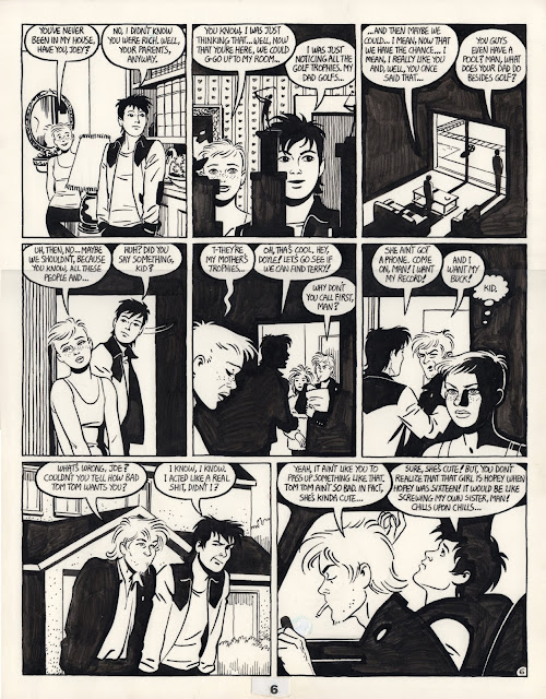
Jaime Hernandez, Love & Rockets“Locas vs Locos” p. 6,  1986

This exhibit would not have been possible without Christopher Sperandio, assitant professor of painting and drawing at Rice University and himself a bona fide Kartoon King.

Share

Pan Recommends for the week of March 14 to March 20

$
0
0
Robert Boyd

THURSDAY

 
Ron Regé, Jr., The Cartoon Utopia p. 16, panel 6, January 20, 2009, 7" x 8.5"

Comics: Works From the Collection of Robert Boyd at the Emergency Room (402 Sewell Hall, Rice University) at 6 pm, with a talk at 7, up through April 11. I heard this was going to be excellent.

FRIDAY

 
Tatiana Istomina, 6 Portraits: heads of Russiaʼs Federal Security Services (FSB) from 1917 to 2010, based on the official website of the FSB (detail: n. 17 and 24), 2010, watercolor on paper, a group of 26 drawings, 9" x 6"

2013 Core Exhibition with work by Miguel Amat, Anthea Behm, Jang Soon Im, Tatiana Istomina, Anna Elise Johnson, Senalka McDonald, Madsen Minax and Ronny Quevedo at the Glassell School of Art, 6 pm, running through April 21. The Core exhibit is always worth checking out, if also often somewhat perplexing. What are the odds that some piece of art in this show will include cinder blocks?

 
Melanie Loew, 2012, Oil on fabric, 11x14 inches 

Lynn Lane and Melanie Loew: Cats, Bunnies, and The Surface Value of It All at Fresh Arts, 6 pm, up through March 26. Photos and paintings of people with cats and/or bunnies? I'm there!

Katie Wynne, The Sylphides have the beast captured and are grooming him, 2011, cardboard, house paint, string, rope, tape, glue, fabrics, wood, furniture and architectural scraps, nails, screws, wrapping paper, metallic basket filler, sequins, motorized tie racks, a tassel, a poster and a plaid shirt, dimensions variable

6 shows at Lawndale (featuring work by Mike Beradino, Richard Nix, Rahul Mitra, Katie Wynne, Brian Benfer, Sharbani Das Gupta, Jessica Dupuis, John Emerson, Jeff Forster, Kamila Szczesna, Daniel Anguilu and Aaron Parizette) at 6:30, through April 20. Lots of interesting work on view, and I am especially intrigued to see the mural collaboration between a mandarin and the street (Parizette and Anguilu).

SATURDAY

 
work by Ann Johnson

Municipal Dirt in Russ Pitman Park at Russ Pitman Park in Bellaire, 4 to 6 pm, up through April 26. Curated by Lucinda Cobley & June Woest and featuring James Ciosek, Lucinda Cobley, Melanie Crader, Michael Crowder, Danielle Frankenthal, Nelda Gilliam, Ann Johnson, Cathie Kayser, Mari Omori, Lelu Overbeck, Jennifer Overfield, Jacqueline Dee Parker, Lisa Qualls, Tecklenberg & Georgeson, Justin Varner, June Woest, and Jo Zider.Weather's supposed to be beautiful Saturday--that alone is a good excuse to go to the park. And all the art? Just a big bonus!

Family Values at UP Art Studio, 6 pm, open through March 23. Features work by the Bernal Family Collective with Luis Guzman, Sae 1, Bryan Cope, Megan Thiede, and Santiago Paez IV. I have no idea what to expect (I can't find any photos), but I'm intrigued by the family art collective aspect.
 
Angel by Paul Darmafall aka The Baltimore Glassman, 20x42, broken glass on found particle board, 1988

Plain Sight with Paul Darmafall, Richard Gordon Kendall and "Remmy" at 14 Pews, 6 pm. Three outsider artists (two from Houston).


Share

New Acquisitions: Julon Pinkston and Thomas "Tad" Dorgan

$
0
0
Robert Boyd

It's been a while since I did one of these. But bonus time hit and I decided to celebrate by buying some art. It took me a while to find some art I was willing to commit to that I could afford--always the tricky balance, for me. But I saw the new pieces by Julon Pinkston at Zoya Tommy Contemporary and I loved them. In fact, there were many there I loved so I'm already feeling buyers remorse over the  other Pinkston works I wish I had. No matter what I had bought, I would have still felt regret for what I didn't get.

Here's the thing. There are artists and whole art movements that strive to somehow remove their art from the capitalist system, who try to create art that is cannot be made into a "commodity." I get it. But the pleasure of buying and owning art is exquisite, so all you trendy commies can go to hell.


Julon Pinkston, Untitled (Tape Over White Over Red), 2013, acrylic paint on canvas stapled to wood panel, 10 ¾ x 14 ¾ x 2”


Julon Pinkston, Winter Coat, 2012, acrylic paint and plastic BBs on wood panel, 6 ½ x 5 ½ 2”

I had seen Julon Pinkston's work at the Big Show at Lawndale in 2011, and I liked it, but it wasn't anything I felt I wanted to have. Not so with these. On opening night, I literally spent 30 minutes trying to decide which of the many pieces I wanted--there were so many good ones.

Now some readers are possibly thinking, man, listen to this rich asshole talking about his art buying. But while I make a decent living, I am far from being in the 1% (much less the .01% who break the records at Sotheby's and Christie's). The thing is, Julon Pinkston, like many local artists, sells his work at prices that a non-wealthy collector can manage. There is a lot of fantastic art out there that ordinary folks can afford. The Vogel's proved that.

Jen Graves wrote a manifesto for collecting in The Stranger (a Seattle weekly newspaper) a few months ago. There have been lots of artistic manifestos, but Graves' manifesto, "Buy Art!" (subtitled "If You Have Never Bought a Piece of Original Art, You Are Doing Life Wrong"), may be the only manifesto for collectors I have ever seen. She wrote:
The last time you avoided an art gallery out of intimidation or slunk out of one feeling out of your depth? That was the final time. Right here, right now—this is the end of your lifelong career of never once having bought a piece of original art.

[A]rt has a double economy. One economy is nearly free. The other—where you actually buy—is perceived to be basically impossible to enter unless you're a Rockefeller. Yes, the art that's sold for millions and makes headlines for its auction records, etc., etc., no, you cannot afford that art. But who cares? The world is jammed with 99 percent art. [Jen Graves, "Buy Art!", December 5, 2012, The Stranger]
Her piece spoke very specifically about buying art in Seattle. Devon Britt-Darby picked up the ball and wrote a piece for Houston in Art + Culture. He wrote, in essence, that what is true in Seattle is just as true in Houston: there's plenty of affordable art if you look around for it and are willing to ask for it. Don't assume that everything for sale in a gallery is out of your range.

So if you are looking at these Julon Pinkstons and thinking, I kind of dig those, go over to Zoya Tommy and look at all the ones she has in stock (or check them out on Pinkston's website). You may find that this is art you can afford. And there's a lot more by a lot of different artists available all over Houston.


Thomas "Tad" Dorgan, Indoor Sports, c. 1921

This comic panel by Thomas "Tad" Dorgan is supposedly from 1921. (I guess there will be a trip to the library's newspaper microfilm collections in my future to precisely date it.) Tad was one of the very early newspaper comic strip artists--his first comic strip was in 1902. But his strips didn't appear on the comics page--they were aimed at sports fans and ran on the sports pages. A surprising number of comics strips started out there--the most famous being Mutt & Jeff. Tad never left the sports page. A big boxing fan (indeed, he is in the International Boxing Hall of Fame), he was reportedly a good friend of the great Jack Johnson.

Tad was an excellent cartoonist, but he had a greater affect on the world for being (like Shakespeare) a prolific coiner of idioms, including "dumbbell" (for a stupid person), "for crying out loud," "hard-boiled" (for tough), "drugstore cowboy," and many more.

Share

Nick Kersulis at Devin Borden

$
0
0
Robert Boyd


Nicholas Kersulis, Within Without the Space of a Corner (He Spent Days Wandering with Headphones on, Lest He Forget His Heritage), 2010-2013, Oil on jute on panel; framed c-print mounted on aluminum Artist’s photograph of a guardrail on a country road with anarchy symbol graffiti. 78 x 73” painting, overall,  24 ¼ x 16 ¼” photograph

The last time I saw work by Nicholas Kersulis, he had painted rocks with gesso--coat after coat--until the gesso was about as thick as the rock itself.  At the time, I thought of them as examples of a process. A very obsessive process. A process that in a way reflected actual geological processes of laying down layer after layer of sediment until sandstone or shale is created.

Nicholas Kersulis, Within Without the Space of a Corner (He Spent Days Wandering with Headphones on, Lest He Forget His Heritage) detail, 2010-2013, Oil on jute on panel; framed c-print mounted on aluminum Artist’s photograph of a guardrail on a country road with anarchy symbol graffiti. 78 x 73” painting, overall 24 ¼ x 16 ¼” photograph

And I saw some of the same obsessive layering in this show. In the painting above (which I'll call Headphones for short), he paints an outer square around an inner square, alternating black and white. As a consequence of this repetitive action, the corners (where the brushstrokes overlap) become especially built up with alternating layers of black and white. They turn this series of five horizontally stacked paintings into a sculptural group, projecting into the viewer's space.

But this exhibit, Within Without the Space of a Corner at Devin Borden Gallery, made me look back on those gessoed rocks differently. Because this show is all about paired things. Things that go with another thing, that are almost twinned (but never perfectly so); things that are unequal or imperfect reflections of another thing. And those gessoed rocks fit into this--Kersulis essentially created a second rock out of gesso for each of his original rocks.


Nicholas Kersulis, Within Without the Space of a Corner (After death, but before burial), 2013, Oil on jute on panel; framed c-print mounted on aluminum Appropriated image of Anita Pallenberg and Brian Jones with the same haircut, posed with hands mirroring each other’s within the frame. 76 x 72” painting, overall, 24 ¼ x 16 ¼” photograph

So each piece in the show is a pair--painting(s) on one side and photo on the other. The pairs are not alike (in medium, in scale) and are further differentiated by physical separation--some are separated by doorways, as with Headphones and After death.  Others are separated by being on different walls in corners.


Nicholas Kersulis, Within Without the Space of a Corner (After death, but before burial) detail, 2013, Oil on jute on panel; framed c-print mounted on aluminum Appropriated image of Anita Pallenberg and Brian Jones with the same haircut, posed with hands mirroring each other’s within the frame. 76 x 72” painting, overall, 24 ¼ x 16 ¼” photograph

The imperfect pairing is reinforced in some of the photos. In After death, we have a photographic image on one side and a series of words on the other. Both can be read as representing the same thing, Anita Pallenberg and Brian Jones of the Rolling Stones. Pallenberg, a model, was Jones' girlfriend for a few years in the 60s. She left him in 1967 because he was physically abusive and became Kieth Richards' companion for over a decade. Jones was found dead in his pool in 1969. Some of the words seem to refer to Jones, who could be "cruel and difficult," had a crush on "Françoise Hardy," was known to be "artistically unsatisfied," and was a Pisces.

In the photo, Pallenberg and Jones are posed in a mirror image of one another. Their hands are in similar positions, their bangs are cut long, their eyes deeply shadowed. They are mirrors are exact but opposite, as are they by virtue of being male and female who, in this image at least, resemble one another closely.

This mirroring occurs in the painted part of After Death as well. The two-square paintings at the top and bottom each feature a red side and a blue side, but they are switched. The four-square paintings are predominately one color each, red above and blue below. And each square in the middle section is equally red and blue.


Nicholas Kersulis, Within Without the Space of a Corner (Be Here I),2013, Oil on canvas; framed c-print mounted on aluminum Warm grey and cool grey paintings paired with a color photograph diptych, a section of the image desaturated. 76 x 72” painting, overall 24 ¼ x 16 ¼” photograph

The notion of an imperfect mirroring is quite literally carried out in Here Be I. The painted panels repeat the basic square arrangements of the other pieces, but instead of being two highly contrasting colors, they are uniform grey. The viewer can stil make out the squares from the brushstrokes, however.

Nicholas Kersulis, Within Without the Space of a Corner (Be Here I) detail,2013, Oil on canvas; framed c-print mounted on aluminum Warm grey and cool grey paintings paired with a color photograph diptych, a section of the image desaturated. 76 x 72” painting, overall, 24 ¼ x 16 ¼” photograph

The photograph is a photo of the central painted panel from After death, laying on a flat surface with a mirror propped up beside it. Kersulis has digitally manipulated the photo to desaturate the image of the painting so that it looks completely grey. But he has left the reflection of the painting along. This creates an amusing optical illusion, that a grey painting is being reflected in bright colors. And it is yet another imperfect pairing. Like Anita and Brian, the painting and its reflection are very similar but not identical.

All the other pieces in this show, save one, are built around this kind of pairing. They all have five stacked paintings on one side and a photo of some sort on the other side. Some of the paintings are heavily impastoed and painted on jute, some are painted on canvas in thinned, liquid layers. They all start at the top with two squares, then four, then six, then four and then two at the bottom. The photos are all the same size.


Nicholas Kersulis, Within Without the Space of a Corner (Not There—Here), 2013, Two black mirror panels installed equidistant from a corner, edition of 3, 78 X 35 X ¾” each

Not There--Here makes the mirroring aspect of the work most explicit. Two black mirrors are in a corner, reflecting different parts of the room and each other to an extent. Unlike all the other pairs in the show, these are identical.

All this pairing and twinning and mirroring suggests that these ideas are important to Kersulis. I assume that "pairing" has some particular resonance for him. But I'm not privy to that. Notions of pairs, twins, dyads, mirror images, etc., have an infinity of meanings and cultural associations. For me, I tend to think of literature (stories like "The Other" by Jorge Luis Borges and Gemini by Michel Tournier and The Cloven Viscount by Italo Calvino) or mythology (Castor and Pollux, Romulus and Remus). You may have your own associations for pairing, twinning or mirroring. And a stroll through Within Without the Space of a Corner may draw forth those associations in you.

Share

Art Thievery, Censorship and Airship Links

$
0
0
Robert Boyd


Art thief in action

This amazing video was posted by the "Queenstown Police," a Facebook page where videos and still images of crimes are posted. They write, "This isn't to report crimes! Its to help catch baddies with photos and videos." This woman went into the Lakes District Museum & Gallery (in Arrowtown, New Zealand) and casually stole a piece of art off the wall. Given the sharpness of the video, I suspect she will be caught pretty quickly. (Hat tip to Matthew Couper.)

 
The Diary of a Teenage Girl - Teaser from Marielle Heller on Vimeo.

According to smart people on Facebook, this teaser is from a movie that has not yet been made. Marielle Heller adapted and starred in a stage version of the harrowing Phoebe Gloeckner graphic novel, Diary of a Teenage Girl, and this film clip is apparently something worked up to raise money for a film version.  She has a diary of work-shopping the film at Sundance. The original graphic novel is one of the most intense comics I've ever read--I can't think of any other that has made me feel so uncomfortable. It was interesting to see in this clip that there is an animated element in it--that recalls the excellent film version of Harvey Pekar'sAmerican Splendor.

 
from Diary of a Teenage Girl by Phoebe Gloeckner


art by Charles Dellschau

Charles Dellschau (1830-1923) was part of the wave of German immigration to Texas in the 1800s (why we have so many towns with names like New Braunfels and Fredericksburg). He arrived in 1853 and worked as a butcher his entire life, retiring in 1899. After his retirement, he started compiling 12 large notebooks that chronicled the adventures and inventions of the Sonora Aero Club, a secret society of Californian inventors who discovered a kind of powered flight decades before the Wright Brothers. The notebooks are outstanding pieces of outsider art. They were discovered by Mary Jane Victor in a junk shop in 1969. She was an art student at St. Thomas, and when she showed them to Dominique De Menil, Menil bought them. A local artist, Pete Navarro, bought the rest of them and sold them to various museums. You might have seen a few of these in the exhibit Seeing Stars: Visionary Drawing from the Collection at the Menil. Slate just ran a nice article about the Dellschau, and it turns out that there is a big fat Charles Dellschau book coming out in about a month. (Naturally, I pre-ordered it!) ["Steampunk Before Steampunk Existed: Charles Dellschau's Fantastic Airships" by Rebecca Onion, March 18, 2013, Slate]


UNIT Featured Artist: Sebastian Forray from The UNIT Store on Vimeo.

The UNIT Store, Houston's own online shop for inexpensive art (yes, you can afford art) has been making videos lately, including this one (above) of Sketch Klubb member Sebastian Forray.


Is this too graphic for seventh grade eyeballs?

How do you get middle school students to read a book? Ban it. That's what Chicago Public Schools  clumsily did with The Complete Persepolis, the great graphic novel by Marjane Satrapi about growing up in Iran before, during and after the Islamic revolution. Schools in the CPS received instructions to remove the book from their libraries by the end of the day on March 15. That was later superceded by an instruction not to remove the book, but not to teach it because "it contains graphic language and images that are not appropriate for general use in the seventh grade curriculum."What specifically bugged them were images of torture experienced by prisoners of the Shah's regime. But this lead to protests by students and loads of bad publicity (and backtracking) for the Chicago Public Schools. Satrapi expressed indignation, but her publisher must be smiling. ["CPS tells schools to disregard order to pull graphic novel" by Noreen Ahmed-Ullah and Lolly Bowean,The Chicago Tribune, March 15, 2013]

Share

Harif Guzman: A Closer Look

$
0
0
Virginia Billeaud Anderson

Within Harif Guzman’s portfolio are artworks that reflect that which is exhilarating and soul-destroying about New York. Examples can be found in his collage series “Uptown Downtown” in which photographic images of fancy people surrounded by fornicating cartoon figures posit the Warholian assessment that New York swells will rush downtown to embrace the underbelly. Guzman’s Dying to Live exhibition at Deborah Colton gallery through April 21 contains a few others, such as New York Lowlife which encapsulates New York’s high-brow and gritty with a coke-snorting cartoon figure that looks like Shakespeare and has blinking LED lights in its brain and “The New Yorker” inscribed above.

From statements made in interviews, it’s clear Guzman operates under a particular conviction related to art-making and life, gained from the experience of having overcome homelessness, that one must have real balls to exist in New York, and that to succeed as a collage or LED-light or photography, or video artist requires unholy scratching and scraping, which struggle, the only meaningful worthwhile thing, will probably do one in. Haculla Coco Chanel Collage exemplifies that bit of wisdom with a photo of the aged shrunken Coco in a cab next to cartoon Haculla (Guzman) giving the finger. The old woman’s abundant wrinkles under her fashionable grand-dame hat emblemize the creative path interrupted by decay and death. Searching the artist’s portfolio I found a conceptually similar piece with a booze-bloated, strung-out Joplin.


Harif Guzman, Haculla Coco Chanel Collage, 2011, Mixed media, 95.5 x 49.5 x 3 in

A handsome Venezuelan-born artist, especially one doing big deal things in the fashion and music industries, easily arranges to photograph beautiful women. One writer used the word pornography, but that is too strong a phrase to describe Guzman’s eroticism, which is less mouth-dropping than what can be found on Greek vases and Indian relief carvings, and reminds me of Picasso’s early drawings of figures screwing. Due to his success, there is an abundance of Guzman’s images on the internet, which is the reason I am aware that some of the exhibition’s collage elements originate from his fine art photography “Red Series,” in which he captured nude beauties in red-toned atmospheric illumination. A memorable photo has a blond posed butt-up doggie style near an image of Robert Plant with “Led Zeppelin” inscribed, possibly meant to amuse geriatric viewers with “back door man” connotations.

I mention Guzman’s fine art photography because a noticeable piece in the exhibition includes collage components from “Red Series.” Feline glows like a stained glass window at Chartres, due in part to its blue-toned illumination. The painting’s photographic centerpiece features female calves above theatrical high heels that echo carnality. Because the figure is posed with her hands near feet, her unseen rump in the air is part of the story, and beneath is a large cat with a halo surrounded by colorful botanical motifs. In one piece Guzman manages to filter impressions of nature’s organic forms, liturgical lighting, and a whore house.


Harif Guzman, Feline, 2012, Mixed media, 96 x 54.5 x 1.5 inches

After viewing the exhibition’s thirty seven mixed-media works I decided to ask Guzman a few questions.

Virginia Billeaud Anderson: Please clarify the term “mixed media”--tell me about your materials.

Harif Guzman: Oil stick enamel, wheat paste paper glued on wood panel, acrylic - house interior paint.

VBA: Are the photographic images collaged in and painted over?

HG: Yes

VBA: Do they sit on a structural ground such as canvas, or panel?

HG: Yes, on a canvas and sometimes this canvas is adhered to a wooden panel.

VBA: Are the artworks originals, or printed reproductions made in series?

HG: Reproductions of photos, but they are all original works of art.

VBA: Your recycling of fine art photography is intriguing. Did you digitally alter images from “Red Series,” with photo shop or other software?

HG: No, they are all shot with natural light and/or red lighting, not altered with any software.

VBA: According to your artist statement, your work “is about transformation.” Please elaborate.

HG: Deconstructing and then reconstructing, starting off with one thing and then ending with another, editing, correcting, altering until the end result

VBA: Comment on the meaning of the exhibition’s title “Dying to Live.”

HG: It means sometimes you have to lose a lot in the creation process, all you got until almost dying, the more you feel struggle and approaching of a sense of death, the more you can feel alive. Emotional struggle during the creation of art.

Share

Pan Recommends for the week of March 21 to March 27

$
0
0
Robert Boyd

Do you want to see every art event this week? Sorry, you can't. This is one of the most crowded art weekends I've seen in Houston. In addition to the NCECA conference and the Bayou City Art Festival, there are, by my count, 37 art openings on Thursday, Friday, and Saturday! This list below only captures a small sampling. (And let me recommend Glasstire's listings if you want a more complete picture.) I'll be running around trying to see them all--so maybe I'll see you somewhere along the way!

THURSDAY THROUGH SATURDAY


A ceramic installation from the NCECA Conference website

The National Council on Education for the Ceramic Arts (NCECA) conference at the Brown Convention Center, today and Friday 8 am to 5 pm, Saturday 8:30 am to 11 am. NCECA actually started on Tuesday, and you may have noticed ceramics exhibits opening up in galleries and art spaces all over town in the past week or so. Attendance is a little pricey, but the exhibitors list alone looks worth it.


Miguel Ángel Rojas, Caquetá, 2007. Video, 7:38 minutes

Caquetá byMiguel Ángel Rojas at Sicardi Galleryruns through Saturday. A former Colombian soldier missing both hands cleans off the camouflage paint on his body. Part of Miguel Ángel Rojas' continued examination of the costs of the drug wars in Colombia.

THURSDAY


Image by Teri Frame

Skin Embellished featuring Teri Frame, Ryan Kelly, Linda Lopez, Matthew McConnell, Margaret Meehan, Julie Moon, and Lindsay Pichaske at Gallery 1724, 7 pm (runs through March 23, so catch it quick). This NCECA-related exhibit explores "skin." I don't know what to expect, but that Teri Frame image above freaks me out!


Nils Olav Bøe, Constructed Landscape 7, 2004. From the series Constructed Landscape

International Discoveries IV featuring Nils Olav Bøe, Kim Tae Dong, FLORA, Patrick Gries and Ian Teh at Fotofest, 7 pm (runs through May 4).If youare a little tired of ceramics, Fotofest has a new photography show going up.


The Bridge Club, their trailer, and Sam Houston(photo by Matt Weedman)

The Trailer by the Bridge Club at the Art League, 2 to 8 pm. The performance group's trailer will be at the Art League (which is opening four other shows, so expect a party).

FRIDAY THROUGH SATURDAY


Fired Up by Audrey Heller

The Bayou City Art Festival in Memorial Park, 10 am to 6 pm each day. I like strolling through this Festival and checking out the booths. I particularly like to see beautifully crafted wooden items, and always do a little early Christmas shopping there. The fact is, you never know what you'll see--for example, photographer Audrey Heller at Booth 287.

FRIDAY


I'm pretty sure this one is by Funk

Funk and Budge (Vernon Funk and Susan Budge) at Darke Gallery,  6 pm, up through April 20. I would see any exhibit (or Blaxploitation buddy movie) called "Funk and Budge," but in this case, they happen to be the artists' names. More ceramics from two accomplished practitioners.

SATURDAY


Randy Twaddle, Forager's Compass, 2013, charcoal on paper

New Work: Drawings, Collages, and Tiles by Randy Twaddle at Moody Gallery, 5 pm (through April 20). Every show by Randy Twaddle is a good one, and I expect this will be no exception.

Share

Jolly Good Core Fellows

$
0
0
Robert Boyd

The annual Core exhibit is always a bit incoherent. After all, the only thing that links these artists is that they happen to be in the same residency program at the same time. But one can say that except for work by one artist, all of the pieces in this exhibit are non-paintings. And even the artist who paints does so somewhat apologetically, by inventing a much older alter-ego to be the putative author of the paintings. So without curatorial oversight, these disparate artists nonetheless managed to create create a show that once again declares the death of painting.


Tatiana Istomina, Alissa Blumenthal, "Small Abstractions," early 1950s, 2012, oil on canvas

Even Tatiana Istomina's oil paintings speak to that. The work was described like this in the press release for the exhibit:
The three abstract paintings in the show are attributed to Alissa Blumenthal, a little-known American artist of the 20th century. Born in Russia in 1897, she studied art at Vitebsk Practical Art School in 1920-23 and in 1925 emigrated to the United States. Schooled in the tradition of Russian Constructivism, by the mid-1930s Alissa developed an individual style, which reflected her preoccupation with cinematography and language. Although virtually unknown until her death in 1995, Alissa Blumenthal was one of the first American painters to work with abstraction, her geometric compositions predating those of Barnett Newman and Mark Rothko by more than 10 years.
Of course, Alissa Blumenthal is a fictional character, an alter-ego. Istomina describes her as a "cover," a way for her to do abstract easel painting. Because in some ways, doing abstract paintings now feels awkward and retrograde. (I write this knowing that there are many abstract painters working whose paintings I admire and who, as far as I can tell, suffer no particular angst over doing abstractions after the "demise" of Modernism. People keep on painting despite painting's many obituaries.)

This awkwardness and even coyness about abstract paintings was one of the subjects of Exile's Return by Thomas McEvilley. He basically posited that Modernism reached an ultimate crisis point in the 1960s, and painting was overthrown as the most important Western visual art form. The theories of historical progress that underlie the expansion of the West (the good--expansion of democracy, citizen rights for women and others, etc.; and the bad, slavery, colonialism, environmental degradation, totalitarian governments, etc.) worked hand in hand with the theories that underlie modernism.  As he pungently put it,
Abstract art came to seem the ultimate self-delusion of Euro-Modernism, no longer to be viewed with a reverent gaze but with a knowing smirk. Malevich's Black Square became the flag on the masthead of the slave ship, flapping sinisterly in the breeze of history. [Thomas McEvilley, The Exile's Return, p. 6, 1993]
McEvilley's problem, as for so many of us, was that he really loved paintings, including abstract paintings. So the entire book is about strategies that painters used to redeem their practice after Modernism foundered on the shoals of history (to mix up the metaphor).

This seems to be what Istomina is doing. By creating a fictional counterpart, she gives herself permission to explore Modernist abstraction without being a modernist. She doesn't have to dive into the quasi-religious sublime of the indistinct space of abstraction or color-field painting. She is one step removed. That remove could result in a "knowing smirk," a parody of the earlier forms. But I don't think that's what's happening. I think the remove allows Istomina to explore abstraction as if she were Blumenthal while remaining historically aware. These are the paintings of an artist named Blumenthal while simultaneously being the biography of an artist named Blumenthal.


Tatiana Istomina, Alissa Blumenthal, "Small Abstraction," early 1950s, 2012, oil on canvas


Tatiana Istomina, Alissa Blumenthal, "Untitled," late 1930s, 2013, oil on canvas

Istomina has another piece in the show as well--a video made from found footage from the Yalta Conference. As in her Blumenthal paintings, she creates a fiction here--through the addition of narration, the film tells the story of a person who disappeared. The video is titled Yalta:A Story of disappearance, and it can be seen on Istomina's website.

Another work that deals with art history (a favorite subject of contemporary artists) is Object with the Sound of Its Own Discourse by Anthea Behm. The object is an Amazon box addressed to Behm with a speaker hidden inside.


Anthea Behm, Object with the Sound of Its Own Discourse, 2013, cardboard Amazon box, internal speaker, http://www.youtube.com/watch?v=MJlwwJLNZbI, pedestal

The sound the box is making is from a video on YouTube showing a protest by a group of Peruvian indigenous people against laws that would open up more of the Peruvian Amazon to mining and agriculture. The spoken part is in Spanish, which I can only understand a bit of. One can get the gist of what is happening by watching the source video itself.

The piece references Box With the Sound of Its Own Making (1961) by Robert Morris. Morris's piece is a key work of conceptual art but could also be seen as a bit of solipsistic cleverness. So perhaps Behm, by including the sound of a political protest, is trying to use conceptual strategies to engage the world instead of navel-gazing.

If so, this seems like a pretty bad way to do so. I take no position on the Peruvian protests. I don't know if the protesters in this video represent a majority of the indigenous Amazonian Peruvians, or if most indigenous people welcome increased opportunities for economic development, for example. So in terms of educating a viewer about a political situation, this is not particularly successful unless you are already know something about this situation.

In any case, I don't think Behm had anything as simple in mind as consciousness raising. If that was her purpose, she could have picked a less obscure way to present it. (After all, how many people are going to see Object with the Sound of Its Own Discourse? And of those, how many are going to follow up and watch the video? And of those, how many are going to follow that up and research the situation? And of those, how many are going to take concrete action to help affect the situation?) It may be that this piece is simply a critique of the hermetic quality of 1960s conceptualism (and minimalism and post-minimalism)--its refusal to engage the world. And certainly, engagement, participation, and collaboration are important aspects of art today, with critics rewriting the history of art through the lens of participatory art (Artificial Hells by Claire Bishop), compiling interviews exploring the various approaches to participatory art (What We Made by Tom Finkelpearl) as well as participatory art projects happening (City Council Meeting, Hear Our Houston) here in Houston. But if critiquing conceptualism's lack of engagement is what Behm is about, why make another object in order to critique Morris's object? In other words, I feel like I'm probably misreading it in some fundamental way.

But so what? It caught my attention and made me think quite a bit. I was fascinated by it on opening night, so much so that I returned the next day so I could record the sound it made (without the noise of a crowd of culture vultures drowning it out). This Amazon box induced me to watch a five minute video of a Peruvian protest in Spanish that I would certainly have never watched otherwise. And I felt like I had to make a little video (above) to properly convey the experience of the box. I put a surprising (to me) amount of time into thinking about this piece. In this regard, Object with the Sound of Its Own Discourse has to count as one of the most successful pieces in the show.

Ronny Quevedo just got his MFA last year, but he got his BFA in 2003 and has been exhibiting throughout this period. His piece in the Core exhibit is an installation in a darkened room. There are two conga drums in the room. One of them is missing the drumhead. It has a group of colored lights inside it. The other has colored lights resting on top of it. The room also has some other stuff in it, but it's hard to see what that other stuff is in the dim blinking light.


Ronny Quevedo, el hijo de la gran..., 2013, linoleum tiles, wooden studs, conga drums, 11 watt light bulbs, milk crates and strip door

The title is amusing. Quevedo leaves it to the viewer to decide how the phrase, "el hijo de la gran..." should end. The answer seems obvious. Google has a suggestion.


 "Hijo de la gran puta" is an insult in Spanish, literally "son of a big whore"--the equivalent of "son of a bitch." But I can't see any obvious connection between the title and the piece. The installation strikes me as an attempt to create an visual analogue to music--an eternal challenge for artists. (I think of the psychedelic posters of artists like Victor Moscoso and Stanley Mouse, for example.) The blinking lights, the congas--one can't help but think of salsa and meringue. (It also made me think of the "melted" conga of Los Carpinteros.)


Miguel Amat, Alter-Door (from the series Imageries of the Multitude/Multitude Imageries), used door received in exchange for a new door

Miguel Amat's pieces are continuations of the installation, Alter Door,  he did at Project Row Houses.  Apparently he traded new doors to people for their old doors and made sculptures, such as Alter-Door above. I like to imagine him walking up to a modest house with an old door, knocking on it, and offering to replace it for free. Do the residents think, is this some kind of scam? I would. So to complete this project, he has to be very persuasive. He has to convince the home-dwellers that he isn't crazy or criminal. It would seem then that the project itself involves negotiation. I think whenever art--particularly contemporary art--has contact with the general public, there is always an inherent negotiation. Contemporary art is always saying, in essence, I'm not crazy and I'm not trying to con you, even though I recognize that you may have a hard time accepting that I'm "art" as you understand it.

In any case, once Amat has the old doors, he alters them in such a way that they are unmistakably art. Alter-Door has rather dangerous-looking wedges cut out of it and reattached. In another part of the exhibit, Amat has created a sculptural group, Uprising,  of giant wedges made out of old doors.


Miguel Amat, Uprising (from the series Imageries of the Multitude/Multitude Imageries), 2013, used doors received in exchange for new doors


Miguel Amat, Uprising (from the series Imageries of the Multitude/Multitude Imageries), 2013, used doors recieved in exchange for new doors

All these wedges made of doors make me think of doorstops, which hold doors open. Amat's first challenge to receive these old doors is to convince the home-dweller to open the door. A door propped open is an optimistic image. It speaks to openness (obviously) and inclusion, to sharing and intercourse.


Anna Elise Johnson, If they were able to conceive or dream another time, perhaps they would be able to live in it (detail), 2012-2013, center: aluminum, vinyl, plastic, projection; collages: acrylic, archival digital prints, resin

Anna Elise Johnson has made art out of images of world leaders meeting, and there seems like there may be some of that in this large installation, If they were able to conceive or dream another time, perhaps they would be able to live in it. One of the collages, made of transparent images sandwiched within layers of clear acrylic, shows a pair of shaking hands.


Anna Elise Johnson, If they were able to conceive or dream another time, perhaps they would be able to live in it (detail--Handshake on the right, Red Banner on the left), 2012-2013, center: aluminum, vinyl, plastic, projection; collages: acrylic, archival digital prints, resin

But the other collages seem at least in part made from well known pieces of art--Liberty Leading the People by Delacroix and The Tower of Babel by Breugel were two I could identify. Both are paintings that could relate to political leaders meeting in summits (Babel symbolizing mutual incomprehension, Liberty being a political goal), but I don't know if that is Johnson's intent.

In the center of the room is a structure with hanging sheets of plastic. Part of the sheets are transparent, while other parts are "frosted" in such a way that they are semitransparent. From either side of the room, projectors are projecting images onto the plastic sheets.


Anna Elise Johnson, If they were able to conceive or dream another time, perhaps they would be able to live in it (detail--center structure)), 2012-2013, center: aluminum, vinyl, plastic, projection; collages: acrylic, archival digital prints, resin


Anna Elise Johnson, If they were able to conceive or dream another time, perhaps they would be able to live in it (detail--center structure)), 2012-2013, center: aluminum, vinyl, plastic, projection; collages: acrylic, archival digital prints, resin

It seems like Johnson perhaps wanted a similar effect to the broken up transparent images in the acrylic side objects. But it doesn't really work--you couldn't make out the images being projected against the plastic at all--they just looked like two spotlights reflecting off the plastic. (In order to see the projected images, you have to ask someone to stand between the projectors and the plastic. Fortunately, I had Dean Liscum to act as my human movie screen.)

Johnson created a related project called Congress Applauding as part of Main Street Projects, a series of window installations in a building at 3700 Main. But in that piece, the technical issues were resolved better--the projected image on the glass was hazy but visible.

The pieces speak about political processes (summits, addresses to Congress, etc.) that are at least somewhat staged. The work of politics is done in closed rooms. But what Johnson is saying about these bits of political theater is not clear. The fact that the elements are simultaneously transparent and difficult to read may be important.


Madsen Minax, Built From Memory (Like Some Other Men), 2013, 8 channel video and audio recording

Built From Memory (Like Some Other Men) by Madsen Minax consisted of a pile of big old televisions each showing a short, repeating image of what looked like a drag show. Each screen shows a portion of the show repeating a brief bit, some loops of only a few seconds. There wasn't much there there in this piece. It felt like it maybe a little slice of something bigger. This feeling is amplified when one looks at the projects on Minax's website--they seem so much more complete and accomplished than Built From Memory (Like Some Other Men), which in comparison feels very tentative.


video by Jang Soon Im

Jang Soon Im has a show up right now at the Joanna. He had one piece in the Core exhibit, and like Madsen Minax's, it felt a bit incomplete. However, this video was so visually overwhelming that I can't complain. It consisted of two rectangular sides, each a different, constantly changing color. Within each rectangle were silhouettes that appeared to come from Asian war epics--archers, swordsmen, etc. The fast cuts and changing colors gave the piece a somewhat stroboscopic effect. In terms of sheer visual overload, it was extremely satisfying.


Senalka McDonald, As a Real One, 2012, digital chromogenic print

Senalka Johnson does some freaky photography and video--look at her website for some examples. As a Real One seems like an exception to her usual work--if not a new direction. It appears to be the ghostly remnant of an image of someone running. As a composition, it is elegant and spare. The panel on the left barely has any visible pigment at all. I find it a haunting image--and kind of the visual opposite of Jang Soon Im.


Share

The Mandarin and the Street Artist

$
0
0
Robert Boyd

One of the coolest and yet most unexpected collaborations I've seen recently is Skywriting by Aaron Parazette and Daniel Anguilu on the side of Lawndale.


Daniel Anguilu and Aaron Parazette, Skywriting, 2013

Think about it. On one hand, you have Parazette, a professor at the University of Houston, a Core Fellow (1990-92), the Art League's 2012 Texas Artist of the Year. He has a graduate degree in art! Parazette paints geometric abstractions, for god's sake! The kind of things that have been confusing and occasionally enraging the homme moyen sensuel for over a century! He is the living embodiment of an elite, intellectual artist.

On the other hand, you Daniel Anguilu. His art career began when he started painting the sides of railroad cars. Now he has the quintessential working class Ralph Kramden kind of job in mass transit--he drives a light rail train. And he still does graffiti--just with permission now.

For the two to collaborate meant two different art worlds had to meet. But this meeting wasn't as unlikely as it may have seemed on the surface, mainly because the success and exposure within the art world that Anguilu has gotten. His murals are highly visible in Midtown, which is also a center of Houston's art world. He's had gallery shows and was one of the featured artists in a recent show at the Station Museum. (Even Texans linebacker Connor Barwin commissioned a mural from him for his condo.)


Daniel Anguilu and Aaron Parazette, Skywriting, 2013

And it turns out that the work works really well together. The two artists obviously agreed on a palette beforehand. Parazette's portion, though completely abstract, is sort of a landscape. There is a horizon line (and a sense of one-point perspective), there is a blue sky. Anguilu's part rests on the horizon line, extending above and below it, and because of this appears as landscape--perhaps rounded hills. That is part of the contrast between Anguilu and Parazette--Anguilu's work consists of interlocking curves while Parazette is all straight lines. Another difference is that Anguilu's work here (and in general) involves heavy black outlines, sort of like Georges Rouault. Parazette in contrast lays his areas of color next to one another with no outline.

Parazette's work ends up containing Anguilu's. But because of the density and fine detail of Anguilu, it competes equally for the eye's attention. And that is one thing I liked about this piece. They are competing visually. It's a collaboration, but it isn't meant to be a seamless blending of the two artist's work. Each has his own part that is highly recognizable as his. Neither surrender's his artistic vision to the other. Some collaborations are incoherent, and some are bland approximations of the solo work of each of the collaborators. Neither of those faults is present here. The elements created by each artists are wholly distinct and yet work beautifully in juxtaposition.

Share

Ann Wood's Plastic Peaceable Kingdom

$
0
0
Robert Boyd

The last time I wrote about Ann Wood's sculptures of animals, I assumed that there was some political or ethical meaning underlying them. And there may be, but looking at her installation Festoon at Avis Frank Gallery, it's hard to discern a particular statement she is trying to make. Which is just as well--it allows the viewer to let the weird confluence of visual elements wash over her.


Ann Wood, Festoon, 2013, taxidermy form, poured latex, pompoms pins and plastic flowers

Avis Frank has two gallery rooms, and one has always been a little bit awkward for displaying work. It's a weird shape and has lots of windows and a low ceiling. Gallery director David Hardaker made a bold decision to hand it over to artists for installations--Ann Wood's Festoon is the first.


Ann Wood, Festoon, 2013, taxidermy form, poured latex, pompoms pins and plastic flowers

Festoon is a nature scene with a reclining deer and a curious coyote and lots of flowers. But there is nothing--literally nothing--natural about it. The animals are taxidermy forms (used by taxidermists to fit the skins of animal trophies around), they are coated with puffy poured latex (apparently the same stuff make-up artists use to create face prosthetics for movies)--even the flowers are plastic. And the colors, of course, are super-saturated pastels.


Ann Wood, Festoon, 2013, taxidermy form, poured latex, pompoms pins and plastic flowers

The whole thing reminds me a bit of Takashi Murakami's superflat esthetic. It seems specifically to reflect Japanese notion of kawaii, a kind of highly stylized cuteness that, to Western sensibilities, seems almost overwhelming, like eating something that is way too sweet.


Ann Wood, Festoon, 2013, taxidermy form, poured latex, pompoms pins and plastic flowers

It is said that hypocrisy is the homage vice that pays to virtue.  Festoon is a utterly plastic, artificial tribute paid to nature. This irony is delicious, as is Wood's installation.


Ann Wood, Festoon, 2013, taxidermy form, poured latex, pompoms pins and plastic flowers


Ann Wood, Festoon, 2013, taxidermy form, poured latex, pompoms pins and plastic flowers

Share

Hideous Mutant Freaks

$
0
0
Robert Boyd

The last time I saw Debra Broz's work was in the New Art in Austin show in 2011. At the time, I thought it was a little overwhelmed in its museum setting, but I found it creepily charming. It seems more successful in her current show at GGallery--perhaps because it isn't competing against other much larger pieces. Her art is inherently delicate and dainty. It is similar in a way to Ann Wood's art--it combines the kitschy/cute with the horrific. The source material art little mass-produced ceramic animals made from slip. What Broz does is to slice them up and recombine them. She is the Dr. Moreau of tchotchkes.

Debra Broz, Duck-faced Cat, 2013, found ceramic, sculpting compound, paint and sealer, 8 x 8 x 3"

On can only shudder to imagine the sick cross-breading experiments that produce the Duck-faced Cat.


Debra Broz, Polar Creature, 2011, found ceramic, sculpting compound, paint and sealer, 5 x 5 x 3.5"

And we know global warming is causing arctic animals to make drastic adjustments, but no one expected to see polar bear/walrus hybrids.


Debra Broz, Dove Box, 2009, found ceramic, sculpting compound, paint and sealer, 5 x 5 x 7"

Dove Box is perhaps the sickest piece because it is in a way the most plausible. Some environmental toxin--or perhaps the latest and greatest antibody added to feed--has caused these doves to grow extra beaks. The fact that they are posed on the lid of a little box, a place for grandma to keep some change or jewelry, accentuates the horror.

But the most horrific is Vestigal Twin Ducks.


Debra Broz, Vestigal Twin Ducks, 2009, found ceramic, sculpting compound, paint and sealer, 12 x 12 x 7"


Debra Broz, Vestigal Twin Ducks, 2009, found ceramic, sculpting compound, paint and sealer, 12 x 12 x 7"

This is what happens when you let a pair of lovely white ducks wander into the Large Hadron Collider by mistake.

The artist Broz reminds me of most is Wayne White. Both evidently haunt thrift stores and "antique" shops. Both find the cheap decorative items that our grandparents or great-grandparents might have used to decorate their working class abodes. And they add a layer of hipster irony that would have shocked the people who unironically decorated their homes with it long ago, but which today produces a wry smirk.

But irony is not all that Broz is playing at here. There is also the notion that nature is being compromised. These chimeras reflect our anxiety over environmental destruction, factory farming, GMOs, etc. When I look at them, the hip irony is battling with the nature anxiety. I suppose it depends on the individual viewer which aspect dominates.

Share
Viewing all 665 articles
Browse latest View live