Quantcast
Channel: The Great God Pan Is Dead
Viewing all 665 articles
Browse latest View live

Pan Recommends for the week of November 21 to November 27

$
0
0
Robert Boyd

Kind of a lot of stuff happening this weekend. When was the last time Lawndale and the Art League had an opening on the same night? I guess with Thanksgiving next week, a lot of events have to be crammed into this week. Good times!

THURSDAY


Sally Bennet, Making Faces,  32x31x2.5 inches

Sally Bennett and Ann Huey: New Works at Koelsch Gallery,  6–8 pm. Work that plays with illustration and design.


David Row, Ellipsis, 2012, Oil on canvas, 50 x 96 inches  

David Row: Elements at McClain Gallery, 6:30–8:30 pm. Paintings, works on paper and sculptures made of cast glass.

FRIDAY

 
from Emily Peacock's W.T. series

Learning Curve 7 and See Food: Contemporary Photography and the Ways We Eat curated by Natalie Zelt and featuring Corey Arnold (Portland, OR), Jonathan Blaustein (Arroyo Hondo, NM), Christin Boggs (Washington, D.C.), Damaris Booth (London, England), Nolan Calisch (Portland, OR), Jody Horton (Austin, TX), Andrzej Maciejewski (Ontario, Canada), Mark Menjivar (San Antonio, TX), Emily Peacock (Houston, TX), Emily Sloan (Houston, TX) and David Welch (Martha's Vineyard, MA) at the Houston Center for Photography, 6–8 pm (with a panel discussion for See Food Saturday from noon to 1 pm).Learning Curve 7 is their annual student show, and See Food is pictures of food, obviously.

 
That's Monica Vidal, looking pretty damn ecstatic in front of her installation Falling Hive

FALLING: Monica Vidal and Everyday Grace: Sedrick Huckaby at Art League Houston 6–9 pm, with artists' talks at 6:30 pm for Sedrick Huckaby and 7 pm for Monica Vidal. Monica Vidal brings Falling Hive home to Houston, just down the hall from Sedrick Huckaby's paintings.


Beth Secor, Sudden Appearance in Places Unknown, 2013, Found embroidered linens with drawing and embroidery, 30" x 30" 

Superficial Outgrowths by Sang-Mi Yoo, Melinda Laszczynski and Jessica Ninci: This End UpBeth Secor: The Significance of "Material" and Regina Agu: Nerve Endings at Lawndale Art Center, 6:30–8:30 pm. I don't have much to say except that all these shows look great!

FRIDAY THROUGH SUNDAY
 
Winter Street Studios

8th Annual Winter Holiday Art Market at Winter Street, 6 to 8 pm Friday ($10 admission), 11 am to 8 pm Saturday (free) and 11 am to 4 pm Sunday (free). Don't let the bleak industrial landscape above fool you--this weekend it will be packed with artists and craftsmen selling their stuff.

SATURDAY


They played at last years' ArtCrawl

ArtCrawl at multiple locations just north of Downtown and on the East End, 10 am to 9 pm. The annual trip through various art spaces and artists' studios near downtown. ArtCrawl related events include:

Anasheh Partiai

The Art of Everyday Politics featuring Amber Baker, Anasheh Partiai, Sarah Rodriguez, and Brandon Zech at Alabama Song, 8 pm Saturday to 8 pm Sunday. Hey, if you have 24 hours free, there's a one day (literally) only show with performances by Amber Baker at 6:45, Anasheh Partiai at 7 pm and Brandon Zech at 7:15, plus other activities throughout the night to help you stay awake!
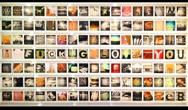

Debora Smail, I fucking love you, Polaroid Installation

RATIO featuring Jenn Blackburn, Ben Tecumseh DeSoto, David Salinas, JoAnn Santangelo, Alex Larsen, Ashleigh MacLean, Abrahan Garza, Edna Sandoval, Galina Kurlat, Ben Parks, Theresa Escobedo, Emily Peacock, Bryan Forrester, Matthew Landry, Rosa Gurrero, Shannon Duncan, Laura Corley Burlton, Maureen Penders, Mark Audacity Romberg, Traci Matlock, Debora Smail, Joe Winsto and Gary Griffin at El Rincón Social, 7 pm to 2 am. El Rincón Social always have these events that last until 2 am, and old guy that I am, I always wonder who is going to hang out until 2 am? Pathetic, huh? This looks great--a lot of my favorite local photographers will be there.

Share

Another Year, Another Artcrawl

$
0
0
Robert Boyd

I've been going to Artcrawl for several years. Some things are always the same, evolving slightly over the years. Like this little dilapidated house at the corner of McKee and Nance.


That's how it looked in 2010. Then in 2012, someone had added this sign to it.


This year, it looked like this:


I look forward to taking a picture of it every year. But let's be honest--it's slowly deteriorating. And that was the feeling of Artcrawl this year. For example, every year I've gone to Artcrawl, the building on Richey Street where Oxheart is located always has had a big bunch of exhibiting artists in a large central room. This year, nothing:


At least the tattoo parlor next to Oxheart had some art up--not to mention some tattoo artists at work.


Not only were there fewer venues for art this year, there were a lot fewer people. I hope that this is purely a result of the weather--cold, windy and damp. I hope this isn't a trend because one of the very great values I've see with Artcrawl is that in past years it has always drawn in a large, diverse audience. I go to art events every week and usually see the same people at them (and even within the events and openings I attend, the audience is segmented--there is little overlap between people who attend openings at Colquitt St. galleries and people who show up for El Rincón Social shows). But we can't forget that Artcrawl is just another "entertainment choice," and on a grey drizzly cold day, people may choose not to walk around a bunch of unheated old warehouses.

Mother Dog Studios is the driving force behind Artcrawl and they always have something special in their studios for the event. This year was no different. They had a show of "snake"-based art and included in this was an actual snake wrangler who brought his snakes and let people handle them.


That's where I saw painter Bas Poulos, talking with a lady snake wrangler who was showing off their collection of venomous snakes commonly found in the Houston are. Yikes.


Poulos, a retired Rice University art professor, had a couple of pieces in the snake show.


Bas Poulos paintings

He told me that his model was for some reason reluctant to model with her nipples showing, so they taped them like so. I replied that taped nipples were a thousand times dirtier than visible nipples.

In the same room as these paintings, a pair of air-brush artists were body-painting a cobra onto a very patient young woman who didn't seem to mind 1) that there were dozens of people taking phone photos and 2) that it was fucking cold in the unheated studio.


John Runnels contributed his own piece to the exhibit--a typical text piece from him.


 John Runnels, Genesis, 1995-2013, acrylic and colored pencil on paper, 68 x 30 inches


Solomon Kane, Caduceus of Creation, 2012, polyurethane intermediate and car paint, 33 x 66 x 14 inches

Solomon Kane had one of his encrusted polychromatic sculptures in the show. And I made a quick stop at Brandon Araujo's studio. (That's him in the hoodie. Did I mention that the studios were unheated?)


Most of the work on display I had seenbefore. But he showed me some large works in progress that he hadn't hung. We were standing in front of one talking about it and I noticed that there was a lady hovering nearby. I thought maybe she wanted to ask Brandon something so I stepped aside and he greeted her. She was apparently unknown to him--just a random Artcrawler. She wanted to take a picture of the big unfinished painting. Brandon politely told her no--it was a work in progress.


In past Artcrawls, the streets have been full of people. It was just too cold this time, but not for the guy in shorts in the picture above. He wasn't going to let 45 degree weather slow him down.


A Daniel Anguilu mural attracted a few admirers.


 Over at Atelier Jacquinet, there was this nice model shrimp boat.


And this guitarist on the kitchen counter. (Atelier Jacquinet always has good music every year. I don't know who this singer was, but she had some adoring fans.)


The Last Concert Cafe also always has some good music, but folks didn't linger in front of the outdoor stage this year. I liked that the guy on the right got dressed up for the occasion.


This broken vinyl record in the dead winter grass was a poignant symbol of something or other.


Over at the Foundry, there was a group pop-up show featuring David Graeve, Michael Meazell, Alfredo Scaroina, Patrick Renner, Felipe Lopez, Cecilia Johnson and Lester Marks. It's where Graeve's studio is, so he was in the position to stage his work quite dramatically. For example:


Two David Graeve sculptures


Two by Alfredo Scaroina

 The rest was hung a little more casually.


And here is Alfredo Scaroina himself. He and his crew were serving tacos (yum!) and beer, so it was hard to leave the Foundry. But I pressed on.


My next stop was Studio Twenty Twenty (I think) on Commerce Street. I liked this Ozzy/O.J. combo. The Ozzy stencil was painted right on the wall.


Then I swung by Super Happy Fun Land. They're a bit off the beaten track for Artcrawl, but they go all out.


The Raggedy Ann wall at Super Happy Funland


This band, Afternoon Power, was playing. Not bad! I hung out listening to them for quite a while, but finally went over to El Rincón Social for a very nice photography exhibit, which deserves more than a drive-by post like this. After hanging out there for a while, I headed home, stopping to pick up some champagne at Spec's (for mimosas at Sunday brunch). 


Artcrawl is a Houston tradition, just like purple drank. Long may it thrive.

Share

Pan Recommends for the week of November 28 to December 4

$
0
0
Robert Boyd

I figured that there'd be nothing happening artwise this weekend. Still it's slow compared to the average week, as you might expect. The Museum of Fine Arts, CAMH and the Menil are open Friday (I'm not sure about Diverse Works, the Art League or Lawndale). This might be a good time to catch up on your viewing--I know I want to see the CAMH's big abstraction shows again (for the third time).

THURSDAY


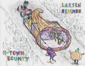
Patrick Renner, Alex Larsen and Eric Todd's ambitious float design. Looks oddly familiar!

Thanksgiving Day Parade in downtown Houston, 9 am til whenever. The parade was almost cancelled this year, but was saved in part due to the actions of the HAA and independent curator Diane Barber, who have roped a bunch of Houston artists into making floats, including Patrick Renner, Alex Larsen and Eric Todd.Glasstire has the story (that's where I got the image above from). Thanksgiving saved by artists. Who'd a thunk it?

FRIDAY

Take the day off, Houston.

SATURDAY

yes, that is a piece of carved wood by Troy Wood

The Story… featuring Troy Woods at the Galveston Arts Center, 6:30–8:30 pm. Troy Woods will be showing his sleek, formally inventive sculptures.


“Black Saturday” – A tribute to Bert Long, Jr. featuring work by Bert Long, Jr, Dr. John Biggers, Lester Marks, Daniel Johnston, Daniel Anguilu, Jim Adams, Ian Anderson, The Alter Girls, John Berry, Vonetta Berry, Michaels Chukes, Kyle Fu, Matthew Gannt, Kentra Gilbert, Gonzo247, Mitch Samuel Grystar, Janet Hassinger, Jim Hatchett, J.P. Hartman, Paula Hawkins, Eric Harker, Paul Horn, Eric James, Marjory Johnston, Solomon Kane, Randall Kallinen, Chicago Kim, Shelly Shanks Lockwood, Lionel Lofton, Jonatan Lopez, Van MacFarland, Marthann Masterson, Mark Masterson, Lynet McDonald, Christian Perkins, Jonathan Rosenstein, John Runnels, Charlie Jean Sartewell, Alfredo Scaroina, Louise Schlachter, Greg Scott, Khalil Taylor, Monica Vidal, Dianne Webb and Victor Zambrano at Black Heritage Gallery, 7-10 pm. An overstuffed show organized by the indefatigable Solomon Kane in honor of the recently deceased Long.


 34 people drawn by Russell Etchen
 
About Seven Hundred Twenty People and About One Hundred Rocks: Drawings by Russell Etchen at Kaboom Books From 7-10 PM. The former Houstonian (current Austinite), Sketch Klubb member and founder of Domy, Russell Etchen has a bunch of drawings to show us.


The Madonna in South Louisiana: Notes on Lynda Frese

$
0
0
Virginia Billeaud Anderson

Lynda Frese wrote recently to announce her photo collage paintings are in this year’s International Contemporary Art Exhibition at Gallery Le Logge in Assisi’s Piazza del Comune, which means the art is ennobled by the first century B.C. Temple of Minerva which is also in that piazza and which has one of the most splendid facades in antiquity. Minerva’s Corinthian capitals are so lovely they seem to challenge the misguided decision to turn the goddesses’ house into a church.


Lynda Frese, Le Grande Salle, 2013, Photographs, egg tempura on panel, 16” x 20” (Exhibited in Assisi through December 8)

Frese is not new to Italy; she has had residencies and exhibitions including some at the American Academy in Rome, but the fact that many of her art images were photographed in Italy makes it a fitting exhibition venue. Further, she employs the technique of painting over collage elements with Northern Italian antique pigments used to repair church frescoes. When I first encountered her art in 2011 at Redbud Gallery in Houston I was so moved by the blue-toned egg tempura pigment she managed to snatch from Italian restoration artists, I described it as “that celestial blue Giotto stole from Cimabue.”

Last year Frese published Pacha Mama: earth realm, a collection of artworks with haunting combinations of myth-based and landscape images that proximate life as organic, pulsating and unified. By straddling human consciousness across demons, saints, Paleolithic cave paintings, the Peruvian goddess Pachamama, grottoes, streams, Neolithic Venus statuary and stone circles, they articulate sacred connectedness freighted with birth-decay-death cyclicality. In one painting a Hindu deity accompanies Romanesque carvings of the Virgin near a mountain pool, in another medieval religious frescoes float above a rainforest. Complimenting earth realm’s images are essays, poetry and Sanskrit verse, and the book includes a refreshing “Acknowledgements” in which Frese expressed equal gratitude to local saloons as to her collaborators and university colleagues.


Lynda Frese, House of Worship, 2010, Egg tempera paint, photographs, gold leaf on wood, 7.5” x 10” (earth realm series)

That area around Assisi is a pretty good place to realize the particular aspect of life’s unity based on fecundity and regeneration. You can’t go two feet without encountering depictions of that feminine principle in the form of the Virgin Mother whose god-birthing Queen of Heaven mythological history and iconography form a continuum with ancient goddesses of earth and abundance. A place to find the Virgin’s image by Cimabue, Giotto, Simone Martini and Pietro Lorenzetti is in the Basilica of Saint Francis where Francis is buried (d. 1226) and where pilgrims go to view his various relics such as raggedy clothes. It was Francis who began the business of saints getting the stigmata (hysteria?) which guarantees sainthood.

It’s often said that Italians invented their own hierarchy for divinity which ranks the Virgin Mary (Madonna) above Jesus. You don’t doubt this in and around Assisi, Perugia, and other Umbrian hill towns where people use the phrase “Madonna” for exclamatory emphasis, the way Sicilians say “Mamma Mia.” “Madonna” is a standard reply and means “oh” and “really” and “how awful” and “wonderful” similarly to our interchanging “really” with “Jesus Christ” or “no shit.” I once traveled to the thoroughly medieval town of Spello to see Roman antiquities and paintings by Pinturicchio at Sant Andrea (begun 1025) and at Santa Maria Maggiore (1159), this second church dedicated to the Virgin and constructed over a temple dedicated to Juno and Vesta, and while there encountered inebriated guys pulling large wine barrels on a wooden cart, Dionysian style. Outside Spello’s ancient walls is the small church of the Madonna of Spella where supplicants talk to the Madonna images in the frescoes and leave written invocations such as a 1586 reminder to do something about the famine.


Lynda Frese, Introitus, (detail), 2010, Egg tempera paint, photographs, gold leaf, 10” x 24” (earth realm series)

Frese didn’t have to travel to India, Crete, Peru and all those other places to realize unity of life artistic inspiration. There is plenty of that where she lives in south Louisiana. The Rhode Island native moved there in 1986 to be a professor of Art at the University of Louisiana in Lafayette. South Louisiana is grounded in Virgin Mary mythology extensively represented in statuary form. Virgin iconography is so prevalent it suggests the human imagination must have its gods in order to conceptualize existence and mortality, for as the Council of Ephesus determined, there could be no erosion of Artemis’s temple and cult without substituting Mary as deity. In south Louisiana the earth-spirit bountiful aspect of the goddess’ totality is palpable - shrimp boat captains, rice farmers, and sugar cane harvesters pray rosaries and light candles to ensure success and profit. Mary’s corresponding role is to intercede in personal matters - “Virgin Mary, help us win the game on Friday night,” “Mary, make Daddy not drink so much,” “Mother Mary, get those children to act right!” So if you want to see how deeply the human psyche longs for ordering through mythological and iconographic intimations of wholeness, unity and abundance, drive through the towns of Breaux Bridge, Delcambre, Arnaudville, or along the canal at Dulac, or down the highway to Grand Isle and witness the unbelievably high quantity of goddess statues, all there to mirror human fears and desires. None of this escapes Frese of course who artistically imagines sacred deities, the god Shiva for instance, in inconceivable places like Holly Beach, Louisiana.

Paint, Ink, Photo, Text: A Wols Retrospective

$
0
0
Betsy Huete

There’s a curious pairing going on at the Menil right now. On the one hand, there is the Luc Tuymans show Nice, a title that coolly represents the works’ vacuous draining of life and emotion. And right next door is the Wols retrospective, a show so wrought with love and aggression that it’s hard to determine if whether their adjacency is brilliant or crazy. If anything, each one provides a respite from the other.

Wols was an abstract painter from the 1940s that represented a group of artists, along with Jean Debuffet and Georges Mathieu to name two, that represented the European movement art informel. It was a abstract painting movement that unfortunately got overshadowed here in the United States by Abstract Expressionism. Luckily for us, Dominique de Menil was an enormous Wols fan, allowing for a comprehensive comparison between the larger than life deKoonings and Rothkos and Wols’ relatively modest paintings. What objectives did all of these artists share? What were their specific methodologies and how, among other things, did they achieve it with scale (or lack thereof)?

Toby Kamps of course doesn’t literally answer these questions, although he does seem to be asking these questions and many more in his curation. It quickly becomes obvious that Wols wasn’t simply a painter: he was also a photographer and drawer. And it also becomes clear within moments that Wols, while being influenced by the people of his time like the Surrealists and Paul Klee, was clearly looking introspectively, producing innovative works that seemed to be speaking an interior language unlike that of his contemporaries.


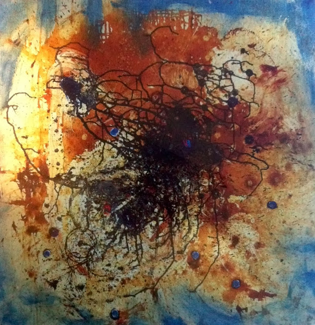
It’s All Over, 1946/7, Oil, grattage and tube marks on canvas, 32”x32”

So what was the structure of that interior language and how does the viewer go about accessing it? Given the disparate media and sheer amount of work in his abbreviated oeuvre, piecing it all together seems like a dizzying prospect—yet somehow Kamps seamlessly strings it together. Like a film that starts with its climax then immediately cuts to the flashback only to build back up to what we’ve already seen, he cinematically slingshots the viewer from the front room of paintings—Wols’ final works—to the photos and drawings of an earlier period and back again to his later abstractions. This dictation of movement in the space is how Kamps allows the viewer to build the connective tissue between all the work in spite of its disjunctures.

Much has been written and discussed of this connectivity. What was the linkage (and slippage) between Wols’ interior and exterior worlds, and how was it represented in his artwork? Philosopher Jean Paul Sartre—to sum it up somewhat reductively—thought it a conflation of the two. He saw Wols as a troubled man wrought and ravaged by poverty, an artist whose work was an extension of his misery. But in connecting his paintings to his photos to his drawings and back to his paintings again, there seems to be repetitious formal treatments apparent in the work that reach far beyond artistic and emotional vomiting: namely that of a nucleus.


Untitled, 1932-41, gelatin silver print, 7.7”x5.2”

From mannequins to food to self portraits, Wols’ photographs are varied in subject matter. Yet more often than not there seems to be a centralized epicenter of bursting activity, most prominently exemplified by Untitled (Nicole Bouban) (ca.1933). It’s a fairly innocuous portrait of a beautiful woman resting blissfully. However, her head feels nearly bifurcated by incisive stripes moving in two directions. Wols uses the hard lines to create tension, the stripes simultaneously serving as a backdrop as the head emerges forth while also compressing her face, claustrophobically pressing her back in. His handling of line in this context serves as a clear precursor to his abstract proclivities.


Untitled (Nicole Bouban), 1976 (ca.1933), Gelatin silver print from negative

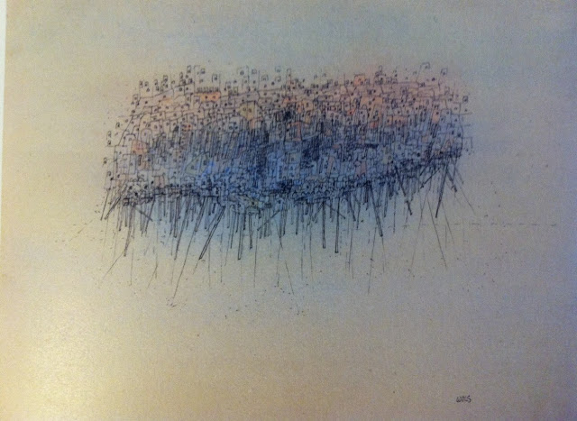
As the viewer proceeds left into the room of drawings, she encounters numerous Klee-esque works on paper: relatively small ink drawings adorned with playful watercolor backgrounds. While an interest in figure and surrealist subject matter carries through most of the work, as time progresses the drawings seemingly coagulate towards the center, densely compacting movement and activity. The climax of this density is shown here with La ville sur pilotis (1944). A tightly compacted composition that Wols must have drawn with a magnifying glass, it reads as a city that isn’t quite sure whether it has been uprooted, freely floating, or precariously balancing on the very apparatus meant to keep it above water.


La ville sur pilotis, 1944, Ink and watercolor on paper, 5.47”x7.28”

And as the viewer falls back into the original space of paintings, the work seems less like abstractions and more like explosions. Rife with all-over flinging and scrawling and smudging of paint germane to its time period, Wols’ abstract paintings retain their nucleic identity with multiple loci within a single frame. Defying simple or singular interpretation, these scabbed eruptions emanate a quiet knowledge that birthings and similar generative moments are often consequences of violent activity.


Voile de Veronique, 1946/7, Oil, grattage and tube marks (?) on canvas, 31.9”x31.9”

While Wols rarely dated anything—a move that must have been incredibly frustrating for Kamps as well as Wols scholars alike—he did sign nearly all of his work, a gesture common in his time period. But while the signature commonly appears in the bottom right hand corner of the work, it’s never in the same spot. Sometimes it is shoved far into the edge while other times falling almost centrally into the canvas; sometimes it is painted boldly and fluidly in black while other times being barely scratched into the paint like a ghostly apparition. A signature is the kind of formality that most artists overlook: a simple way for them to stamp its authenticity. Yet Wols seems to have treated it time and again as a formal consideration of the work, thoughtfully positioning it in relation to its content.

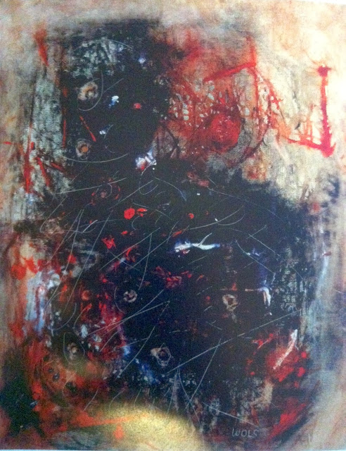
It seems that Wols was grappling with languages repeatedly in his drawings and paintings. In a true exercise of ambivalence, it feels like much of the work was the result of semiotic warfare—this being most prevalent in Oui, oui, oui (1946/7). Here an interior visual language of color and layers and circularity directly butts up with an actual exterior language—as if Wols went spelunking into a cave of his own interiority and was linguistically trying to claw his way out. He’s furiously scrawled desperate affirmations all over the canvas. What exactly is he saying yes to? What is he is giving permission for? And at the bottom right appears “WOLS,” itself an unintentional mangling of his name that the artist adopted. It’s a moment of textual lucidity that shockingly feels more schizophrenic than the rest of the picture plane.


Oui, oui, oui, 1946/7, Oil, grattage and tube marks on canvas, 31.7”x25.3”

It is no secret that Abstract Expressionism is thoroughly tread territory. But showing work at the helm of art informel simultaneously sheds light on an overlooked movement while additionally informing the entirety of abstraction in the late 1930s to early 1950s. And with the Wols retrospective, the Menil has faithfully represented the comprehensive though short career of an all too often ignored yet nevertheless important abstract painter.

Wols: Retrospective runs until January 12, 2014 at the Menil Collection.

Phillip Guston and Jackson Pollock Were Expelled From High School

$
0
0
Robert Boyd

[Philip] Guston and [Jackson] Pollock were also politically active in their support of art education at a school that was fast becoming a hotbed of talented high school athletes. Their activity reached a climax when they were expelled for publishing and distributing leaflets against the popularity of high school sports. (Michael Auping, introduction to the catalog for Philip Guston Retrospective, 2003)

To which I can only say RIGHT ON!


Philip Guston, Drawing for Conspirators, 1930, graphite, ink, colored pencils, and crayon on paper, 21 1/2 z 14 1/2 inches. This was drawn when Guston was 17.

In Review - Waltercio Caldas: The Nearest Air, at the Blanton

$
0
0
Paul Mullan

Brazilian artist Waltercio Caldas, long influential in his home country, is less known in the United States. Co-organized by the Blanton Museum of Art at the University of Texas in Austin, and by the Fundação Iberê Camargo in Porto Alegre,“The Nearest Air” is Caldas’ first US museum retrospective and is currently on display at the Blanton.

Co-curated by Gabriel Pérez-Barreiro, Director of the Colección Patricia Phelps de Cisneros, and Ursula Davila-Villa, former Blanton Associate Curator of Latin American Art, the survey eschews a chronological installation. Viewers can start at either entrance to the ground-floor galleries and randomly step through the exhibition; Caldas’ different themes and approaches will gradually become apparent.


Waltercio Caldas, Aquário completamente cheio (Completely Full Aquarium), 1981, Glass and water, 13 3/4 x 11 13/16 x 11 13/16 inches

There is nothing physically in Completely Full Aquarium (1981) except water, which reaches the very lip of the clear, glass tank and does not manifest a discernible water-line. From a medium distance, the water evidences little movement caused by the air conditioning or vibrations from people walking though the gallery, and it can almost be read as “air”. Since the water acts as a lens, those passers-by and other objects in the vicinity appear as small, crisp images – reversed and upside-down – “filling” the bowl (but which blur, when the viewer is at a close distance). This imagistic interior is a dynamic, immediate, and ephemeral indexing of the work’s exterior. Each viewer can also become, from a vantage point always other than their own, an image “filling” the bowl. The conventional boundary between spectator and work breaks down.

The site-specific work Pre-Corner includes an orange, polygonal field which traverses the intersection of the west and north walls of the Blanton’s main atrium. In “front” of that field are four slender lengths of yarn hanging from the ceiling and terminating a few inches above the floor. From a close distance, the two vertical, black lengths of yarn visually mimic the darkened, linear recesses in the ceiling, such as the air conditioning vents and the tracks along which gallery lights are positioned. One of the other, orange lengths is located near a vent and slightly angled by the gust of continuous air; it sways only intermittently and gently. 

However, from the far distance of the atrium’s opposite corner, near the grand staircase landing, the swaying of the yarn is no longer visible. As well, a column blocks sight of the intersection. The irregular, seven-sided shape of Pre-Corner then appears as part of a continuous plane and resolves (roughly) into a quadrangle. The environment’s impact on the works’ materiality (the yarn) vanishes, signaling the secondary character of that materiality and the primacy of the pictoral; this was the case as well with Aquarium, with the physicality of the water being secondary to the images transmitted.


Waltercio Caldas, Longínqua (Far), 1986, Glass sheet and nylon strings, 39 3/8 x 47 1/4 inches (variable height)

Far (1986) is a rectangular glass plate, approximately three by four feet in size, suspended a few inches above a pristine, white pedestal by two continuous nylon threads, which are hung from the ceiling and run under the plate at each side’s midpoint. On an initial approach with a horizontal view, the work’s structure is more obvious: the glass is understood as massive and heavy and is conceptually counterposed to the thin supports which manage to keep it from crashing to the ground. However, when viewing the work close-up and from above, the precisely defined shadows cast on the pedestal, both by the threads and by the edges of the plate, are almost indistinguishable from those threads and edges themselves. Looking through the top, the glass becomes a picture plane flattening out the depth between the shadows’ sharp lines and the sculptural materials proper. By “compressing” the three-dimensionality of Far in this way, the pictoral is again prioritized and the underlying material structure rendered secondary; though whereas the images “in” Aquarium were derived from the context strictly outside of that work, those “in” Far are derived from the work internally.


Waltercio Caldas, A emoção estética (Aesthetic Emotion), 1977, Painted iron and shoes on carpet, 7 7/8 x 80 11/16 x 76 3/4 inches

On a rectangular cut of worn, pale-earthtone carpeting in Aesthetic Emotion (1977), a black pair of men’s dress shoes are squashed by the weight of an open iron arc, painted black. The iron is sheared off at, and is flush with, the edge of the carpet; if imagined to extend beyond that edge, it would constitute a circle. A small, metal plate engraved with the name and date of the work, and name of the artist, is affixed near a corner. This is analogous to the antiquated museum practice of identifying paintings via a plate attached to the bottom of the frame, and to the painterly practice of signing and dating a work at the bottom of a canvas.


Waltercio Caldas, Escultura para todos os materiais não transparentes (Sculpture for All Nontransparent Materials), 1985, Pairs of polished metal, wooden, and marble hemispheres, Dimensions variable

Thus, the carpet can be understood as a pictoral field, one which is, yet again, rendered primary over the material and which abruptly terminates the massing and weightiness of the iron. This most basic geometric form – the circle, or the sheared sphere in Sculpture for All Nontransparent Materials as well – can exist only when the spectator “completes” it conceptually. Nor do Caldas’ actual forms exist in an “empty”, homogeneous space of equivalent points, as demonstrated by the ultimate resolution of the orange quadrangle in Pre-Corner from the “correct” point at the staircase. In these three senses, then, Caldas’ work is decidedly not a variant of minimalism, given the latter’s emphasis on a “sculptural” form’s empirical facticity, wholeness, and mass and on the “filling” up of homogeneous space through serial repetition of such a form. Likewise, while the artist uses steel, glass, bronze, aluminum, and industrial materials widely, his compositions and aberrant shapes do not at all recall industrial production, another of minimalism’s common themes.


Waltercio Caldas, As sete estrelas do silêncio (The Seven Stars of Silence), 1970, Silver needles in chromed steel box lined with velvet, 1 3/8 x 11 3/4 x 9 7/8 inches

The Seven Stars of Silence (1970) is presented at tabletop level, which forces the observer to look downwards. The sculpture is a shallow, steel box with clean, simple lines and no décor, aside from two oxidized, ornamental latches. The box is opened, revealing seven silver needles lying flat in a velvet-lined interior. Those needles are: of varying shapes, linear or curved; of varying lengths; and aligned horizontally. How they might resolve into points or “stars” is not obvious. However, as with Aesthetic Emotion, a small, metal plate with the title of the work is affixed to the bottom edge of the interior, then interpretable as a pictoral field. Given the velvet’s dark tones, this field is further analogous to the flat blackness of a starry sky.

The box resembles either a type for holding precious, luxury objects, such as jewelry, or a type for storing delicate medical or surgical instruments. The former reads as allegorizing the private or domestic; the latter as something quite sinister. In either case, the box secrets objects away from public view when shut. This sequestration is posed as within, not an intimate (and silent) enclosure, but a vast expanse of the natural world, the nighttime sky.


Waltercio Caldas, Centro de razão primitiva (Center for Primitive Reason), 1970, Gold needles in velvet-lined box, 11 3/4 x 3 7/8 x 3 7/8 inches

Center for Primitive Reason (1970) is a second, finely-crafted box: in dark wood; a foot tall; elevated on a pedestal; and with a metal plate, identifying the title of the work, attached to the exterior. Four gold needles are mounted vertically on the velvet-lined interior and are highlighted against the black lining of the open lid behind them, constituted as a pictoral field by the frontal plate. If a viewer circumvents that field and, instead, aligns the eye straight above the points, those sharp, menacing ends actually resolve into faint, hazy “stars” proposed by the companion sculpture.


Waltercio Caldas, O Louco (The Madman), 1971, Lead figurine in velvet-lined box, 2 3/8 x 31 7/8 x 3 1/8 inches

The Madman (1971) is a third box, shallow and very wide. A metal plate with the title is secured to the frontal exterior, as with Primitive Reason. Represented by a tiny lead figurine, only a few millimeters in height, is a worker wearing a red cap and with a bundle slung over their shoulder. From the close-up vantage required to see the figurine’s details, the worker trudges across the interior of a vast “landscape” analogized by the velvet lining. It is notable that Caldas, elsewhere, only rarely figures the human body directly.


Waltercio Caldas, Dado No Gelo (Dice on Ice), 1976, Chromogenic color print in lightbox, 29 1/2 x 27 1/2 x 3 15/16 inches

The photograph of Dice on Ice (1976) shows a die frozen in a solid cube of ice, which, until it thaws, arrests any potential for chance. 

These four works from the 1970s use a somewhat different strategy, and have a strikingly different tone, as compared to works of later periods. Dice on Ice, Seven Stars, Primitive Reason, and The Madman rely upon a traditional figuration: static, unlike the dynamic and ephemeral indexing operations of Aquarium; sculptural or photographic, unlike the perceptual effects, and sense of compression, in Far; and unitary, unlike the conceptual “completion”, demanded by Aesthetic Emotion, of interrupted elemental forms. These representations are strictly internal to the composition, an impression further reinforced by the closed, insular character of the jewel-box forms and lightbox; the only relation to the broader exhibition context is the conventional spectatorial position demanded by a pictoral plane. Finally, these earlier artworks are heavily metaphorical or allegorical.

Brazil’s left-wing President João Goulart was ousted in a coup d’etat in 1964, ushering in a notorious military government. It was only the first in a wave of reaction: vicious, authoritarian regimes were invested over the next ten years, throughout the continent, to smash popular movements. Caldas, who began his artistic practice in the late 1960s, was not a political artist in any conventional sense and did not create agitation or propaganda.

However, in a return of the repressed, this objective historical context forces its way to the surface, and is a necessary part of any interpretation, of Caldas’ art from the period. The hidden threat (and reality) of massive state violence and torture is analogized in both Primitive Reason and Seven Stars. The statis of the political situation – the dictatorship was in power for more than two decades – is allegorized in Dice on Ice; and the laboring body – working class upsurges were very much the target of the South American coups – in The Madman. These were elements of everyday experience for many in Brazil. Given the attacks on genuine collective, political action and shared language, however, their memory could only exist sequestered in the isolated private or domestic domain – or, encoded in a language more acceptable to the armed bodies of men ensconced in high office, as allegory.

“The Nearest Air: A Survey of Works by Waltercio Caldas” is on view at the Blanton Museum of Art, the University of Texas at Austin until January 12, 2014.

Nothing's Changed

$
0
0
The art crowd consists of 200 visual artists, gallery owners, curators, architects, historians, writers, critics, musicians, dancers, patrons, students, hangers-on, and dilettanti who bump into each other year after year at the same art openings, performances, parties, and the same ten restaurants. There is much running around in packs, a hedge against loneliness as well as intimacy; sometimes two eventually pair off and marry, or friends quarrel and avoid each other, finally growing friendly again, because there aren't that many people to talk to, the cast of characters is so limited. Every once in a while a new curator or artistic celebrity moves to town and is feted, courted, scrutinized, privately dissected. Every so often, too, one of the regulars, like a Chekov character who keeps sighing, "I must go to Moscow," actually picks himself up after years of threats to do so and moves to New York or Los Angeles or Washington, D.C. These defectors later return for visits, wistfully reporting that they have never been able to find anything like that warm camaraderie of the Houston art crowd. On the plus side, the art scene here is exceptionally cohesive, supportive and loyal, on the minus, this close-knit courtesy has so far stifled the development of honest, tough-minded public criticism, which means some local artists are never challenged to go beyond producing half-baked work.
This is from Phillip Lopate's essay "Houston Hide-and-Seek" published in Against Joie de Vivre: Personal Essays (1989).


LOKALKOLORIT: Representation, Repetition, and Punctum

$
0
0
Betsy Huete

Philosopher Roland Barthes coined the term “punctum” in his final publication Camera Lucida in 1980. In enumerating the term, he was in effect making an argument against the sole interpretation of photography as a set of linguistic, political, and societal codes. While a photograph naturally contains these codes, of course, Barthes argued that there is an additional kind of meaning inherently embedded in the work. It’s a meaning that defies terminology or code breaking—it is the kind of resonance that connects with the viewer on an intensely emotional level, thereby making the work indescribably unique.

Upon entering Inman’s first main gallery, it is tempting to immediately cock one’s head to the side and think, “what the hell is going on here?” Between the nude drawing, while attributed Corinne von Lebusa but questionably drawn by a young hormone-induced boy who snuck into a life drawing class and, horny and over-imaginative, just wanted to draw neon boobies, and the muddied squirrel-rabbit something or other by Jochen Plogsties, the work immediately feels trite, out of place, and even abject. Yet they command attention. How? Furthermore, how do we connect these five artists together (von Lebusa, Plogsties, Inga Kerber, Johannes Rochhausen, and Edgar Leciejewski) who seem to be making fairly disparate work? Additionally, does the sole fact they are exhibiting in a group show necessitate their connection?


Corinne von Lebusa, Nuby, 2012, Drawing, watercolor, varnish, 27.6” x 19.7”

In titling the exhibition LOKALKOLORIT, which quite literally translates to “local color,” Inman intimates that we should. Other than their proximity to each other in sharing the same studio building and having gone to school together, and that Leipzig (where the artists reside) is our sister city, they all employ representational imagery and methods of banality and repetition that question modes of originality and authorship in art making.

These, however, are the kinds of postmodernist tropes that have been around in the art world for quite some time. And while this tongue in cheek sort of nihilism certainly pervades the work, there is also a notion of sincerity inherent in it that belies its postmodernist stereotypes—as if these artists genuinely want to cull meaning from our overly saturated, hyperbolically monitored world. And it is this kind of sincerity that not only connects the work, but also commands the viewers’ attention and displays the works’ punctum.

Naturally there are pieces in the show that communicate this more surprisingly emotively than others, and the series that most effectively achieves it are the series of floating head portraits John, Inga, Hans, Romy, and Dory (all 2013). Modestly scaled and oriented horizontally in a row, von Lebusa draws playful, lyrical faces that humorously feel like a cross between David Bowie and Glamour Shots. While Hans faces the viewer head on, the rest seem to be looking afar with entranced glances, their poses evocative of cheesy 80s portraiture, replete with fuzzy colors and backgrounds. However, this playful sensibility is sharply contrasted by sharp facial features and arresting, penetrating eyes. This contrast in conjunction with the repetition of faces demands sustained attention from the viewer, as if the faces are asking to be taken seriously in spite of themselves. This kind of unexpected seriousness is far more interesting than von Lebusa’s Portraits 1-12 (all 2012), which do not read as anything much more substantial than topical caricatures of women. And while that is probably the whole point, these portraits are simply less provocative than Hans and company.


Corinne von Lebusa, Portrait 7, 2012, Drawing, watercolor, varnish, 9.4” x 7.1”

Speaking of banality, Johannes Rochhausen paints his studio. That’s it. While repeatedly painting one’s studio may sound like an act of obsession or even narcissism, according to the exhibition catalogue, he uses his studio as subject matter less as the content of the work and more as a control to work through various aspects of painting. Therefore, the work is less a conceptual statement on Rochhausen’s place of artistic production and more self-referential exploration on the act of painting. However, it’s arguably impossible when repeatedly painting the same representational subject matter to divorce the imagery from its content. And whether he intended for that separation or not seems inconsequential because it’s actually when Rochhausen’s treatment of the paint activates his studio as the content of the work that the most exciting things start to happen. This is most prominently represented in Untitled (study of room) (2013). While still representational, this barely illuminated corner of the room more so than the rest of his work leans toward abstraction. The dark browns and grays as well as the long vertical strokes of the corner walls lend the work an air of mystery and strange intimacy, creating a space that at once feels thoroughly lived in and foreboding. And it’s this kind of ambivalent treatment of a space that is far more engaging than Air Conditioning (2013) that, while beautifully rendered, conceptually and aesthetically flatlines.


Johannes Rochhausen, Air Conditioning (Study), 2013, Oil on paper, 56.3” x 41.7”

While these are only two examples, there does seem to be this common thread of a strange, unexpected punctum prevalent in much of the works of these five artists. While they all employ representational elements and engage with postmodernist tropes of authorship, repetition, and originality, there does seem to be an optimistic attitude of garnering meaning where there, upon original inspection, doesn’t appear to be any. While of course this sincerity works better in some works more than others, hopefully this is what defines Leipzig’s local color instead of nihilistic, played out postmodernist attitudes.

LOKALKOLORIT runs until January 3, 2014 at Inman Gallery.

Something to do when you have 4 hours and 48 minutes free

$
0
0
Robert Boyd


Listen toFor Philip Gustonby Morton Feldman, performed by the S.E.M. Ensemble. (Hat tip to Alex Ross.)


Philip Guston, Friend--to M.F., 1978

In the 50s, Morton Feldman was Philip Guston's closest friend. But their friendship ended in 1970 when Feldman disapproved of Guston's newcartoonish figurative "bad" paintings. Apparently Guston regretted the rift, which is why he painted Friend--to M.F. Perhaps Feldman similarly regretted the estrangement. In any case, four years after Guston's death, he composed For Philip Guston.


How To Dispose of 5000 Works of Art: Herb and Dorothy 50 x 50

$
0
0
Robert Boyd

The collector's mania sneaks up on you. I'm in my super-cluttered bedroom looking around, and there are 51 visible artworks (and many more in portfolios on my bookshelves as well as artworks hanging in other rooms). They range from a painted postcard sent to me by Earl Staley and silkscreened limited edition beer-bottles with art by Ron Regé, Jr. and C.F. to paintings by Lane Hagood, Rachel Hecker and and Chris Cascio. I'm not saying this to brag--well, maybe a little--but to point out what all serious collectors come to realize--that they have a lot of stuff and will someday need to dispose of it.

We think of collectors as rich people, but despite the shocking auction prices we read about, the reality is that almost anyone can collect art. Small artwork, prints, art by non-"big name" artists can all be pretty affordable. If you can buy directly from an artist, that usually saves you some money. Sometimes you can trade for art--if you offer a service that artists need. (Hence the art collections of dentists.)

The Vogels are the gods of this approach to collecting. A quick recap of their story: Herbert Vogel was an amateur painter who worked for the post office. His wife Dorothy had a job at a public library. They loved art. They were really into pop art when they got married in 1962, but it was too expensive for them. So they started buying minimal art (not quite yet the new thing when they started). They made a deal with one another--they would live on Dorothy's salary and buy art with Herbert's income. And they did, for decades. In the end, they had a collection of over 4000 pieces of art, which they donated to the National Gallery. In 2008, a really entertaining film , Herb & Dorothy by Megumi Sasaki, was made about the couple. And that seems like it should have been the end of it. The problem is that Herb and Dorothy kept on collecting and kept on donating to the National Gallery, which finally said, enough! As big as the National Gallery is, it just couldn't absorb 5000+ pieces of art.

So they came up with a wonderful solution. They made a gift of art to 50 museums--one in each state--of 50 pieces of art. This is the 50x50 program. Thus 2500 pieces of art were distributed all over the country. And Megumi Sasaki filmed a sequel, Herb & Dorothy: 50x50.

The Blanton Museum at the University of Texas got the 50 pieces of art reserved for Texas. I saw them when the Blanton mounted an exhibit of the work, and one thing I noticed is that not every artist they collected has ended up in the canon. The Vogels had an amazing ability to pick "winners," but no one bats a thousand. (Interestingly, the Blanton also received James Michener's large collection of modernist art after his death. In the bookAmerican Art since 1900, Robert Kushner looks at Michener's collection in terms of a year by year "batting average"--significant works as a percentage of the whole. He calculates Michener's lifetime average at .319, which I'd say is pretty great. Is it crass that I'd like to know what the average is for the Vogels?)
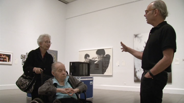
That's one thing the new documentary examines--artists who haven't achieved any particular fame whose work was collected by the Vogels.


Charles Clough with the Vogels at the Metropolitan Museum (still from Herb & Dorothy 50x50)

For example, the film looks at Charles Clough. He is an abstract painter who came out of the same Buffalo scene that spawned Cindy Sherman and Robert Longo (Clough was a co-founder of Hallwalls). The Vogels collected a large number of his pieces (127 are part of the 50x50 collection), and he is one of the artists whose work ended up in all 50 museums. But his career as an artist has been rocky. He admits to having hardly sold anything in the previous 10 years. He points to a map of the USA covered with thumbtacks. Each one represents an artwork in a museum. And two-thirds of them are a result of the 50x50 program.


Charles Clough painting (still from Herb & Dorothy 50x50)

Another artist who never achieved fame was Martin Johnson. Johnson had some success in the late 70s and early 80s, but eventually moved to Richmond Virginia to run the family business, which represented plumbing supplies to buyers.


Martin Johnson and the family business (still from Herb & Dorothy 50x50)

As it turned out, the Virginia Museum of Fine Arts in Richmond was one of the recipients of the Vogel collection, and they were amazed to learn that one of the artists whose work they received lived right there in Richmond.


Martin Johnson and his work (still from Herb & Dorothy 50x50)

Artists whose moment of success happened decades ago are suddenly finding their work in museums all over America. For artists like Clough, it could mean a second chance at success.

The artist who most exemplifies the Vogel collection is Richard Tuttle. Herbert Vogel was quite close to Tuttle, and Tuttle is represented by 336 pieces in the 50x50 collection--enough for each museum in the program to get at least six Tuttles.


Richard Tuttle with the Vogels (still from Herb & Dorothy 50x50)

As it turns out, he's not super happy about the 50x50 program. He would have preferred to see the collection stay in one piece, even if it meant storing most of it. But he's realistic and is shown visiting with curators in Maryland to discuss the best way to display his work from the collection.


Richard Tuttle at the Academy Art Museum in Maryland  (still from Herb & Dorothy 50x50)

Of course, Tuttle is a pretty difficult artist to love. Most of his work in the collection consists of pieces of lined notebook paper with one or two small watercolor marks on it. This is pretty challenging work, especially in provincial museums in Montana or Alabama. How to show this work in these disparate places is the main subject of the movie. The filmmaker traveled to several of these far-flung museums, including small museums in Honolulu and Fargo, North Dakota. Stephen Jost, the director of the Honolulu Museum of Art, addresses this head on. He knows the work is difficult for many visitors, and the Honolulu Museum has worked very hard to help viewers engage with it. One scene shows children playing a game with the art--they have a guide to all the pieces with little image excerpts, and they are in a race to see who can find them all on the walls first. But Jost acknowledges that there are some viewers who are just plain hard to reach in general and especially with the art from the Vogel collection. These viewers are teenagers and young adults.


Sullen teens at the Honolulu Museum of Art (still from Herb & Dorothy 50x50)

What some of the museums have done is make the Vogels the focus of the exhibits--telling their story. The Blanton had the first Vogel documentary running continuously. Some museums actually recreated parts of the Vogel's apartment, down to stuffed cats and turtles (the Vogels never had children--they had pet cats, fish, and turtles).


The Plains Art Museum (still from Herb & Dorothy 50x50)

Places like the Plains Art Museum were thrilled to get the gift. Director Colleen Sheehy states her pride in being in the company of LA MOCA and the Albright-Knox Gallery, who also received Vogel gifts.  She used the Vogels themselves as the way to interest viewers in the work. She explained it this way: "The work might seem difficult, but they're so accessible." She actually commissioned a local artist, Kaylyn Gerenz, to create a stuffed animal version of one of their cats to be exhibited alongside the work in a small recreated corner of the Vogel's apartment.

One of the museums they donated the work to, the Las Vegas Art Museum, abruptly closed in February 2009, a victim of the recession which hit Las Vegas especially hard. Part of the conditions for accepting the gift were that if you closed, you had to give it to an approved museum in the same state. In this case, the work went to the Donna Beam Fine Art Gallery at UNLV. By focusing so much on several small, regional museums, Herb & Dorothy: 50x50 almost becomes a documentary about provincial museums. It's fascinating to see how they strive to stay relevant and stay afloat.

Herbert Vogel died during the filming of this documentary. The Vogels had already stopped collecting, and their apartment was emptying out.


Before and after (stills from Herb & Dorothy 50x50)

After you've given away your life's work, I guess passing on (at the ripe old age of 90) is not so bad. But I worry about Dorothy (now 78). Will an apartment with no art and no Herb be too lonely for her?

One more interesting thing about Herb & Dorothy: 50x50. It was partly financed by a Kickstarter campaign. They did a typical thing--gifts of a certain size would get you a download of the finished movie, and a little more would get you the DVD.  In short, they presold the movie. I was pretty sceptical when I heard about it, mainly because I didn't really believe there was anything else to say after the first movie. But I went ahead and donated enough to get the DVD, and I was very pleasantly surprised. By focusing on artists like Charlie Clough and Martin Johnson and museums like the Plains Museum and the Honolulu Museum, Sasaki created a completely new documentary around the Vogels. It's an informative, moving documentary.


Report from the Golden Age of Art Comics: Kuš!

$
0
0
Robert Boyd


Renata Gąsiorowska, Jungle Night (Mini Kuš! #21) cover, November 2013

Latvia is a tiny Baltic state, intermittently independent but historically claimed by nearby states like Poland, Lithuania, Germany and Russia. It was an unwilling part of the Soviet Union until 1991. There are about two million Latvians. When you think of European culture (much less world culture), Latvia must be counted as on the fringe. Of the top of my head, I can't think of any prominent Latvian artists, writers or composers, living or dead.

But as someone who lives in Houston, I have no choice but to believe that culture can pop up anywhere at any time. (Otherwise I'd be forced to move.) The Latvian capital, Riga, is not large but it is old and has a cultural history. In the era of the internet, of Fedex and DSL, of jet travel and high-speed trains, no European country can be truly isolated.

So the fact that Kuš! Komiksi, an international comics publishing house, is headquartered in Riga is slightly surprising but also comforting. They publish cutting edge work by Latvian and international cartoonists. The work is published in English, which is both excellent (it means I can read it) and a little disturbing. One must conclude that they wouldn't be satisfied trying to reach the two million or so readers of Lettish. But English is a colonizing language.


Clockwise from top left: Dace Sietiņa, Bobis (Mini Kuš! #9), September 2012; Mari Ahokoivu, Otso (Mini Kuš! #10), January 2013; Maciej Sieńczyk, Historyki (Mini Kuš! #12), January 2013; Emmi Valva, All You Need Is Love (Mini Kuš! #11), January 2013

Mini Kuš! is a series of tiny comics (4" x 5 3/4" trim size), each given to a single artist. They're beautifully produced objects. They share a common design on the covers but otherwise are quite distinct. They art reproduced in beautifully reproduced in color. The artists are international--for example, Dace Sietiņa is from the Netherlands, Mari Ahokoivu is Finnish, Maciej Sieńczyk is a Polish artist and Emmi Valva is also from Finland.


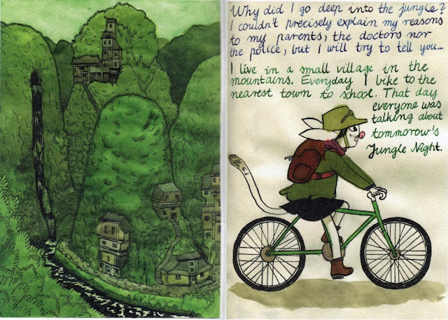
Renata Gąsiorowska, Jungle Night (Mini Kuš! #21) pages 2 and 3, November 2013

Renata Gąsiorowska, an artist from Poland, tells an updated animal fable in Jungle Night. In the protagonist's world, Jungle Night is a night when the adolescent animals spend the night in the jungle in order to return to their roots. Of course it's actually an excuse for partying. But somehow, our heroine has an urge to go deep into the jungle and really experience life as it was lived so long ago.

The art is beautiful, and one thing that distinguishes it from typical comics art is that the physicality of the paper is not denied. You can see from the pages above that Gąsiorowska allows the warping of the paper from her watercolors to become part of the art itself.


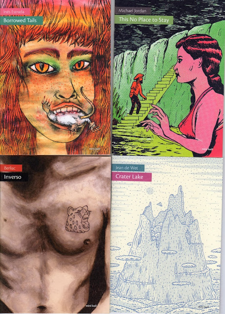
Clockwise from top left: Inés Estrada, Borrowed Tails (Mini Kuš! #17), August 2013; Michael Jordan, This No Place to Stay (Mini Kuš! #18), November 2013; Jean de Wet, Crater Lake (Mini Kuš! #20), November 2013; Berliac, Inverso (Mini Kuš! #19), November 2013

 (Inés Estrada is a Mexican cartoonist. Michael Jordan is from Germany and has nothing to do with the basketball player. Berliac is an Argentinian artist currently living in Norway. Jean de Wet is from South Africa.)


Michael Jordan, This No Place to Stay (Mini Kuš! #18) pp. 10 and 11, November 2013

Michael Jordan's Mini Kuš!, This No Place to Stay [sic] is described as "semi-fictional, semi-autobiographical." It has the feeling of a dream, an anxious dream about being in a hospital and feeling vaguely threatened by the environment. The writing is interesting--it's English, but English as written by someone with imperfect knowledge. Typically, the English in the Mini Kuš!series is perfectly adequate. But in This No Place to Stay, the occasional error or awkward English adds to the feeling of alienation and dread experienced by the bearded protagonist, as does the bilious mostly-monochromatic color scheme.


Clockwise from top left: Amanda Baeza, Our Library (Mini Kuš! #13), January 2013; Tiina Lehikoinen, The Pernicious Kiss (Mini Kuš! #14), August 2013; Emelie Östergren, Runaway Dog (Mini Kuš! #16), August 2013; Heta Bilaletdin, Hideous Fiesta (Mini Kuš! #19), August 2013

(Originally from Chile, Amanda Baeza lives in Lisbon, Portugal. Tiina Lehikoinen and Heta Bilaletdin are from Finland. Emelie Östergren lives and works in Stockholm, Sweden.)

Most (but not all) of the artists in these 13 Mini Kuš! volumes are from the eastern side of Northern Europe, except for a few. Curiously, none are Latvians. (Some of the earlier volumes featured Latvian cartoonists, though.) What this tells me is that Kuš! Komiksi is a very unnationalistic operation. Furthermore, it suggests that the primary creative work is editorial, or to use a popular modern word, it's curatorial. They don't just publish--they host comics events and residencies. Kuš! is an art institution in addition to being a publisher. Given the diminishment of paper publishing in this electronic world, this may be a model for publishers of art comics in the future.

But it is still important to pay for these things. Heta Bilaletdin's Hideous Fiesta, for example, was supported in part by FILI, the Finnish Literature Exchange, an organization that promotes the translation and publication of Finnish literature abroad. Kuš! Komiksi get some support from the State Culture Capital Foundation of Latvia and other governmental organizations from Latvia, Finland and the EU. But they also earn money by selling the published works and they aren't above a little begging on their website.


Heta Bilaletdin, Hideous Fiesta (Mini Kuš! #19) pp. 4-5, August 2013

Hideous Fiesta depicts episodic scenes from a party, particularly as seen from the point of view of an older guest who has been invited and is shocked by the party-goers cynical view of the recent death of a politician. Bilaletdin depicts the party with a combination of drawing and collage, which seems just right for the subject matter. 

So far Kuš! has published 15 volumes of their anthology š! and 21 volumes of Mini Kuš!. Some of the early volumes are sold out, but all the available ones can be easily purchased from Kuš! Komiksi's web store.

UH Sculpture: Performance and a Precipice

$
0
0
Betsy Huete

I’m a sculpture student—a grad student at that. Bogged down, stressed out, aloof and largely unaware of anything except the date of the next critique, I spend most of my time wandering around our studio space searching for materials and inspiration, my ear buds lodged firmly into my ears, listening to awful (fantastic) top 40s music while politely smiling and waving at passersby. At the University of Houston, the graduate students share studio space with the block students (at least in the sculpture department), which are a select group of undergraduates who endure an intensive three semester program to finish with a BFA—a program that, quite frankly, I wish I had had in my undergraduate experience. But while we share the same space, due to our divergent schedules and classes our conversations are limited, and at best we catch glimpses of each other’s work in passing on critique days. So when Jana Whatley handed me the card for their senior show Floor Plan, I decided to go. I was curious, and although I really wasn’t sure what to expect, I thought it unlikely that I would want to write about it.

And I had my suspicions about the show being in our very studio space, South Park Annex. An elderly, thoroughly weathered building relegated to the far reaches of campus, South Park Annex is UH’s sculptural headquarters. Also—ask the local pizza delivery guys—it’s nearly impossible to find: it literally shares an address with a nearby parking garage. Furthermore, the previous semester’s senior show was at brewery, and drinking alcohol is fun. But upon entering the space it became clear why they chose it. Filled to the brim with large sculptural works and full-scale installations among many other pieces, it would be unlikely for this group to locate an exhibition venue that would comfortably house their work.

Among the clunkier works in the show is Drag 4 (Queer Monster or I Eat Zach Galifiabreakfast) (2013) by Dan Harp. It comprises a dilapidated, upright piano with three antiquated television sets mounted on top. Each TV quietly loops images of men in popular culture, images I should probably recognize. But the only one I did recognize was the serial killer from Silence of the Lambs; it was the scene where he tucks his penis between his legs and sashays around his bedroom in heels and makeup. Regardless of the clarity of the references, it is clear that Harp is referencing men adopting queer and/or abject personas or identities. But after spending a few minutes with the work it became obvious that something was missing. This didn’t feel like the work but instead the prop or stage set for something else. And sure enough, across the room was his performance documentation. The performance changes everything because it quickly becomes clear that the queerest aspect of the work isn’t the strange video work but Harp himself. A burly, scruffily bearded guy snugly fitting himself into a painfully heterosexual brown blazer, he sits at the piano and proceeds to play a familiar yet unrecognizable song while the looped videos run overhead. His completely out of tune singing felt desolate, hermetic, and vulnerable, taking the piece down a strikingly painful and personal road. And the materials list is equally revealing: he calls the piano an altar, suggesting worship. But his performance seems less religious than mournful. What exactly is Harp mourning? His own queer desires? Or maybe the fact that he doesn’t have any? Is it valid to want to be strange or harbor secrets? Here he raises interesting and not easily answerable questions. But one thing is certain: given that so much information is lost without the performance and that the lush imagery of the videos as well as the lavish browns of the decaying piano are lost in the documentation, the only way this work should exist is live—not as an installation and not as a video. To be fair I left before the end of the night and Harp said he would perform by the end of it, and I hope he did. Drag 4 also feels arguably out of context within a gallery format. What would happen if Harp performed in a place like Notsuoh? A forlorn drag show? The corner of a seedy bar? Regardless of how the work manifests itself, this seems like fertile territory for Harp to be exploring.


Dan Harp, Drag 4 (Queer Monster or I Eat Zach Galifiabreakfast), 2013, Performance with video moments and piano altar, Dimensions variable, Courtesy of the artist

Another artist who engages with enticing forms of intimacy and seclusion is Noelle Dunahoe. From afar there appears to be a flimsy, modestly large geometric abstraction made of wood and cardboard. But there are square holes scattered throughout the cardboard, and it doesn’t take long to realize that these holes aren’t solely formal decisions: they also function as peep holes. Peering through the peepholes, Dunahoe has staged a miniature living room with tiny, model scale living room furniture. But she hasn’t illuminated the interior of the box. Relying on the exterior light penetrating the peepholes, the living room reads as muted silhouettes. It evokes the disturbing yet somehow comforting moments of solitude one feels while sitting alone, silently waiting for night to fall.

As I traversed across the entrance hallway to the other side, I encountered another of Dunahoe’s pieces, Horn (2013). Phallic and flaccid, soft and aggressive, light and overbearing, it’s a horn-like sculpture made of canvas that juts from the wall. But it felt confined and neutered, as if it was made to be a wall ornament against its will. So when she told me that it is intended to be a mask and she anticipates photographing herself and others with it on, I immediately felt desperate to learn more. What will the subject be wearing? What environment will they be photographed in? Will they confront other people in the shot or will they stand alone? While Harp’s work demands live performance, Horn requires itself to be frozen in photographs. I hope she takes them, and I hope they get exhibited somewhere.

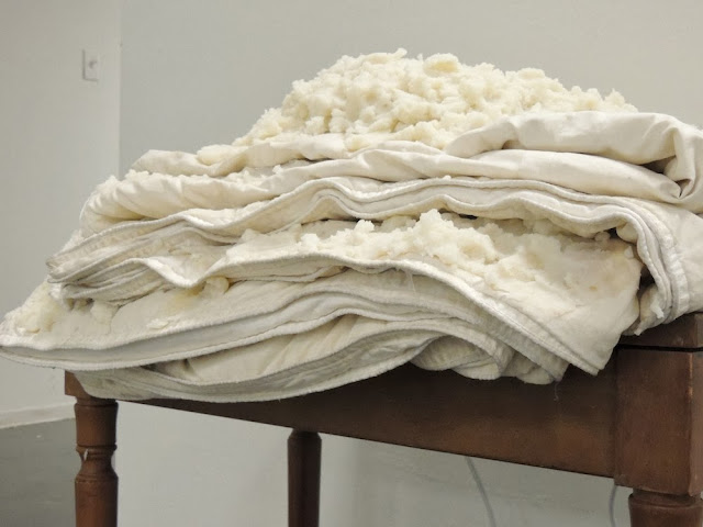
As I turned away from Horn, I smelled dinner. Being someone who gets overly excited about food, I rabidly followed the trail, stopping dead in my tracks at Randi Long’s Comforteur (2013). Here she has literally mashed together two domestic comforts: mashed potatoes and a heated comforter. It’s soothing and disgusting and gluttonous and overwhelming. A fetish of familiarity, it seemed lonely parked up against the wall, and I was left craving more information. Is the work asking for a participant? What if Long just started eating it? What if she wrapped herself in the blanket, smothering her body in warmth and food? What would that tell us? It’s hard to say what it would add, but if anything it probably would be more provocative and uncomfortable. And after spending time with her sound work on Sound Cloud, it seems that Long has an interest in encasing her viewer in a perpetual, droning climax—an arresting discomfort.


Randi Long, Comforteur, 2013, Milk, butter, potatoes, straws, comforter, steam, 4’x3’x2’, Courtesy of the artist


Randi Long, Comforteur (detail), 2013, Milk, butter, potatoes, straws, comforter, steam, 4’x3’x2’, Courtesy of the artist

Close to graduation myself, I continuously hear disheartening statistics about the large number of MFA’s who quit making work just one year out of school, and I can only imagine the numbers would be far greater for undergraduates. For what it’s worth, I hope this group sticks with it. Whether it’s graduate school or giving it a go in some far off city or navigating the Houston art scene, one thing is for certain: this group of seniors are on a precipice of seriously exciting breakthroughs in their work.

Floor Plan was exhibited at South Park Annex at the University of Houston on Friday, December 13, 2013.

Top 10 Posts of 2013: You People Have Dirty Minds

$
0
0
Robert Boyd

What posts got lots of page views this past year? Dirty ones. It makes me want to put "NSFW" in all my post titles. To be honest, it's a little depressing. I want great posts like "Continuum's Live Art Series - Night 4 (NSFW)" to be popular because they're good, not because they have photos of peen in them. But it is what it is. Here are the 10 most popular posts of 2013 based on page views.

1) Go Get the Butter (NSFW). This was a review of Staring at the Wall: The Art of Boredom curated by Katia Zavistovski at Lawndale. What made it NSFW (and presumably popular) were the penis-based artworks by Clayton Porter.


Clayton Porter, untitled (casts of melted butter), 2012, plaster of paris

2) Continuum's Live Art Series - Night 4 (NSFW). Dean Liscum's performance art posts have been some of the most popular, partly because he is a witty and sensitive writer and partly because people seem to love naked performance artists. This one had an edge over all the others. If you go to Google Images and enter the search term "ball sack", the second image you see is Jonatan Lopez nude painting his dick blue. Click the photo, and you come to this post.


Jonathan Lopez moments before the dick painting (photo by Dean Liscum)

3) A NSFW Pan Art Fair--Dallas Memoir. So the NSFW-nature of the popular posts is starting to wear me down. In this case, it was a post about holding a one-day micro-art fair in Dallas. The NSFW part was a photo of legendary stripper Candy Barr topless (it was related to a vinyl 45 by Michael A. Morris of his granddad reading Barr's poem, "A Gentle Mind Confused"). The post was fun, and gave me a chance to reflect on two parts of Dallas--the uptight establishment part and the outlaw part--and the post got a lot of readers from Dallas. As well as a lot of readers who like boobs.


Michael A. Morris, A Gentle Mind Confused

4) POLL: Where Do You Houston Artists Live?.This is just what the title implies. I think this was popular for two reasons--people love polls, and Swamplot linked to it.

5) "I Am" Is a Vain Thought: Thomas McEvilley 1939-2013. Houston lost Bert Long, Lee Littlefield, Cleveland Turner and others this year. I'll miss Thomas McEvilley the most. This post was my attempt to summarize his thinking about art as reflected in six of the books he wrote.


Marina Abramovic, Thomas McEvilly and Ulay from Art, Love, Friendship

6) An Open Letter to Homeowners in the Memorial Villages. This post wasn't a piece of criticism--it was just an excuse to run some photos of sculpture by Meredith Jack. But somehow Swamplot picked it up and therefore it got a lot of page views.


A Meredith Jack sculpture on the lawn at AMSET

7) Big Five Oh, part 2: Frieze. My nephew Ford and I share a birthday. In 2013,  he turned 21 and I turned 50, so I decided to give him (and myself) a birthday gift of a trip to New York, where we saw a bunch of art fairs. We saw the fairs with a couple of my friends, identified by the pseudonyms LM and DC. I wrote several posts about the trip, including this lengthy post about Frieze.


LM and I discuss Gursky (photo by DC)

8) Reasons to Go the the Houston Fine Art Fair. The Houston Fine Art Fair get a lot of criticism this year, including some from me. But it also featured some interesting art, including a lot of art from Latin America, ranging from older art like the mini-exhibit of Xul Solar pieces to contemporary art like the excellent showing from the art space LOCAL in Chile.


Xul Solar, Proyecto fachada para ciudad, 1954, watercolor on paper, 25.5 x 36.6 cm

9) Picasso Black and White. What can I say? Picasso is always popular.


Pablo Picasso, Head of a Horse, Sketch for Guernica (Tête de cheval, étude pour Guernica), 1937, 65 cm x 92 cm

10) Where the Artists Are.This post was where I crunched the numbers from the respondents to the poll in the fourth most popular post above. Not only did it get a lot of pageviews, it also generated a healthy dialogue in the comments section, which I always love. The surprise in these results were the unexpected popularity of Glenbrook Valley, Eastwood and Greenspoint for artists.


A really pretty mod in Glenbrook Valley

Beyond that, Google Analytics tells me that 72% of the page views came from the U.S. (followed by the U.K., Canada, France and Germany). Houston produced 25% of the page views (followed by New York, undefined, Austin and Dallas). Most referrals (as they are called in the online world) came from Facebook, followed by Reddit, Google and Swamplot.

Thanks for reading The Great God Pan Is Dead in 2013!

2013: A Highly Personal Top 10 List

$
0
0
Robert Boyd

Usually top 10 lists are about one type of thing. Top 10 movies, top 10 books, etc. In the past we've run best-of lists for visual art and performance art. This year, I decided to follow Griel Marcus's example and just list anything I wanted, regardless of genre. This blog is still an art blog, however, so art dominates the list. But it's not all art exhibits. These are exhibits, books, comics, etc., that appealed to me mightily this year.

The list is not in any particular order. There are many items on the "honorable mention" list that could easily have gone in the top 10 list if I thought about it long enough. And these items reflect both my own taste, idiosyncratic as it may be, and what I had access to. (I'm always impressed by critics who seem to have, for example, seen every movie released in a given year. But I'm an amateur part-time art critic, and I know I missed some great exhibits in the past year.) So the way to view this list is not as a top 10 list but rather as a list of things that I considered good in 2013.


Forrest Bess: Seeing Things Invisible, curated by Claire Elliot and Robert Gober (The Menil) and Forrest Bess: Key to the Riddle by Chuck Smith (powerHouse Books)

It was a Forrest Bess year for me this year. The Menil put together a fine exhibit, which included within it an exhibit originally curated by Robert Gober for the Whitney Biennial. I suspect that the exhibit was what prompted Chuck Smith to turn his 1999 documetary into a book. The documentary is good, but the book is so much better--including complete texts of many Forrest Bess letters and tons of photographs. For me, the exhibit and the book inspired three posts that I'm proud of--first a review of the show, then a recounting of legendary newspaperman Sig Byrd's visit with Bess, and finally an account of my attempt to find the location of Bess's long-gone shack on East Matagorda Bay.


12 Events by the Art Guys

The Art Guys have been a partnership for 30 years. This year, they decided to step away from the baroque style of their more recent projects and do 12 "simple" events. Some involved endurance (walking the length of Little York, the longest street in Houston; doing standup comedy for 8 hours straight), some involved repeating the same absurd action over and over (riding around the 610 Loop over and over for 24 hours; walking around the crosswalks at the intersection of Westheimer and Hillcroft for 8 hours); and some were sui generis (wearing portable fences as they walked around city hall; moving objects counterclockwise from the southernmost, westernmost, northernmost and easternmost points of the city). They concluded by restaging their first event, The Art Guys Agree on Painting, as The Art Guys Agree On Painting, Again, This Time From Thirty Feet Up. 12 Events wasn't just a celebration of their long partnership, it was a tribute to the site of that partnership, the city of Houston.


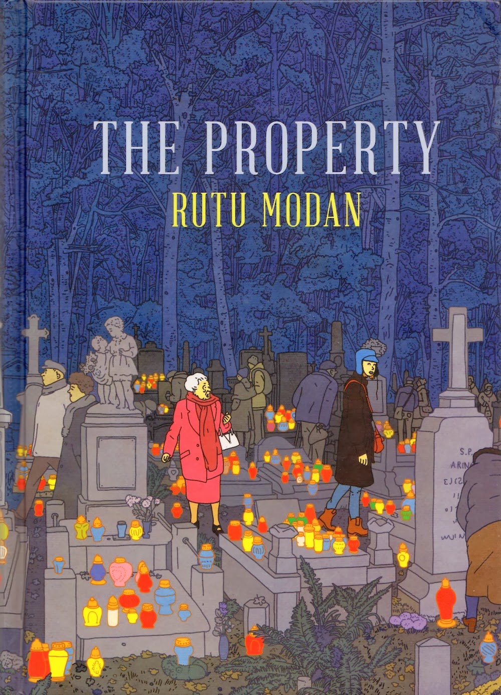
The Property by Rutu Modan (Drawn & Quarterly)

This graphic novel (which I reviewed here) by Israeli cartoonist Rutu Modan took the form of a madcap romantic comedy (a delightful one) to deal with the fraught issue of the history of relations between Polish Jews and Gentiles. (See Postwar: A History of Europe Since 1945by Tony Judt for a grimmer recitation of this distressing history.) The opening and closing scenes on the airplane (coming to Poland and returning to Israel demonstrate the duality between frivolity and seriousness that typifies the story. Of course, it helps that the art is beautiful and the visual storytelling lively. It's Modan's best comic from a career of excellent work, and it suggests where she can go in the future. My main worry now is that she may end up seduced away from comics to film--Modan would be a great screenwriter/director.


Sean Shim-Boyle's Salt House at Project Row Houses

To describe what Sean Shim-Boyle did with his Project Row Houses installation is to minimize its impact on the viewer. Nonetheless, here goes. Shim-Boyle took inherent elements of the row house and limited his installation to minimal use of existing elements. Specifically he put a second chimney in and added a new light source in the floor. But the magic was actually being in the space. The angled chimney was uncannily like the original chimney, and by its position made the familiar boxy room of the row house utterly strange. Devon Britt-Darby wrote in Art + Culture Texas, "The criss-crossing lines created by the chimneys, the beams, the windows and shadows give seemingly every vantage point an enchanting division of spaces that cries out for a viewfinder."


Hillerbrand+Magsamen, untitled, 2013, plastic toys, mostly from McDonalds Happy Meals, dimensions variable

Hillerbrand+Magsamen's Stuffedat Brand 10 Artspace

When I saw the above piece in Fort Worth, I instantly thought of Richard Long circles of slate. Long's work suggests to me the deep geologic time of the earth. Hillerbrand+Magsamen's Happy Meal toy version suggests another kind of time--call it "mess time"--the tiny period of time it takes for children to spread toys evenly over the floor space of one's home. It's work that makes you smile, but it also makes you think about the stuff that fills our lives. Mary Magsamen and Stephen Hillerbrand often use their two children in their work (they should get credit!), and much of the work is about being a suburban nuclear family. (I wonder how their work will change when their kids enter adolescence. So far, though, they seem like real good sports about working with mom and dad.) This exhibit was especially about the possessions that fill up a suburban home--the piles of stuff that fill a house, end up in garage sales, Good Will stores, and landfills. It was a playfully absurd exhibit.


Jeremy DePrez, left: Untitled (Milton), 2013, oil and wax on canvas, 82 x 36 inches; and right: Untitled (Harriet), 2013, acrylic on canvas, 82 x 36 inches

Jeff Elrod's and Jeremy Deprez's Fantasy Island at Texas Gallery 

I'm not going to pretend I really understand Jeremy DePrez's artwork. On the contrary, I feel like whenever I try to analyze it, I fall flat on my face. That was the case when I looked at his work in his MFA exhibit, and it was the case when I saw his paintings in the Boredom show at Lawndale. I wish I could say I had an "aha!" moment seeing his work displayed with Jeff Elrod's at Texas Gallery. But I did have a revelation: whatever it is that DePrez is doing, I like it. The slightly irregular look of his canvases in this show (the stretchers weren't straight, the parallel lines were broken up) gives the work a carefully constructed feeling of slackness. They get it right by not getting it right. Oh, and the Jeff Elrods were excellent, too.


Brave Genius: A Scientist, a Philosopher, and Their Daring Adventures from the French Resistance to the Nobel Prize by Sean B. Carroll  (Crown)

Germany invaded France on May 10, 1940, and in just over a month defeated the French and British armies there. Albert Camus was the editor of a French Resistance newspaper called Combat. Jacques Monod, a biologist, was recruited into the Resistance group Francs-Tireurs et Partisans. When the various Resistance organizations were joined under an umbrella organization, the French Forces of the Interior, Monod was the chief of staff. The writer and biologist didn't meet each other until after the war, however, when they became close friends. Camus continued to write and remained an activist, turning against Communism in the face of the Soviet invasion of Hungary. Monod fought a public battle against the ideologically-motivated Soviet pseudo-science of genetics known as Lysenkoism. Camus died in a car accident in 1960 shortly after winning the Nobel Prize in literature. Monod went on to win a Nobel Prize in medicine for his pioneering genetics work. Only a brief portion of the book that considers the personal friendship of the two men. Instead, Carroll weaves their life stories into the history of the French Resistance, the Hungarian rebellion, the study of genes, etc. In addition to showing the intersections between these two brilliant men, this book manages to show how the advances in biology in the period from just before World War II through the 60s are as much a part of history as anything else--that despite the split of the humanities and science into"two cultures," it is possible to consider them together fruitfully. I could not put Brave Genius down once I started--it was the most compelling book I read all year.


Brandon Araujo's exhibit at Domy Books and New Paintings by Brandon, Dylan, Guillaume and Isaiah at Spring Street Studios

Araujo's paintings have sneaked up on me over the course of the year. I know I have probably seen his work before, but the first time I noticed was at the exhibit at Domy (it was really a "Brandon" show, but Domy was still there). And I wasn't totally sure what to think about it. Then I saw more of his work in the Spring Street group show and finally visited his studio during Artcrawl. Araujo is an artist who is working out his own style, but he is also one whose work has a relationship to work by other artists around his age in Houston. So trying to understand his work is related to the task of trying to understand the work of some of his peers (among whom, the artists in the Spring Street show--Dylan Roberts, Guillaume Gelot and Isaiah López). But these artists aren't the germ of some regional school of painters--there are artists all over who are working in similar areas of abstract painting--Nathan Green, for example. They are sometimes called New Casualists or New Provisionalists. I'm a little loathe to put Araujo in that pigeonhole, particularly so early in his career. I can't put my finger on what I like about it, but the thing is, every time I see his work, I want to see more.


Ken Price, Pastel, 1995, fired and painted clay, 14.5 x 15 x 14 in.

Ken Price Sculpture: A Retrospective at the Nasher Sculpture Center

If you read much about contemporary art, you will have seen over the past few decades a reduction of discussion of craftsmanship in the conversation. This goes doubly so for arts that are traditionally considered part of the craft tradition. But the considerable rise in the critical fortunes of Ken Price recently suggests that the the fortunes of craft may be changing. Price, who died in 2012 just a few months before his retrospective opened at LACMA, was one of the artists associated with the Ferus Gallery. His work has a jazzy West Coast vibe. It's playful and fun. As a ceramicist, Price would make overtures to the traditions of the crafts (his highly abstracted "cups," for example) but was also quite willing to toss tradition completely overboard when it suited him. Seeing a lifetime's work from Price was one of the best museum experiences I had all year.


Sam Zabel and The Magic Pen by Dylan Horrocks

This is an incomplete comics narrative. Every now and then, Horrocks will throw up a new page on his website. He just posted page 103. The first page was posted in 2009. So why call this a 2013 work? I've been following it for quite a while with great pleasure, but it was this year that it really electrified me. The very first page in 2013 plops the protagonist Sam in the middle of an orgy with 50 beautiful green Venusian women (the page reproduced above is the only "SFW" page from that sequence). Now if someone had described this too me, I'd say it sounded like a lame pile of adolescent fantasy wish-fulfillment, and I certainly wouldn't imagine that a cartoonist as sensitive and possessing of moral rectitude as Dylan Horrocks would draw such a thing. And yet, here it is. It isn't ironic--it's eroticism is meant to be erotic. But within the context of the narrative, it works--especially as you see how the rest of 2013's pages unfold. Sam Zabel and the Magic Pen is about the ability of comics to be wish fulfillment. The first part is essentially realistic, a story of a blocked cartoonist. But there is an abrupt switch to the fantastic, specifically magic realism in the sense of Italo Calvino.This feels like it is shaping up to be a sequel of sorts to Hicksville, Horrock's graphic novel that posited that there was an secret art history of comics. That Horrocks continually creates major works about cartoonists and comics may seem solopsistic, and the character Sam does in many ways seem to be a stand-in for Horrocks himself. But the work is playful in the same way that If on a winter's night a traveler is playful, and that draws me in.

Honorable mention


Betsy Huete’s Top Ten of 2013

$
0
0
Betsy Huete

With a city as large and diverse and bustling with artistic activity as Houston, it’s easy to stumble upon great work. So as anyone can imagine, it was not difficult for me to come up with a top ten list for 2013. To be totally fair, however, I didn’t start writing for The Great God Pan is Dead until June of this year—which doesn’t mean much except that I was probably paying more critical attention in the second half of the year than the first. Therefore, it’s possible that I may be biased toward the latter half of 2013. At any rate, the following are my top ten pieces exhibited in Houston last year.

10. Bryan Forrester, Imogene (2012), The Big Show at Lawndale Art Center 
Imogene didn’t even hit #1 on my Big Show top five list, so it may be surprising to see it crop up here, in the top ten of everything. But sometimes images stay with a person in unpredictable ways, and this nude, vomiting, tattoo-laden man stuck with me. Vile and rich, Forrester’s photography is lush and personal, and Imogene feels equally fearsome and romantic.


Bryan Forrester, Imogene, 2012, C-print, 24 x 36 inches (courtesy Lawndale Art Center)

9. Katrina Moorhead, Trying to describe the way that space wraps itself around an object (2013), The Bird That Never Landscape at Inman Gallery 
Like a free-wheeling toddler, or perhaps the elderly homeless man with a pink tutu that frequents the Heights bike path, Katrina Moorhead’s work harbors an irreverent autonomy, seemingly unphased by its presence within a laser clean contemporary gallery like Inman. Yet strangely enough, it’s as if the work also depends on it being shown there, as if it requires that very platform to appear as autonomous. It is a bizarre and exciting paradox, and in Moorhead’s most recent solo exhibition, Trying to describe the way that space wraps itself around an object does not disappoint. A skeletal, black glittering bottle rack that looks like it came from a goth version of Claire’s, Trying to describe the way that space wraps itself around an object is strikingly, disturbingly, and simultaneously playful and menacing.


Katrina Moorhead, Trying to describe the way that space wraps itself around an object, 2013, antique bottle rack, powder coating, plasticine, bandage, 20”x19”x20” (courtesy Inman Gallery)

8. Geoff Hippenstiel, Untitled (2012), Winter Garden at Devin Borden 
I saw Hippenstiel’s solo show Territorial Pissings at Devin Borden in early 2013. While they were nice and engaging enough, there was something almost absurdly commanding about his Untitled shown this past December in the group show Winter Garden. Following his modus operandi of extremely thick, smudgy brush strokes, here Hippenstiel employs sickly decadent silvers, pinks, and golds melding together, toppling each other. Despite its confinement to the wall, Untitled ensnares the viewer, somehow making her feel as though she’s trudging through sugary magma.


Geoff Hippenstiel, Untitled, 2012, Oil on canvas, 36” x 48" (courtesy Devin Borden Gallery)

7. Jillian Conrad, Bonsai Radio #1 (2013), Ley Lines at Devin Borden 
When I reviewed Ley Lines earlier in the year, I wrote quite a bit about Conrad’s proclivities for drawing sculpturally, for crafting lines that reside in an anxious place between forming linkages elsewhere and existing as its own object. It’s this uncertainty that makes the work so compelling, and Bonsai Radio #1 is the best example of that liminality. A quiet work, Bonsai Radio #1 feels like it is whispering vital and indecipherable information.


Jillian Conrad, Bonsai Radio #1, 2013, Concrete, brass, rubber, 18”x20”12”

6. Romana Schmalisch, Notation of Efficiency (2013), From Here to Afternoon at the Glassell School 
From Here to Afternoon was a cerebral show that required lots of time and attention from the viewer. Schmalisch’s Notation of Efficiency was one such work—but with an enormous payoff. A dry and intentionally tedious slide show of Laban Lawrence diagrams from an old fashioned projector, she infused the work with subtle yet nevertheless effective humor. And by controlling the cadence of the slides demarcated by remotely audible clicks, she was able to manipulate the viewer in and out of a lull while asking fascinating questions about the conflation of movement, labor, and efficiency.


Romana Schmalisch, Notation of Efficiency, 2013, Slide projection and model (bamboo sphere)

5. Wols, Oui, Oui, Oui (1946-7), Wols: Retrospective at the Menil Collection 
In a recent review I compared Wols’ Oui, Oui, Oui to spelunking into a cave. What makes this painting so enrapturing is not only Wols’ ability to fervently convey a deeply interior language, but also his scrawling attempt to link the work back to an exterior world.


Wols, Oui, oui, oui, 1946/7, Oil, grattage and tube marks on canvas, 31.7”x25.3”

4. Jamal Cyrus, Texas Fried Tenor (2012), Radical Presence: Black Performance in Contemporary Art at CAMH
I didn’t see the actual performance; instead I saw the remnants in the Valerie Cassel Oliver curated Radical Presence. And quite honestly, I don’t care about the performance and would even go as far to say that it doesn’t need it. A fried saxophone, it is voluptuous and grotesque, indicative and inviting of performative elements from the artist and viewer alike. It invokes scathing sensations of crunching and the taste of bitter metal while debilitating one form of expression to create another. And without a hint of didacticism, it poignantly and very tangibly lets the viewer in on the beautifully varied and layered complexities of blackness.


Jamal Cyrus, Texas Fried Tenor, 2012, Fried saxophone, taken from www.studiomuseum.org


Jamal Cyrus, Texas Fried Tenor, November 29, 2012, performance

3. Joan Jonas, Good Night Good Morning (1976), Parallel Practices: Joan Jonas & Gina Pane at CAMH 
Jonas is a pioneer of feminine performance and video art, and Good Night Good Morning is a seminal work from the art historical canon. A largely conceptual work, at the CAMH it was exhibited as an elderly video piece emanating from an outdated TV set—yet it still felt contemporary for both intentional reasons and not. While using repetition in all art, not to mention conceptual works, is thoroughly tread and fully utilized territory, it still feels fresh here: one can pick up on miniscule though revealing nuances as Jonas consistently greets the camera each morning and night. Also, due to glitches in the then-new technology, the camera created faded double images as Jonas would traverse the room. A happy accident, the work is fraught with ghost images of Jonas haunting herself.

2. Leslie Hewitt and Bradford Young, Untitled (Structures) (2012) at the Menil Collection 
Speaking of hauntings, Untitled (Structures) is a cinematic recounting of present day architecture that inhabited various critical moments within the civil rights movement. Long time collaborators Hewitt and Young formally captured the innards of these spaces with barely detectable movement, providing mere glimpses or suggestions of history. These lush cinematic shots fuel an air of mystery, leaving the viewer craving more information, with no choice but to fill in the blanks herself.


Leslie Hewitt and Bradford Young, Untitled (Structures), 2012, Dual channel video

1. Soo Sunny Park, Unwoven Light (2013) at Rice Gallery 
No one can argue against Unwoven Light’s airy and dynamic pulchritude. A weaving structure filling the installation space at Rice Gallery, Unwoven Light contains thousands of lightly tinted acrylic panels continually refracting light, constantly changing color throughout the day. But the real game changer for me was its unexpected commanding, and really demanding, movement from the viewer. Using tons of winding chain link fence, Park builds an armature that in some places hugs the viewer in like a vortex while spewing him out in others.


So Sunny Park, Unwoven Light, 2013, Chain-link fence, Plexiglas, acrylic film, dimensions variable 

Burnt Plastic Abstraction by Gil Rocha

$
0
0
Robert Boyd

Abstract art is really hot right now. The CAMH has just completed three abstract shows and is in the process of initiating three more (although one of them, The Rites of Spring, doesn't really have anything to do with abstraction as far as I can tell). Abstract art is big in New York with artists who are working in a style that has come to be called New Casualism. And some of the best Houston artists are abstractionists (and could even be called New Casualists.) I put a couple of them on my top 10 list for 2103 and Betsy Huete selected some abstract paintings for her best-of list as well. The resurgence in esteem of abstract painting has even created a backlash. Everyone's talking about a dyspeptic article by Holland Cotter in the New York Times, a vast and mostly hopeless takedown of the moneyed art world, which included this paragraph:
Outside auctions, the marketing mechanics buzz on. Roughly since the end of the multicultural, postmodern 1990s, we’ve watched new art being re-Modernized and domesticated, with painting the medium of choice, abstraction the mode of preference. Together they offer significant advantages. Paintings can be assembly-line produced but still carry the aura of being hand-touched. They can be tailored to small spaces, such as fair booths. Abstraction, especially if color is involved, can establish instant eye contact from afar. If, in addition, the work’s graphic impact translates well online, where stock can be moved eBay style, so much the better. ("Lost in the Gallery Industrial Complex,"Holland Cotter, The New York Times, January 17, 2014)
Pretty brutal, but you don't get this kind of censure for an art trend unless it's successful in the first place. This is something I've been thinking about lately: the revival of abstract painting and questions about whether or not this is a good thing.

It was with this on my mind that I walked into Zoya Tommy Gallery for Gil Rocha's show, The Tacos Are Here. Rocha is from Laredo, a Texas border town. Now how an artist survives in Laredo, I don't know. I'm guessing some day job is involved. But looking at this show, I thought that Laredo was lucky to have him there. It's a very interesting exhibit, with some of the stuff edging towards conceptualism, but most of it being abstract "painting." I put "painting" in quotes because the works aren't really painted in the traditional sense.


Gil Rocha, Genesis, 2013, plastic and iridescent cellophane, 41 x 55 inches

Rocha is layering cellophane and plastic wrap, then burning holes in it with a blow-torch. This creates a highly colorful surface with white "holes" where the plastic has broken and curled up. The result has the feel of abstract expressionist paintings with all-over compositions. It barely has a sense of space--instead, it speaks almost exclusively to the surface of the canvas. If you discount the materials Rocha uses, it feels very much in line with tendencies in Post-War abstract painting.


Gil Rocha, Los Dulces del Diable, 2013, plastic and iridescent cellophane, 24 x 30 inches

Even though the descriptions say "plastic and iridescent cellophane," I find it hard to believe that there isn't some paint in these pieces. If not, Rocha has trained his plastic to look very paint-like.Whatever the material, these "paintings" have a presence on the wall that feels completely convincing. I don't see them as experiments with a particular set of non-art materials, but as complex, beautiful autonomous images.

In her article "ABSTRACT PAINTING: The New Casualists," Sharon Butler comments that some of the painters in this newish tendency "combine non-art materials in their paintings just for the hell of it, work at different scales, employ different color combinations, and experiment with unusual ways of applying paint. With less investment in honing a unique visual language, painters like Kadar Brock, Rebecca Morris, and Jasmine Justice use earlier forms of abstraction the way Rauschenberg used found objects. In the process, there is no room for handwringing about originality; it is simply assumed that it will result from synthesis and recombination. And if it doesn’t, well, isn’t that just as interesting?" This description could easily be applied to Rocha's painting-like works in this exhibit.


Gil Rocha, Los Desaparacidos, 2013, plastic and iridescent cellophane, 6 x 5 feet

Rocha's cellophane abstractions combine gorgeous iridescent effects with grungy surfaces. The combination is especially apparent in Los Desaparacidos, where curtains of iridescent green show through a bumpy surface of Monet-like violets and oranges. This pretty-ugly duality is something I've noticed a lot in contemporary abstract painters (Nathan Green, for example). Rocha is not all about making beautiful wall-objects, but he doesn't reject the possibility of doing so. Beauty is an acceptable outcome for him.


Gil Rocha, untitled, 2013, fabric and chrome paint, 45 x 0 inches

This atypical piece, untitled,  is the one that many viewers seemed to love. A maelstrom of fabric folds frozen in space, it's a beautiful object, a trophy for some collector's wall. This aspect of new abstract painting--its collectibility--is one that troubles some people like Holland Cotter. Art in some ways has split into two art worlds. There is art that isn't going to challenge the rentier class that collects it--on the high end, giant Jeff Koons balloon dogs, but abstract paintings are also lumped in here. And there is art that doesn't worry to much about looking good (or even being visual at all) but that engages the world politically and socially (and always from the left)--social practice art, for example, or the photos of LaToya Frasier that were recently shown at the CAMH. It's a battle between the righteous and the pretty.

I dislike this dichotomy because it suggests that an artist has to choose sides. And by even mentioning this dichotomy, I risk being accused of setting up a straw man. And yet this split really exists, and it's pretty easy to see in the Houston art community. So through the lens of this dichotomy, I could look at this exhibit and say that Gil Rocha is just a maker of luxury objects for sale that are void of political meaning. But that would be false. Gil Rocha is also the guy who did theBillboard Projectin Laredo.


Gil Rocha, Lluvia de Rezos, 2010

In the Billboard Project, Rocha used a billboard on a public street in Laredo to put up an ever-changing set of images and phrases that addressed local political and environmental issues in Laredo. These are not included in the Houston show, but are on Rocha's website. Maybe in a big city like Houston, it's easy to make a choice to be one kind of artist or another, but in a city like Laredo--about a 20th the size of Houston--flexibility is a virtue. In any case, the Billboard Project shows that it is impossible to pigeonhole Rocha.

I am very interested in new approaches to abstract painting, and I found Rocha's work in this show very stimulating and beautiful (in a grungy way). That would be plenty for one artist, but learning about the breadth of his artistic practice makes Rocha all the more fascinating. I hope this isn't the last we've seen of him in Houston.

Carlos Hernandez's Gig Posters

$
0
0
Robert Boyd

Live and in Person at the Rice Media Center is a show of gig posters by silkscreen printmaker and Burning Bones Press honcho Carlos Hernandez. The show features walls full of bold, colorful posters, most advertising musical acts that have came through town over the years.


The posters are under glass (or plexiglass), which is not the ideal way to see them because of the reflections on the glass, but it's a necessary evil with work on paper. One could also criticize the clean white walls--these posters would look better in the grungy confines of a rock and roll nightclub or a dorm room wall.


Still, it's nice to see so many at once and to be able to consider them as a body of work.

The art world has problems with this kind of thing. For one thing, these are advertisements. They're fundamentally commercial. There is a client somewhere who commissioned this work. The posters don't have the autonomy that a bona fide work of "fine art" has. They aren't the pure expression of an artist's will. One might think that postmodernism would have swept away these distinctions, but not really. Maybe if we wait a few decades, the art world will come around on this stuff.

Nonetheless, rock posters certainly aren't just advertisements and they have their own art history. It's worth remembering a little of that history because it informs Hernandez's work. In San Francisco in the 60s, a group of artists began making silkscreen posters for rock shows. The one main rule of making a poster was "readability"--the type and the image had to be clear. These artists--people like Victor Moscoso, Alton Kelley, Stanley Mouse and Rick Griffin--broke that rule with glee. They created hand-drawn typography that was deliberately difficult to read, for example. They would place two colors together that were the same value, so instead of one color "popping" out from the adjacent color, the colors would have a vibratory effect that simulated a psychedelic experience. Sometimes the posters were hand-drawn, sometimes they featured photos--but the photos rarely were of the bands or singers being advertised. These artists loved to use deliberately antique graphic elements (photos, typography), modernized by being printed with intense fluorescent colors.

The sixties rock poster set the stage for future posters like this, but the idea of the artist-driven rock poster faded in the 70s as rock music became more corporate and less localized. Rock poster art was revived when the punk scene came along, first via cheap xeroxed flyers and later with the return of the silkscreen rock poster. Frank Kozik started designing flyers in Austin in 1981 and is generally credited with reviving the art of silkscreen rock posters. Kozik was not much of an illustrator, but he was a great designer. Like the 60s artists, he loved to dig up old images and recombine it in his posters--in visually arresting and often quite disturbing ways.

Après Kozik, le déluge. Soon every town had its own poster artists doing silkscreen gig posters for the local palais de rock. Here in Houston, Uncle Charlie (Charlie Hardwick) is popular, as is Hernandez.

Around the same time as Kozik was recreating the silkscreened rock poster, Art Chantry was the art director for a music publication in Seattle called The Rocket. He worked with photographers and illustrators in a more-or-less traditional way, but he also started to old images and old design--design that was, as he put it, uninfluenced by the Bauhaus or Paul Rand. The design of cruddy newspaper ads. He designed posters for rock shows and art shows at Seattle's Center on Contemporary Art where photographic images would not be halftoned, but would instead be reproduced by crude xerography. His work had a witty working-class feel--it was literally grungy and fit right in with the grunge scene in Seattle.


I mention all these artists and designers because you see a lot of their influence in Hernandez's posters. Look at the photo of Andre Williams in the poster above. It seems clear that Hernandez took an existing photo and xeroxed it, creating a rough, high contrast image. And he doesn't even try to stay "in the lines" with the red shape under the photo.


Ditto with this Supersuckers poster. The image looks vintage and slightly sleazy in a coy retro way. The photo (and the background) are reproduced in high contrast and not halftoned at all. (Halftones are a photo-mechanical method for creating print-ready images that show subtle changes in value in a given image.)


While Hernandez doesn't go as far as the San Francisco poster artists, he often uses hand-drawn lettering more for a visual effect than for ease of reading.


His lettering is distinctive. It has a feeling of being carved, as if he were doing woodblock prints or zinc plate engravings.


That "engraving" feeling extends to his drawing as well and is one of the the things that defines Hernandez's work. In addition to the influence of earlier rock poster artists, Hernandez is influenced by José-Guadalupe Posada, the great Mexican printmaker from the early 20th century. This influence was made obvious in his work for Messengers of the Posada Influence at the Museum of Printing History recently, as well as at his annual Day of the Dead Rock Stars exhibits at Cactus Records over the years.


This is what sets his poster work apart. While it is firmly in the tradition of the silkscreen rock poster that began in the 60s, the influence of Posada's Mexican revolutionary printmaking gives Hernandez's work a flavor all its own.

Live and in Person! Gig Posters and Other Printed Matter by Carlos Hernandez is on display at Rice Media Center through January 30.


The Bart Book of the Dead

$
0
0
Robert Boyd

The catalog says it best: "Sketch Klubb is a group of friends who get together every other Saturday morning to draw." It was 12 guys, but one of them, Michael Harwell, recently died. 1,000 Crappy Barts for Michael Harwell plus Klay Klubb is a tribute to their lost compadre.


When you walk into the big back gallery of Box 13, there is a vitrine with an open sketchbook. This is Harwell's sketchbook, and the page we see has 16 drawings of Bart Simpson's head. There are a minimal number of lines in the Matt Groening-designed head of Bart, and Harwell deliberately takes them apart.

Starting from this page, the surviving members of Sketch Klubb--Seth Alverson, Rene Cruz, Russell Etchen, Sebastian Forray, Lane Hagood, Cody Ledvina, Nick Meriwether,Eric Pearce, Patrick Phipps, J. Michael Stovall and David Wang--drew 1000 versions of Bart Simpson, which are on the three walls surrounding the vitrine.


They aren't very memorable drawings. The goal was quantity over quality. This may reflect the ethos of Sketch Klubb. They've put together a few zines and a book before, but I suspect the idea is to get together and draw without having an endgame in mind. Doesn't matter if it's "good."


Not that there weren't a few drawings that were clever. Like this Creature from the Black Lagoon Bart.


Or this Bart who looks a little like Hank Hill crossed with Walter White.


How about an airbrushed Bart with 13 eyes?


Or a sweaty Bart with a beard and boobs for eyes. (There were a lot of mutant Barts in the show.)


The work was hung in a off-hand, unprofessional way--pages curled up in the humidity. But that seemed right. After all, they weren't creating something for the ages--this was a temporary tribute to Harwell that no doubt recalled their casual Saturday morning get-togethers.

Slightly more finished work was on display in the front gallery of Box 13. These were ceramic objects made by Sketch Klubb. None of the work was labeled, so for the purpose of this review, just assume a collective authorship for these bizarre ceramic knick-knacks.


(Thank God the "MAN MILK" jug was empty.)


Some of them are pretty funny, and they seem like a natural extension of the artistic ethos of Sketch Klubb.

The individual artists in Sketch Klubb do a wide variety of work on their own, but as diverse as their styles are, I'd say that what they have in common is an element of humor. The question I have is that was it their sense of humor that drew them together in 2005, or is their sense of humor as artists partly a result of their time together in Sketch Klubb?

I saw this exhibit on opening night. The crowd was boisterous and good humored. I wonder what it would be like to see when the galleries are quiet and unpopulated.

One last picture from the show--Sketch Klubb member Cody Ledvina showing off some Bart body art.

Autumn Knight invokes Robert Rauschenberg at the GAR

$
0
0
Dean Liscum

I wasn't sure what to expect when I drove to Galveston to see Autumn Knight perform The Ghost of Robert Rauschenberg, a piece conceptualized by Eric Schnell and Sallie Barbee, at the Galveston Artist Residency. It was a sunny Saturday in January (1/11/2014) and the appeal of the solitary, windswept beach and the frisson of confronting a ghost was enough to get me in the car. So I went with it.  When I entered the gallery space, it was evident that Knight had crafted a piece that was all thoroughly Rauschenbergian.


The stage with its sand and drift wood recalled the Port Arthur native's childhood environment. The bedsheet-esque backdrops hanging from the ceiling alluded to many of his famous combines, which merged sculpture and painting through found objects and painted images. The casting smacked of Rauschenberg. Flaunting the convention of traditional Noh plays in which male actors play both male and female roles, Knight, an African-American female, played the role of Rauschenberg, a white-Caucasian male. Even the score referenced Rauschenberg. As percussionists Brandon Bell and Craig Hauschildt played xylophones with horsehair bows and the cymbals with their fingers, the original piece by Thomas Dougherty exhibited the influence of the music of avant-garde composer John Cage, one of Rauschenberg's close friends.


I can only imagine Rauschenberg's glee, epitomized by his impish smile.


The performance was a modern Noh play, which is a form of Japanese musical drama that's remained primarily unchanged since 13th century. The fact that it was based on the choreography of Rauschenberg's own Noh play performed when he was collaborating with Cage and others makes it a re-imagining of modern (i.e., Rauschenberg) interpretation of a Noh play.


Given the number of artistic interpretations, the performance could have resulted in no Noh play at all.


I'm not a Noh play expert, but it seemed to adhere to the form. I'd categorize this modern re-interpretation as a Kami mono in which Knight plays the Shite, which is the protagonist in human form. The waki, the Shite's counterpart or foil, is never seen because it is nothing more than Rauschenberg, nothing less than his life.


To this untrained eye, the narrative/conflict played out as man vs. himself\woman vs. herself. (I appreciate the gender ambiguity, but it's tough to write about.)


The Shite, and make no mistake Knight is the SHIT-E in this performance (check out the scowl in the following pic) is born/emerges, ...


struggles, dies, and ...


rises as a ghost to exit stage back...at least that's my somewhat flawed understanding of what transpired.


I was never so sure of the plotline, but Autumn's energy, grace, and concentration was unmistakable and well worth the drive. You can experience it for yourself on March 15, 2014  as the GAR will present the performance second time.
Viewing all 665 articles
Browse latest View live