Quantcast
Channel: The Great God Pan Is Dead
Viewing all 665 articles
Browse latest View live

From Here to Afternoon: Labor and Formalities

$
0
0
Betsy Huete

Revealing and the concealment of information: it’s a formidable issue that artists and curators alike frequently contend with in presenting to the public. Places like the CAMH or the MFAH, for instance, provide detailed museum placards laying out the exhibition’s historical context or even outright meaning of the work. Most galleries provide some sort of handout, again rooting the work and/or the artist(s) within a particular context. Places like the Menil, on the other hand, provide very little information to the viewer other than the title, year, and artist, greatly entrusting the viewer to enact meaning onto the work—for better or worse. Patrik Haggren and Mikhail Lylov's latest curatorial effort From Here to Afternoon, up now at Glassell, somehow jockeys these two positions.


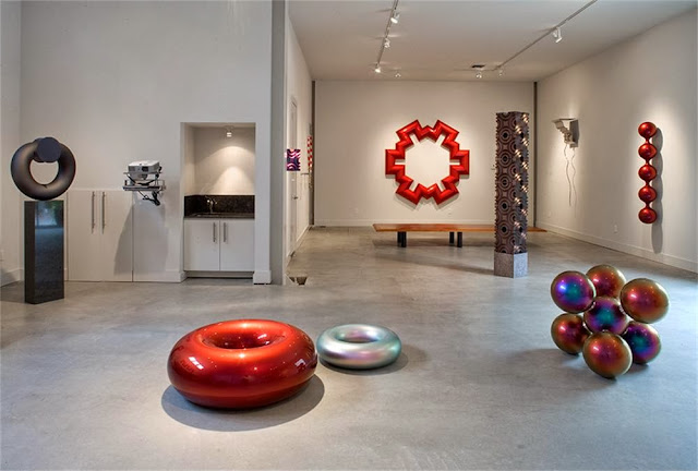
Exhibition entrance

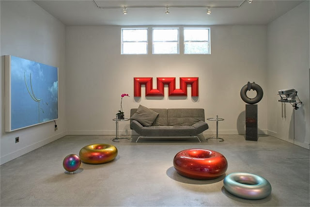
Albeit written in somewhat ambiguous and fairly impenetrable language, Haggren and Lylov do provide a written document explicating the context and meaning of the exhibition. Also, there are writings scattered throughout the space that functionally anchor and appropriately provide context, and even meditate on a contemporary art exhibit’s positioning within modes of labor and efficiency. But given their equivalence in scale to and spacing between the actual artworks, the writings seem to bear their own weight as autonomous art forms, and work surprisingly well as such. The transmutation of written explanation to art object is a surprising and innovative move that simultaneously informs and subverts meaning—a smart ambiguity that relies on the viewer to fill in the blanks. Another notable treatment (or lack thereof) of the space is the omission of artist and title placards. The result is a cohesive and deeply nuanced yet nebulous grouping: a curation drafted as an unintentional collaboration between artists. While totally practical and probably necessary, it makes the image list attached to the handout seem almost disappointing.
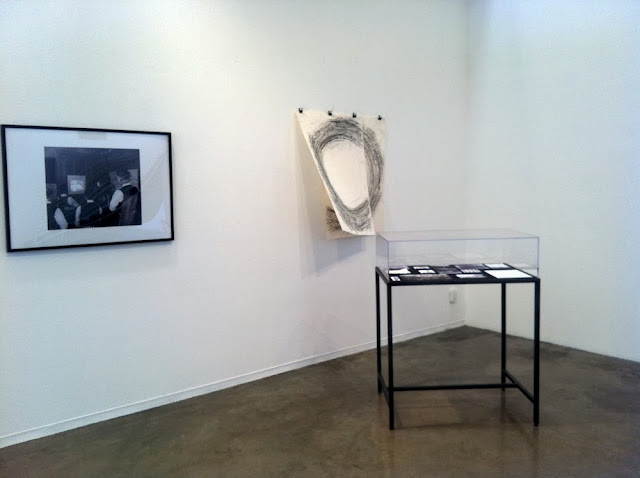

Installation view, front gallery

Placing trust in the viewer to properly engage with the work is a respectable although risky move here—this is an exhibition that requires time. Lots of it. With its text-heavy, historicized, and intellectual agenda, glazing over the work and shrugging it off as an exploration of the banalities and dignity of labor as well as the manipulation of its laborers seems like a tempting prospect. This isn’t fresh territory, after all. Between the Touch Sanitation (1970-80) project of Mierle Laderman Ukeles, Vito Acconci’s Step Piece(1970), or even Houston’s currently running Shrimp Boat Project, effort used as both a material and concept in art has been in play at the very least since the post-minimalists. Fortunately, for the viewer and Haggren/Lylov alike, it doesn’t take too long to realize that in this situation, labor is instead used as a stepping-stone to engender abstraction and formal concerns.


Installation view, middle gallery

That’s not to say that these issues aren’t prevalent in the work, or aren’t meant to be included, or shouldn’t be a part of the work. It’s that they immanently present themselves through a corroboration of visual and textual abstractions resulting from actual systems of efficiency, like the photographic motion studies of Lillian and Frank Gilbreth, speech conducting, and shipping containers, just to name a few. One clear example of this is the Laban-Lawrence studies of rhythm and labor, examined here through the lens of Romana Schmalisch. She uses these studies, conducted and published mostly in the 1940s, to explore the texture and rhetoric of efficiency, the most effective of which is Notation of Efficiency (2013). Situated in its own cozy dark room, the piece consists of a single slide projector, operating as an outmoded PowerPoint presentation. It’s a sequence of facts, visual aids, and Laban-Lawrence diagrams that hardly make any sense to the layperson. While seeming to do nothing more than explain a system, Schmalisch’s dead-pan delivery reveals subtle humor, making intense studies of movement like wrapping a Mars Bar feel fascinating, concise, and utterly ridiculous. She also controls the cadence of the projector, its intermittent clicking flying through some slides while spending way too much time on others. It’s a clever way of forcing the viewer to focus on phrases or images he would normally disregard, rendering certain aspects of these studies as not only important, but foreboding, manipulative, and slightly terrifying.


Romana Schmalisch, Notation of Efficiency, 2013, Slide projection and model (bamboo sphere)

Another instance of slide projector usage occurs with Liz Magic Laser’s The Digital Face (2012). In the main part of the exhibition space, two projected images face each other on opposite walls. They are two dancers, Alan Good and Cori Kresge, silently reenacting the choreography of George H. W. Bush’s 1990 and Barack Obama’s 2012 State of the Union address, respectively. The slides present images of frozen movements punctuating various points of the speeches. Overall, the piece is a fairly hilarious and extremely intelligent isolation of the movement and texture of political rhetoric, and poignantly fits in the show. But the piece originally existed as a performance at MoMA PS1 and usually shows up in galleries as a dual-channel video, and so much of the humor, nuance, and impeccable movements of the dancers is thus lost in this iteration. While the use of outmoded technology transplanted the viewer to a correlating time period in Schmalisch’s work, it doesn’t make sense with Laser’s. It’s a curatorial attempt at cohesion that cuts The Digital Face off at the knees—a grave misstep.
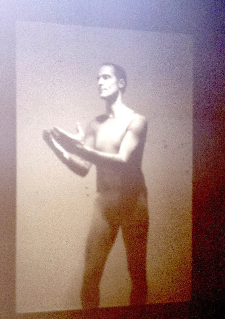

Liz Magic Laser, The Digital Face, 2012, Two slide projector installation

As previously stated, there are several pieces that quite purposefully lack immediacy, that demand extended attention, and Elke Marhofer and Mikhail Lylov’s Hongkong Turbulence (2013) is one of them. Although the running time is unstated, the looped video likely takes over half an hour to cycle through. The video initially reads as boring and self-indulgent observations of the transportation, shipping, and packing of commodities—a piece that is blanketly ungenerous to the viewer. But after about ten minutes or so (hang in there!), the work suddenly shifts from tedium to intense satisfaction. As it cyclically demonstrates machines and people binding, packing, smashing, crushing, compartmentalizing, selling, beeping, and deconstructing massive amounts of things, the work abstractly and formally, and almost ethnographically, reveals the innards of contemporary systems of efficiency.


Elke Marhofer and Mikhail Lylov, Hongkong Turbulence, 2013, 16mm film transferred to HD video

From Here to Afternoon makes interesting and borderline risky curatorial decisions that, while sometimes hurting the work, also enable it and create formal and conceptual relationships that would not likely exist if each piece were seen by itself. It also uses art to vocalize and think through overshadowed historical moments, and it’s usually presented the other way around in a standard contemporary context.

From Here to Afternoon runs until November 24, 2013, at the Glassell School.

Share

Postcard from Italy

Exiles at El Rincón Social

$
0
0
Robert Boyd

I want to quote the description of Exile, an exhibit at El Rincón Social. This ran on their Facebook invitation to the event.
Exile explores the boundaries between individual expression and the disintegration of human traces on the economic, social, and political field. The artists featured in this exhibition use artifacts as a means to evoke the obscurity of this disintegration — exploring with materials to communicate and testify to a suppressed history. Exile presents works that recontextualize exiled historical narratives into present personal narratives.

Stripping away the boundaries of genres, these works internally remap the notion of a frontier as a mode of resistance. Incorporating found materials, optic distortions, photography, video, and paintings recounting art historical tales, the artists emphasize the weight of personal accounts to disrupt the structures of image making. Resulting in questions of the self, the psychological landscapes developed in these works denote a regenerative introspection.
Reader, do you have any idea what this means? If so, I invite you to translate this into ordinary English in the comments. It made me think there were three possibilities. First, that it was deliberately obfuscatory, which would be a dick move. Second, that it was badly written, but not on purpose. And third, I'm dumb. (While option three is obviously true, I think options one and two are also possible.) Whichever the case, this text made me want to not see the exhibit. 

But Saturday night rolled around and I  decided to check it out despite all. And did the things I saw there have anything to do with the statement above? Was there any "regenerative introspection"? Were "exiled historical narratives recontextualized"? Did this art "remap the notion of a frontier as a mode of resistance"? Fuck if I know, but maybe you can decide when you see some photos of some of the work.


Robert Nava, (left) I didn't mean to, (center top) untitled, (center bottom) Love Circle, (right top) The Monster 4, (right bottom) Parrot Café Cupcake, 12 x 12 each, acrylic, charcoal, pencil, crayon on paper

Robert Nava has a suite of small drawings that, with the exception of the text piece in the center, are deliberately childlike. When I write "childlike," I don't mean "done in a charmingly naif fashion," I mean in imitation of actual tropes of children's drawings. Take a look at the work he has on his website--it's more of the same as you see here, but both the subject matter and the visual problem solving are based around things a 1st grade teacher would find common.


Robert Nava, Love Circle, 12 x 12 each, acrylic, charcoal, pencil, crayon on paper

Then there is Love Circle, which is a little more "adult"--or at least adolescent--than the other drawings. It's a funny transcription of a thought process. The irony is the thought that this note would have been sent to the writer's beloved. It's like when someone says, "Did I just say that out loud?"

I'd like to address Nava's work within the stated purpose of the show, but since I don't  understand the purpose, let me simply say that it seems very unlike the other work in this eclectic gathering. But the same could be said of most of the work. There were however several pieces that had a similar vibe--a grungy bricolage that reflected El Rincón Social itself.


Darwin Arevalo, untitled, cement on wood, 2013

Like Darwin Arevalo's untitled piece, dwarfed by its own pedestal, casually leaning against a wall. Cement on scrap wood by all appearances. All you can say about this is that it is art. As Arthur Danto said, it embodies an idea. But what idea is not something we viewers are privy to. But at least we know its art because it's on a plinth and it's in an art show.


Oscar Rene Cornejo, Horizonte, 2103, cotton pillow casing, woodblock on hand made paper, Brick, nail, plasti-kap, acrylic, oil stick, xerox on wood

Oscar Rene Cornejo's Horizonte is even easier to see as art. It has formal qualities we associate with art--composition, art materials, and it hangs on a wall like a painting. And it is a painting except for its use of non-painting materials. But that barrier was broken long ago--and one of those who broke it was Rauschenberg. He didn't shy away from using paint, but he'd put anything on the wall. Whatever else Horizonte is, it is a work that recalls Rauschenberg--so much so that it comes across as an homage. Even the xerox element reminds one of the crude half-tone silk-screen elements in many of Rauschenberg's best known works. And the bricolage elements of course recall Rauschenberg.


Sandra Cornejo, Cenizas Bajo Los Comales, 2013, volcanic slate, 8 x 12 inches each

Cenizas Bajo Los Comales by Sandra Cornejo contains three parts, each with a dark bottom half, a lighter top half, and a dark line extending up into the lighter half. So they appear to be three drawings, basically. They could be read as landscapes with single monoliths rising from the horizons. Both the light and dark parts are pretty dark--the values of light and dark here are actually quite close. It gives the images a menacing crepuscular appearance, as if these were three distant views of Barad-dûr. But actually I have no idea if these are meant to be landscapes at all, or if they are simply three similar abstract images. The title means "ashes on the griddles." A comal is usually made of cast iron but they can be made of clay. Can one be made of slate? Could these, in fact, be objects that had been used for cooking? In which case, the colors would be the burned remnants of whatever was cooked on them. I like that they could be interpretation is inherently ambiguous here--meals cooked, a geometric form, a menacing tower.


Caroline Chandler, Key, Keeper, Connector, cotton yarn, 53 x 93 inches

For some reason, there are a lot of three-part works in this show.  Cenizas Bajo Los Comales faces Key, Keeper, Connector by Caroline Chandler. The "key" and the "connector" are easy enough to understand. I don't quite get the "keeper" part. Drawn like this, they also resemble letters of an alphabet similar to but not identical to ours. A code perhaps. Therefore the three together look like a word. And if it is a coded words, the title is quite suggestive. But again, Key, Keeper, Connector defies simple interpretation. After all, the fact that it is knit or crocheted out of yarn is obviously important--why else use such a laborious technique? Like so much of the work in this exhibit, it's a head-scratcher.  But it's the kind of enigma that is quite pleasing. At least, it is to me.


Rushern Baker IV, untitled, 2013, acrylic on canvas, 11 x 14 inches each

It's probably hard to tell in this photo, but the left and right panels of Rushern Baker's untitled triptych are mirror images. Each depicts a parallelogram that looks like a floating square that has been angled to the viewer. One is black and one is silver. They both seem to be floating in space against the sky--a day sky on the left and a night sky on the right. The middle image seems completely abstract, although I guess it could be said to be showing a morning or evening sky seen from within a hole. In any case, all three images are very painterly with some thick impasto, and all three seem slightly menacing and uncanny, just as Cenizas Bajo Los Comales did. I liked that about them. So near Halloween, it's nice to be a little spooked.


Blanka Amezkua, selections from Corners and Body series, 2011-the present, 6 x 9 inches each

Not all the art in the show is assemblage or painting. There is some lens-based art, such as the photos by Blanka Amezkua from her Corners and Body series. In most of these, there is an architectural corner in which someone (Amezkua?) is standing facing the corner with her hands above her head as if she is about to take off, Superman style. You can see a lot more of these images here. The odd thing about the prints was that they seemed to be on some kind of silvery paper, so any "white" that showed through in the images appeared silver. (This quality doesn't come through in the photo here.)


Sondra Perry, Double Quadruple Etcetera Etcetera II, 2013, HD single channel video loop, color, silent

The two Double Quadruple Etcetera Etcetera videos by Sondra Perry were among my favorite pieces in the show. In them, a person with dreadlocks is dancing frenetically. It's like the dancing you'd see in the audience of a hardcore punk band back in the 80s. The body of the dancer is cunningly blurred. The video is silent, which gives it the feeling of a surveillance video. The setting is in the corner of a mostly featureless white room. It has an institutional appearance.

Given all this, what are we seeing? In a way, the dancing figure has an unreality about him that might remind you of the supernatural character Sadako in the film Ringu. It's a deeply disturbing, uncanny image--a good part of what makes this movie so terrifying. But at the same time, the frenetic blurred movements might make you think of the Tasmanian Devil in the old Warner Brothers cartoons. It is a simultaneously disturbing and funny image, equal parts horror movie and Saturday morning cartoon.


David Salinas, Ed, 2013, silver gelatin weave, 5 x 5 feet

This gigantic photo-mosaic portrait by David Salinas was another favorite. Ed is so massive that his face won't even fit into this large frame. The splatter along the edge of the image also hints at Ed's massiveness--he's literally exploding out of the box he's in. This image is a warm celebration of "Ed," a guy who has been around the block a few times. He's seen some shit. It's a heroic image of an ordinary man.

These are just some of the twenty-one works by eighteen artists in the show. Do these heterogeneous pieces of art have anything in common? Beyond the nonsensical statement, is there any theme or concept here? If anything, I'd say they share a modesty and rough-hewn home-made quality. I wouldn't want to see this in a sleeker white cube gallery. But in El Rincón Social, they look just right.


Share

Appropriation/Exchange: Posada and his Descendents

$
0
0
Robert Boyd

 
Dennis McNett, Wolfbat Storyteller (Mask), 2011, wood armature, paper mâché, woodcut prints, 36 x 30 x 26 inches

Dennis McNett in the information card that accompanies Wolfbat Storyteller writes that as a teen, he was impressed by punk rock and skateboard graphics. "When I took my first printmaking class and pulled my first woodblock print it was graphic, bold, and raw. It had the same aesthetic of everything I was into during my early teens." As a printmaker, his eyes were opened to German Expressionist graphics, Japanese woodcuts and the great Mexican printmaker José Guadalupe Posada. Studying Posada, he saw the "similarity with the punk movement, energy, and graphic sensibility." I think this particular artistic journey is one that many of the artists in Messengers of the Posada Influence, on view at the Museum of Printing History, have more-or-less taken.

This is on my mind because of an editorial recently published by Free Press Houston , "White People Are Killing Day of the Dead". Its author, Luciano Picasso, calls the use of the Day of the Dead by what he identifies as "white organizations" racist.
This goes for Lawndale Art Center in Houston, Texas. Their 26th Dia de Los Muertos exhibit is the 26th time they turn Day of the Dead into a cultural garage sale to make money. They lump in Dia de Los Muertos with a Gala and Retablo Silent Auction so they can insult us twice over, and there is not one actual alter on their premises that speaks to that day. They make money off this mess to pay for their White programming all year long. I’m sure they will give us the same lip service the Texas Book Festival gave: we have a Hispanic intern  . . . yada yada yada . . . the equivalent of “I’m not racist because I shagged a Hispanic once.”
This goes for the Museum of Fine Arts Houston (MFAH). This is another example of a White arts group taking money for Latino outreach and never reaching Latinos. They’ve got several events for “Day of the Dead” including a DJ party with IKEA-the Swedish plundering of our demographic, and a couple of sorry ass lectures by Germans showing slides of their cool adventures in Mexico. Wow, deep. See, this proves that MFAH stands for Mother Fucking Ass Holes.
It's hard to read this editorial because it is so vituperative and hate-filled. I guess the Museum of Printing History is lucky they didn't get called out by name. I doubt Luciano Picasso would have approved of Wolfbat Storyteller.

But it is hard for me to see McNett's appropriation of Posada's imagery (and via Posada, imagery from the Day of the Dead) as anything but homage to a master. It is an expression of respect.


Artemio Rodriguez, Dia de Muertos en Edo, 2012, linoleum cut print, 25.5 x 16 inches

Of course Luciano Picasso's editorial implies a one-dimensional world of racist appropriators of a victim's culture. It can't explain an image like Dia de Muertos en Edo. Who's appropriating what? Artemio Rodriguez, a Mexican print-maker, went to Japan where he made this print. It's a playful combination of two disparate cultural elements--a 19th century street scene in Edo (as Tokyo was was called until 1868) and the Day of the Dead calaveras.


Artemio Rodriguez, Payasos piden a la virgen alto a la maldita crisis, 2013, linoleum cut, 18.5 x 22 inches

A satirical artist like Rodriguez doesn't worry about offending cultural sensibilities, such as when he sends this group of clowns to make an offering to the Virgin Mary. Except that this is an actual thing--clowns do march every year to make offerings to the Virgin! That's what true satirists discover--and that includes Posada himself--that reality frequently exceeds your ability to make fun of it. All you can do is draw it and proclaim, this crazy thing exists.


Tom Huck, Possum Promenade from "The Bloody Bucket" series, 2000-2005, woodcut, 51.5 x 37.5 inches

Printmaker Tom Huck spoke on the night of the opening. His talk covered his own work and Posada's about whom he was very knowledgeable. The influence was direct--he even tried to use paper that matched the color of the yellowed newsprint on which Posada's woodcuts were printed. But his work avoids the motifs of Posada. Huck comes up with his own. But where the two artists are similar is in their rage and their humor. "The Bloody Bucket" was a series of enormous manic satirical prints. Like Posada or Hogarth or Gillray or so many others, he can be quite jolly while exposing the underside of the society in which we live. The Bloody Bucket was a bar in his hometown of Potosi, Missouri. He takes typical habitués and creates narrative images of them--some mildly pathetic, like the loveable loser dancing with a broom above.


Tom Huck, Joe's Meat Grinder from "The Bloody Bucket" series, 2000-2005, woodcut, 51.75 x 45.75 inches 

Other barflies are less appealing, like the racist WWII vets in Joe's Meat Grinder.  Huck spoke about how he'd hear about "the greatest generation" in reverent terms, and how that didn't jibe with his own experiences at all--that the WWII vets he knew were all unreconstructed racists. That's what a good satirist does--he goes after sacred cows.


The Amazing Hancock Brothers and Carlos Hernandez, Posada: 100 Years On (24 of 100 prints), 2013, screenprint, 18 x 24 inches each

Carlos Hernandez and the Amazing Hancock Brothers teamed up for this enormous tribute to their master. The individual prints in Posada: 100 Years On are full of visual quotes from Posada. Hernandez and the Hancock's have similar styles, but the layering of image and color here reminds me more of Hernadez's work than the Hancocks. Of course, in a collaborative work like this, it's hard to know who did what, and certainly they all have a similar aesthetic--they are, as Huck spoke about in his talk, "outlaw printmakers," who take inspiration from folk culture and often despised subcultures (sideshow banners, for example). Obviously the Day of the Dead is huge for Hernandez--his work is full of calaveras. Every year he puts together a Day of the Dead Rock Stars exhibit. He designed a calavera label for St. Arnold's beer. Their kaleidoscopic remixing of Posada is a beautiful tribute.


The Amazing Hancock Brothers and Carlos Hernandez, Posada: 100 Years On (detail), 2013, screenprint, 18 x 24 inches each

When I see a show like this, I'm reminded of one of my favorite songs, "Chiclete Com Banana", written by Gordurinha and Almira Castilho.

Eu só boto bebop no meu samba
Quando o Tio Sam tocar o tamborim
Quando ele pegar no pandeiro e no zabumba
Quando ele aprender que o samba não é rumba
Aí então eu vou misturar Miami com Copacabana
Chiclete eu misturo com banana
E o meu samba vai ficar assim:
bop-be-bop-be-bop bop-be-bop-be-bop
Eu quero ver a confusão

(I’ll only put bebop in my samba
When Uncle Sam plays the tamborim
When he grabs the pandeiro and zabumba
When he learns that samba isn’t rumba
Then I’ll mix Miami with Copacabana
I’ll mix chewing gum with bananas
And my samba will turn out like this:
bop-be-bop-be-bop bop-be-bop-be-bop
I want to see the confusion )

I first heard this sung by Gilberto Gil, but I like the original 1959 Jackson do Pandeiro version better. When I see the work of the artists in this show, from the U.S. and Mexico, I see the "confusion." And it's glorious.

Share

The Chimeras of Louviere+Vanessa

$
0
0
Robert Boyd

Jeff Louviere and Vanessa Brown are photographers from New Orleans who exhibit their collaborative work under the name Louviere+Vanessa. Their work has a deliberately antique look. They ascribe the look of their photos to their city: "We live in New Orleans. Time here has no context, the whole city is like a photograph, frozen in an old moment but continually aging." One might also add that new Orleans is a city redolent with magic and the supernatural, which their art addresses.


Louviere+Vanessa, Dextrorsum, 2005, inkjet on handmade gampi paper with wax and blood, 53 x 33 inches

Dextrorsum depicts a man with a mask and rags, a savage Caliban-like creature. The image is blurred and damaged and yellowed so that it looks like a 19th century photograph.

In the 19th century, some photographers were obsessed with capturing on film what they eye could not see. Eadweard Muybridge is the best known now, primarily because he succeeded so well in his task. But there were also those who took "spirit photographs"--frauds who preyed on the desperate for the most part. Their photos were fakes, as are Louviere+Vanessa's. The difference is that Louviere+Vanessa aren't trying to fool anyone, any more than John Heartfield was with his photomontages.


Louviere+Vanessa, Custos Lux, 2005, inkjet on handmade gampi paper with wax and blood, 53 x 33 inches

Both Dextrorsum andCustos Lux feature figures in masks. They reminded me of Josh Bernstein's double-eagle mask, and in fact Louviere+Vanessa's work on the whole reminds me of Bernstein's  Galveston project. They both link their work to a place with telluric supernatural forces. Bernstein's work seems deeper to me, in part because I know the history and mythology Bernstein has woven into this body of work. Louviere+Vanessa may have a similar mythology underlying their work. But without knowing it, what we end up with are beautifully-wrought, spooky images.


Louviere+Vanessa, 945-Flying, 2005, inkjet on handmade gampi paper with wax and blood, 53 x 33 inches 

And that's enough. This was a perfect Halloween show and excellent artworks for the collector with a taste for goth. 945-Flying is a delightfully ghostly image.  But their work doesn't quite cross over into the uncanny. Looking at it is like watching the average horror movie or reading ghost stories. Such films and books may entertain, but they rarely transcend the genre-- House of Leaves or Mulholland Drive are notable exceptions. And, among photographers, so are the Starn Twins or Joel-Peter Witkin.


Louviere+Vanessa, A Barking Dog Never Bites, 2011, inkjet on kozo paper on mirror with resin, 8 x 10 inches

I wouldn't quite put Louviere+Vanessa in that class. Instead, they produce strange, witty images like  A Barking Dog Never Bites. Louviere+Vanessa create beautiful images, with is more than most photographers ever accomplish.


Louviere+Vanessa, Still Life with Amnesia, 2009, cinegraph, 18 x 22 inches

But with a few pieces in the show, they go further and create something uncanny. They call pieces like Still Life with Amnesia "cinegraphs". They are made by laying strips of super-8 film (an obsolete home-movie film stock) out in parallel strips. The image is exposed, and the work is displayed in a light box (super-8 film, like all movie film, is transparent). Why this seems uncanny to me is it's disruptive nature.

When we watch a film, we have certain expectations--that it will start and end and that there will be some moving images between the start and the end. For those of you old enough to have seen non-digital films, recall a time when the film got stuck. It starts to melt before your eyes. The film is literally split in two parts. And the bargain that film has made with you your whole life is broken. To me, the cinegraphs are breaking the bargain of film as well. It's a deliberate rupture (unlike the melting film, which is accidental). And that rupture is uncanny.


Louviere+Vanessa, Still Life with Amnesia (detail), 2009, cinegraph, 18 x 22 inches

Louviere+Vanessa are on view dm allison art through November 16.

Share

Pan Recommends for the week of November 7 to November 13

$
0
0
Robert Boyd

Damn, this week's going to be tough! There's the usual round of openings, but layered on top is that Cinema Arts Festival, which officially opened Wednesday. I've highlighted quite a few of their films below, but you can see their entire schedule at their website, as well as trailers for most of the films. It's a pretty unique festival in that it shows a lot of films about art--visual, theatrical, musical, literary, cinematic, whatever. In addition to all these features that you have to buy tickets for, I strongly recommend you stop by their headquarters 1201 Main (at Dallas) because they have a variety of screens set up for showing experimental animated films that are completely free (there are several other programs that are free in the Festival as well). Some of these are classic animation experiments (by Norman McLaren, for example), while some are quite fascinating interactive animations using iPods as the tool for audience participation. The festival headquarters is also where they have "Cinema 16," which is a busy venue for somewhat more experimental films all during the festival.

THURSDAY


Cutie and the Boxer at Sundance Cinemas, 12:45 pm. The story of octogenarian pugilist painter Ushio Shinohara and his wife Noriko. Shinohara also has an exhibition of paintings opening on Friday at Zoya Tommy Contemporary.


Big Joy: The Adventures of James Broughton at Sundance Cinemas, 12:50 pm. Experimental filmmaker and poet James Broughton was a prophet of sexual experimentation in the days before the counter-culture blossomed.


North of South, West of East by Meredith Danluck at  Cinema 16, 1 pm, 7 pm and 9:30 pm. Meredith Danluck's feature film is shown simultaneously on four screen in the round. Audiences sit in chairs that can rotate and must always decide which screen to watch. (This obviously limits the audience size, which may be why it is running so frequently over the course of the festival. I recommend buying tickets in advance.)


Harry Dean Stanton: Partly Fiction by Sophie Huber at Sundance Cinemas, 3:40 pm. The great character actor (Repo Man, Paris, Texas, Alien, and 200+ more) profiled.


Portraits of Women Artists: Lover Other / Maya Deren’s Sink by Barbara Hammer at Cinema 16, 4 pm. Two films that sound fascinating: Portrait of Women Artists is a true story about a pair of lesbian surrealists who became Resistance fighters in World War II, and Maya Deren's Sink is about the great experimental filmmaker and her sink.


Putting the U in Color by Prince V Thomas, CC Stinson Kavi T, and Jyoti Guptaat the Doshi House, 5 to 7 pm. An exhibit dealing with an issue I never heard of--"colorism"--bias against dark skinned women in South Asian communities.

Liliana Porter, The Square II, 1973

Liliana Porter: The Square and other Early Worksat Sicardi Gallery, 5–7 pm. The Argentine conceptualist and her early work.


Marco Maggi: Fanfold at Sicardi Gallery, 5–8 pm. Not sure what to expect from this show based on the photos and description, but Maggi has done very interesting work in the past.


Galina Kurlat: Inherent Traits at Peveto, 6–8 pm. Galina Kurlat creates beautiful photos, and I expect to see more beautiful photos in this show of self-portraits.


Tom Marioni's The Act of Drinking Beer With Friends is the Highest Form of Artat the BLAFFER Art Museum, 6 pm to 9 pm. A well-lubricated performance of of Tom Marioni's famous conceptual piece, part of their show Feast.


Elvira Sarmiento, “Tu con El” Homenaje a Posada, 1913–2013. Solar Plate, Size: 19” x 27.5”

Elvira Sarmiento: Alludere Posada at the Museum of Printing History, 6–8 pm. Continuing with their tributes to José Guadalupe Posada is this solo show by Mexican printmaker Elvira Sarmiento.


Shepard and Dark by Treva Wurmfeld at  Sundance 2, 6:30 pm. Documenting the friendship of playwright Sam Shepard and Johnny Dark.


Paris, Texas at Sundance Cinemas, 9:40 pm. My favorite move set in Houston. The best freeway shots ever filmed!

FRIDAY


Jamel Shabazz: Street Photographer by Charlie Ahearn at Project Row Houses Eldorado Ballroom, 10:30 am. , and at Sundance Cinemas, 9:30 pm. The director of Wild Style, Charlie Ahearn, turns his camera on Bronx photographer Jamel Shabazz.


"CUTIE AND THE BOXER" work by USHIO SHINOHARAat Zoya Tommy Contemporary, 4-7 pm. A pop-up show to accompany the documentary about Shinohara.

North of South, West of East at Cinema 16, 1 pm and 6:30 pm.

Harry Dean Stanton: Partly Fiction at Sundance Cinema, 1 pm.

Geraldo Rosales

Gerardo Rosales at Avis Frank Gallery, 6–8 pm. His statement says that his art is about "about homophobia, sexuality, violence, loneliness and the imagery of the 'bear' subculture within the gay community." And sometimes it's about two headed ducks wearing a giant shoe.


an older painting by Danielle Frankenthal: Camelot,  acrylic paint on three transparent acrylic resin panels, 36 x 48 in

Danielle Frankenthal: Turbulence at Wade Wilson Art, 6 to 8 pm. She has an interesting interactive painting up at CAMH, so what better time for a solo gallery show?


Houston vs Austin featuring James Burns, Chris Cascio, Galina Kurlat, Jonathan Leach, Patrick Turk, Jerry Defrese, Hector Hernandez, Syraya Horton, Koseph Phillips and Lana Waldrep at BLUEorange Contemporary, 6–9 pm. Galina Kurlat appears in her second opening in two nights in this potential bloodbath pitting Houston artists against Austin artists. Maybe they can get John Nova Lomax to officiate.


Art Hard by Meredith Danluck at Cinema 16 at 9:00 pm. Jim Deneven makes the world's largest work of art on Lake Baikal.

SATURDAY


11th Annual Book Fairat the Museum of Printing History, 10 am – 5 pm. Oh so many lovely books, including plenty of art books from Exquisite Corpse.


Charlie Ahearn’s Hip-Hop Videos at Cinema 16 at 1 pm. From the director of Wild Style, nine videos that look totally fun.


Perry House, 3-5-11, Helter Skelter series,2011,  acrylic on canvas, 36x36 inches

PERRY HOUSE "Explosions" at HBU Contemporary Art Gallery, 1 to 4 pm. OK, this is a bit mysterious since it is not listed on HBU's way out of date webpage. It is listed on Glasstire, though. And Perry House is always worth seeing.


Persistence of Vision by Kevin Schreck at Sundance cinemas at 3:30 pm. A documentary about an unfinished animated film by the great Richard Williams.

North of South, West of East at Cinema 16 at 4 pm.


If the van's a-rockin'

The Art Guys: Loop along the 610 Loop from  5 pm Saturday to 5 pm Sunday. The 11th of their 12 events, they will drive around 610 Loop in the van pictured above (currently on view at Memorial City Mall--take that, Galleria!) for 24 hours. They will stay in contact with people via Facebook and Twitter, and you can just call the Guys up during the performance on a temporary phone line, 832-712-6207. Of course, you could just drive along side them--their van will be easy to spot!


Life Goes On… I Keep Singing by Jonas Mekas at Deborah Colton Gallery, 6 pm. Photos and videos by the great Jonas Mekas.


Jeremy Rourke: Live Music and Animation at Cinema 16 at 8:15. Jeremy Rourke is a musician/anumator who will be combining the two.


Wild Style by Charlie Ahearn at Sundance Cinema at 9:45 pm. If you want to be reminded that hip hop is old, watch this classic movie, Wild Style, from 1983. One of several Charlie Ahearn movies being shown at the festival.


Madeleine Dietz: What Remains at Gallery Sonja Roesch, 5–7 pm. These very interesting pieces toy with being architecture or interior decoration. Their liminal ambiguity combined with their beauty appeals to me a lot.

SUNDAY


Time Shift: The Films of Scott Stark at Cinema 16 at 1:00 pm. Austin experimental filmmaker Scott Stark is showcased.


Approved for Adoption at Sundance Cinema  at 1:15 pm. Interesting looking autobiographical film by cartoonist Jung Hemin. Born in South Korea, he was adopted and brought up in Belgium. His comics work looks (to my eyes) like typical Belgian adventure comics (with Asian settings). I can't find any examples of more personal comics work by Jung Hemin--except this movie.

Life Goes On… I Keep Singing at the Deborah Colton Gallery at 2 pm


North of South, West of East at Cinema 16, 6:15 pm and 8:45.


Antonio Berni, Ramona en la calle, de la serie Ramona Montiel y sus amigos (Ramona in the Street, from the series Ramona Montiel and Her Friends), 1966, xylo-collage-relief 

Antonio Berni: Juanito and Ramona at the Museum of Fine Arts, 10 am – 5 pm. Argentine artist Antonio Berni created his characters Juanito and Ramona in the mid-50s and continued to depict them in various media for the rest of his life. This show brings them together in the U.S. for the first time.

MONDAY

Life Goes On… I Keep Singing at Deborah Colton Gallery at 9:30 am

TUESDAY

Life Goes On… I Keep Singing at Deborah Colton Gallery at 9:30 am.


Houston Short Film Fund: World Premiere Screening featuring Kathryn Kane, Lauren Kelley, Douglas Newman, Jerry Ochoa and more at Sundance Cinema at 6:45.SWAMP (the best acronym ever) helped fund these short films by Houston filmmakers.

Share

A Talk with Danielle Frankenthal

$
0
0
Virginia Billeaud Anderson

Recently a New York gallery published a video of Danielle Frankenthal discussing her art in her New Jersey studio, and when I watched it I realized I had been ignorant of a particular element of her process. The artist applies paint to both sides, not just one, of the acrylic resin panels that make up her paintings. As she explained in the video, to paint both sides of three transparent panels gives her six painted surfaces through which light can penetrate. Wall-mounted with space between them, the plastic panels and their acrylic paint reflect light quite dramatically. Misunderstanding the significance of light reflection, I once wrote amateurishly that paint in Frankenthal’s art, “seems to float.”


Danielle Frankenthal, Turbulence 6, 2013 Acrylic paint on acrylite, 31 x 31 inches

I talked to Frankenthal during the opening reception of Turbulence, her solo exhibition at Wade Wilson Art (through December 20) and sensed her composure masked a slightly breathless state, not unsurprising given the fact that she was also exhibiting in Contemporary Arts Museum’s group exhibition Outside the Lines: UIA (Unlikely Iterations of the Abstract), which had opened the evening before. Outside the Lines marks the 65th anniversary of the CAMH’s October 31, 1948 inaugural exhibition. I missed CAMH’s opening, but figured the evening would be somewhat ceremonial when I read this officious line in the invitation: “Reading of Mayoral Proclamation: 6:30pm.”

If Frankenthal felt overwhelmed by gallery and museum installation, stacked openings, after-parties and dinners, a gallery talk with Bill Arning as a panelist, and collectors to tend to, that would be natural. So it was unnecessary for her to apologize for not calling after having written, “Virginia, I’ll be in Houston from 10/22 – 11/9, installing at the CAMH,,.would love to have a drink and get caught up, Danielle.”

My dear, you are forgiven!

Having collectors present at her opening did not stop her from answering a few questions:

Virginia Billeaud Anderson: Do the ten paintings in Turbulence reflect any change from your previous handling of plastic?

Danielle Frankenthal: There’s a slight difference. Some pieces, Turbulence 6 for example, I covered the furthest panel entirely with paint. The panels are painted with “metal gilding,” so the furthest one appears solid, and naturally interacts differently with light and with the two closer panels.

VBA: Another slight difference is your use of cool tones. Turbulence’s ultramarines and ceruleans remind me of the lovely dark olive green you used in the Camelot series.

DF: Yes

VBA: Your titles occasionally give clues to artistic inspiration. The series Chaos Contained (2011) evolved from an improved emotional state that came ten years after the trauma of watching the Twin Towers destroyed. You called the warm colors in Chaos Contained“embers,” and said they were “a positive thing that provides light and energy,” contrasted to the charcoal-like tones in the previous 9/11 series, one of which I saw. It was horrific.

DF: You know some collectors didn’t get that.

VBA: 9/11’s dark-toned sinuous forms looked precisely like charred body parts.

DF: Years after the horror, the fire had become an ember.

VBA: Did you know one of your Embers paintings charmed a critic when you showed it in Wade’s 2011 group show Blurring Lines? Houston Press’s Altamese Osborne called it “the darling of the night,” and wrote it “drew the most eyes.” Danielle I’m wondering if a significant event inspired the art in Turbulence.

DF: You know, we were stuck in Sandy. Hoboken where we live is in a flood plane and we were trapped there in 10 feet of water, David and I, and the water was gray and swishy with stuff in it. I think the art grew out of hurricane Sandy.

VBA: I remember your mayor issued a request for citizens to bring their boats to City Hall to help evacuate people from the condos and brownstones.

DF: Hoboken is a tight-knit community, and the town rallied, we could go to the church to plug in our phones. We ended up staying with friends on Long Island. David and I live on the third floor, and the elevator did not operate for 5 months. I remember I wanted my husband to have a Xmas tree, a real one, well I had lost my car in the flood, and using a borrowed car I went out and bought a tree, but couldn’t get it up-stairs. Our existence is endlessly turbulent, the reality we live in, these times are turbulent, but never without hope. I remember feeling so cold, everything was damp and cold, and then, months later the water receded, and the sun came out and it was warm again, never without hope.


 Danielle Frankenthal's installation in UIA (Unlikely Iterations of the Abstract) at the CAMH on opening night


from Danielle Frankenthal's installation in UIA (Unlikely Iterations of the Abstract) at the CAMH

Share

Whiplash In the Dark

$
0
0
Robert Boyd

At this year's Cinema Arts Festival, they showed two movies by Meredith Danluck. Art Hard (which I'm sorry to say you missed--it played yesterday) is a feature documentary. North of South, East of West combines two genres--narrative feature film and experimental film. North of South, East of West is playing three more times on Saturday, November 9, and Sunday November 10--so you can just catch it.


Jim Deneven on Lake Baikal

Art Hard (2010) follows an artist, Jim Denevan, who is seeking to make the world's largest artwork on the frozen surface of Lake Baikal in Siberia. Denevan is an earth artist who draws geometric patterns on ice or sand. They are, obviously, highly impermanent. He was commissioned by the clothing store Anthropologie to do this piece. (This was a part of the store's "Anthropologist" program of commissioning works from creative people. It appears to be defunct, as far as I can determine.)


The finished artwork (detail)

The whole idea of creating the world's largest artwork seems megalomaniacal (and ridiculous), although that's mitigated by the piece's impermanence. Deneven's crew seems mostly concerned with drinking and having fun--they don't quite get the work. Deneven explains that his mother was a math teacher, and that this work relates to that (it's very geometric). In the end, the appeal of the work (when seen from the air) is that the circles focus your attention on the naturally formed skein of white cracks in the deep blue ice.

The documentary has a casual, matter-of-fact style. It doesn't try to inform as much as immerse the viewer in the experience.

Watching Art Hard would in no way prepare you for North of South, East of West. It's a fiction film that follows several characters, Yvonne (played by Sue Galloway, a regular on 30 Rock), Dale (James Penfold), an auto worker whose name I didn't get (Ben Foster, currently in the theaters playing William S. Burroughs in Kill Your Darlings) and Miguel (Erik Quintana). Their stories are more-or-less unrelated, but the characters cross paths. So far, not unlike a typical narrative film. But what Danluck does that's quite odd is that she shows their stories on four screens, formed in a square, with the audience sitting in the middle. A viewer simply cannot watch all four screens at once. You sit in a swivel chair and are constantly spinning around.


installation view of North of South, West of East

She could have done this film on one screen, switching from character to character as their stories progress and occasionally intersect. Instead, what happens in the four screen version is that when the viewer is supposed to be paying attention to one screen, the other screens show something banal and boring--someone in a shower, a horizon, the night sky, a character watching TV, etc. For the most part, it's obvious what screen you are meant to be watching at any one time. But not always--sometimes Danluck forces you to choose. And sometimes, you may be watching a bit of dialogue one one screen when something trivial but engaging happens on the second screen. (For instance, when the very stoned Miguel makes a taco out of a tortilla and Oreos).


Yvonne and Miguel at the diner

The plots are fairly simple: the auto worker is a drug-addicted gambler who owes a bad guy $10,000 and decides to get out of town, thinking about going to Las Vegas after a conversation with Yvonne. Yvonne is a frustrated actress and unsuccessful cosmetics saleswoman who is given the job of driving a pink company Cadillac (which she picked up from the auto worker at the plant in Detroit) to Las Vegas, where it will be given to some sales champion at the company's annual convention. Dale is a rancher with a dislike of cops who gets thrown in jail overnight for messing with one, then has another encounter with one at the end of the movie. Miguel is a young heavy metal musician working for minimum wage at a cafe with occasional odd jobs for Dale who decides to make a big score by delivering drugs for the local drug kingpin. Dale and Miguel live near Marfa, and Yvonne drives through on her way to Las Vegas from Detroit (yes, I realize this makes no sense geographically).


The auto-worker nods off

These plots seem fairly conventional (at least for indie cinema), and except for the long stretches of nothing happening when the viewer is looking at another screen, they are filmed in more-or-less classical cinema style. However, if you chose to look at just one screen, it would very much seem like an experimental film--some bursts of action followed by extremely long slow periods of inactivity. Hence the whiplash--you are constantly whipping back and forth to look at the screen with the "action." At one point, all four screen go into the "experimental" mode at once--they each show extended sequences of TV screens, representing what the characters are watching.


Yvonne on the road near Marfa

This combination of experimental and traditional narrative film is quite bracing. I was gripped by this film all the way to its rather abrupt ending. North of South, West of East is never coming to a theater near you--it only works with four screens in an "in the round" setting. You have three more chances to see it this weekend. I highly recommend you do.

Share

No Particular Place to Go

$
0
0
Robert Boyd

For the last 11 months, the Art Guys (Michael Galbreth and Jack Massing) have been doing a series of events--performance pieces that often hearken back to their earlier work--to celebrate 30 years of artistic partnership. These performances often take something fairly ordinary and turn them into something seemingly absurd using time, repetition, etc. For example, the took a walk--the entire length of Little York, Houston's longest street. They shook hands with stranger in the downtown tunnels for eight hours. They got on stage and told jokes for eight hours. And this kind of thing recalls well known earlier performances, like when they sat in a Denny's restaurant for 24 hours straight.

Some of their earlier performances in this series were fairly private, even as they took place in public. I don't know how many people visited them as they walked down Little York. Patrick Bresnan photographed them, but I don't know if he was with them the whole time.

For Loop, their current performance (current in the sense that it is continuing until 5 pm tomorrow), they are driving around the 610 Loop for 24 hours. For 12 hours they are going clockwise, and then for 12 more hours, they will be going counterclockwise. They made this event a public spectacle as much as possible. They put the van they'd use for the trip on display at Memorial City Mall (the sponsor of the event) for a week prior. They have a phone number you can call to talk the Art Guys as they travel--832-712-6207. You can follow the event live (and comment) at http://www.facebook.com/theartguys or https://twitter.com/TheArtGuys. And perhaps the coolest thing is to follow their progress on Glympse:


And they took people on rides. I met them around 7:30 pm at the Taco Cabana on the North Loop at Durham. The van they were riding had been painted by a professional sign painter and looked great.


They clearly were hoping that people might call them from their cars.


Their sponsor was prominently identified.


And there was a little bit of editorial comment--I'm not sure if this was an improvisation by the sign painter or the Art Guys instructed him to include it.


John Nova Lomax would approve.

Inside they had a driver, a documentary filmmaker, Michael Galbreth, Jack Massing and for one circuit, me.


Michael's on the left, the driver is wearing a captain's hat, and Jack is in the yellow jacket.


Michael spoke about how these events were about doing whatever they wanted, getting back to their roots. I mentioned how so many of them involved the geography of Houston and its economic, political and social structure, that they could be seen collectively as a portrait of the city. Michael also spoke of how even though they were in theory always turning right (for the first half of the performance), there were odd little doglegs in 610 when they would veer slightly to the left. He was becoming extremely familiar with the little things about the Loop that most people wouldn't notice, like the bizarre pedestrian bridge over the Loop at Gulfgate Mall.

Going around the Loop once has a point--you learn something about the city you're in. Going around it 18 times is an utterly pointless act. And as Hennessy Youngman says, that's how you know it's art.


Share

Report from the Golden Age of Art Comics: Geneviève Castrée, Peter Bagge, Rutu Modan and Brian Ralph

$
0
0
Robert Boyd

I've read a considerable number of comics recently. I'm going to try to discuss a few of them every week, and I've been thinking about a way to organize them. "In the order that I read them" was my default choice, and "randomly" was considered. But I decided to group them as much as possible by publisher.

Doing this gives a small claim of authorship to the publisher, which may rub some readers wrong. To claim any authorship for the publishers sounds a little like the corporate comics published by Marvel and DC and Archie--comics where the corporation owns the work and the artists who create the work are replaceable cogs. That arrangement, where a corporation has legal authorship, has come to really disgust me over the past few years. But that's not what I'm talking about in these reviews.

Instead, I'm thinking about the roles of gatekeepers or taste-makers that occur in any kind of art. I'm talking about the impresarios. In comics, they're the publishers and editors. In theater and movies they're the producers. In visual art, it's the gallerists and curators. And so forth. Publishers over time develop a particular voice based on the kinds of projects they choose to take on. They are in business to make money, sure, but to reduce the motivation of a publisher of art comics to money is simply ridiculous. No one gets rich publishing art comics. At best you can survive if you run a lean operation and have a good eye.

One of the great survivors is Drawn & Quarterly. Founded in Montreal in 1990, their first successful artists were Julie Doucet, Joe Matt, Chester Brown and Seth, followed soon by Adrian Tomine. Although all these artists were quite different (and became more different as they developed as artists), they all did fairly unflinching autobiographical comics--and popularized a genre that came to define art comics in the 90s. It would be unfair to characterize all of Drawn & Quarterly's output as low-key autobiographical comics, but enough of it was that they got a reputation for autobiography. (As you will see, only one of the four comics below is autobiographical.) Drawn & Quarterly has evolved quite a lot over time, but one big reason for the change in flavor is the addition of Tom Devlin as the company's second editor (after founder Chris Oliveros).

Devlin ran a small publisher called Highwater Books in Boston and New York from 1997 to 2004. He had a very firm and peculiar aesthetic philosophy--the comics he published were precious objects, they weren't realistic (and in that regard quite different from many of Drawn & Quarterly's main comics), they were often quite experimental. When he was brought into the Drawn & Quarterly fold, at first he was a bit shy about pushing his tastes. But books that to my eye seem very much like "Devlin" books started to pop up. Here's a story that will illustrate this. Back in the early days of Highwater (late 90s), I was visiting him and he gave me a set of photocopies of a comic strip I had never heard of. It was Moomin, drawn by the great Finnish children's author Tove Jannson. It was crisply photocopied and bound (Devlin worked part time at a copy shop). He had discovered this strip--a masterpiece of wry, humanist humor and whimsy--and was eager to share it with cartoonists and other editors like me. Then in 2006, Drawn & Quarterly came out with the first of many official Moomin comic strip book collections, Moomin: The Complete Tove Jansson Comic Strip. Obviously this was Devlin's baby.

This goes back to the "authorship" of publishers. It's inevitable that Drawn & Quarterly would evolve as a publisher, but when a small publisher brings on a new acquiring editor like Tom Devlin, the flavor of its overall output will sharply change. It's what a publisher chooses to publish that defines its voice, and that voice changes as the personnel that make up a publisher changes. (I wonder, for example, how Fantagraphics will change now that Kim Thompson has died.) The four reviews below will give you an idea of the range of what Drawn & Quarterly is currently publishing. I would say that Susceptible is definitely an Oliveros acquisition, and Reggie-12 is a Devlin acquisition. The other two? Who knows and really, who cares--they're all Drawn & Quarterly books in the end.


Susceptible by Geneviève Castrée (Drawn & Quarterly, 2012).Susceptible is an exceptional example of autobiographical comics and therefore fits in with Drawn & Quarterly's historical profile. And according to an interview with Castrée, she was asked to do something bypublisher Chris Oliveros in 2001--back when autobiographical comics were more prominent in Drawn & Quarterly's list. By 2012, Susceptible is an odd book out in terms of content, but in terms of quality, it fits right in.


Geneviève Castrée, Susceptible page 27

The book deals with Castrée's life from birth until she's 18. In the book Castrée is called Goglu, her mother's nickname for her. Above we see her when she was 6, after having a nightmare about Marc Lépine's anti-feminist massacre of 14 women at the École Polytechnique in Montreal. This anchors her story in time, but generally the depiction of time in the story is more personal. It could be the story of a North American child from anytime in the past 30-odd years. Castrée is being raised by a single mother in Montreal. Her father is in British Columbia, "a mythical kingdom where dads go to disappear."

Her mother is quite young, an accountant who put off getting a college education because of Goglu. She drinks quite a lot and has a somewhat chaotic life that Castrée recoils from.


Geneviève Castrée, Susceptible page 36, top tier

The book is episodic and there are a lot of captions setting the scene. However, she mostly avoids analyzing the scene from the point of view of her 30-year-old self. While her means of expression are sophisticated and adult, she is writing about the perceptions of a child. So her reaction to her mom drinking and taking drugs is rationalized by the fact that drugs are illegal. This is a 10-year-old's world. A 30-year-old would have a different way of thinking about what it meant to have a passive-aggressive alcoholic mother.


Geneviève Castrée, Susceptible page 37

Her panels are spare--no more visible information in included than necessary. This means there are a lot of panels like the top two, where there are figures and nothing else. After establishing the reality of the piggyback ride in the first two panels, Castrée only needs a barrage of speech balloons in the middle. But in the bottom two panels, she shows the stairs to remind the reader of the distance she is trying to keep from the intoxicated adults upstairs.


Geneviève Castrée, Susceptible page 67

As Castrée becomes a teenager, she has a typically contentious relationship with her mother that is complicated by her mother's drinking. She is sent to therapy, where her councilors eventually tell her to tough it out a couple of more years and move out. Not exactly the most empathetic advice, but realistic. At 17, she moves to that mythical land of BC, to a rural part of Vancouver Island to live with her father. Despite having the fact that they've only seen each other once since she was 5, he takes her in and builds her a small cabin so she can have solitude.

 
Geneviève Castrée, Susceptible page75

When she turns 18, she moves back to Montreal for a summer, where the above scene takes place. Again, the spare panels (leaving out the borders this time). Castrée's story is both personal and typical of childhood in the late 20th century. Lots of readers will find plenty to identify with. Her drawing is very appealing, combining aspects of classic French language comics (which she read from an early age) and the comics that came out of the North American alternative and self-published comics scene--I see strong similarities with Julie Doucet's and John Porcelino's work. But her work feels a little more grounded than those two artists, who are respectively more surreal and more poetic than Castrée. While Susceptible is within the tradition of autobiographical comics, it is a strongly individualistic work. Its rhythms are unusual but appropriate. Curiously, her technique of presenting a string of episodes is precisely how Peter Bagge structures his otherwise very different book, Woman Rebel: The Margaret Sanger Story.


Woman Rebel: The Margaret Sanger Story by Peter Bagge (Drawn & Quarterly, 2013). Peter Bagge is best known for his two comic book series from the 80s and 90s, Neat Stuff and Hate. These were humorous fictional comics, but after the end of Hate, he started dabbling in non-fictional reportage in such venues as Suck and Reason. This practice evolved into a series of short comics about America's  founding fathers. Throughout, he maintained his rubbery cartoon drawing style and his humor. Woman Rebel is not strictly a biography in comics form of Margaret Sanger but instead a series of episodes from her life, mostly one and two pages long. Bagge follows the 72 pages of comics with a 20-page prose appendix, which provides a context for each of the episodes. The comic section and the appendix together form a pretty decent biography of Sanger.

 
Peter Bagge, Woman Rebel: The Margaret Sanger Story page 14

Bagge's drawing is pretty much the same as when he was drawing Hate--highly stylized humorous faces, figures with no joints in their arms and legs. But the writing is not always humorous--as in this scene where Sanger and the doctor she works for visit a woman who tried to give herself an abortion and nearly killed herself. But what's great about Woman Rebel is how frequently Bagge is able to turn episodes of her life into comedy, such as this bizarre scene where she meets pioneering sexologist Havelock Ellis.


Peter Bagge, Woman Rebel: The Margaret Sanger Story page 31

As is spelled out in the forward by Thomas Spurgeon (which is practically a review of the book the reader is about to read), Bagge "portrays Sanger as a comedic protagonist, as someone with an inflated sense of self and a whole list of appetites and specific desires to fulfill on her way from cradle to grave." We're not used to seeing biographies like this. In books, modern biography tends toward encyclopedic documentation (particularly of every fault and stumble). In film, hagiography is the norm. The notion that the life of an important and accomplished person like Margaret Sanger could be told in a voice that resembles, say, Eastbound & Down doesn't enter our consciousness. But Bagge already has a great narrative voice, and Woman Rebel proves that he can apply it to the most unlikely subjects.

 
Peter Bagge, Woman Rebel: The Margaret Sanger Story page 51


Sanger, of course, was the leading proponent of contraception in the early 20th century. Her own mother had 18 pregnancies, and the lack of control that women had over their own bodies often lead to tragedy, as seen in the sequence on pages 14 and 15. Her crusade was opposed strongly by the Catholic Church (and other religious institutions) and the U.S. Postal service, which repeatedly seized Sanger's publications and pamphlets.

 
Peter Bagge, Woman Rebel: The Margaret Sanger Story page 55

Her reputation now is a bit frayed because of attacks on her from the right and the left. The right excoriates her for founding Planned Parenthood and in general for being in favor of contraception. The right has a problem with female agency in general, and certainly with sexually adventurous persons like Sanger. On the left, there is her support for eugenics (which was quite tepid, as depicted on page 55), her speech to the Ku Klux Klan women's auxiliary and her clinic in Harlem, for which she has been accused of wanting to wipe out the black race. (When I typed "Margaret Sanger" into Google, the third link was "Black Genocide," which accused Sanger of just that; the fifth link was a harangue against her radicalism by a neo-John Birch-ite website called "Discover the Network"; and the sixth link from a site called "LifeNews" basically accused her of being pro-infanticide.) I think her "shot by both sides" status  must have appealed to Bagge. He depicts Sanger's mission as helping women gain control of their own reproductive systems--whether those women were Catholocs, Ku Klux Klanners or African American.

 
Peter Bagge, Woman Rebel: The Margaret Sanger Story page 56

 
Peter Bagge, Woman Rebel: The Margaret Sanger Story page 63

Sanger lived long enough to see the contraceptive pill, which represents the fulfillment of her long struggle (not that reactionaries don't continue to fight against contraception, of course). But despite her success, I think she remains too controversial a figure to be taught in high school American History classes. (Hell, we're lucky that the Texas State Board of Education permits mentioning the abolitionists and suffragettes.) So a book like this is useful for schlubs like me who had only a vague notion of what she was all about.

Bagge humanizes Sanger and places her in the context of her times. But more important, he creates an utterly amusing and engrossing story. He's funny all the way through (even in the appendix), and that's what I look for is a Bagge comic.


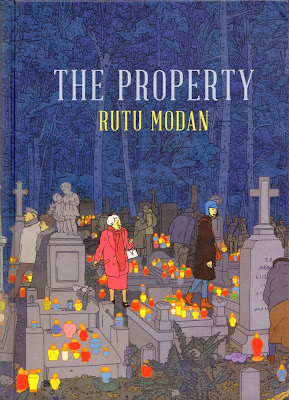
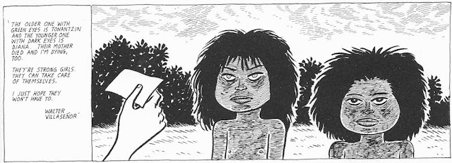
The Propertyby Rutu Modan (Drawn & Quarterly, 2013). Rutu Modan was a member of an Israeli comics collective called Actus Tragicus that published beautiful comics in the 90s and 2000s. Her work then was very stylized, so for longtime readers it was quite a shock when she started working in the style she employs in The Property. The figures are simplified in the ligne clair style, but otherwise much more realistic than her earlier work. And apparently Modan used a lot of photographic sources--she credits "comic actors" for all the characters in the back of the book, including her Actus Tragicus colleagues Yirmi Pinkus and Batia Kolton.


Rutu Modan, The Property page 10

The story is built around a trip to Poland by Regina and Mica Segal, grandmother and granddaughter respectively. They share their plane with a school trip for Isreali teenagers to see the sites of the Holocaust. As you can see above, the teenagers aren't getting into the spirit of the thing. (At the end of the book, Regina and Mica are returning to Israel on the same plane as the high schoolers, who are now much more somber.) The story ostensibly involves the recovery of property by Regina that had been taken by the Nazis in the war. This sounds like a very depressing story, but what's amazing and delightful about it is that despite this background, it's actually comedy of errors, a romantic comedy spanning three generations.


Rutu Modan, The Property page 10 detail

Mica meets a tour guide named Tomasz, and over the course of seven days, their relationship swings wildly between attraction and misunderstood motives. But at first at least, they find each other fascinating. Modan uses Tomasz to wryly comment on comics as art and the sense of incomprehension that this notion evokes in the average person.


Rutu Modan, The Property page 88 detail

Tomasz's sketchbook becomes a plot point in the story. To give his comics a different look, Modan had another excellent Israeli cartoonist, Asaf Hanuka, do all of Tomasz's drawings.


Rutu Modan, The Property page 89 detail

The irony is that this conversation suggests a dichotomy between "serious" comics and "humorous" comics--but The Property straddles that division. It has a level of sophistication that you don't often see in comics. This is a comic for adults.


Rutu Modan, The Property page 100

The fly in the ointment in this story is Avram Yagodnik, a busybody who, for mysterious reasons, keeps interfering in Mica's search for the property. His part in the story slowly unfolds, as does Regina's. Like classic comedies from Shakespeare to the present, all the characters in The Property except the ingenue Mica have secrets that don't quite unfold until the end. It may be too much to say that the contentious romantic entanglements in The Property represent the contentious relationship between Polish Gentiles and Jews. Suffice it to say, it's not just Mica and Tomasz who have a complicated romance. I don't want to spoil the story, so I won't write more.


Rutu Modan, The Property page 184

For comics to mature as a medium, they have to include stories like this--stories that might remind one of the novels of David Lodge or Allison Lurie. Serious works about the absurdity of human relationships that happen to be humorous. The Property is a deeply enjoyable comic.


Reggie 12by Brian Ralph (Drawn & Quarterly, 2013). Brian Ralph was a founding member of the artists collective Fort Thunder, which spawned such artists, collectives and bands as Forcefield (including Mat Brinkman and Jim Drain) and Lightning Bolt (which includes Brian Chippendale). Ralph was the first artist to get a solo publication from Highwater Books, and he has now had three books published by Drawn & Quarterly including his latest, Reggie 12.
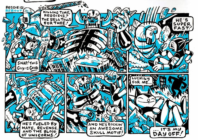
 
Brian Ralph, Reggie-12 page 12, bottom half

Reggie 12 is a robot in the mode of Astro-Boy. The strips poke gentle all-ages fun at the conventions of classic manga (as well as American comics). Most of these strips originally ran in the magazine Giant Robot, which itself was full of ironic appreciation for Japanese pop culture.

 
Brian Ralph, Reggie-12 page 40

Ralph playfully inverts the cliches of the comics he bases Reggie 12 on. But love for the originals comes through. Parody can be a critique of the source or an homage (and often a combination of the two). Reggie 12 veers closer to the homage end of the spectrum.


Brian Ralph, Reggie-12 page 4, top half

Often he includes homages to other comics. The maple syrup monster Landark appears to be a kind of tribute to the comics of his Fort Thunder compatriot Mat Brinkman.


Brian Ralph, Reggie-12 page 16

And the "Space Gods" above are a deliberate reference to Jack Kirby's 70s comic, The Eternals. Reggie 12 must fight against Jemiah the Analyzer, which is the actual name of a Celestial (the giant space gods in The Eternals). It doesn't go well for Jemiah.

  
Brian Ralph, Reggie-12 page 18

These comics are dynamic, clever and funny. They are quite a long way from Drawn & Quarterly's realistic roots and are therefore a good example of how the company has grown and evolved over the years.


Share

Pan Recommends for the week of November 14 to November 20

$
0
0
Robert Boyd

After last week's movie madness, this week is a bit slow in comparison. It's a good weekend to catch up on art you might have missed--or just go bowling.

THURSDAY

 
This bacon bank was in last year's Annual Student Art Show

Annual Student Art Show at the College of the Mainland Art Gallery, 6:30–8:30 pm. If you happen to live or work anywhere between Friendswood and Galveston, consider making a stop here and seeing what student artists are doing.


Chris Cascio: Color Sickness at the EMERGEncy Room Gallery, 7–9 pm. I believe that this show will be very scarf oriented, if scarfs are your thing. Otherwise, just come see it because Chris Cascio rocks. (And to change the subject, The Emergency Room needs its own website--the Rice Visual and Dramatic Arts website is more boring than the DPS's!)


Henry Kaiser, Undersea Video from Antarctica + guitar at 14 Pews, 7 pm Thursday and Friday. Kaiser is an underwater videographer for the U.S. Antarctic Program as well as a musician. He will be accompanied by Damon Smith, Sandy Ewen, David Dove and others.

FRIDAY


Tara Locklear, Unbridled Royalty Necklace, 2011. Cement, reclaimed glass, sterling silver

Detritusfeaturing Kat Cole, Laritza Garcia, Tara Locklear and Chesley Williams  at the Houston Center for Contemporary Craft, 5:30–7 pm. This is a show of mostly jewelry. The work all incorporates some element of discarded found material.

SATURDAY

 
Rahul Mitra, Sex and the City

A Conversation: Rahul Mitra and Catherine Ansponat Hooks-Epstein Galleries. The prolific Mitra discusses his work, which is currently on view in his solo exhibit Race, Religion, Politics, Art and Sex at the end of the world.


UP Art Studio Celebrates One-Year Anniversary: Still Up Yoursfeaturing art by Sebastien "Mr. D." Boileau (Houston/France), 2:12 (Houston), Burn353 (Springfield, IL), Cujo RK (Chicago), Cutthroat (Houston), Diff (England), Dual (Houston), El Pez (Barcelona, Spain), Gape RK (Chicago), Gear (Houston), JPS (Bristol, England), Lee Washington (Houston), Mason Storm (England), Poem FX (NYC), Devo (Tuscon, AZ/Houston), Santiago Paez (Houston), Statik RK (Chicago), Z.A. Casto (Houston), Zen Full (Houston) and Zink520 X-Men at UP Art Studio,  1–10 pm. The international street art community comes together to celebrate one year of UP Art Studio.


an example of work by Kudditji Kngwarreye, My Country, synthetic polymer paint on canvas 122.0 x 120.0 cm 

Kudditji Kngwarreye: Landscapes in the Family Tradition at Booker-Lowe Gallery, 3–5 pm . Kudditji Kngwarreye paints Hans Hoffman-esque abstractions.


Share

Notes on Robert Motherwell

$
0
0
Virginia Billeaud Anderson

The beauty of the image McClain Gallery sent to announce its Robert Motherwell: Four Decades of Collage exhibition, which runs through November 16, inspired some brief notes on Motherwell.


Robert Motherwell, Arches Cover, 1976, Acrylic, paper, printed paper and packing tape collage on canvas board, 40 x 30 inches

Encouraged by Peggy Guggenheim to explore the medium, Motherwell began working with collage in 1943, and in that year Guggenheim included him in an exhibition with works by Ernst, Schwitters, Picasso and other important collage artists. “It was here that I found …my identity,” Motherwell said in a 1971 interview.1 Not long after Guggenheim gave him his first solo exhibition, which did not stop him from complaining about the poor quality of Peggy’s liquor according to Jacqueline Bograd Weld’s biography of Peggy Guggenheim.

“You know, I taught them about Stravinsky, about Picasso, about Joyce, about Mondrian, about the Surrealists, about the Dadaists, about Whistler, about John Marin, about Eakins, about I don't know what, to give them the sense that they were living in the midst of one of the most absorbing moments in the history of human culture and it would be fascinating to be aware of it and participate in it and follow it all one's life,” Motherwell said in a discussion about teaching studio art in a university environment. We might glean from his words that his teaching style valued convergences of literature, history and art-history. And if you doubt such an intellectual inclination adds depth to art, try to imagine Picasso perfecting early Cubist fracturing and fragmentation without knowing the writing of Joyce. Motherwell called his own education a “civilized, marvelous education!”

Motherwell was a painter who held a doctorate in Philosophy, was steeped in French Symbolist poetry, and considered himself an “expert” on Delacroix in the Baudelarian vein. Unsurprising he chose Frank O’Hara to organize his MOMA exhibition. He believed that with a poet he had a better chance of “the most radiant” works being shown. His series titled after the Spanish civil war, which reached pure beauty with large oval and rectangular shapes, evolved from scholarly purposeful study, just as the many artworks inspired by music point to his knowledge of it.

The guy worshipped Matisse. “Matisse moves me more than any other twentieth-century painter,” Motherwell said. He considered Matisse who wrote “beautiful blues, reds, yellows stir the sensual depths in men", to be the greatest colorist of the modern era. Here’s an interesting aside: Matisse scholar Jack Flam is President and CEO of the Dedalus Foundation which owns Motherwell’s works and writings. Flam co-authored the 2012 Robert Motherwell Paintings and Collages: A Catalogue Raisonne, 1941-1991. As I write this my bottom’s rocking because I’m having a memory of Professor Flam telling us many years ago about revisions to his volume of Matisse’s writings.

“Collage,” Motherwell said in 1944, is “the greatest of our [art] discoveries.” This confident assertion appeared in the New York Guggenheim Museum’s press release for Robert Motherwell: Early Collages, which opened in September after its run at the Peggy Guggenheim Collection in Venice. Walter Robinson’s slightly more informative catalogue essay statement published by McClain Gallery was that Motherwell believed his major contribution to collage was the extensive use of torn edges rather than clean-cut ones, which contributed another layer of the emotional density the artist typically sought in his work.

Collage made up a large part of Motherwell’s output, and he approached the medium through automatism, allowing the unconscious mind to guide his hand, the result being spontaneity and meaningfulness. And because he was so heavily published, Motherwell became rather self-important about his role in transmitting this Surrealist guiding principle to Americans ignorant of European art.

An elevated appreciation of avant-gardism did not diminish his intolerance for those who dared to challenge tradition. Most of you know the story. Motherwell, Adolph Gottlieb, Mark Rothko and other Abstract Expressionists got pissy about assaults to aesthetic standards from Pop art and artists such as Johns and Rauschenberg. How could such garbage be shown? So in 1962 when the Sidney Janis Gallery mounted the “New Realists” show, its seminal Pop Art exhibition, Motherwell, along with Philip Guston, Gottlieb and Rothko resigned from the gallery in protest. In Robert Rosenblum’s recounting, the old guard viewed Lichtenstein as the devil incarnate. “Olympian” was the term Rosenblum used to describe the outraged Motherwell.

I remain fascinated by the art market. How can one not be when only about ten minutes ago a work by Francis Bacon sold at Christies for the unfathomable price of $142 million? Here’s what I learned recently about art commercialism. Research indicated the collage Arches Cover which inspired these notes on Motherwell sold at Christies in 2011. I asked McClain Gallery’s Erin Siudzinski (who is always gracious and helpful when I bother her) if McClain was the 2011 purchaser, or if that purchaser was trying to flip the collage, which is so interesting.

Siudzinski replied:
Thanks for your note and in advance for coverage of the Motherwell exhibition at McClain Gallery. To organize an exhibition of this scope, covering 40 years, requires extensive efforts to find available and suitable works through private collections, auctions, and from dealers and museums. Fortunately we were able to find lenders for this exhibition who were also willing to offer the consigned works for sale.

So, in short, your research is correct, several of the pieces in the exhibition were purchased at some point by auction and of course, by nature of the historic material (and work by an artist who has been deceased for over 20 years) many works have changed several hands over the years.

We have full provenance documents for every piece in the gallery, along with documentation from the catalogue raisonné on hand. The gallery does not personally own Arches Cover; we carefully selected each piece in the exhibition to complement a range of Motherwell's work from the mid-1960s to his death in 1991.
I think I learned from Erin that galleries are quite curatorial when organizing a show of this type, and that collectors are willing to flip works such as this one, for the right price.


1. Direct quotes of Motherwell were taken from Oral history interview with Robert Motherwell, 1971 Nov. 24-1974 May 1, Archives of American Art, Smithsonian Institution. Interview, by Paul Cummings.


Share

The Wacky, Wacky World of Ad Reinhardt

$
0
0
Robert Boyd


There's a big Ad Reinhardt show not at a museum, but at the David Zwirmer Gallery. And it looks fantastic, as you can see from the Robert Storr guided tour above. I wish I could see it, but I have ordered the accompanying book How to Look: Ad Reinhardt Art Comics with text by Storr. I might have more to say about Reinhardt after I read the book, but I wanted to show a couple of his cartoons. All of these are from "The Semi-Secret History of Modernism's Best Comic Artist" by Robin Cembalist from this month's ARTnews. (George Herriman is unquestionably Modernism's best comics artist, but that little disagreement is no reason not to read the article.) Reinhardt, it turns out, was a really good cartoonist, but he often avoided drawing and used collage. As the article states, "The master of the iconic, reductive Black Paintings was a virtuoso of white-out fluid, paste-up, and Photostats."

The funny thing is that Reinhardt seemed like such a puritan when it came to painting. He had a theory, expressed in such gnomic tautologies as "Art is art-as-art. Everything else is everything else", that lead inexorably towards his own highly reductive paintings. And at the same time, he had this wacky side to him as a professional cartoonist.


This is perhaps his best known cartoon. He did two versions of it--this one from ARTnews in 1961, and an earlier one for the left wing daily newspaper P.M. (where he worked) in 1946. Storr points out how many of the names are pretty much unfamiliar to us now. I always find that to be true when I look at old art magazines. I think there is a class of curators who pour through those old magazines to see if there is anyone who's reputation can be rehabilitated.


This text-heavy piece was part of his "how to look" series, which ran mostly in P.M. (P.M. deserves its own book--Theodore Geisel (better known as Dr. Seuss) did some 400 cartoons for them and Crocket Johnson'sBarnaby debuted there. ) And Reinhardt didn't just do cartoons about art--he also did lots of political cartoons. He reconciled the severe minimalist painter and theoretician of art side of himself with the wacky (but intellectual) cartoonist side, I'm not sure. All I know is that if you knew him just by his funereal black paintings, you would never guess that he had also authored hundreds of cartoons.


Share

Carpet Mannequins Vaginas Oh My! The Experimental Films of Scott Stark (NSFW)

$
0
0
Betsy Huete

This past Sunday at the Houston Cinema Arts Festival, experimental Austin filmmaker Scott Stark showed several of his films at Cinema 16. It was essentially a chronological display, culminating in his most recent effort, The Realist (2013). Although varying widely in subject matter, there seemed to be an obvious stylistic thread between all of them, which was a flicker created by stereophotography. Stark presented to the audience a rather unsophisticated wooden contraption that nevertheless effectively held two cameras with the intention of taking shots simulating the slightly alternate perceptions naturally occurring in human vision. Coined by him as existing in 2.5 dimensions, the films take a shockingly flat yet layered quality, an aesthetic that becomes obviously more sophisticated and mastered over time. This technique coupled with his penchant for the kind of flickering that is variously nauseating and mesmerizing quickly leads to a set of short films that at once heighten reality, induce seizures, and are really, really weird.

Oddly enough, the film that shares the least in common with Stark’s signature style may also be the most impactful: Hotel Cartograph (1983). It is a banal, droning 16mm film of carpet in a San Francisco Hilton. That’s it. While at first begging to be cast off as an annoying and expected trope of avant garde cinema, it steadily transforms the viewers’ experience from frustration and tedium to what critic Michael Sicinski describes in the post Q&A as “Carpet Land.” Stark requires us to study and attend to the formal qualities of architecture that we routinely dismiss, that we quite literally walk all over. Here Stark makes no illusions: he’s simply walking around with a cart, staring at the floor, and he wants us to know it. Yet it somehow feels transformative, surreal, and with its dim hallway lighting, even a bit sinister.


Scott Stark. Hotel Cartograph (film still). 1983. 18mm film. 11 minutes. Taken from hi-beam.net.

Hotel Cartograph, while stylistically so divergent from his other films, retrospectively makes sense as a precursor to his other work. Stark expresses continuity through intense focus and scrutiny upon one object, or set of objects. But while he traverses the camera through a static object or hallway in his very early films, the focus becomes inverted later on as he uses the flicker to mutate a static shot. This is most epically represented by Speechless (2008), where Stark alternates flickering shots of landscape photography with extreme close-ups of clitorises. Once again, the viewer braces, fighting back the urge to roll her eyes at what at first seems to be an obvious and pathetic pandering to shock value. But within the first few minutes, it becomes clear that the flickering lends evocative formal qualities to such overbearing imagery. The vulvae seem to ecstatically vibrate, as if they are cyclically birthing themselves. It’s the type of movement that commands and defies meaning, vacillating between anatomy, pornography, and sincere, caring investigation. The visual linkage between the vagina and vaginally reminiscent landforms is heavy-handed. But the connection of biology, fertility, and sexuality to earth nevertheless asks interesting questions and implores the viewer to consider what, whom, and how we are rendered speechless.


Scott Stark, from Speechless, 2008, 16mm film, color, sound, 13 mins. Sound by Greg Headley.

The series ends with The Realist, an 81 minute film combining flickering and stereophotography, and it is clear by now that Stark has become a master of his own aesthetic. Filmed mostly within the confines of a department store, sharp vibrating, tight cropping, and rabid bursts of color immerse the viewer in nearly overwhelming propensity. She feels whisked into and paralyzed by a violent dance of inanimate objects. It becomes a surreal interior space occupied by commodities almost forced to life against their will. Paired up with a looping, melodramatic, and even humorous soundtrack by Daniel Goode, the film’s cadence lends to a simultaneously scary, funny, and critical narrative, even with its heavy abstraction. Unfortunately, Stark seems to display a crisis in confidence with The Realist’s already strong implicit narrative, overlaying it with a silly and tragically dumb love affair gone wrong between mannequins, culminating in the lead getting splattered in red watercolor paint that’s intended to read as “blood.”

 
The Realist (preview) from Scott Stark on Vimeo.

The enormous benefit to an event like the Houston Cinema Arts Festival is that we are provided access to a wide array of filmmakers, including exciting experimental work like that of Scott Stark’s. Hopefully HCAF and Stark will continue to bring this kind of challenging work to Houston.

Share

Invisible Cities

$
0
0
Robert Boyd

Rahul Mitra's exhibit at Hooks Epstein Gallery has a ponderous title: Race, Religion, Politics, Art and Sex at the end of the world. It's ambitious, I'll give it that. But no art exhibit could quite live up to that title. The work in this show is from 2001 to 2013. This time period has been a busy one from Mitra. In particular, his Box City installations have been created in Italy, in Oklahoma, and here at Lawndale Art Center last March.

CargoSpace: Mitra + Anguilu from AHHA TULSA on Vimeo.

This installation changes from place to place--it's created from scratch using local materials (corrugated cardboard boxes and in the case of the Lawndale installation, wooden wine crates) sometimes in collaboration with other artists.


Rahul Mitra, Box City, 2013, installation with wine boxes


Rahul Mitra, Box City, 2013, installation with wine boxes

The reference is to the vernacular architecture of favelas and shanty towns--places where the very poor build their own homes from recycled material--cardboard, plywood, sheet metal, plastic sheeting, etc. Because of the steep hillsides in Rio, its favelas often take on an appearance that Mitra's installations resemble. They look like stacks of random boxes. And I think this precarious stacking in Mitra's work is meant also to contrast with the perfect verticality of skyscrapers--designed by architects, built by skilled builders, paid for by official institutions, whether private or public or some combination, projecting an image of wealth and solidity. A Box City, by contrast, could be washed away in a heavy rain. Skyscrapers imply permanence. Shanty towns are provisional. Their dwellers don't possess title to the land they live on. At any time, men with writs and bulldozers can come, and the residents will have to get up and build new provisional shelters elsewhere. To paraphrase Anatole France, the law, in its majestic equality, forbids the rich as well as the poor to build houses on land to which they don't have title.


Rahul Mitra, Invisible City, 2013, ink and marker on handmade paper, 29 1/2 X 22 1/4 inches

The show at Hooks Epstein contains mostly drawings and paintings. Some, like Invisible City, are directly related to the Box City installations. These cities are invisible because we don't want to see them. (Of course, when I first heard the phrase "invisible cities," I thought of the poetic cities that Marco Polo describes to Kubla Khan in Italo Calvino's Invisible Cities. And Mitra's cities are fantastic and poetic in their way. He's not a documentarian, after all. But I don't think you can go too far with this connection.)


Rahul Mitra, Invisible Cities 2, 2013, acrylic and cardboard on paper, 30 X 22 1/2 inches


Rahul Mitra, Invisible Cities 1, 2013, acrylic and cardboard on paper, 30 X 22 1/2 inches

In the two cardboard collage versions of Invisible Cities, Mitra gives us the strongest link between his installation work and his more traditional wall pieces. These may be my favorite pieces from the exhibit (although it's hard to choose!). With the smallest number of elements and the cheapest material imaginable, Mitra has created objects of formal beauty that also manage to embody his idea of the invisible cities where the wretched of the Earth reside.


Rahul Mitra, Sex and the City, 2013, painted box construction, 80 x 34 x 32 inches

In the center of the gallery, Mitra has installed a Box City installation called Sex and the City. As usual, each of the boxes that forms the installation is painted with iconic images, most of which don't have obvious meanings. But this particular piece features a lot of images of women--particularly a thin woman with long hair,  standing contrapasto, with one fist raised. Sometimes she is nude, sometimes she wears a miniskirt.


Rahul Mitra, Sex and the City detail, 2013, painted box construction, 80 x 34 x 32 inches

Mitra is identifying "sex" with heterosexual male desire. But the Box Cities have a political element, and the women on Sex in the City are depicted (sometimes) as protesters or revolutionaries. It's a contradictory mix--sex object and committed revolutionary. It reminds me of the quandary in the late 60s of  Playboy magazine, which was liberal and sympathetic to the protest movements of the time, but still basically trafficked in a hedonistic lifestyle and female sex objects. So it ended up with hilariously contradictory images like this:


Playboy, September 1969

So my question as a viewer is this--is Mitra trying to have it both ways? Or is he satirizing having it both ways? Or is it a weird combination of both? There are precedents--when Robert Crumb drew "Lenore Goldberg and Her Girl Commandoes" (1969), he was drawing the Amazonian women he was attracted to and making fun of the women's liberation movement--and yet, he is obviously sympathetic to them. For example, he depicts their enemies as evil, sexist idiots.


Rahul Mitra, Sex and the City detail, 2013, painted box construction, 80 x 34 x 32 inches

Some of the images on Sex and the City dispense with the revolutionary aspect altogether. Perhaps the way to read this is that Mitra is not exempting himself from sexism, so even when he wants to include women as part of political action implicit in the Box Cities and Invisible Cities, he won't pretend to see them purely as comrades. He can't turn his "male gaze" off.


Rahul Mitra, Pruitt Summons Truth, 2013, acrylic on canvas, 48 x 48 inches

Two of the pieces depict other artists. In Pruitt Summons Truth, artist Robert Pruitt stands with arms raised on the right. Triangular rays emanate from his head towards the sky. He is in a bleak landscape with a low horizon--I was reminded equally of De Chirico and Tanguy. The mysterious figures amplify the De Chirico feeling. And looming ominously is a ghostly version of Tatlin's Monument to the Third International. The forced perspective and inexplicable elements suggest dream images, and that suggests surrealism.


Rahul Mitra, Trenton Fights Fate, 2013, acrylic on canvas, 40 x 48 inches

That surreal feeling of a strange blank landscape littered with inexplicable objects and figures is also present in  Trenton Fights Fate. I assume that "Trenton" is Trenton Doyle Hancock. Mitra depicts him action, about to assault a strange menacing figure with a hand for a head (an a single eye in the hand), holding a decapitated head in his right hand.


Rahul Mitra, Trenton Fights Fate detail, 2013, acrylic on canvas, 40 x 48 inches

Get 'im, Trenton!

Race, Religion, Politics, Art and Sex at the end of the world runs at Hooks-Epstein through November 27. Mitra will have a public conversation with Catherine Anspon today, November 16, at 2:30 pm. (Seating will be limited.)


Share

Report from the Golden Age of Art Comics: Jim Woodring, Gilbert Hernandez and 40 Years of Minicomics

$
0
0
Robert Boyd

Continuing my survey of current comics I've read, here are a bunch of comics published by Fantagraphics. As I've written before, I was an editor for Fantagraphics in the early 90s. I started with them when they moved from Los Angeles (the Simi Valley, actually) to Seattle in 1989. This move, weirdly enough, resulted in a huge windfall for them. They sold a house that they owned in Agoura Hills and bought two houses in Seattle! Co-publisher Kim Thompson told me that the company made more profit from that one deal than they had made since they began publishing.

But life with a small-press alternative publisher is always a bit precarious. Fantagraphics has gone through several serious, company-threatening crises. Shortly after the move to Seattle, the dire implications of the "black and white bust" of 1987 caught up with them. Great titles that had sold very well just a year or so earlier fell off precipitously. That's when they started Eros Comix (taking a page from Barney Rossett and Grove Press--publishing smut to finance art) as well as when they ramped up their catalog sales.

I realize this company history is probably a bit dull (don't worry, I discuss actual comics below). The only reason I mention it is that the death of co-founder Kim Thompson has created another crisis situation for the company. So they are running a Kickstarter campaign to pay for their spring season (book publishing is organized into two "seasons" for some reason). When I started writing this post on November 6, they were $73,000 into their campaign for $150,000. By November 12, they had raised the entire amount. (That said, they still have some good premiums and can use the extra money if you find yourself with an urge to spend some mad money between now and December 5.)


I think Kickstarter is a great tool for publishers, whether self-publishers or small presses like Fantagraphics. The reason is that they essentially act as catalogs for future books--your "donation" is really just an payment for a book that will be published and sent to you later. (For this one, I ordered a boxed set of the complete run of Eightball by Daniel Clowes.)

I don't want to belabor this. Instead, let's look at a few more-or-less recent Fantagraphics books.


Problematic: Sketchbook Drawings 2004-2012 by Jim Woodring (Fantagraphics Books, 2012). It's impossible for me to be objective about Jim Woodring. For one thing, I've known him ever since he and his family moved to Seattle when I was living there and working for his publisher. Then in 2011, I curated an exhibit at Lawndale of work by Jim Woodring and Marc Bell. Problematic is a collection of work from Woodring's sketchbook. The sketchbook is a key locus of creativity for many cartoonists, most notably Robert Crumb and Chris Ware, who have had pages from the sketchbooks printed in handsome volumes. Unfortunately, their example can be intimidating for other cartoonists. They want to create sketchbooks as fully realized as Crumb's and Ware's. Woodring writes in the introduction:
I would buy a big, beautiful new blank book with the determination to fill it cover-to-cover with the best work of which I was capable. [...] Instead, I would fill the first twenty pages or so with stiff, sterile, overworked displays of autodidactic lug-muscle. These would be followed by desperate attempts to loosen up, resulting in eyesores so hideous that I would declare the book ruined and throw it away.
It was the discovery of small Moleskine notebooks that allowed him to embrace sketchbook life. The Moleskine notebooks are small enough that he can hold it in his hand as he draws. The beige paper preempts the desire to use white-out to cover his mistakes.  As a consequence, the work is fresh and spontaneous.


Some, like this one, are drawings from his mundane existence, pretty much realistic. Of course, he embraces some things that the rest of us might recoil from. (I was pleased to see that one of the "realistic" drawings he did was of a nut on the street in Houston from his time here.)


But most of the drawings are along these lines--fantastic, bizarre, highly imaginative.

You flip through this small but thick book having your mind repeatedly blown by Woodring's fecund imagination and astonishing drawing prowess. These drawings are blown up to 140% of their original size, which is astonishing. Most illustrators will tell you that shrinking a drawing is preferable because it covers up a lot of little mistakes. Conversely, blowing it up amplifies its imperfections. So for an artist to deliberately blow up his work implies one of two things. First, that the artist has no ego. He doesn't care if you see his mistakes. The other possibility is that the artist knows he is the shit and that his drawings will look excellent even when blown up. Curiously, Woodring may possess both of these seemingly contradictory qualities.


Fran by Jim Woodring (Fantagraphics Books, 2013). According to the flap copy, this book can either be read before Congress of the Animals, after Congress of Animals, or as a stand-alone story. In Congress of Animals, Woodring's protagonist, the odd cat-like "funny animal" character Frank leaves his hitherto self-contained world, the Unifactor, and meets Fran. Although the characters Fank and Fran seem sexless, we can call Frank a male and Fran a female based on their names alone. But they are also very similar (as are their names). Fran has a slightly different head than Frank (longer ears) and her body is subtly different.

Fran finds them in wedded bliss. One day a hideous creature steals an object of Frank's. Frank chases him, kills him, and discovers that the creature had a hoard of stolen objects. Frank and Fran examine the haul and discover amongst the varied items a projector. The projector works by having the user wear it on one's head. Then it shows what's happened to the wearer in reverse chronological order.


Jim Woodring, Fran page 24

Fran however is unwilling to try it (presumably because she'd like to keep her past secret) and in her anger breaks the machine. Frank is extremely angry with her and Fran runs away. I won't say any more about the story--you'll have to read it yourself.

Like all Frank stories, this one has a lot of mysterious, fantastic events. They are compelling in the same way Dr. Seuss books are compelling. I want to read this over and over as much as I wanted to read Happy Birthday to You! over and over when I was 8. Woodring's way of drawing the fantastic is so beautiful and compelling--his work is a strong argument for high craft in comics.
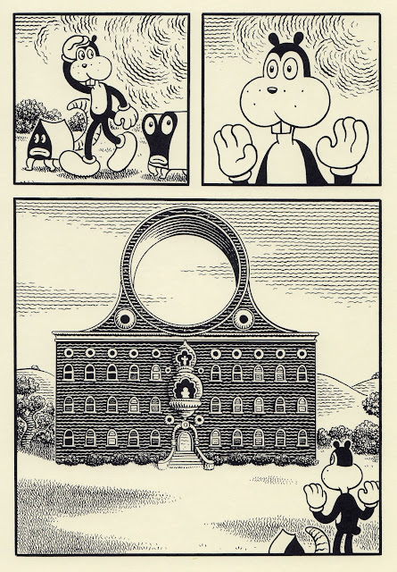

Jim Woodring, Fran page 73

I mean, look at page 73 when Frank's rocket crashes into a moon. Wow.


Jim Woodring, Fran page 75

And one other thing I want to mention about Fran and all of the Frank stories. Woodring is a great designer and architect.  I would love to see actual furniture (and even actual buildings, like the one on page 75) constructed out of Woodring's imagined furniture and buildings. They're fanciful, sure, but otherwise seem solid and more-or-less plausible. Maybe if I win the lottery, I'll build "Woodringland." Until then, I'll have to be satisfied with his beautiful books.


The Children of Palomar by Gilbert Hernandez (Fantagraphics Books, 2013). Gilbert Hernandez has been publishing work with Fantagraphics since the early 80s. He and brothers Jaime and Mario created the magazine Love & Rockets, one of the finest and most artistically significant comics of the past 50 years. Hernandez's best work is based around the inhabitants of a small Central American town called Palomar. The Children of Palomar returns to this setting. It's composed of four related stories. Back in the 80s and 90s, they probably would have been published in four consecutive issues of Love & Rockets. But these were originally published in  an Italian co-publication with Coconino Press, which says something about the creative ways independent publishers like Fantagraphics must employ to finance projects.


Gilbert Hernandez, The Children of Palomar page 5

The original title of the Coconino Press/Fantagraphics copublication was New Tales of Old Palomar, which is very apt. Hernandez is taking the chronology of Palomar that he has already established in many, many stories from Love & Rockets and shoe-horning new events, some of which fill in gaps that had only been implied in earlier stories. For instance, the two swift-moving thieves on page five are the sisters Tonantzin and Diana.


Gilbert Hernandez, The Children of Palomar page17, panel 1

Tonantzin and Diana will become very consequential characters in the Palomar stories, but their introduction to the town had never been depicted until now.


Gilbert Hernandez, The Children of Palomar page 72

In the third story of the collection, Tonantzin is older (a young teenager, I'd judge) and an accepted member of the community. She sees a strange baby who speaks to her. This is a device Hernandez has used before--the vision that only certain people can see but that other people accept as real. See for example the classic story "Sopa de Gran Pena" from 1983. It's because of touches like these that Gilbert Hernandez's work has been called magic realism. Obviously this is characteristic of many Latin American writers from "el boom", but the writer Hernandez reminds me of is Nigerian writer Ben Okri, the author of The Famished Road, whose characters live simultaneously in the quotidian world and a supernatural world that is overlaid on ordinary existence. Tonantzin can see the baby, the "Blooter," because the Blooter is trying to communicate to her. But other people know the Blooter exists, even if they can't perceive it.

Hernandez was born and raised in the United States and has stated that the Palomar stories originally came from stories told him by older relatives about Mexico. But the supernatural or magical elements don't seem "authentic"--they seem more like things that Hernandez has made up. After all, he didn't grow up in an isolated village in Central America, nor is he an anthropologist who has studied the rituals and beliefs of other cultures. What he has done is to imagine a supernatural existence in Palomar that exists simultaneously over the mundane rational world. This overlayed supernatural world is half folkloric and half science fictional, which reflects Hernandez's own cultural background.


Gilbert Hernandez, The Children of Palomar page 72, panel 2

This can be seen in the home of the bruja that Tonantzin visits on page 72. Tonantzin is trying to get the Blooter to leave her alone and is asking for magical help. The bruja's home has a large circular window. Hernandez grew up reading American comics. That window is a visual quotation fromDr. Strange, the supernatural title created by Steve Ditko and Stan Lee in the 60s.


Frank Brunner, commissioned drawing of Dr. Strange and Clea, 2002

Here is an example of the window drawn by artist Frank Brunner, who drew Dr. Strange during a memorable run in the mid-70s. Dr. Strange allowed artists like Ditko and Brunner to go wild visually, but their stories were always fundamentally pulp stories--good versus evil in a magical setting. In Hernandez's Children of Palomar, the magical stuff is simply an aspect of reality, to be dealt with like any other aspect of reality. It's there to be endured and enjoyed.


Treasury Of Mini Comics Volume One edited by Michael Dowers (Fantagraphics Books, 2013). Three years ago, Fantagraphics published an 892-page brick of a book called Newave!: The Underground Mini Comix of the 1980s (848 pages) I guess enough people liked this super-obscure corner of comics history that they put out a second book, which by being subtitled "Volume One" implies future volumes as well.
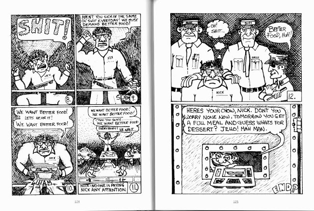
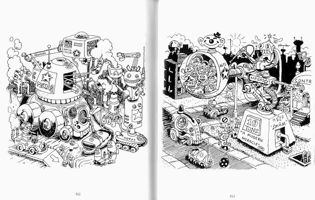
The first thing you notice about this book (and its precursor) is the diminutive trim size--4 3/4 by 6 inches. There is a historical reason for this size--it is very close to the size of many 8-page mini-comics over the past few decades. Here's how it worked. You drew your comic and then pasted it down onto two 8 1/2 x 11 boards, four pages of the comic on each. You photocopied them onto both sides of a piece of 8 1/2 x 11 inches copy paper. You fold this over once, then once more until you have basically a 4 1/4 x 5 1/2 inch booklet. You trim it and staple it, and for the cost of one double sided copy and two stapes (one if you're being thrifty), you have yourself a sweet little comic book.

What this book demonstrates is that from the late 60s almost to the present, this has been a popular way for people to do self-published minicomics. Dowers had lots to chose from to fill this volume. In 1992, I started writing a column for The Comics Journal called "Minimalism" that was devoted to minicomics. I wrote it through 1996, after which point it was taken over by Tom Spurgeon and other writers. In my experience looking at hundreds of minicomics, they came in all shapes and sizes. The 4 1/4 x 5 1/2 inch 8-pager was common, but I don't think it made up the majority of published minicomics. I mention this because it shows how much is left out of Treasury of Mini Comics and Newave!, despite the fact that they collectively have 1700-odd pages. The amount of utterly ephemeral self-published material that falls into the general category of "mini comics" is immense, and because of its underground existence, it will never be fully catalogued (even though there are some large collections--for example, the one at Washington State University at Pullman.)


Matt Feazell, Cynicalman Meets the Boss pages 4 and 5, 1994

The work in Treasury of Mini Comics is presented more-or-less chronologically, starting with comics by Leonard Rifas and Justin Green from 1969 and 1972 respectively. Then there is a long section of the cartoonists who were active in the 80s, like Matt Feazell. Feazell is particularly important because he created a style that was extremely well-suited to the format he published the work in. By using stick figures, he was able to cram a huge amount of content into each page. And he decisively demonstrates how expressive such seemingly limited drawing can be. This is a model for many of the best minicomics in this volume.


Macedonio Manuel Garcia, Tales From the Inside #3 pages 6 and 7, 1982

Another important aspect of minicomics is that they gave voice to people who way outside mainstream culture. Colin Upton has produced hundreds of pages of droll, whimsical, revealing comics while living an extremely modest life on disability payments in Vancouver, Canada. And then there is Macedonio Manuel Garcia (above) who did comics while serving time at the Ramsey Unit prison. Considering that the average alternative comics artist is white middle-class 20-something hipster, minicomics offer a little variety.


Marc Bell and Rupert Bottenberg, Arbeitees: Einer Industrium Dokument den Marc Bell ut Rupert Dottenberg pages 4 and 5, 1996


Fiona Smyth, At Monastiraki pages 2 and 3, 2008


Peter Thompson, I'm the Devil pages 4 and 5, 2007

Unless you draw very small and very clean, the 8-pager format doesn't lend itself to ordinary comics narratives. It's not uncommon for minicomics to be just a series of full-page drawings around a theme or idea. A bunch of the work in this volume falls into that category, such as the ones above by Marc Bell, Peter Thompson and Fiona Smyth. I tend to like this kind of work a lot--it seems very appropriate for the tiny format. Otherwise, you have to force yourself to draw in a minimal style.


Carrie McNinch, You Don't Get There From Here #11 pages 14 and 15, 2008-09

But as I've stated in regard to Matt Feazell, minimalism works for some artists like Carrie McNinch, who not only manages to put an exceptional amount of personal detail in her diary comics, but also provides a sound-track.


Ron Regé, Jr., Yeast Hoist #6 pages 10 and 11, 1997

One of the wonderful things about a book like this it shows you work of artists who later achieved acclaim (at least in the small pond of art comics) before many people knew about their work. Ron Regé, Jr. is one example (he also drew the cover). In addition to the artists already mentioned, this book has work by Esther Pearl Watson, John Porcellino, J. Bradley Johnson, Molly Kiely and others whose work is now well-known and highly respected. Aspiring cartoonists take heed. If no one wants to publish your work, publish it yourself on the cheap.

Treasury of Mini Comics volume 1 is a meaty, entertaining volume.

Share

Tales of the Unexpected: The Katy Contemporary Arts Museum

$
0
0
Robert Boyd


The Katy Contemporary Art Museum

Visual art in Houston is an inside-the-Loop affair. This isn't just snobbery talking here. When you think in terms of art places--museums, galleries, public art, etc.--they are mostly inside the 610 Loop. The further out into the suburbs you go, the less art there is. Look at the map. Consequently, I think it's really important when a new art space opens up outside the Loop.

The west side of Houston has slowly been gathering steam in terms of art. HBU has their contemporary art gallery, currently showing a terrific Perry House exhibit. (Unfortunately, they seem unable to update their website.) WOAH in West Oaks Mall hasn't quite lived up to its potential, but now that it is home of the Katy Visual and Performing Arts Center, it may blossom. And as of two months ago, Katy has a contemporary art museum.


The Katy Contemporary Art Museum Ibsen Estrada exhibit

The current exhibit has the unfortunate title of Primitive or Is It? Neither of the two abstract artists on display are in any way "primitive," which as a category of art should have been retired after Thomas McEvilley's 1984 evisceration of MOMA's 'Primitivism' in Twentieth Century Art: Affinity of the Tribal and the Modern. The art is by Dallas artist John Irazarry and Houston artist Ibsen Espada. I wasn't all that impressed with Irazarry's work, but I've long been a fan of Espada's paintings.


Ibsen Espada, Harpoon, 2000, polymer and tempura mounted on canvas, 74 x 75 inches

In addition to large paintings like Harpoon, the show included a lot of intriguing works on paper by Espada. Espada will speak with director Ana Villaronga-Roman at KCAM on December 5.

KCAM bought some of Espada's work for its permanent collection. You heard right--they're going to have a permanent collection. I asked where they would hang it and was told that the plan is to expand the facility for it in the future. It's ambitious, that's for sure. But for now they have a Kunsthalle-type space in an older lumber company's building, which seems just right for an art space.

This exhibit goes through January, and will be followed by a sculpture show and then by a photography show. KCAM also offers photography classes, which I think will help it engage with a community that probably doesn't know all that much about art, but is willing to learn.

They talk about "food deserts," areas of town where it is very difficult to get fresh healthy food. Houston and vicinity also has "art deserts", where it is very difficult to see visual art. Katy used to be one of those places. That's why I think KCAM is so important. Right now it's taking baby steps--I look forward to seeing where it goes from here.


Share

Fair Play at Gallery Longnecker

$
0
0
Robert Boyd

Fair Play at Gallery Longnecker is an odd grouping of artworks. There are installations which are quite conceptual and there are pieces that are examples of old-fashioned artistic technique. This dichotomy reflects a major dividing line in art for the past 40 years. Of course calling it a dichotomy simplifies the issue. There is plenty of art that straddle these two camps. But in Fair Play the gulf is pretty broad.

The unifying principle of the show is ethnicity. The gallery webpage says:
Postracialism, affirmative action, and immigration reform continue to be major points of contention in the political and social arena. The eight artists represented in Fair Play are a selection of emerging and mid-career Chicano and Mexican artists. They have inherited the social awareness of their forebears, but have realized that the conversation is now much more nuanced.
This struck me as a little odd to be happening at this particular moment. Just under a month ago, Adrian Piper pulled her work from Radical Presence: Black Performance in Contemporary Art, which had run at the CAMH initially and is now up at NYU's Grey Art Gallery. Piper wrote in a letter to curator Valerie Cassel Oliver, "Perhaps a more effective way to ‘celebrate [me], [my] work and [my] contributions to not only the art world at large, but also a generation of black artists working in performance,’ might be to curate multi-ethnic exhibitions that give American audiences the rare opportunity to measure directly the groundbreaking achievements of African American artists against those of their peers in ‘the art world at large.’" (This led Hyperallergic to include "Identity Politics Curators" in its tongue-in-cheek annual listing of "The 20 Most Powerless People in the Art World".) It's hard to say if this is a trend, but it does suggest that there are people in the art world who are questioning ethnic identity as an organizing principle for group exhibits.

But it's unfair to lay such a heavy burden on this small exhibit. Curator Techang has put together a small group of artists with widely varying practices that you might not normally see in one art space, much less a commercial gallery. I like the incongruous nature of the show.


Alex Rubio, God of War, 2012, acrylic on canvas, 96 x 36 inches

Alex Rubio's painting God of War belongs in the  "traditional art skills" category. With its intense reds and oranges and its aggressive imagery, it bubbles with adolescent energy. The image of a tank crossing a desert may remind the viewer of the U.S.'s deadly adventures in Iraq or Afghanistan. God of War is all about being a powerful, overwhelming picture just as, say, David's Death of Murat was.


Jimmy James Canales, Flagged, 2013, 620 Stake Flag Glo Markers, 60 x 70 x 20.75 inches

Contrast God of War with Flagged by Jimmy James Canales. Canales is probably best known for his performances, and this piece, an outline of a body (his?) using surveying flags has a performative aspect. Like God of War, it suggest a political interpretation. These flags are used to demarcate property lines, so perhaps there is an analogy between the body and property being made. But it is conceptually unlike God of War--it is not about bravura technique. Indeed, anyone could make this piece if they had instructions from Canales. As Lawrence Weiner wrote:
(1) The artist may construct the piece.
(2) The piece may be fabricated.
(3) The piece need not be built.

Each being equal and consistent with the intent of artist, the decision as to condition rests with the receiver upon the occasion of receivership.
Canales has another piece in the show, Pica Hat.


Jimmy James Canales, Pica Hat, 2012, 3,000 pins in a straw hat, 7 x 11 x 10 inches


Jimmy James Canales, Pica Hat, 2012, 3,000 pins in a straw hat, 7 x 11 x 10 inches

A pica is the lance that a bullfighter uses. This hat is prickly and defensive like a porcupine or a cactus. But the main thing about it in my eye is how cool it looks. The multicolored pinheads on the inside, the silvery penumbra on the outside. This is charge-card art--Canales bought a hat and bought 3000 pins and carefully joined them. But the result is a delightful sculptural object.

 
Carlos Hernandez, Promise Maker, 2013, seriography, 51 x 81.5 inches
 
Carlos Hernandez is represented by one of his highly layered silkscreen prints entitled Promise Maker. This work reminds me a little of Faile in the dense layering of imagery. A cartoonish Satan head superimposed of cheesy ads (including one for "bust cream") associates the promises of advertising with the temptations of the devil, which seems a little trite. But the act of interpretation is secondary to the graphic punch this print has. It simply looks great.


Adriana Cristina Corral, Within the Ashes, 2013, aerial map of Juarez, Chihuehue, Mexico, with marked sites of found mass graves, ashes from burned paper lists of victims' names marked with red powder pigment.

Contrast Promise Maker with Adriana Cristina Corral's Within the Ashes. Promise Maker is right on the surface--it doesn't require that you know anything more than what you see. Within the Ashes, however, is pretty meaningless unless you know the story of its making. You might be able to recognize the map of Juarez, but there's no way you would know it was made of ashes from pieces of paper with the victims of murder unless you read the price price sheet. If you were already familiar with Corral's work, you might guess it was something like this--she has made other artworks dealing with mass violence (particularly with the femicides in Juarez) before.

Sometimes we view the conceptual and the traditional, the mental and the optical, the intellectual and the visceral as irreconcilable opposites. While I questioned the premise of this show, it has to be admitted that it allowed Techang the freedom to ignore this division. Finding a way to put such dissimilar artists was Adriana Cristina Corral and Carlos Hernandez in one show is challenging but worth the effort.


Share

Changing Horses at Full Gallop: Howard Sherman at McMurtrey Gallery

$
0
0
Robert Boyd

Hollywood stuntman Yakima Canutt was famous for jumping from a horse onto a pair of horses pulling a stage and then dropping under the horses. He did this in John Ford's Stagecoach. Howard Sherman hasn't risked his life like Yakima Canutt, but he has metaphorically jumped from one horse to another with his current show, Metaphysical Batman at McMurtrey Gallery.

Last year, his work looked like this:


Howard Sherman, Fear Eating Machine, 2012, acrylic and marker, 70 X 60 inches

Fear Eating Machine combines paint and marker, so we can say it has some link to street art, but otherwise it is identifiably a traditional painting. A flat image on a flat surface. His new work looks more like this:


Howard Sherman, Sportsmanship is For Suckers, 2013, acrylic, marker and acid free paper on canvas, 83 x 76 x 13 inches

It's not so much that Sherman is now using paper as a collage element in his paintings like Sportsmanship is For Suckers, it's that he is using it as a deep relief element. These are no longer just paintings. They have a sculptural element to them now. We've seen this kind of expansion from the picture plane by artists before--Frank Stella is the most famous example.

So Sherman has jumped horses. Did it work? Well, at first glance the new work seems strikingly different from the old work. But when you see the smaller works on paper, which he calls "Internal Dialogues", Sherman uses paper collage but in a more traditional way. The paper is more-or-less flat on the ground. It is usually torn, Robert Motherwell-style. But aside from the paper bits, these look pretty much like his older work in technique and style.


Howard Sherman, various "Internal Dialogue" paintings on paper, 2013

When you go from the "Internal Dialogues" to Sportsmanship is For Suckers, it again isn't a gigantic leap. He retains the slashing colorful paint and the scribbly marker lines. He is still affixing paper to a ground. The only difference--and it's admittedly a big one--is that he is crumpling and folding the paper so that it projects forward from the canvas.


Howard Sherman, Letter of Correspondence, 2013, acrylic, marker and acid free paper on canvas, 83 x 76 x 13 inches

I don't think this approach always works. To me, the relief elements in Sportsmanship is For Suckers and especially in Letter of Correspondence feel tacked on. Sherman is between two horses on the runaway stage without being firmly on either one. The work feels like there are two competing visual ideas that aren't willing to come together.


Howard Sherman, A Giant Among Pygmies, 2013, acrylic, marker and acid free paper on canvas, 83 x 76 x 13 inches

But this might just be us viewers seeing him "mid-leap". If so, that's a privilege. And in A Giant Among Pygmies, he has surrendered the canvas entirely to the paper relief elements. While I like the idea of a piece that exist in the liminal space between sculpture and painting, I like the all-over relief of A Giant Among Pygmies better than something halfway there like Letter of Correspondence. It doesn't feel like it's at war with itself. It allows the shape, the volume, the light and shadow of the relief element to dominate, and those elements are excellent in this piece.

So maybe this is the direction he's going--his new horse. We won't really know until the next show, I suppose. But A Giant Among Pygmies strikes me as a good start.

One final note--paper. Maybe it's the klutz in me, but paper as a sculptural material rubs me the wrong way. It seems too fragile! When I look at A Giant Among Pygmies, I imagine it made of sheet metal like a John Chamberlain. But maybe that's just my own fear of bumping into artworks and destroying them. (I love beautiful glass sculpture, but I'd never own one!)


Share

Edward Lee Hendricks On the Move

Viewing all 665 articles
Browse latest View live