Quantcast
Channel: The Great God Pan Is Dead
Viewing all 665 articles
Browse latest View live

The Day the Plastic Clown Died

$
0
0
Robert Boyd

Two guys in a bar stood up on stage and took turns telling jokes. The jokes usually started, "Two guys walk into a bar..." they did this for 8 hours. Because it was art, it didn't have to be funny. And mostly it wasn't.


The Art Guys at Notsuoh: Michael Galbreth left and Jack Massing right

The Art Guys are celebrating 30 years of collaboration with a new absurd performance each month. Many of these involve some feat of endurance--walking the length of Houston's longest street or shaking hands for eight hours straight. Or telling jokes for eight hours.


The venue was Notsuoh. The format was a stage with two chairs, where Jack Massing would stand up, tell his "joke," then sit down. Then Michael Galbreth would stand up, tell his "joke," then sit down. Sometimes the jokes were long, sometimes very brief. But always two guys walked into a bar.


Galbreth gestures hypnotically

For a while there felt like real tension. One would stand up and say something like "Two guys walk into a bar and one of them takes a shotgun and shoots the other one in the face." The the next would stand up and say something like "Two guys walk into a bar and one of them chops the other one's head off." This went on for quite a while.


But most of the jokes were fairly benign. Galbreth was more a physical performer, wringing an incredible amount of emotion out of a lengthy dissection of the phrase "Two guys walk into a bar."


Massing did a joke where he combined every element of every "_______ walks into a bar" joke he could think of. He did another where he muttered his joke inaudibly--but at great length.


People wandered into Notsuoh, checked out the act, had a beer or two, left. The jokes never stopped.


Me, I was there for about two hours. Then I had drunk just enough Lone Stars that I could still drive home, so I left.


Joke books on stage.

And when I was about to leave, Notsuoh owner Jim Pirtle came up to me and shook my hand. He was seriously upset. He had just learned that a local performance poet, Al-Gene Pennison III, also known as the Plastic Clown, had died late the previous night. He had been at Notsuoh, went to a friend's place, and then fell off a balcony. Pirtle was quite broken up about it.

As for the Art Guys, well, the death of a Plastic Clown is a hard act to follow.

Share

When Sig Byrd Met Forrest Bess

$
0
0
Robert Boyd
After supper at Forrest Bess' house at the mouth of Chinquapin Bayou (surely the loneliest spot in Texas), we all went into the shipshape studio to drink tequila and coffee and look at our host's pictures.
That is the opening sentence of an article called "Trawling in the Collective Subconscious at Chinquapin" by the great Houston newspaper columnist Sigman Byrd. It was published on Sunday, March 11, 1956 in the Houston Chronicle. Byrd is one of the very few writers who actually went out and visited Bess in his shack on East Matagorda Bay and wrote about it. (I went to the microfilm library at the University of Houston to read this column as research for an article chronicling a trip to East Matagorda Bay in search of Bess's home.) I greatly admire both Bess and Byrd and was delighted when I learned they had met. That opening sentence, so unlike a good, solid J-school-approved opener, shows why Byrd is such a great writer. He throws us right into the middle of his story with no explanation; he uses an unusual word "shipshape" which happens to literally describe Bess' studio (which apparently had a concrete "prow"); he mixes tequila and coffee in a family newspaper. (Literally a family newspaper--that was the Houston Chronicle's motto at the time--"Houston's Family Newspaper".)

Byrd was a newspaper columnist who specialized in telling human stories about folks who lived in places where polite middle-class white folks seldom went. He was surely one of the few Houston writers of the 1950s to regularly write about African American and Hispanic subjects. He also was willing to write sympathetically about ex-cons, petty criminals, prostitutes and other denizens of the demimonde. There is one great collection of his columns, Sig Byrd's Houston, which is of course long out of print. (I wrote about it on my old blog back in 2009.) Byrd wrote a classic column called "The Stroller" in the 40s and 50s for the old Houston Press newspaper (back when Houston had three daily papers). Robert Kimberley has been scanning these for a while now and you can read a lot of them on Flickr.

By the time he wrote about Bess, he was working for the Chronicle, where he would stay until 1964. The Chronicle was not so interested in Byrd's stories of low-life and put him on a farm/rural beat. And maybe that's why he wrote about Bess, an eccentric (which would have appealed to Byrd) in an extremely rural setting. I looked up this old article because I was researching the location of Bess's shack for an article I wrote for Glasstire.

Byrd is bemused, and the work is a bit beyond his ken. He was a little too street to have much understanding or sympathy for abstract painting--his appreciation of Bess is strictly on the basis of Bess's status as a likeable oddball.
Forest [sic] calls his paintings ideograms--"pictures that talk back to the other part of our natures." They are filled with symbols trawled up from the muddy bottom of what this fishmonger-artist calls "the collective subconscious."
If I dig this cat--and I'm not sure I do--he first dreams these pictures while sleeping of lying half-asleep and listening to the Matagorda wind and waves. Then he puts them on canvas in bold form and color. And finally he searches out the meaning of his symbology in the literature of mythology, alchemy and Jungian psychology.
Byrd visited Bess with Jack Akridge, a plumber from Pasadena, and  his wife. Akridge was a collector--he already had two Bess paintings and was buying a third on an installment plan.Bess was delighted to include a plumber among his collectors.

Byrd recounts their discussion of one painting in particular.
Then he called our attention to a curious painting in which a couple of dozen unidentified quadrupeds ranged a grey prairie under a pendulous cloud. "Most people get sleepy when they look at this," he said.

Sure enough, Earl [a local fisherman] and Mrs. Akridge started yawning. Not me, though. "Several days after I did this one," said Forest, "I discovered that what you call a cloud is a uvula--the lobe at the end of the roof of the mouth. You are looking at a yawn. What do the small animals suggest to you?"

"Stigarees?" guessed Earl.

"Bacteria," I said. "Probably streptococci."

"They're sheep to be counted while yawning," said the artist. "I call this Sleep."
As soon as I read that description, I knew the painting he was talking about, which is now referred to as Untitled (No. 31).


Forrest Bess, Untitled (No. 31), 1951, oil on canvas, 8" x 10"

This painting is on display at the Menil through August 18 as part of Forest Bess: Seeing Things Invisible. I reviewed this show and wrote about this painting in particular--but certainly didn't see it in the way that Bess described it to Byrd!

Bess and Byrd are hardly household names. But they both have Facebook pages--Bess has 173 "likes" and Byrd has 183. I know about these Facebook pages because I created both of them (in July 2010 and November 2009 respectively). Bess and Byrd are two great Texans who should never be forgotten, and I'm glad they got to meet at least once.


Share

Four Painters

$
0
0
Robert Boyd

Pop-up shows drive me crazy. You blink and you miss it. And the policy of this blog is primarily to write about shows our readers can see, not shows that happened in the past. It's an expression of humility, believe it or not. We want to say to the reader, here's what we thought, but go see it for yourself. So pop-up shows, which almost by definition can't be reviewed before they're done, are frustrating.

New Paintings by Brandon, Dylan, Guillaume and Isaiah at the MAS Gallery (studio 227) at the Spring Street Studios is a pop-up show. But fortunately, it is lasting more than one day. I saw it Saturday. If you want, you can see it Wednesday between 1 and 5 pm.

Brandon Araujo is a painter about whom I've written recently. The work in this show isn't substantially different from the work in the previous show. He still likes taking a texture and spraypainting it to exaggerate its surface.

 
Brandon Araujo, Untitled, 2013

But Araujo doesn't stick to one technique. As a painter, he's like a clothes shopper, trying on different suits in different styles. Whether he will settle on one is the question, but for now it means we can go from a spray-paint on plaster production to a heavily impasto painting like the one below.


Brandon Araujo, Untitled, 2013

The super-creamy horizontal application of paint reminded me a little of Nick Kersulis' paintings from his recent show at Devin Borden. It's almost like cake icing.

 
Brandon Araujo, Untitled, 2013

And this piece reminded of some of the recent Jeff Elrods I saw at Texas Gallery. The only commom traits of Araujo's paintings are their black, white and grey palettes and the fact that they are abstractions. I'm not going to say he needs to settle down on one style--I quite liked the variety--but he needs to find his own voice. I liked what I saw here a lot, though. I think Araujo is an artist to watch.

 
Dylan Roberts, I.S.Y.B.N.O.T.I., 2103

Dylan Roberts is someone I had known previously as a painter of highly colorful, highly painterly works. And in I.S.Y.B.N.O.T.I., there is the remnant of something quite colorful, peeking through a large field of white. It's almost as if he is embarrassed by his earlier self, the Philip Guston-like architecture of paint. I don't quite get it--I liked that earlier iteration. But artists gotta evolve.

 
Dylan Roberts, O.S.O., 2013

And that evolution can include figuration, as in O.S.O. Roberts pasts a crude drawing of a rather upset-looking face on top of what appears to be a larger painted version of the face.


Guillaume Gelot, Green (left) and Cat Dreams (right), 2013

They say you should paint what you like, which suggests that Guillaume Gelot likes pussy. Two of his four paintings in the show focus on that area of anatomy. Cat Dreams is an abstracted beaver shot.


Guillaume Gelot, Wet Flowers (left) and Brown (right), 2013

Wet Flowers is a bit more demure.  In both cases, the subject is dehumanized by the focus only on the genitalia. They have the subtlety of bathroom stall art. And humorously, they are paired with two fairly severe abstractions. It's as if Gelot is saying that your puritan, minimal, intellectual abstract artworks are no different from the scrawls of horny teenagers. It's a theory I'm willing to entertain.


Isaiah López, Untitled and Untitled, 2013

Isaiah López's paintings feel pretty similar to some of Araujo's, except that he adds a color to each one. I'm also reminded a bit of Nathan Green's paintings.


Isaiah López, Untitled, 2013

Which is to say that while I found the work pretty likable, it didn't bowl me over with its originality. I don't know how old  López is, but if he's a young artist, I'd call this work a good start. It's enough to make me want to see more. I like the way the paint is applied (and scraped off?). He achieves some interesting visual effects.

All in all, I found this exhibit pretty enjoyable. I don't know where these artists are going next, but they've all interested me enough to follow along.

Share

Going Darke

$
0
0
Robert Boyd

Darke Gallery is closing. Ratio, a group show featuring Jonathan Clark, Tara Conley, Allison Hunter, Catherine Colangelo, Heath Brodie, Nicholas Auger and Sophie Clyde, is the their final show. It opens this Friday.


Allison Hunter, still from Honey Bee, 2011, 3D stereoscopic color video with sound, RT 7.5 min

Darke Gallery is closing because gallery owner Linda Darke is having serious health problems which will require two surgeries and lengthy recovery time. She told me, "I wanted to make it clear that the gallery was for the most part a great experience.  And that I wasn't closing because it is too hard to make a commercial gallery operate at a profit in Houston."

Kathryn Kelly's sculpture outside Darke Gallery

Darke  Gallery opened in 2007. It's in a strange location, pretty far from all the other galleries in town. When I started going there, there was a big empty lot across the street that made parking easy. But their neighborhood, Rice Military, has been built up so quickly that empty lots don't last. Parking was a bit of a pain after they filled that lot with townhouses.

Darke Gallery was fairly adventurous for a commercial gallery. "I very much enjoyed being able to create the artist in residence program.  It gave me the chance to put on wonderful exhibitions for Emily Sloan, Kathy Kelley, Joshua Goode and other artists whose work would not normally be shown in commercial spaces," Darke said.  (Most of the photos here are from Kathryn Kelley's show in 2011, which featured an amazing installation. It's hard for me to imagine any other gallery in town showing an installation like that.) As a gallery goer, I appreciated Darke Gallery's willingness to take this kind of risk.


Kathryn Kelley wall pieces

By my count, The Great God Pan Is Dead wrote about 11 Darke Gallery shows starting in October 2009, shortly after the blog began. I think my favorite pieces were Dean Liscum's review of Baby Ruth in a Swimming Pool by Emily Sloan and my piece on John Adelman.


Kathryn Kelley installation

I also bought work at Darke Gallery--a wonderful drawing by Rabéa Ballin and a photo printed on fleece by Magsamen + Hillerbrand.


Kathryn Kelley installation

That's Linda, seen from inside a Kathryn Kelley installation. She intends to stick around--"I will continue to be involved in the Houston art scene, once I get this medical stuff resolved I am going to plan my come back.  I may reopen Darke Gallery in a new space, focus on art fairs or pop up exhibitions.  As I said in my note, the art scene is changing so fast, I think there are a lot of exciting possibilities.  And we have an apartment in NYC so we'll be able to spend more time there.  (I threw that in so that you can't feel sorry for me!)" I already look forward to her triumphant return.

Share

Salon des Refusés- Fun-Fair-Positive Arts?

$
0
0
Dean Liscum

When I was 10, I sucked at baseball. I needed glasses. I had a weak throwing arm, and my coach's treatment for my hyperactivity primarily involved doing push-ups and running laps around the outfield. I tried out for the select team and got cut. I joined a "regular" team, which guaranteed only that I could practice. Usually, I played 1 out of 7 innings if I was lucky. When I got to bat, my coach advised me on how best to stand to earn a walk. My teammates prayed I'd get hit.

In other words, I sucked; it sucked, and I quit...and that was a good thing.

In the Fun-Fair-Positive world we live in today, that doesn't happen. Some well-meaning losers have created a world in which children are sheltered from the harsh realities of failures. The kids still fail. Nevertheless, they get a trophy and recognition for their efforts. Everyone knows who won and who lost. But, if those that come up short want to engage in a little self deception, there's an entire industry in place to help them.

I greatly appreciate the art and curatorial work that Emily Sloan does. However, I worry that Sloan's Salon des Refusés has run its course. That it is in danger of becoming the Fun-Fair-Positive non-competitive competition for artists, where half-hearted artists go to hang their latest mediocro-piece.

The original Salon des Refusés in 1863 was a protest of the Paris Salon's very narrow definition of art. Being very French (after all they have L'Académie Française, which is a government body in charge of regulating the usage of the French language), the avant garde artists appealed to the Emperor Napoléon III for government sanction. He granted them the use of an annex to the regular salon. The rest is art history.

Lawndale's The Big Show 2013 is many things, but it is hardly monolithic. As our posts indicate, it is wildly divergent and appeals to diverse tastes and aesthetics. And it has been for the 20 years it's been in existence.

I attended part 2 of 4 of Sloan's Salon des Refusés. I saw many works that I liked such as these....

 
Magdalena Abrego Sanchez, Magic of Darkness, 2013

 
Diane Fraser, On The Street Where I Live, 2012

 
Yma Luis, En Vogue, 2013


N. Blanca, Weightless II, 2013

I also saw many that I didn't. I saw work that could have benefited from a second look, a reworking, a little tough love. Like the kind I got from my little league baseball coach. He pulled me aside, looked me in the eye, and said "son, I don't think baseball is your game. But this might be." Then he handed me a newspaper ad for a local track team. I've been running ever since.

Among Sloan's salon artists, I think there might be a writer or a musician or an actuarial accountant or two. And that's good thing.

The Salon des Refusés this year is a four-part exhibit at BlueORANGE. Part 3 opens this Friday, and part 4 opens August 9.

Share

Pan Recommends for the week of August 1 to August 7

$
0
0
Robert Boyd

It's August and art is supposed to stop. We're supposed to be relaxing in our summer homes in Maine. Or if that option is a bit above our socio-economic status, we should be spending every spare second soaking in a tub of gin and tonics. When it's 1032 degrees (like it is right now), we aren't supposed to be out looking at art. You people need to get with the program. Instead you keep putting on art shows that I want to go see. Curse you!

THURSDAY


JooYoung Choi, Sacrifice of Putt-Putt, 2013, acrylic and paper on canvas, 75 x 70 inches

The Big Slide Show at Lawndale Art Center,  6–7 pm, with five minute presentations by Perry Chandler, JooYoung Choi, K.C. Collins, Bryan Forrester, Jenna Jacobs, Carrie Markello, Leo Medrano, Mari Omori, Bernice Peacock, Ellen Phillips, Natalie Rodgers, Nana Sampong, Rosalind Speed, Chadwick + Spector, Adair Stephens, Happy Valentine and Camille Warmington. The first half of this annual event was last night. The second half is tonight. The Big SLide Show is an excellent way to see and hear a bunch of local artists you never have seen before.


photography by David Salinas

Mid Main First Thursday, starting at 5 pm and carrying on til very late, with Main Street Projects "Time + Process" featuring artists David Salinas and Bret Shirley, My Flaming Heart featuring mixed media artist and photographer Jaz Henry and AURORA PICTURE SHOW film screening featuring AFA @ the Art Garden 8:30 pm, as well as many musical and other acts at various venues including The Continental Club, Shoeshine Charlie’s Big Top, Tacos A Go-Go, Sig’s Lagoon, My Flaming Heart, The Tinderbox, Double Trouble, The Alley Kat and Natachee’s. All of this is a benefit for American Festival for the Arts, so that's your justification for all this partying.

FRIDAY

Salon des Refusés at  BLUEorange Contemporary 6–9 pm, featuring art by Jim Adams, Chris Comperry, Zoanna DaLuz Maney, Luisa Duarte, Carlos Garcia, Cinthia Gomez, David Granitz, J.G. Harkins, Linda Harmes, Peter Janecke, Anne Jensen, Naz Kaya-Erdal, C. Michael Krzeslenski, Corey Beth LaBuff, Larry Larrinaga, David McClain, Abigail McLaurin, Monica Melgar, Adam Miles, Stephen Parker, Lucia Pena, Mitch Samuels aka "grystar", K. Shelton, Becky R. Soria, Margo Stutts Toombs & Kapir Nair, Charles Tatum II, Dianne K. Webb and Charisse Weston. Part 3 of the Salon des Refusés. See what didn't make the grade for the Big Show and you can decide whether there was a grave injustice done by excluding these pieces, or if this is, as Dean Liscum writes, a "Fun-Fair-Positive" art exhibit.


Catherine Colangelo, Quilt Square #16

Ratio featuring art by Tara Conley, Allison Hunter, Catherine Colangelo, Heath Brodie, Nicholas Auger and Sophie Clyde and curator Jonathan Clarke at Darke Gallery. A bittersweet show--the last at Darke Gallery.


Esteban Delgado

Esteban Delgado: Abstractive Constructions at Avis Frank, 6 to 8 pm. Hard-edge abstraction refuses to die! Come see Delgado's paintings, and if I interpreted the photos I saw correctly, his wall-painting as well.


Mark Perry, Time I, 2009, 14×14″, oil on canvas

Summer Breeze: Mark Perry, Danville Chadbourne & Alex Shinoghara at Zoya Tommy Contemporary, 6:30 to 10 pm. Three fairly dissimilar artists share the gallery space. I hope the title of this show indicates that she will have the AC turned way up.

SATURDAY

 
Mat Brinkman, from Heads Collider, copublished by PictureBox and Le Dernier Cri

The Burning Bones Press Open House featuring Le Dernier Cri at Burning Bones Press, 2–5 pm. Did you know that "puking eyeballs" in French is "vomir des yeux"? For 20-odd years, Dernier Cri has been committing crimes against art from their home base in Marseilles with such artists as Blanquett, Thomas Ott, Fabio Zimbres, Julie Doucet, Georgeanne Dean, Mark Beyer and Takashi Nemoto, just to name a few of my favorites from the many astonishing artists with whom they have done graphic work. I'm not sure what will be at this Burning Bones stop, but this is an absolute must to see this Saturday.


Kia Neill, Small Spore Study

Striations - Work by Kia Neill & Margaret Withersat Ggallery, 6 to 9 pm. This is an interesting pairing--Neill and Withers each make work with organic elements that on the face of it seem to compliment each others' work quite well. Looking forward to this one.

WEDNESDAY

 
Rock Romano, Detail, acrylic on canvas, 24"x 30"

Rock Romano at d.m. allison, 6–8 pm. Rock Romano, aka Dr. Rockit, has rocked Houston since the 60s as a member of Sixpentz and Dr. Rockit and the Sisters of Mercy, and now has his own recording studio up in the Heights. But can he paint? I dunno, but the jpegs on d.m. allison's website look pretty groovy.

Share

Outsiders

$
0
0
Robert Boyd

I first became aware that there was a category of art called "outsider art" in the late 80s. I was moving from Los Angeles to Seattle, read about an Adolf Wölfli exhibit at Berkeley and decided to take a detour to check it out. I was spellbound by it and by the whole idea of an artist somehow completely cut off from any other art, whether the kind of art one studies in school or traditional folk art. This feeling was deepened in 1990, when Raw published a selection of work by Henry Darger. I thought I had a clear idea about the demarcations between outsider art, folk art and mainstream art. Outsider artists were people who were almost completely cut off from access to other art--asylum patients like Wölfli or Martin Ramirez, or "hermits" like Darger. Folk artists were artists who worked out of a folk tradition, where techniques and conventions were passed orally from master to apprentice. And "mainstream" or "cultural" artists were artists who had access to art schools and museums.

But these handy categories break down the more you think about it. Forrest Bess and Charlie Stagg feel like "outsiders" of the hermit type because they chose to live and practice their art in remote locations away from the influence of mainstream art. But in both cases, they were neither real hermits (they had plenty of contact with other people, including people involved in art), nor were they in any way ignorant of current mainstream art practices of their time. And before Thornton Dial was "discovered," he had claim to be an outsider artist, but since that time he has seen a lot of other art in museums and knows that there are painters and sculptors whose work is superficially similar to his. Additionally, the romance of the outsider artist as coming from a completely different mental state, being a visionary, being insane, falls apart once you leave the Wolflis and Dargers behind.

I recently read three very different books that serve to illustrate the ambiguities of outsider art. The Last Folk Hero: A True Story of Race and Art, Power and Profit is a book-length piece of journalism from 2006  that deals with the relationship between a dealer/collector and the outsider artists he discovers and represents. The Genius (2008) is a novel about what happens when a contemporary art dealer in Chelsea accidentally discovers a trove of art by a seemingly deceased outsider artist, and Charles Dellschau (2013) is a giant art book about the German-American painter of airships.
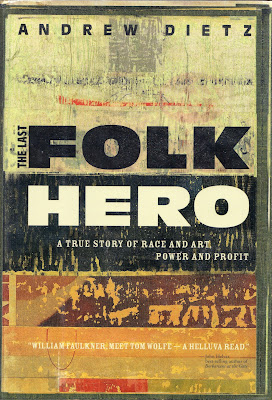
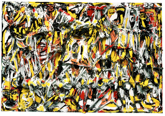

William Arnett was an Atlanta dealer who specialized first in Mediterranean antiquities, then Asian art, then African art. But his life changed when he became aware of a couple of self-taught African American artists, Jesse Aaron and Sam Doyle.
While on a road trip to Houston with a friend, Arnett began his search for much more. His hypothesis was formulating: there is a hidden world of untrained African American artists who are making work of equal importance to any other living artist, but no one is giving them much credit. (The Last Folk Hero p. 68, Andrew Deitz, 2006)
But that wasn't all. He was a dealer, after all. His notion was essentially one of arbitrage--take an asset (a piece of art) that is extremely undervalued in its current market or environment and sell it in a market when and where its "true" value can be discerned. He wanted to take these objects out of poor people's front yards and put them in a gallery.

This is what is so delicious about this book. Is Deitz an exploiter? Is he harming the artistic value of these objects by taking them out of their folk world and turning them into capitalist assets? These and many other issues are implicitly and explicitly discussed in The Last Folk Hero. And Deitz is not the only character in the book--the artists, particularly Thornton Dial and Lonnie Holley, are major characters. 


Thornton Dial, Blood and Meat, 1992 , Mixed Media on Canvas, 65" x 95" x 11"

Arnett searched out art all by self-taught artists all over the South. Lonnie Holley's sculptural work had been bought (and even stolen off his lawn), but when he met Arnett, he felt respected as an artist, perhaps for the first time. He was no longer a freak but a part of an art world. Arnett represented him and helped him achieve financial success and recognition. And Holley became a scout for Arnett. Thornton Dial was one of Holley's discoveries.


Lonnie Holley with some of his work (Al.com, 2009)

The quilters at Gee's Bend were also Arnett discoveries. And Arnett didn't just represent these artists as a dealer--he was a tireless promoter of them to museums. He worked hard to get critics and Museum curators and directors to see the value in this work. In doing this, he managed to alienate much of the Atlanta museum establishment, but outside Atlanta, he was very successful. Working with Thomas McEvilley, he got Thornton Dial simultaneous shows at the Museum of American Folk Art and the New Museum. Peter Marzio put on an exhibit of the Gee's Bend quilts at the MFAH, which ended up traveling the country for years subsequently.

But there was always a hint of exploitation about Arnett's relationship with these artists. For example, Dial was able to move out of his modest home in a rough neighborhood into a larger house on a huge lot, but the house was owned by Arnett. Arnett had a somewhat paternalistic relationship with many of his artists. And in a way, how could it have been otherwise? Until Arnett showed up in their lives, many of them had had almost no contact with the white bourgeois world. It wasn't like they were going to engage with a lawyer to represent them in their dealings with Arnett, even though they certainly should have.

This came to a head in 1993 when 60 Minutes did a hit piece on Arnett using Dial as the bludgeon. According to the book and by many other accounts, it was completely unfair. Arnett believes that his many enemies (he was accomplished at making enemies) in the Southern art world were informants to 60 Minutes. Certainly many participants in that world feel that Arnett pushes museum shows so heavily in order to increase the value of his own holdings--and it's hard to argue with the fact that when Thornton Dial gets a retrospective, Bill Arnett's collection become more valuable.

In any case, while there is paternalism in the way Arnett deals with his dealings with these folk artists, the fact remains that many of them would still be doing lawn art if Arnett had not doggedly searched them out and created a market for their work. Furthermore, Arnett has repeatedly risked his own money to promote and support this art. The cost of printing the two volume Souls Grown Deep, an encyclopedic compendium of African-American vernacular art, was staggering. We should bow down to Thornton Dial for is art, but we should also thank Bill Arnett for helping to make it possible for us to see it.

The book is well-written but eccentric. The author is neither a scholar nor a journalist (he is apparently a business consultant), and has no other writing credits that I can determine. The book itself lacks both an index and a bibliography, both of which make it hard for the reader to track down other sources for this information to independently verify it. That said, there is nothing that says you have to be a professional writer to write a good book, and what I could track down (using good old Google) more-or-less confirmed the information in the book. And it certainly is not a hagiography of Arnett, who in addition to being portrayed as a paternalistic figure with regards to the artists he represents, is also shown to be difficult, controlling and paranoid.

There are interesting issues when folk or outsider art is "discovered" by the mainstream. The Last Folk Hero deals with them well by telling a particular story (as opposed to taking a birds-eye view and discussing the issues more abstractly or theoretically). I found it fascinating and compelling.


Jesse Kellerman's The Genius deals with similar issues through the bizarre lens of crime fiction. Ethan Muller is a Chelsea gallerist who is struggling to be successful. It's funny how gallerists in pop culture are always depicted as wildly successful. The reality that running a gallery is a difficult business with a high failure rate is acknowledged here. A scion of a rich family, he is estranged from them and determined to make a success on his own. But when his father's right hand man tells Ethan about finding a treasure trove of outsider art in an apartment in a large housing complex (built by the Muller family many decades ago), he is willing to take a look. This is how he acquires the work of Victor Cracke, a man who has seemingly disappeared.

Kellerman is deliberately echoing the story of the discovery of Henry Darger's work. Darger was a tenant in a building owned by photographer Nathan Lerner, who lived in a house next door. The essential difference is that while Lerner didn't know what Darger was up to for most of his life (Darger was already a tenant when Lerner bought the building), he found out about Darger's art while Darger was still alive, when Darger was forced to move out due to health problems. (Lerner seems to have been an ideal landlord--he even lowered Darger's rent at one point.) Darger gave the work to Lerner, and Lerner didn't try to publicly display it until four years after Darger's death in 1973. Muller, on the other hand, instantly recognizes Cracke's genius, takes the artwork (despite the fact that Cracke is still alive, as far as Muller knows) and prepares to show it immediately. He almost instantly sells some of it for a huge price to wealthy client.

Muller is opportunistic and unethical, but Kellerman's portrait of him is more nuanced. He doesn't just see Cracke as a cash cow (although it is the perfect cash cow for a gallery--work that can be sold at a high price with the gallery keeping 100% of the revenue), but also deeply loves the work. He's obsessed with it. I think this is the paradox of gallery owners (and book publishers and film producers and many other kinds of artistic impresarios). They want to make money--indeed, they want to get rich--but they also love the art. Sometimes these two impulses work in perfect harmony, sometimes they are in conflict with each other. Kellerman does a good job depicting this conflict.

There is some typical crime novel stuff--threats, a little violence, etc.--and Muller ends up researching Cracke with a retired police detective and his assistant DA daughter when it starts to look like Cracke may be linked to some horrific unsolved murders (which, when the word gets out, makes the art all the more valuable). And in the end, Muller leaves the art world behind in a way that feels like a moralistic judgment on it and seems to forget that there is a reason people love art. But let's face it, crime fiction's ultimate weakness is that the endings are usually pretty unsatisfactory. Everything that you enjoyed up to the end--the unsolved mystery, the danger--goes away as the bad guys are caught or killed and the mystery solved.

Despite that, Kellerman is able to deal with a lot of the issues dealt with in The Last Folk Hero in The Genius. I sometimes get the feeling that the art world is estranged in some ways from the world of fiction. But to me, fiction is one more way--a very good way--to think about things like this. The story of Nathan Lerner and Charles Darger is fascinating. But Kellerman can take a lot of the messy reality of that story and streamline it into a means for really examining the issues of outsider art, the art market, etc. In a sense, fiction is a hypothetical example. (Of course, it's also much more than that.) The Genius is not a great book, but it's worth reading if you're interested in some of the ethical and artistic issues surrounding outsider art.


The path of discovery of outsider artists is one of the subjects common to the first two books. Charles A.A. Dellschau, the subject of a huge color monograph and the story of his discovery as an artist in truly strange and circuitous. Dellschau was born in 1830 in Brandenburg, Prussia. He immigrated to the U.S. when he was 19, presumably coming through Galveston, the entry port for many German immigrants. He settled in Richmond, Texas, where he worked as a butcher's assistant. Sometime during the 1850s, he moved to California for four years. He returned to Texas and worked as a butcher. He married a widow, but she and his young son died in 1877. About 10 years later, he moved to Houston and lived with his stepdaughter and her husband. He worked as a clerk for the Stelzig Saddlery Company (which was in business until 2004, amazingly enough) and then retired in his late 60s. Then he started recording the events of his life in a pair of memoirs and 12 large albums of drawings (it seems he may have drawn at least 10 more albums worth of picytures, but they ahve been lost.) He focused on his California years, where he claimed to be a member of the Sonora Aero Club, a group of men who discovered means for building airships. He worked on these from 1908 until 1921. He died in 1923.

The albums remained in an attic in the family home for 40 years. After a fire elsewhere in the house, the family was told to clean out the attic by a fire inspector. They were then left in the gutter, where they were picked up (presumably along with other detritus from the attic) and sold to a junk shop, the OK Trading Post. It was at this point that people started to recognize them as art. Four of the books were purchased by the Menil Collection. The other eight were purchased by P.G. Navarro, a commercial artist who had an interest in airships. Navarro spent many years studying the books, trying to determine if the stories of the Sonora Aero Club could be true (he quite reasonably concluded that they couldn't, but he thought that some of Dellschau's plans for airships were plausible). The images start off fairly matter-of-fact and grow more fanciful over time. In one of the essays in the book, Thomas McEvilley writes, "Dellschau's early work may strike on as pragmatic and technical, while in the later work it seems he is either losing his mind or becoming an artist."


Charles A.A. Dellschau, From Below, June 28, 1911, 16 1/2 x 18 3/4 inches

The book has six essays in all, and they tend to be quite repetitious, looking at Dellschau from slightly different angles. The best is by Thomas McEvilley--it may have been his last essay. He has obviously studied not only the work of Delschau, but also the extensive and eccentric annotation by P.G. Navarro. He succinctly tells Dellschau's story and does his best to situate the art in a comprehensible space.


Books 8 and 9 of the 12 volumes

This is the thing about outsider art. Unless it can be understood as having some relationship to art, especially modern art, it can't be seen. In 1923, when Dellschau's books were stored away in the attic, they hadn't yet been viewed by someone who could see them as art. It took chance encounters by people who were already "trained" to see art for the work to be so recognized. If Nathan Lerner had not been a photographer, but was instead an accountant, he might have thrown Henry Darger's art away. If people like Picasso had not promoted Henri Rousseau's painting, it may have been forgotten. So in a way, however isolated "outsider" artists might be from the main currents of art, the act of discovering their work drags towards the middle of the river. ("Recognize" might be a better word than "discover.") James Elkins writes that modernism requires "the other.":
Part of modernism is the desire for something genuinely outside the academic European tradition, and naïve and self-taught art fill that desire perfectly. If you think of outsider art this way, it no longer makes sense simply to enjoy the art directly, “on its own terms”: the question has to become, “What sense of modernism do I have that permits me to find these examples of outsider art compelling or expressive?” In other words, one asks about one’s desires, and one watches one’s symptoms. The many different kinds of outsider art testify not to a diversity of practices that need to be conceptualized but to changing senses of modernism. ("Naïfs, Faux-naïfs, Faux-faux naïfs, Would-be Faux-naïfs:There is No Such Thing as Outsider Art," James Elkins, 2006)
We can't recognize Dellschau as an artist until the right person at the right time sees it. In 1923, in Houston, this is not art. In 1963, in Houston, it is.


Charles A.A. Dellschau, Aero Honeymoon, Front or Rear, April 12, 1909, 14 1/2 x 18 1/4 inches

The book is extremely handsome--huge and heavy, it is packed with beautiful color reproductions of Dellschau's art. When I first saw this work, it reminded me a little of Adolf Wölfli's. The decorative borders and the use of repetitious patterns seem similar. However, these both may reflect the artists being influenced by graphic design conventions of their time. (Wölfli lived from 1864 to 1930.) As obsessive as Dellschau was, his work seems much less strange than Wölfli's. Dellschau has a light touch, and there are many humorous elements to the work.


Charles A.A. Dellschau, from Erinnerungen (Recollections), von Roemeling marital bed prank scenes, 1900, 7 1/2 x 9 1/2 inches

Over time, Dellschau incorporated collages of images and texts from newspapers and magazines in his books, especially when they had a relationship with flying machines. He was very interested in what was happening with aviation in World War I, for example. He called these clippings "press blooms."


Charles A.A. Dellschau, Press Blooms (Attacking Forest Fires with Gas Bombs), August 6, 1919, 16 1/2 x 16 1/2 inches


Charles A.A. Dellschau, Maybe, December 3, 1919, 17 x 17 inches

But my favorite pieces are his plan-like drawings that almost become geometric abstractions. (You can see a lot more of his work here.)


Charles A.A. Dellschau, Mio from Above from Below, February 7, 1910, 15 3/8 x 19 inches

Whatever is problematic about the discovery/recognition of outsider artists, if the result is that I get to see big beautiful books about people like Charles A.A. Dellschau, I am for it. I find the category fascinating, especially as I examine the lives and work of artists like Forrest Bess and Charlie Stagg, who were not outsider artists but chose to isolate themselves to a certain extent from the art world in order to create better art. In a way, that is what "outsiders" show us--a different way to approach art-making.

Share


A Six-Ton Weathervane

$
0
0
Robert Boyd

This is the new Mark di Suvero at Rice University.


Mark di Suvero, Po-Um (Lyric), 2003, Steel, stainless steel 16' x 16' 3" x 8' 5"

It was apparently in a private collection when it was displayed in 2011 on Governor's Island. How Rice got it, I don't know.


Mark di Suvero, Po-Um (Lyric), 2003, Steel, stainless steel 16' x 16' 3" x 8' 5"

It seemed atypically curvy when I saw it. I'm used to the more severe di Suveros, like the one in Menil Park. But a look at di Suvero's website shows that "curvy" has been his thing for more than 10 years now.


Mark di Suvero, Po-Um (Lyric), 2003, Steel, stainless steel 16' x 16' 3" x 8' 5"

It's located behind the Physics Building. (Or I guess I have to call it "Herztein Hall"now. Herzstein, by the way, was not a great scientist or physicist. Herzstein was just some rich guy.)


Mark di Suvero, Po-Um (Lyric), 2003, Steel, stainless steel 16' x 16' 3" x 8' 5"

It's on a pole and is designed to rotate, but I assume it takes a pretty stiff breeze to get this behemoth to move.


Mark di Suvero, Po-Um (Lyric), 2003, Steel, stainless steel 16' x 16' 3" x 8' 5"

I was over on campus yesterday. I can't say I love this. It's no 45°, 90°, 180°, which fits my idea of a great public sculpture to a tee. In addition to being an interesting piece of art, it's one that its audience (students, mostly) interact with directly. They sunbathe on it, they climb it, classes are conducted on it, people study on it, etc. But Rice students are resourceful--they may find unforeseen ways to interact with Po-Um (Lyric).

Share

Real Estate Art #2

$
0
0
Robert Boyd

It's time for another voyeuristic look at other people's art collections, courtesy of the fine people at HAR.com. This time, we have a condo on Shepherd in River Oaks. I recognize a lot of the art, but I'm not going to spoil it (at least, not right away). If you can name the artists who made any of these pieces, let me know in the comments. After a while, I'll pipe up with what I know. But I will give one clue--this collector likes to buy local--many of the pieces here are by Houston area artists. Nice to see!

If you see a piece you think you recognize but can't quite tell, I suggest checking out the HAR listing--there are a lot more interior photos there. Oh, and if you like the condo, it's yours for a mere $2.475 million.

Because there are so many photos, I'm going to number them. If you want to identify one in the comments, please refer to the photo number.


photo 1

I think this is an entryway. Behind the gate, we have a mural. Then the gate itself is pretty interesting. And inside the gate there is a sculpture on a pedestal and a bunch of paintings of cats.


photo 2

Then there is this huge room with multiple artworks. From left to right is a colorful grid on the wall to the left, a colorful ladder-like piece, a pair of paintings and a sculpture, and four colorful bowl-like wall sculptures.


photo 3

The room keeps on going. Again from left to right, the bowl-like sculptures, another colorful transparent ladder, and two large corner pieces. We can see a little bit of what appears to be three paintings cut off on the right edge, and there is a glass object on the table.


photo 4

The room keeps on going though. There is a red and grey column/sculpture in the middle and what appears to be a boxy sculpture on the floor on the right.


photo 5

I won't try to address the things on the balcony, which we will see more clearly in the next photo. But again left to right, there is a pink sculpture under the TV, then three paintings that are two hard to really see, a sculpture of a dog, three chrome-plated wall pieces, a couple more paintings that are too hard to see, four round paintings and a red mobile.


photo 6

Then up in the balcony, there is a very large painting and a set of five colorful sculptures that look sort of like jacks.


photo 7

I can't tell much about the paintings on the staircase. Above them is another dog statue and two colorful dog-cows.


photo 8

The dog artist shows up again here, along with a glass sculpture on a pedestal in the corner.


photo 9

This is a bedroom, I suppose. At least it has a bed in it. Left to right, there is a very large, very colorful painting, then a stack of six paintings. To the left of the bed is an interesting grey abstract floor sculpture, then another fucking dog painting, and another mobile, consisting of cursive letters.


photo 10

And here are a couple of sculptures outside on a balcony.

And the astonishing thing is this is not by any stretch all the art in this condo. This homeowner's taste is not exactly mine--by a longshot--but there are definitely some pieces here that I like, and I like the way they have filled their home with a wide variety of artworks. And unlike a lot of collectors, therse don't seem to shy away from sculpture. Given the number of the pieces and the size of many of them, the owners must be prominent local collectors. According to HCAD, their names are Don and Christine Sanders. These names mean nothing to me though. However, I will hazard a guess that they buy a lot of art from McClain Gallery.

Like I said, I recognize some of this art. Do you? Let us know your guesses!

Share

Pan Recommends for the week of August 8 to August 14

$
0
0
Robert Boyd

Another slow August week, but there are a few art events happening around town. Check them out if you can peel yourself off the couch.

FRIDAY


The Afronauts by Cristina De Middel
from DEVELOP Tube on Vimeo.


Art League Houston and Our Image Film present Black Radical Imagination: A Futurist Film Showcase, curated by Amir George and Erin Christovale, featuring work by Adebukola Bodunrin, Ezra Clayton Daniels, Cauleen Smith, Anansi Knowbody, Cristina De Middel, Akosua Adoma Owusu and Jacolby Satterwhite, 6:30 - 10 pm with a panel discussion Saturday from 1-2 pm. This is subtitled "An Afrofuturist Short Film Showcase." Afrofuturism seems to combine elements of black nationalism and science fiction nerdism, about which one must say, why not?After all, space is the place...

Salon des Refusés at  BLUEorange Contemporary 6–9 pm, featuring art by Alex Barber, Mark Benham, Rafael Castanet, Jaime Coronado, Dick Craig, Candice Davis, Blase Distefano, Nela Garzon, Jake Hayward, Dannye Jones, Sebastian Montes, Al Nash, Katie Odermatt, Bob Pahlka, Laura Pregeant, Dandridge Reed, Daniel Rocha, Steve Ruth, Brian Simmons, T. Smith, Stutz, Michael Toskovich, Jeremy Underwood and John "Happy" Valentine. Part 4 of the Salon des Refusés. This is the last chapter in this huge exhibit, opening the day before the official Big Show at Lawndale closes. Let's hope the A/C is working this week!

SATURDAY


Funnel Tunnel by Patrick Renner dedication ceremony at the Art League, 6 - 9 pm. Have you wondered what that thing on the esplanade on Montrose in front of the Art League is all about? Now you can see the finished result.


Katy Visual and Performing Arts Center grand opening at West Oaks Mall, 9:30 am to 3:30 pm. Ever since the West Oaks Art House (which has evolved into We Open Art Houses) announced that it would be using its massive space in West Oaks Mall for something, I've wondered what that something would be. Despite some interesting speculation, giving space for the Katy Visual and Performing Art Center seems just right--this organization does community theater and art classes for kids. Multiple events during the day, including a "Princess Afternoon Tea."


Cathy Cunningham-Little light sculpture

Reconstructing Visual Isomers by Cathy Cunningham-Little at Redbud Gallery, 6 to 9 pm. A group of sculptures made of glass and projected light, this looks like a good one to see after the sun has set.

Share

Beautiful Rejects

$
0
0
Robert Boyd

Dean Liscum condemned the Salon des Refusés at BLUEorange Gallery as "Fun Fair Positive art"--everybody's a winner here! And there is a lot of art that got shown over the four weekends that the Salon des Refusés ran that wasn't all that great. But there is a big difference between the Big Show and the Salon of 19th century France. The Big Show makes no claim to show the best work--indeed, no one could convincingly make such a claim today because the very act of judging has become so atomized and problematic. What the Big Show has a right to claim is that it is the best show that the guest juror could make when applying his tastes to the material offered. So of course that means he rejected a lot of inept, half-baked art. But he also rejected art that was good or pretty or interesting or even art that he liked but that didn't fit in with the show he wanted to present.

So the upshot is that any given piece of art in the Salon des Refusés might be pretty good or not, depending on your own tastes. This is a wishy-washy thing for a critic to say, I admit. But that's why I sign my reviews. Everything I write is filtered through my experience, my education and my tastes.

With that in mind, here are a few pieces from the Salon des Refusés that appealed to me.


Happy Valentine, El Radio X, 2013, found objects including a radiation mask, 27 3/8 x 33 3/8 x 14 inches

Happy Valentine had a video in the Big Show, but I guess this one didn't make it. But I like it--the radiation mask mounted on a black background is creepy and disturbing. I don't like the sunglasses and bandana or the lights inside (not so visible in this photo) so much-I think it might have been better just to show the mask alone.

Needless to say, this is an artifact of Valentine's own treatment, as is the video Code Blue in the Big Show. Valentine was a musician who after being treated for cancer could no longer play. These two pieces are among his first visual artworks.


Jim Adams, Siblings, 2011, rescued metal, 17 x 16 x 54 inches

The only thing I don't like about Siblings by Jim Adams are the two faces--they seem too literal to me. But I love the rich texture and color of the metal. I like it when a sculptor sees a piece of metal crap and thinks, I see beauty in that and with my welding torch, I can make other people see the beauty, too.


Cynthia Gomez, 2013, Nearly Devouring Growth, fabric, thread, 6 x 9 1/16 inch

Several of my favorite pieces in the Salon des Refusés appealed to me because they had interesting textures. Nearly Devouring Growth by Cynthia Gomez, for example.


Sebastian Montes, Renovation 1, 2013, latex on canvas, 12 x 12 inches

Renovation 1 by Sebastian Montes also had a cool texture.


Laura Pregeant, 2013, untitled, refrigerator, fur, chandelier, 8 feet tall

I guess I'd have to say I have a soft spot for altered found objects, like Laura Pregeant's piece and Happy Valentine's. But it's not that I find that kind of art inherently more interesting than other kinds of art--I just happened to like these two pieces. The blinged out refrigerator made me laugh, which counts for a lot in my book.


Blase DiStefano, 2012, 4 Queers and 4 Faggots, typographic/ornamental collage, 15 13/16 x 15 15/16 inches

I guess the letters in 4 Queers and 4 Faggots by Blase DiStefano are iron-on appliques or something like that. It is amusingly put together--I saw the pattern before I could read the words. It reminds of an ultra-stripped down Lari Pittman. And one can't help but think of Cary Leibowitz (aka Candyass).


Dandridge Reed, Collectible Item, 2004, mixed media, 18 x 24

I like Collectible Item by Dandridge Reed for its layering of collage elements and paint and the way the painting looks and the pleasing nostalgic subject.

Share

The Oddball at Station: A Talk with Angel Quesada

$
0
0
Virginia Billeaud Anderson

He began with an apology for his “rambling mess of thoughts,” but a rambling mess of thoughts I reminded Angel Quesada can wield a considerable mess of information. Quesada is one of twenty-one graffiti and mural artists exhibiting in Station Museum’s Call it Street Art, Call it Fine Art, Call it What You Know, and after seeing his mural I contacted him to ask a few questions.

Station chose the artists it said because their works are recognized in public spaces across Houston, and reflect “the politics of claiming access to the city environment.” I’m unsure why, but those words brought memory of our Montrose home’s spray-paint defacement by a young artist who according to a witness entered our property accompanied by his mother. It was painful to watch my husband pressure-wash the brick, and would have been comforting to think artists distinguish between public and private spaces when “claiming access.” Inevitably nothing will lessen the sadness I feel in Rome when encountering lovely stone facades assaulted with paint.

The murals at Station are astonishing. Although some might find the incessant political chatter a bit tiresome, form is finely rendered and colors are exhilarating. Overall, one is overwhelmed by the artistic skill, and by the unbridled energy that enlivens the museum’s interior.


Angel Quesada, Aura Rising, 2013, Acrylic, Latex and Aerosol, Approximately 12’ x 12’. Photo by Alex Barber

Virginia Billeaud Anderson: Open to alternative realities, I’m stopped in my tracks when I detect metaphysical leanings in contemporary art, and here you are entitling your Station mural Aura Rising. In your philosophy, what are auras? Metaphysicians imagine them as ectoplasmic emanations that signal our incorporeal essence and have colors that can be detected by the psychically adept. Do you actually see auras? Tell me what you believe about that.

Angel Quesada: My background as a musician, Martial Artist (Tai Chi) and Feldenkrais Method student has informed my image creation and is part of my mental toolbox. My ultimate goal is to unite the various facets of my world experiences. My interest in color stems from numerous sources: anthropology, traditional music, and physical movement. As per your question about auras, I think all living things emanate an energy field. Some call this a "vibe" which I understand to be a frequency that most sentient beings can perceive on some level. It’s interesting to ponder the idea of an artwork imbued with an aura. What immediately comes to mind is the Mona Lisa, an example of a non-machined, hand-made artwork holds power that interacts with the gaze of the viewer. It exists in its own space on the earth-shared space for all to see and to become lost in its narrative. I think that pop-art has helped devalue the aura of art; it echoes mass production, designed and replication by machines. Why produce another copy of what a machine can make? Why deny the hand of the artist? I see art as the first kernel that nowadays sparks redundancies and iterations, disseminates a common denominator with less personality. To see an end product, evidence of labor, is exciting and part of my working process.

VBA: In his review of the Station show for Glasstire, Bill Davenport called your mural an “oddball” among the others, and certainly it is different. The critic thought he saw a “multi-mandala,” and mentioned its “floating eyeballs.”

AQ: If Bill Davenport called me an oddball, it’s a huge compliment. "Oddballs and Eyeballs" has a good ring, so maybe I should re-title the work. The museum exhibition impacted my process. I tried to hold fast to the notion that I was creating a work that could live out of doors, but came to appreciate that Station was a good place for a more intimate viewer/participant exchange.

VBA: Your artist statement indicates the mural is a counterpoint to the urban landscape, which you called “a monotonous brown hum punctuated by lame advertisements that prescribe to me the values and products I should desire.” And that its energy and vibrating color combinations you imagine as a totem lifting up spirits. Do you equate the art’s totemic lifting of spirits to a meditative tool? Is your mural meant to facilitate self-knowing and higher knowledge? Station’s curators connected its colorful patterning to spirituality.

AQ: I loved what Jim Harithas posed to museum visitors, it resonated with me. He said Aura Rising was painted by a holy man, and that if you stand facing the painting and allow its vibrations to permeate your body it will heal you from the inside.

In regards to energy, I can only speak to that with which I'm familiar. I know about "CHI", or energy, as cultivated and sensed in the practice of Tai Chi, Feng Shui, Acupuncture, and other such practices. From my study of Tai Chi I learned to not distinguish energy types, rather to perceive the varied qualities of energy.

There are basically two forms of energy that we can integrate, the energy we inherit from our parents (pre-natal) and the energy all around (cosmic chi) which we harness through Tai Chi, Yoga, working out, etc. In our daily lives we experience this "flow" of a contiguous field of energy. It activates our pleasure centers as we become united with it and enjoy our lives. Energy "flow" is also experienced through art, work, love, sex, music, drugs, and exercise. All of these realities are valid in the worlds of creativity! I believe the psychically adept are more sensitive to nature, thus interested in these perhaps archaic but essential traditions which are found in many forms of geomancy.

My initial exhibition proposal imagined a political narrative in the form of a great big head. In its current state it acts as an exorcism of the monotonous grey outside of doors, and inside our minds. Station’s wall called for something different than my initial plan, so the head turned into a sun, which, in three stages rising also references the earth, the human plane and the ethers of the universe (or the place God begins). The eyes are remnants of the head I proposed to the museum. Aura Rising was indeed a meditation. It was created as a social painting. It is a wild animal that would lives in the concrete jungle. Aura Rising received its name towards the end. It is like a poem about science, movement and the body, a sutra or talisman to affect the energy pattern that surrounds us. Like a Totem meant to ward off evil intellect and its trappings, the work celebrates color and fights against a quick read.

VBA: If the head evolved into a sun, which in three stages rising references the earth, the human plane and the ethers of the universe, it seems Davenport misinterpreted the “multi-mandala,” but perhaps he wasn’t entirely in error about Hindu iconographic inflections in your art. I saw in your portfolio a painting of the god Shiva with the lotus flowers that symbolize letting go of worldly desires. Indeed you state in your biographical material, “I accessed all of Asia.” Davenport undoubtedly appreciated the connection between the sun and the mandala which in Hindu Vedanta philosophy is a meditative tool. The eyeball motif holds meaning for devout Hindus, who when praying at Banaras direct their prayers to the sun and call it an eyeball in their prayer. Hindus believe that one who dies in Banaras breaks the bondage of death and rebirth and is transported immediately to the side of Shiva in paradise. For followers of Buddha, the mandala symbolizes the cosmos and enlightenment, and the Buddha preached his Noble Truths at Banaras.

AQ: It was very cool to see the work from my day job at the Houston Arts Alliance’s Folklife and Traditional Arts Program surface in the imagery at Station. While painting Aura Rising I was designing an exhibition called Anointed and Adorned: Indian Weddings in Houston that included Rangoli art, so it’s natural that influenced my hand. I'm interested in artworks which allude to the phenomenon of energy, and the concept that Gods and their pantheons have always been ways to incarnate different qualities of energy pervades the Hindu religion. You referenced the Trimurthy (Shiva), which was commissioned for a Hindu temple in Austin, and resided there for over fifteen years. Upon my return to Texas after 12 years of being away a friend informed me its stretcher bars had warped and it was about to be disposed of. Worshippers believed the canvas became distorted because the god residing in the oil painting had left! I promptly collected the painting and fixed the stretcher and now it is at a friend's home in Austin. Interestingly, while painting it I was not allowed to eat meat, nor allow a menstruating woman to come into the studio.

VBA: Do you work with a preliminary design or sketch? Your materials are acrylic, latex and aerosol. Was any brushwork involved? Describe the process.

AQ: I begin painting without an initial sketch, working freestyle with a basic mental narrative and respond to the color in front of me. I try to work quickly, intensely and then walk away, and go do something else, which is important to keep a fresh perspective. It’s necessary to shift gears to sense what is coming out of me and remain cognizant of what color is referencing, some references are retained - many discarded. Example, I pair colors symbolically and according to color theory, such as EARTH: green, copper, brown, blue, purple; SOCIAL: orange, red, yellow, green, magenta; HEAVEN: yellow, beige, gold. I do not incorporate black into the design so the colors will remain pure and unfettered. I did use black and white for the "eyeball" motif as well as 20 colors to make the work impactful and visceral. When painting I meditate on patterns of line and color that are beyond the design, which might be perplexing, but it’s important to allow for the painting's aura to disrupt the rational.

I am physical when I paint, and enjoy the scale that requires me to move my entire body, and I’m unconcerned with rendering a perfectly clean line. What’s important is that the energy is clear. Symmetry, guides, but I’m not tied to it. And I restrict myself to basic marks: circles, zig-zags, wavy lines, arcs, dots, interlocking s-shapes, all within the constructs of the mural tradition of Adolfo Best-Maugard. When painting I integrate Tai Chi practices into the mark-making.

VBA: One difference between you and the other muralists at Station is that you have been formally trained. Time spent at university art schools makes you an exception to the museum’s curatorial assertion that the exhibiting artists “mastered an art that lies outside the academic and commercial tradition of fine art.” Say something about going from academic training to making murals/street art in Los Angeles, San Francisco, Austin and Houston.

AQ: To be honest I don't have any degrees and, pointedly, art schools don't really teach much to students. I learned mostly from being in the company of great artists and minds. My interest led me to attend 5 different art schools and read the hell out of artist books, which is where I got most of my education. Art school only buys you time to make work and build relationships. My interests are too numerous to simply go the path of Art School, Graduate Degree, Gallery Representation, Teaching . . . I am happy doing art that I enjoy although I do wish I had a bit more time to pursue other opportunities related to visual and performing arts, such as audio-music, composition, performing; production- theatre, curatorial projects, exhibition design, marketing, visual- murals, printmaking, fashion; Healing Arts- Martial Arts, Yoga, meditation; as well as opportunities to connect to different cultural groups by way of these methods. Many twisted paths brought me to this point, made me who I am today.

VBA: Another thing that makes you an oddball at Station is the fact that your mural lacks content. Where Daniel Anguilu mixed abstraction with stylized architectural and pre-Colombian flavored animal motifs to defend “all humans who have left their homeland and are now labeled illegal,” and Michael C. Rodriquez chronicled the killing of Iraqi children by drones, and Lee Washington’s expertly devised portrait of Hugo Chavez voices doubt the Venezuelan died of natural causes, and another mural references the Sandy Hook school massacre, another the Deepwater Horizon oil spill, and so on including cartoony skull head figures with grenades and tanks, Aura Rising is devoid of political and social commentary.

AQ: I believe a "spiritual" work such as Aura Rising is highly political in a street context. It is art that stirs nothing that I consider not to be political.

While I respect my contemporaries’ choice of creating politically charged work and their immense talent in doing so, political art can be somewhat predictable, causing the message to get lost. I wanted to create something timeless using a language to which anyone could relate. I've been making art for over 25 years and am uninterested in trying to get people to listen to what I think is right, so I simply paint what excites me.

VBA: Yet your initial mural design was narrative.

AQ: In keeping with Station’s mission of providing a platform for political dialogue, I thought I would address a reality close to home. In Laredo and Eagle Pass where I am from, there are atrocities perpetrated in order to communicate with the powers that be. My first sketch summoned the beaches of Acapulco where about two years ago decapitated head were washing ashore. The design was a seascape in which heads are dwarfed by an ominous body of water, a dark abyss. That felt a bit forced so I devised just one head in a colorful style to make a beautiful dark joke about our love of violence. My sketch for it is actually behind Cecil's Pub on West Gray.

VBA: The Mexican mural painting tradition, stylistic elements of which you previously mentioned, is inherently political. It was unsurprising to see Station’s gallery notes cite the early-twenties muralists Orozco, Siqueiros, and Rivera, call them “revolutionary,” and by implication link them to the exhibiting artists. Orozco believed art was at the service of the worker. Rufino Tamayo seemed to recognize proper Marxists in his backward at the muralists who “wore overalls and mounted the scaffoldings.” Station has in the past exhibited muralists from Mexico who were grounded in this history. In 2008 I mentioned in an article the ASARO collective (Assembly of Revolutionary Artists of Oaxaca), which during the Oaxaca citizens’ uprising created murals to inspire resistance to government forces specifically with barricade erections and by commandeering radio stations. Do you consider yourself part of that tradition?

AQ: I’m linked to it stylistically. It is possible Jim and Alan saw the piece I did at Lawndale last year which had stylistic affinities to the plein air school of mark making found throughout Mexico. Its stylistic components were formalized by the early century artist Adolfo Best-Maugard who in his role as "Minister of Drawing" brought visual art to pueblos and remote areas for nationalistic purposes. He elaborated seven basic marks that identify Mexican artisan creations, and he was extremely important in shaping the evolution of Mexican art at the beginning of the century. Diego Rivera did a portrait of him.

VBA: Station’s exhibition title seems to acknowledge confusion or blurriness between graffiti, street art and murals, and I gather from our talk Angel you are uneasily reconciled with your “street art” being inside the museum.

AQ: In my imagination I created the mural with the intention of it being outside as a slight to the landscape, to charge empty blights of lame uninspired or forgotten buildings. The notion that it is actually living inside the walls of a Museum cannot be denied, but the fact is Street art minus the street is just art. Nevertheless the street and the energy are there at Station, the aliveness of youth is there. The fact that Station endorsed us is extremely important. That is revolutionary and I am proud.

Many of the themes in the exhibition were graffiti inspired, that is, what one would expect to find from a long evolution of "writing". The law is what deems it "graffiti", and that is of course illegal. Many of the artists in the exhibition came out of this street-culture, they learned to ply their skills as a way of staking out a piece of real estate, this type of mark-making comes from deep within. An urge to "write" graffiti is simply uninhibited. I believe it becomes a badge of pride. On the streets it's a way to get respect from peers in an otherwise non-academic context, with graphic source material being comic books or consumer-based advertising, i.e. magazines, etc and is honed through efficient technique. The walls at the museum had very little pure graffiti and the notion of street art has, in my opinion evolved beyond what we all assume to be street art.

I was arrested for painting on public property in 2009 and that is now on my record. It was deemed graffiti by the letter of the law. What I have always been interested in is the environment of art. Where does it exist and who gets to see it? Outside versus inside!

VBA: Body movement and sound are extremely important to your art, which aligns you with the pioneers of graffiti art who decidedly crossed mediums – the early graffiti artists were musicians, dancers and performance artists. Take as an over-used example Basquiat, who made films, co-founded a rock band, performed in music videos, and served as a producer for hip-hop records, activities which paralleled his graffiti writing, signing and painting. You express yourself through martial arts and theater, and appear to be equally dedicated to both. So important an aspect of your art is this extra dimension, I’m inclined to feel as if the fact that it cannot be adequately covered in a short article does you a disservice, but this is Pan, not a book. AQ: When I paint I combine my movements into the painting – thirteen years of Tai Chi go into the mark making. My interest in color relates as much to sound as to body movements. I believe that the frequency of sound corresponds to color, and that by pairing certain colors a third harmonic can be achieved. To keep the purity of the color and to leave the frequency in place, I made it a point in the mural to not use any black (except in the "iris"). This intensifies the viewer’s experience. One can look at the painting closely or from afar, it is two different works. I tried to imagine seeing the work from a passing car on some abandoned wall yet up close you see the aspects of a meditation. I wanted the viewer to see traces of the human hand that created it.

Share

Art Out in the World: Jim Nolan's shifting SCALE

$
0
0
Robert Boyd


Richard Serra, TWU, 1980, steel (photo by Donna Svennevik)

Richard Serra started making large-scale public sculptures in the 70s. Some of these are on the consecrated grounds of museums and sculpture parks, but many, such as TWU above, were placed in decidedly unconsecrated public areas. They weren't always respected there. A piece called Slat (1985) was removed in 1989 by the mayor of Puteaux after it became a magnet for graffiti and vandalism. Tilted Arc (1981) was eventually removed from the Federal Plaza in New York City over Serra's very strong objections.

The thing about these sculptures is that their relationships to their environments and to the populations that interact with them is not the same as sculptures in a museum or in a private space. An art-lover might look at a Serra in terms of mass, in terms of the color and texture of Cor-Ten steel, in terms of its relationship with surrounding architecture, etc. But a skateboarder might see it as obstacle. A tagger might see it as a surface. A late-night drinker might see it as a semi-private place to take a leak. And many might just see it as a thing that they don't even really think about, much less think about as art.


David Hammons, Pissed Off, 1981, performance (photo by Dawoud Bey)

In 1981, David Hammons did a performance using TWU. He peed on it and then had an encounter with a police officer. (It is widely reported that he got arrested, but there is some doubt about that.) As it was, Serra's sculpture was already a home to graffiti, wheat-pasted signs and litter. Of course, 1981 was in the middle of a fairly grim period in New York's history. More recent photos show TWU as being graffiti-free.

David Hammon undoubtedly had many things in mind when he did Pissed Off. But one of them must have been to reinact one of the grungy ways that the public interacts with public art. And this works really well with minimalist art like TWU because such pieces are empty vessels. They don't have accessible meanings for the general public. They aren't obviously memorials, for example (unless they have the names of the dead engraved on them, as in the Vietnam Veteran's Memorial by Maya Lin). They don't represent something, like a civic bronze statue. Instead, they are just objects plopped down in some park or square someplace.

So Hammons, as an artist, treats TWU the same way many non-artists do. In one performance, it becomes a urinal. In another, a place for shoes.


David Hammons, Shoetree, 1981 (Grupa OK)

Interestingly, Hammon is not just dealing with public art, he is specifically reacting to a piece of minimalist art. Jim Nolan's work has also been largely about dealing with the legacy of minimalism and post-minimalism. Part of this involves creating work out of deliberately cheap materials--crap purchased off the shelf from 99¢ Only or Home Depot. So when he was commissioned to do a temporary public installation as part of the Blaffer Art Museum's Window Into Houston series, it must have seemed like an opportunity for him to play with the idea of minimalist art in public spaces in his usual way. But the thing here is that these windows in a building on Milam in Downtown Houston are not very big. He exactly can't do a "life size" piece the way David Hammons did in 1981. To address public art, he has to shift his scale.


Jim Nolan, shifting SCALE (right window), 2013, mixed media installation

In part, that meant creating a scale model of a sculpture park, using painted 2x2 pieces of wood assembled to resemble colorful David Smith sculptures and scale model people of they type you can get from a hobby shop. (Interestingly, Nolan is not the only Houston artist using these tiny figures--Leo Medrano had a couple of interesting pieces in the Big Show that employed them as well. His use of them, to "bottle" an episode or incident, is very different from Nolan's.)


Jim Nolan, shifting SCALE (detail), 2013, mixed media installation

He also uses a small amount of model railroad landscaping material in the "scale model" portion of the piece. A hastily spray-painted green line is used to suggest a tree-line. But viewed on another scale (life-size), it also suggests graffiti.  Nolan is mixing a scale model of a park filled with minimalist public art with life-sized things that one might find in such a park--unofficial and occasionally illegal interactions with the art.


Jim Nolan, shifting SCALE (detail), 2013, mixed media installation

So he includes objects like beer bottles, fast food wrappers and an old flannel shirt, the kind of trash one might encounter around large scale public art pieces if you get there before the groundskeepers do.


Jim Nolan, shifting SCALE (detail), 2013, mixed media installation

shifting SCALE is a work that loops in on itself. It is a piece of public art about public art. It is simultaneously life-size and a tiny scale model. It contains representations of its subject as well as actual found objects as its subject.


 Jim Nolan, shifting SCALE (left window), 2013, mixed media installation

And like TWU, shifting SCALE exists in public. That means that Nolan can't predict how the public will react--the people who see it will not necessarily be art appreciators. In fact, if it weren't for the sign that accompanies shifting SCALE, it's quite possible that some viewers would not realize that this is a piece of art at all. The piece could end up vandalized or the windows broken.


Jim Nolan, shifting SCALE (detail), 2013, mixed media installation

A homeless person might sleep under one of the windows one night, or park himself there with a sign reading "Need Money For Food" in hopes of scrounging a few bucks off the drivers exiting I-10 for downtown.


Jim Nolan, shifting SCALE (detail), 2013, mixed media installation

And a street critic (a variation on the street artist) may tag it with a succinct critique: "needs work".  Nolan seems to have anticipated a range of types of engagement viewers might have, including apparent indifference. He knows he's asking a lot of the average joe viewer. Maybe that's why he includes bouquets as part of the piece--little peace offerings to the public.


Jim Nolan, shifting SCALE (detail), 2013, mixed media installation

Amazing what you can buy at the 99¢ Only store.


Jim Nolan, shifting SCALE, 2013, mixed media installation

What next? I think HAA needs to commission a permanent piece of public art from Nolan. Now that Wayne Dolcefino is not on the air anymore, they might get away with it.

[Full disclosure: I own some art by Jim Nolan--some drawings and a tube sock with the word "SUCCESS" stenciled on it.] 

Share

Real Estate Art #3

$
0
0
Robert Boyd


Beautiful, huh? And for four million bucks, you can have it and the acre of land it occupies on Buffalo Bayou in River Oaks. Unlike the last house we visited, this one is very elegant and spare, inside and out. No clutter here. So there are a smaller number of visible artworks than the previous home, but still this was obviously the home of a serious collector.

And indeed, HCAD identifies the owners as Jeffery and Toni Beauchamp. But Toni Beauchamp died in 2012. That is a reminder that a house for sale is part of a story, sometimes a sad one. Beauchamp was an important person in the arts in Houston. She was one of the first people to work on Houston's art history, writing the extremely interesting chronology in the 1980 Houston Area Exhibition and Recapitulation: 1928-1960 catalog. There used to be an annual exhibit of art from the region called the Houston Area Exhibition. In 1980, the catalog for that exhibition also contained chronology of all the other juried exhibits and all other key art milestones in Houston up through 1980, compiled by Beauchamp. Now she did many other important things in her life, but as someone interested in Houston's art history, I appreciate this one the most.
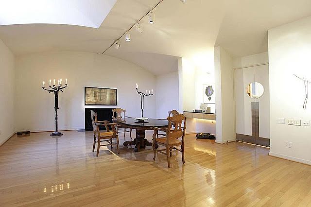
But enough of that--what about the art? I only recognize one of the pieces I see in these photos. But I won't say which. If you can identify any of the artists, let us know in the comments section.


Photo 1

There is a small sculpture on a pedestal and a crazy-looking painting here. 


Photo 2

From left to right, there is a piece of art above the fireplace, then another over the desk nook, and then a very minimal piece that looks like it is made of two sticks.


Photo 3

Here is another view of the piece over the fireplace--admittedly it will be hard to identify because it's so small in the photo. Good luck.


Photo 4

Another piece over a fireplace--but one almost obliterated by the spotlight on it. You can see a little bit of the image, though. Is that enough to identify it? Not for me, but you readers have good eyes...


Photo 5

In one picture, a man appears to be holding a woman. The other is a black and white portrait.

There you have it. If you know anything about any of this art, please let us know in the comments. And you can see more photos of this house at HAR.


Share


Outsiders in the New Yorker

$
0
0
Robert Boyd


Just 10 days after I wrote a review of The Last Folk Hero by Andrew Dietz about Bill Arnett and Thornton Dial, the New Yorker has an article about the pair, "Composition in Black and White" by Paige Williams. Even though The Last Folk Hero was published seven years ago, this new article doesn't really add much. The primary events in Arnett's and Dial's lives since The Last Folk Hero have been health issues. But Dial is still producing artwork and Arnett is still out there making sure it gets seen. The article doesn't even have any good photos of Dial's art.

But what it does do is place the story in front of vastly more eyeballs than the book did. After I wrote the review, Andrew Dietz wrote me. Despite the fact that The Last Folk Hero was very well-written and professionally packaged, it was in fact self-published with only modest success. Dietz explained that commercial publishers "didn’t want to take a chance on it." This seems crazy--it's a highly entertaining book.

Anyway, you can get a hint of the story in the current issue of The New Yorker, but I recommend buying a copy of The Last Folk Hero--you can get copies quite cheap from Alibris.

Share

Hot August Links

$
0
0
Robert Boyd

Why write for The Great God Pan Is Dead for free when you could write for the New York Times for free instead? Art workers, the New York Times wants you to write about why you do what you do. No pay, but they say it will be great exposure.


Tony Fitzpatrick, The Black Swan (via New City)

Tony Fitzpatrick is not only a really good artist, he is a goddamn excellent writer. In case you've forgotten. Here's a paragraph from his latest--and some good advice to artists.
My father, for the life of him, could not figure out how a person was going to make a living drawing pictures—what I mistook for anger was actually fear. My parents were children of the Depression, and all around them, real Americans starved to death outside of grocery stores. Poverty was not an abstraction—but a palpable and ever-present entity with definable features. It wasn’t happening to someone else, but to their neighbors and relatives. What he feared is I would be unable to support myself.
When I finally told him I wouldn’t do anything but draw pictures because it was the only thing that meant anything to me—he pulled the car over and pointed in my face and hollered, ”Then do it like you’re fighting a war, like your life depends on it!” I said “what do you mean?” He looked at me and said very evenly, “Not one step backwards.” ("Dome Stories: The Black Swans, Tony Fitzpatrick, August 14, 2013, New City)

Harry Tuthill would like you to smoke

I love the Bungle Family, a comic strip that ran 1914 until the '40s.  It was a successful strip, but one of many that was soon forgotten after Harry Tuthill shut it down and retired. I discovered it in Smithsonian Collection of Newspaper Comics, edited by the late Bill Blackbeard. Now an article he wrote about the Bungle Family for Hogan's Alley magazine has been posted online (I can't date the article, but it was from Hogan's Alley issue 13).
Tuthill’s simply sketched characters appeared only in their apartment house setting for days on end, all but engulfed for much of their static strip existence in 14- and 15-line dialogue balloons, emerging only at some briefly climactic point in the dullest possible urban locales, often in a surprising slapstick turn, but one quickly abandoned for a return to the delightfully funny and acerbic dialogue that was the real mainstay of the strip. [...] It all read like a deft, daft soap opera set in Purgatory with no time out for good intentions. ("When the Bungles Mixed It Up with Their Neighbors on the Battlegrounds of Sunken Heights," Bill Blackbeard, Hogan's Alley #13)
I have several Harry Tuthill originals. They are amazingly inexpensive.


Share

Pan Recommends for the week of August 15 to August 21

$
0
0
Robert Boyd

This is a weird week for art in Houston. Late summer is always a little light, but when was the last time there were no big openings on Saturday? Friday, on the other hand, looks quite busy--I don't see how anyone can hope to see it all. (But I'll try.)

FRIDAY


Good Fences Make Good Neighbors by the Art Guys, on the sidewalks around City Hall downtown, 11 am to 1 pm. The Art Guys will walk around downtown with portable fences around them, making it very hard for annoying pests to get right up in their grills.


Buster Graybill, Tush Hogs (at Frieze New York in 2012)

Feral by Buster Graybill at the Art League, 6 to 9 pm.Buster Graybill's Tush Hogs, combination minimalist sculptures/wild animal feeders finally make their way to Houston. This show has been hotly anticipated by the local squirrel population.


The Trojan Box: BOX 13 Artspace at the Art League, featuring Kelly Alison, Daniel Bertalot, Elaine Bradford, Karen Brasier-Young, Michelle Chen-Dubose, Jennifer Ellison, Monica Foote, Quinn Hagood, Dennis Harper, Michael Henderson, Janine Hughes, Kathy Kelley, Jonathan Leach, David McClain, Jennifer McNichols, Tudor Mitroi, Kristy Peet, Mark Ponder, J. Michael Stovall and Alonso Tapi, from 6 to 9 pm. Box 13's resident artists (who include some of Houston's finest) haul their stuff from Segundo Barrio over to Montrose. Amazingly, it all fits in that little box.


I think this one is by Dylan Conner. No, it's by Alex Larsen.

Dylan Conner/Alex Larsen: States of Matter at Avis Frank Gallery, 6 to 8 pm. Another pair of artists with studios on the East Side (in El Rincón Social) are moving uptown--or to the Heights, at least. The art world may shut down for the most part in August, but one side benefit of that is that established galleries feel the freedom to experiment a bit.


ink art by Jose Cordova

Just Ink (chapter 3) at the East End Studio Galleryfeaturing Robin Baker, Austin Simmons, Heather Gordy, David Pilgrim, Jamey Franklin, Tina Higgins, Carolina Guzman, Michel Draper, Catfish Perez, Lizbeth Ortiz, No L, Robin Silvers, Jessica Guerra, Vincent Fink, Francisco Montes, Jason Scholte, Blue One Thirty, Angela Obenhaus, Luke Poteete, Cynthia Vela, Katharine Kearns, Veronica Vega, Saida Fagala, Kelly Kielsmeier, Sophia Luna, John Paul Luna, Dinora Alonso, Allison Currie, Matt Gantt, Rachel Racz, Melinda Patrick, Christine Lopez Browning, Jamie Kinosian, Jessi Jordan, Bruce Small, Stephanie G. Garcia, Fini Jo, Johnnie Rosales Jr., Julie Zarate, Lee E. Wright, Sarah Cloutier, Jennifer Hernandez, Jose Cordova, Kimm Schlosser, April Roseberry, Sarah Paul, Michael C. Rodriguez, Ack!, Jessica Gonzalez, Erik Martinez, TOK, Joshua Perales, Melissa Dorris, Jose Alonso and Marcus Leonard, from 6 to 10 pm. Of course, some artists stay on the East End--you gotta go to them. Just Ink (chapter 3) is a one-night only show.

SATURDAY


Art Car: The Movie at the Orange Show, 6 pm to 11 pm. Filmmakers Ford Gunter and Carter Ahrens followed Rebecca Bass as she led her high school class in a project to complete an art car for the annual Art Car Parade. The film begins at dusk, which should be about 8 pm.

Share


Searching for Forrest Bess

$
0
0
Robert Boyd

(This was originally published onGlasstire in a slightly different form.)

In 1947, Forrest Bess, who is the subject a show at the Menil that runs through August 18, moved to Chinquapin, a tiny unincorporated settlement at the end of a dirt road on the northeast side of East Matagorda Bay. ( I reviewed that show here.) Michael Ennis wrote, "In 1947 Bess left San Antonio and went to live with his parents at their bait camp at Chinquapin." After a while, Bess built his own place: "Back at Chinquapin Bess found himself again under the hypnotic, almost mystical influence of the Gulf. 'The peninsula is a lonely, desolate place,' he wrote, 'yet it has a ghostly feeling about it—spooky—unreal—but there is something about it that attracts me to it—even though I am afraid of it.' He was now determined to stay. He built a shack on a concrete slab using the hull of a tugboat and copper sheets from the bottom of an old ferry, and he added a slanted concrete 'prow' to his little home that would, he hoped, withstand the battering of hurricanes. He continued to fish for a living and to record and paint his visions." ("His Name Was Forrest Bess," Michael Ennis, Texas Monthly, June 1982) After Hurricane Carla hit in 1962, only the slab and the concrete prow of his shack remained. Bess rebuilt. It wasn't a hurricane that made him move away from Chinquapin; it was the sun. After having surgery on his nose for skin cancer in 1966, Bess moved to his mother's house in Bay City.

What Ennis doesn't say is whether Bess lived on an island or on the mainland. Robert Gober describes his home as being "on a tiny spit of a treeless island" ("The Man That Got Away," Robert Gober, published in Forrest Bess: Seeing Things Invisible, 2013). Houston Chronicle columnist Sigman Byrd visited Bess at his shack, so his testimony should be authoritative--unfortunately, it is extremely ambiguous. He wrote, "After supper at Forrest Bess' house at the mouth of Chinquapin Bayou (surely the loneliest spot in Texas), we all went into the shipshape studio to drink tequila and coffe and look at our host's pictures." ("Trawling in the Collective Subconscious at Chinquapin," Sigman Byrd, The Houston Chronicle, March 11, 1956) So was the bait camp on an island or not? Either way, the place is remote. Chinquapin lays on East Matagorda Bay between (but not particularly close to) Matagorda and Sargent, two barely-there communities. The nearest town of any size is Bay City, with about 20,000 residents, 25 miles away.

But why should we care where Bess lived? He was an important artist, and I like knowing about the lives of Texas artists. That's probably reason enough. But I think there is more to it. This place was obviously important to who Bess was and how he made his art.

His work is arcane and very private. It doesn't admit the viewer easily. What made Bess the painter he was? Since he painted the symbols he saw in visions, we have to ascribe at least some of his genius to mental illness. Bess developed a theory of immortality through hermaphroditism that became an unhealthy obsession. He not only saw visions (which seems fairly benign) but performed dangerous autosurgery on his own penis and was eventually hospitalized for schizophrenia and alcoholism. (I mention these last things because I don't want to perpetuate the myth of madness as artistic inspiration--whatever benefit Bess derived from his illness, the costs he bore were far higher.)

A frustrated sexuality played into his esoteric theories, which informed his paintings. Bess was homosexual, but had no outlet for it in Bay City, where he was afraid to reveal himself. While he was in the army, he received a savage beating when he divulged his homosexuality. While he was able to meet other gay men in Houston and San Antonio, he complained that they found him too masculine. After his retreat to Chinquapin,  he may have experienced no sexual relationships, much less romantic love. (No wonder he was such an avid letter-writer--his correspondents, who included Meyer Schapiro and Carl Jung, were some of his closest acquaintances.) Loneliness shines out in his work.

While it seems obvious that these factors contributed to his art, I think the place he made the work is also important. He started seeing the visions that fueled his most important work after he moved out to Chinquapin. Would he have seen the same things, done the same work, if he had been living in Houston or New York City? I guess it's possible, but it seems to me that the extremity of his life on this desolate shore must have had some effect on his art. Jesus and the stylites also went to bleak remote locations to facilitate their visions, after all.


Chinquapin Road

I drove out to Chinquapin in June to see what I could see. Chinquapin Rd. is a 10-mile dirt road off of FM 521. It takes you through miles and miles of corn fields and past the Big Boggy National Wildlife Refuge.  My iPhone, chirping at me to turn right or left on this dirt road, seemed to be leading me to the end of the Earth. But finally I reached East Matagorda Bay. There are a number of houses at the end of Chinquapin Rd., apparently all built after Carla which, by all accounts, scraped this area clean. The houses are all on a winding creek called Chinquapin Bayou which runs down to the by from Lake Austin, just to the north. The whole area is surrounded by water--lakes, creeks, the bay, marshes--and very little of it rises more than a couple of feet above the water. People in these parts are fishermen and shrimpers.

My first trip out there was inconclusive. If Forrest Bess lived on the mainland, he didn't leave any obvious trace (not that I was expecting to find anything visible after 49 years). And if he lived on an island, as Gober writes, I couldn't access them without crossing the Intracoastal Waterway. I didn't have a boat and wasn't quite confident about my swimming ability. So I looked around a bit, took a few photos, and left.


The remains of a concrete slab on the mainland--could it be Bess' cabin's foundation?

That afternoon, I drove straight from Chinquapin to Galveston, where there was an exhibit opening at the Galveston Artist Residency. I told a friend there about the unsuccessful trip and explained that to really explore the area, I needed a boat. She said she knew someone who might be able to help. She introduced me to Eric Schnell, the director of the GAR and I told him what I believed--that Forrest Bess lived on an island in East Matagorda Bay when he started having visions and painting the abstract paintings we have since become familiar with. (By this time, I had somehow convinced myself that he definitely lived on an island as opposed to the mainland, even though I have no particular proof one way or the other.)

Eric suggested that he might be able to wrangle a boat and got my contact information. I marked it down as merely a conversation over beers at a party--I didn't really expect anything to happen. I put it out of my mind and moved on to other projects. Then in late June, I got an email from him. The expedition was on. He had a friend from the National Oceanic and Atmospheric Agency who needed to take a trip out to Matagorda to look at a couple of potential habitat restoration projects. We set a date and I shared what maps I could find. Assuming Bess lived on an island that was near the terminus of the Chinquapin Rd., I figured there were only four islands it could be.


Four candidates for Forrest Bess's island

As it turned out, Eric's friend from NOAA, Kristopher Benson, was interested in checking out Bird Island, which is a protected wildlife habitat. Kris is a marine habitat resource specialist at the Galveston NOAA National Marine Fisheries Service Laboratory located in the old Fort Crocket Buildings. His proposal was for us to accompany him as he went to West Matagorda Bay to look at an oyster reef, then over to East Matagorda Bay to see Bird Island. My work schedule is such that every other Friday, I have a day off. So on July 19, I drove down to Galveston early in the morning, meeting Eric at GAR at 7:30 am. We drove together over to NOAA and met up with Kris. We had a comfy government Suburban and a flat-bottom aluminum boat in a trailer behind us. The boat reminded me of the boats I used to work on when I worked doing shallow water seismic exploration for Western Geophysical back in the 80s in Nigeria and Brazil. It was designed to go very fast (it had a large outboard motor) and to be able to operate in very shallow water. The tradeoff is comfort, but that's OK--it was a work boat, not a pleasure boat.


NOAA's flat-bottom aluminum boat

I thought it was strange that Eric happened to know a NOAA scientist. I chalked it up to the fact that Galveston is a small town, but the reason was actually more direct. Kris is married to the director of Artist Boat, a art/education/environmental non-profit in Galveston. Artist Boat has lots of projects that combine art and the environment, including a purchase of some of the last undeveloped land on the west end of Galveston for the purpose of keeping it wild. Kris had firsthand experience mixing art with the environment, so our little expedition was right up his alley.

We headed off first to Palacios, a small pretty town on West Matagorda Bay. Palacios has a sizable population of Vietnamese immigrants and their descendents. We drove past a Vietnamese neighborhood that could be a suburban subdivision in Houston--brick homes, cul de sacs--except for the shrimp nets drying in the back yard. The other weird thing about Palacios is how people pronounce it--the Spanish origin has been totally forgotten. Folks say "puh-LA-shush".

We  entered the bay from the public boat launch. It was still early, and there wasn't a breeze. The water was smooth and occasionally glassy. The sky blended with the water at the horizon, leaving us in an indistinct space of blue. Matagorda Bay was like a giant naturally formed James Turrell.


The bay was filled with jellyfish--thousands of them. We elected not to do any swimming.


Kris opened the throttle and headed out to a spot that seemed like literally the middle of nowhere. The bay is large and even at full throttle it took a while to get to our destination. We had maps and a GPS device and were using them to try to find a particular oyster reef known as Half Moon Reef. Kris later wrote me with a description of the project: "The currently funded phases of the project will restore approximately 40 acres of oyster reef through the placement of substrate material to restore the 3-dimensional structure of the reef and the hard substrate needed for recruitment and settlement of oyster larvae (spat). My purpose in visiting was to get a sense of the on-the-ground conditions at the project sites, as they are in an area of the coast that I'm only rarely able to get out in the field to see. We are also working with The Nature Conservancy on oyster restoration projects in other areas, so comparing these sites with those areas is helpful in understanding how our projects function." NOAA is one of the many federal and state agencies cooperating on the Half Moon Reef project.


Eric Schnell, left, and Kris Benson, right

Except for the shrimpers, we were mostly alone out there. It was an astonishingly isolated place, even though we knew Palacios was nearby.


Finding the reef was not easy. The map and the GPS device didn't seem to exactly match up. Nonetheless, Kris took samples of the salinity (high due to the drought) and dragged the anchor to look at the contents of sea bed.

When we headed back, the motor started conking out. It seemed that it wasn't drawing fuel. We switched out fuel lines and messed around with it, but we couldn't get it to work quite right. We limped slowly back to the landing at Palacios. I was worried that this was the end of our expedition, but Kris was still eager to see Bird Island. So we loaded up the boat, stopped for some bahn mi sandwiches, and pressed on, driving over to the Chinquapin Road and thence to East Matagorda Bay.

According to the Texas State Historical Association,
CHINQUAPIN, TEXAS (Matagorda County). Chinquapin is on an unpaved road on Live Oak Bayou just north of the Gulf Intracoastal Waterway and East Matagorda Bay, east of the Big Boggy National Wildlife Refuge, and eighteen miles southeast of Bay City in southeastern Matagorda County. It is surrounded by swampland. It and nearby Chinquapin Bayou were probably named for a type of tree in the area. The community, which has been in existence since at least the 1940s, was built on land that was once part of Bay Stock Farm, property owned by John J. LeTulle (a half brother of Victor Lawrence LeTulle). At one time Chinquapin had grown to around 100 cabins. In 1961 it was completely destroyed by Hurricane Carla; it gradually rebuilt, and by 1972 a landing strip and nineteen new dwellings had been added. The community appeared on 1989 highway maps. It is primarily a fishing village. In 2000 the population was 30. (Rachel Jenkins, "CHINQUAPIN, TX (MATAGORDA COUNTY)," Handbook of Texas Online (http://www.tshaonline.org/handbook/online/articles/hrcer), accessed July 23, 2013. Published by the Texas State Historical Association.)
I assume that population of 30 refers to full-time residents.There were more than thirty houses there, and they looked like weekend retreats for serious fishermen.


Chinquapin

Some were quite nice (but far short of the palatial beach houses on Galveston's West End), but most tended towards the ramshackle end of the spectrum.


Sometimes they looked as if they had been built one piece at a time, perhaps over several years. I like the one above because it is a classic dogtrot style house. But it worries me, too--a stiff breeze and some heavy rain will flood it.


I don't know how these houses compare to what was here in Forrest Bess' day. But let's just say that the powers that be have never bothered to pave the Chinquapin Road. The community is extremely remote and the dwellings pretty modest.

The Chinquapin Road ends at the Intracoastal Waterway.  Islands 1, 2, 3 and 4 are on the other side of this dredged-up channel. But we had to launch our vessel from a private boat launch further up Chinquapin Bayou, which meanders very lazily to the bay. (This is no Houston-style channelized bayou.) I was worried that we'd stall out again and be stranded. Eric stayed on shore just in case we needed to call for help. It took many tries to get the motor to start, which didn't boost my confidence. But Kris seemed unconcerned.

We headed out very slow on the bayou. It was very shallow and he didn't want to risk stranding us by going too fast and hitting a sandbar.


Chinquapin Bayou

Once we crossed the Intracoastal Waterway, we passed through the narrow channel (really a continuation of the bayou) between islands 2 and 3. Before the Waterway was dug, these islands had been part of the mainland. But because of this narrow channel, they are now desolate uninhabited places. But was that always the case?


It was on island 3 where we saw this little fella. We couldn't tell if it was a starving coyote or a fox or a stray dog, and we wondered how it managed to survive on this treeless desert island. Were there mice to hunt?

The islands were devoid of human habitation of any sort. The only sign that people had been on the islands were from the raised areas (where dredged mud had been deposited in decades past), detritus that had washed ashore, and the occasional duck blind.


Duck blind on Island 3

There was no obvious ruin of Bess's shack, which we didn't expect to see anyway. Just scrub grass and shrubs, some birds, and our fox friend, who we saw more than once as we rode around the islands.


Island 1

After cruising past all three islands on the Intracoastal Waterway side, we went out bay side to check out the other side of each island. Kris decided to land on island 3 (he offered to go ashore on each of the islands, but I didn't see much point--they were all the same).


Island 3

Except where the islands had been built up with dredged material, the land and water blended seamlessly. The boat went through this area of grass in about six inches of water before reaching dry land.


standing on island 3

These islands were fairly long but very narrow. As I stood on the south side of the island, I could see a tugboat on the north side in the Intracoastal Waterway. There was constant barge traffic here.

Bess started to have visions of symbols when he lived here. The visions are the source of the symbols we see in his paintings. These islands are so small and isolated, and may have been even more isolated in the 1950s. It doesn't seem all that strange that someone living here would start to see things. Particularly someone blessed (or cursed, as it may have been in Bess' case) with imagination.


Forrest Bess, untitled (The Crowded Mind/The Void), 1947, oil on canvas, 10" x 11 3/4"

From what I had been told, I've concluded that if Bess lived on an island, it had to be island 1, 2 or 3. But there was a fourth island to check out--Bird Island. Once I saw it, it was obvious that Bess could never have lived on it. As small as 1, 2 and 3 were, Bird Island makes them look enormous. (Having said this, it's probable that the island was bigger in the 50s--these sand spits are always eroding and changing size.)


Bird Island

Bird Island was one of the reasons we were there. It is a protected bird habitat, and this tiny spit of land is covered with birds of all different species nesting. It's far enough from shore that predators like the fox can't get to it.


Kris wrote me that "the Bird Island site in East Matagorda Bay (also called Dressing Point), and the adjacent Half Moon Shoal area, are areas where a project concept has been proposed by multiple state and federal agencies.  NOAA did not originate the project concept and does not yet have an official position with regard to the concept.  In general, the proposed project would prevent erosion of the island and stabilize the shoal, and possibly expand the size of the island." So while NOAA was not officially involved with any proposed Bird Island project, Kris was interested in checking it out. 


And you can see why. Birds already use every square inch of the island for their nests. I was astonished to see so many different kinds of birds, from roseate spoonbills to cormorants to brown pelicans and more, nesting side by side. I was torn by a desire to get closer and a responsibility not to disturb the nesting grounds.


Even if we never saw the exact spot where Bess's cabin was, it was worth the trip to see Bird Island. It was a breathtaking sight. I only wish I had brought a telephoto lens.

We made our way back to the landing, where Eric was patiently waiting for us (hoping we hadn't managed to stall and strand ourselves). Tired and a little bit sunburned, we loaded the boat onto the trailer and headed back to Galveston. As we drove back, Kris told me that NOAA might be able to help me find the exact location of Bess's cabin. It turns out that people have been taking aerial photos of the coastal areas of Texas since the 1940s. He uses them in his work to determine how habitats have changed over time.


Photo courtesy of the Texas General Land Office

This is an aerial photo from 1952 of the northeast part of East Matagorda Bay. You can see Bird Island in the center and the Intracoastal Waterway running as a stripe across the top third. Chiquapin Bayou and the three islands are easily visible, but island 3 is connected to a larger island. Between 1952 and now, there has been visible erosion of the islands.


Photo courtesy of the Texas General Land Office

Here we can see what appear to be two structures, one on island 2 and one on island 3. (Island 1 and 2 were apparently a single island back then.) Could one of them be Forrest Bess's shack? And the other his parents' bait camp? It's possible I suppose. Then again, I could have it completely wrong and they could have been on the mainland.

What would I do if I found the location of Bess's cabin? I'd like to go back and put a plaque in the ground there. And wouldn't it make sense to petition the state government to name that island after Forrest Bess. Here is one of Texas's greatest artists, and as far as I can tell he had nothing named after him. "Forrest Bess Island" would be a nice start. But most of all, I'd like to maybe cmap out on the spot--just pitch a tent, close my eyes and see what visions come.

Epilogue 1

Shortly after I wrote the article above, I saw painter Richard Stout at the Menil bookstore, and mentioned my search and the difficulty of finding Bess’ camp. Stout instantly said it was on an island. I asked him which one–pointing out that two islands at the mouth of Chinquapin Bayou are separated by the bayou itself. He thought for a second and said, I think the east island, which was the island we saw the fox on, aka Island 3.

I walked into the store, and bought a copy of Forrest Bess: Key to the Riddle, a new book version of Chuck Smith’s 1997 documentary film. It’s more about Bess the man than his art and reproduces a number of letters and photos, including photos of Bess’ shack! The book definitely states that the bait camp is on the island, on the bayou side. Fishermen coming from the mainland would go through the bayou channel, pull up to the little dock Bess built, and yell out for him to bring out some bait shrimp. So the mystery was getting close to being solved.

Epilogue 2

Or was it? After the original version of this article was published, I started hearing from people who had ambiguous evidence and contrary eyewitness testimony. First, I received a scan of a letter from Forrest Bess that featured a hand-drawn map. It seemed to confirm that the shack was on island 2.

But then Bob Bess, Forrest Bess's nephew, wrote a letter to Glasstire indicating the camp was on the mainland! I sent him an email with the following image attached.


I asked him which, if any, of these four locations was the location of the camp. He confirmed that it was #2--on the mainland, on the west bank of Chinquapin Bayou. "If you have seen The Key to the Riddle DVD, I am the young boy with Forrest (probably about 1952). That was obviously filmed at the camp." Despite the repeated references to an island in various texts, Forrest Bess's home was on the mainland. This fits with what Sigman Byrd wrote in 1956--he wrote about having to be ferried back to his car. Chinquapin Road is on the east side of the bayou. And it even matches Forrest Bess's hand-drawn map, which didn't indicate north. The reason I thought it indicated a camp on an island was because I was looking at it upside down.

Somehow it feels more romantic to imagine Bess on a desert island. But let me say that location #2 is every bit as remote as any of the islands, except for Bird Island. All the houses are on the other side of the bayou. On the west side, there is a whole lot of marshy nothing. It is still one of the loneliest places in Texas, I reckon. A good spot to hang out if you want to see visions...

Share

Mildred’s Lane and The Order of the Third Bird

$
0
0
Betsy Huete

Mildred’s Lane is a living sculpture, archive and museum, artist residency, and pedagogical experiment coordinated by artists J. Morgan Puett and Mark Dion and located in Beach Lake, PA. It’s a site that brings in various visiting artists that lead projects throughout the year, but mostly in the summer.

I had the pleasure of attending a week-long workshop this past week called "The Order of the Third Bird." Highlights include, but are not limited to: dancing under a meteor shower, Mark Ruffalo helping me light a candle, and watching a deer from ten feet away eat an entire apple in one bite.

As a newly inducted Bird, I am beholden to a certain amount of secrecy, but I can say that it involves a ritualized, sustained attention to objects made to looked at (usually works of art). The following are my accounts of each practice. (Anything in my journals alluding to ritual, however,  has been redacted.)


Deer at Mildred’s Lane

August 6

Originally saw a statue of a woman’s head, previously completely wrapped in a yellow scarf. Scarf withdrawn, neck bathed in yellow fabric. Standing on wrought iron table.

My goal was to disassemble assumptions regarding the work, like its link to classical sculpture. Instead, simply understand and assess as an object. Actually, trying to undo what I understood it to be as a representation of a woman. Kept seeing the head though…I re-assembled the head in conjunction with the cloth and the table. It formed an awkward being…a seemingly top-heavy structure. I also reincorporated the structure as a component of its immediate environment—linking color and form together. Yellow of cloth linking to yellow of flowers, dilapidated head linking to rusty/decayed objects in the immediate landscape.

I undid my understanding of it as representation, as a woman. I deconstructed it as an art object, setting the stage to try to understand it as a valid object worth engaging. When I deconstructed it, removing its artfulness, I began to look at the surface. I saw breaks in the surface, but not in the actual material. This showed a capturing of action, a recreation of passing time. I also saw on the object actual markings that appeared unintentional, like dirt and scratches. These were actual, in the moment markings of time. In rethinking of it as an art object, I see it as something that holds real and perceived markings of time.


At Puett’s studio. These are collector’s edition pieces of canvas mold that came from the walls of the Mildred’s Lane exhibition at MoMA last fall.

August 7

I came in and saw a brown woman’s ass, bent over, ready to take it doggy style. Except her ass was also the color of the icing of a chocolate donut, and the texture had the same consistency. Her butt was covered in sprinkles, and she appeared to be trapped in the side of the mountain. Really her butt was sticking out of a small pile of rocks, but the lighting on the side of the rocks was majestic, making everything feel out of scale. The small pile seemed huge, and the woman’s ass seemed normal and giant at the same time.

The angle I settled on was a profile, so I was less engaged with the work as half an ass and more its form. I also began to think of the previous woman, and all the empathy it needed and how I felt none. I thought this was much more deserving of empathy—after all, this poor woman is crunched, ass-out, in a mountain. But I didn’t feel empathy, I felt enthralled and a little disgusted. The form seemed confrontational, as if it was barking to me, “I’m fine!” when obviously she wasn’t. The form was in and out of place, variously echoing and rejecting the landscape with its neon sprinkles. It also seemed like the mountains were spewing this globular thing, and it was on the way of oozing out.

I thought instead of the woman being trapped, what if she grew mountainous armor and top-heavily collapsed forward with her ass in the air? What would happen if I did feel sorry for it? I even feel sorry for referring to “it” when I should say “her.” The empathy is pretty agonizing in that case—it must be absolutely humiliating to be standing with your ass hanging in the air and some asshole adorned sprinkles all over it. I also thought about the total form being a rejection of this place. While it was bathed in a warm mid-afternoon sunlight, it seemed like it should reside under fluorescents. After a while I just listened to the rain and forgot about the work altogether.

I wasn’t sure what had changed at firs, but it sincerely seemed like it didn’t want me to feel sorry for it. Then everything suddenly felt wildly optimistic. The form seemed pregnant and about to give birth.


This is the pathway leading from the barn to Dion’s Memento Mori

August 8 (part I)

Everything felt ominous and really anxious. There was a playful attitude about the work, but it was as if it knew it was fake and being obvious about it.

When you’re trying to hear something, an attempt is made to drown out your other senses. Like when you’re talking on the phone, you aren’t really paying attention to where you’re looking, but inevitably your eyes fall on something. After a while I noticed my eyes were falling on the same thing, which was a hole in the floor. And I became interested in the problem, or maybe not problem of sustained attention of two senses. As I was listening I became interested in why I settled on that hole. Slipping away? Escaping to another side? Finding comfort? And I was interested not only in the relationship between sound and object, but also the issues surrounding the value system of what we choose to look at and why.

The first at least third of the piece is very ambient, which triggered me to turn around and face the landscape. My motive was to think of the sound work as just another part of the environment, like the birds chirping, wind blowing, etc. So I just looked out and tried to let that happen. I started thinking about the sound drawing lines, delineating edges of trees and hills. Also I thought about how all these things can’t talk and the implications of not having a voice. But then I thought that they do talk all the time, that it’s just not a language we speak in particular.

I closed my eyes and stopped trying. I sat there, not trying, and everything became very bodily for me. The music turned my body into flowing water at one point, it made me want to vomit at another, and then it turned me into a hairbrush.


Side view of Puett’s house, early morning

August 8 (part II)

Walking in felt like a deeply interior space. I was more drawn to the humming of the projector. The projector and the silence of the video somehow made me feel like I needed, or really wanted, to be watching this by myself.

I started counting her movements, but ended at “two.” I was accidentally counting one and two to the rhythm of her movement. I also noticed the intonation of my voice changing with each movement, like a failed attempt at binary code. This made me think of decoding language through movement and vice versa.

I headed to the projector and listened to the sound of the projector. My 1’s and 2’s turned into onnnnne’s and twwwwwwwo’s that were really just following my breathing. Then I started listening more deeply and heard these rapid stutterings, so I followed that. 1212121212 and so on…but it was too quick to keep up with and I failed. So I stopped doing that and just listened. Turns out there were multiple layers in the sound…humming, vibrating—all kinds of vibrations.

I asked the piece what it needed, and it told me it needed to be consumed. So I did that. Normally I feel very uncomfortable as a voyeur of any kind, but I reveled in it this time. Every movement that seemed provocative in the slightest I let feel sexual, anything trite I let it feel dumb, anything frustrated I let it be so. It made me horny and visually hungry.


Stairwell inside Puett’s home

August 9 (part I)

I encountered a dramatic unveiling of the barn window to reveal a landscape. Immediately, I felt a sense of competition among planes. First there was the 2D plane of the light/window, there 2D plane of the white circle, there were the competing pillars acting as interventions, and there was the depth of the landscape.

The angle in which I settled did not allow me to view the intended object, and decided that was ok. So I let my eyes course through the various planes I did see, and started viewing everything from the vantage point of pure form rather than representation. Everything became a geometric abstraction—the angle of the roof, the rafters, the meeting of hillside to sky. I began to look at the sky. It looked like gray milk. It looked really opaque.

Then I put all of my focus into that singular object in an attempt to drown out the landscape. I stuck my head through the window, breaking that plane as well. I noticed how the rain soaked through the fabric, creating a palimpsest of the table.

I stepped back into, vaguely into, my original spot, I gave everything equal weight and noticed how censors were just made.


The Mildred’s Lane library

August 9 (part II)

The house seemed carefully curated, like it was consciously dilapidated.

I stood in front of the house, looking back at it. I was standing in the rain, and at first it felt really nice. As it rained harder and harder, I began to reconsider. Then it started to rain absurdly hard—I almost jumped onto the porch when it occurred to me that, after all, the house is getting rained on like this too, so I might as well stay out there. I began looking at the porch and some of its wooden supports, noticing that some had been replaced more recently than others. And I thought about the rain rinsing off things from the house. It was like the house was fighting itself, like it couldn’t decide if it wanted to erode or keep itself together, like a patchwork quilt.

Since I had faced the house and purposely endured what it was enduring, I came up onto the porch and faced out. I just let myself feel the comfort of being sheltered. As I was looking out, it occurred to me that this is probably fun for trees because it’s their dinner. The leaves looked really green, and they were bouncing all around because of the raindrops.

I needed to learn more about endurance. So I went back into the rain and looked at things that are better at enduring than houses or myself. I looked a while at the trees and overall landscape, and it seemed that they are better at endurance because they are quiet and accept violence.


View from the best reading chair in the entire world

Share

This Post Is an Excuse to Post Pictures of the Funnel Tunnel

$
0
0
Robert Boyd


I went over to see Patrick Renner's Tunnel Funnel today. I wasn't the only one stopping to take photos. People love this enormous object. It's been well reviewed. It's on a scale that even drivers zipping by will notice it--a plus in Houston.


People still fondly rememberInversion, Havel + Ruck's deconstruction of the old Art League cottages from 2005. That Funnel Tunnel recalls it is a nice link to local art history for those in the know.


But that knowledge is not necessary. People just think it's cool to look at. It may succeed in catapulting Patrick Renner, an artist we have written about several times before both for his solo work and his work as part of the Exurb collective, into local fame.


Swamplot, the local Houston blog about real estate and places, has written about it several times. I like reading the trollish comments (a small minority, thankfully) condemning it. But there was one criticism of the piece among the Swamplot commenters that I thought worth considering:
From Ebrbein:

Hmmmmm….
Engage the ground, engage the trees.
Make the installation about the place.
There’s no grace, there’s no elegance.

It’s so, so close. It’s a great ‘almost’, just needed another iteration on the drawing board. 
OK, "no grace, no elegance" seems a bit extreme, but I agree that it feels a little clunky, especially around the tail. It doesn't taper smoothly. 


I also don't like that the lattice of wood slats is a bit threadbare in places. I heard that they ran out of slats (underestimating the total needed, which must have been immense).


At first I was disappointed that the slats were random colors, instead of some deliberate pattern. Because the random coloring of the wooden elements actually makes it a less visually striking piece--somewhat "greyed" out due to a cacophony of conflicting hues.


But the more I think about it, the less this bothers me. It's important to think about the difference between a good piece of art and a good piece of public art--their virtues overlap but are not identical. By being coated with randomly colored slats, Tunnel Funnel is, in a sense, graffiti-proof. This is not to say that a tagger couldn't tag it, but if they did, so what? It would just add to the already chaotic whole.


To me, that is evidence that the piece is ready to be engaged by the public. It's a piece that will please drivers, amateur photographers (I expect images of Funnel Tunnel to proliferate like mad on Instagram, Pinterest, Facebook, Flickr, etc.), and maybe even graffiti writers. It has no other purpose but to be visually engaging, to be pleasurable. (It has none of the smug moralism of Tolerance, for example.)


Personally, I like it a lot. But you know me. I love lawn art.

Share
Viewing all 665 articles
Browse latest View live