Quantcast
Channel: The Great God Pan Is Dead
Viewing all 665 articles
Browse latest View live

Uriel Landeros Turns Himself In

$
0
0
Robert Boyd

After running away and hiding in Mexico for several months, Uriel Landeros has turned himself in, according to click2houston.com.
According to the Harris County District Attorney's Office, Uriel Landeros turned himself in at the Hidalgo Port of Entry shortly after crossing the border from Mexico into the United States about 4 p.m. on Tuesday. He has been charged with criminal mischief and felony graffiti, both of which are third-degree felonies. He's being held at the Hidalgo County Sheriff's Office awaiting extradition to Harris County.
Landeros said he's not apologetic for spray painting a stenciled image of a bull, a matador, and the Spanish word "CONQUISTA," which means conquest, onto Picasso's "Woman in a Red Armchair."
"(Expletive) his painting. It's just a piece of cloth. What matters most is the people who are suffering," Landeros said.
Landeros said his actions were fueled by a mixture of social and political defiance.
"I'm part of the whole Occupy movement," Landeros explained.
Landeros said he chose the 13th of June because the number refers to a power structure. He said all he wanted to do was shed light on the corruption of banks, government and large institutions in the United States and Mexico.
"If I wanted to destroy that piece, I could have done it," he claimed. "The spray paint that I used was easily taken away." ["Man accused of defacing Picasso turns self in," January 8, 2013, click2houston.com]
Landeros reconfirmed that he is an utter idiot by adding the following: "I really don't give a (expletive) about the 15 minutes of fame. If anything, I made that painting more famous than what it is."

Share

Houston's Favorite Art From 2012

$
0
0
Robert Boyd

The votes are in--the people have spoken. Below are the most popular exhibits, performances and art fairs as chosen by an internet poll. There were 329 responses (of which 72 had to be disqualified*). Here's what you all thought was the best art of the year in Houston.

Favorite Exhibits

 
Christian Marclay, Grey Drip Door (The Electric Chair), 2006, synthetic ink on synthetic polymer paint on canvas, 94 3/8" x 51 1/4" from the exhibit Silence

  1. Silence at the Menil Museum with 28 votes
  2. Richard Serra, Richard Serra Drawing: A Retrospective, Menil Museum with 26 votes
  3. tie: Hillerbrand+Magsamen , eState Sale at the Art League Houston and Aaron Parazette, Flyaway at theArt League Houston with 20 votes each
  4. Lisa Chow and Y.E. Torres, Once there was, once there wasn't: Two tales from the minds of Lisa Chow & Y. E. Torresat ARC Gallery with 19 votes
  5. Flying Solo at the Art League Houston with 16 votes
  6. tie: Debra Barrera, Kissing in Cars, Driving Alone at Moody Gallery; Staring at the Wall: The Art of Boredom at Lawndale Art Center; and James Turrell, Twilight Epiphanyat Rice University with 15 votes each
  7. tie: WAR/PHOTOGRAPHY: Images of Armed Conflict and Its Aftermathat the MFAH; Geoff Hippenstielat Devin Borden Gallery; and Emily Peacock, You, Me & Diane at Lawndale Art Center with 14 votes each
  8. tie: James Ciosek, Human Hamster Wheel at Lawndale Art Center; In Plain Sight at McClain Gallery; [Hx8] at Station Museum;YE Torres and Erin Joyce, Raised in the Wild: Memories of a Bad Unicorn at the East End Studio Gallery; and Eric Zimmerman, Endless Disharmony & Telltale Ashes at Art Palace with 13 votes each
  9. tie: Debra Barrera, Drive Me There and Back Againat Blaffer Art Museum Window Into Houston; Sasha Dela, The Emotional Life of a Spyat theArt League Houston; Radical Presence: Black Performance in Contemporary Art at the CAMH; Laura Lark, The Livable Forest at Devin Borden Gallery; Peter Lucas, Voyager Foundat Lawndale Art Center; and David Politzer, When You're Out Thereat the Houston Center for Photography with 12 votes each
  10. tie: Adela Andea, Primordial Gardens at the Art League Houston; Jamal Cyrus, STACKS residency at the Art League Houston; Sandy Ewen, Projection and Amplification at ARC Gallery; TheBigShowatLawndale Art Center; Lisa Marie Hunter, Camouflage at the Art League Houston; Phillip Pyle II, STACKS residency--Black Fridayat the Art League Houston; M'Kina Tapscott STACKS residency--New Soil: Tessellations of Dark Matterat theArt League Houston; Julia Zarate, In Somnis Veritas at the East End Studio Gallery
An additional 357 (!) exhibits got votes, so congratulations all around.

Favorite Performances

 
Emily Sloan, Carrie Nation Hatchetation, performance at Notsuoh

  1. Emily Sloan, Carrie Nation Hatchetation at the The Lone Star Performance Explosion with 23 votes
  2. Zubi Puente and Y.E. Torres, Let's Play Doctor at the Continuum Live Art Series/Avant Garden with 20 votes
  3. tie: Jim Pirtle performance at Notsuoh as part of The Lone Star Performance Explosion and Tina McPherson, Love Exorcist at the Continuum Live Art Series/Avant Garden with 16 votes
  4. Non Grata, Force Majeure at the The Lone Star Performance Explosion with 14 votes
  5. tie: Nathaniel Donnett, ZZzzzzzz at the Art League Houston and Nancy Douthey, Chicken 'N Dinner at the  The Lone Star Performance Explosion with 13 votes
  6. tie: Emily Sloan, Is that a Baby Ruth in the Swimming Pool?at Darke Gallery and Militia "Malice" Tiamat, Know Thy Self, Continuum Live Art Series/Avant Garden with 12 votes
  7. tie: Daniel- Kayne, Three Day Fast at the The Lone Star Performance Explosion; Orion Maxted performance at Notsuoh at the The Lone Star Performance Explosion; and Non Grata , [performance at Avant Garden], The Lone Star Performance Explosion with 10 votes each
  8. tie: Jonatan Lopez performance at Avant Garden during the The Lone Star Performance Explosion and 1KA performance at the The Lone Star Performance Explosion with 9 votes each
  9. tie: Jamal Cyrus, Texas Fried TenoratCAMH; Miao Jiaxin, I Have a DreamatBox 13; and Pope L., Costume Made of Nothing at the CAMH with 8 votes each
  10. John Pluecker, Antena Books: Pop-Up Bookstore and Literary Experimentation Lab, Project Row Houses with 7 votes
An additional 43 performances got votes. Congratulations all.

Favorite art fairs
  1. Texas Contemporary Art Fair with 73 votes
  2. Pan Art Fair with 48 votes
  3. Houston Fine Art Fair with 43 votes
A few closing comments. It's not always obvious where the boundary between exhibit and performance is. That was especially the case with with Radical Presence: Black performance in Contemporary Art at CAMH and STACKS at the Art League. Stacks was additionally difficult to deal with because it was, in effect, a series of residencies followed by one-person shows. So do you deal with them separately or as part of a greater show? I split them into separate shows and performances, but several people wrote in STACKS as a combined unit.

The favorite art fair question was admittedly a bit of a joke. 48 votes for the Pan Art Fair probably comes close to the entire attendance of the Pan Art Fair. But thanks everyone who voted.

* Unfortunately, there appeared to be some ballot stuffing activity. I created an algorithm to detect ballot stuffing, and while I probably missed a few, the 72 votes that were disqualified were almost certainly all from ballot stuffing. It's very disappointing that anyone would do something like this. I don't  understand it--there is no prize being given here. It's like cheating to win the election for junior high class president--and about as mature. All I wanted to do with this poll was to see what shows people liked best. The results however arealmost certainly somewhat skewed by self-dealing on the part of certain people. You know who you are (and so do I). The result of these shenanigans is that I will probably not be running this poll again next year (or ever). It's not worth it to deal with the cheaters.

Share

Pan Recommends for the week of January 10 to January 16

$
0
0
Robert Boyd

Busy weekend ahead for art. Here are some of the shows we're looking forward to.

FRIDAY


The Bridge Club, The Voyage Out II, 2012, archival digital print, 24" x 36"

The Bridge Club: Still at Art Palace, 6 pm, through February 16.The Bridge Club, a four-woman performance group noted for their very deliberate performances (and their wigs) are performing again at Art Palace as well as displaying a selection of "stills" from their previous performances.


 SATURDAY


Ian Hamilton Findlay and George Oliver, Arcadia, 1973, silkscreen print on paper

Ian Hamilton Finlay: Printed Works at Hiram Butler Gallery, 11 am, runs through February 23. I'm not sure if the print above will be in this show, but any show by this late post-modern neo-neoclassicist is worth checking out, in my opinion.


Clifford Owens, Photographs With an Audience (New York) (detail), 2008-09

Clifford Owens, Anthology at the CAMH at 2 pm. Clifford Owens performs as part of the CAMH's Radical Presence: Black Performance in Contemporary Art. This particular performance is the performance equivalent of a singer doing a covers album.


Devon Britt-Darby, Trust Exercises

Devon Britt-Darby, Keepsakes from Several Occasions at PG Contemporary (Milam St. location) at 6 pm. PG Contemporary's old location with one final show will close out with a bang with a show featuring Devon Britt-Darby, former Houston Chronicle art critic and central figure in The Art Guy's Marry a Tree affair. I'm looking forward to a spectacle, if not an outright scandal!


Maggie Taylor, Small Boat Waiting, 2012, inkjet print

Maggie Taylor, No Ordinary Days at Catherine Courtier Gallery at 6 pm, runs through February 9.Maggie Taylor returns for a new exhibit of her gently surreal painterly photo-collages.

What exhibits will you be seeing this weekend?

Share

Some Questions for James Drake

$
0
0
Virginia Billeaud Anderson 

On January 12 Moody Gallery opens Group Exhibition of Gallery Artists, and it is unsurprising James Drake is part of the group. Surely, every time I visit Moody there are a few pieces by Drake displayed, and I’m having a memory of how parentally puffed up Betty Moody seemed on the opening night of Drake’s Station Museum exhibition.

According to Moody’s press release Drake will be showing works from his “Red Touch” series, so I contacted the artist to ask a few questions, and his replies clarified his choice of red for intensity, and the political reality underlying his series.

Virginia Billeaud Anderson: Your use of red pastel goes back for some years. Please comment on your attraction to it as an art medium. Are you drawn to its classic old-masterish quality?

James Drake: I started using the red pastel (chalk) about fourteen years ago while living in New York. I do not use much color, but felt an intense red was appropriate for this specific subject matter. While I love classic old master drawings these were not influenced by or based on that love and appreciation. I believe most of the “old masters” used more of a sienna color and I wanted these drawings to have an intense contemporary red.


James Drake, Red Touch #2, 1999, Pastel, charcoal and lasquox fixative on paper, 60 1/2" x 45” Courtesy of Moody Gallery 

VBA: Your works on paper seem heavily influenced by Renaissance and Baroque drawings. Do you look to them for inspiration?

JD: Yes, I have a very real passion for Renaissance/Baroque drawings and always succumb to their beauty, sensitivity, and grace. And yes, they are a tremendous inspiration.

VBA: Why do you work in very large size?

JD: I work in a very large scale because when I draw on that scale it is necessary to use my entire body and is very physical. Up and down ladders, arms swinging, pacing back and forth - it is all a part of the process. Also, most people think of drawing at a scale of about an average sheet of paper measuring 20”x30”, however, these large drawings are meant as finished pieces and not sketches for paintings or other works. And of course, there is a certain drama inherent in large works that I try to convey to the viewer.

The Red Mirror is about 11 ft. x 21 ft and I have made many other drawings in that scale and some larger. For example my drawing City of Tells is 12 ft x 32 ft and I am currently working on a drawing that will be exhibited at the Museum of Contemporary Art, San Diego (formerly the La Jolla Museum) in June of 2014 that is 15 ft in height x 342 ft in length. It is a grid divided into ten sections which are in turn, composed 1266 drawings measuring 19”x 24.”

VBA: Do you begin with a preliminary sketch? Or, for a work as large as Red Mirror, do you project an image to guide your design?

JD: Yes, I usually make preliminary sketches and in the case of TheRed Mirror, made about fifty or so. Sometimes I draw a very large figure or object on a separate piece of paper and then, move that drawing around on the final large paper to establish the composition and position of the figure or object. This gives me a sense of what the final drawing might look like and I can try different placements without drawing the figure each time.


James Drake, Red Touch #1, 1999, Pastel on paper, 45” x 56” Courtesy of Moody Gallery 

VBA: There seems to be psychic distance between the Red Touch images and the more clearly political Exit Juarez, or the Trophy Room installation, two unforgettable works I saw in 2010 the evening I met you at Station. Please comment on what seems like incongruence. Or, is there a link?

JD: Actually, the Red Touch series of drawings were based on and inspired by a body of work titled Tongue-Cut Sparrows which dealt with a prison language and political issues prevalent along the U.S. Mexican border. Briefly, Tongue-Cut Sparrows depicted women using an invented sign language to communicate with their loved ones in jail or prison. They were able to stand on the street, look at the men in jail and speak to them using this sign language. I made drawings, a book, prints, and a video of this truly unique phenomenon. This piece has been shown in many museums throughout Europe and the United States, including the 2007 Venice Biennale, curated by Rob Storr.

One of the frequent phrases the women repeatedly used while signing to their loved ones was “I want to feel and touch you.” Therefore, because they were denied physical contact I made the Red Touch series and used an intense red to convey that sense of passion. I was born in Lubbock, Texas, but spent my early childhood in Guatemala. All of my family lived in Guatemala at that time and I am convinced that a lot of the issues and works I have produced are a direct response to that experience.


Share

I-10 Links

$
0
0
Robert Boyd


I know where I'm going the next time I visit New Orleans. I'm always suspicious when some boosterish persons decides that this or that neighborhood is an "arts district." That said, the artscene along St. Claude Ave. seems like a real, organically-formed thing. Last time I went to New Orleans to look at art, I wasn't all that sure where to go (not that it kept me from seeing some excellent art). Now, thanks to New Orleans design firm/art blog Constance, I have a map.

I'm not sure where to go the next time I visit San Antonio. After all, the gallery scene seems to have been decimated there in 2012, according to Art Magazine, an online magazine covering art in San Antonio and the region. First in April, several galleries in the Blue Star Arts Complex closed when Blue Star started charging market rate rents. Then David Shelton moved his gallery to Houston. Art Magazine tried its best to put a positive spin on things, and not all art news from San Antonio in 2012 was bad. But San Antonio's collector base is apparently either too small or doesn't buy locally, and that makes running a gallery there a risky venture. ["2012: What changed?", Haydeé Muñoz De la Rocha, Art Magazine. Hat-tip to Glasstire]

FPH has a suggestion on which gallery not to visit in Houston.  Art Writers grant recipient Harbeer Sandhu pulled no punches in his pieces for the FPH's "Worst of Houston" feature. His choice for worst art gallery? War'Hous, the gallery located on Main near Lawndale and the Houston Center for Contemporary Craft.
If you like your art easy (both in execution and in content), decorative, vapid, and shallow, then this is the place for you.  Nothing here will challenge you–nothing will make you think or feel in ways you’d never expected to; nothing will make you feel uncomfortable; nothing will challenge your preconceived notions.  This is where beautiful people go to pose beside paintings of beautiful people. [...]
Dandee Warhol, the gallery’s proprietor, whose name is a rip-off of a lame ‘90s band whose name is a play on the name of a truly great conceptual artist, was voted “Houston’s Best Artist” by readers of Houston Press in 2011.  All that proves is the lameness of Houston Press readers. ["The Worst of Houston: 2012 Edition", FPH, January 7, 2013]
If this is the kind of vitriolic rant we can expect from Sandhu's proposed blog, then I say right on!

Share

Uriel Landeros' Attorney

$
0
0
Robert Boyd


Emily DeToto, the lawyer representing Uriel Landeros (the Picasso grafitti guy, for those coming late to the party), was interviewed on ABC-Eyewitness News. They put up this nice long clip from the interview on their website. She seems a bit nervous, and probably says too much (like when she says Landeros is an accomplished graffiti artist, but only does legal graffiti). She seems highly frustrated with Landeros mouthing off to the press and on social media. She suggests that the bond will be high because he had already fled to Mexico for several months.

In an interview with the Houston Chronicle, she said, "A criminal defense attorney's worst nightmare is when your client gives an alleged full confession on tape." No doubt! And given this, there doesn't seem any way that Landeros will be found not guilty. I think DeToto's job is to minimize his sentence. I expect a plea deal.

Share

The Menil's PTSD

$
0
0
Robert Boyd


The Art Guys, The Art Guys Marry a Plant, 2009, live oak tree that the Art Guys married in a performance

As many of you probably alread know, the Menil is getting rid of the Art Guys tree (the remnant of their 2009 performance, The Art Guys Marry a Plant).  Ironically, this happened at the same time that the Picasso vandal, Uriel Landeros, has turned himself in after months on the lam. This will sound a little dumb, but I only realized now that there is a link between these two things. In each case, a piece of art belonging to the Menil was vandalized. And these two acts of vandalism seem to have really shaken the Menil.

What made me realize the connection is an editorial by Rainey Knudson, wife of Michael Galbreth (half of the Art Guys) that was published in Glasstire. Knudson is the publisher of Glasstire, and she acknowledges her bias right up front. But she also points out that when the controversy first flared up, Glasstire purposely played it low-key because of the possible appearance of a conflict of interest. Her piece was entitled "On Institutional Cowardice: The Menil Collection." In it, she wrote
Here is what the Menil is going to say about this decision:
-       They want to save the tree;
-       They’re worried about vandalism.
Here is the truth:
-       They’re tired of the controversy around the artwork;
-       They need to raise money for their drawing center and want this distraction to go away;
-       They don’t believe in the artwork and are sorry they ever accepted it into their collection.
Certainly similar speculations were made last night as members of the local art scene made the rounds to various openings.  And this feels right. Except for one thing--in little over a year, two artworks in the Menil Collection have been physically attacked. And until a week ago, both attackers were still out there. Now that Uriel Landeros has turned himself in, the Menil only has to worry about one attacker. (Unless Uriel Landeros was responsible for both attacks--unlikely but possible, I suppose.)

The weird thing about the deaccessioning of the tree is the timing. The director of the Menil, Josef Helfenstein, met with the Art Guys in December of 2012 and told them of "his decision to move the tree, either behind a building somewhere on the Menil campus, or preferably, off the premises entirely," according to Knudson. Why a year later?

Since we're all engaging in speculation here, let me offer this. In December 2011, someone snaps the Art Guys' tree in two. In June 2012, Uriel Landeros spraypaints Woman in a Red Armchair by Pablo Picasso. The Menil--perhaps specifically Helfenstein--feels besieged by barbaric destructive criminality. Perhaps this feeling of lurking danger grows over time. And the most vulnerable piece of art in the collection is the still fragile, right-out-in-the-public Art Guys tree. The tree--it sits there, so inviting to suggestible sociopaths. What to do? Hide it? Give it away? So you can see where this is going.

In the end, it may not have been institutional cowardice, but institutional paranoia (if not full-blown PTSD) that caused the terrible decision to remove the tree.

Share

Shipwrecks and Other Moons

$
0
0
Robert Boyd

One could, on seeing Ted Kincaid's photos at Devin Borden Gallery, be tempted into a conversation on the authenticity of photography. But that conversation would be old hat. What interests me is that these highly manipulated images are not obviously double-coded. They aren't images of things and about being images of things. They generally lack irony.


Ted Kincaid, Shipwreck 712, 2012, digital photograph on Hahnemühle photo rag pearl, 22x30"

This misty, seemingly faded image of a shipwreck is meant to be seen as an image of a shipwreck. In the 18th and 19th century, people who lived in coastal towns probably knew of people who had been in shipwrecks or had witnessed shipwrecks themselves. It was a popular subject of paintings--J.M.W. Turner painted more than one shipwreck, for example.

For a modern person, however, shipwrecks are extremely uncommon (notwithstanding the Costa Concordia). And the image of a foundering schooner like Kincaid's Shipwreck is likely to evoke nostalgia more than, say, sublime terror. One might think about Turner or Géricault, Ernest Shackleton or Patrick O'Brien's The Thirteen Gun Salute. But what we know looking at this picture is that it is meant to represent the past. The only irony in the work is that it uses modern technological methods to depict the past. Otherwise, it is simply what it seems--a romanticized image of shipwreck, laden with all the symbolism such images suggest (mortality, futility, the power of nature, etc.).


Ted Kincaid, Stormy Sea 807, 2012, digital photograph on Hahnemühle photo rag pearl, 22x30"

Kincaid's show is called Earth, Sea and Sky. Stormy Sea and Shipwreck are the two "sea" pictures. There are several landscapes, which are similar to the nautical pictures in their sense of nostalgia. Kincaid's landscapes aspire to be simultaneously gothic and sublime, and therefore to recall late 18th century/early 19th century literature and art.


Ted Kincaid Earth Sea and Sky installation view.

But the oddest and most original pieces in the show are his series of Possible Moons.


Ted Kinkaid, Possible Moons

These moons float in miasmal space. Indeed, they seem suspended in some unhealthy medium quite unlike the cold vacuum of outer space. Of course, this is also nostalgic. Until the early 20th century, scientist believed there was a medium in space called ether.


Ted Kincaid, Possible Moons 1011, 2012, digital photograph on Hahnemühle photo rag pearl, 20x16"

 These moons are mysterious and somewhat threatening. The antique look of the images might make one think of early science fiction--more H.G. Wells with his sinister plots (see First Men in the Moon, for example) than Jules Verne.


Ted Kincaid, Possible Moons 1010, 2012, digital photograph on Hahnemühle photo rag pearl, 20x16"

It used to be an insult to refer to pictures as being literary. Being so described was to suggest that the art in question betrayed its essential nature. But I think the infinitely manipulable nature of digital photographs puts paid to such notions of essentialism. To say then that a work is evocative of some older literary source or genre is no insult. The only issue then is whether it does this well or poorly. I think Kincaid's images do it very well. But they shouldn't be hanging on the white walls of a modern gallery. They should reside in some wood-paneled library whose owner retires there to read 18th and 19th century literature (perhaps The Castle of Otranto or Wuthering Heights) on his Kindle.


Share

Pan Recommends for the week of January 17 to January 23

$
0
0
Robert Boyd

Lot's of performance this weekend, and distant art outposts like Galveston and Kingwood are demanding our attention. Here are a few of the shows we'll be checking out this weekend. Let us know what you're looking forward to seeing.

THURSDAY


 RGB installation view

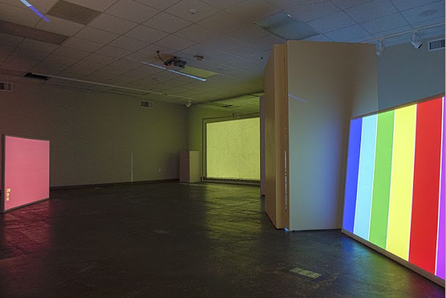
Johnny DiBlasi: RGB at Lone Star College - Kingwood Art Gallery, opening at 12:30 am to 2:30 pm and 6 to 8 pm, running through February 7. Part of the Exurb collective, DiBlasi has created an immersive interactive video environment for Kingwood. If you're in far northeast Houston Thursday, you have two opportunities to check it out--lunch time and after work.

FRIDAY


Kathryn Kelley's installation in progress

Kathryn Kelley, The uncontrollable nature of grief and forgiveness (or lack of) at the Art League Houston, 6 pm with an artist's talk at 6:30 pm; show runs through March 8. We love Kelley's huge rubber hanging installations, so we are eager to see what she does at the Art League.

 
Christine Cook and Sway Youngston mop the floor from the first installment of the Continuum Live Performance Series

Continuum Live Performance Series at Avant Garden, 7 pm. Continuum's back with its latest installment in its performance residency at Avant Garden. Past performances have been shocking, emotionally raw, humorous and/or perplexing. We expect more of the same (but all new) on Friday.

SATURDAY

Autumn Knight, Here and Now, 7 pm at Project Row Houses. Autumn Knight continues her Futz performance series with Here and Now. The description is a little vague (words like "experimental experiential art forms" and "group behavior" are bandied), so expect the unexpected.

 
Curtis Gannon, Closure Construction #5 from his exhibit at ARC in 2012

Curtis Gannon, Never Enough at the Galveston Art Center, 6:30 pm; runs through March 3. When I ponder superhero comics from the past three decades, I can hardly imagine a more fitting fate for them than to be sliced up and turned into formalist artworks. And that's what Curtis Gannon has done with the work in this exhibit.


Share

Crackhouse Nazi

Studio Visit: Keith Hollingsworth

$
0
0
Virginia Billeaud Anderson

No nudes, extreme violence, or racist imagery. Those are the guidelines for the exhibition Warm Up to Black and White: A Tribute to Picasso which opens at the Lyric Center on January 18. According to Keith Hollingsworth, one of the five artists in the exhibition, Lyric Center rules were “laid down by lawyers and management.”

We all know it would be improper to show a nude in the Lyric Center, but a primary category of Hollingsworth’s oeuvre is politically ripe imagery, some a bit dramatic. During a studio visit, I previewed the paintings he will be showing, which depict the U.S. led invasion and destruction of Fallujah in Iraq. Ballerinas with swords, missiles, corpses, agonized and grieving women, a starving child eating crumbs off the ground, and a version of Picasso’s frenzied Guernica horse were only some of the details. “The US and its allies destroyed that country,” he told me. “How do I calibrate if the art crosses over to violence?”

“I plan to exhibit five works created specifically for the show, loosely based upon the theme of Picasso and black and white,” he said. “The largest 4' x 8' piece references Picasso's Guernica, but represents a modern war-like atrocity, and the smaller pieces contain elements related to the larger work, while revisiting the ballerina theme I used in previous encaustic works. My medium is white acrylic gesso, blue and black silkscreen ink, chalk, and charcoal.” Hollingsworth believes his newest works adhere to Lyric Center guidelines, but can’t be certain until he delivers the art for installation. “If I am asked to remove some or all of the works, then perhaps I aimed at the correct audience.”


Keith Hollingsworth, Culture Clash, 2006, Beeswax, Crayola crayons, resin on canvas, 72" x 44.5"

We discussed earlier “ballerina” paintings, which Hollingsworth considered more “overtly political” than the Guernica-inspired works. Rendered in encaustic, Culture Clash features a ballerina dancing on a coffin before the iconic Abu Ghraib prisoner torture image. “The painting’s narrative and symbolism make it a more direct political statement,” he said. “As for its meaning, obviously it represents the ongoing crusade between East and West, Catholic and Muslim, old and new, rich and poor. The emblem on the ballerina’s breast is the American eagle with a Star of David imposed over it, a reference to the U.S. and Israel alliance. Its priest figures were borrowed from a photo of Catholic priests saluting Hitler and the Nazis and allude to Catholic and fundamentalist support of wars of aggression against Muslims in the Middle East, in Iraq and Afghanistan, symbolized by the tortured prisoner and the poppy field. All images have a specific meaning and purpose,” said Hollingsworth.

This artwork’s dimensions were programmatic. Hollingsworth sized his painting according to the mathematical rules of the “golden ratio," proportions considered divine by painters and architects from the time of the ancient Greek Phidias. He conceptualized size by way of the esoteric, and also furthered his investigations into the wax medium. “This was the first painting completed entirely in encaustic, without oil,” he said. Although he continues to work in all media, he would eventually come to be labeled the “crayon king” by Catherine Anspon and other art writers.

“The painting is not from a specific series,” Hollingsworth said, “but part of an ongoing narrative on world events. I’m motivated to make statements to appease my soul.” He showed me other works that appease his soul, such as one from the “Neo-Plague” series in which ghoulish skeletons terrorize a neighborhood. It held multiple allusions, but an important theme related to displacement through urban gentrification. That painting demonstrates adeptness at incorporating art historical precedents. Hollingsworth informed me of another series from that time related to Apartheid in South Africa, “during the Reagan presidency.”


Keith Hollingsworth, Untitled from the “Neo-Plague” series, 1994, Oil on canvas, 5' x 10'

To be certain, Hollingsworth’s visual language is objective and representative. His regard for images called to mind something Francesca Fuchs wrote in her Glasstire review of Robyn O’Neil’s newest paintings. Fuchs said that she and O’Neil were both “artists who still do the unthinkable - MAKE IMAGES.” That high-minded endorsement of representative imagery stuck with me because I had been spending quite a bit of time thinking about Keith Hollingsworth. Seeing his Love Birds at Mother Dog’s Studios a few months back reinforced something I’ve believed for many years: Hollingsworth makes images with total disregard for commercialism or the dictates of avant-gardism.

Most readers know that Fuchs and O’Neil are Hunting Prize winners. Each collected the Hunting’s $50,000, one of the largest art awards in existence. According to the Houston Press, blogger Buffalo Sean eloquently described the award as “a boner-inducing amount.” I mention the award because Hollingsworth was a Hunting Prize finalist.

Let’s look quickly at Love Birds because the “Bird Brains” exhibition is at Mother Dog Studios through February 14. About his painting Hollingsworth said, “The work was part of my efforts to better control the fusing process of the encaustic method in which I am currently working. I suppose its 'ambiguity' is due to the intermixing of the wax as it was being heated (fused). I titled it "Love Birds" to convey the closeness - literally melting together, of the pair of the forms. The medium is beeswax, crayola crayons, and damar resin. I also incorporated an acrylic medium as a glaze to help prevent the wax from migrating, trying to produce encaustic works that look like oil painting, but with a greater luminosity which the wax provides.”

It’s been said the Hunting Prize people freak out over political submissions, so it’s ironic that Hollingsworth became a Hunting Prize finalist with politically flavored art. “The painting is from my “Souls Ascending” series, sixteen or more works created to commemorate those who lost their lives in Bush's war based on lies,” he said. “The ‘Souls Ascending’ series shares the same perspective of a previous series called, ‘Spiritual Landscapes,’ that from a ‘bug's eye view.’ I incorporated beeswax emulsion into the oil for a more luminous surface quality. Like in many political works, I employed skeletons, human skulls in this case. This painting has a beautiful surface quality.”

"Souls Ascending" was significant in Hollingsworth’s development because the result of mixing wax emulsion into the final glazes resulted in luminosity and surface depth that deepened his interest in encaustic. He would continue to use Crayola crayons as an art making medium.

I pointed out the universality of skull imagery. “The series was inspired by Bush's wars,” he said, “but the series is a universal statement about war, and a meditation on what happens to the many souls forced to leave this realm because of those without a conscious soul. Yes, universality is the language I want to incorporate into my work, is the reason I used skeletons in many works prior to this series. All art work is political! My artistic language, overt or otherwise, responds to that which I encounter in the world.”

“I endeavor to create images that are consciously informed, and universally appealing,” he told me in a separate conversation.


Keith Hollingsworth, Untitled, “Souls Ascending” series, 2003, Oil and beeswax on linen, 72” x 60” (Hunting Prize finalist)

Last year while flipping through one of Houston’s illustrious art publications I spotted a photo of Hollingsworth. He had won first prize in the “Museum of Fine Arts 16th Annual Citywide African American Artists Exhibition,” the two sentence announcement informed me. “That’s it?” I recall thinking, no more information than that about this hard working and dedicated artist. It was then I knew that one day I would try to learn more about Hollingsworth’s art and career.

So when I ran into Michael K. Taylor the other evening at Nathaniel Donnett’s Art League exhibition, we sat on the patio and had a chat. I asked Taylor, who served as curator and organizer of the above mentioned “MFA’s 16th Annual Citywide African American Exhibition,” why he thought Hollingsworth was awarded first place. Taylor explained that his curatorial plan for the exhibition was to show art unidentified by race, class and gender, to “curate out stereotypical expectations.” Not only did Hollingsworth’s art fit that requirement, but it was beautiful, indicated an elevated level of skill, seemed to require diligence to produce, was in an unusual medium, and “there was nothing else like it in the show,” Taylor said.

The winning painting, In the Garden We Worship a Higher Source from the “Spiritual Landscape” series, was made with oil, color pigments, beeswax and resin on canvas, and was devoid of political commentary. “All art work is political,” he insisted in other conversations, precisely the same thing James Harithas says practically every time I visit him at Station Museum.

Hollingsworth initially said the painting was one of numerous landscapes he’s made through the years, “from my imagination, with a bug’s eye view from below.” I questioned him further about what inspired so docile and serene a subject, and just about fell off my chair when he revealed one of the most exciting things I’ve ever heard an artist say, and I’ve talked to plenty of them. “'The Spiritual Landscape' series was inspired by an out of body experience, where I saw a light, which was a sun-like entity, and I was among other glowing sperm-like entities making our way towards the big light source. Imagine male sperm swimming towards the female egg. In the process, I realized that if I continued towards the source, and became one with it, then I would cease to be - I would be dead or something. I asked the source if I could return to the physical realm, where I would then dedicate the rest of my life to shedding light and beauty in the world. So the theme of combining nature with the light, or an energy source that makes it all happen, came to be the impetus behind the 'Spiritual Landscapes' from a 'Bug's Eye View' series. I incorporated the bug's eye perspective seeking to give the viewer a sense of the light’s grandeur, its connection to nature, and how small we humans are in comparison. The title of the work references the common religious beliefs expressed by people everywhere on the planet, what I am trying to get across - that there is a higher source that is worth worshipping, and that we could learn something from how nature worships the source that gives it life.”


Keith Hollingsworth, Untitled, Spiritual Landscape series, 1996-2005, Oil on Masonite, 1996-2000

It can’t be easy to glimpse the sublime and return to ordinary bullshit. Hollingsworth was losing his studio and being forced to move, a logistical and financial hardship. And his wrist was fractured from a hit and run driver who sideswiped his bicycle. Instead of stopping to help him off the ground, that lovely person “gunned it” to get away. I wondered if anger or negativity could diminish whatever was transformational about his out of body experience. He said at times it is difficult, but he has the ability to clearly recall the experience. “I don’t know what happened to me, but its effect was profound.” Hunting Prize’s big bucks eluded him but he managed to snatch some of Lawndale’s money when he won First Place in the 1996 “Big Show.” The winning painting "When Worlds Collide" was a “collaborative panel,” a term Hollingsworth uses to describe the 4’ x 8’ wooden panels he created between 1991 and 2000 in his Summer Street Studio. They are named for his practice of organizing studio exhibitions and encouraging guests to mark the gessoed panels with crayons, a starting point for more fully realized works. “I embellished the images on the panel, and composed them into unified narratives.” Those preliminary markings formed the basis for more “refined works of art, made with crayola crayons.”


Keith Hollingsworth, When Worlds Collide, about 1992-1995, Oil, crayon on “collaborative” wood panel, 4 ft x 8 ft, Big Show winner

The last collaborative panel brought technical challenges that furthered his knowledge about encaustics, while seeming to allegorize difficulties in his personal life. “I had to redo the last panel in the collaborative series because the original image was destroyed by chemicals I thought would preserve and protect it, and caused the wax base to melt and the colors to run. I eventually re-worked it into its final form, which I titled MRC Blues, a reference to Michael Ray Charles, about whom I argued with two old black ladies at his exhibit in Austin, over his use of "Sambo" imagery, which I believe is derogatory towards black people. So the title MRC Blues came from that experience as well as a rough time in my life - divorce, losing my studio, etc. The piece’s working title was ‘Melting Pot,’ the red color tones of which are like red hot lava flow and appropriate for intense emotions, with the 'Blues' in the title referencing my emotional state. I painted in one of Charles’ Sambos.”


Keith Hollingsworth, MRC Blues (Melting Pot), late 1990s, Oil, crayon on “collaborative” wood panel, 4 ft x 8 ft

He won a “Big Show” and was included in eight others, but ultimately quit entering Lawndale’s annual juried competition because he became increasingly disillusioned with the organization’s exclusion of traditional representational art. Hollingsworth recalls a board member telling him that Lawndale “will not show certain genres of art such as traditional landscapes as long as he is on the board." He added, "I was around during the original Lawndale days, when it was a part of the University of Houston art department, and the art shown there was more representative of the local flavor - cutting edge, and inspiring.”

Hollingsworth senses a lack of reverence for artists, and a concerted effort by some in the art community to “dumb-down” the arts with the practice of defining art as “anything you can get away with,” which discourages and dilutes opportunities for those who have talent. “Today it is the curators, directors, and board members who set the agendas, resulting in art that lacks soul.”


Keith Hollingsworth, Untitled, Lilly Pad series, 2010-2011, Crayon on canvas, 4 ft x 8 ft

He experienced a similar rejection of his style by the University of Houston art department where many of the instructors thought little of representational art. Hollingsworth has a memory of Derek Bossier telling him his art was too much like an “illustrator” and that “the edges of my figures were too defined.” During class critiques, he was forced to defend his stylistic choices, which looked back to “Albrecht Durer, Leonardo de Vinci, and Rembrandt, who were out of style in my instructors’ opinion. I went against the grain and against their advice by pursuing Old Master techniques.”

Hollingsworth sketched prodigiously as a child, and earned income making mechanical drawings before entering the university to study engineering on an academic scholarship. Once there he switched to art which displeased his family. “After a semester and a half of engineering and advanced math classes I enrolled in fundamentals of drawing with Richard Stout, and was persuaded by Richard and James Surls to consider an art degree. Of course it was their job to recruit students into the art department, and so I fell for it, and took all art classes the following semester. I must admit the fact that there were more women than men in the art classes also motivated me.”


Keith Hollingsworth, Untitled, Master Works series, 2007, Crayola, Size unknown

While discouraging his style his instructors taught him “some basics,” but Hollingsworth believes he began to truly develop when he moved to Los Angeles in 1989 and painted full-time. “I honed my skills as a draftsman while riding the buses and hanging out in coffee shops, and every where else I went. I filled every moment sketching the people and places around me. I consider that period my graduate course in drawing. I often visited the Getty museum to study the paintings and drawings, and other museums and galleries.”

A trip to Amsterdam inspired a series of Old Master still lifes painted in encaustic in Old Master style. When Hollingsworth exhibited some, they caught the attention of Kelly Klaasmeyer who described them in the Houston Press as “opulent.” A lovely one in his studio turned our discussion to the fact that the use of encaustic spans back hundreds of years, and that he deviated from tradition by incorporating Crayola crayons as a coloring agent. Hollingsworth summarized his process. “With an electric griddle I heat beeswax, damar resin, and crayons to a liquid state. The temperature must be hot enough to melt the wax and resin, but not enough to cause the mixture to boil and smoke. I use a natural bristle brush to apply the wax to a hardwood panel with a gesso ground, occasionally incorporating ground glass for texture.” After drawing or tracing a preliminary design, he renders the image three to four times and fuses the waxy pigment with a heat-gun between renderings. “The first rendering is usually the best and the freshest, but after the first fusing, the wax migrates and is less rich and lacks the surface depth that the subsequent renderings entail. There is a give and take with the process, but I am continuing to improve it.”


Untitled (Still Life), Master Works series, 1999-2001, Crayola crayons on wood panel, size unknown

What else? Hollingsworth reminded me he works in all medium, and his representation spans “political commentary, sensual eroticism, natural and imagined landscapes, still life, and portraits.” He is currently exhibiting paintings in The Cloister Gallery at Christ Church Cathedral downtown. He said he is eager for the opportunity to exhibit the “Lilly Pad” series, and very much desires to have a major exhibition of his drawings which comprise a large category of his artistic output. I ended our visit knowing I had spent time with a superb technician.

Share

Dispatches from Little Sparta

$
0
0
Robert Boyd

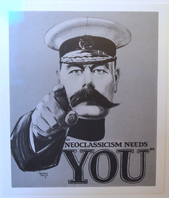
The first time I heard of Ian Hamilton Finlay (1925-2006) was in a book by Charles Jencks called Post-Modernism. Jencks' conception of Post-Modernism was shot through with classical allusion (and neoclassical allusion), and Ian Hamilton Finlay seemed the artist who best embodied Jenck's ideas. (I wonder now if Jencks didn't form his conception of a neo-classical post-modernism after being exposed to the work of Finlay.) It would be unfair to bring everything Finlay did down to neoclassicism, but it nonetheless runs through his work.


Ian Hamilton Finlay, Neoclassicism Needs You, 1983, 6.4 x 5.5"

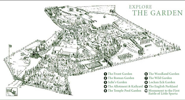
Finlay was a poet who established his own press, Wild Hawthorn Press, to publish his poetry. He belonged to the school of concrete poetry, and at some point got the idea of inscribing lines of poetry into stone and placing them in his garden. Working with sculptors as his collaborators, he began designing a garden for himself (with the collaboration of his wife, Sue Finlay). Because of his running conflict with the Scottish Arts Council (headquartered in Edinburgh, the"Athens of the North"), he named his garden Little Sparta. Now this is a very grand garden. I think I'd call it a park if it were not for the fact that it was a private creation and that the Finlays lived there.


A map of Little Sparta

Finlay created numerous prints published by Wild Hawthorn Press. Like the pieces in his garden, he depended on collaborators to help him create the pieces, not unlike many post-modern artists who came to prominence in the 1980s. But unlike many of these artists, Finlay tended to credit his collaborators.


Ian Hamilton Finlay with Ron Costley, National Flag Series: Arcadia, n.d., Serigraph on postcard, 4 1/16" x 5 3/4"

Many of Finlay's small silkscreen prints are currently on display at Hiram Butler Gallery, or you can see all of them at Wild Hawthorn Press's website. Some of the small prints at Hiram Butler are from Finlay's "National Flag Series." None of the "nations" exist--they are either mythical, fictional, or have specific art historical resonances unrelated to their actual existence. For instance, the Arcadia flag more likely refers to the Arcadia of Poussin than the actual place, a landlocked area of Greece known in antiquity for being bucolic and rustic. But in Poussin's two paintings around this subject, Greek shepherds find a monument (a tomb?) with the inscription "Et in Arcadia ego," which means "I am also in Arcadia." The "I" here is Death.

So Finlay's flag, which appears initially to be a pirate standard, essentially mirrors the meaning of Poussin's paintings. The green field refers to the bucolic land of Arcadia, and the small skull and corssbones in the corner is the reminder that death also dwells here.


Ian Hamilton Finlay with Karl Torok, National Flags Series: Cythera, 1974, 4 1/16" x 5 3/4"

Cythera (now usually spelled Kythera--the "C" is hard) is a real Greek island that in mythology was said to be the birthplace of Aphrodite.  But those who know art history will recall The Embarkation for Cythera by Jean-Antoine Watteau.The painting shows a group of men and women descending to a boat. Despite the title, they are leaving Cythera--a comment on the brevity of love. So even though Cythera is a real place, the Cythera of Ian Hamilton Finlay is Aphrodite's island.


Ian Hamilton Finlay with Michael Harvey, National Flags Series: Valhalla, n.d., 4 1/16" x 5 3/4"

Valhalla was the hall in which half of those slain in battle go to await (and prepare for) Ragnarök. (The other half apparently go to a place called Fólkvangr .) So it appropriate that three tanks are silhouetted on the flag.


Ian Hamilton Finlay with Michael Harvey, National Flags Series: Utopia, n.d., 4 1/16" x 5 3/4"

Utopia is the one I like best. The word "Utopia" was coined by Thomas More in 1516 as part of a book of political philosophy centered around a fictional island of that name. The word comes from Greek and is usually interpreted as "no place." So the blankness of the flag is appropriate. But I also interpret it as reflecting the impossibility of progress towards perfection or purity. In other words, it could be seen as Finlay teasing the utopian ambitions of Modernism. A blank white image is sort of the ne plus ultra of Modernism--and its dead end. Finlay's own work, even when it resembles modernist work (as in Utopia) is rich with allusions and associations. This was in fact one of the characteristics of post-modernism as described by Jencks, which is probably why he found Finlay's work so admirable.


Installation view at Hiram Butler Gallery

Finlay's primary work is his garden. These various small silkscreen prints produced by Wild Hawthorn Press seem like little portable adjuncts to the main project. But they are charming, amusing, and surprisingly multi-layered.

Share

Birds and Grids: A Talk with Roberta Harris

$
0
0
Virginia Billeaud Anderson

In 2009 I wrote a catalogue essay for Roberta Harris’s Dallas museum retrospective, which is the reason I know she has been using some of the same pictorial signifiers since the beginning of her career. Birds, Grids and Other Symbols at the Jung Center through January 30 is an avowal of how interiorly grounded are those visual associations. I talked to the artist about her iconography.

Virginia Billeaud Anderson: You just closed the exhibitionRoberta Harris: Recent Paintings and Works on Paperat Houston Baptist University in which you showed over 20 artworks created in 2011 and 2012. Are the Jung Center works new?

Roberta Harris: Six pieces predate 2012, and all of the others were created in 2012 except one bronze I finished on New Years day. A few from 2012 were exhibited at Houston Baptist University.

VBA: Describe the Jung Center exhibition, how many artworks are you exhibiting, what are their subject matters, and materials.

RH: The show has 32 pieces with depictions of birds and a few of my other standard motifs. I’m exhibiting five large paintings, and ten smaller collage paintings, all made in 2012. In the atrium is an edition of 5 bronze birds, each painted in a different style, the last one completed on January 1, 2013. I’m showing two circular paintings and four collage paintings from 1987 because their symbols relate to the newer works. Another gallery holds works on paper, all new.

VBA: How comforting to see bronzes that are a manageable size, given the monumentally sized sculptures you produced in the past, one of which required structural engineering. And there was no need for welding.

RH: This is the first time I worked in bronze, and yes it was a pleasure to work on this scale.

VBA: The largest sculpture in your portfolio is a “bird” with moon and star components that calls to mind Miro’s monumental sculpture, so let’s talk about birds.

RH: They allude to healing and regeneration. In many cultures they emblemize inner journeys, prophecy, visions, and spiritual enlightenment, and, also bridging worlds and past-life connections.

VBA: I remember the “Ka.”

RH: Yes, from studying depictions of birds in ancient Egyptian hieroglyphs and temple carvings I learned the bird represents “Ka” which translates to “spirit.” The “Ka” arrived at birth and lived on after death, and stood for the creative and sustaining power of life. My birds in flight denote a life force.

There’s one more thing about the birds. We've never talked about this before but I want to share it. For the past few years, I have had a recurring thought about what it might have been like to be inside a cramped boxcar, hurtling through the darkness, on my way to a death camp, a memory that’s been with me ever since visiting the Holocaust Museum in Budapest in 2010. As I understand, not knowing the direction they were headed in, many prisoners wrote their last words, and pushed notes and letters through cracks or small openings of the train car hoping they would be found. In some of the letters, it was mentioned that they never heard birds singing while at the death camps. As it turned out, birds would not come close to the camps because of the stench and fumes of death. I was doing bird paintings before knowing this, and reflecting back, I’m certain I was projecting a vision of hope.


Roberta Harris, Fire, Fire, 2012, Acrylic on Paper, 50" x 38 1/2"

VBA: For forty years you have painted checkerboards and stairs.

RH: My rectangles are Ziggurats, ancient temple steps, and the grid and checkerboard patterns found in Etruscan, Greek, Roman, Chinese and Mayan art and architecture. Many cultures employ a visual approximation of stair steps to speak of higher realms and enlightenment.

VBA: You often lay down grid patterning as invisible ground for imagery.

RH: Even if invisible, it has subliminal force. I put it out there so it can work magic for the viewer. Repetitive patterning is akin to a mantra.

VBA: This esoteric approach bows to Mondrian whose work you studied at MOMA when you lived in New York.

RH: As well as my father’s craftsmanship. He spent his life creating glass installations. My mother was a mosaic artist.


Roberta Harris, Ziggurat II, 2012, Enamel and Acrylic on Paper, 50" x 38 1/2"

VBA: Your time in New York at Parsons, and completing your Whitney Museum Fellowship, exposed you to the work of important artists, and we’ve talked about how significantly it influenced you. Warhol’s repetitions mimicked Jasper John’s flag and letter grids. Stella was a major influence, so was Lucas Samaras. Rauschenberg taught you innovation and you subsumed Pat Steir’s manner of working in both the real and metaphysical realms.

RH: Rauschenberg’s vision! You do something, and then do something different. Agnes Martin was showing grid paintings at Betty Parson’s Gallery and she was brilliant, her work was meditative, peaceful, about seeking peace and calm. I admired its complex simplicity. Louise Nevelson’s sawed-up fragments and found objects were influential. She was a glorious woman, all about dedication to her craft, bold and audacious. Twombly taught me subtlety with his delicate art. At the Whitney his paintings seemed to cast a pink glow, it felt like walking through air. From Joan Snyder, I learned to be gutsy, from Pat Steir, I learned grids, and less is more.

VBA: You’ve made clear statements about your belief in a collective unconscious, the pre-existent forms and primordial archetypes humans hold in their psyches, which were described by Jung. I’m compelled to point out a bit of ironic linkage between you and Bert Long, who is very sick, and who in 2011 exhibited at the Jung Center artworks inspired by Jung’s personal journal. Bert opens a show on February 28 at Houston Baptist University.

RH: I believe there are forms, shapes, images, patterns, and ideas that we carry inside us as part of the human species, since the beginning of time.

Share

Pan Recommends for the week of January 24 to January 30

$
0
0
Robert Boyd

Curiously enough, Thursday seems to be the big day for openings this week. I guess no one wants to compete with openings at Lawndale and the Station Museum scheduled for Friday evening, and who can blame them. Those institutions always draw big crowds for their openings. So the art weekend begins tonight. Here are a few events that caught our eye.

THURSDAY


Arturo García Bustos, El sembrador (The sower), 1958, 8.3 x 8.5”, linoleum print

Arturo García Bustos at the Museum of Printing History, 6 pm; runs through April 13. This master printer and painter, who studied under Diego Rivera and Frida Kahlo (as a follower of Kahlo, he belonged to a group that ws called "los Fridos"). Expect to see many dramatic, political,  and somewhat nostalgic images.


Nicolás Paris, Subject, 2009, Plastic figure and dime, 6.8 cm x 2.8 cm x 2.5 cm

Transitional, curated by María Iovino and featuring work by María Isabel Arango, Teresa Currea, Cesar González, Diana Menestrey, Nicolás Paris, Andrés Ramírez Gaviria, Luisa Roa and Adriana Salazar at Sicardi Gallery, 6 pm; runs through March 16, 2013.  A group show of eight Colombian artists. I can't say much about them, but the images on the Sicardi website are quite intriguing.

FRIDAY


This is a older piece by Abi Semtner

Carrie Cook & Abi Semtner: Doing It Like Dolly Does...How Does Dolly Do It at Lawndale Art Center, 6:30 pm; up through March 21. There are several shows opening at Lawndale Friday, but I especially want to call attention to this show because I've liked the Abi Semtner work I've seen, and want to see what she is doing now. Also, Dolly Parton is the musical inspiration for the show, which is awesome.


Alexandre Rosa does delicate blue drawings like this one

ProjeXion featuring work by Tim Gonzalez, Devon Britt-Darby, and Alexandre Rosa at Avis Frank Gallery, 6 pm; runs through February 20. Described as "a multimedia exploration of masculinity and sexuality through abstract, homo erotically charged vignettes" and restricted to viewers 21 and older, I anticipate many penises in this show.

SATURDAY


Kalup Linzy as Kaye, Romantic Loner

Performance: Kalup Linzy at the Houston Museum of African American Culture, 7 to 8 pm. The CAMH's series of performances continues, this time with Kalup Linzy at the HMAAC on Caroline St. You've seen his videos--now see the artist performing his newest character, Kaye, the Romantic Loner.


Share

Questions for Mark Williams

$
0
0
Virginia Billeaud Anderson

Two days after Mark Williams notified me of his Houston exhibition, The Illusion of the Precise: Robert Ryman, Mark Williams, Todd Williamson at Wade Wilson Art through February 2, he informed me he is exhibiting at Fruehsorge in Berlin through February 23. Aesthetic dissimilarity between the two presentations is indicative of the artist’s ongoing experimentation with materials and processes. In an earlier post, Williams spoke of uninterrupted “interest in structure (the grid) and gesture (the paint.)” He also listed a few artists at whose works he looks closely while working his day job as installer at MOMA, some favorites being “Robert Mangold, Brice Marden, Anne Truitt, Donald Judd, Robert Ryman, Mark Rothko, Dan Flavin and Blinky Palermo.” I asked Williams a few questions about his current exhibitions.

Virginia Billeaud Anderson: What do you think about Wade Wilson continuing to link you to Ryman, which he did last year for his Impressions exhibition? Do you perceive any connection between you and Ryman?

Mark Williams: I suspect that Wade recognizes a workman-like connection between us. Both Robert Ryman and I have an investigative approach to art making. We experiment and try new materials in a variety of combinations. I came across this statement and it pretty much describes my approach to art making: the reality of paint and process is a high-priority. I think Ryman would agree.

VBA: Please give me a brief description of the work you are exhibiting at Wade Wilson Art, how many pieces, their size and materials. Tell me about your process.

MW: There are four framed works on paper and one large painting on canvas at Wade Wilson Art in Houston. The works on paper were made using enamel paint, acrylic paint, and alkyd paint. The paint was applied with inexpensive brushes which I purchase at a hardware store. The paper is 14" x 11". I started with a two simple restrictions/rules that I set for myself, use vertical and horizontal edges exclusively, and use only rectangular forms. Oh, and one more rule: all forms must be anchored to at least one edge of the image. By alternating applications of paint and tape, and its removal, surface and image are developed simultaneously. These steps are improvisational, it's a rather organic process. I may repeat this process several times before determining that a work is finished. How do I know a work is finished, it has an intuitive sense of rightness.

The large painting is titled Homage to White (2010, 90" x 72 1/2"). The oil enamel, alkyd, and acrylic paints were applied with a brush. White is the dominant color. It is applied over dark rectangular shapes, radically flattening the pictorial space of the painting.


Mark Williams, four untitled works, 2007 (Wade Willson Art installation view), oil enamel, alkyd and acrylic on paper, each 14" x 11"

VBA: I’m charmed by a piece you are showing at Fruehsorge in Berlin. Its loopy forms are unexpected and lovely after so many grids. You created this more organic image about the same time you were painting large boldly colored rectangular forms in acrylic on canvas. Say something about these aesthetic variations.

MW: Yes, these artworks were shown recently in Berlin at Fruehsorge Contemporary Drawings. They are made of oil paint on gridded paper. Here the grid has a supporting role. Each sheet is 8 1/2" x 11". I began making works of this group back around 2005. My drawing tool is a piece of found plastic. It has a wonderful elliptical shape and I instantly thought I might be able to use it as both a drawing tool and a printmaking tool. It appealed to me. At the time, I immediately set out to see what I could make with it. I worked on many different papers and on Mylar and plywood, too. The results were hybrids: part drawing, part monotype. They have the appearance of being a kind of writing, glyphs for an unknown language. Again, an intuitive process. Sometimes it takes new tools to make new art.


Mark Williams, Untitled, 2005, Oil on paper, 14 x 11 inches

VBA: Do you assign any personal meaning to the circular forms, or is this strictly one of your formal exercises?

MW: Not sure what I expected, however, I was surprised by the sensual forms I made.

VBA: Is there anything you want readers to know about you or your art, particularly something unexpected or not written about in the past?

MW: I am driven by curiosity and process. I have no agenda. Everything you need to know is carried within each artwork.

Share

Pan Recommends for the week of January 31 to February 6

$
0
0
Robert Boyd with Dean Liscum

Another busy week in the world of Houston art. It would be pretty much impossible to hit every art-related event, but here are a few we like the looks of.

THURSDAY


Gunilla Klingberg, Wheel of Everyday Life, 2008, Akershus University Hospital, Lorenskog, Norway. Photo: Guri Dahl. 

Wheel of Life by Gunilla Klingberg at the Rice Gallery, 5 pm;  Galina Kurlat at the EMERGEncy ROOM (Sewall Hall 402), 7 pm; The Space Above Our Heads by Brent Solomon and Josephine Tran at the Matchbox Gallery in the basement courtyard of Sewell Hall, 7 pm;  Are We There Yet?, an open house for Cargo Space at the Sewell Hall loading dock, 8 pm; and a general Art Fiesta at Rice. Multiple events at Rice University's Sewell Hall. Dean Liscum recommends it "for those who want a party with their art."


Cargo Space versus the Kraken

CORRECTION: The workshop is from 2 pm to 6pm, Thursday.Printmaking workshop with Oscar Rene Cornejo at the Art League, 8 pm as part of the exhibit Bringing It All Back Home. Dean recommends this one "for those who want to learn with their art..."

The Art Guys will be featured on Houston PBS Channel 8 Arts Insight, 7 pm. I recommend this one for those who have nothing better to do than watch TV and have a couple of brews. (Don't worry if you miss it tonight--it repeats Friday at 9:30 am and Sunday at 2:30 pm)


Christopher Cascio, Some drawings and a beer. On the floor.

Christopher Cascio: Selections from the Hoard at the University of Houston art building, 4th floor Projects Gallery, 6 pm.Cascio's exhibit is the show recommended for those who experience horror vacui.


I wish I had a photo of Devotion. But here is a photo of Call to Color by Ballet Austin designed by Trenton Doyle Hancock. Imagine colored balloons coming from their behinds.

Devotion by Trenton Doyle Hancock at the CAMH, 6 pm. I'm just going to let CAMH describe this one: "Join us for a performance of Devotion. Sleep-deprived artist Trenton Doyle Hancock snoozes atop a wooden structure, covered in a colorful, fur-striped sheet. Upon awaking to the sound of an alarm clock, Hancock is fed huge bowls of various colors of Jell-O. And, in an amusing twist on the logic of consumption, he expels colorful balloons out of the rear of the structure." Dude.

FRIDAY


Phillip Pyle II: Caroline Plantation at the Houston Museum of African American Culture, 6 pm. This sounds like a must-see--Pyle has recreated the the Wavering Place Plantation of South Carolina out of 7000 Legos.


A cobra-hydra-horsey by Joshua Goode

Origin of Myth by Joshua Goode at the Darke Gallery, 6pm. Goode seems to have created a variety of chimeras for a mythical natural history museum. Shades of the Museum of Jurassic Technology!

SATURDAY


Ricardo Ruiz, El Mero Chingon, Oil on Board, 10" x 10"

Love Songs For The Palomia by Ricardo Ruiz at Redbud Gallery, 6 pm. Without knowing anything else about this exhibit, the image above makes me eager to see it.

SUNDAY

I think there's something on TV today. Have a couple of brews.

Share

Questions for Becky Soria

$
0
0
Virginia Billeaud Anderson

When Becky Soria exhibited art based on Paleolithic cave paintings at Redbud Gallery in 2011 she made a few statements, the importance of which to understanding her art I failed to fully appreciate. Prehistoric bison and horse imagery, she said, calls up “profound, hidden, unconscious” parts of the psyche. She also spoke of her deep interest in biology and systems of the body, which dates back to childhood with a physician father.

It was the totemic figures with fragmented torsos and brightly colored entrails she showed at Deborah Colton Gallery in 2012 that helped me realize how effectively her earlier statements illuminated her art. Recently I previewed the newest paintings of Paleolithic cave animals and abstracted human figures that she will exhibit in Signs, Symbols, Sentinels at Archway Gallery on February 2, and, with what I believe is deeper insight into her work, asked Soria a few questions.

Virginia Billeaud Anderson: Your show at Archway opens on February 2 and runs through February 28. How many pieces will we see, and what are they?

Becky Soria: I will exhibit 11 paintings, 8 in larger size, 3 on a smaller scale, all painted on canvas or wood. I will also show 9 works on paper, mixes of painting and drawing, using charcoal, pastel, acrylics and oils. Remember, I will be giving an artist talk at 6:30 pm the evening of the opening.

VBA: On a simplistic level you are an artist looking back at other artists who worked 30,000 years ago, during the Paleolithic.

BS: The thing that is so intriguing is that we don’t know their arts’ purpose, anthropologist can only speculate about its meaning.

VBA: But you are drawn to its properties.

BS: Yes, along with the enigma of their meaning, I’m fascinated by their present look, that is, the plasticity they have today, altered and damaged by time. Some of the drawings and paintings incorporate uneven cave wall surfaces into their design. I take from all of that, and make “my own” contemporary expression. Most importantly I am trying to capture their mood.


Becky Soria, Salto, 2012, Acrylic and charcoal on canvas, 36 x 48

VBA: You’ve used the word “primitive” in some of our past discussions, and also titled your 2011 exhibition with that word. What does it mean to you?

BS: It’s a quality in pre-Colombian art or African art, related to simplicity, distortion, a sort of reductive abstraction that reaches to the essence of something. You know it by its estranging imperfection. The primitive was all around me when I was a child in Bolivia, the archaeological site of Tiahuanaco, for instance, and my father had an important collection of pre-Colombian artifacts.

VBA: That word perfectly describes my Moche statue with a decidedly estranging fan shaped head. By the way, Picasso shared your view of the primitive. Your reds knock me over - crimson, vermilion and magenta. Humans’ use of red ochre dates back to the Paleolithic, meaning red was one of the first colors used artistically. Make a comment about your choice of colors. Are they symbolic?

BS: I have an instinct for reds in all its combinations, they come naturally to me. And they do hold symbolism. I use them to portray strength, passion, mystery, life. In general I am drawn to earth colors.

VBA: As you know I traveled throughout Peru so those reds are not unsurprising. I’ll never forget the red on the relief carvings at the Temple of the Moon in Trujillo, still dramatic after centuries. And the Andean textiles I saw were surprisingly vibrant.

BS: I assimilated it as a child.


Becky Soria, Piedra Y Rojo, 2012, Acrylic and charcoal on canvas, 36 x 48

VBA: Let’s talk about the stylized human figures in some of your works. The stick figures that float through Umbral’s composition appear to have the same gestures as schematic figures in the Toquepala Cave.

BS: Along with Western European upper Paleolithic images that date to roughly 35,000 or 40,000 years, I take inspiration from shamanistic societies such as the African Sand Rock, and others indigenous to the Americas. Some of my works on paper are derived from that imagery.


Becky Soria, Umbral, 2012, Acrylic and pastel on Reeves prepared paper, 34 x 24

VBA: The leaping figure in Shaman has visceral components similar to those in the abstracted figures you showed at Deborah Colton.

BS: He is a shaman. Many believe Paleolithic cave paintings in Europe and North Africa were made by the societies’ shamans, who entered the caves, went into trance, and painted images related to their visions. Their art, like fertility goddess figurines, represents man’s earliest use of symbolism. You have seen many of my goddess figures which are grounded in the mystical. Similarly, I use shamans and animals ritualistically.


Becky Soria, Shaman, 2012, Acrylic, charcoal and pastel on handmade prepared paper, 20 x 26

VBA: Becky, during one of our visits you said our “primordial ancestry as human beings” is central to your art. Primordial is an arresting word. I take this to mean we carry within us collective memory of all that went before. Imbedded and capable of being brought to full consciousness are memories of millions of years of human existence, perhaps even those animal-like instincts that serve us. Our two-million year old human ancestor resides within us in the deepest levels of our psyche. The “profound, hidden” knowledge of your artist statement is the means to self-knowing and our fullest expression.

BS: Yes. Our relationship with these animals is at the root of artistic consciousness, deeply enmeshed in our DNA, which I believe is the reason they became a significant part of totemic, religious ritual for millennia.

Share

Bert Long: 1940 - 2013

$
0
0
Robert Boyd

The great Bert Long has died. He was 72. Long didn't become a full-time artist until 1979--prior to that he was a chef. But he more than made up for his late start, becoming one of Houston's most beloved artists. Here are a few of the obituaries and articles that have been written about him over the past few days.

"Houston artist Bert Long Jr. Dies," Claudia Feldman, The Houston Chronicle, February 1, 2013

"Bert Long, Texas Art Paradigm, 1940-2013," Bill Davenport, Glasstire, February 1, 2013

"Iconic Houston Artist Dies," Tyler Rudick, culturemap, February 1, 2013


Bert Long, Field of Vision, 2002

You can see a lot of Bert Long art reproduced on his website as well as that of his dealer, Kirk Hopper.

On Thursday, February 14, the Menil will be screening A Valentine for Bert Long, a documentary about the man. And Houston Baptist University will be hosting an exhibit of Long's work from February 28 through April 18.

Long's work is in many museum collections (for instance, Dama is in the Art Museum of Southeast Texas in Beaumont). I hope these museums will pull his work out of storage and let people see his work. But one place you can always see Bert Long art, day or night, is at the corner of Elgin and Bastrop (one block west of Dowling). That's where the Long's sculpture garden piece Field of Vision is. I will be driving over there later today with a few flowers for one of the great of Houston.

Bert Long, Dama, 2981, mixed media


Share

Pan Recommends for the week of February 7 to February 13

$
0
0
Robert Boyd with Dean Liscum

It's Mardi Gras time and there will be partying. Or alternatively, you can discuss public art or go on a long walk or look at a few paintings. It's all cool.

THURSDAY

Slide Jam: Sally Frater and Kimberli Gant at the CAMH, 6:30 pm. It's usually artists who show the slides at CAMH's slide jams, but this time they've handed the projector over to curators to talk about what it is that they do.


Marcelyn McNeil, Crudely Drawn Mimic, Oil on Canvas, 58"x60", 2013

Howard Sherman: Artist's Picks featuring Michael Guidry, Geoff Hippenstiel, Marcelyn McNeil, Tudor Mitroi, Robert Ruello, Howard Sherman, and Shane Tolbert at the Alliance Gallery- Houston Arts Alliance at 5:30 pm through March 26. An artist (with an ego and an opinion and not afraid to sling either) picks other artists to exhibit.


Rebecca Hamm, Ski Hut, watercolor on paper

Toward Substance:Paintings by Rebecca Hamm and Cary Reeder at the O'Kane Gallery, 6 pm, runs through March 14.Rebecca Hamm paints dense underbrush and Cary Reeder paints Charles Sheeler-esque images of cottages--sounds like an interesting combination.

FRIDAY


One of the pieces in Judged and Juried

Judged & Juried with guest juror Alyssa Monks at East End Studio Gallery at 6 pm. Featuring work by Adrienne Wong, Anat Ronen, Angela Obenhaus, Antonio Torres, Aron Williams, Blue OneThirty, Christian Perkins, Claire Richards, Dawn Thomas McKelvy, Diane Gelman, Ellen Hart, Jonathon Lowe, Kevin Peterson, Lacey Crawford, Leslie Roades, Lisa Comperry, Mario Casas, Mark Chen, Marky Dewhirst, Maryann Lucas, Melinda Patrick, Mic McAllister, Rona Lesser, Sacha Lazarre, Saida Fagala, Sam Li, Sarah Cloutier-Houston, Spartaco Margioni, Tatiana Escallon, Tim Walker, Will Brooks. This show seems a bit overwhelming on the face of it--an East Side "Big Show". Look out Lawndale!

SATURDAY


Mac Whitney, Houston, 1982 (in Stude Park)

Public Art and Its Impact Within Houston featuring panelists Michael Guidry (University of Houston), Jimmy Castillo (Houston Arts Alliance), and Cynthia Alvarado (Midtown Management District) and moderated by Paul Middendorf at Gallery Sonja Roesch, 2pm-3pm. Where does Houston rank in terms of public art? And who green-lighted those Jaume Plensa sculptures on Alan Parkway? All will be revealed.

El Rincon Social Music Night at the Art League featuring Ryan Lee Hansson, Lisa Marie Hunter, Josiah Gabriel and Fernando Ramirez at 8 pm. This is interesting not just because of what it is but because it represents a trend I've been noticing recently in Houston--that art exhibits are having continuous related events throughout the course of the show. We saw that with STACKS at the Art League and with Radical Presence: Black Performance in Contemporary Art at CAMH, and we're seeing it now with Tony Feher: Free Fall at Diverse Works. Anyway, go to the Art League early to get warmed up, then head on over to...


Poster by Sebastian Forray

Otis Ike and The Joanna Gallery Present:MARDI GRAS - An Epiphany of Anal Beads with the World Famous CHRISTEENE!!!  at Numbers, 9 pm til 2 am. Promises to feature Human King cakes! Tranny floats! An unmarried gay Tree! Bears! Cubs! Moms! Glory Holes! Shims! Hymns! Kings! Queens! Beads! Altar boy bathroom attendants! Enron! Elrond! & A Barbara Bush invitation to move to HOUSTON!!!

SUNDAY


Carrie Schneider and Alex Tu will apparently be wearing hazmat suits on Sunday

The Human Tour with Carrie Schneider and Alex Tu, 11 am starting at Natachee's in Main. This is the first of 10 walks to be conducted by Schneider and Tu along the path of the Human Tour, an enormous art project originally created by Michael Galbreth back in 1987. The piece was a map of certain Houston streets that formed a crude outline of a human figure.


Michael Galbreth, The Human Tour, 1987

Share

Ricardo Ruiz’s Neighborhood

$
0
0
Virginia Billeaud Anderson

When Ricardo Ruiz paints a javelina, he is pictorially describing a place. South Texas ranches along the Mexican border are overrun with javelinas. On Saturday afternoon I previewed Ruiz’s Love Songs for the Palomia at Redbud Gallery, an exhibition of paintings, drawings and prints which can be seen through February 27. Redbud Gallery describes the Corpus Christie artist as one who “uses imagery culled from religion, folklore and the Mexican-American cultural experience in South Texas,” favorite motifs being devils, angels, El Cucuy, martyred frogs, family members and well-dressed grackles in fez hats.

I contacted the artist to ask a few questions, and his mention of music brought memories of trips into the barrio where the beer bottles were shoved into ice, huevos cost nothing, and I would give the proprietor money to select his favorite ranchera music with unforgettable strings, trumpets and yearning in the voices.


Ricardo Ruiz, El Mero Chingnon, 2012, Oil on Panel, 10” x 10”

Virginia Billeaud Anderson: Your artistic relationship with the frog dates back many years. As the story goes on childhood trips to Mexico with your family you coveted a mariachi frog figurine in the market. Years later you purchased a small frog playing the accordion, and upon close inspection determined it wasn’t a toy but an actual taxidermied toad, so in the mid-eighties you began to celebrate the martyred frog in your art. Is there a similar personal connection to the black bird or grackle which is also an important iconographic element?

Ricardo Ruiz: The grackles have been a constant presence here in South Texas, they follow me around as I cut the grass and they eat the bugs I stir up with the mower. It occurred to me a few years ago that I rarely see a dead grackle. This led to the theory that the grackles that were around in my childhood are the same grackles around today. That being the case, I’m sure they've had time to build some sort of civilization, which would include creation of the type of service organizations we see in every city.

VBA: It required a closer look at the oil painting Vicente (2010) to realize the frog does not reference Vicente Fox. Its flamboyant gestures with legs and arms wide apart and the way the figure takes up practically the entire canvas initially led me to assume you were talking about some El Jefe big shot. Its costume is theatrical.

RR: That frog in Vicente is dedicated to my father's memory. Before he died, he loved to watch the Spanish programming on TV and would always alert me when the mariachis performed. Our favorite performer was of course, Vicente Fernandez and we would sit together every time he came on TV. My oldest son's middle name is Vicente in his honor, as well, so this small piece takes the taxidermied toad from the mercado and brings him back to life and gives him a stage upon which to perform.

VBA: Redbud’s gallery notes described your style as one that bows to the Northern European Renaissance tradition. Please speak about your painting style, and also about your development and influences. Did you study Renaissance art? Who do you look at, what art inspires you?

RR: I do love the subtle way the northern renaissance painters distort their imagery for the sake of the composition and narrative. I didn't have very good background knowledge of artists from which to draw inspiration while in school, I was working full time, in school full time, so I didn't get to museums. Upon graduation in 1986, I started to look to other artists for inspiration and found Frida Kahlo of course, but just as important to me was Gregory Gillespie, the great modern realist.  I also love artists who utilize a narrative so Thomas Hart Benton, Edward Hopper and more recently, Donald Roller Wilson.

VBA: Some of your figures are costumed in the garish style of Spanish colonial religious paintings, resembling the red poofed-out skirts one finds on the archangel Raphael or a Mater Dolorosa. Make a comment about Catholicism.

RR: I was raised Catholic, attended Catholic school and served Mass in my youth, but the biggest effect it had on me was in the great illustrations I found in our family bible. The colors were rich deep greens contrasting with intense reds that seemed to radiate from the page and tickle my eyes. I've never gotten over the pleasure those images gave me and I still have the bible to pore over whenever I need inspiration.

VBA: That must have been some bible. You painted a devil with rattle snake tails for ears, and a snakes head for his nose. Your depictions of El Cucuy are also twisted. Tell me about El Cucuy.

RR: The Cucuy is the Mexican-American version of the boogey-man and growin up, our parents, tios and tias would tell us these harrowing stories of disobedient children being snatched up and eaten by the cucuy. I remember looking out the window in the middle of the night and seeing him flitting from tree to bush to cactus, I guess that's what jump-started my imagination.

VBA: Explain your exhibition title Love Songs for the Palomia.

RR: The Palomia is a local slang that refers to the people of the neighborhood. You can't do anything without the Palomia finding out about it. When someone does something dumb, we say "that's the Palomia!" I consider it a term of endearment for the good people who surround us and live among us.

VBA: According to gallery notes your work “examines the mysteries of life, love and the commonality of the life experience.” Please elaborate.

RR: I hope I don't sound overly Rockwellian, but I am a very simple man with a very simple life and my search in my art has been to find our commonality.

Share
Viewing all 665 articles
Browse latest View live